Most of us don’t fancy the word popup because it makes us think of things we don’t particularly like – for instance the Tuesday morning that your condescending mother in law decided to popup in your home and disrupt your life or the ghastly red message that started flashing as soon as you decided to exit a website.
You might need a therapist to get to the bottom of the issues that you’re having with your mother in law but as far as the flashy red message is concerned I’m your guy. Today we’ll be talking about popup ads – the infamous villains of the marketing world – we’re going to be looking at a completely new side of popups though – a side that is going to repair your estranged relationship with them as a marketer.
First Some Fascinating Statistics
According to a survey a whopping 99% of people that come on a website don’t end up buying anything – sure, the data represents e-commerce websites, however, it still awakens you to a very real user behavior and you’re forced to think if 99% of people don’t buy anything from you on their first visit how is it that you get them to return to your website for a second visit?
Breathe a sigh of relief because the survey also details that 75% of people leave your website with intentions to return another day – their first visit is simply them window shopping. And while they’re in their lull of browsing through your website if you put in front of them a cleverly designed relevant popup ad what you’re doing is executing a persuasion play known as pattern interrupt.
Where you basically disrupt the normal pattern of someone’s thinking by drawing their attention to something unexpected – this gets you a chance to make a proper first impression.
Be wary though because this technique only works on your customers if your popup has been designed properly and most of all is relevant. If your pattern interrupt aka your popup helps solve a problem that your customers may be having, then bang, you’ve just caught their attention and earned a conversion.
See case in point:

Imagine you’re going through the Copy Hackers blog, you’re fascinated, yes, but you’re actually looking for regular conversion tips without having to scour for them yourself, then this copy hackers popup does its job of pattern interrupt as it gives you exactly what you wanted.
Get what I am saying?
Not every popup ad looks or acts like the one featured above? Am I right? And it’s because popups don’t behave the same way all the time that’s causing us to have such distaste for them.
However, it isn’t fair to diss the whole popup ad world just because of a few noisy moronic examples – what we need here is to outline the proper code of conduct that all popups must follow to be effective.
4 Rules That all Effective Popups Must Follow
When it comes to popup ads you need to consider a few rules:
- The time that it takes for the visitor to show up on your site and the time that the popup shows up in front of your visitor is really important. If you do it too quickly, your visitor will be taken aback and there goes your sale and if you do it too late you might lose the opportunity to do it at all.
- Make it really easy for your visitors to close your popup ad, don’t hide away the close button, because no one’s going to spend time looking for that X, they’re just going to go away from your website.
- How many times does your popup ad appear, does a single visitor see it more than once?
- The call to action button of your popup needs to be attention grabbing and phrased properly.
Effective Popup Case Studies
I personally am I big fan of case studies because I can really go blue in the face telling you all the pros of popup ads without really convincing you and with just a case study or two in front of you you’ll be running out to design your very own popup ad in a matter of minutes.
Mama’s Lebanese Kitchen – a recipe blog started using opt in popups asking users to subscribe to their blog in September 2012 – with the pop ups displayed for just one month – the blog subscription increased from one subscriber a day to 10 subscribers a day.

When WP Beginner started using popups with exit intent (which is just a fancy way of saying that the popup appears in front of the visitor when they’re about to leave the website) just on single posts not even on every page of the website they increased their subscribers from 70-80 a day to 445-470 a day!

Convinced?
Good! It’s now time to see the many shapes and sizes that popups come in.
Popups With Offers
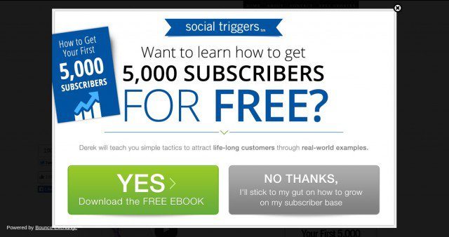
Offer Popups are those that offer users something for free such as an ebook or a white paper. You offer your users something for free in exchange for their email address. Yes, you give away free stuff but you also gain subscribers in the process.

Exit Intent Popups
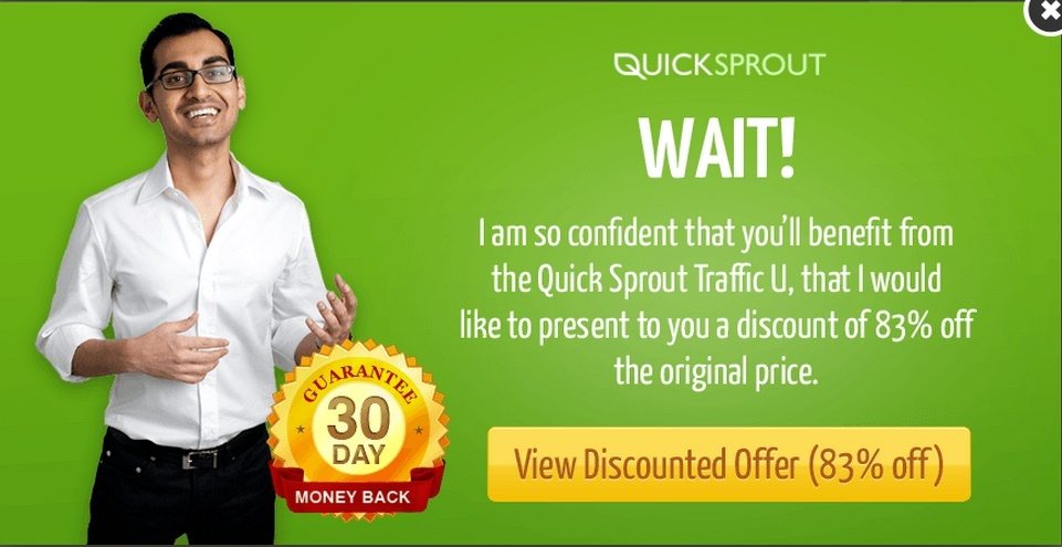
These popup ads use mouse tracking and other variables to ascertain when the user is about to leave the web page and as soon as the intent to exit is noticed the popup ad appears. Neil Patel used an exit intent popup and increased conversions by 46%.

Obnoxious Popups
A lot of websites are now in the habit of using obnoxious popups – these are the ads with big bulky CTAs – claiming to know what’s best for you better than you do. Something like this.

If you want to get conversions with popups remember that the timing of the popup is extremely important. Some studies show that popups that are displayed after 5 seconds result in the highest sign ups. However, every industry is different which is why you need to test your popup timings yourself.
Don’t hate popups just because they have a shady history – explore what they have transformed into today and enjoy the benefits of increased conversions.
If you’re looking into creating pop up boxes post-click landing pages, sign up for an Instapage Enterprise demo today.

See the Instapage Enterprise Plan in Action.
Demo includes AdMap™, Personalization, AMP,
Global Blocks, heatmaps & more.
