What is a Landing Page?
by Tyson Quick
Many marketers would have you believe a post-click landing page is simply any page a visitor lands on after clicking through an advertisement or promotional link. That’s incorrect.
While countless campaigns use a variety of website resources (like homepages, “About” pages, or “Contact Us” pages) as post-click landing pages, that does not make them post-click landing pages.
Think of it this way: You could use a baseball glove to retrieve a hot dish from the oven, but that doesn’t make your baseball glove an oven mitt.
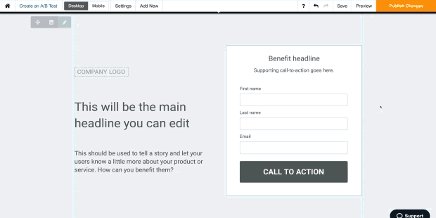
Similarly, directing visitors to your homepage or “Contact Us” page doesn’t make those pages post-click landing pages. A post-click landing page is a standalone web page, disconnected from a website’s navigation, created for the sole purpose of convincing a visitor to act (to sign up, buy, download, etc.). This is generally powered by a robust landing page optimization platform:
As businesses become more data-driven, post-click landing pages become more popular for their ability to deliver high ROI. Research has shown that companies using 40 or more post-click landing pages generate 120% more leads than those using less than 5.
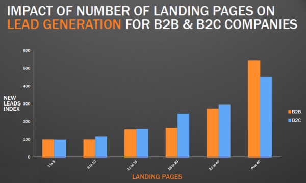
The interpretation of that data is simple: If you want more conversions, you need more post-click landing pages. And there are two major reasons why…
post-click landing pages are different from most other web pages in two major ways. Proceed to chapter 2 to learn why post-click landing pages were made to convert, and why you’re wasting your marketing budget by directing visitors to a homepage (or any other web page).
There are two major reasons every promotion needs its own post-click landing page. Both highlight why it’s a bad idea to direct visitors to your homepage, or a generic page on your website like “About” or “Contact us.” They also highlight how post-click landing pages can generate more conversions for any business. Here are those reasons:
When a prospect clicks through your advertisement or promotional link, they’ll have certain expectations for the post-click landing page. It’s your job to meet those expectations with something called “message match.”
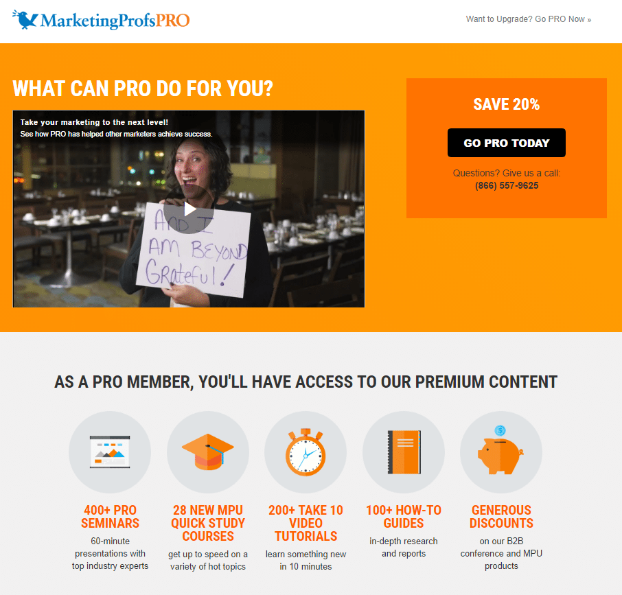
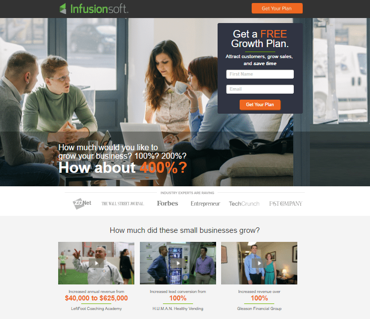
The following are a few examples to illustrate. First, a look at bad message match: This link advertises a 40% discount on “Deep Dive” courses…

But when you click the “Upgrade Now” button, the post-click landing page features only a vague mention of discounts; there’s no “40% off” offer in sight:
Instead, this Men’s Health campaign is what you should aim for. First, the paid search ad:

Then, the post-click landing page, which features great message match:
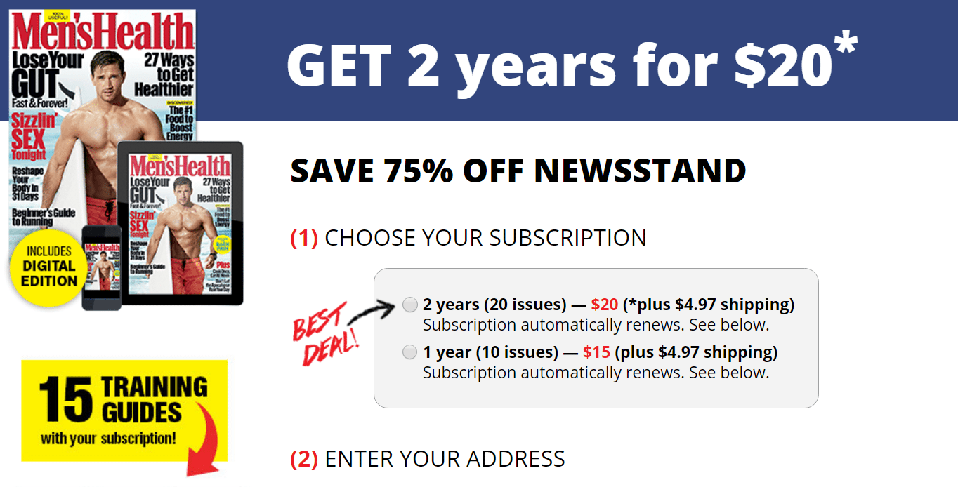
When visitors arrive here, their expectations are met. There’s no question about whether this post-click landing page is where they’re supposed to be, or whether they’ll be able to claim the offer that was presented in the ad.
On the other hand, without the mention of a 40% discount on the first post-click landing page, visitors may question whether they’re able to claim the offer advertised in the link. Prevent similar confusion on your post-click landing page by making sure:
Without strong message match, your post-click landing page visitors won’t trust you. And if they don’t trust you, they’ll bounce before they convert.
The term “conversion ratio” refers to the amount of outbound links on a page compared to conversion goals. On your post-click landing page, that ratio should be 1:1 — meaning, there should be only one outbound link and one conversion goal.
This is the singular act you want visitors to take. If you’ve created a report post-click landing page, your conversion goal is downloads. If you’ve built a free trial post-click landing page, your conversion goal is signups.
Each post-click landing page should only have one goal. If your post-click landing page is built for the purpose of getting prospects to sign up for a free trial of your service, it shouldn’t also attempt to convince them to download a report. Two CTAs of “Download” and “Sign up” will steal conversions from each other. Instead, it’s better to build a separate page for each.
This practice is based on research that shows what happens when people are presented with too many choices.
In one experiment specifically, Sheena Iyengar and her colleague Mark Lepper set up a display table at a local grocery store, offering jars of jam at $1 off. On the first day, they presented shoppers with 24 types of jam to choose from, and on the second day, they put out only 6.
At the end of the study, the bigger display drew more attention, but it also generated 10x less sales.
Additional research from Iyengar shows that, when offered more options, people…
Every additional option presented on your post-click landing page, whether that be a second offer or several outbound links to other web pages (which you’ll learn about below), can potentially decrease prospect satisfaction and detract from your conversion rate.
These are any links that drive users off your post-click landing page. There should be no outbound links in your logo, in the body of your page, or any links in a navigation menu (because your navigation menu should be non-existent… more on that later).
The only link that should drive visitors off the page is the one in your call-to-action button. When they click it, your visitors should be directed to the next step in the conversion process — whether that’s another post-click landing page or a “thank you” page. Any other outbound link detracts from your conversions.
Here’s a page from ActiveCampaign designed to eliminate distractions with a conversion ratio of 1:1:
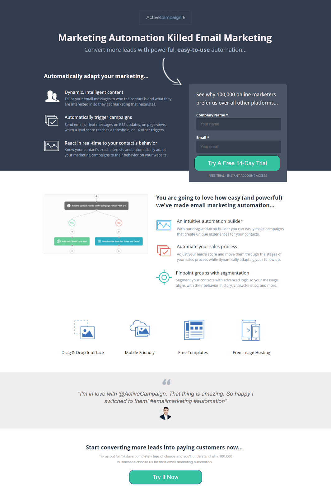
On it you’ll see two CTA buttons, but both accomplish the same goal by guiding visitors toward signing up for a free trial.
This post-click landing page, however, has a conversion ratio of more than 10 to 1 because of social icons and links in the footer:

Here’s another page with a conversion ratio of more than 5 to 1:
Remember: Each outbound link that’s not in your call-to-action directs visitors off the page, which makes it less likely they return to convert. When that happens, your overall campaign suffers.
Any marketing campaign can benefit from the help of a targeted post-click landing page, but it’s paid promotions that absolutely should not be run without one. When you’re spending valuable chunks of your budget to generate traffic, outbound links and lack of message match can translate to lost dollars. The following are campaign types that should not, under any circumstances, be run without a post-click landing page…
If you use Google Ads or Bing Ads to drive traffic, your campaign won’t reach its potential without a post-click landing page. Google has made it clear in its advertising guidelines that post-click landing page experience has a giant impact on Quality Score.
Without a dedicated post-click landing page relevant to your visitors’ search, your campaign will be penalized, which will result in lower ad visibility and ultimately less traffic to your website. According to Google:
post-click landing page experience is Google Ads’ measure of how well your website gives people who click your ads exactly what they’re looking for—quickly and effortlessly. Your post-click landing page is the URL people arrive at after they click your ad, and the experience you offer affects your Ad Rank and therefore your CPC and position in the ad auction. Your ads may show less often (or not at all) if they point to websites that offer a poor user experience.
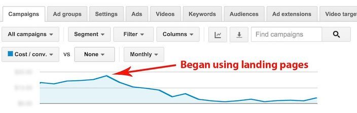
Those aren’t empty words, and here’s proof: When Jacob Baadsgaard of Disruptive Advertising began driving a client’s paid search traffic to dedicated post-click landing pages, he saw their cost per lead drop by more than half:
Paid social media advertising has gotten much more powerful in the last several years with the fine-tuning of pinpoint targeting and retargeting capabilities. But those targeting capabilities are wasted if you send traffic to a web page with general and scattered information (like a homepage or an “our services” or “products” page, for example).
Highly targeted ads need highly targeted post-click landing pages with message match to generate maximum ROI. If you know enough about your users to reach them with laser-targeted advertising parameters, you know enough about them to deliver a highly relevant post-click landing page experience.
Those who click your ad do so because they’ve caught the scent of information that could help them solve a problem. That’s why it’s important you deliver exactly what you promised in your ad.
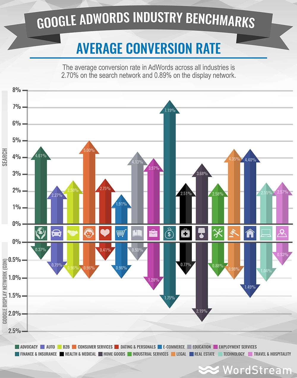
The average Google Ads conversion rate on the search network is 2.7%. On the display network, it’s just 0.89%. That means it’s likely anywhere between 97% and 99% of your traffic is going to need to be drawn back to your post-click landing page.
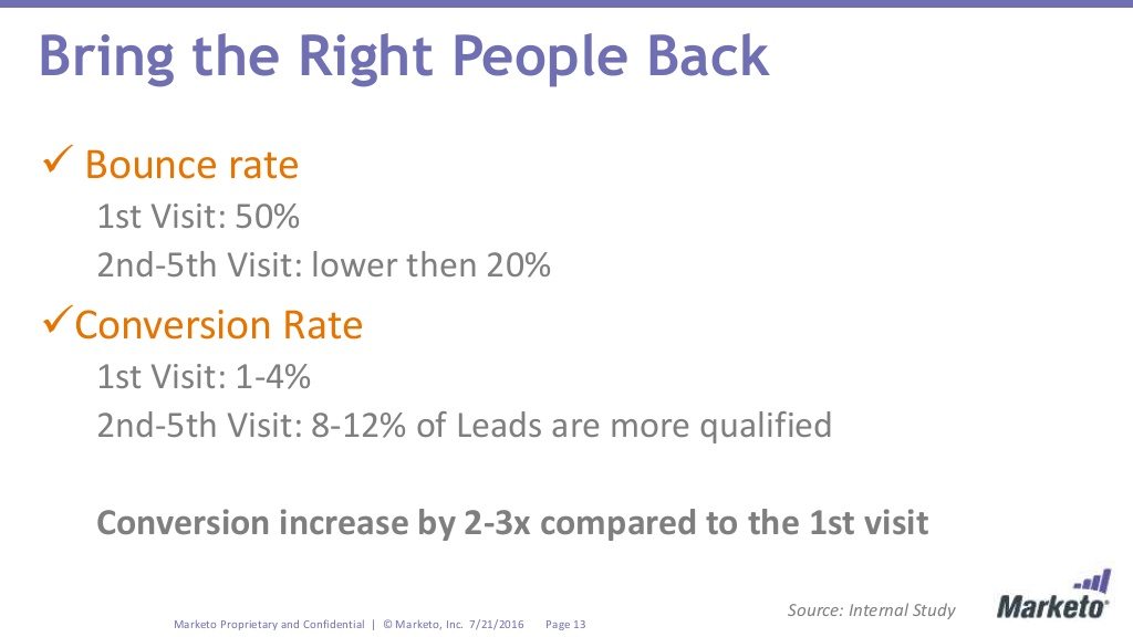
With personalized retargeting campaigns that deliver ads based on prospects’ behavior, you can do that. Tools like the Facebook Pixel and companies like AdRoll allow you to send ads to visitors based on their behavior on your website.
And according to Marketo, the technique can boost conversion rate by 2-3x on your post-click landing page:
Email is still marketers’ most valuable channel, delivering $44 in ROI for every $1 spent. When combined with targeted post-click landing pages, that revenue potential gets even higher.
In their State of Email Marketing Report, GetResponse names post-click landing pages as one of the 8 “critical factors” of email marketing success. That’s no surprise, considering studies show that personalized emails generate six times more transactions, and every personalized email requires a personalized post-click landing page to match. In an article on the Campaign Monitor blog titled, “How email marketing + post-click landing pages work together to get awesome results,” Sal Partovi explains why:
When a subscriber clicks on an offer in an email and is taken to a post-click landing page, he or she is focused on one task and one task alone. That increases the likelihood of a subscriber following through with the action.
What happens if there isn’t a specific post-click landing page for an email offer? Most likely the subscriber is taken to the homepage, or a product page and has to figure out how to take action.
Of course, your homepage is also full of a dozen other links, tab, and images. All of these things can be distracting to this particular subscriber who just wants to follow through with the action outlined in the email. That’s why post-click landing pages are so effective. They cut through the clutter. A subscriber is less likely to get sidetracked, or confused because he or she arrives on a page that focuses on the offer from the email and allows him or her to take action.
By far, the two biggest benefits that post-click landing pages provide to your visitors are personalization and focus. But what kind of design does it take to provide them? Learn more in the next chapter…
Converting a visitor takes the cooperation of many design elements. Together, they not only need to form a persuasive argument, but a usable post-click landing page as well. At the bare minimum, here’s what you’ll need to include on your post-click landing page to compel prospects to act:
In most cases, navigation links are helpful to website visitors who want to learn more about your business via different pages like “About” or “Services.” On your post-click landing page, though, they shouldn’t be needed. Here’s why…
Your post-click landing page is a virtual elevator pitch. It’s a one-page summary of your offer that provides visitors all they need to know to decide whether or not to convert. If it’s not relevant to the offer, it shouldn’t be included in your design.
That means most of the information on your “About” page — like the story of how your company started — probably isn’t necessary. Your blog content isn’t either.
Every time you offer visitors a link to another page on your website, you offer them an escape ronesoute. And by doing that, you’re killing your conversion rate. Here are two case studies that prove it…
HubSpot tested two versions of a post-click landing page — one with navigation links, and one without:
Here were the results:
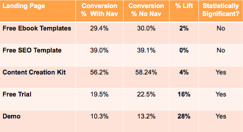
Every statistically significant test showed that post-click landing pages without navigation converted more visitors than ones with navigation. In one case, removing navigation boosted conversion rates by nearly 30%.
Another case study from Yuppiechef and VWO showed something similar, but even more impressive. Here’s the original:
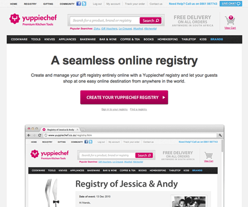
And here’s the variation, without navigation:
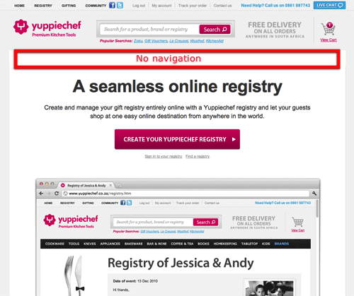
This one boosted the conversion rate by 100%!
And while these tests focus on navigation links in the header of your post-click landing page, there should be no navigation links anywhere in your design. They shouldn’t be in your subheads, body copy, or even your footer. It’s been mentioned multiple times but it’s worth repeating: Navigation links kill conversion rates.
Without a call-to-action, no one will be able to convert on your page; without benefit-oriented copy, they won’t know why they should. But without an alluring headline, your visitors won’t stick around long enough to see any of the other elements on your post-click landing page.
That makes your headline, in a way, your most important design element. Here’s how to make the most of it:
You may not realize it now, but the subheading above this text contains a powerfully persuasive phrase. It’s likely been used in more headlines than any other string of words since the dawn of modern advertising — and for a reason: It works.
That phrase is “How to.”
And the reason it works is because it plays to visitors’ self-interest. When they see a headline beginning with the words “How to,” they know they’ll learn, or improve by claiming and using the content. Here are a few examples from current campaigns:
Of all strategies, this is the safest to use. You can’t go wrong with a headline that starts with “How to.”
On top of the need to improve, there are other innate needs we all possess that skilled copywriters can take advantage of…
When we read headlines like “The One Skill That Will Take Your Writing From Good To Great,” we can’t help but click through them. The reason is something called the “curiosity gap.”
According to Joanna Wiebe of Copyhackers, who used the curiosity gap to boost clicks on a pricing page by 927%, the curiosity gap is defined as:
“The space between what we know and what we want or even need to know.”
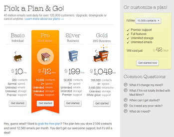
Here’s an example, from the A/B test she conducted…
First, variation one of the pricing page:
Second, variation 2 of the pricing page:
The results of the test were as follows:
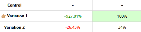
Clicks to the gold plan in variation one were boosted by 927%. A closer look reveals why:
You’ll notice that, on the first variation, the gold plan isn’t listed in the pricing infographic. Instead, it’s just below it. The text reads:
“Got a big list? Choose the gold plan for up to 350,000 contacts, 3.5 million emails per month, and 4x the speed.”
The one thing it was missing: price. Because users wanted to know how much the gold plan cost, and because it wasn’t listed on the page like the other plans were, they had to click through to find out. Hence the boost in clicks.
Some curiosity headline examples:
Be careful when creating this kind of headline, though. Relying on curiosity alone to get your content read is dangerous. If the curiosity gap is too large, visitors may not be tempted to read the rest of your post-click landing page at all.
For instance, in the examples above, “This Is What Drives Us” is a headline that creates too large of a gap. Readers will likely wonder, “What does that even mean, and why should I care?”
The best curiosity headlines include an element of self-interest. Visitors should never have to ask themselves “Why should I care?”
A better example is the “Swipe this to grow your company.” The element of curiosity is there, and claiming whatever “this” is will help readers grow their business.
A universal truth about humans is that we’re all inherently lazy and greedy. Some say it’s evolutionarily embedded within us: We only exert effort when we have to as a way to conserve our energy for survival-related tasks.
That means we want the most return for the least amount of work — always — which is why “quick and easy” headlines work so well. They position your offer as an effortless solution to prospects’ problems.
Here’s an example from AWAI:
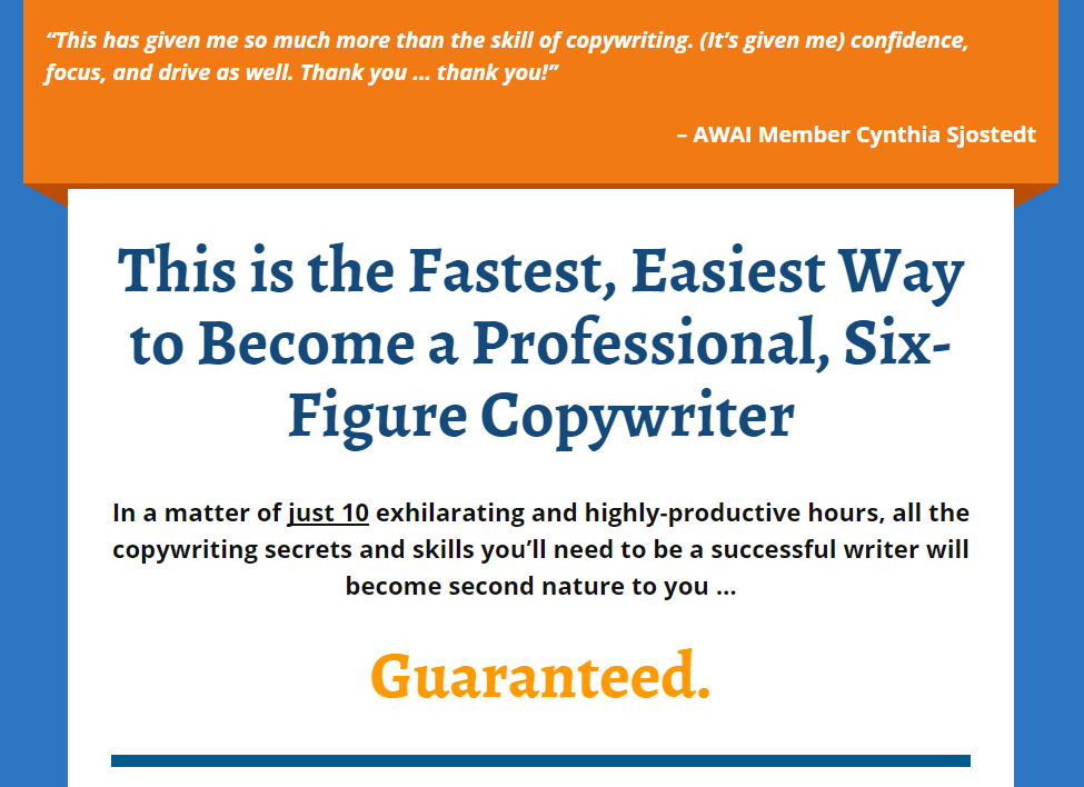
The words “fastest” and “easiest” draw the reader in, as does the phrase “just 10 exhilarating and highly-productive hours.” Most people would jump at the chance to learn skills they can turn into a six-figure career in such a short amount of time.
This can work for nearly any product or service. Ask yourself: What does my offer turn people into?
Software can create agile marketers; courses can create master storytellers. Determine how your product or service transforms your visitors, and let them know in your headline.
As the world advances at a frantic pace, we all have a need to keep up with the newest tools and knowledge to solve our problems.
If your offer is a new arrival that can improve your prospects’ lives in a way they’re not familiar with yet, it’s important to let them know like these headlines do:
As is the case with quick & easy headlines and curiosity headlines, news headlines work best when combined with self-interest. Without a reason to click through, visitors won’t.
Designing an effective call-to-action button is more complicated than you’d think. It takes more than simply throwing words on a shape that’s hyperlinked to your “thank you” page. Carefully, you need to pick the right copy, size, shape, location, and color.
The traditional call-to-action makes little sense. Up until now, marketers have focused on emphasizing what readers have to do to claim an offer, using words like “Download” and “Request.” But usability expert D Bnonn Tennant thinks CTAs should be written a different way:
After spending hours on funnels and objectives, sequences and timings, it’s only natural we start thinking in terms of what our prospects must do to trigger the events we have planned.
That’s why we talk about the call to action — we are asking our prospects to do something.
The trouble is, that’s backward. Prospects want to know what they get, not what they have to do. Rather than calling our prospects to action, we should be giving them the payoff we’ve promised. We should be emphasizing what you will do for them, not what they must do to get it.
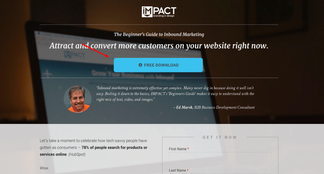
For example, Impact Branding & Design used the idea to optimize a CTA button on an ebook post-click landing page. The original button read “Free Download:”
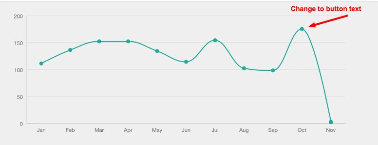
The variation, though, emphasized the benefit of claiming the download with the copy “Show Me How To Attract More Customers”:
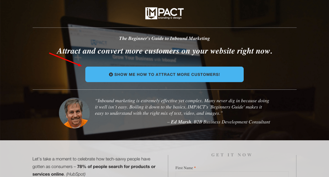
The new button improved conversions by nearly 80%:
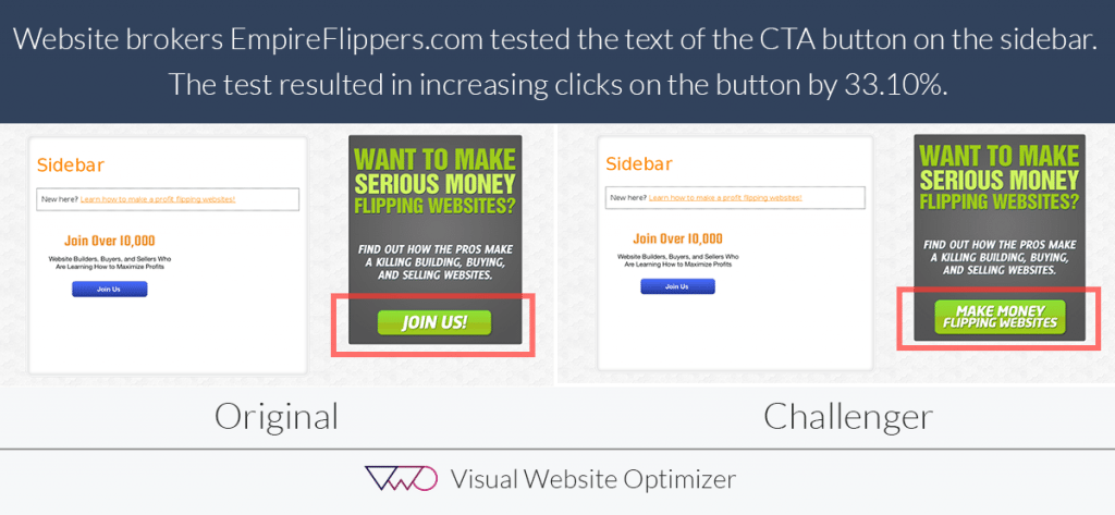
Take another example, this time from Empire Flippers, who changed their CTA from “Join Us” to “Make Money Flipping Websites.” The result was a 33.1% boost in conversions:
Here’s one last example to drive the point home, this time from Roader Studios. First, the CTA before:
Then, the adjustment, which brought an 8.39% increase in conversion rate:
The next time you create a post-click landing page offer, don’t make your visitors work to claim it. Instead, get them excited to claim it by emphasizing the benefit of doing so on your button (exception: if you’re creating a sales page. In this case, it’s best to be clear with a CTA like “Buy” or “Purchase” or “Donate,” so prospects know their card will be charged when they click the button.)
Beyond copy, there are three things you need to keep in mind when designing your CTA button:
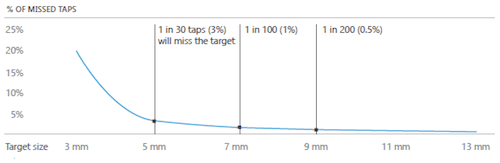
If your button is too small, it won’t just be harder to notice; it’ll be harder to click too. Most people access the internet via mobile devices now, which means your button has to be a big enough target for your prospects’ fingerpad.
An MIT study shows that the average touchpad is between 10 and 14mm, which makes 10x10mm a good minimum button size:

Any smaller than that, research indicates, and your button will be too little of a target. Visitors will frustrate themselves trying to push it:
If you make your button in the shape of a star, chances are visitors won’t know it’s a button. That’s because they have a preconceived idea of what a button looks like based on encounters in real life and online.
The keys on their keyboards are buttons they’re used to pressing, so are ones online that look like this:
Here’s an example of a button they won’t recognize:
The amorphous blob in the lower-right corner doesn’t resemble a button at all. When designers altered it to look more like a traditional button, conversions predictably increased:
With a traditional rectangular shape, and textual clues like “Add To Cart” in block lettering, the new button indicated its clickability.
Other effects, like shadowing, can make a button more easily identifiable by creating a 3D appearance.
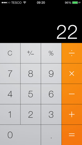
The technique falls under a concept known as “skeuomorphic design,” which revolves around creating identical digital versions of real-life objects. Here’s an example of a calculator created with skeuomorphic methods:
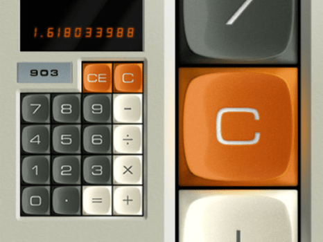
Buttons created with effects like these are best used on audiences who aren’t as internet-savvy. For seasoned users though, flat design techniques may work just as well. Here’s the calculator again, this time created using flat design:
Notice that there are no 3D effects used, like drop shadows or excessive shading. If buyer persona research indicates that your target audience is made up of veteran web users, this style button can work well too.
For a happy medium, consider “Flat 2.0.” The design style strikes a balance between the overly formatted skeuomorphic button and the minimalistic flat button. It uses shadows and shading to indicate pressability, but it does so subtly. Here’s a Flat 2.0 button:
Ultimately, the effects you add to the shape of your button will depend on who you expect to click it. The shape itself, however, should remain rectangular. Take a look at these 100 post-click landing page examples. You’ll find no round, square, or octagonal buttons.
The reason comes back to Jakob Nielsen’s Law of the Web User Experience, which states something obvious but valuable to your page design: Internet users spend most of their time on other websites — not yours. That means they develop their expectations of how the web works on those other websites.
So, if every other post-click landing page features a rectangular button, yours should too. Sacrificing usability for uniqueness (like in the RIPT Apparel example above) can get your page abandoned.
In copywriting, it’s important to separate yourself from your competition. But when it comes to design and usability, deviating from the norm can confuse and frustrate visitors into leaving your post-click landing page.
You’ve probably heard it a million times: “The call-to-action always goes above the fold.”
Usually, those recommending this “best practice” do so because they’ve read that people don’t like to scroll. But that’s not necessarily true.
Marketing Experiments proved that CTAs could work below the fold when they moved one from here (above the fold):
…to here (below the fold):
The result was an increase in conversion rate by 20%. The cause, researchers say, has to do with the content presented before the call-to-action:
If you just rotely put the call-to-action above the fold, you may be making “the ask” before your potential customer sees the value in why they should act. Or, sometimes, before they even know what you’re asking. A long, ugly page with a call-to-action “buried” below the fold can outperform this so-called “best practice.
That’s why, many times, you’ll see the call-to-action “buried” much further below the fold on sales pages. Before they can be convinced to hit the “buy” button, visitors to these pages need to be presented with far more persuasive information than they would on a page offering a free ebook.
When deciding where to position yours, consider your offer: If it’s complicated or expensive, it may require more elements — like copy, testimonials, and media — to convert the visitor. And that will inherently push the CTA button lower.
For instance, on longer post-click landing pages like this one, a CTA button doesn’t appear until the visitor scrolls through thousands of words of copy and countless testimonials.
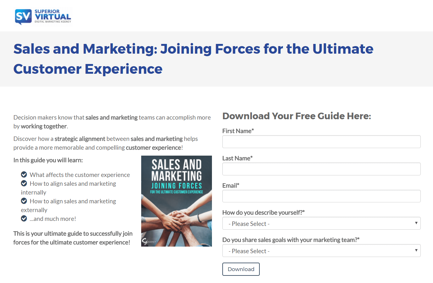
If your offer is simple or straightforward, though, a short page with the call-to-action placed above the fold can be all it takes to convert a prospect. Such is the case on most post-click landing pages that offer free resources like ebooks or reports. Here’s an example from Superior Visual:
But above or below the fold isn’t the only consideration you’ll need to make when positioning your call-to-action button…
Consider this example, from Nature Air, in which the call-to-action button is placed to the far right of the page:
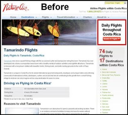
In that location, it was mostly missed by visitors, who upon arriving to the page likely followed this pattern of page consumption:
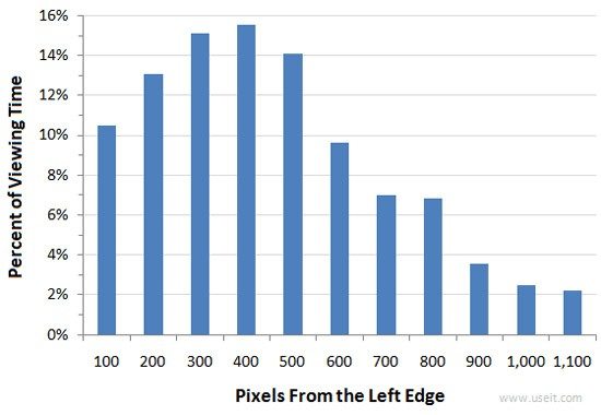
In that entire progression, readers missed the call-to-action because it didn’t fit into their natural flow of consumption. Since the right sidebar tends to contain less relevant information to the visitor, like ads and navigation links, it usually gets noticed less than the left side of the page. Research reinforces this:
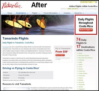
When the button was moved to accommodate visitors’ reading style, conversions boosted by 591%:
To accommodate the natural progression of the visitor, you need to understand how they read. That will be covered in the next chapter.
If you’re new to post-click landing page design, you probably stay away from green buttons. In their place, you prefer red ones because they generate more conversions. Among other case studies, this one from HubSpot proves it:
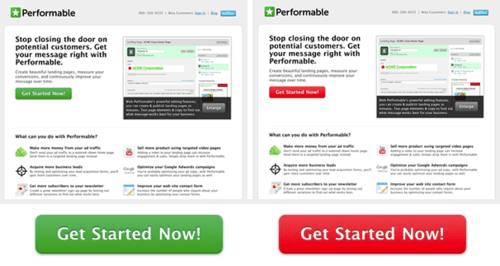
But a closer look at this study reveals that the takeaway isn’t “red beats green in all cases.” Instead, it’s that the button which stands out more earns more attention.
In this instance, red beats green because it better contrasts other page elements. Green, the color of the original CTA button, is already included on the page in several places: the logo, the image, and an icon at the bottom of the page.
What it comes down to is this: People need to know where to click to convert.
High-performing CTA buttons don’t attempt to subliminally convert prospects with color psychology. Green’s relation to “go” or “environment” and red’s “danger” connotation have little to do with their ability to convince people to click.
Instead, it’s contrast and clarity that makes them so appealing to visitors. A red button screams “here I am” to the visitor upon arrival. In this case, a green button doesn’t.
Writing for someone who doesn’t want to read isn’t easy. On your post-click landing page, that’s what you’ll need to do, since visitors are there strictly to evaluate your offer. They don’t want to pleasure read.
What they want to know is if your ebook is worth downloading, your product is worth purchasing, or your webinar is worth attending — and they want to know quickly. Even early research indicates prospects decide in an instant whether they should read your copy.
Decades ago, Munich’s Direct Marketing Association ran one of the first studies that aimed to discover how people read. With cameras, they watched subjects’ eyes intently as they encountered a freshly printed page for the first time. They found that…
To accommodate that style of reading, you’ll need to emphasize your offer’s benefits concisely. Here’s how…
According to famed usability expert Jakob Nielsen, to write copy people read, you need to optimize for three things:
Here’ an example of an illegible typeface:
And here’s another:
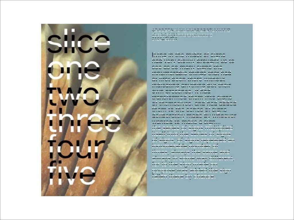
To be legible, your post-click landing page copy:
Here’s an example from Royal Discount and VWO that shows making a font more legible can result in a conversion increase. First, the control page with the small “Sale Price” type:

Then the variation, which drew more attention with a larger and more legible “Sale Price” type:
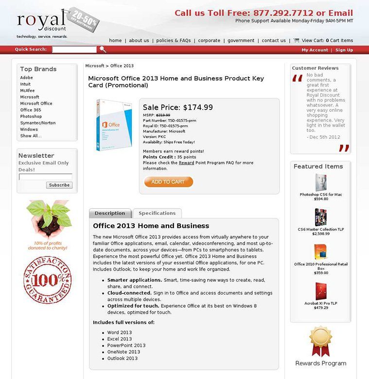
The result was an increase in “Add to cart” conversions by over 36%!
Readability has to do with how easily lines and blocks of text can be read by a visitor. To make copy readable, you have to pay attention to:
The third and final necessity for skimmable copy is comprehension, which centers on the issue of whether your visitors can actually understand your offer. To maximize comprehension:
Being clear about what your offer can provide is crucial for comprehension. A study by Sheena Iyengar showed that when employees were told to imagine all the benefits of saving money, they were 20% more likely to open a retirement fund. They also committed to contributing 4% more to it regularly than those who were not instructed to consider the benefits of saving money.
Where words fail to convey the value of an offer, visuals can excel. Studies have shown that it’s far easier for people to process images than text, which makes sense when you consider humans largely interpret the world around them without the help of words.
On your post-click landing page, visuals like explainer videos can detail how your offer works, and images can help your visitor imagine how your product or service changes their world for the better.
At the same time, visuals aren’t a one-size-fits-all solution. The type you choose to persuade your visitors depends on what you’re offering.
Here are a few types you might consider using on your post-click landing page:
Picking the perfect image to represent your offer is tough. You might wonder what you should choose: a shot of your product or a model using it? Should you include a photo of your ebook cover, or a page within the book itself?
Whatever you decide, it’s important to remember one crucial guideline for adding images to a post-click landing page:
Always be informational. If an image doesn’t help visitors evaluate your offer, it doesn’t belong on your post-click landing page. Here’s an example of a no-value-added image:
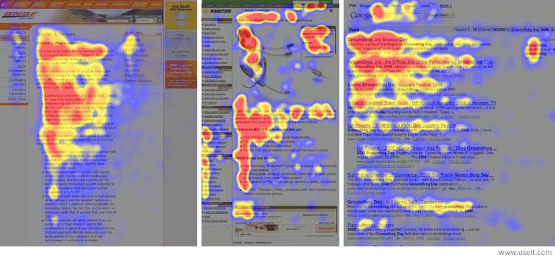
Research from Nielsen Norman Group shows that generic images like these get ignored. Below is a map that tracked a group of internet users’ eyes as they scanned a web page. Notice how the stock image goes completely unseen:
To get the most out of your post-click landing page image, it’s key to ensure you pick one that actually contributes to the goal of the page. Here are a few to consider:
These images (and sometimes videos) tout your product in a different way. Instead of spelling it out in words, a hero shot shows a visitor what the benefits of claiming your offer are:
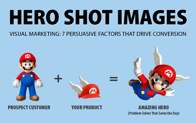
Here’s an example from Angie Schottmuller:
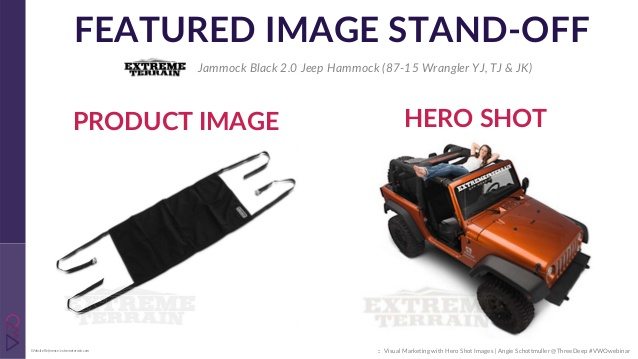
Both photos show the product, but the one on the right helps visitors visualize its benefits. Here’s another one for the same offer:

This type of image can work for nearly any product or service — from lawn care to watches, and even software. Learn more about creating epic hero shots here.
A good product shot enables a visitor to see the ins and outs of your offer. If that offer is technical, this is an effective way to showcase its features:
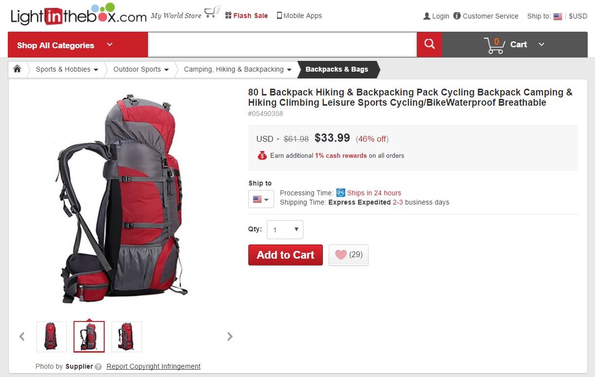
This backpack has lots of pockets and angles and straps. Several product photos help people better understand it. If your offer similarly has many features that need to be highlighted in order to help visitors make better buying decisions, this type of media may be appropriate.
If you do take product photos, put yourself in the mind of the visitor. What will they need to see to evaluate your offer fully?
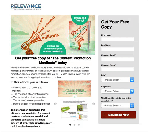
For example, most ebook post-click landing pages feature a picture of the resource’s cover. But, that doesn’t help visitors evaluate what’s on the inside of the ebook. Instead, a preview of the inner content would, as shown on this this Relevance post-click landing page:
Remember: Developing great images for your product isn’t just about using the right camera or finding the right lighting. It’s about creating something informational that your visitors can actually use.
Conceptualizing data can be hard for the average consumer. On your post-click landing page, infographics like charts and graphs can make statistics more accessible. Here’s a basic example from Five9, a call center software provider:
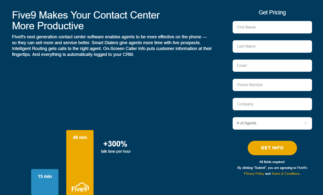
The small bar graph helps people conceptualize exactly how much Five9 can improve call center effectiveness.
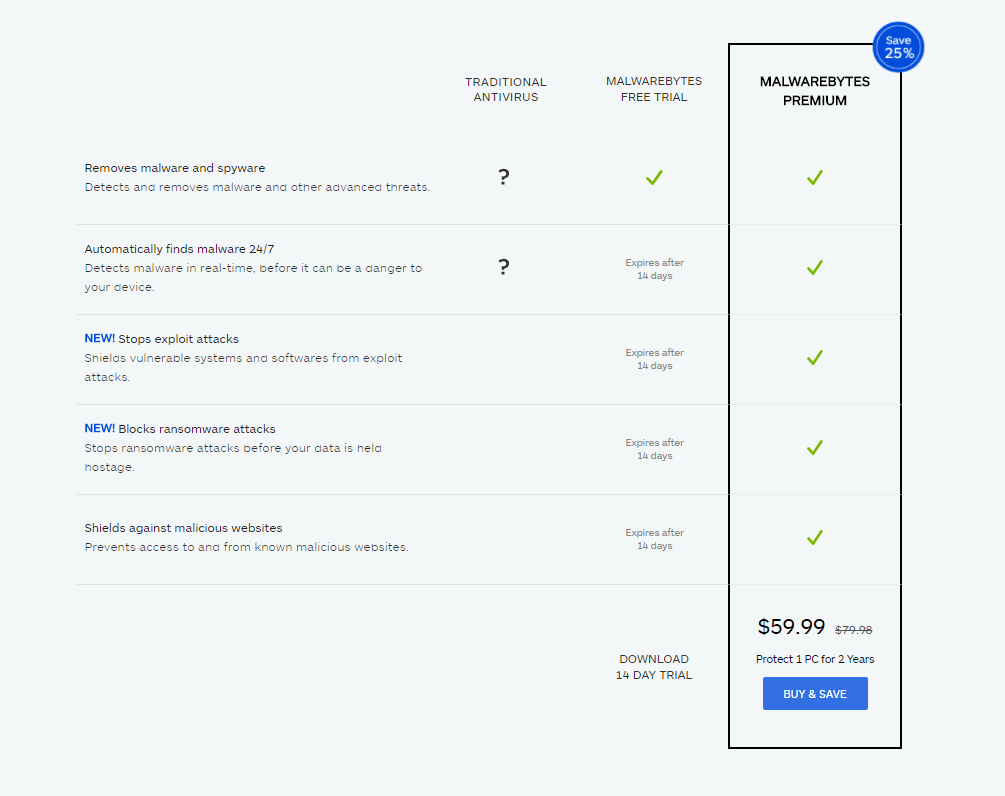
Here’s another example from Malwarebytes — an infographic that helps visitors compare the company’s various plans:
And here’s one more from Wrike, which draws attention to the benefits of using the software according to customers:
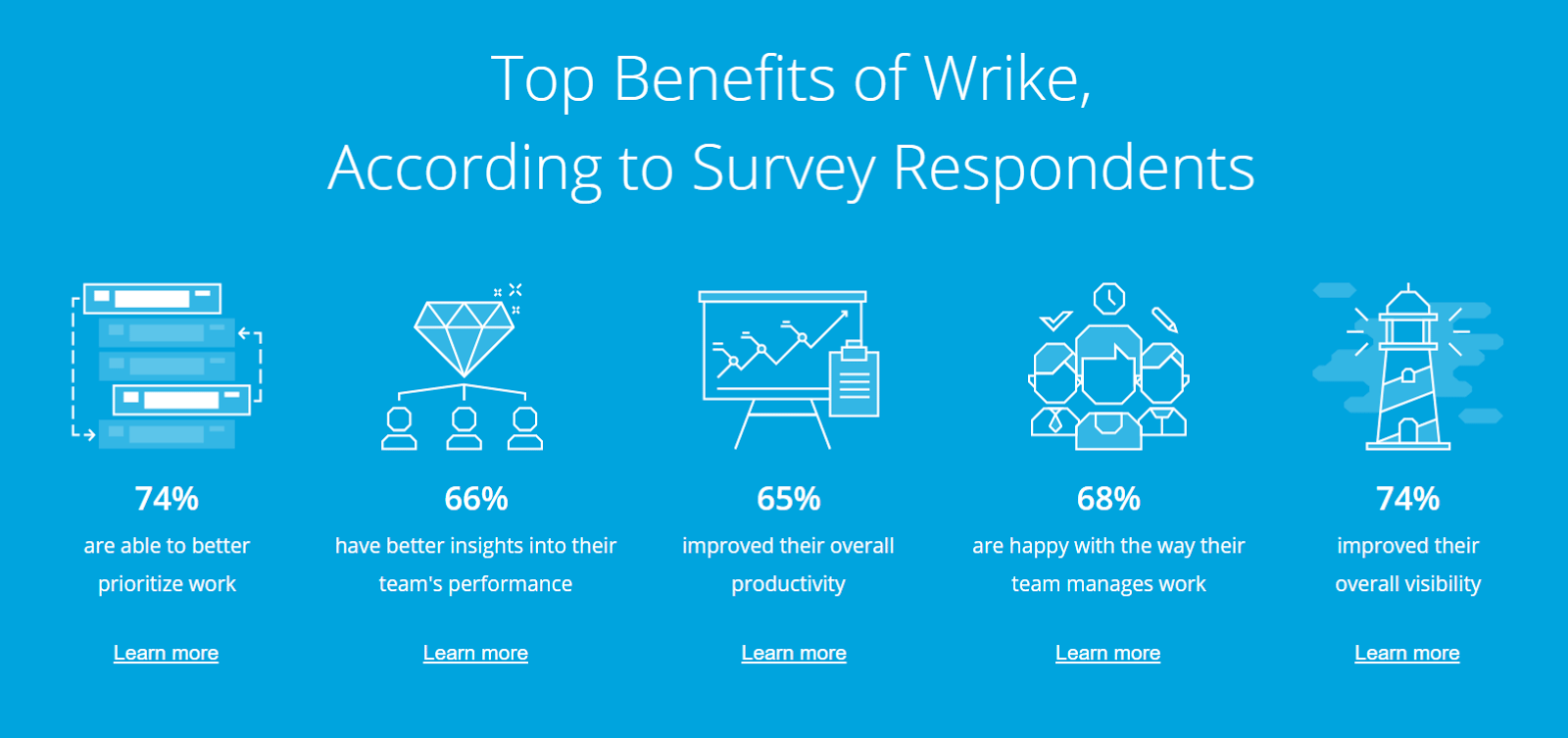
If persuading your prospect to convert involves comparisons or the presentation of numbers, an infographic can be a powerful way to illustrate the data set.
On post-click landing pages, icons are especially useful for the reasons presented before. First, people are able to process images more quickly and easily than text. A well-designed icon can make an idea or action more recognizable.
Second, people don’t like to read. Like bullets, icons can break up unnecessarily long blocks of text. Take a look at how QuickBooks uses them on this post-click landing page:
![]()
Each complements the accompanying text well in a recognizable way that enhances comprehension. The “Effortless Invoicing” icon, for example, uses lines behind a slanted image of a document to communicate movement and indicate a speedy invoicing process.
The “Get payment instantly” icon helps people understand that customers can quickly and easily pay with account information stored in the cloud. If you choose to incorporate icons into your post-click landing page design, make sure they’re…
Here’s a page that could benefit from some icons to break up the text:
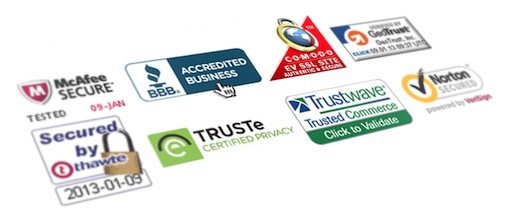
These images make prospects more comfortable with converting on your post-click landing page. They’re indicators that your website is safe to complete transactions on, or that you operate a legitimate business.
Because visitors know little about what makes a site secure, and they won’t always have time to research your company intensely, they look for seals or badges like the ones below as shortcuts to determining your trustworthiness:
The Baymard Institute found that, among these, the most recognizable and trustworthy were as follows (for buyers specifically):
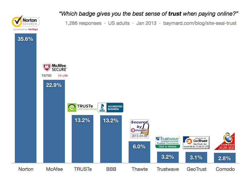
However, which you choose to display will depend on the message you’re trying to communicate. More on how to pick the right trust indicators later in this chapter.
The web is becoming increasingly video-centric as people express their preference for watching online content. One shocking statistic: American adults, on average, spend more time watching online video than they do working.
And so, marketers are now investing heavily in video. A majority of 93% report using the medium for sales, communication, and some form of digital marketing.
On your post-click landing page specifically, research has shown that incorporating video can boost conversion rate by 80%. Here are a few types that could potentially do it for your post-click landing page:
When your product is new or especially complicated, explainer videos can detail exactly how it improves your customers’ lives. These short, routinely animated clips often take visitors through a PAS scenario that introduces a problem, agitates it, then presents your offer as the solution.
Dropbox famously jump-started its company with a short and clear video description of its service:
Crazy Egg’s founder, Neil Patel, generated an extra 21,000 a month with an explainer video that helped people better understand his tool. If there’s a barrier to comprehending your solution, this type of media is highly effective at helping your visitors overcome it. Learn more about creating them here.
When a business is relatively unknown or when the success of a post-click landing page depends on the person behind the offer, an introductory video can establish the credibility needed to convert a visitor.
This post-click landing page features one from Sam Ovens:
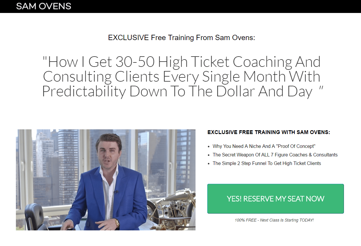
In it, he describes his rise from a kid living in his parents’ basement to a 7-million-dollar business owner in just a few years. A nice suit, gold watch, and expensive accessories add to his authority (a principle you’ll learn about later in this chapter), helping him convince people he’s as successful as he claims.
With a video introduction like this one, Sam goes from an unknown guy selling his services to a seemingly credible source of information.
A testimonial nudges your prospects toward conversion by showcasing your happy customers, usually with a textual review accompanied by a name and head shot. Here’s an example from ROI Revolution:
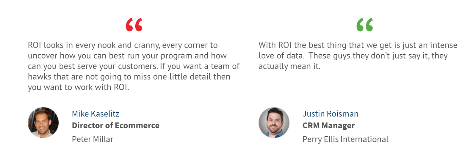
A video testimonial brings that review to life by capturing it on camera. Here’s an example from Jamie, a LifeLock customer:
In particular, video testimonials like these add credibility to an offer by humanizing the reviewer. They help post-click landing page creators overcome a common design hurdle: making a testimonial, along with the person giving it, appear believable. There are some other ways to do that too, which you’ll learn a bit later in the chapter.
On your post-click landing page, a short case study in video form can be an even more powerful persuader than a video testimonial or an introductory video; and that’s because case studies prove to your prospects you can meet their needs based on real results from past performances. Here’s an example from Cognizant:
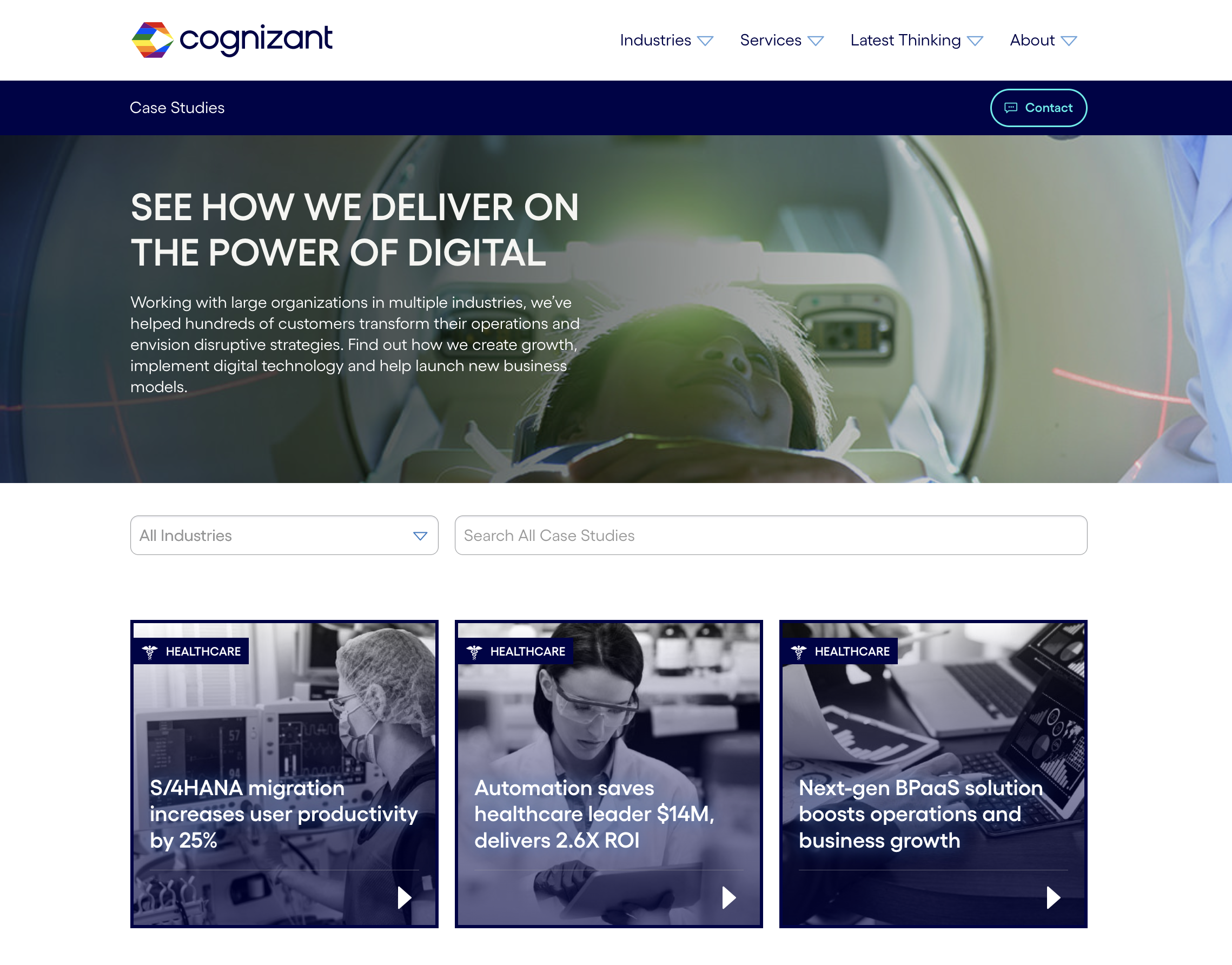
Notice how it’s less about the client’s experience with the service provider — the way a testimonial would be — and more about the solution Cognizant provided, along with the process it took to deliver it.
Nearly every type of post-click landing page features a form. And on all those post-click landing pages, the form is commonly the biggest source of friction. It’s where you ask your visitors for their personal information — from name to credit card number, and everything in between.
It’s for that reason the post-click landing page form has been a highly examined design element by many conversion optimization teams. As such, there’s a lot of information on the internet about creating an effective one.
With every field you add to your form, you learn more about your prospects — but, there’s a tradeoff. Every field you add is an additional obstacle that stands in the way of what your visitor wants, says Joanna Wiebe:
Think of every field in your checkout as a hurdle your prospect has to leap over. Then ask yourself if it’s worth the possibility of losing a sale — or thousands of sales — because you want to fill a database.
After the Great Field Culling Exercise, as it will come to be known in your office, you’ll want to make sure the forms that remain are so frictionless, users will barely notice they’re doing actual data entry.
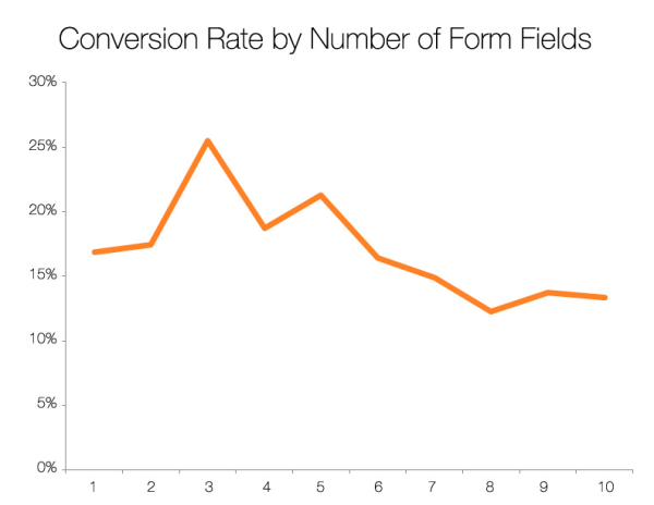
Her quote refers to a checkout form, but it’s the same case even on pages that don’t solicit the sale. Ask too much, and risk losing conversions. Here’s data from 40,000 forms that proves it:
But, how much is too much? The exact answer is different for every business, but the process of getting there is the same.
Ask yourself:
Looking at most forms, you might not think much thought went into their design. But, because the form is where all interaction on your post-click landing page takes place, it has to be carefully created according to certain principles that make it easy to use.
According to the Nielsen Norman Group, those are as follows:
1. Visually group form labels near their corresponding fields so it’s clear where users need to input their information. This form’s ambiguous white spacing may make visitors question where which label belongs to which field:
The labels on this version of the form, on the other hand, are closer to their corresponding fields:
2. Present your form fields in a single-column layout to keep from interrupting the downward momentum of the user, unless fields are related (like first name and last name or city, state, and zip code). Here’s an example from SkillJar:
3. Avoid the use of placeholder text, as it’s been shown to confuse visitors, test their memory, and make form fields less noticeable. According to NNG:
When you place the labels inside the text field as filler text, the label disappears when users input their text and they must remember it as they fill in the field. This especially causes an issue if users use the Tab key to move through a form. When they tab to the next field without looking, they will miss what information is required. Also, users are drawn to open text fields; they might mistake the filler text as a default answer and skip that form element.
Here’s a form that misses the mark:
Instead, here’s a better example, with permanent labels above each field:
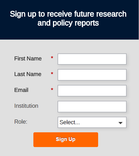
4. Request prospect information in a logical order. Don’t ask for first name, then email address, then last name. Ask for first name, then last name, then email address.
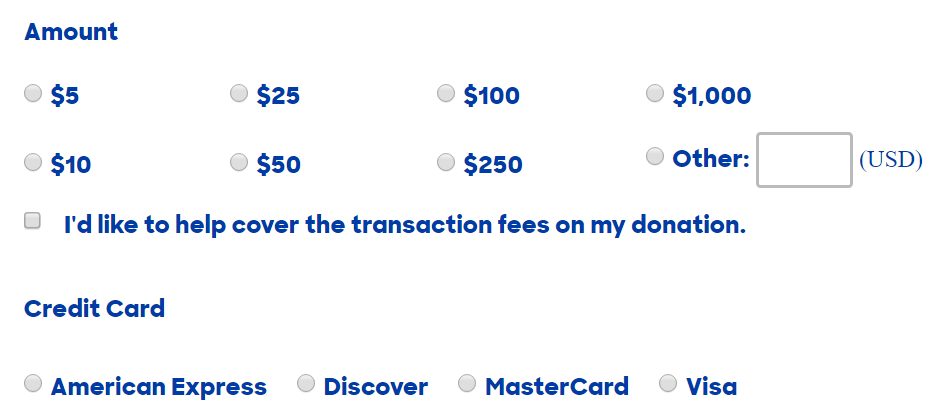
5. Make sure the size of the field corresponds to the size of the input. If an input is expected to be short, like zip code, then the field should be short. If a field only has three possible inputs, consider displaying those inputs as radio buttons instead of in a drop-down. Here’s an example from Hillary Clinton’s Onward Together post-click landing page, which lets visitors simply click to select a donation amount and the type of credit card they’re using:
6. Eliminate as many optional form fields as possible, then make sure you distinguish between the rest of the optional ones and their mandatory counterparts. Here’s a good example from ACT, who uses asterisks as indicators of required fields:
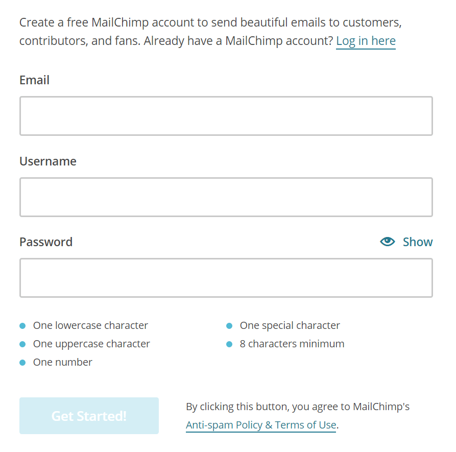
7. Let visitors know if a form input has any special rules. If it needs a capital letter and a symbol, the form label should specify that. This form does it, but in the placeholder text, which will disappear once visitors start typing:
Here’s a better example from MailChimp:
8. Prepopulate common inputs. If your form features a “Country” field and most of your prospects are from the United States, prepopulating “United States” can save them the time it takes to search for it in the drop-down. Here’s both a good and bad example of prepopulating form fields:
The “Country” form field is populated (good) and so is the birthdate — but with the current date (bad). This field is better left blank, since there’s no way of knowing what the birthday of the visitor is. It serves no purpose because, in all cases, visitors will have to change that input from the current day to their birthday. It doesn’t speed up the process of filling out the form.
9. Make sure error messages are clear and noticeable to users that either forget to complete a form, or submit incompatible information. Use red lettering as well as other attention-grabbing indicators, like more heavily weighted text and a red box around the field in which the mistake was made.
10. If you do absolutely need to ask for a lot of information from your prospects, consider asking for it in steps, the way the post-click landing page below does. According to Formstack, multi-page registration forms have been shown to outperform single-page ones by more than 9%:
You’ll also notice that this form, at the bottom, features two badges that let visitors know their personal information is safe when they submit. Throughout your post-click landing page, these “trust indicators” play a big part in proving that you have your prospects’ best interest at heart.
No matter your conversion goal — whether it’s signups, downloads, sales, or anything else — to convince your visitors to claim your offer, you need to get them to trust you. With indicators like social proof, security badges, and more, it’s possible.
Each indicator communicates something different, so it’s important to know when and where it’ll have the maximum impact on your post-click landing page.
Touting your own products and services has never been an effective way to sell them. Nobody believes the owner of a company when he or she claims their solution is the best on the market.
What they do believe, though, is when other people say an offer is the best, or the most affordable, or the tastiest. Research shows that product reviews are trusted 12x more than product descriptions from manufacturers — and for good reason: Customers have no incentive to mislead their peers about a product’s effectiveness. For example, a review on a third party side that compares landing page software or offers unbiased Instapage reviews can be very persuasive for a prospective customer.
That’s why testimonials — reviews from delighted custbelomers — have the potential to boost the perceived value of an offer, even if the reviewer is unknown to the reader. A report from the Nielsen Norman Group indicates that 70% of people will trust a testimonial from someone they’ve never met.
What they won’t trust, though, is a lazy testimonial. An effective one will optimize for:
A review that reads “This was a good product” won’t compel someone to buy as much as one that reads like this:
Feature testimonials from your most enthusiastic brand advocates. The more positive a review is, the more power it holds.
Here’s an example of a testimonial that’s not positive enough:

Translated, this testimonial says, “You break even and then make a little on top of that when you advertise with this company.” Is that really “what you’re looking for in advertising”? The bare minimum?
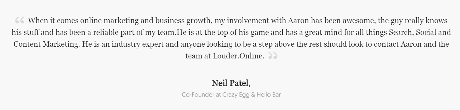
A review’s level of persuasiveness is also impacted by the person giving it. If that person is an expert in their field, known by the reader, or works for an established company, their opinion carries more weight.
A glowing review from Neil Patel, marketing influencer and co-founder of Crazy Egg, is more persuasive than a testimonial from an unknown individual:
Similarly, a review from someone you know will be more persuasive than from someone you don’t know, which is why Facebook will let you know when one of your friends likes a particular brand:
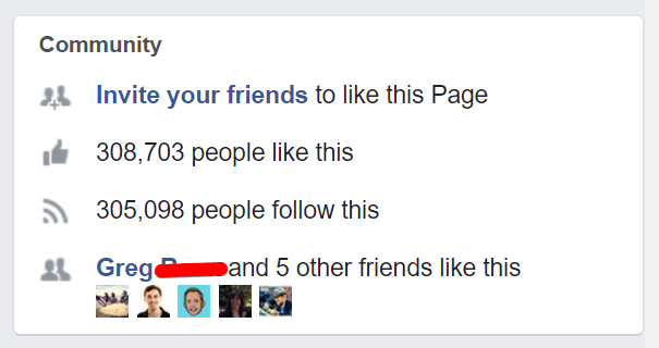
When evaluating the trustworthiness of a brand online, people look for indicators of familiarity. The more recognizable it is, the more they’ll trust it.
Details are crucial to establishing trust. The more specific a review is, the more credible it is, and the more a visitor will trust the value of the offer behind it.
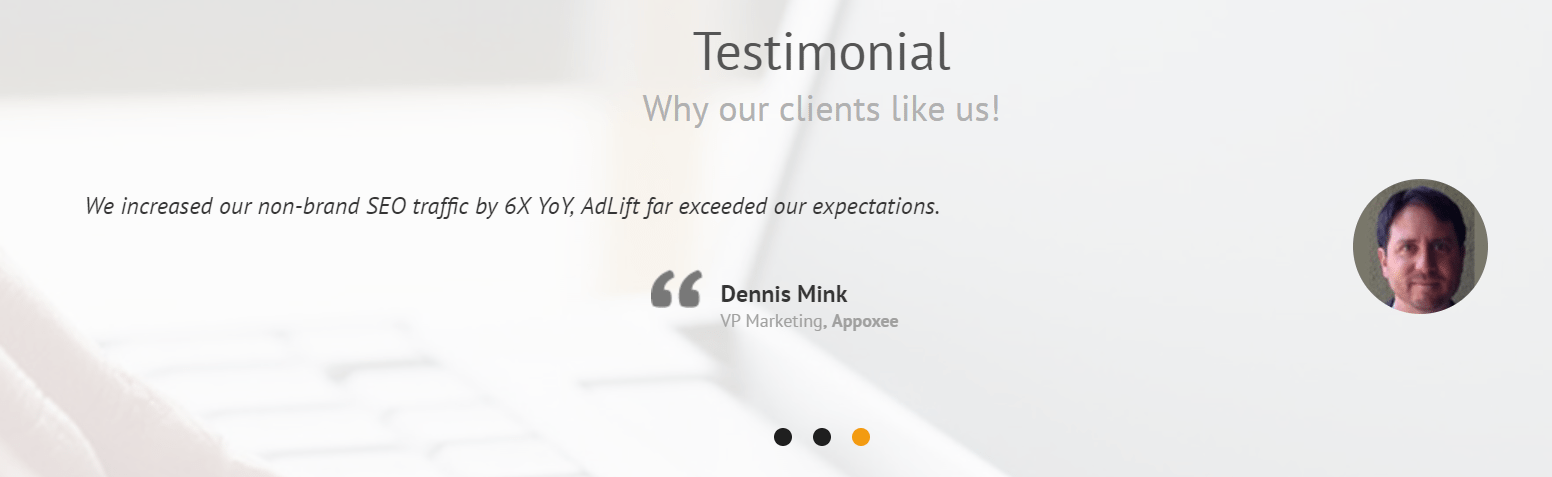
For example, here’s a specific testimonial from AdLift:
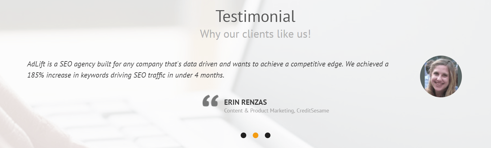
It touts the service with actual results: “We achieved a 185% increase in keywords driving SEO traffic in under 4 months.” This one does the same thing:
But the third testimonial featured on the page is less specific as far as results are concerned:
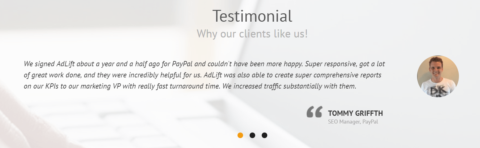
What they all do well, though, is provide specificity as it relates to the reviewers. Full name, title, and company are all listed next to a headshot of each reviewer — which humanizes them — letting visitors know that these are real people.
You can Google “Erin Renzas,” “Dennis Mink,” and “Tommy Griffith,” and likely find identifying information — like a LinkedIn page or personal website — associated with each.
On the other hand, a review from “Tom G.” without any identifying details, like where he works or what his position is, comes off as fake. Tom G. could be real, but there’s no way of confirming. Here’s an example of testimonials that could use more identifying details:
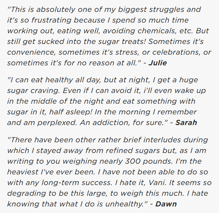
Are Julie, Sarah, and Dawn real people? Or are all three of these testimonials created by the business owner?
Relevance and recognizability work together. When a testimonial is given by someone well-known, it carries more persuasive power. But, for maximum effectiveness, that person should be relevant to the offer and business.
For example, these testimonials for writing software, MasterWriter, are more powerful because they’re given by award-winning writers:

If they were instead given by professional athletes or celebrity chefs, they wouldn’t hold as much power. For a workout or diet program, an endorsement from an athlete or bodybuilder could sway the visitor. But, for a writing software, testimonials from well-known writers are more persuasive because the target audience is writers.
Before submitting their personal information on a post-click landing page, visitors will look for signs that indicate it’s secure. The “https” in your URL isn’t enough. You’ll also want to include clear and obvious signs, like:
Pages that don’t include these indicators communicate to visitors that their information could fall into the hands of malicious hackers or immoral spammers. Here’s a page that gets security signals right:
From a young age, we’re taught to obey authority figures like doctors and police officers. And so, as we get accustomed to seeing these figures repeatedly in everyday life, our mind creates shortcuts for determining whether we should trust someone without question.
We look for uniforms or scrubs, guns or stethoscopes, badges pinned on collared shirts or titles embroidered on lab coats. Dr. Robert Cialdini, famous for his work on the psychology of persuasion, called these shortcuts titles, clothes, and trappings:
By working these elements into your post-click landing page, you can boost the odds your offer gets claimed. Tai Lopez, for example, is someone known for using authority indicators to prove his offer is valuable. In this video, he shows off a new Lamborghini and seven new bookshelves:
When they finish watching the clip, most viewers will assume the following:
Whether it’s true or not (he could’ve borrowed the Lamborghini from a friend, and he may have never read any of those books), we can’t know for sure. However, judging by his nearly 1,000,000 YouTube subscribers, most people accept his authority without question.
When designing your post-click landing page, consider what you want to communicate to your prospects. Then, determine what titles, clothes, and trappings you possess that can convince a visitor you embody those qualities.
We all assume that people in positions of authority are trustworthy; but to be credible, it takes something extra. Here’s the major difference between the two phenomenons:
Authority is assumed. Credibility is earned.
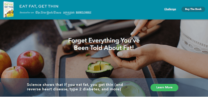
Dr. Hyman’s “Eat Fat, Get Thin” post-click landing page has authority built in simply because the man who created it is a doctor, and his title is referenced throughout the page:
But is Doctor Hyman a good doctor? Should visitors trust his health advice? They’ll look for credibility signals to determine, like:
Remember: Nobody will trust you when you tell them your offer is worth claiming, but they will trust someone else, especially if that someone else is authoritative and relevant to the offer. Here’s an example from Dr. Hyman’s post-click landing page:
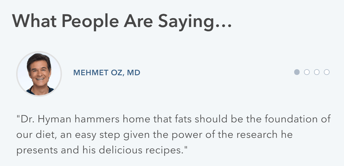
Mehmet Oz is an authoritative and recognizable celebrity who, as a doctor, is relevant to the offer. A testimonial from him adds much credibility to the page. So does this testimonial from Dr. Toby Cosgrove:
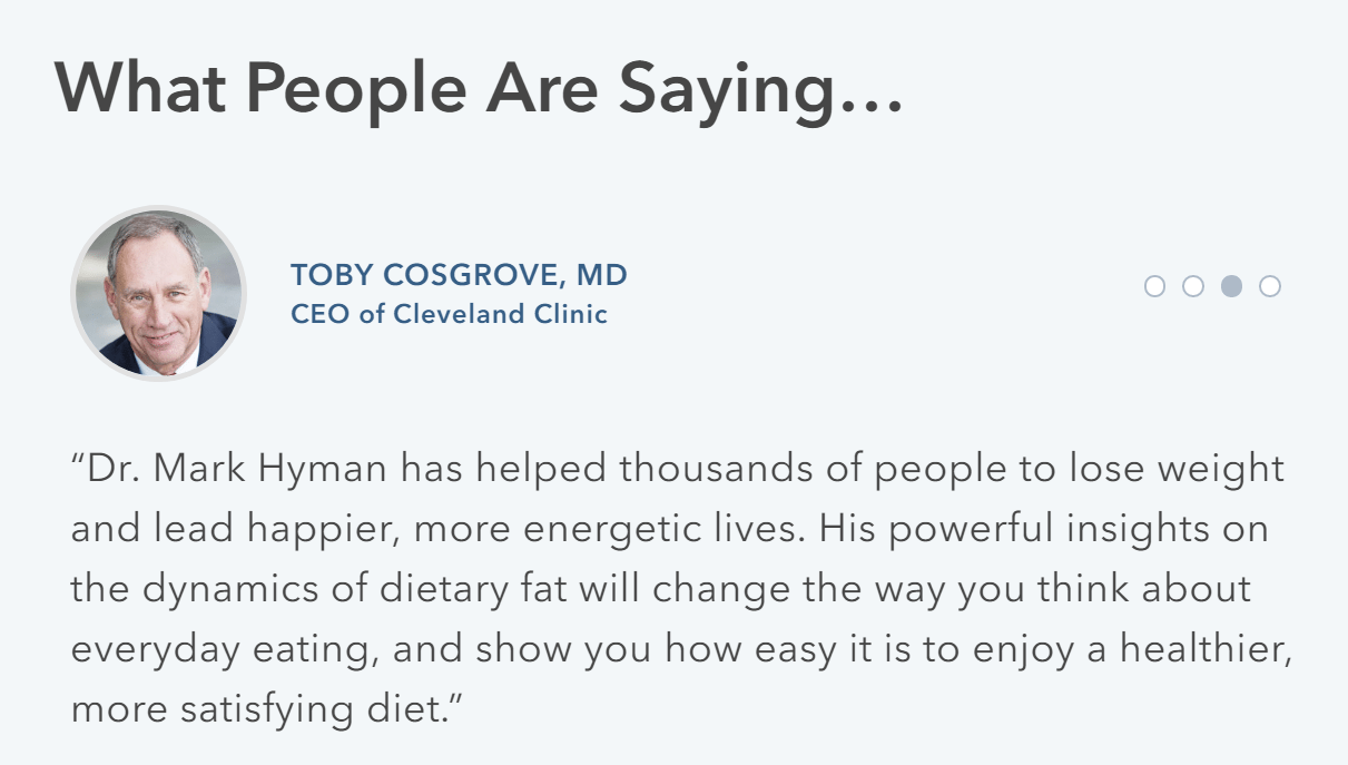
He’s less recognizable than Dr. Oz, but a title underneath his name reveals why Cosgrove is in a position to give an authoritative review on Hyman’s diet program: He’s the CEO of the Cleveland Clinic, one of the most well-known medical institutions in the country.
Optimized testimonials like these let visitors know that people outside of the offer’s creator also consider the “Eat Fat, Get Thin” diet to be effective.
The same goes for high-profile clients. When a business features logos of well-known companies they’ve done business with, it essentially says, “some of the most trusted brands trust us, so you should too.” Here’s an example from Mindgruve:
Numbers are almost always more persuasive than words. Statistical proof of ROI from real customers beats even the most positive testimonials, because the old adage really is true: Numbers don’t lie.
Here’s an example from Dr. Hyman’s post-click landing page:
Here’s another example from Louder Online, a San Diego marketing agency:
On your post-click landing page, if you feature results from particular case studies, keep them brief and highlight the numbers. Nobody will read them in block text form, the way they’re written on this post-click landing page:
To boost credibility, you can never go wrong by showcasing awards. Even if they’re from little-known organizations, these convey an outside party’s acknowledgement of your excellence in a particular field or on a certain campaign. Here’s an example from L7 Creative:
If your business or offer has been featured in any well-known publications, on your post-click landing page is the place to let people know. Here’s an example from the “Eat Fat, Get Thin” post-click landing page:
Visitors view outlets like CBS, PBS, and ABC as credible sources of information. They assume that if you or your offer have been featured on any of them, you are credible by association.
Think, for a second, about what happens when you see a long line outside a restaurant: You assume the food is good.
Similarly, when you see a brand is followed by thousands of people, or a product has been claimed millions of times, it’s an indicator that brand is worth following and that product is worth claiming:
![]()
That’s why counters can be an effective way to showcase your brand or offer’s popularity, and by extension, its value. Here’s an example from Content Marketing Institute:
Here’s a Facebook “Like” counter from another post-click landing page, which indicates the brand has 563,000 fans on the platform:

These counters effectively communicate the message, “our content/product is valuable to hundreds of thousands of people,” which makes visitors think, “this could be valuable for me too.”
A post-click landing page is like a puzzle. Having all the right pieces isn’t enough. Your elements need to come together to form a page that subtly guides your visitor toward conversion. Learn how to put them all together in the next chapter.
Creating a post-click landing page involves more than haphazardly throwing the elements from chapter four on a web page. Those elements need to be arranged correctly to persuade visitors to take action.
To do that, you’ll need some knowledge of design concepts rooted in Gestalt psychology, along with an idea of how people read on the web.
Around 2006, researchers at the Nielsen Norman Group learned that the findings from Munich’s Direct Marketing Association translated to the internet. In a study that tracked how 232 internet users viewed thousands of web pages, they noticed that…
The researchers named this the “F-pattern” for its shape:
Though, they also noted that people’s eye movements don’t always form a perfect “F:”
Obviously, users' scan patterns are not always comprised of exactly three parts. Sometimes users will read across a third part of the content, making the pattern look more like an E than an F. Other times they'll only read across once, making the pattern look like an inverted L (with the crossbar at the top). Generally, however, reading patterns roughly resemble an F, though the distance between the top and lower bar varies.
Whether their reading pattern forms an “F,” “E,” upside down “L” or “Z,” the implications are the same for English speaking people: Readers progress from left to right, then top to bottom, scanning for important pieces of information on the page. So it’s crucial to know what makes a piece of information “important” to the reader.
In the early 1900s, three German thinkers began forming the foundation of Gestalt psychology, a theory of visual organization that can be summed up in one commonly known phrase: “The whole is other than the sum of its parts.”
The founders of the theory proposed that humans don’t perceive their surroundings individually and equally; instead, they make sense of them in the context of the whole. From their research, 8 laws of perceptual organization were developed. One of them, the law of similarity, describes how people group together individual elements based on how alike they are to their surroundings.
For example, in the image below, most people see three rows of white dots and three rows of black dots instead of 36 dots, or 6 rows of dots, or 6 columns of dots:

The reason is our tendency to organize things based on their similar characteristics. And because of this tendency, our attention is specifically drawn to things that are different from those groups.
The Gestalt psychologists called these different things “anomalies.” The red jellybean below is an anomaly because it stands out from the group of similar yellow jellybeans:

Because our attention is drawn to anomalies, “different” has become synonymous with “important” in an age when advertisers are at war for impressions. On your post-click landing page, the most important thing to your visitors is what attracts their attention first. The second most important thing is what attracts their eyeballs next, and so on.
Since readers don’t read, but instead skim, it’s important you create a visual hierarchy that highlights the most important information on your post-click landing page. You need to make sure that, even at a glance, they can quickly identify why they should claim your offer.
Together, these anomalies will form a visual hierarchy. The most attention-grabbing anomaly is at the top of the hierarchy, the second most attention-grabbing is second priority, and so on. If you’re optimizing your page to be readable at a glance, this is what you’ll want to highlight at the very least:
1. Your headline: It should contain your USP in a benefit-oriented fashion. Let visitors know what the biggest advantage to claiming your offer is.
2. Your benefits: Every visitor should be able to quickly identify what the benefits to claiming an offer are. Features are not important. Instead, it’s the benefits those features provide that need to be highlighted on the page.
3. Your call-to-action: Once your visitors know why they should claim your offer, they need to know how to claim it. That’s where your call-to-action comes in. It should be attention-grabbing and positioned where it’s easily seen.
Your hierarchy will vary from page to page. Sometimes, for example, an image will be the biggest attention-grabber. Other times, you’ll want to work testimonials into the hierarchy.
However, these three elements should be present on every post-click landing page. Here’s how to highlight them in a way that makes them readable even at a glance.
Making your headline, benefits, and call-to-action noticeable on a page with many elements takes some design know-how. To create a visual hierarchy, here’s what you should manipulate:
Take a look at how DigitalMarketer manipulates them on this post-click landing page to create a visual hierarchy:
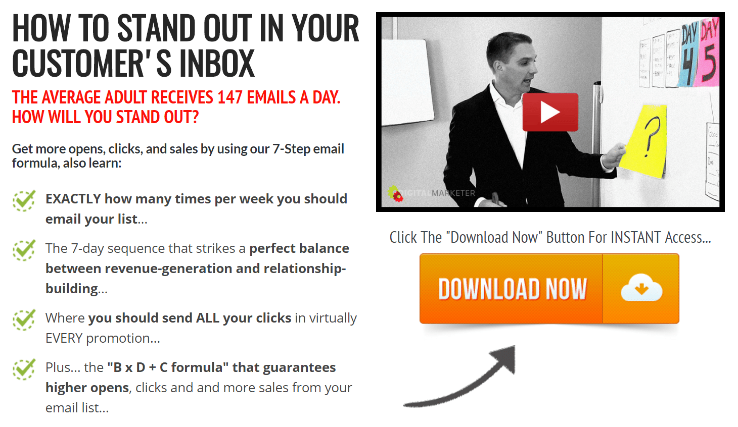
Let’s break down the elements of visual hierarchy on this page:
Similarly, your post-click landing page should draw attention to the headline, benefits, and CTA at the very least. If you’re using elements like images and subheadlines, they shouldn’t get in the way of the reader’s ability to determine your USP and the benefits of your offer, or click the CTA afterward.
Look up at the image on the DigitalMarketer post-click landing page. It doesn’t interrupt the flow of the user, who arrives at the CTA by reading in the shape of an L (headline, benefits, call-to-action) or F (headline, image, benefits, call-to-action).
Aim to design similarly: First, grab your visitors’ attention with a compelling image or headline; then draw them to your benefits; and lastly, guide them to the form/call-to-action button. Here are a few more examples of this design in action:
This design in particular is popular on many post-click landing pages because it naturally guides the visitor to the CTA button. And if that call-to-action button is designed correctly, it will be highly noticeable. Here’s how to use color to create an attention-grabbing button.
Though many marketers believe it, choosing a color scheme has little to do with the psychological meaning of a hue. Countless bloggers claim “blue means trust” or “green means go.” Here’s an excerpt from that button color case study discussed in chapter 3:
Green connotes ideas like ‘natural’ and ‘environment,’ and given its wide use in traffic lights, suggests the idea of ‘Go’ or forward movement.
The color red, on the other hand, is often thought to communicate excitement, passion, blood, and warning. It is also used as the color for stopping at traffic lights. Red is also known to be eye-catching.
While not completely useless, these statements have a major flaw: They’re based on cultural associations. For example, in the western world the color red symbolizes danger; but in China, it symbolizes happiness, celebration, and luck.
Instead of designing your page based on these largely subjective color meanings, it’s more important to design based on color theory. With it, you can create contrast between your background, form, and CTA button, which contributes more to conversion rate than subliminal messages. Here’s how to design a scheme that converts:
Studies have shown that simpler is better when it comes to picking a conversion-centered color scheme. Three hues are an ideal number for guiding visitors toward your call-to-action button.
To pick those three colors, Jared Christopherson from Yellowhammer suggests using the “60-30-10” rule of color in web design. Here’s how it works:
An accent color is going to be the brightest and boldest on your page. It should draw attention to the CTA button with a hue, tint, or shade that contrasts the rest of your color scheme. Only 10% of your post-click landing page should be filled with your accent, and a safe way to choose it is by starting with a color from your logo or its variations.
Once you have your accent chosen, the next step is picking a base color for your header, form, and footer on which it displays well. On the color wheel, pick a tone, tint, or shade, that’s opposite your accent to give it the most contrast. This is called a “complementary” color:
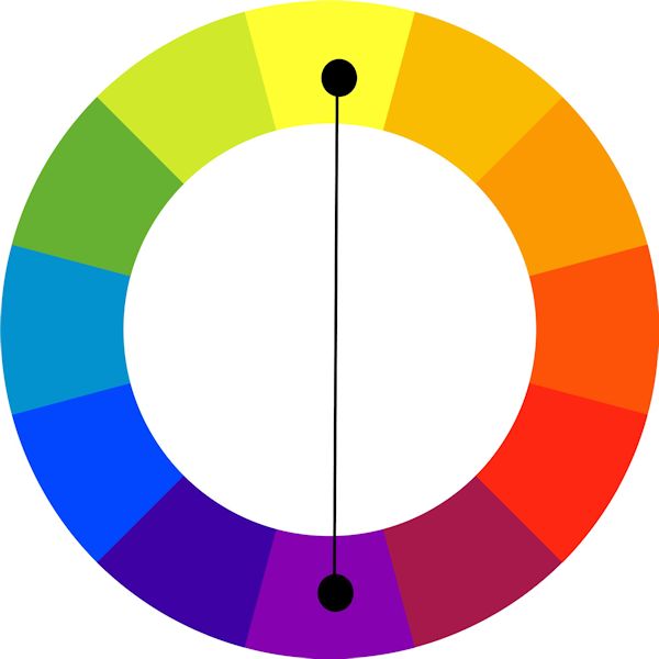
Choosing a split-complementary color will also create the same contrasting effect. These are colors next to the hue that’s opposite your accent color. In the above photo, that would be yellow-green and yellow-orange. Here’s another example:

Complementary to blue is yellow-orange; and next to yellow-orange are blue’s split-complementary colors: yellow and orange. Overall, your base color will fill 30% of a post-click landing page’s visual space.
The background color takes up 60% of a post-click landing page’s visual space. This color should be soft and nearly unnoticeable. Generally white is a safe choice here since all tints, tones, and shades display well on it — including the color of your font, which is crucial for readability.
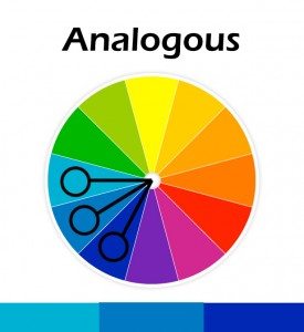
If you’re firmly opposed to white, choose a color that’s monochromatic or analogous to create a subtle background.
Analogous colors are neighbors on the color wheel. If your base is blue, you might choose blue-green or blue-purple as a background.
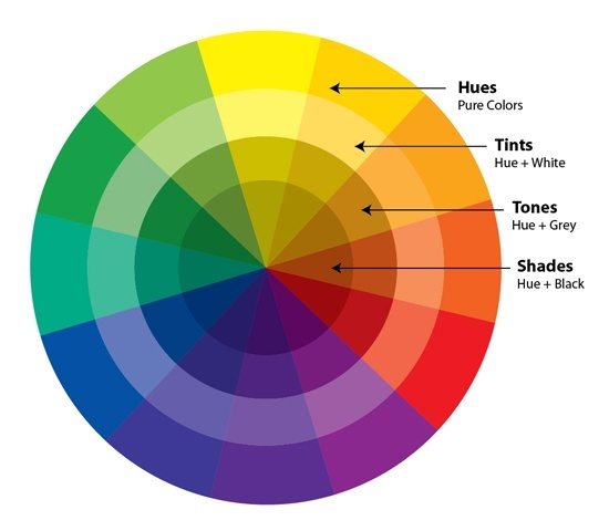
Monochromatic colors are all the variations — tints, tones, and shades — of one particular hue. If your base is yellow, you might try combining it with:
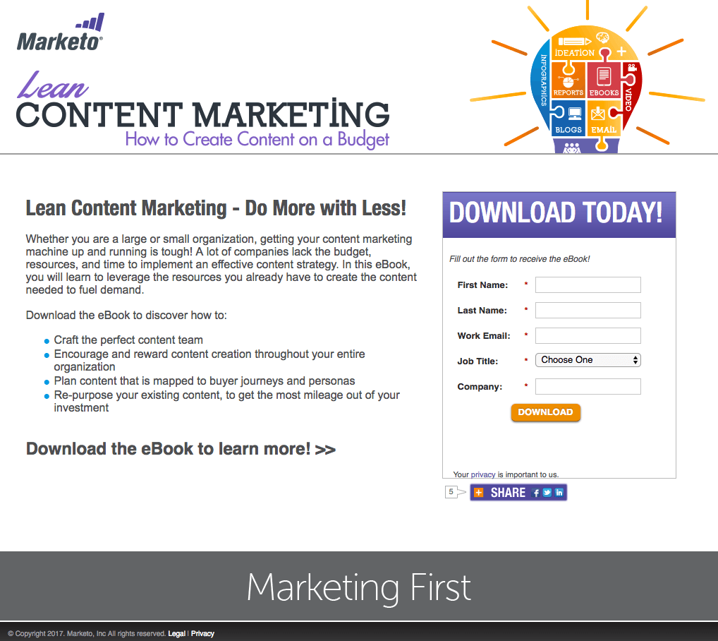
Conceptualizing these color schemes is easiest with visual examples. Here are a few post-click landing pages, along with descriptions of the colors used for their background, base, and accent:
Background: White
Base: Grey
Accent: Orange
This is a great example of how a post-click landing page should draw attention to important elements with color. Notice how the base and background are different, but both subtle, and the most persuasive information on the page is highlighted in orange: the CTA button and numbers relating to ROI.
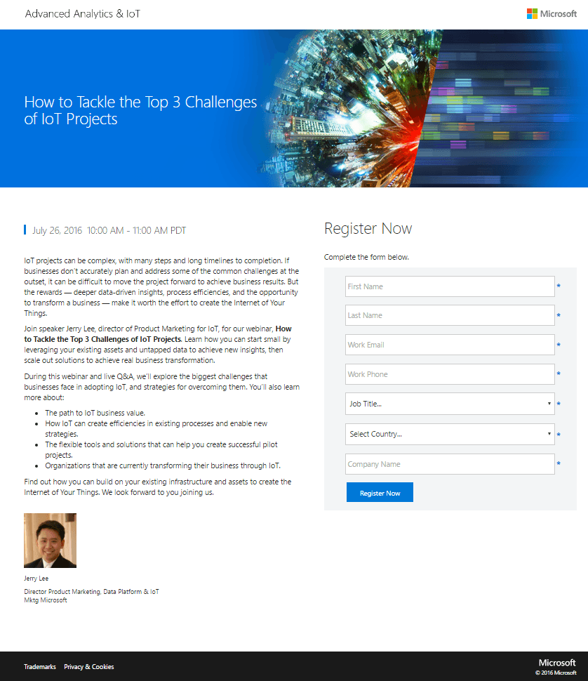
Background: White
Base: Blue
Accent: Orange
Here’s another great example of a conversion-centered color scheme. Your eyes barely notice the white background or the blue base. Instead, they’re drawn to the orange accent color on the CTA buttons.
Background: White
Base: Light grey
Accent: Red
Here’s an example of what not to do. The only color on this post-click landing page is in the featured image and on the logo. These elements draw the eyes of curious visitors but don’t provide much value. To the right, the form without a base color and a translucent ghost CTA button fail to draw the attention of scanning prospects.
Background: White
Base: Grey
Accent: Green
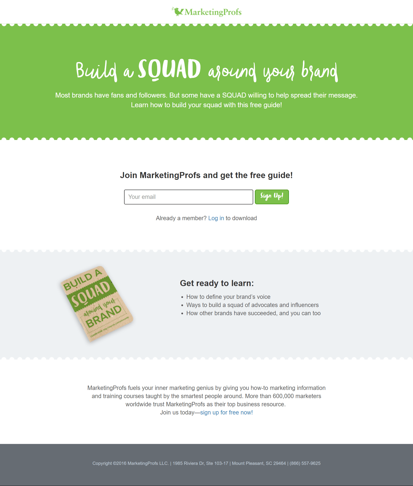
Here’s another example of what you should stay away from. This time, MarketingProfs does a great job of choosing a background and base color, but they use their accent color, green, a little too liberally. A quick fix could improve the page’s ability to draw attention much more effectively: Change the top portion of the page — on which the text “Build a SQUAD around your brand” sits — from green to grey. The result is a subtler base and an accent that grabs more attention.
You’ve learned a lot so far, and there are only two more chapters to go. By now you should know:
The last thing left to learn is which type of post-click landing page will produce the best results for your campaign. There are five main kinds, and the one you choose will depend on a number of factors. Find out how to pick the right post-click landing page in the next chapter.
Building a post-click landing page is one thing, but building the right post-click landing page is something else completely. The term “post-click landing page” encompasses five different types of pages:
Which one you build will depend on your goal and where your prospect is in the buyer’s journey. A sales page used at the top of your funnel will fail to convert its visitors nearly 100% of the time, while a squeeze page in its place will see much more success. Learn how the five types of post-click landing pages fit into your marketing funnel and when to use each:
The top of your marketing funnel is an unsure place for both you and your prospects. At that point, they’re not sure that you’re the right solution to their problem, and you’re not sure that they’re seriously interested in your product or service.
The way to find out, according to a majority of marketers, is via email. An overwhelming 96% say that email address is the most important piece of information to capture on lead gen forms:
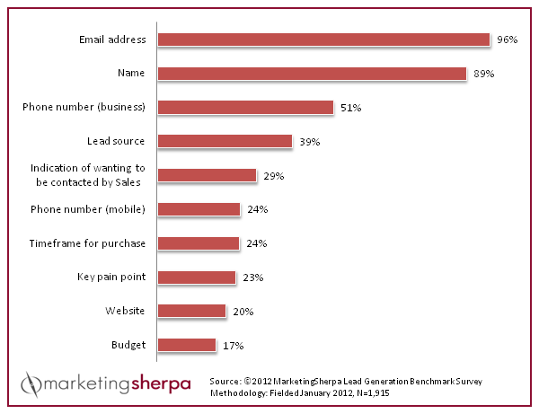
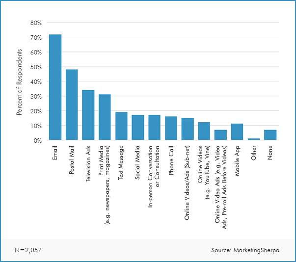
The reason it’s important to marketers is likely because consumers say that email is the channel they prefer to be contacted by companies over any other:
Squeeze pages are particularly valuable at the top of your funnel because they’re made solely to capture a prospect’s email address, which you can use to begin a lead nurturing initiative.
As modal windows, squeeze pages pop up to cover your prospects’ screen, forcing visitors to interact with them before engaging with your website’s content. Here’s an example from SiteTuners:
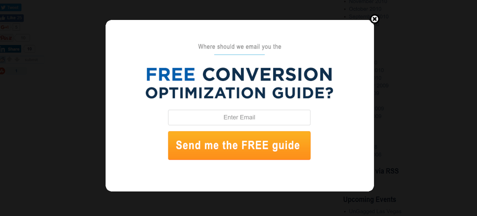
Notice that the only form field on this page requests an email address. Some squeeze pages also request name along with email, but ideally never more than that. In addition to a super-short form, an effective a squeeze page will also:
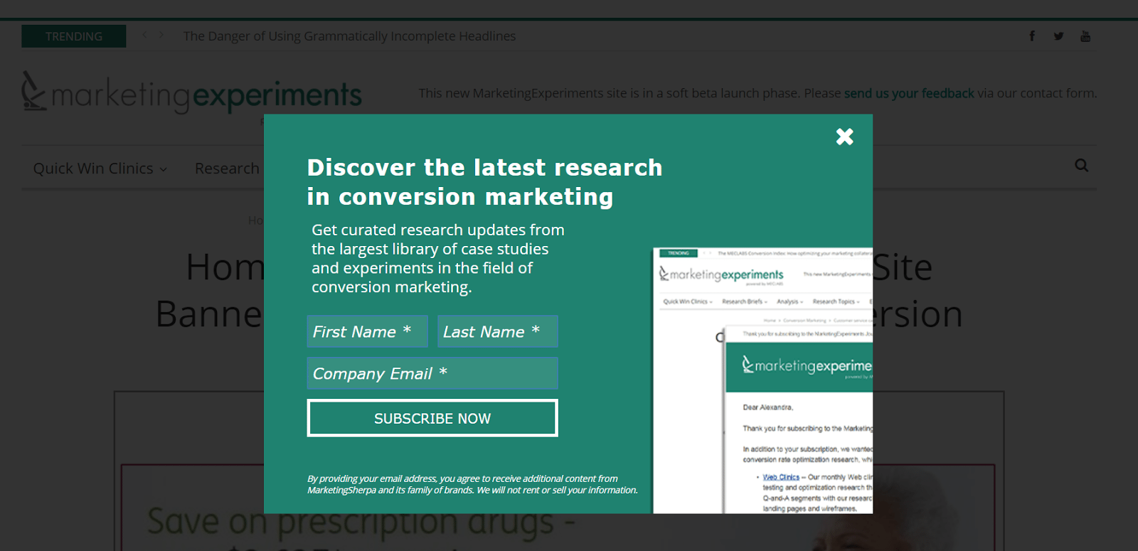
Here’s another example from MarketingExperiments:
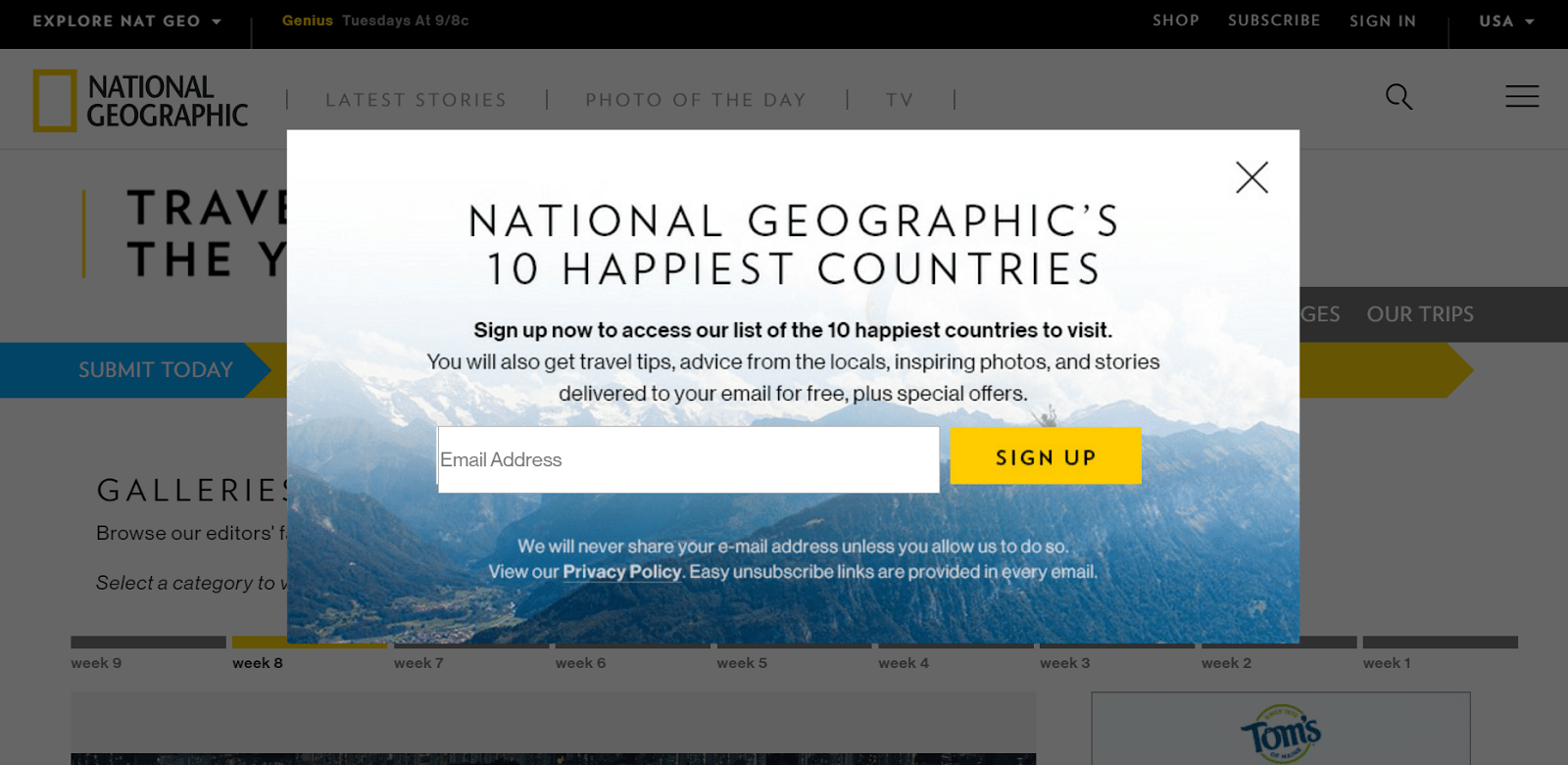
And one more from National Geographic:
For more examples of how marketers use squeeze pages to earn email addresses, check out this blog post.
Normally, prospects click through a paid advertisement with the expectation that they’ll be directed to a post-click landing page on which they can evaluate your offer. That’s not the case with a splash page.
Instead, visitors land on a splash page after being redirected by you, the advertiser, for one of a few different purposes (which you’ll learn in a minute). Here’s an example of a splash page that Forbes often redirects its visitors to when they click on a link to a featured article:
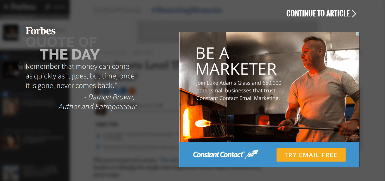
You’ll notice that on this splash page there’s no specific goal. There’s a “quote of the day,” an ad, and then a “continue to article” link in the upper-right corner of the page.
Presumably, Forbes continues to direct people to this intermediary splash page because they earn revenue from those who click the featured ad. Otherwise, to us, it serves no clear purpose — which raises the secondary difference between splash pages and all other post-click landing page types: Their goal isn’t always conversion.
A few goals of a splash page might be:
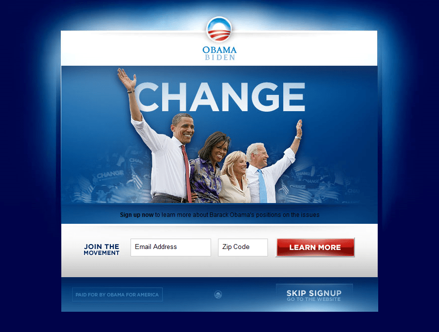
1. To earn a conversion, like this one from Barack Obama’s campaign team:
2. To make an announcement, like this one:
3. To allow visitors to choose their preference for interacting with your site (language preference, for example):

Whatever the goal of your splash page, it needs the following to accomplish it:
As long as it has a clearly defined purpose that adds value, a splash page can work throughout the funnel and beyond on both first-time prospects and recurring customers.
Lead capture post-click landing pages are the most versatile and widely used of the five post-click landing page types. These can be used at the top, middle, and bottom of your funnel. Their main distinguishing characteristic from other post-click landing page types is their form, which every lead capture page needs to accomplish its goal: capture leads.
When creating your form, it’s best to consult the best practices listed in chapter 4. The information you request from your prospects will depend on what your sales and marketing teams need to qualify your leads.
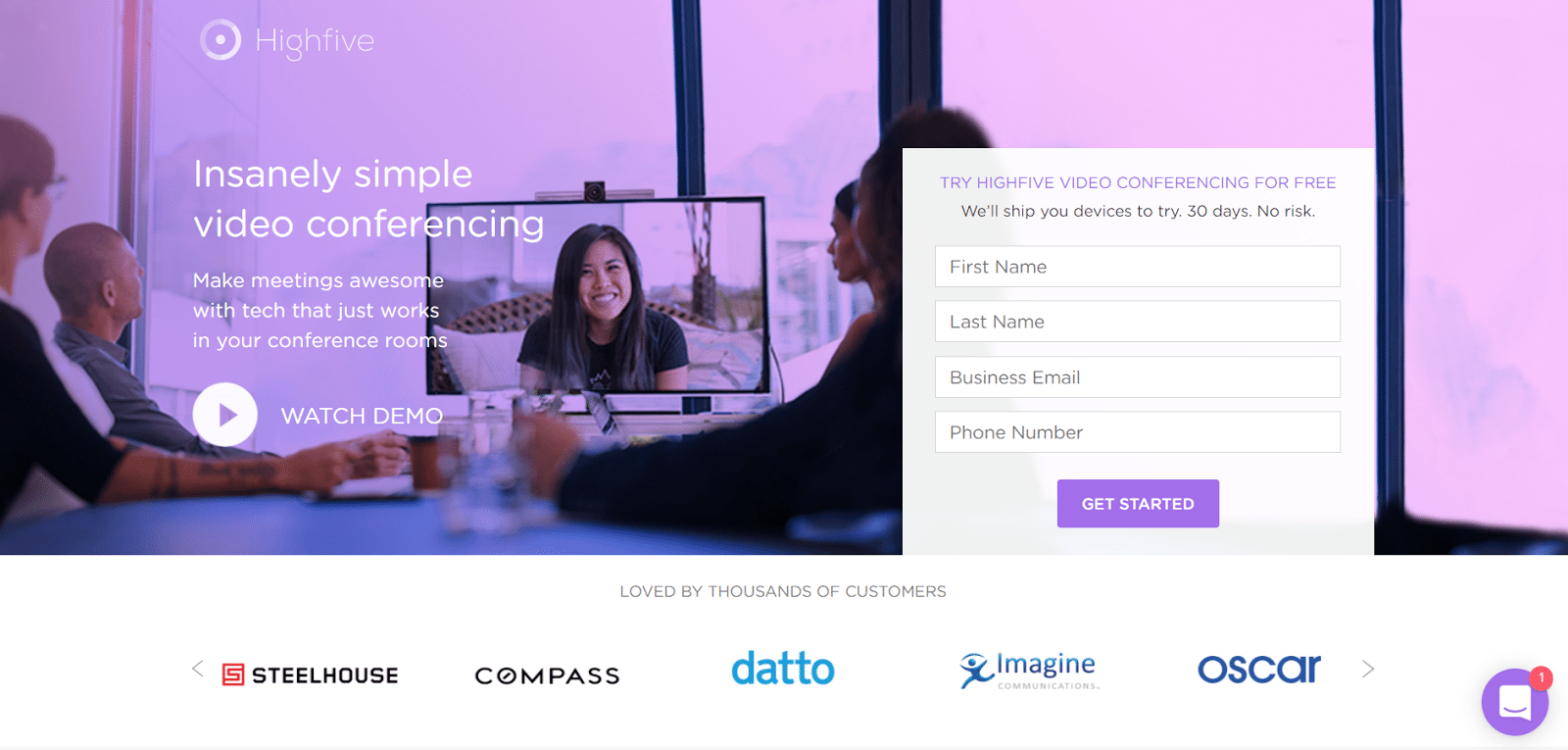
Generally, though, top-of-funnel lead capture post-click landing pages ask for less information — strictly what your team needs to begin a lead nurturing initiative, the way this lead capture post-click landing page from Highfive does:
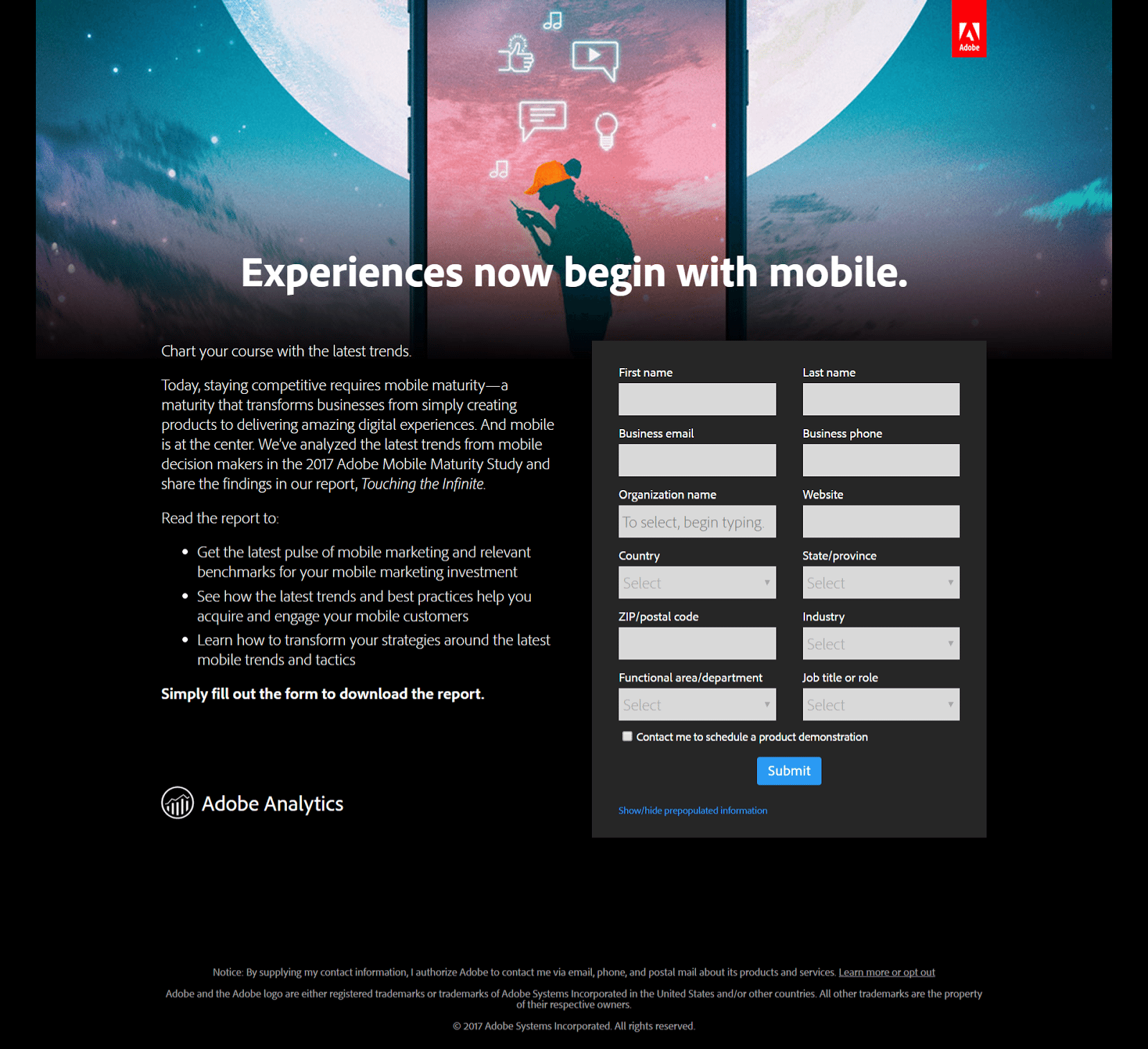
Then, once you have their name and email, longer lead capture forms help you learn more about your lead to determine whether they’re actually interested in your product or service, like this one from Adobe does:
Remember: No matter where your leads are in the marketing funnel, they shouldn’t be frightened by the size of your form. Only request what is absolutely necessary. The fewer fields you feature, the less friction involved in converting, and the more likely visitors are to claim your offer.
For more examples of how marketers use lead capture post-click landing pages to convert their visitors, check out this blog post.
Click-through post-click landing pages are most valuable at the bottom of your funnel for warming up your leads to a particularly high-scrutiny offer. They can be used at all stages, but most often they pre-empt pages that feature the most friction-causing element known to marketers: the credit card form.
This post-click landing page type allows visitors to read persuasive information about an offer without being distracted by the terrifying “buy” button. If and when they click through, they’re directed to a page where they can claim the offer via a form.
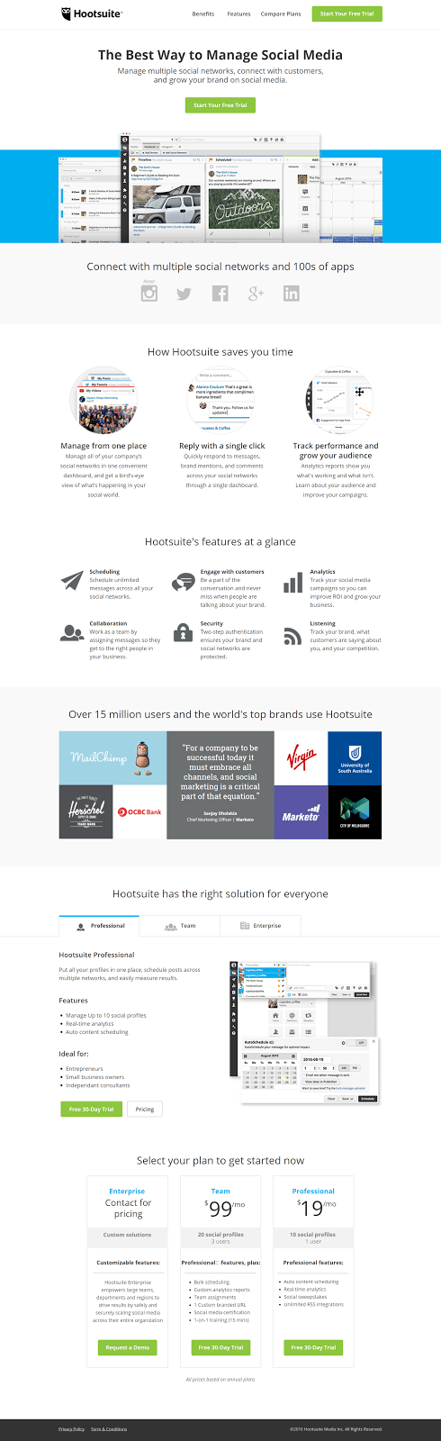
Here’s a long, persuasive page from Hootsuite that allows visitors to click through if they’re interested in starting a free trial (a bottom-funnel offer):
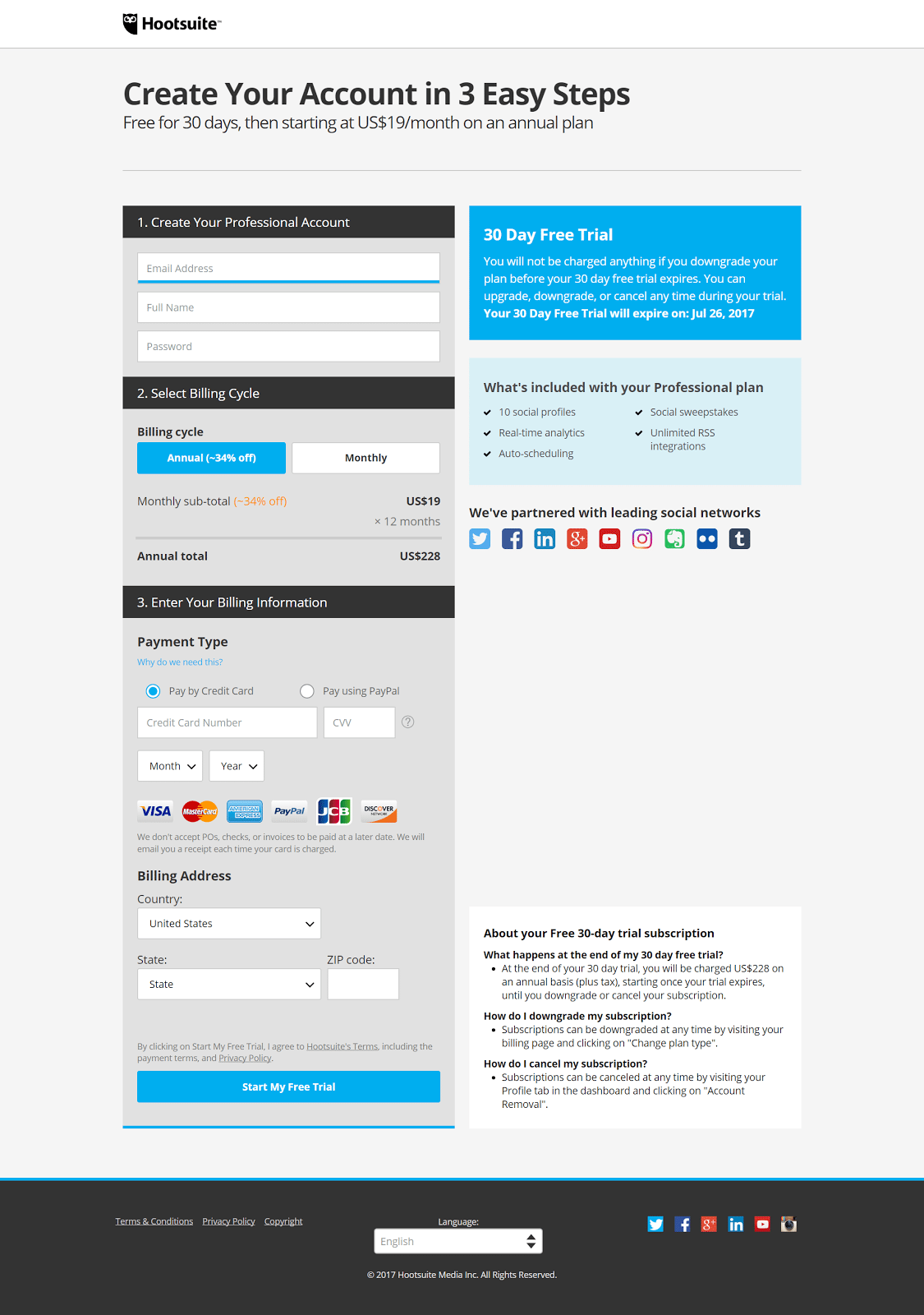
And here’s the page you’re directed to after clicking through:
Because your click-through post-click landing page is likely to pre-empt a high-friction conversion obstacle, it should be made very carefully with nearly every persuasive element mentioned in chapter 4.
post-click landing pages that offer free ebooks or tip sheets can get away with skimping on testimonials or authority badges. However, when credit card information and ultimately money is on the line, your visitors will look for any reason to distrust you. It’s your job to make sure they can’t find one.
For more examples of how marketers use click-through post-click landing pages to ease friction and earn high-value conversions, check out this blog post.
Of all post-click landing page types, the sales page is the most difficult to get right; and that’s because it goes after the conversion that’s most valuable to marketers and most intimidating to visitors: the sale.
For that reason, sales pages must include every element covered in chapter 4 with the exception of the form (because most sales pages are click-through post-click landing pages that request payment on the following page). That means they can be monstrous as a result.
This one from AWAI has over 5,000 words on it:
That’s not to say yours should be this long. This particular story is masterfully written by Paul Hollingshead, the Co-Founder of an organization that sells a copywriting course.
Instead, yours may save space by using video to make your most compelling argument, this sales page from Derek Halpern does:
To discover how to most effectively sell your product, review your most profitable sales channels. Find out where the most purchases of your product or services happen and why.
That’s what the team at Conversion Rate Experts did for Moz when they were brought in to optimize a sales page. They watched founder, Rand Fishkin, pitch the product to them face-to-face; and here’s what they found:
In our analysis of Rand’s effective face-to-face presentation, we noticed that he needed at least five minutes to make the case for Moz’s paid product. The existing page was more like a one-minute summary. Once we added the key elements of Rand’s presentation, the page became much longer.
“Much longer” is an understatement. Here’s the difference between the original and optimized page:
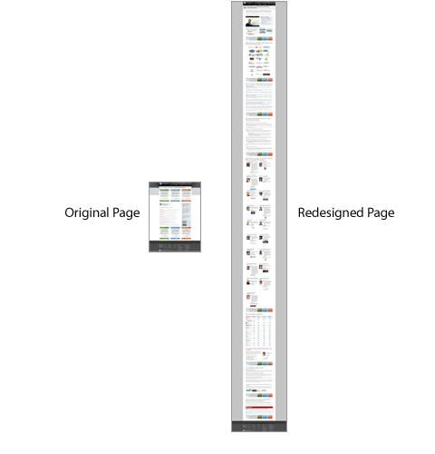
That variation outperformed the control by 52%.
Another case study from Conversion Rate Experts proved something similar. A long-form post-click landing page created for heat-mapping software, Crazy Egg, outperformed its shorter original page by 363%:
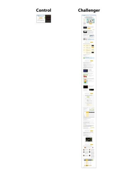
One of the reasons it performed so well was that this new page featured language that customers used to speak about heat mapping software, not the technical jargon that its creators used to speak about it. It also overcame common buying objections with more content.
The most important thing to remember when creating a sales page is this: Think like your target customer. Or, even better — ask your target customer. Find out the biggest obstacles preventing them from purchasing your product or service, then, adjust your post-click landing page accordingly.
On a sales page, including all the elements in chapter 4 isn’t enough; optimizing them according to best practices isn’t enough (though, it’s not an awful start) either. To create a high-converting sales page, you need to know your target customer intimately.
Every business is different, and so is every business’s target customer. A great sales page designer takes those differences into account.
For more examples of how designers use sales pages to earn the most coveted conversion, check out this blog post.
Putting all your newfound knowledge to work can be a hassle. Creating a post-click landing page from scratch isn’t easy. There are wireframes to be built and coding to be done; and the process can routinely drag out for days at a time. There is a way, though, to shorten that process to a matter of minutes.
With Instapage, you can pick from over 200 fully customizable templates proven to convert:
You can add new elements to those templates by dragging and dropping from the top menu bar:
You can click to fine-tune any element or section of your page to keep design 100% on-brand, right down to the style of your typeface (with countless fonts from Adobe Typekit and Google Fonts):
You can group elements and align them to your preferences while creating pixel-perfect designs with axis lock and edge measurement features.
Integrate your page with 20+ popular marketing technologies you already use:
You can even build pages together with your team using the industry’s only collaboration solution:
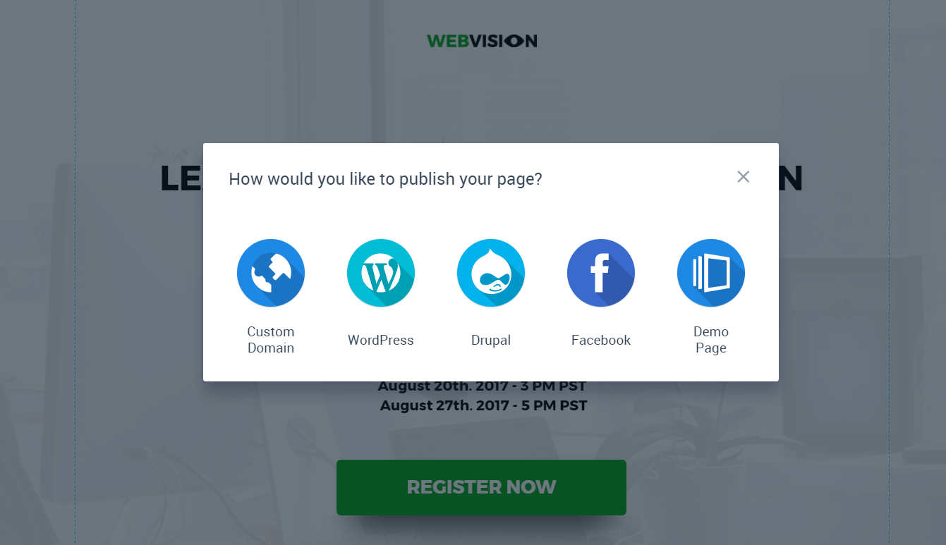
When you’re done, you can preview your design on both desktop and mobile, then easily publish to a custom domain, CMS, Facebook, or our demo server:
See why we’re the choice of brands like Autopilot, HelloFresh, Heap Analytics, and Wealthfront. Start building professional post-click landing pages faster with Instapage, the most designer-friendly software on the web.

You learned a lot today about how to create a high-converting post-click landing page — so much, that it warrants a brief review. Here’s a short recap you can use to refresh your memory before you take off to create your highest-converting post-click landing page yet.
The most important information you can take away from chapter 1 is the true definition of a post-click landing page, which is:
A post-click landing page is a standalone web page, disconnected from a website’s navigation, created for the sole purpose of convincing a visitor to act (to sign up, buy, download, etc.).
Research shows that companies who use more post-click landing pages generate more leads.
post-click landing pages are more effective at converting than other web pages because they eliminate distractions and deliver exactly what visitors expect. They do that by incorporating two elements into their design:
Together, these two differences form the foundation of a persuasive post-click landing page that optimizes ad spend.
Any marketing campaign can benefit from a highly optimized post-click landing page, but it’s paid campaigns that shouldn’t be run without one. When conversion is the goal, the following campaign types should always drive visitors to a post-click landing page:
Message match and an optimized conversion ratio form the foundation of a persuasive post-click landing page, but there’s much more involved in designing one. The anatomy of an effective post-click landing page looks like this:
To attain a conversion ratio of 1:1, you shouldn’t have any outbound links in your page’s header, body or footer. There should be no easy route off your post-click landing page. The only way your visitor should be able to exit the page is by clicking your CTA button or the “X” in the top corner of the browser window.
It’s your headline’s job to convince your visitor to read the rest of your page. To do that, it should contain words used in the referrer (good message match), and answer the question every prospect asks before reading further: “What’s in it for me?”
To compel a visitor to click, a CTA button should…
Your copy should emphasize the benefits of your offer over its features, and it should do it quickly and concisely. To be skimmable, your copy needs to be optimized for three things:
Pointless images are likely to be ignored by your visitors, so if you’re going to include media on your page, it should be for a reason.
A form is the biggest cause of post-click landing page friction. To ensure your form doesn’t scare visitors away, make sure:
Regardless of what you’re offering, you can’t earn a conversion without trust. The following types of indicators will help prove that you’re an authoritative and credible source:
Arranging the aforementioned elements is no easy task. Knowing where to put them takes an understanding of Gestalt psychology and how people read on the web:
Knowing both these things, you can draw attention to the most important information on your post-click landing page by:
Once you know how you’ll position your elements on the page, it’s time to determine the page’s colors. Here’s how:
Your post-click landing page color scheme is made up of a background, base, and accent color.
Together, these will create an effect that draws attention to the call-to-action. Your background and base color should be analogous or monochromatic in relation to each other. Your call-to-action should be complementary to your base color.
The term “post-click landing page” encompasses five different types of pages. Which you use will depend on its goal, and where your visitors are in the funnel. Here’s what you should know about them before picking one:
With that brief refresher, you’re free to convert your traffic to leads and customers like never before. Start building professional post-click landing pages faster with Instapage, the most designer-friendly platform on the web.
Try the world's most advanced landing page platform today.