When thinking about optimization, most marketers don’t consider their pricing page as an issue.
To most marketers, the pricing page is the page a visitor comes to at the end of the decision-making process. When they arrive, they are already convinced to buy.
This false assumption is why the pricing page is often neglected in comparison to homepages or post-click landing pages. The reality is even a convinced customer can exit if the pricing strategy isn’t thought out and the design of the page sucks.
Setting up a pricing page is crucial to getting conversions. This includes both the design of the page and the strategy.
In this post, we will go over best practices for creating a pricing page that your visitors don’t see as an obstacle but as an opportunity.
Psychological principles to use in your pricing strategy
Robert Dooley of Neuromarketing talks about establishing a pricing strategy that keeps in mind the power of precision, the rounded price effect, and the phenomenon of prices having syllables.

According to Dooley, when we attach syllables with pricing, we make them seem higher than they are. The principle behind this phenomenon is whenever we see a price, we tend to sound out the value in our minds. More syllables translate into having a higher perceived price.
Research shows rounded prices like $100 work when the buyer is making a decision driven by emotion. Non-rounded prices like $99.99 work when the purchasing decision is a more logical purchase. This is because rounded prices are easier for our brains to process than non-rounded prices are.
To decide whether you should round your pricing, you need to consider the product you’re selling. If it’s an app that collects and sends family photos, your pricing should draw on emotional appeal (rounded). If you are offering your visitors analytics software, then rounded pricing will be effective.

Choosing on pricing plan names
Naming pricing plan names shouldn’t be an arbitrary decision. The purpose of naming a plan is to reduce customer frustration, so they instantly know which plan is right for them.
The Mailchimp pricing page is a good example of well-chosen pricing plan names. Just by reading the names (Entrepreneur, Growing Business, and High Volume Sender) the visitor knows at a glance which plan is right for them:

Keep it Simple Stupid
Don’t stuff your pricing plans with too much information. You’re not helping your visitors. When you overcrowd or cram too much on your page, it makes it difficult for visitors to understand what they are getting.
Visitors skim your pricing page. Don’t make them read every single word you write. If you have more information they need, then include a separate FAQ section below the fold.
Your page needs to be clutter-free, unlike Dyn’s pricing page:

Make it easy to compare
You need to establish the context of what one price plan offers in comparison to the other – and this is simple if your plans are comparable.
Conference Badge makes it easier to choose one of their two stated pricing plans:

PlanGrid also does an excellent job of comparing their four pricing plans. What you get from each plan is clear:

There’s still a problem, however. This pricing page is missing a CTA button.
Always include a CTA button
If you do not include a CTA button on each plan, you might as well not bother creating a pricing page. A pricing page without a CTA is like an offer without a post-click landing page or a homepage without a logo. It just doesn’t work.
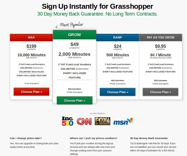
You need a CTA button at the bottom or top (A/B test this) of every pricing plan, just like Grasshopper does in this example:

Make sure to test the copy of the CTA button to get more conversions, too. When Copy Hackers tested the Mad Mimi pricing page A/B testing five page elements, including the button copy. The test revealed the copy “Get Started Now” performed better than “Sign Up.”

We do this at Instapage too:

Order your plans properly
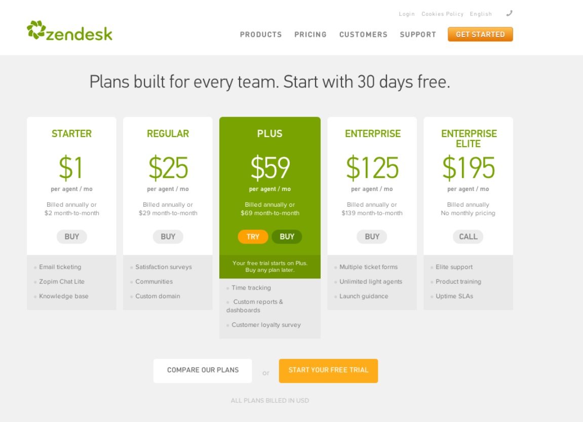
Arrange your plans with a strategy in mind. The Mad Mimi pricing page case study was eye-opening. It turns out you ordering your plans with the least expensive first maximizes conversions.
This is what Zendesk does here:

Another tactic to get more conversions on your pricing page is highlighting a plan as the most popular option. You can see this on the Zendesk and Mad Mimi pricing pages. This is also what WUFOO does on its page:

Your pricing page needs attention too. If you are looking for more conversions, start optimizing your pricing pages. Sign up for an Instapage Enterprise demo today.

See the Instapage Enterprise Plan in Action.
Demo includes AdMap™, Personalization, AMP,
Global Blocks, heatmaps & more.
