
Post-click landing pages are powerful marketing persuasion tools. When optimized properly, the combination of page elements and the overall post-click landing page design have the ability to convince visitors to perform the action on the page. Ranging from signing up for a free trial to downloading a PDF.
How Do You Optimize Post-click Landing Pages Properly?
Optimization is defined as the process of improving a campaign or part of it (web page, advertisement, post-click landing page) to the point that it’s as near-perfect as it can get. Optimization starts with continuous testing, data collection, and ends with making improvements to campaigns based on those results.
Translation – your post-click landing page conversions depend on optimization, and how successfully you optimize the post-click landing page depends on how you collect post-click landing page data.
Without data, there’s no way of knowing what’s working on the page and what’s not. There are two main types of data that you can collect:
- Quantitative data
- Qualitative data
Analytics tools such as Google Analytics help you gather quantitative data – metrics such as average time on page, bounce rate, and traffic channels. Qualitative data helps you understand the full story of visitor interaction, and it is most easily collected via heat maps.
Heat map data allows marketers to make optimization decisions that lead to higher post-click landing page conversions. User data collected from heat maps can then be used to run informed A/B tests to improve conversion rates.
This marketing guide will inform you about everything you need to know about heat maps. From the types of heat maps available to understanding when heat maps should be used, to a list of tools you can use to create heat maps on your post-click landing pages.
What is a heat map?
A heat map is a visual representation of data that showcases how visitors interact with a web page. Such as displaying where they click and where they don’t click. Here’s what a typical heat map looks like:

A heat map uses warm-to-cool color spectrums to showcase which page elements got the most user attention.
When used on post-click landing pages, heat maps allow marketers to identify if there’s any friction on the page that’s causing a hindrance in the conversion process.
Friction in digital marketing is any part of the conversion process that makes a user less likely to convert. On a post-click landing page, an example of friction could be a long form, poor message match, or too much text. Heat maps point out elements that could be causing friction, so you can run A/B tests and improve the post-click landing page conversion rate.
For example, a heatmap can determine if visitors aren’t clicking the CTA button or if they’re trying to click an element that’s not clickable. The insights collected can then be used to test your pages and increase your conversion rates.
You can judge how effective a web page is by analyzing a heat map on the following two things:
- How much information visitors engage with: Look at how much of the page visitors actually read, based on this information you can assess which page elements are working well and which are not.
- What actions do users take: What are visitors clicking? Do they click the CTA button, type in the form fields etc?
There are essentially four types of heatmaps:
- Click tracking heatmaps
- Scroll maps
- Mouse tracking heatmaps
- Eye tracking heatmaps
1. Click tracking heatmaps
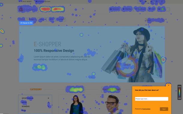
Click tracking heatmaps are the most common type of heatmap, they record data based on where visitors click on your post-click landing page:
![]()
The red spots showcase the areas where the visitor clicked the most, the number of concentrated clicks goes down as the color becomes lighter.
Click maps help you see if your visitors are clicking where you want them to click on your post-click landing pages. The highest number of visitor clicks on a post-click landing page should be on the CTA button since that should be the only clickable element on the page. (Conversion ratio of 1:1 i.e. one clickable element per conversion goal).
2. Scroll maps
Scroll maps record visitors’ scrolling behavior, helping you see the exact point where visitors scrolled on the page. This type of heatmap indicates whether the length of your page is ideal for user experience.
Scroll maps are generally used for long-form sales pages.
This is what a scroll map looks like:

A scroll map tells you where users are abandoning your page in the reading process.
Using this data you can create a hypothesis of why users are only scrolling down to a certain point and then create A/B tests that prove or disprove this hypothesis.
Maybe your page has lackluster copy, an image that’s turning people off, or even a readability issue.
3. Mouse tracking heatmaps/ hover maps
Hover maps are heat maps that show user’s mouse movements on your post-click landing page. The primary problem with hover maps is that you can’t always directly correlate a visitor’s mouse movements to what they’re actually looking at. Just because a user’s mouse stayed on the headline for 5 minutes doesn’t mean they’re still reading the headline.
Users aren’t always looking at the exact spot where their mouse is. Therefore, the reliability of hover map data is a little questionable.
Google’s, Dr. Anne released her findings on the accuracy of hover heat maps that showed.
- Only 6% of people showed a vertical correlation between mouse movement and eye movement, so 94% of people showed no correlation.
- 19% of people showed some horizontal correlation between mouse movement and eye movement.
- 10% of people hovered over a specific page element while continuing to read the rest of the page.
Another experiment from Google and Carnegie Mellon found a 64% correlation between mouse movement and eye movement.
Here’s what a hover map looks like:
Mouse tracking heat maps such as click maps, hover maps, and scroll maps have the following pros:
- The maps passively collect data on how users interact with your post-click landing page elements.
- With heat map analysis you can answer multiple questions related to user experience and the customer journey on your post-click landing page.
- You don’t need to rely on assumptions about how customers behave, you have actual data at your disposal.
Clicktale defines the pros and cons of mouse tracking maps in the following way:
![]()
4. Eye tracking heatmaps
Eye tracking heatmaps record users’ eye movements while they look at your post-click landing page. Typically, eye tracking studies are conducted in labs where participants wear special tracking devices that accurately measure eye movement. Nowadays, eye tracking studies can also be conducted via web-cams.
By examining where visitors focus on a page, you can place the important page elements in the visitors’ natural eye path increasing the possibility of them fulfilling the conversion goal.
When analyzing eye tracking heat map data, it’s crucial to understand exactly what you’re looking at so as to read the data correctly.
The primary source of confusion on eye tracking heat maps is the timeframe.
A heat map showing how users look at a page during the first 3 seconds won’t be the same as when they keep looking at the page for 30 seconds.
The example below showcases how timeframe impacts the heat map colors:

Another source of confusion with eye tracking heat maps is the actual data being shown.
Two types of eye-tracking heat maps
There are 2 main types of eye tracking heat maps, and they’re very different.
- Fixation volume heat map: the map shows the parts of the page which attracted the highest number of eye fixations. A fixation is usually recorded every time a user looks in a single spot for more than 50 milliseconds, measuring how frequently visitors kept looking at a particular page element.
- Fixation duration heat map: the map shows how long they looked at a specific element on the page.
Many marketers confuse the two types of eye tracking studies which causes them to misinterpret the data.
For example, a fixation volume heat map will be more useful to understand which page element stands out on a post-click landing page (i.e. is the most eye-catching). While a fixation duration heat map will show you which element they found the most engaging, as they spent more time on it.
Eye-tracking studies also make it possible to understand common user gaze paths and the typical order of fixations across the page. Whether they are looking at your page in an F-pattern or a Z-pattern.
The pros and cons of eye tracking vary depending on the method you use to run the study, generally, however, you gain more insights than just clicks and mouse movements.
The downside of eye tracking mostly comes down to practicality, doing the study is expensive and time-consuming.
You can create eye tracking heat maps in the following three ways.
- In-house eye tracking: You can buy the professional equipment needed for eye tracking heat maps ask users to look at web pages in-house to collect data.
- Remote eye tracking using webcams: You don’t need any professional gear to run these eye tracking heat maps. You can simply use participants’ webcam to track their eye tracking movements while they’re looking at your post-click landing page.
- Use professional eye tracking labs: You can run your eye tracking heat map studies in professional user research labs. Tests conducted in a professional set up produce precise results.
Benefits of heat maps
Heatmaps provide you with a visual guide of visitor behavior. Allowing you to see the post-click landing page through the visitors’ eyes – helping you make any changes needed to improve post-click landing page optimization and increase conversions.
Here’s a breakdown of the benefits heatmaps provide marketers:
- The maps monitor user behavior
- Data collected via heat maps can be used to run A/B tests and optimize the page and increase conversions.
Heatmaps can be used to make UX decisions on post-click landing pages
Heatmap data helps you answer the following questions about user behavior:
- How visitors are actually using the post-click landing page?
- How do they navigate on the post-click landing page?
- What catches their attention and where do they tend to click?
- Which page element are they ignoring?
- Do they click the call-to-action button?
- How engaging is your copy?
- Where should you place the page elements that you don’t want your visitors to miss?
Answers to these questions allow you to gather a deeper understanding of visitor behavior and you find out if there’s anything that you need to change on the page.
Heat map case studies
This section includes case studies on how different types of heatmaps helped increase conversions on web pages and lead to business growth.
1. Softmedia
Softmedia used heatmaps to identify friction areas on their web pages:

After collecting more than 10,000 pageviews of data, the heat map data revealed several distractions that were causing friction on the page, and users weren’t able to complete their desired actions.
Instead of clicking on the form, users were getting distracted by a ‘do not click here’ button on the page. When Softmedia removed the distraction their conversions increased by 51%.
2. Pair
Pair (now Couple) featured a click heatmap of their post-click landing page that showed that visitors were getting distracted by the navigation bar on top of the page.
Here’s what the original post-click landing page looked like:

Here’s the click map:

After looking at the heat map analysis Pair ran A/B tests to see if removing the distractions (navigation links) from the page would lead to an increase in conversions.
Removing the navigation links from the page lead to a 12% increase in conversions.
3. August Ash
When August Ash ran a heat map on their web page they discovered that visitors weren’t clicking the CTA button even though it was designed in a contrasting red color and had actionable copy on it:

Notice how the hover map reading on the CTA button is a quick mix of red to green, which according to the scale means that only 45-60% of visitors see scroll through to the CTA button. Changing the location of the CTA button from below the fold to above the fold led to an increase in clicks and therefore conversions.
4. Bluewire Media
Bluewire Media used heatmaps to see where visitors where clicking once on the page, they found almost no user activity was present on the lead capture form:

Based on the heatmap analysis, the web strategy company decided to re-design their webpage. And these are the heatmap colors their new design generated:

By changing the image and form design, they were able to increase clicks on the form and the CTA button.
These heat map examples prove that heatmaps help businesses increase growth. The question now remains, should every marketer start using heat maps?
Considerations for using heat maps
Though heatmaps provide valuable insights which lead to an increase in conversions, not everyone should jump in and start running heat maps on their post-click landing pages.
To ensure your heat map data you collect is accurate and most importantly is generalizable. It’s important that you have an ample sample size – so the changes you make on your post-click landing pages based on the data actually work.
At least 2,000-3,000 page views per screen are recommended per device for accurate heat map readings before you begin making changes to your post-click landing pages. Changing post-click landing page elements based off of heatmap data with very little traffic won’t help you make the right optimization decisions.
Heatmaps are indeed a valuable tool for understanding how people behave on your post-click landing page. However, they should not be the only tool in your marketing arsenal. As, when taken alone they paint an incomplete picture of user experience, and solely relying on them to judge visitor behavior has the potential to mislead you.
Though helpful, heatmaps are still limiting.
For example, if a heatmap shows that a lot of visitors are not filling out the form beyond the first field, this doesn’t necessarily mean that visitors only filled out the first field. This could also mean that visitors used their keyboard to tab through fields instead of their mouse.
In this specific case, it would be better to measure the time a user spent within each form field instead of simply looking at click maps.
When you’re creating heat maps make sure looking at the full picture, so you can actually benefit from the heat map analysis.
How can you use heat maps?
Heat maps are a valuable tool to see what actions visitors take on your page and which page elements are able to engage them. Heat maps help optimize the conversion journey by creating post-click landing pages that successfully engage users. PPC managers can use the maps to improve their advertising ROI by connecting ads to relevant and dedicated post-click landing pages.
Both Conversion Rate Optimization (CRO) practitioners and PPC managers can use the data they gather from heat maps for the following three purposes:
- Tracking visitor behavior
- For conversion rate optimization
- Make UX decisions
Tracking visitor behavior
Tracking visitor activity is the basic purpose of creating heatmaps. Since there’s a screen separating you and your visitors i.e. you can’t physically see what they are doing. PPC managers and CRO practitioners use heat map analysis to understand why visitors are behaving the way they do on their web pages.
While analytics metrics tell you the exact traffic numbers on your post-click landing page, and of those visitors how many abandon your page. It is heat maps that explain what happens when a visitor comes on the page – where they click, where they don’t click, what they read, and what they don’t read.
Understanding why users behave the way they do helps you create a post-click landing page that users find easy to navigate without any friction.
For conversion rate optimization
Conversion rate optimization is the continuous process of ensuring that the marketing funnel works successfully, in that it converts leads into customers with the help of different optimization processes. These processes include A/B testing, improving on-page experiences with heat maps, usability tests, etc.
The insights collected from heat maps can be used to run informed A/B tests that are based on real data instead of hunches.
It is not recommended to begin A/B testing just because you think it will increase your bottom line, testing page elements randomly won’t do a lot for conversions, you should instead look at user data to see the exact elements you should be testing.
Always start your A/B test with a hypothesis. The thing you want to test so when you see a winning variation you know exactly what works. Don’t A/B test your post-click landing pages randomly, start with a particular idea in mind – the hypothesis comes from insights collected from heat map analysis.
To Make UX decisions
Another way you can use heatmaps is to make User Experience (UX) decisions on your post-click landing pages. Instead of making assumptions about how visitors see your post-click landing page, you can collect real-time data of how their on-page experience was.
This data then helps you create a page with great user experience.
Getting started with heat maps on your post-click landing pages
What happens when a user finds your ad relevant and clicks it?
Their post-click journey begins as they come to your post-click landing page, however, just coming to the page doesn’t guarantee that they’ll click the CTA button.
Simply creating a post-click landing page is not enough. For your post-click landing pages to get conversions you need to ensure that you’ve optimized the post-click landing page for visitors.
Collecting post-click landing page data helps you do that. Heatmaps help you collect qualitative data that showcases how visitors are behaving on your post-click landing page. So you can test the elements that aren’t working.
There are different heat map tools you can use to create heat maps on your post-click landing pages, some of the best tools are:
Hotjar
Hotjar allows you to understand your users in a fast and visual way. You can use the tool to get instant visual feedback, see how people are really using your website, and uncover insights to make the right changes.
You can create click maps, move heat maps, and scroll heat maps with Hotjar.
Smartlook
Smartlook allows users to run collect qualitative analytics for websites and mobile apps. You can understand the ‘whys’ of your user behavior with the help of clear and visual insights.
Smartlook’s heatmap feature helps you gather UX insights and understand user behavior better. You can create scroll heat maps, move heat maps, click maps, and heat maps for new and returning users with Smartlook.
Instapage
If you want to create heat maps on your post-click landing pages and combine that information with your analytics metrics then using the Instapage Heat map Visualizer is your best bet. Instapage’s heat map functionality provides you with the ultra-specific information you need to determine which page elements to A/B test.
The Heat map Visualizer provides 3-in-1 tracking functionality — mouse movement, clicks, and scroll depth. You can gain a better understanding of where visitors spend the most time on your page, which elements they’ve clicked on, and how far down they’ve scrolled, so you can optimize your post-click landing page for conversions.
Here’s what the maps look like within the platform:
Mouse movement
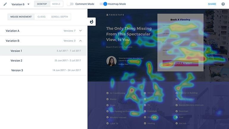
Click map

Scroll map

Follow these steps to create a heat map in the Instapage platform:
To access heat maps, open your page in preview mode. You can do this from the page builder, by clicking on the Preview button in the top right corner:

If you don’t publish the page, you can also access its preview mode from the dashboard, just click ‘Preview page’:

Once in Preview mode, simply enable the heat map mode by clicking on the toggle:
![]()
And now you can see visitors’ behavior on your page:

Hovering your mouse over the fire icon in the top left corner will open the heat map menu from here you can switch between three tracking metrics.

1. Scroll Depth allows you to see how further down the page your visitors have scrolled:

2. Clicks show you which elements your visitors have clicked:

3. Mouse movement allows you to see where on your post-click landing page the visitors spend the most time:

Heat maps are used for analyzing the behavior of visitors on a web page. The data collected through heat maps allow you to gauge if visitors are facing any friction when interacting with your page elements. This information can be used to create A/B tests that are based on real user data instead of wild guesses.
You can use the Instapage Heatmap Visualizer tool to create heat maps on your post-click landing pages without signing up for and paying for an external tool. Create scroll maps, mouse movement maps, and click maps to understand how visitors act on your post-click landing page and optimize it for conversions.
See how our heat map visualizer can help you create high-converting post-click landing pages. Sign up for an Enterprise demo here.

See the Instapage Enterprise Plan in Action.
Demo includes AdMap™, Personalization, AMP,
Global Blocks, heatmaps & more.
