If you’re looking for examples of wonderfully executed Google Ad campaigns, you’ve come to the right place.
In this blog post, we’ll cover examples of Google Ad campaigns across different industries—including detailed breakdowns of what makes them successful.
Let’s jump right in.
What makes a great Google Ads campaign?
Every ad campaign consists of two distinct phases: The pre-click phase and the post-click phase.
- The pre-click phase: Everything your audience sees before clicking on an ad
- The post-click phase: The landing page experience users see after clicking on your ad
When creating ad campaigns, many digital marketers focus too narrowly on optimizing just the ads (the pre-click phase). A great Google Ads campaign will also build a compelling post-click experience—one that convinces customers to stay, learn, and eventually convert.
The difference between an average Google Ads campaign and a great one is that a great campaign focuses more on the post-click phase.
As you’ll see in the examples below, these companies optimize the post-click experience by building in conversion-boosting tactics, such as:
- Personalization: Ads and landing pages provide a tailored experience for each audience segment
- Message-matching: Ads and landing pages reinforce the same selling points
- Conversion-centered design: Post-click landing page design is aimed at achieving one specific goal
- Conversion-focused: Product landing pages are used in place of typical product pages
- Persuasive copy: Post-click pages feature benefit-oriented headlines and compelling CTAs
- 1:1 conversion ratio: Each landing page drives the user to only one CTA
- Readability: Page design has a clear visual hierarchy
By employing these tactics, advertisers can smoothly tie together the pre- and post-click phases, creating a seamless path to purchase. Optimizing the post-click experience will not only improve the customer journey but increase conversion rates, too.
Now that we know what it takes to create a successful advertising campaign, here’s a look at nine companies that are running can’t-miss Google Ads campaigns.
1. Endy
Endy is a Canadian DTC brand that sells mattresses in a box. The DTC mattress industry has taken off thanks to the success of Casper, which spawned dozens of major competitors. To stand out, Endy focuses on personalizing its pre- and post-click experiences for its Canadian audience.
Here’s Endy’s ad for a “mattress” search:
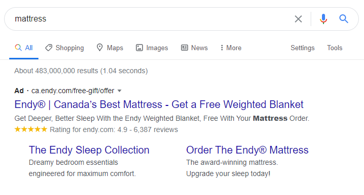
Endy’s ad is persuasive because it:
- Personalizes the message to its audience (“Canada’s Best Mattress”)
- Features a compelling offer (“Get a Free Weighted Blanket”)
- Demonstrates social proof (“6,387 Reviews”)
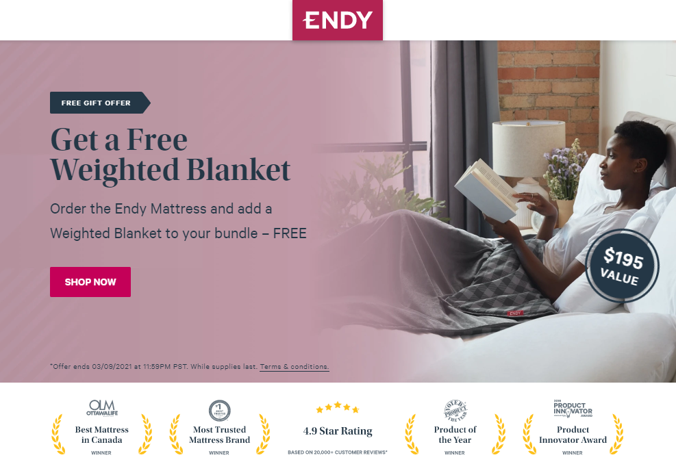
By clicking the ad, you arrive on this post-click landing page with the same weighted blanket offer:
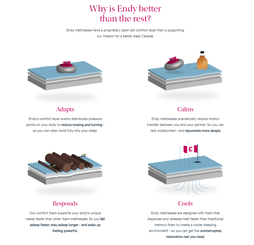
The landing page also features uniquely Canadian imagery like curling rocks and maple syrup to reinforce the “best in Canada” message to Endy’s Canadian audience:
The page also highlights features positive lots of testimonials from other Canadian shoppers:
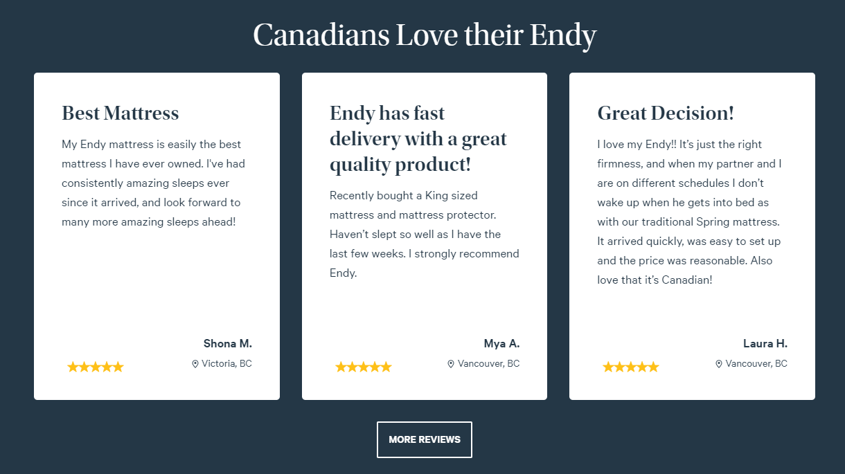
Here’s how their landing page stands out:
- It’s message-matched to the ad (“Get a Free Weighted Blanket”)
- It’s personalized to the audience (“Canadians Love Their Endy”)
- It’s using a landing page instead of a product page
- It presents a compelling, limited-time offer (“Add a Weighted Blanket to your bundle—FREE”)
2. Shopify
Shopify is an e-commerce platform for businesses of all sizes. They offer stand-alone online stores, integrations to turn existing websites into e-commerce sites, point-of-sale systems, and other services to help businesses sell their products anywhere.
Their wide range of products and clients requires that they segment their ads and audiences effectively.
Take a look at the ad that targets “create an online store” searches:
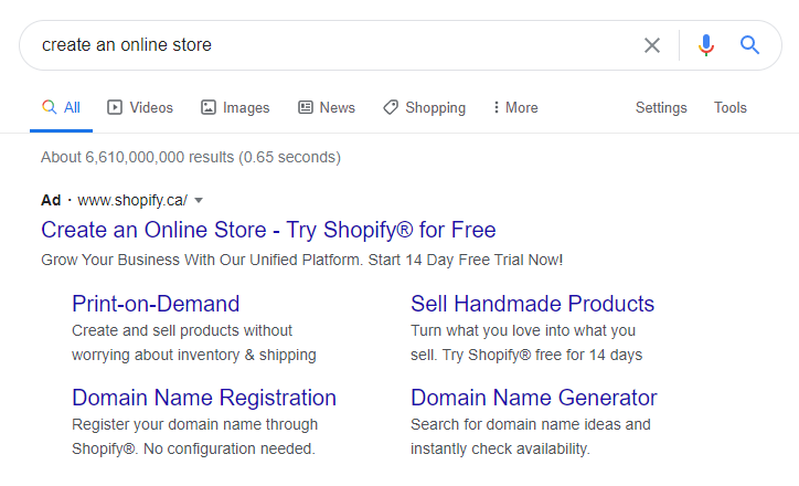
Clearly, this ad focuses on small businesses. The ad extensions highlight potential concerns of first-time e-commerce business owners, like how to register a domain, or how to sell handmade products online.
The post-click landing page has a singular message:
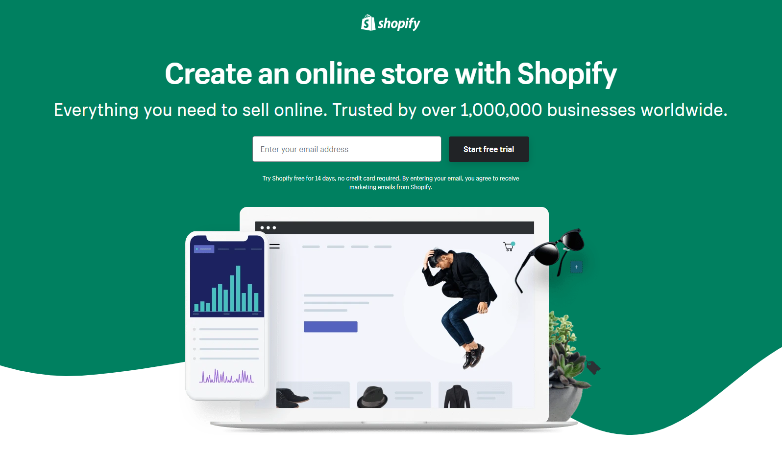
Shopify’s message is clear and to the point. “Create an online store with Shopify. Everything you need to sell online. Trusted by 1,000,000 businesses worldwide.” A single-field free trial form makes signups easy.
Contrast this with Shopify’s “ecommerce platform enterprise” ad:
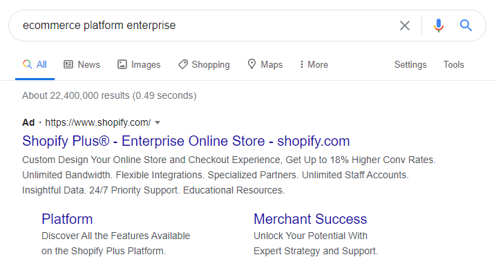
The ad copy addresses common concerns for more sophisticated or established businesses. Benefits like “up to 18% higher conversion rates” and “unlimited staff accounts” show these ads target large companies who are looking to grow their businesses.
Shopify’s enterprise landing page is completely different. The use of dark colors and minimal design and copy all convey a different message. The heading focuses on customization and conversion:
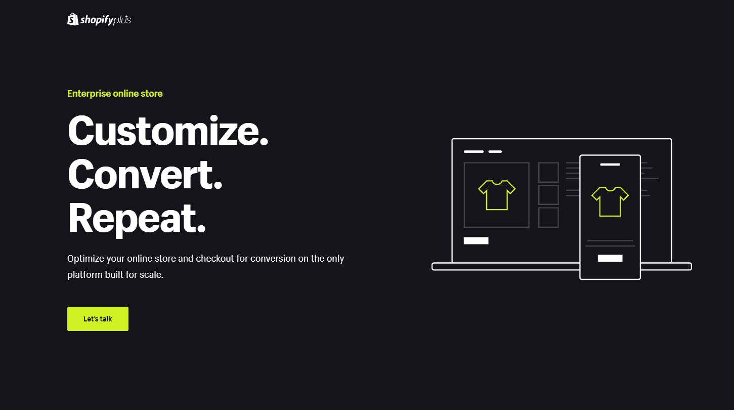
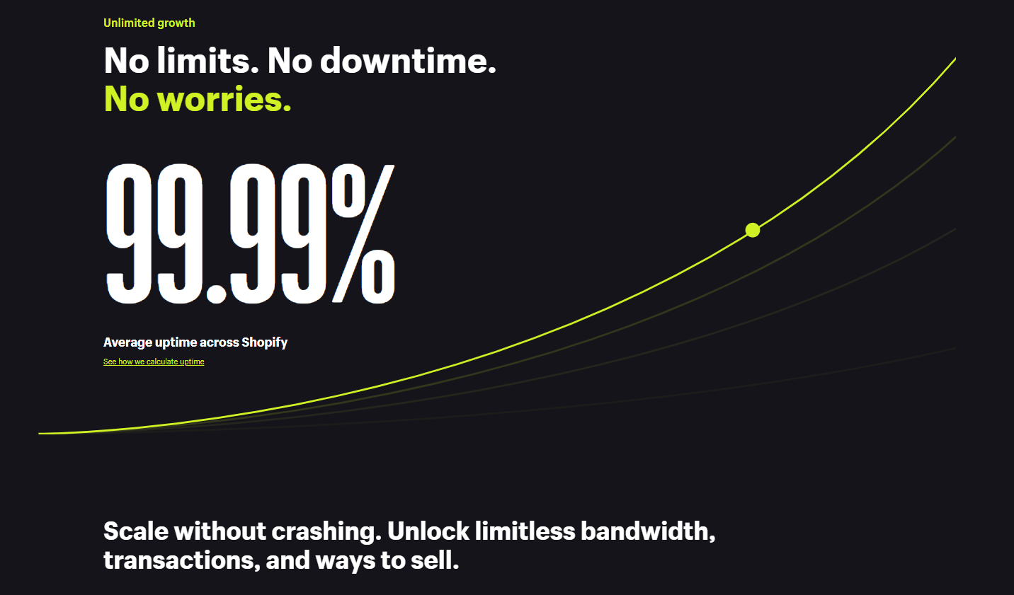
Later sections focus on compelling stats to reinforce the conversion messaging. They also reinforce the “unlimited bandwidth” messaging from the pre-click ad:
Ultimately, there’s a higher barrier to entry for enterprise customers, and Shopify has built this landing page to speak to a different audience than their simple “build a website” page.
Shopify does a lot of things right on their Google Ads campaign:
- The ads are segmented by audience
- The landing pages are personalized to each audience segment
- Message-matching is effective
3. Wealthsimple
Wealthsimple is a Canadian Fintech company targeted at millennials. As their name suggests, their messaging is focused on how easy it is to invest through their platform.
Here’s an example from Wealthsimple for a “best stock trading app” search:
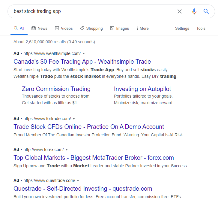
The ad is compelling for a few reasons:
- It targets a Canadian audience (“Canada’s $0 Fee Trading App”)
- The ad copy and ad extensions address two potential audience apprehensions: Commission and how involved they will need to be in investing
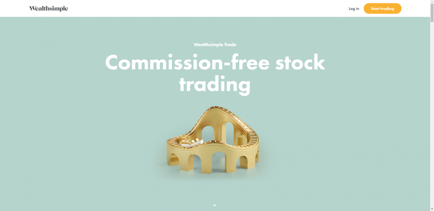
Wealthsimple’s post-click landing page header reinforces the “commission-free” messaging from the ad:
The page features simple, powerful visuals that reinforce the “easy investing” messaging:
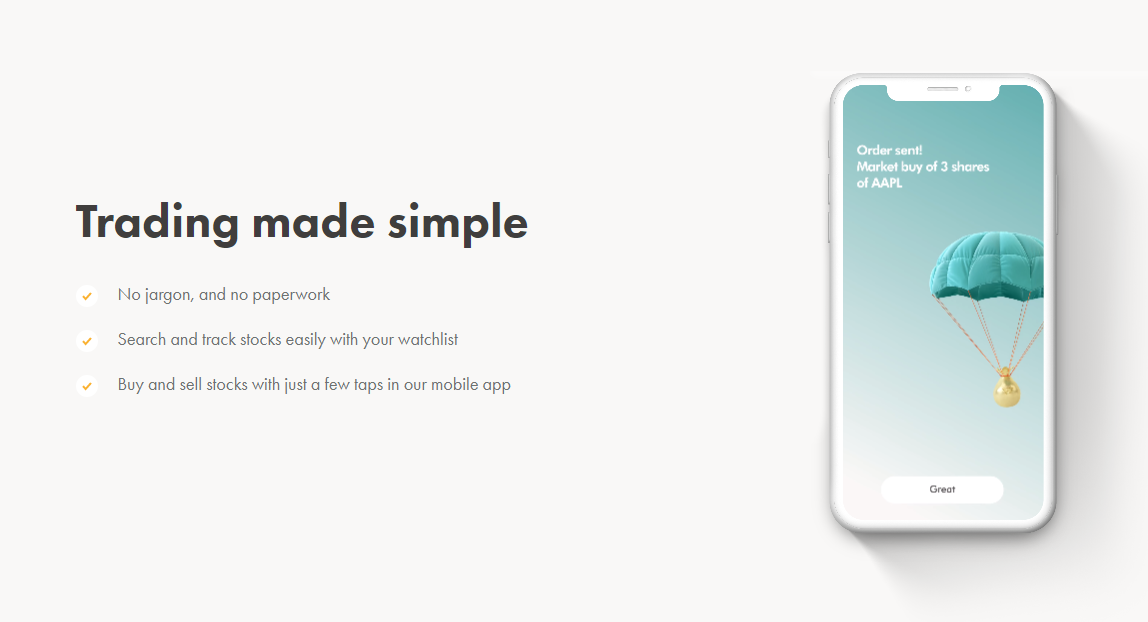
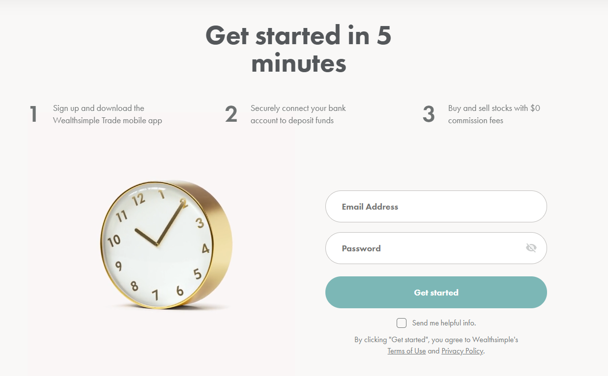
A single, compelling CTA further reinforces the message of simplicity:
Overall, this Google Ads campaign is exceptional because:
- There’s a clear value proposition: Invest on autopilot with $0 fees
- The value proposition is message-matched across the pre- and post-click phases
- Strong visuals are used intentionally to reinforce the messaging
- There’s a clear, single call to action
4. Docebo
Docebo is a SaaS learning management system (LMS). Companies use their products to create e-learning programs for their employees, partners, and customers.
Here’s a look at Docebo’s ad for the “learning management system” keyword search as well as a few competitor ads:
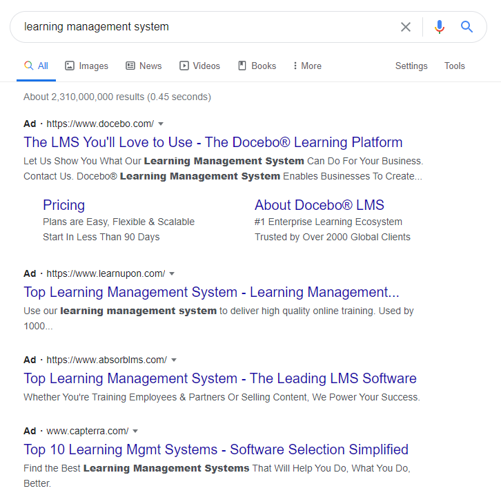
Docebo’s ad is compelling because of its emotional appeal. The headline, “The LMS You’ll Love to Use,” stands out from their competitors’ keyword-stuffed headlines.
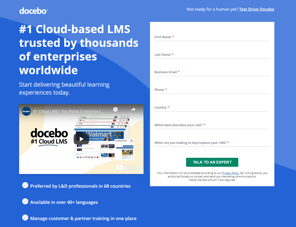
The ad takes users to this post-click landing page:
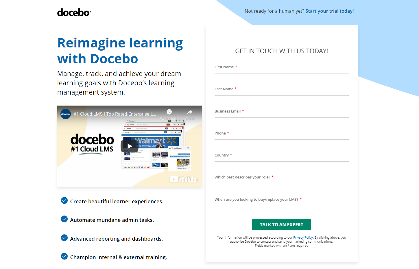
This landing page is entirely conversion-focused. The header features a clear value proposition, four product benefits, this promotional video, and a form to get in touch with an expert.
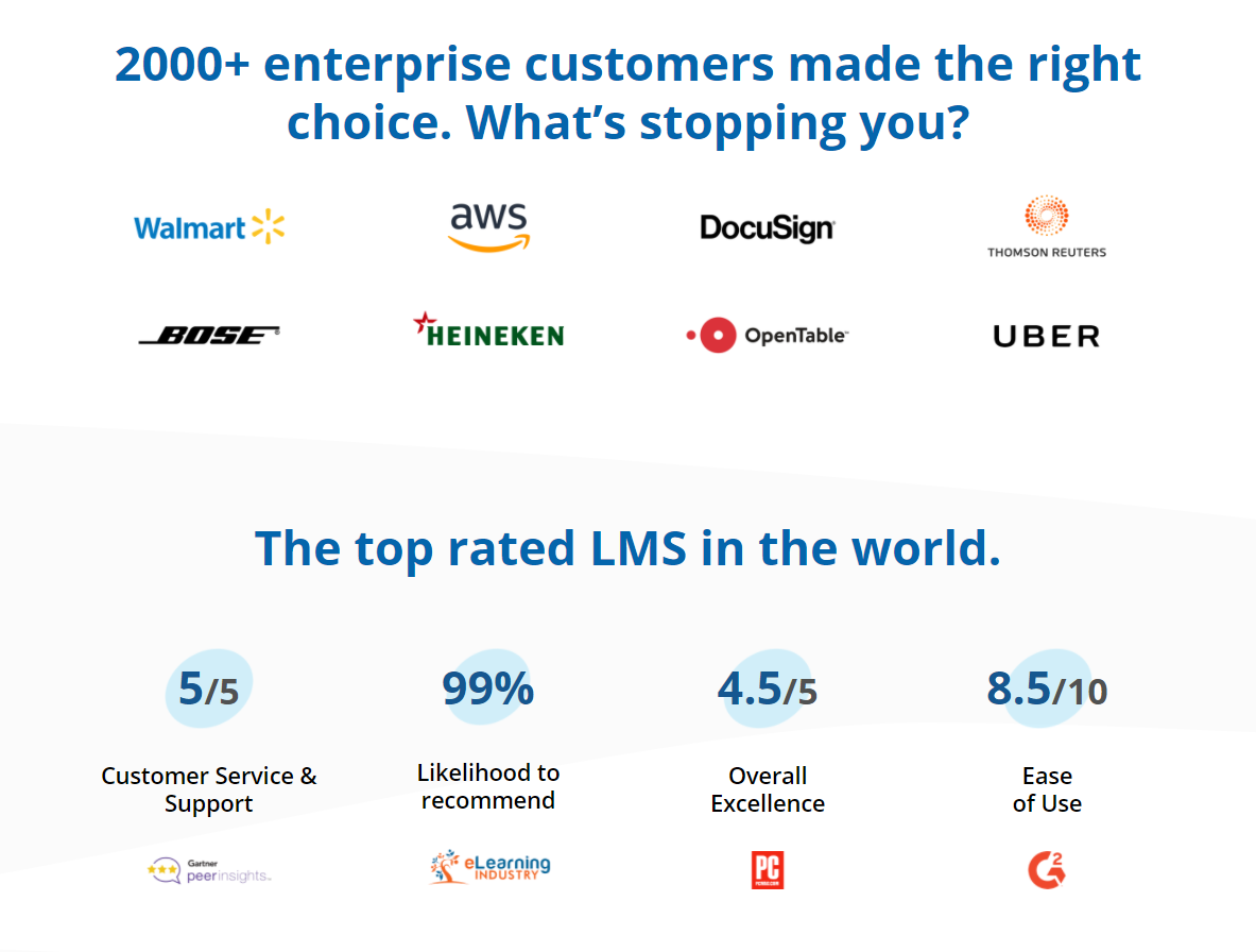
The landing page also features social proof elements including logos and product reviews from well-known brands that use Docebo:
Like Shopify, Docebo has an enterprise-focused landing page linked to ads for an “enterprise LMS software” search:
Overall, Docebo’s ad campaign is appealing because:
- The ad copy features emotional appeal (“The LMS you’ll love to use”)
- They segment their audience (enterprise vs. non-enterprise)
- Landing pages are personalized to each audience segment
- The landing page uses a 1:1 conversion ratio (one form, no external links)
- Video is effective and compelling
- Customers’ reviews offer powerful social proof
5. Upwork
Upwork is an American platform used by companies to hire freelance talent. As a talent platform, they have two target audiences: Businesses that need freelancers and freelancers who need work. Here we’re looking at their ads aimed at businesses.
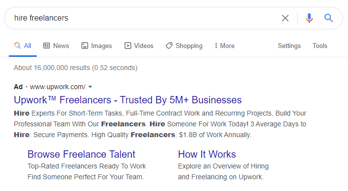
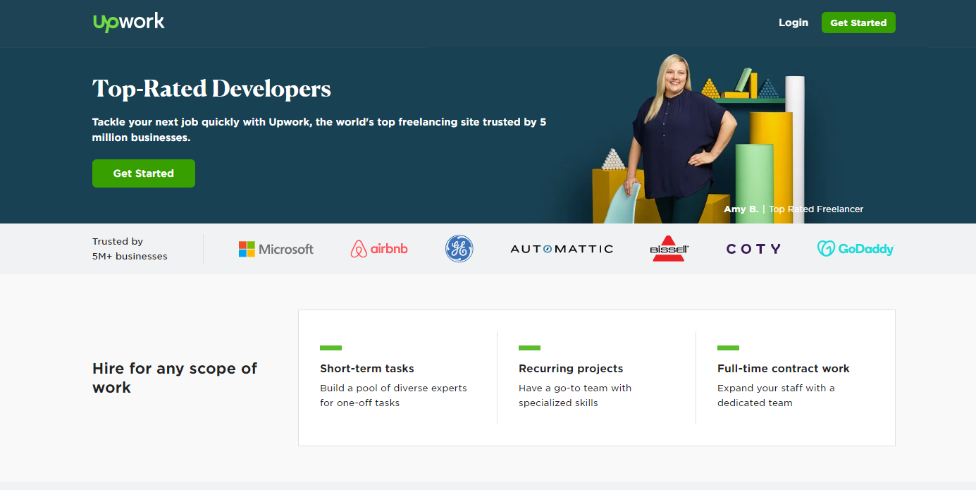
The search for “hire freelancers” brings up the following ad:
The ad is compelling for a few reasons:
- It’s highly relevant to the search, which helps with the Google Quality Score
- It builds trust (“Trusted by 5M+ Businesses”)
- It solves the searcher’s problem—fast (“3 Average Days to Hire”)
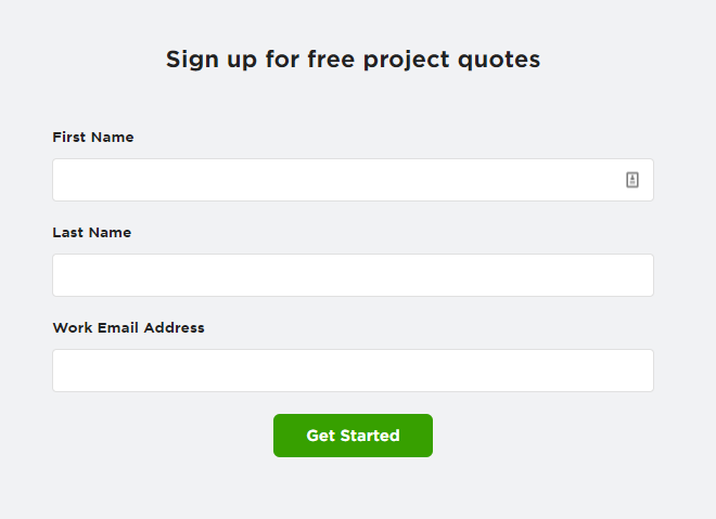
The ad takes users to this post-click landing page:
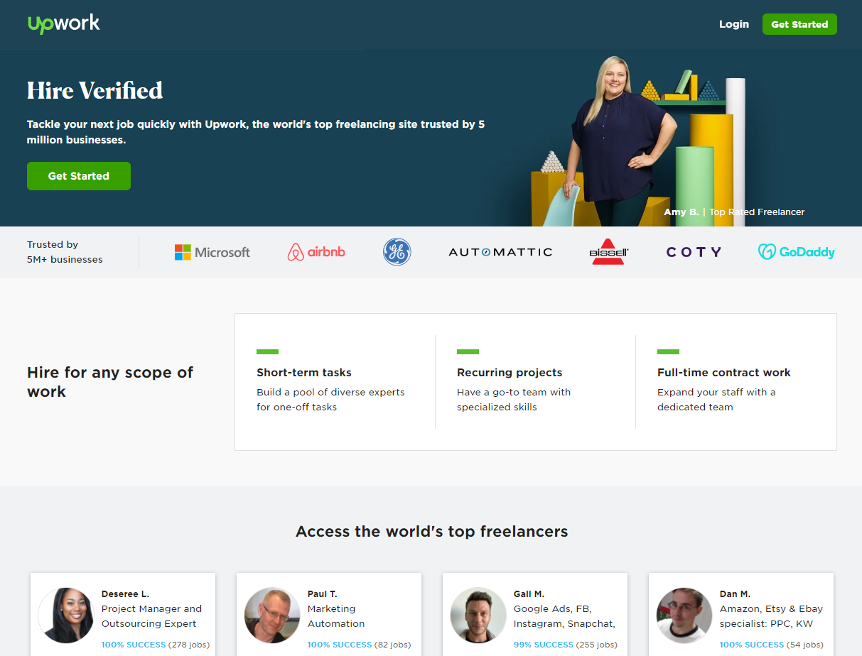
The page has a simple, yet compelling headline, “Hire Verified,” supported by a strong value proposition that message-matches the ad.
In addition to showcasing recognizable client logos, project types, available freelancers, and a testimonial from Microsoft, the page features this simple form at the bottom:
Upwork’s landing page for “hire top developers” is identical except for the page heading:
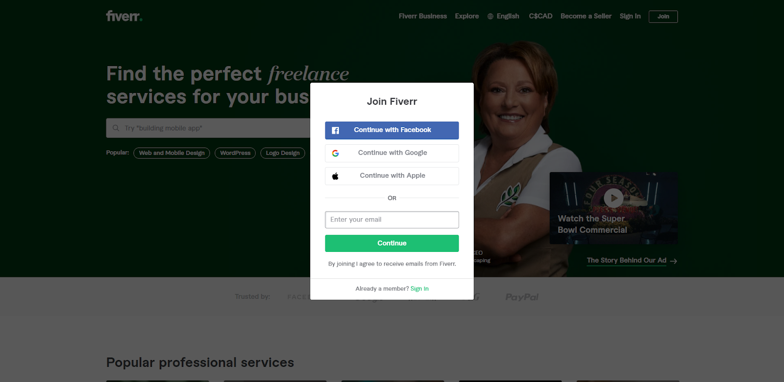
Contrast this with Fiverr, Upwork’s top competitor, which sends all their ad traffic directly to their homepage with an unappealing pop-up that requires visitors to join or sign in:
Upwork’s campaign is effective because they use:
- Message-matched ads and landing pages
- One landing page per keyword group
- Lots of social proof
- One compelling CTA with a short, simple form
6. MeUndies
MeUndies is a DTC underwear company. They offer monthly subscriptions and underwear “a la carte” with discounts for customers that subscribe to the service.
Searching for “underwear subscription” brings up this ad: 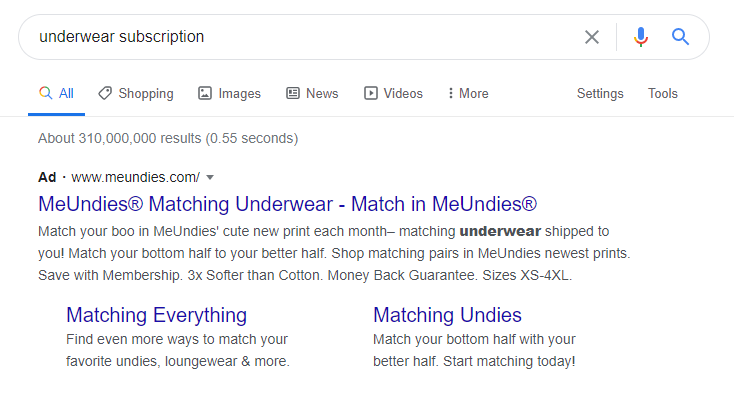
The ad copy is attention-grabbing and highlights a specific service: Matching options for couples. The ad is personalized, specifically targeting younger, fun-loving couples who would get a kick out of wearing matching underwear. It also mentions membership, which relates to the subscription part of the initial search.
The ad takes you to a post-click landing page with their MatchMe promotion:
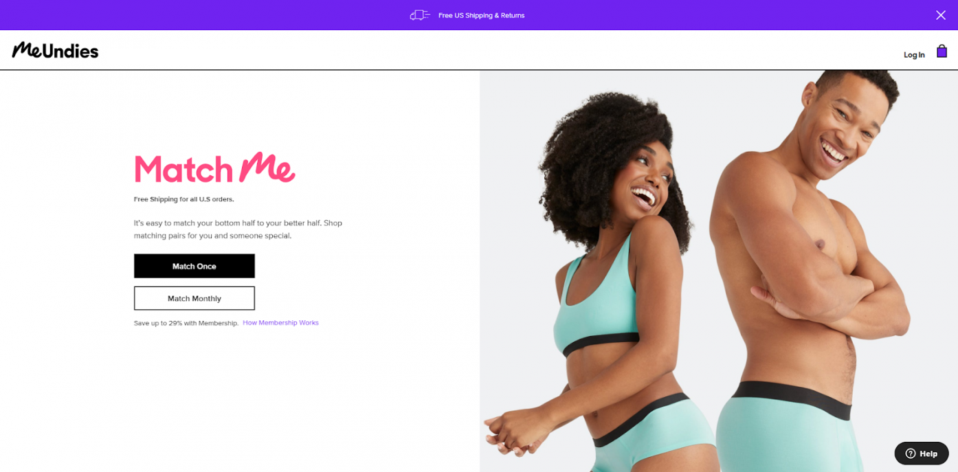
This page is a great example of conversion-centered design, as the section pictured above is the entire page. The visitor has two options: Match Once or Match Monthly.
Clicking one of the two buttons leads the visitor to a sequence where they can select underwear options for them and their partner:
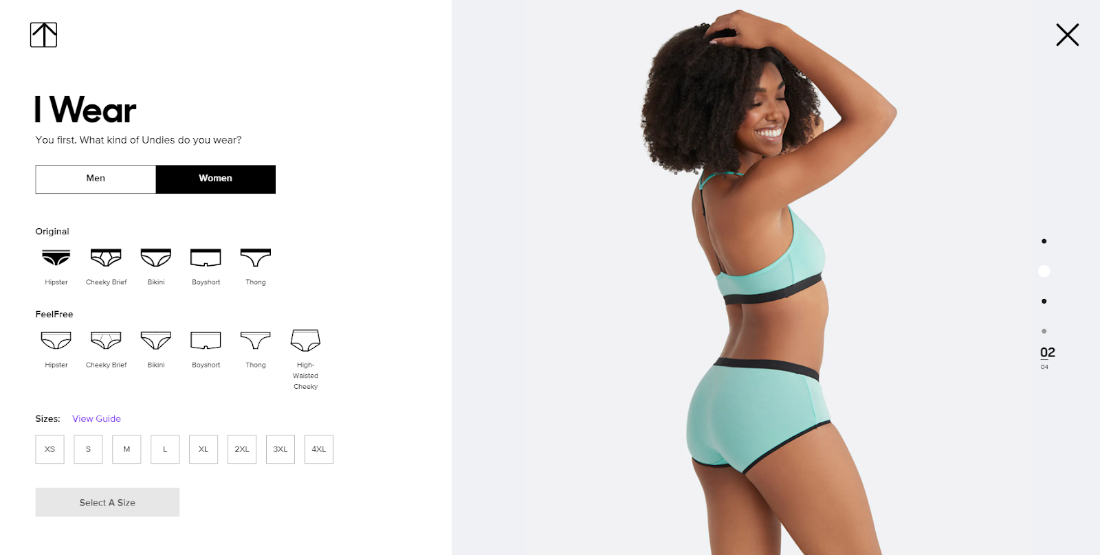
While the result is similar to a product page (the site visitor selects underwear sizes and styles), the journey feels much more personal and playful—which is a great way to boost conversions.
MeUndies’ ads are exemplary because:
- They target specific audiences: Couples, women, men, etc. with different ads and landing pages
- The “form” is simple and interactive
- The conversion-centered page focuses entirely on getting the visitor to click one of two buttons
7. Copper
Copper is a CRM that pitches itself as designed for G Suite. They’re another example of a company that understands segmenting audiences.
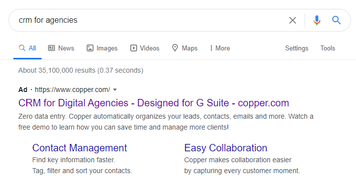
When searching for “CRM for agencies,” users see this ad from Copper:
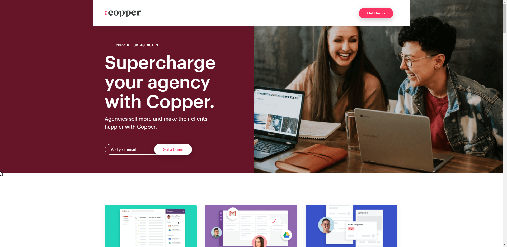
The corresponding post-click landing page is personalized to the agency audience:
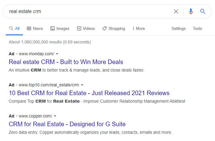
Contrast this with their “real estate CRM” ad and corresponding post-click landing page:
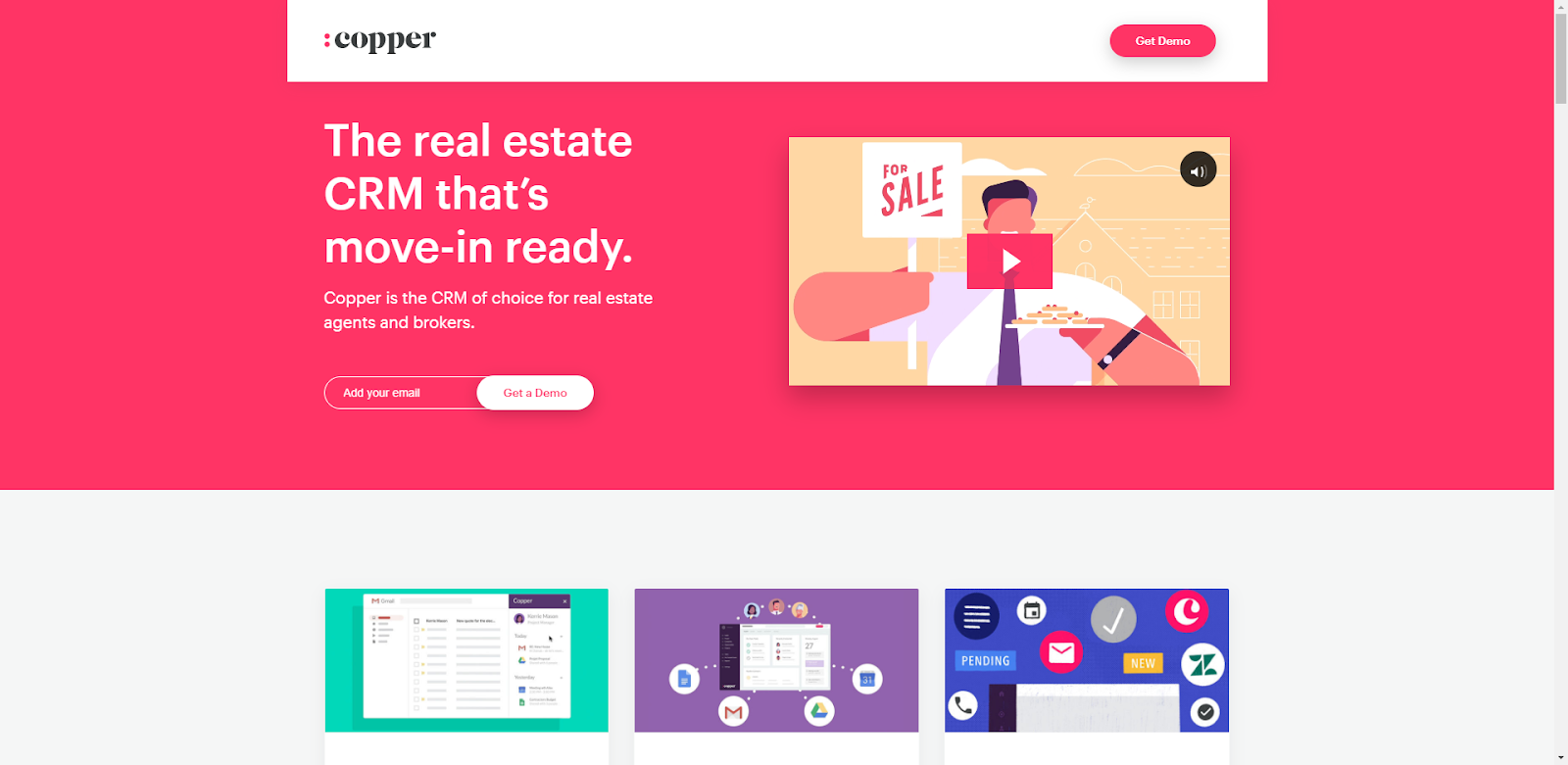
Copper’s ad campaign checks lots of boxes:
- Ads are segmented by customer persona
- The post-click landing page messaging is tailored to the customer segment
- There is a single “Get a Demo” CTA
- There are no distracting navigational links
8. Dollar Shave Club
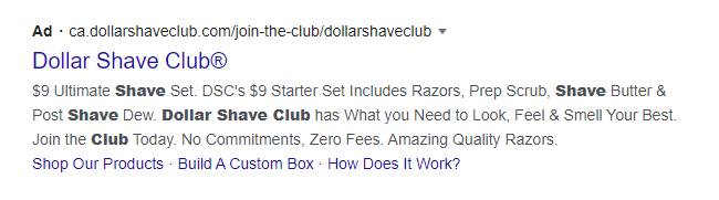
Dollar Shave Club is another DTC brand that offers a monthly subscription, this one for razors and other shaving products. While their website features a wide variety of products, their ads focus on directing customers to their $9 starter shave set:
The post-click landing page features a simple, message-matched pitch to try this $9 starter set:
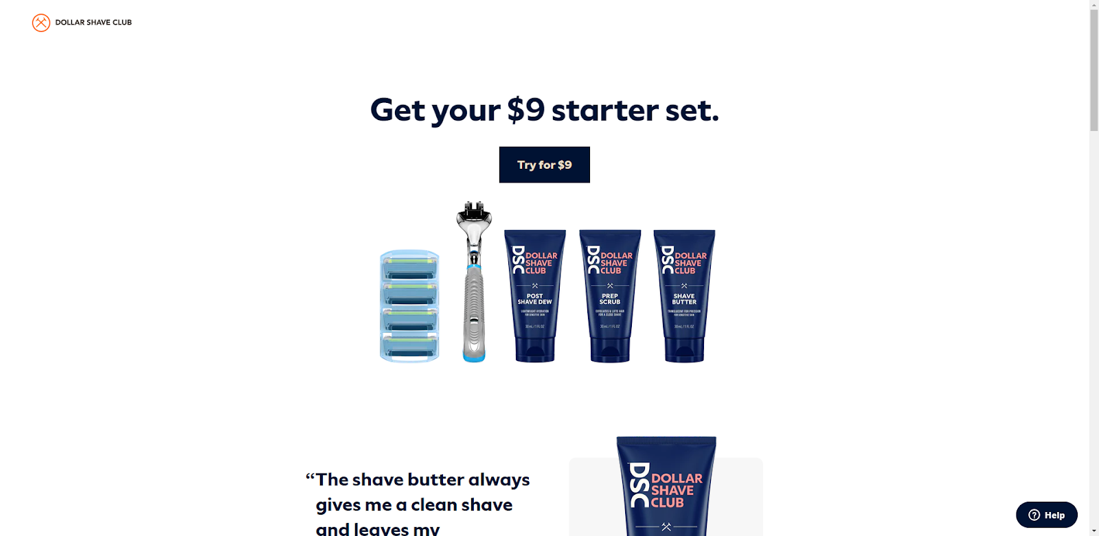
The heading tells visitors the set is $9. The CTA button tells them to “Try for $9.” When scrolling down the page, a CTA pops up on the navigation telling visitors to “Try for $9.” A CTA at the bottom of the page repeats the “Try for $9” message. It’s repetitive but consistent.
Dollar Shave Club’s ad and post-click landing page are effective because:
- The landing page uses conversion-focused design
- Message-matched ads and landing pages make the connection between pre- and post-click experience clear
- 1:1 conversion ratio with a consistent CTA and no external links
Everything from the pre-click ad to the post-click page aims to get users to try their $9 starter set, which is a low-friction way to hook long-term customers
9. Zendesk
Zendesk is a well-known customer support software platform. Their product has lots of use cases and therefore a wide range of customers.
Here’s an example of Zendesk’s ad for a “customer support software” search:
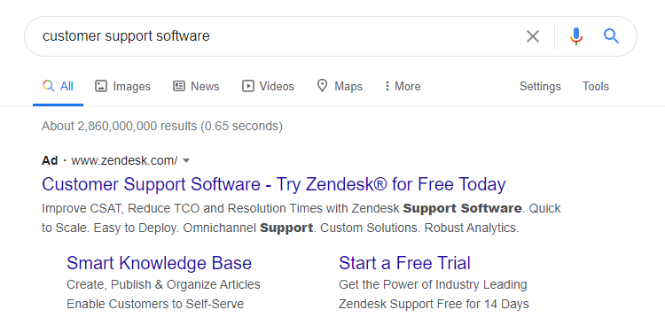
The ad and the post-click landing page highlight Zendesk’s free trial:
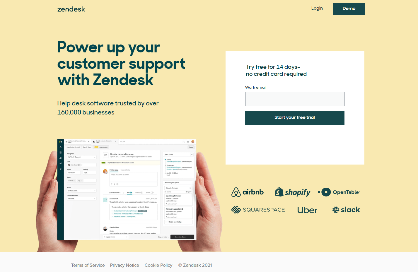
Similar to the Shopify landing page, the only thing visitors can do on this page is to sign up for a free trial. While this post-click landing page is short, it manages to pack in a clear value proposition, a compelling CTA, and social proof.
Interestingly, Zendesk sends ads for generic “Zendesk” searches to their homepage:
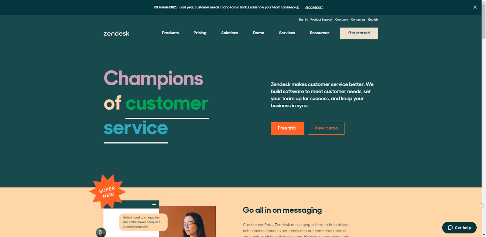
While it’s generally recommended to send ads to landing pages, it’s hard (or impossible) for Zendesk to know the intention or persona of each user that’s searching by their brand. Realistically, it’s a good problem to have. However, Zendesk counteracts this by formatting its home page like a landing page—driving visitors primarily to sign up for a free trial or to view a demo.
Overall, Zendesk’s ad campaign is effective because of the:
- Simple “free trial” CTA
- Segmented landing pages
- Clutter-free, conversion-focused design
Optimize your campaigns from start to finish
An effective Google Ads campaign requires personalized, segmented ads with thoughtful message-matching between the pre- and post-click phases. This means your landing pages must continue the narrative to be fully optimized. Instapage is here to help. We offer three different plans to take the stress out of building, optimizing, and converting—helping you to create better landing pages and see better results. Schedule an Instapage demo here.
