Do you think you behave rationally?
Well, think again.
Humans don’t think or act as rationally as we would like to believe. According to cognitive research, human actions are based on both nature and nurture motivations. Once we have enough information about how these two elements impact a particular audience segment, predicting user behavior becomes easy.
In other words, marketers who understand cognitive biases can influence user behavior.
Cognitive biases help you anticipate how visitors will behave on your landing pages. When you have this information, it’s much easier to create pages that will persuade visitors to click the call to action (CTA) button. But, before we delve into the specific biases you should be using on your pages, it’s essential to understand what cognitive biases are and how they work.
What are cognitive biases?
Although we may want to believe that we experience the world objectively, this is rarely true. Everyone sees things differently based on their preconceptions, past experiences, and environmental or social factors. The way we think or feel about something doesn’t always represent reality.
A cognitive bias is a systematic error in mental processing that causes humans to exercise poor judgment. It is a tendency to think in a certain way, often resulting in a deviation from rational, logical decision-making.
Although biases are studied mainly in psychology and behavioral economics, they’re present in all areas of life. Whenever we make decisions—large or small—cognitive biases inform those decisions.
When you leverage cognitive biases on landing pages, you can predict user behavior and increase landing page conversions. Here’s a list of common biases that affect user behavior and ways to use them to your advantage.
Confirmation bias
Confirmation bias is our ability to focus on new information that confirms our pre-existing beliefs and trivializes anything that might challenge those beliefs.
People acting with confirmation bias:
- Are unwilling to accept the validity of any evidence that goes against what they believe is true
- Place emphasis on “facts” that appeal to their underlying assumptions, to the exclusion of contradictory evidence
- Actively find information that proves they are right
- Have a selective and often incorrect recollection of events, facts, or statistics
How to use confirmation bias on your landing pages
Let’s begin with a hypothetical example. Imagine you’re trying to break into a new industry with a long-standing brand that is trusted and liked by users. You know your solution is better. So, how do you get users to ditch their confirmation bias for the bigger brand and give your better solution a chance?
By showcasing testimonials from past customers who were skeptical at first—and now prefer your solution. Social proof helps you build trust with your prospects and gives users a reason to click the CTA button.
Rex Homes is an online real estate service that is changing the way people buy and sell homes. The brand features social proof on their landing page that explains just how much better the service is compared to a traditional real estate agent, which has historically been the first choice for most users.
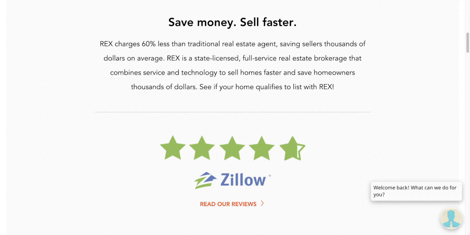
To overcome your user’s confirmation bias, frame your copy in the voice of the customer, so they can relate to it. This will help them logically consider your brand and persuade them to give your solution a chance.
Offering a free trial or money-back guarantee is another great tactic to help users let go of their confirmation bias and try your solution.
The principle of least effort
The principle of least effort states that people will choose a path or take an action that requires the least amount of energy and effort. For example, if you have two paths that would get you from point A to point B, you are likely to choose the shorter path—if they are equally safe and comfortable.
How to use the principle of least effort on your landing pages
Ensure that your pages are free from clutter and have a clear conversion goal. Visual clutter is likely to instill frustration and confusion in your visitors, leading them to abandon the page before they click the CTA button.
Make clicking the CTA button seamless for your visitors by ensuring they clearly understand the value of converting. There should be only one conversion goal, so visitors understand exactly what they need to do when they arrive at your post-click landing page.
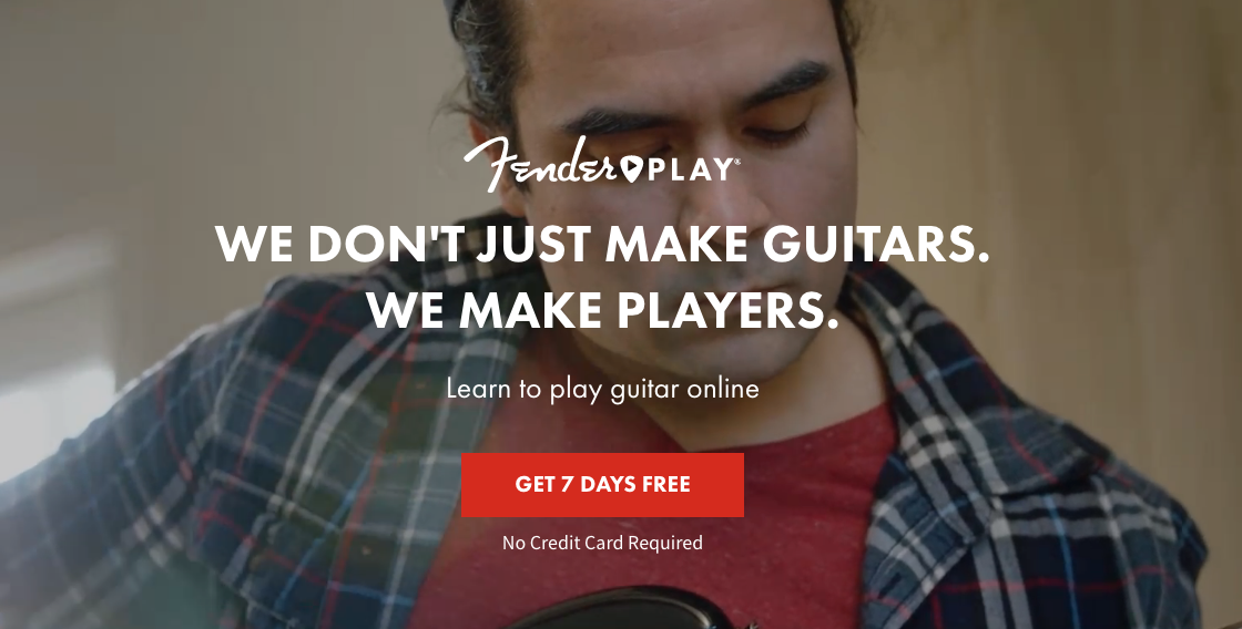
Fender Play is a guitar lesson subscription service powered by the world’s leading guitar manufacturer. Their landing page is clutter-free and clearly explains the offer. When users click the “Get 7 Days Free” CTA button, it’s clear they’re getting free guitar lessons for a week without inputting their credit card information—which would introduce additional friction.
The Von Restroff effect
The Von Restroff effect, also called the isolation effect, dictates that we notice and remember items that stand out from their background.
Which of these bottles are you more likely to remember?

How to use the isolation effect on your landing pages
Use color contrast and white space to draw attention to the most important page elements, such as your CTA button.
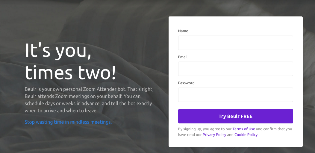
The Beulr landing page features a bright purple CTA on a white background with an overall gray page to draw visitors’ attention to the conversion.
Hick’s Law
According to Hick’s Law, the time it takes for a person to make a decision depends on the choices available to them. If the number of choices increases, the time to make a decision increases logarithmically.
So, the more options you give a user the longer they will take to decide what to do because the second choice will increase their cognitive load significantly. Moreover, providing too many options at once can stifle user experience by adding an unnecessary level of complexity to your offer.
How to use Hick’s law on your landing pages
Make sure the conversion ratio on your landing page is always 1:1, meaning, there is only one place to click and it relates directly to your conversion goal. This requires eliminating secondary CTA buttons that can distract visitors from the conversion goal as well as off-page navigation links that do the same.
For example, the Instacart landing page seems perfectly optimized when a user first arrives on it. There’s no clutter, one CTA button, a log-in button for already registered users, and a clearly defined offer.
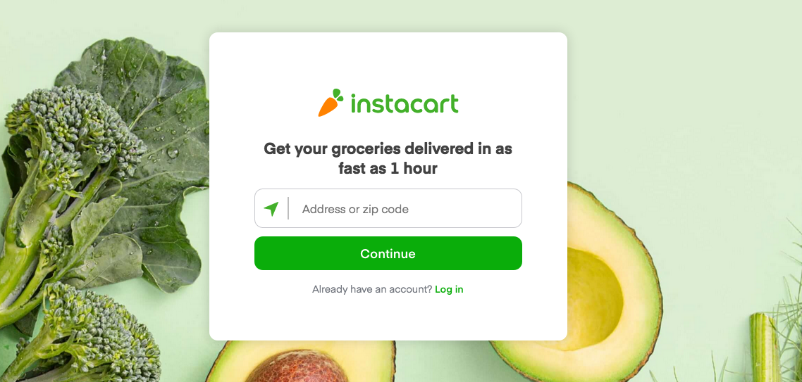
However, as the user travels down the page, this is what they see:
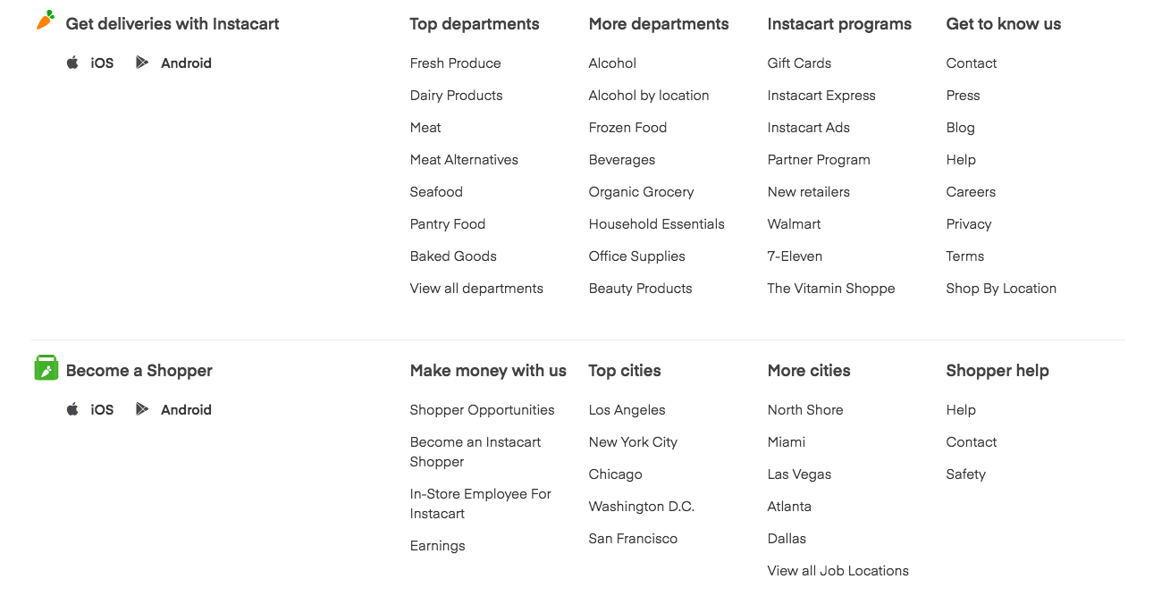
Off-page navigation links distract visitors from the page’s primary conversion goal and give them multiple escape routes. And once a visitor leaves your landing page, you can’t guarantee they’ll come back.
To make sure you get that CTA button click, design your page around one conversion goal and see to it that nothing gets in the way of completing that goal.
Start leveraging cognitive biases on your landing pages
Landing page design has its roots in cognitive and behavioral psychology. Understanding how users behave on your page helps you create a design that brings in advertising conversions.
Utilize cognitive biases to craft landing pages that engage and convert users. Start tapping into the power of human psychology and create pages that get you higher conversions and ROAS.
If you don’t know where to start, begin with Instapage, a platform that empowers you to scale your landing page production faster than ever.
Interested in trying us out? See all Instapage plans here and get access to 100% customizable landing page templates, Instablocks™, and so much more.
