Your CTA button ultimately helps determine the fate of your post-click landing page.
That’s because visitors who don’t click, don’t convert.
The call to action is the main point of action on your page (it’s in the name for goodness sakes). It’s the CTA button your visitors click to download your free ebook, request to see a free demo of your product, or start a free trial of your service.
Without an effective CTA button, your post-click landing page gets no visitor love because no amount of compelling copy or enticing images could save your post-click landing page if your call to action fails to impress.
When created effectively, a CTA button has the power to:
- Direct visitors’ attention to the right spot
- Get them to take your desired action
- Improve overall conversion rates
So, with that said…
What makes an effective CTA button?
There are certain criteria involved to judge all post-click landing page elements.
Headlines are conversion worthy when they are clear and include your product or service’s unique value proposition. Images, on the other hand, must be relevant and enticing to make an impact.
An effective CTA button is essentially judged on the following four factors:
Color
Your button needs to be designed in an eye-catching color, something that contrasts with the rest of your page so you can direct your visitors’ attention toward the button.
Size
The button should be sized appropriately. If it’s too small, your visitors may not notice it, and if it’s too big it may ruin the overall aesthetics of the page.
Position
You need to place your button in the right spot to make an impact on your visitors. The “fold” concept is outdated so forget everything you know about the page fold. Your button should always be positioned after you have clearly explained your offer.
Copy
The call to action copy needs to be action oriented and personalized. The words you put on your button need to minimize post-click landing page friction and initiate action.
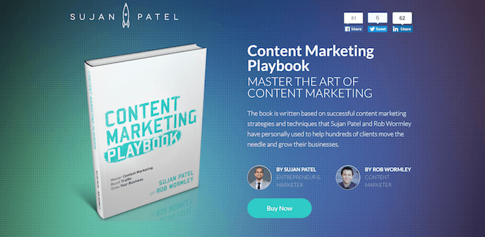
Most marketers have embraced the size and contrast aspect of the call to action button. Most of them are even successful with positioning. But, a majority of marketers are still creating buttons with copy like this:

The button copy is uninspiring, it’s not individual to this particular post-click landing page — there’s nothing personalized about it. In fact, these call to action words could work on any ebook post-click landing page, which makes the CTA button ordinary, rather than making it one of a kind.
The key to writing effective button copy lies in never using these two kinds of words:
- Words that cause friction
- Words that are not individual to your page
Don’t use words that cause friction
Words that cause friction are certainly not welcome on your CTA button. Avoid using words that suggest your visitors have to give something up to get something — whether that’s their time, money, or energy.
Words like “Submit,” “Buy,” “Sign Up,” and “Download” are high friction words when used by themselves. These words imply that the visitor has to perform chores, and who likes doing chores? Nobody I know.
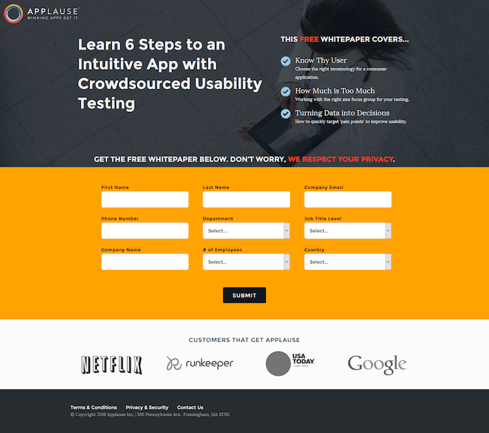
Look at Applause’s call to action button copy as an example:

It’s not just the form that’s intimidating, but the button copy “Submit” implies that you’re giving up something important. Just like a losing MMA fighter submits to the winner by tapping out, the service wants you to submit your information to them and walk away.
Although, as marketers, in a way your post-click landing page acts as your “submission” move. Your headline and image draw your visitor in, your copy convinces them, and your form and CTA button are your finishing move where they say “Okay, you got me, here’s my email address.”
If you want to intimidate your visitors, then by all means keep using generic words that cause friction on your post-click landing page.
If you don’t want to scare visitors away, start using call to action words that compliment your page by adding a personalized touch.
This brings us to our next point.
Don’t use words that are not personalized
What’s the first thing you do when you write your post-click landing page headline?
Make it all about your offer, right? What about the images, the copy, the testimonials? Same answer? That’s what I thought.
So, why wouldn’t you take the same approach with your call to action words?
Instead of your ebook CTA button saying “Download,” why not make it personal to your visitor?
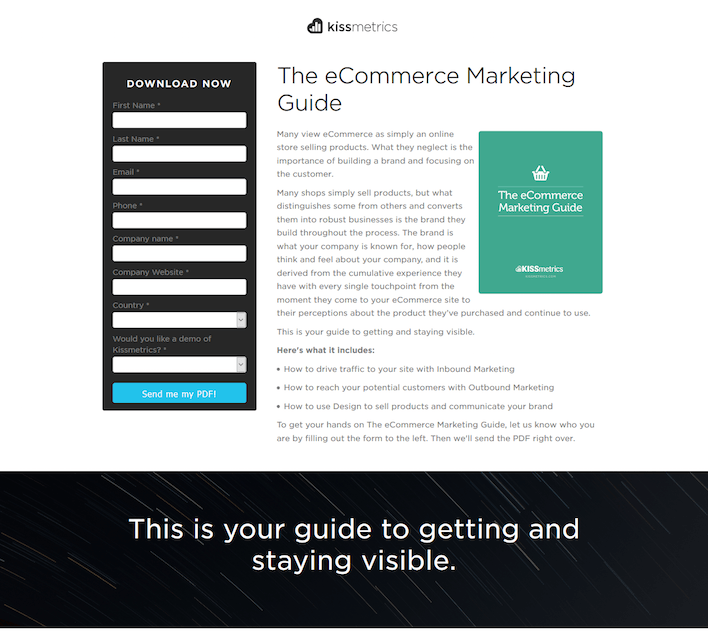
That’s what Kissmetrics does with their CTA copy, “Send me my PDF” for their eCommerce Marketing Guide:

When iMPACT personalized their CTA button copy, they saw a 78.5% increase in conversions after only one month of A/B testing.
This was the original CTA button, “Free Download:”

This was the variation with more personalized copy:

Personalized CTA button copy does wonders for your page because the copy is individual to that page only. The button copy should mean something even if you look at it individually.
The variation button copy for the iMPACT post-click landing page is a meaningful phrase. Even if you read the call to action words out of the context of the post-click landing page, “show me how to attract more customers” is relevant to the service and it convinces me to click.
This was not true for the original CTA button copy which simply stated, “Free Download.”
Look at this Instapage CTA button copy as another example:

The phrase “Build My Page Now” is relevant to the offer and it reinforces the idea of publishing a lead generating page — as promised by the headline.
Personalized button copy that uses the words “I,” “me,” or “my” convert well because visitors like being talked to on post-click landing pages.
Put yourself in your visitor’s shoes
Your button copy isn’t something you should write as an afterthought. Don’t just focus on the size and color of your CTA buttons, craft button copy that flows smoothly and talks to your customers on a personal level.
Sign up for an Instapage Enterprise demo today.

See the Instapage Enterprise Plan in Action.
Demo includes AdMap™, Personalization, AMP,
Global Blocks, heatmaps & more.
