Here on the Instapage blog, we do the best we can to give you tips on how to make your post-click landing pages as persuasive as possible.
We suggest you include eye-catching images of people actually using your product or service. We say “include testimonials,” because those have the potential to increase user trust. We recommend you leverage social proof to showcase just how popular you really are. And we even tell you to add a badge or two to your page to boost perceived authority.
Now, these are all great suggestions. The more of them you take, the more persuasive your post-click landing page is likely to be.
which
But, truth be told. You could do without them.
There are plenty of pages that convert prospects without using testimonials. Here’s an example from Join.Me.
And this one from ServiceMax doesn’t have any images whatsoever.
But there’s something that all of these pages have in common — something that if they didn’t have, they would never convert even a single person.
Do you know what it is?
(Cue Jeopardy theme song)
What is a call-to-action button, Alex!?
Correct!
They all have a call-to-action button. It’s the only element a post-click landing page cannot exist without. No CTA button means no way to convert. And if you’re not taking the time to create an effective one (e.g. using a generic CTA like “Submit”), you might as well throw in the towel right now.
Today we’re going to show you how to take your call-to-action buttons from pathetic to press-worthy.
1. Write your CTA button in first person
This tip has to do with altering something called “possessive determiners” on your buttons. You may not recognize by name, but you will as soon as I show you them in action.
In English, there are seven different possessive determiners: my, your, his, her, its, our, and their.
In copywriting, we’re taught that the most powerful word you can include in your writing is “you,” because of its ability to make the reader feel as though their being spoken to directly. So, many times we use its possessive form on our call-to-action buttons, like this one from Earnest.
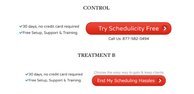
The team over at copyblogger tested CTA button copy using different possessive determiners:

Treatment B, which is in the first person, generated a lift of 24 percent with 98 percent confidence. Of course, Treatment B also eliminated the phone number (without negative impact on the business) and introduced more benefits-focused language.”
Writing this way helps your prospect visualize the action they’re about to take. So when you’re writing copy for your post-click landing page, address your reader as “you,” but in your button copy, give them a gentle nudge toward conversion by using “me” or “my” instead.
2. Find the perfect color
Ahh, the never-ending debate: which color produces the highest conversion rate?
Let’s look at red and green, two of the most popular colors for CTA buttons.
If you ask Hubspot, they’ll tell you red beats green. But if you call up the people at Heinz, they’re likely to say that green trumps red.
So what’s the truth?
The truth is there is no one “best” color for buttons. Ott Niggulis put together a really entertaining post about the whole debate. Ultimately, here’s what you should take from it:
“Color usage does matter, sometimes a lot. But saying that one color converts better than another is simply stupid. There is no universal best color. What works on one site, doesn’t necessarily work on another.
Visual hierarchy matters and making your call to actions stand out matters. So “green vs red” is not so much about the color, but “does the important stuff stand out enough” and if not, how can we improve the situation.”
We’ve talked before about how color psychology can help lift conversions. And as Moz points out, it can do so by a very hefty margin.
But when deciding on a button color, think less about getting inside your user’s heads using color psychology mind tricks, and more about making your button stand out so they know exactly where they need to click to convert.
Take this Salesforce page for example. The logo is blue, the links are blue, the entire right sidebar is blue, so if you were designing this page, what’s the one color you wouldn’t use for your CTA button?

Right, blue.
Yet there they are, in the blue right sidebar next to the blue icons of a clipboard and a book. And it took me forever to find them.
I looked around the left side of the page, then scanned bottom, but it wasn’t until I carefully stared at the right sidebar before I realized that those slightly-darker-blue rectangles were supposed to be call-to-action buttons.
That should never happen.
Upon arrival, you should always be able to find the CTA button immediately (if it’s above the fold, that is).
Here’s a good example from Smartsheet:

There’s absolutely no question about where I need to click on this page to try Smartsheet’s software. And there should be no question where I need to click on your site to convert, either.
If your page’s color scheme is blue and white, don’t color your button blue (not even a different shade of it). If your page’s color scheme is purple and green, opt for something like red or yellow to make it stand out.
There’s no universal “best” button color. The only way to figure out which is best for you is to test.
3. Make your copy results oriented
In college I was taught by our department’s career counselor to make my résumé “results oriented.” I had never heard of such a thing.
She said, “Your résumé focuses too much on the tasks that you performed, and not enough on the results of those tasks.”
For example, if I’m a conversion rate optimizer, instead of saying something like “I optimize client post-click landing pages,” I would say “I optimize client post-click landing pages, routinely boosting conversions by 7%.”
If I’m a clerk who was tasked with creating a new method for filing client contracts, instead of saying “Developed new filing method,” I would say “Developed new filing method that saved the company $5,000 a year.”
And if I’m a CTA button that’s trying to convince people to download an ebook on post-click landing page conversion optimization, I’m not going to say “Download ebook.” I’m going to say “Show me how to skyrocket conversions” or “Teach me how to boost my conversion rate.”
Don’t focus on what the prospect has to do to claim your offer, focus on what they’re going to get out of it when they do.
CTAs that begin with “Buy”, “Order”, “Click”, “Sign-up”, etc. inherently focus on what you have to part with. Coming up with alternatives that start with, “Get” helps you focus on answering the prospects’ number one question, “What’s in it for me?”
4. Leverage powerful words
As humans are greedy, we’re lazy, and we’re cheap. The sooner you understand that, the better buttons you’ll create.
We want to be richer, better looking, and in shape — we want to be so now, and we want the solution to be free.
It’s important to keep this in mind when writing CTA button copy.
Appeal to laziness:
- Emphasize words that convey a quick result. Use ones like: now, today, quickly, swiftly, easily, simply, effortlessly
- Example: “End my struggle with weight loss now!”
Appeal to greed:
- What will pressing this CTA button help your prospect become? Use words that convey an elevated status: wealthier, smarter, more handsome, more beautiful, happier, slimmer, stronger
- Example: “Send me the kit for a whiter smile!”
Appeal to frugality:Use words
- Use words like: free, affordable, at no cost, inexpensive, for the low price of, for just…
- Example: “Show me how to get fuller hair, at no cost.”
I use a book called “Phrases That Sell” to find powerful copywriting ideas when I get stuck, but for most, a simple thesaurus will do.
Whenever you’re tempted to use a boring, everyday word or phrase as a CTA like “Learn how to invest,” substitute it with a stronger action verb, and appeal to the three things we mentioned above. Soon “Learn how to invest” becomes a more powerful CTA like “Discover the secret to unlimited wealth.”
Which would you rather click?
5. Forget about “the fold”
You’ve got your whole button designed – compelling copy, a beautiful color, and you’re ready to place it on your post-click landing page…
But where?
Below the headline? Next to the form? Above the fold?
Too many people fear that if their CTA button isn’t immediately within view, it won’t get clicked. And that assumption couldn’t be more incorrect.
In fact, the MarketingExperiments team boosted conversions by 20% when they moved a CTA all the way to the bottom of these post-click landing pages. And many others have disproven this myth, too.
The reason, Neil Patel theorizes, is the amount of research that has gone into confirming the existence of “the fold” – the portion of a page that’s visible on the screen before you scroll down.
But research has shown that if your page is compelling enough, it doesn’t matter if your call-to-action is at the top of your page or at the very bottom. Users will find their way to it.
If your product or service is complicated, and it necessitates a longer, more comprehensive page, don’t stress about cutting down copy. If it’s well-written, they’ll read it. In the words of legendary advertiser Howard Luck Gossage:
“The real fact of the matter is that nobody reads ads. People read what interests them, and sometimes it’s an ad.”
(Or in this case, sometimes it’s a post-click landing page.)
6. Make the button look like an actual button
As the saying goes “if it looks like a duck, swims like a duck, and quacks like a duck, then it probably is a duck.”
But that’s not always the case when it comes to call-to-action buttons.
Sometimes images that look like buttons aren’t buttons. And sometimes designers use links, photos, and words with no borders in the place of buttons. Does that big black blob in the lower right-hand corner of this image look like a button to you?

Here are some tips to make sure your buttons always look the part:
- Use a border that surrounds the button so you don’t end up with a blob like in the photo above.
- Try creating a 3D effect that makes your button look like it’s jumping off the page, ready to be pressed.
- Shade the top and the edges of your buttons like this.
The fact of the matter is, if you want your prospect to click your button, they must first realize that it’s actually a button.
Build a CTA button that’s better-than-ever
Remember: without a properly designed button, your post-click landing page is doomed to fail.
Use these six tips to start creating better call to action buttons than ever before, and drop them on your post-click landing page in just minutes, sign up for an Instapage Enterprise demo today.

See the Instapage Enterprise Plan in Action.
Demo includes AdMap™, Personalization, AMP,
Global Blocks, heatmaps & more.
