What is Conversion Rate Optimization?
by Fahad Muhammad
When you increase the size of your post-click landing page call-to-action button to generate more conversions or set up specific conversion goals in your Google Analytics dashboard — you’re practicing conversion rate optimization to improve your marketing funnel.
Regardless of expertise level, a majority of marketers use some form of conversion rate optimization to improve their marketing campaigns as shown by this Econsultancy graph:

So, what is conversion rate optimization, (CRO)?
Let’s explain the concept by defining the two terms that make up conversion rate optimization, i.e. conversion rate and optimization.
What is a conversion rate?
Conversion rate can be defined as the percentage of people who visit a web page and click the call-to-action button and convert for that offer. A conversion can mean different things depending on the page goal such as a blog subscription, an ebook download, webinar registration, free trial sign-up, etc. For example, when a visitor registers for your webinar by clicking the call-to-action button on your webinar post-click landing page, your conversion rate increases.
What is optimization?
Optimization is the process of improving your marketing-funnel (or a specific part of your campaign such as your post-click landing page or a website page) so that visitors can easily understand the purpose of the campaign and convert on your offer.
All experienced marketers know the importance of creating an effective marketing funnel because the funnel helps engage, educate, and inform prospects about your product. If all the funnel stages have been tailored for prospects, transitioning them into dedicated customers becomes simpler.
This is what conversion rate optimization helps you achieve.
Conversion rate optimization is the continuous process of ensuring that the marketing funnel works successfully, in that it converts leads into customers with the help of different optimization processes. These processes include A/B testing, improving on-page experiences, usability tests, etc.
This guide will provide a detailed account of what conversion rate optimization is, the importance it holds in your marketing campaigns, and how you can enhance each component of your CRO strategy to yield the best results. At the end of the guide, you’ll also get a list of trending CRO techniques.
The importance of conversion rate optimization for marketing campaigns
Just having an online ad, a post-click landing page, or a website will not bring you more customers, even if you have a consistent stream of traffic coming to your page through a variety of methods.
So, what do you need for conversions?
For prospects to convert, not only do you need to have a marketing funnel in place, you need to optimize the funnel.
Conversion rate optimization involves using elements of visual design, UX, psychology, testing, copywriting, and customer behavior to convince visitors to act at different funnel stages — which moves them further down your marketing funnel.
CRO is important for marketing campaigns because it helps maximize results. To maximize results, testing plays a significant role. Specifically, A/B testing and usability tests help improve your campaigns and ensures that you only show the best ad or page that gets the most audience engagement.
When you optimize your online experiences for your target audience, you convert more visitors into leads, and leads into customers. Hence, CRO lowers your cost of customer acquisition and retention.
To see the power of CRO in action let’s analyze two web pages, one that’s optimized for visitors and one that is not.
This 1-800-Dentist post-click landing page is the first page we’ll showcase:

And now the homepage for Dr. Shoshany:

Both pages are related to the medical industry; both have a slider and information about the service. So which page is optimized?
The first one because it focuses on one goal.
Sure, both the pages have nearly the same elements but the arrangement and intention of these items are what makes one page conversion worthy and the other cringe worthy.
What’s the difference between the pages? The 1-800-Dentist page makes it easy for the visitor to go through the page to get to the conversion goal:
In contrast, on Dr. Shoshany’s page:
Optimization is the key to getting visitors to act, and conversion rate optimization ensures that your visitors click the call-to-action button — no matter where they are in the funnel.
How is conversion rate optimization different from post-click landing page optimization?
While post-click landing page optimization focuses on optimizing post-click landing pages for visitors and getting them to fulfill a specific conversion goal, conversion rate optimization deals with the optimization of the entire marketing funnel — from the awareness stage down to the decision stage.
The difference between LPO and CRO is the scope of both approaches. The goal of post-click landing page optimization is to generate maximum conversions whereas the goal of conversion rate optimization is to generate conversions on ads, post-click landing pages, and website pages — helping you retain customers for the long haul.
In essence, post-click landing page optimization is just one part of your CRO strategy.
Conversion rate optimization helps you get the best out of your marketing funnel. With the help of A/B testing, CRO tells you exactly which element (such as a headline or CTA copy) at each funnel stage generates the most engagement and which element needs to change for you to maximize conversions.
The next chapter will highlight the different stages of the marketing funnel, and later chapters demonstrate how CRO comes into play at each step.
Since conversion rate optimization mainly deals with optimizing every stage of the marketing funnel, it is important we discuss each funnel stage individually. The marketing funnel is divided into three parts or stages:
Each stage of the funnel carries a specific function; if one stage of the funnel is optimized, more prospects trickle down to the next stage, and this process continues. Contrary to what many marketers believe, the marketing funnel doesn’t end with a click of your post-click landing page call-to-action button. Instead, it continues down to the retention stage:

Top of the Funnel Strategies
The purpose of top of the funnel content is to engage your prospects and help them discover how your product is the optimal solution for the problem they’re experiencing. This is the funnel stage where you look for indirect customer acquisition and brand awareness (e.g. soft sell) — so the content used at this stage is primarily educational.
Top of the funnel is recommended for soft sell content, i.e. the marketing materials work to acquaint prospects with your product or service without asking for too much personal information in return.
Easy to read, snackable content comprises the top of the funnel, so create content in a format that your prospects will engage with, and promote all offers with dedicated post-click landing pages.
Top of the funnel marketing involves the following content formats:
The offers included in this part of the funnel are “free” so to speak but contain short-form lead capture forms on their respective post-click landing pages to redeem them.
Here’s an example of top of the funnel content Instapage uses to educate prospects about post-click landing pages and marketing trends:

The post-click landing page has a two-step opt-in form so that visitors aren’t intimidated by providing their information as soon as they come to the page. The opt-in form asks visitors to enter their name and email address in exchange for a guide on marketing trends.
Another example of top of the funnel content comes from Marketo in which they use a webinar to educate prospects and how they implement personalization via email, web, and mobile:

Remember, this stage of the funnel is about educating your audience and maximizing brand awareness. It’s not about convincing prospects to buy your product; that comes later in the funnel.
Middle of the Funnel Strategies
The goal at this stage of the funnel is direct customer acquisition because at this stage you’ve already engaged your leads with basic information about your brand — and now you need them to buy.
You should produce and promote content at this stage to align a buyer’s need with relevant products in your arsenal.
Some middle of the funnel content techniques are:
The content at this stage revolves around customer-relationship management through segmentation. When you segment your audience based on age, gender, geographical position, professional role, etc., you are better equipped to offer them targeted content that interests them. Hence, they move further down the funnel.
Here’s an example of a targeted email from Optimizely:

The email addresses the prospect by name and persuades them to join a webinar that will teach how to optimize customer experiences at every touchpoint. This is the webinar post-click landing page connected with the email:

The form on this post-click landing page is the appropriate length for the middle of the funnel offer. The page asks for the visitors’ company name, and because they’re already familiar with the company, the prospect isn’t hesitant to share more personal information with Optimizely.
In contrast, HubSpot uses an ebook on B2B vs. B2C Content Lessons to push leads further down their funnel. You will notice this ebook post-click landing page’s form is quite detailed and asks a lot more information from the visitor, such as how many employees, their role, and which CRM they currently use:

It’s also worth mentioning that retargeting prospects who have shown some interest in your offer at one time is also included in this stage of the funnel (retargeting strategies will be discussed at length later in chapter 7).
Bottom of the Funnel Strategies
This is the place marketers want all of their prospects to end up as soon as they enter the funnel, and it can be achieved if you’ve checked all of your optimization boxes up until now. The conversion phase of the funnel deals with transactions with customers, which means you need the most targeted and valuable offers at this stage.
Some offers created for the bottom of the funnel are:
The offers at the conversion stage are straightforward and full of value — designed to convince prospects to complete the funnel (i.e. purchase).
The Hatchbuck demo page is an example of a bottom of the funnel offer:

The offer persuades customers to sign up for a demo and learn more about how Hatchbuck helps them with their marketing.
The journey from prospect to lead to customer is complicated, but when you have a sound CRO strategy in place, the process becomes simpler.
With the help of conversion rate optimization, you’re able to design a marketing funnel that doesn’t have any conversion friction, and the prospect seamlessly transitions from one funnel stage to the next.
Here’s what a standard conversion funnel flow looks like:
Your ad, post-click landing page, and homepage are the most important pit stops in your customer’s’ journey. Optimizing them guarantees an increase in conversion rates and this is what CRO helps you achieve.
The next chapters of this guide are going to show you how you can optimize your ads, post-click landing pages, homepage, and increase your conversion rates.
There are essentially two types of ads:
b. Display ads: These ads are also known as banner ads and they appear as a prospect is browsing online — not searching for your product or service. These ads are prompted by search history and online behavior.
Let’s look at the optimization processes of both of these ads individually.
Optimizing Search Ads
This is what a typical Google search ad looks like:

These are text ads and include (from top to bottom) a headline, display URL, description, and ad extensions (The number and type of ad extensions can vary depending on which extensions the advertiser has activated in their paid search campaign.)
Since the ads have a length limitation, it’s important that your ad copy includes the relevant keywords (based on the user’s search query) and explains your service in a way that persuades them to click the ad. You can then optimize your Google paid search ads by adding a relevant description.
Another great way to optimize your ads is to apply extensions such as the location extension and review extension to share additional information about your business with the prospect.
Instapage uses a review extension on our Google paid search ad, by displaying a testimonial from TrustRadius

GrubHub uses uses callout extensions — the line about discovering new restaurants, 24/7 customer service, order delivery & pickup — which adds more benefit-oriented text to the ad:

Consistency and message match are essential characteristics of an optimized search ad because they create personalized advertising experiences for the search user. The more they see what they’re looking for from ad to post-click landing page, and the ad explains the service based on their search intent, the better chance you have at converting search users on your offer.
The La-Z-Boy recliner chair ad not only has the relevant keywords but also includes actionable copy that persuades prospects to click. ‘Shop La-Z-Boy today and save big,’ compels the prospect to click the ad:

In addition to Google paid search ads, you can increase your chances of ad clicks by using Bing search ads. As far as functionality goes, the Yahoo Bing ads work the same way as Google search ads.
Optimizing Display Ads
The main difference between a search ad and a display ad is that the former are displayed only in search results while the latter are shown on sites within the Google Display Network, such as Forbes and Wall Street Journal. Display ads also include an image and a CTA button.
This is what a typical display ad looks like:

The ad contains the brand’s name, an image, a headline, and a call-to-action button.
Relevancy is the key to creating an optimized display ad because the headline, image, copy, and CTA button must all complement each other to tell a single story. Content Writers does just that with their display ad:

Optimizing your ads gives you a better chance of catching your prospect’s attention when they see the ad, ensuring that your marketing journey starts the right way.
post-click landing pages are standalone web pages used to promote a single offer and fulfill one conversion goal. The conversion goal of your post-click landing page depends on the type of page you’re creating. For example, a lead generation page is created to collect leads whereas a webinar post-click landing page is created to get registrants to sign up for the webinar.
All your post-click landing pages should have a conversion ratio of 1:1, because post-click landing pages have one conversion goal, they should only have one clickable element — the CTA button.
Regardless of the conversion goal of your page, every post-click landing page typically has the following elements:
However, simply including these elements doesn’t guarantee conversions. For your post-click landing pages to be optimized, the page elements should perform the following functions:
Headline
The headline should clearly explain your service’s UVP, and ideally, it should let the visitor know how your service is going to solve the problem they’re facing. You can also include statistics in your headline, and get numerical proof to work in your favor.
Another type of post-click landing page headline that work are ‘question’ headlines. Craft your headline into a question that relates to the problem your visitors are having and then present your service as the solution to their problem.
The Relentless Movement post-click landing page headline explains the offer and initiates a sense of urgency:

Copy
The copy should highlight the product or service’s benefits and what makes it the best solution for the visitor’s problem. post-click landing page copy should also be displayed in a readable way, such as bullet points or numbered lists so visitors can quickly scan the information (instead of getting lost in large blocks of text).
Infusionsoft’s video post-click landing page copy is displayed with bullet points and focuses on the offer’s benefits:

CTA Button
The call-to-action button is the most important post-click landing page element because it is the place visitors have to click for a conversion to happen. CTA buttons should:
You can have more than one CTA button on a longer post-click landing page, as long as the buttons are focused on one goal.
The CTA buttons on the Fleetmatics page are contrasting and have personalized copy on them:

Lead Capture Form
The form fields should be labeled properly and arranged in a way that they are easy for visitors to fill out. Also, the form shouldn’t ask visitors for too much information. However, the amount of information marketers can request of prospects depends on the funnel stage of the post-click landing page’s offer. The lower the offer is in the marketing funnel, the more personal information can be requested.
Tracx’s lead capture form is straightforward and easy to fill out:

Customer Testimonials
Testimonials help provide social proof to your post-click landing page. Reviews from real customers are the most trustworthy and help persuade visitors to click on the CTA button, especially if they include the reviewer’s headshot, title, and company.
Outbrain makes the most of their post-click landing page customer testimonials, displaying them in a slider format, like this one:

Trust Indicators
Trust indicators help establish trust on your post-click landing page and lower conversion friction. Some common post-click landing page trust indicators are statistical evidence, customer badges, privacy policy links, and third-party seals.
For example, the Invoca post-click landing page displays some customer badges and has the TRUSTe seal beneath the form:

Remember, your prospects can arrive at your post-click landing page in a variety of ways (clicking a search ad, display ad, social media post, email link, etc.). And even though message matching plays a key role in getting them to convert, just because they arrived on your page does not mean they will convert on your offer. Your post-click landing page must include the optimized elements in this chapter to get your prospects to act on your conversion goal.
Your post-click landing page should focus on a single offer, but your homepage is more about the visitor’s browsing experience — providing all the information about your company. So even though the homepage is not optimized for a single offer, it’s still an important part of your marketing funnel.
An optimized homepage must have all of these core functions:
Similar to chapter 4, let’s look at some examples of company homepages and explain why each example is optimized.
Company Logo
Your company logo is the visual representation of your brand. The company logo should be placed in the top-left corner of every page on your website. When a visitor clicks the logo, they should immediately be brought back to your homepage. Regardless if you opt for a text or design logo, just remember to use something that’s meaningful to your brand.
Upwork uses a text logo that combines two different typographic styles:

Conversely, Twitter uses their signature design logo:

And, as you notice, no matter which page you happen to be on with Upwork and Twitter; their respective logos are located in the top left corner and, when clicked, direct users to the homepage.
Navigation
A homepage is essentially a map of all the other pages on your website. And since a homepage typically presents multiple offers and pages, the navigation menu should be designed so that visitors can easily find the page they’re looking for.
Most homepages use a traditional navigation header and footer like Quintly shows here:

Another way to implement your homepage navigation is with a hamburger menu, a series of three horizontal lines that open up the menu tab when you click it.
Visage uses a hamburger menu:

Another way to optimize your navigation is to add a floating navigation bar. This way visitors can always see the navigation menu and don’t need to scroll to the very top or bottom of the page.
Headline
Your homepage is the place for you to showcase all the services your brand offers. So, your homepage headline should be written in a way that encapsulates those services. You could also choose your UVP and showcase that through the headline.
Another way to phrase the headline is to include statistical evidence to convince visitors that they should sign-up for your service.
This is what Insightly does with their homepage headline:

CTA Buttons
Homepages can feature multiple CTA buttons. Similar to post-click landing page CTA buttons, homepage buttons should be contrasting and be written with persuasive copy.
The Disruptive Advertising homepage uses multiple CTA buttons for a variety of offers, including testing services, analytics services, and PPC services among others:

Images
Your homepage images should be relevant to your brand and the services you provide. The images should also be engaging enough to capture your visitor’s’ attention. One way to do this is to use alternate media formats such as gifs.
HubSpot’s homepage uses images and gifs (scroll down on the link to view the gifs) to help explain their services:

Trust Indicators
Trust indicators on homepages perform the same function they do on post-click landing pages i.e. they reduce conversion friction and put the visitor at ease.
VWO’s homepage uses brand logos, case studies, and customer testimonials:

Copy
Since homepages are generally busy promoting all your services, the copy should be formatted properly — written in short paragraphs or a bulleted list so that it’s easily readable. It should also be benefit-oriented, explain what benefits your service will provide visitors, and how it can help improve visitors’ lives instead of just focusing on the features.
The Weebly homepage copy is formatted so that visitors can scan it quickly and be persuaded to click the “Get Started” CTA button:

The homepage browsing experience is such an important touchpoint for potential customers that you can’t afford to leave its design to chance. Once you optimize your homepage with the critical elements listed above, you’ll have a better chance at engaging visitors and converting them into customers.
Just because your post-click landing page and homepage may be optimized for conversion does not mean that is the end of your visitor’s journey with your brand. To retain customers, it is paramount that you optimize the post-click landing page, too.
You do that by optimizing your thank you pages and thank you emails.
A thank you page is the page where customers should be directed as soon as they click the call-to-action button on your post-click landing page or homepage.
An optimized thank you page and email perform the following functions:
For example, when you download Instapage’s 25 Best Google Ads Tips:

This is the thank you page you’re redirected to:

The page confirms the download by showing the guide you’ve just downloaded. It also thanks you for completing the conversion goal and presents you with a CTA to visit the Instapage blog, where you have additional opportunities to interact with the brand.
This is the thank you email you receive, with your copy of the PDF download attached with it:

The thank you email also promotes the Instapage webinar and requests you to register for it so you can create better Google post-click landing pages. It also shares links to other Google Ads resources you might find helpful.
In contrast, this is what an unoptimized thank you page looks like:

The headline doesn’t bother thanking the attendee for signing up; it merely gives them a nod of condescending approval. The page informs the person that the webinar will not be recorded, so it’s highly encouraged to view the webinar live. That’s all well and good, but where is the thank you?
This is the thank you email accompanying the page:

It briefly thanks the person for registering and explains how the presentation is going to be helpful, it continues to repeat how great their first presentation was.
An optimized post-click marketing experience should also be focused on the prospect or customer, not just the offer.
To demonstrate another example of an optimized thank you page, look how LeadSquared designs theirs:

The page is focused on the “thank you”, and lets you know that they are also sending an email with the webinar details. They conclude the page by providing more options you can try. This is the follow-up thank you email LeadSquared sends registrants:
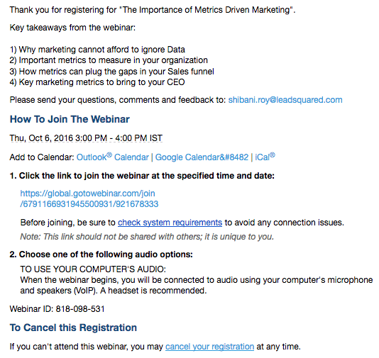
Even though the email is generated from a separate service (GoToWebinar), LeadSquared still puts a personalized touch to it by listing some key takeaways from the webinar.
Don’t let a conversion opportunity pass by failing to optimize your post-click landing page. Start optimizing your thank you pages and emails and you’ll have more engaged prospects and customers.
Remarketing, or retargeting, is a form of online advertising that enables advertisers to show ads to users who have previously visited their site or taken a specific action on their site.
So, the display ads you see following you around after you’ve visited a website — those are remarketing ads.
Remarketing ads have one fundamental purpose — to get visitors who came to your website or post-click landing page, and exited without performing an action, to return and complete the action. With remarketing you’re ensuring that you stay relevant in your prospect’s mind — even though they’re not on your page.
This visual by Retargeter sums up retargeting perfectly:

Retargeting campaigns are divided into two types:
a. Pixel based: This retargeting involves the use of pixels (JavaScript code) that gets placed on your website and post-click landing page. The pixel drops an anonymous browser cookie when a visitor arrives on your page and makes sure your ad follows them around on other web pages.
b. List based: This retargeting uses lists of your existing leads and targets specific ads at them. An example could be retargeting your blog subscribers to also download an ebook from you
The goals of a retargeting campaign are simple:
Your retargeting campaign starts off with a retargeting ad, similar to this one:

The ad is a display banner ad that includes a headline, an image, copy, and a CTA button. Optimizing your remarketing ads follows the same procedure as optimizing your display ads i.e. with benefit-focused copy and headline, relevant image, and a contrasting CTA button.
To optimize your remarketing campaigns, you need to connect all your remarketing ads with targeted post-click landing pages instead of busy homepages.
This is what the QuickBase remarketing campaign does because the ad showcased above brings the visitor to this post-click landing page:

The page is designed with:
(Note: this is a click-through page, so you have to click the CTA button to get to the form)
An optimized remarketing ad and post-click landing page like the one QuickBase uses are what make your remarketing campaigns successful.
If your remarketing ads are taking visitors to your homepage, then you haven’t optimized the remarketing experience.
Give visitors the best chance to convert on your post-click landing page and make it easy for them to take action. Optimize your remarketing campaigns by connecting your display ads with relevant, targeted post-click landing pages.
We’ve talked at length about optimizing the entire marketing funnel. Discussed the techniques to use with your ads, website, post-click landing pages, thank you pages, and remarketing campaigns to make it easy for visitors to take the desired action at each step.
However, conversion optimization isn’t only about a list of practices; not every website or post-click landing page simply needs a bigger, brightly colored CTA button to get more conversions. Knowing the best optimization techniques to use in your funnel helps in creating a more action-oriented funnel. But, finding out and solving your particular funnel’s conversion problems is what makes your own funnel optimized.
In this chapter we’re going to focus on the second part of conversion rate optimization — that is collecting and testing data to improve your marketing funnel conversions.
Let’s look at the techniques you can use to gather data from your marketing funnel:
Heuristic Analysis
Heuristic analysis is an experience-based assessment of a web page, it can be done relatively quickly and involves reviewing the page to identify problems with usability and the user interface (UI) design.
There are three main frameworks most widely used in heuristic analysis: The Neilsen Norman Group’s Heuristic evaluation, Marketing Experiments’ Model, and the LIFT model.
Nielsen Norman Heuristic Analysis
The NN/g has highlighted ten steps that need to be considered for heuristic analysis:
1. Visibility of System Status:
The visitor shouldn’t feel lost on a web page; they should be informed about the next step they should take with the help of navigation and user onboarding messages etc. Call-to-action button copy that explains to the visitor what they’ll get once they click the button is an example of this step.
2. The match between system and real world:
The copy on the web page should reflect the language that visitors use and are familiar with. The information on the web page should also follow a logical order.
3. User control and freedom:
The visitor should always be able to easily exit the web page if they feel the need to. Popup screens that hijack the entire screen and don’t let you exit is a perfect example of what not to do on your website.
4. Consistency and standards:
A web page should always maintain consistency and standards, i.e. not use same words for different situations, because this could confuse visitors.
5. Error Prevention:
Prevent errors on your web page. However, you should also prepare to notify visitors accordingly when they do occur. For example, if your page server is down, you should notify visitors via a message on the web page.
6. Recognition rather than recall:
All instructions of your web page should always be visible to the visitor. They shouldn’t have to remember information they want to access. A sticky navigation bar that scrolls with the visitor promotes the principle of recognition rather than recall.
7. Flexibility and efficiency of use:
Make it easy for visitors to perform frequent actions, with the help of personalized CTAs and tailoring the experience for them. An example could be showing customers customized in-app messaging, such as using their first names, etc.
8. Aesthetic and minimalistic design:
Keep things simple when it comes to web page design, if an element doesn’t add to user experience there’s no benefit in using it. Don’t clutter web pages with unnecessary elements just because they may look good.
9. Help users recognize, diagnose, and recover errors:
In case a page error occurs, it’s best to help users identify the error by telling them in plain language as opposed to code what has happened and what they need to do to fix it. Designing a 404 page is an example of this step.
10. Help and documentation:
It is necessary to provide visitors with help and documentation to improve their web page experience. A knowledge base and an FAQ section are examples of adding help and documentation on web pages.
Marketing Experiments Model
The marketing experiments heuristic model is represented by the following equation:
C = 4m + 3v + 2(i-f) – 2a
Where:
Essentially, the formula dictates that the probability of a conversion depends on the match between the offer and visitor motivation plus the clarity of value proposition plus the incentives to take the action, subtracting anxiety from the equation.
LIFT Model
The LIFT Model, introduced by WiderFunnel is nearly similar to the marketing Experiments model, but contrary to an equation, the model is explained by a graphic:

The LIFT model focuses on six conversion factors to identify issues and opportunities for testing web page hypotheses and design.
The main thing to remember about heuristic analysis is that it doesn’t tell you the solution to a problem. It doesn’t even tell you how important the problem is. What heuristic analysis does is help you understand the overall layout of your webpage.
After performing heuristic analysis, ideally you’ll want to conduct other tests to improve the landscape of your web page.
Web Analytics Analysis
Web analytics gives you answers to a whole array of conversion questions, including:
Some of the most popular web analytics tools on the market are Google Analytics, Adobe Analytics and Quantcast.
With web analytics you gain an insight into funnel visualization, learning how much traffic is coming at each stage of the funnel. You can also find out where you’re failing to convert visitors and understanding which parts of your website or post-click landing pages need fixing.
Analytics is also a good way of checking if your website is browser-compatible. Check if you’re losing out on conversions on a specific browser and if you are, it’s time to analyze your site’s UX from that browser.
With analytics you can collect and calculate data for a wide range of metrics, such as:
Before you begin analyzing data it’s important that you set up proper key performance indicators (KPI’s) so that you can measure how successful you were at achieving your marketing goals.
Where Heuristic analysis gives the answer to the question “why,” web analytics analysis tells you about the “what,” “where,” and “how.”
Visitor Behavior Analysis
With visitor behavior analysis you can collect data on what visitors do with their mouse when they’re on your web pages. This allows you to understand if they are having any problems with any specific page elements — such as clicking something that’s not clickable and changing those elements accordingly.
To track visitor behavior, heat maps and user session replays can help you.
Heat Maps
Heat maps are visual representation of data and these help you record what visitors are doing with their mouse or trackpad when they’re on your web pages.
The heat map can be in monochrome, with the values ranging in black and white. However, heat maps are mostly designed in the following five color gradients from lowest/coldest to highest/warmest:

To ensure that the data you collect from heat maps is accurate, it’s important that you have an ample sample size before you start generalizing results and making changes to your web pages.
It’s recommended you have at least have 2,000-3,000 page views per screen, and per device (desktop and mobile) before you start generating heat maps. That’s because heat maps won’t be as beneficial and uncover as much for you if your page has low traffic.
Changing website elements based on data collected from a heat map with very little traffic and data isn’t going to help you make any optimization decisions.
There are different types of heat maps that you can use.
Hover map
Hover maps record visitors’ mouse movement and tell you where visitors have hovered when interacting with your website and post-click landing pages.
This is what a hover map looks like. In this example, the user mostly hovered over the text fields with percentages:

Although hover maps provide additional insight into your visitors’ cursor movements, they are considered a poor version of eye tracking, because the accuracy of mouse tracking studies is questionable. presentation by Google’s Senior User Experience Researcher, only 6% of people showed some positive correlation between mouse movement and eye tracking. Furthermore, 10% of visitors hovered over a link and then continued to read different things on the page.
Just because a user’s cursor is in one spot, that does not mean that’s where they’re looking. For example, maybe they’re having trouble locating the CTA button while their cursor sits on the headline. And research supports this, too.
Although hover maps can be used to record user behavior on your website and post-click landing pages, there are some concerns as to the accuracy of their data. That’s where other heat maps can pick up the slack, such as click maps.
Click Maps
Just like their name suggests, click maps show you a visual representation of aggregated click data on any given web page. The brighter the color, the more “clicks” that particular area received:

Click maps explain which page element is attracting the most attention, and which element is a cause for concern for visitors. For example, if visitors are clicking a certain element on the page that isn’t even clickable, a click map would show you that data. Then, you can make that particular element clickable while optimizing the user’s experience.
Attention Maps
Attention maps help you determine which areas of web pages are viewed the most by the user taking into consideration the horizontal and vertical scrolling activity.
Attention maps are best summarized by Peep Laja at CXL:
Attention maps are useful because they take into account different screen sizes and resolutions, and shows which part of the page has been viewed the most within the user’s browser. Understanding attention can help you assess the effectiveness of the page design, especially above the fold area.
Scroll Maps
Scroll maps show you how far visitors scroll on your web pages. And since not everybody likes to scroll, a scroll map will generally look darker the further down the page you go:

Scroll maps are beneficial for collecting user behavior data on long-form sales pages as you can find out at what point visitors usually stop scrolling the page. Once you determine that particular point, you can make that section of the page more engaging (like inserting a CTA button, for example).
You can generate a variety of heat maps for your website and post-click landing pages using tools such as Crazy Egg, Inspectlet, VWO and Hotjar.
User Session Replays
In contrast to heat maps, user session replays don’t require any color interpretation. Instead, user session replays (or user recordings) give you a video account of what visitors did on your website and post-click landing pages. Simply watch a video of how visitors are interacting with your web pages. All the data you collect with user videos is qualitative data.
User session replays help you identify any usability and optimization issues that may be affecting your websites and post-click landing pages. You can find out which elements your visitors are responding well to, and which elements that are still not being interacted with. For example, if user recordings show visitors exiting the web page after they attempt to complete the form, it’s probably best you look at optimizing your form.
Some tools you can use to generate user session replays are Inspectlet, Hotjar and Mouseflow.
A/B Testing
A/B testing allows you to create, measure, and then test variations of your web pages to determine which combination of elements on a page are more successful at converting visitors.
You can use A/B testing to improve conversions on your website, post-click landing pages, and marketing emails.
Before you begin A/B testing, though, it’s important that you have enough traffic on your web pages. Starting out, for best results your pages should at least have 350-400 conversions per variation. That way, your results can be generalized and you can optimize the elements that need to be changed.
All A/B tests start with the original version of your post-click landing page, this is also called the “control” variation. Once you have a control page, there are four steps to follow when conducting A/B tests:
1. Set Conversion Goals: The conversion goal you set depends on the campaign you’re running at the moment. For example, if you’re setting goals for your ebook post-click landing pages the conversion goal would be ebook downloads.
2. Create Variations: You can create page variations simply by changing one element in the original variation. For example, if your control page has an on-page form, your variation could have a two-step opt-in form.
3. Start Testing: When you begin testing, the testing platform you use will randomly send equal amounts of traffic to both variations so that the results generated are more accurate.
4. Analyze Results: After your test reaches 95% statistical significance, an average A/B test takes approximately 4 weeks to run. Only then can you begin to analyze the results. Keep in mind, the results you get also depend on the A/B testing platform you’re using because different tools test for different metrics. Most tools calculate metrics such as unique visitors and conversion rates.
Some popular A/B testing platforms are Optimizely and Visual Website Optimizer. However, we recommend Instapage’s advanced A/B testing analytics because it simplifies the testing process. It allows you to quickly and easily create variations with our fully customizable builder. You also have the option to duplicate, transfer, and delete any page variation you want at any time.
Not only that, but all your A/B testing results are displayed in an easy-to-understand analytics dashboard, which shows the following metrics:
1. Unique Visitors: the number of unique visitors that have viewed a particular post-click landing page variation.
2. Number of Conversions: the number of visitors who have completed the post-click landing page goal.
3. Conversion Rate: the percentage of visitors that completed the post-click landing page goal on a particular page variation.
4. Improvement: the difference between the conversion rate tested against the control version and variation B.
To see how easy it is to create and A/B test post-click landing pages in Instapage, follow the next steps.
Click “Create an A/B Test” and then click “Variation A” and “Duplicate.” Once that’s done, you’re all set to make changes to the original page:

You have the option to duplicate, transfer and delete your variation:
Duplicate: copy a specific variation when creating a new test
Rename: write in a new name for a specific variation
Transfer: transfer the variation to another post-click landing page
Delete: remove a variation completely (all stats accumulated will also be deleted)
You can always monitor the results of your tests in the analytics dashboard. Remember though, it’s best to wait and make conclusions from your results after your A/B test has reached 95% statistical significance.
Collecting and analyzing data is an important part of conversion rate optimization because with data you’re able to see exactly which element of your website and post-click landing page is underperforming. Only then can you understand what needs to be fixed to create a more optimized marketing funnel.
Conversion rate optimization is no different than any other marketing strategy in the sense that it sees its fair share of trends each year. These trends involve new and improved ways to engage audiences and enrich their experiences in the marketing funnel.
Some key conversion rate optimization trends from 2016 are:
Increase in sticky website elements
Sticky website elements (like the navigation bar) follow the visitor down the page as they scroll. This helps improve the user’s navigation experience by reducing the clutter. It does this because, with a sticky navigation bar, every section essentially follows the user around. It can also potentially increase your conversion rate.
A sticky navigation tab is a good example of a sticky website element. The Nishiyama homepage employs a sticky navigation bar:
The navigation may be the most popular sticky website element, but other web page elements can have this functionality, too. Some e-commerce websites include a sticky “add to basket” element, along with sticky filters and product descriptions:

Increase in video marketing
Video marketing is not a new practice, but over the past years video marketing content has increased rapidly. According to Cisco’s Visual Networking Index, by the year 2020, global consumer internet video traffic will account for 80 percent of all consumer internet traffic. And why wouldn’t it when videos offer a better chance at converting visitors on both post-click landing pages and homepages as they are able to add a human element to the page.
The Bamboo HR post-click landing page uses video to explain what the service does:

Crazy Egg’s homepage is another example of video being used to engage prospects and get them to take action:

Video as a medium hasn’t just gained popularity on websites and post-click landing pages. In fact according to Twitter, videos and images get the most retweets. Video ads have also become increasingly popular, with over 50% growth in video viewing on Facebook — video ads on the social network have become very common:

Videos are an important marketing medium because they help visitors visualize using your product or service. Plus, they speak to visitors on an emotional level which is a good practice when you’re trying to persuade them to click the call-to-action button.
Marketing Automation
Marketing automation allows you to optimize your marketing funnel easily. To build an optimized marketing automation program, it’s highly recommended you map out customer journeys while creating content to match each specific funnel stage. The marketing software can take care of the rest by ensuring that all your leads are captured, nurtured, and ultimately, converted to sales.
As a discipline, marketing automation has become the norm for brands big and small across the world. In fact, according to Gleanster, 77% of CMOs at top performing companies indicate that their most compelling reason for implementing marketing automation is to increase revenue.
When Paper Style, an invite and stationery specialist used a marketing automation campaign that targeted brides, brides to be, and friends of the brides based on how they acted on the website and responded to emails; they werend able to increase their revenue by 330%.
Whereoware used a marketing automation software to ensure users got timely offers that were most relevant to them depending on their role in the wedding party.
While automation ensures that a visitor is targeted properly with the right offer automatically to increase conversions, personalization ensures that every offer that is presented to a visitor is tailored to their specific needs.
Personalization
Personalizing your marketing funnel gives you an edge and allows you to cultivate relationships with your leads and customers. What better way to make an impression on prospects and customers than by tailoring every offer you show them, specifically to them.
The basics of personalization start with:
Here’s what on-site personalization looks like on Bunting. Visitor one is female, who is browsing the e-commerce site in June or July, seeing this page:

Visitor two is male from the UK who has browsed Nixon watches before but hasn’t purchased anything yet. This is the website he sees:

Personalized emails, segmented content, and automated behavioral-triggered emails are the future of conversion rate optimization. To demonstrate, when the British-based luxury jeweler Astley Clarke personalized the online shopping experience for visitors they were able to increase their online conversions by 60%!
Start optimizing your marketing funnel
Conversion rate optimization takes your average marketing funnel and makes it exceptional with the power of optimization. CRO techniques are what convince casual visitors to stay on your page long enough to be persuaded by your offer and convert into customers.
However, conversion rate optimization isn’t only about a list of best practices and optimization techniques. To create a successful optimized marketing funnel, marketers should know how to collect data at each funnel step. Collecting and analyzing data is an important component of conversion rate optimization, because without collecting the right data you can’t make informed decisions about your marketing funnel.
Combine your knowledge of optimization practices with proper data collection strategies and you’ll be able to create a conversion rate optimization strategy that improves and scales with time.
Try the world's most advanced landing page platform today.
