What is a Mobile App Landing Page?
by Fahad Muhammad

We take smartphones for granted rarely giving a second thought to how simple our lives are because of this device that fits in our pocket and the palm of our hand. Not only do the phones make it easier to communicate with others; but we can also manage our calendars, shop online, and even confirm travel plans by just tapping the screen.
For marketers, though, smartphones provide an opportunity to convert visitors into customers on their mobile devices at any point during the day. With smartphones, marketers now have the perfect gateway to present their visitors with tailored messages — increasing the likelihood for conversions.
It wasn’t always this easy to get your marketing messages in front of a targeted audience, though. Prior to smartphones, landline phones reigned supreme and the primary marketing methods were television, radio, newspapers, print ads, etc.
Traditional marketing (aka outbound marketing) did allow marketers to promote offers, but targeting your audience was harder than we enjoy today. This meant you had to cast a wide net and reach the maximum number of people often using impersonal methods.
The digital revolution started with the invention of transistors by Bardeen, Brattain, and Shockley in 1947. The electronic fabrication technology in the transistors accelerated the process of storing memory on tiny silicon chips.
The world saw the likes of the first smartphone when IBM launched Simon Personal Communicator in 1992. Simon had a monochrome touchscreen, a stylus, and a charging base unit. However, it wasn’t considered a smartphone. Nokia entered the market in 1996 with the Nokia 9000 communicator which had a QWERTY keyboard.
The Nokia 9000 wasn’t officially called a smartphone, although it had the capability to browse the web, email, and fax. Japanese firm NTT DoCoMo released the first smartphone; the phone ran on i-mode, which provided data transmission speeds of up to 9.6 kbit/s.
In June 2007, Apple released the first iPhone. Later in 2008 Google joined the market with Android OS-based smartphones, with the HTC Dream phone.
What improved with each new smartphone was the user’s’ capability to do remarkable things with the device. They didn’t just have the option to browse websites, but they could, in reality, buy things online, with a tap on the screen — which meant they could accomplish many tasks virtually, which wasn’t possible a decade prior.
Smartphones have made the seemingly impossible tasks, possible.
In the following paragraphs, we’re going to delve into the smartphone world — discussing the various company providers and their growth in the smartphone market.
There are five primary smartphone company providers:
The table below describes the smartphone market share and shipment (in millions) according to the data by IDC for July 2015:

IDC also released smartphone market share data for August 2015:

A Smartphone Operating System (Mobile OS) is a software platform which allows application programs or apps to run on mobile devices, enhancing the phone’s functionality. Mobile OS are designed to run on smartphones, tablets, PDAs and other handheld devices.
Your Mobile OS determines which third party applications are used on your device, along with identifying the functions and features available on your phone such as Wireless Application Protocol, text messaging, keyboards, etc.
The following is a list of all the mobile operating systems:
As of August 2015, the worldwide smartphone OS market share looked something like this:

Android is dominating the smartphone market, with other operating systems lagging behind in the smartphone race.
In the United States, the following four network operators have the largest share of the market:
Other notable mobile network operators in the United States are US Cellular, C Spire, Shentel, and Ntelos.
The wireless carrier metrics for Q2 of 2016 were as followed:

And a graph that displays the historical trends in the wireless industry (since Q3 2012):

According to Gartner, in Q1 of 2016 worldwide smartphone sales grew 3.9%. China’s smartphone vendors are closing in on the race, while Apple registered its first double-digit decline.
2016 saw smartphone sales driven by the demand for low-cost solutions in emerging markets such as China and South Korea.
Two Chinese brands; Huawei and Xiaomi ranked within the top five for worldwide smartphone vendors in the first quarter of 2015 — representing 11% of the market. The first quarter of 2016 saw three Chinese brands, Huawei, Oppo, and Xiaomi smartphone sales increase by 20%.
The table below shows worldwide smartphone market share in the first quarter of 2016:

Everyday smartphone users use their devices to access various websites to shop, communicate via social media, leave reviews, etc., and they do all of this via web browsers.
So, before we begin discussing how important it is for you to create mobile post-click landing pages, let’s take a look at the market share for Internet browsers in 2016.
According to Statista, Safari is leading the charge for web browsers, with Chrome coming in second:

With Facebook’s Internet.org and Google’s Loon project, the use of mobile is only expected to increase in the next ten years, no matter where you live. So, if all your visitors aren’t on mobile right now, they will be in the coming future – it’s better if you prepare your marketing for the mobile marketing world of the future.
The following chapters of this guide will explain the importance of mobile apps and mobile-optimized post-click landing pages. Plus, we elaborate why as a marketer you need to go mobile if you want to stay relevant in modern-day marketing.
More people now use mobile phones more than they do desktops, according to comScore:

The affordability and accessibility of smartphones have ushered in a new age of marketing — marketing that doesn’t rely on web browsers to reach users, and instead reaches them via mobile applications (mobile apps).
Mobile apps are applications developed for handheld devices such as smartphones, tablets, and PDAs. While some mobile apps come preloaded with your smartphone; users can download others from your mobile app store.
Mobile experience has a huge impact on the first impression users form about your brand. An Oracle study found that after a poor mobile experience with a brand, 54% of millennials would be less likely to use the brand’s services. Mobile apps take precedence over mobile websites because they load faster than a website does. Clearly, loading speed is a big factor for users:

Mobile apps work better than mobile websites because they offer:
In 2016, the number of mobile apps available for Android users reached 2.2 million, whereas Apple’s app store boasts 2 million available apps.
Mobile apps offer marketers a unique opportunity to advertise since their users are already using the apps. However, Google made sure that marketers didn’t annoy their users with interstitial ads.
An interstitial ad (full-screen ad) covers the interface of the host app, and the user has a choice to either tap on the ad’s call-to-action button or close the ad and go back to the host app. As of November 2015, Google doesn’t like interstitial ads like this one on mobile devices:
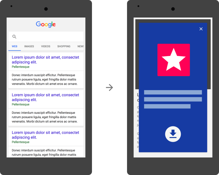
An ad this size is permissible by Google:

Google penalizes mobile apps that show interstitial ads and disrupt users’ engagement with the app. Instead, the search engine urges marketers to use mobile-friendly app install banners instead.
For maximum appeal, design your mobile post-click landing pages with all mobile devices in mind. If you only optimize your post-click landing page for smartphones, you’re likely to lose business from visitors who happen to come across your page on their tablets.
To optimize pages across all mobile devices, it’s important to know what devices are available.
There are four primary mobile devices:
A smartphone is a mobile device built on an operating system, with more advanced computing capability and connectivity than a feature phone. When smartphones first became available, they combined the functions of a PDA (personal digital assistant) with a mobile phone.
As the phones evolved, other features such as cameras, GPS navigation, and multimedia players made these devices even more powerful.
Today’s smartphones have high-resolution touchscreens and web browsers that have the ability to display websites and post-click landing pages using wifi internet or a mobile broadband connection.
Smartphone browsers are similar to desktop browsers and they can render a broad set of the HTML5 specifications, even though mobile phones have a smaller screen and the screen size is set to vertical by default. Plus, the operating systems of smartphones make it easy for users to download mobile apps that enhance the phone’s functionality.
Regarding popularity, smartphones are the most widely used mobile devices with 80% of internet users owning one:

A multimedia phone offers more functionality than a feature phone, but not as much as a smartphone. Multimedia phones typically come equipped with basic features such as a high-resolution camera, high-quality sound, and a few native applications such as MMS (multimedia messaging service).
The phones have browsers with the capability to render web pages coded to meet XHTML standards. They support HTML5 Markup and JavaScript/ECMAscript, however, they may not support some extension APIs in HTML5 standard. Multimedia phone browsers are similar to browsers of 3G-ready phones that are not quite smartphones.
Feature phones provide standard text messaging and voice calling features, along with basic multimedia and internet capabilities while some even have touchscreens and 3G connectivity. However, their browsers lack the capability to render pages coded using standard HTML. Instead, the phones have browsers that can render only cHTML (iMode), WML, XHTML-MP, etc.
Tablets first emerged on the market in the 1990’s and this type of mobile device has a larger screen than phones. A tablet’s screen is its primary input device, and they usually run on Android or Apple’s iOS software, which means you can easily download mobile apps on a tablet.
Finally, you can access websites and post-click landing pages on your tablet and according to comScore data, tablets are used mostly at night:

Creating an optimized post-click landing page for all types of screen sizes and types is paramount to increasing conversion rates. No matter who your target audience is, they are likely not restricted to one mobile device when it comes to accessing web pages. This is why it’s important to understand the main techniques to use when creating a page that looks pretty on all screen sizes.
There are three mobile configuration options:
Web pages created with responsive web design show the same page on the same URL regardless of the user’s device and screen size.
RWD is Google’s recommended design pattern when you create a responsive post-click landing page because its algorithm automatically detects the setup and then Google user agents crawl the page and its assets that include CSS, JavaScript, and images.
This is how a responsive web design setup looks like on different devices:

With the help of responsive design, you reduce the possibility of unplayable content, faulty redirects, mobile-only 404s, irrelevant cross-links and slow mobile pages.
By adding a viewport meta tag to the head of the web document, you eliminate the risk of mobile browsers trying to make your content look better, which results in the inconsistent appearance of font sizes.
When you specify the meta viewport tag you achieve the following results:

Dynamic serving is similar to responsive web design because both setups use the same URL on different devices. However, with dynamic serving the server responds with different HTML (and CSS) depending on the user agent requesting the page.
The setup sends different code to each device, but it does this on the same URL:
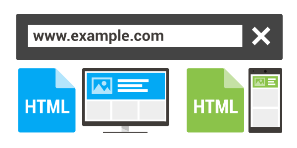
Because dynamic serving is not Google’s recommended setup, marketers need to use the Vary HTTP header to signal your changes depending on the user agent, so that user agent strings are detected correctly and users see all the content.
In the separate URL setup, every desktop URL has an equivalent different URL for mobile-optimized content. Usually, the URL for the mobile optimized content is exactly like the desktop URL, with only a letter ‘m.’ at the beginning of the URL:

When implementing the separate URL setup, it’s important to check that desktop pages aren’t accidentally redirected to an unrelated mobile page:

You can redirect your pages using HTTP and JavaScript redirects.
Mobile post-click landing pages need to provide users with the optimal experience, because if there are problems with mobile optimization with your page, your Google rankings will suffer.
Regardless of the setup you choose, make sure to keep your page resources (such as HTML, CSS, and JavaScript files) crawlable. This is because if Google or other search engines don’t have access to your page’s resources, then they won’t be able to detect how it’s built to display, and your page’s appearance and functionality will suffer.
Now that we’ve discussed the backend aspects of mobile app post-click landing pages, it’s time to examine the front-end design. In this chapter, we will highlight the UX (user experience) practices and optimization techniques that are required for mobile app post-click landing pages.
Going mobile is no longer a trend. In chapter 2 we saw the number of mobile users had surpassed the number of desktop users, which means your offers and the post-click landing pages you connect them with must be ready for mobile audiences.
According to Business Insider, mobile is growing faster than all other digital advertising platforms, and advertisers have begun allocating their marketing budgets for mobile users. Specifically, U.S. mobile ad spend will surpass $80 billion in 2018, which is a marked increase from 2013:

The important thing to understand about mobile users is that they behave differently than desktop users. The average session duration on mobile is 72 seconds, whereas desktop it’s more than double at 150 seconds. So it’s imperative that your page not be too long because mobile users are less likely to engage long enough and get value from an unnecessarily long page.
Therefore, your mobile post-click landing pages shouldn’t be copy-heavy, just include enough copy to explain your offer’s value, and refrain from filler paragraphs that don’t add any value to the page and simply look pretty.
For example, Flyosity’s mobile app post-click landing page doesn’t overwhelm you with copy:

As far as typography and font size goes; fonts should be legible, be applicable to your brand, and Google recommends using a base font size of 16 CSS pixels.
Also, it’s recommended your form not include too many fields because if users hesitate to convert on their desktops, they’re even less likely to convert on mobile devices. This is because mobile users are too preoccupied with text messaging, email, and social media – you don’t want to create friction with a long form that requires significant effort to complete.
Threatmetrix runs the risk of losing conversions by including a long form on their mobile page:
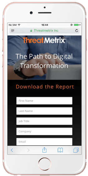
Given the average mobile phone’s screen size, a form of this length looks too overwhelming for visitors. Plus, a free report doesn’t require so many fields in the first place, especially on a mobile page.
To increase your conversion chances, design your page with mobile UX principles in mind. According to UX Matters, mobile phone users interact with their phones in three different ways: one handed (49%), cradled (36%), and two-handed (15%):

The thumb plays a significant role in mobile touch screen action, so it’s critical that your call-to-action buttons and lead capture form fields be within the “thumb zone:”

The thumb zone is a heat map that portrays how easy users can tap different areas on phone screens. Below is what the different colors represent:
Also, keep in mind that the heatmaps above apply to right-handed users. For left-handed users, you simply flip the heatmaps. If you’re mindful of UX principles when designing your mobile post-click landing page, your conversion rates are likely to increase.
Your mobile post-click landing page call-to-action buttons should be prominent and easily understood. For example, Reddit’s mobile app post-click landing page CTA buttons draw visitors’ attention and lets them know how to download Reddit’s app in the App Store and Google Play:
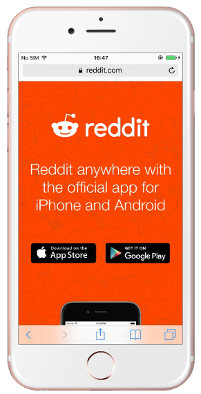
You can also add a click-to-call CTA button on mobile pages because offering visitors the option to call you after they’ve seen your offer is another way to earn a lead and potential customer.
A Search Engine Land study found click-to-call functionality to be most effective while the visitor is in research and purchase phases, and smartphone-based calls tend to come from buyers making larger value purchases:

As an example, String Automotive A/B tested their mobile post-click landing page and found a 200% increase in conversion rates with a click-to-call button above the fold. Furthermore, according to Google, 61% of mobile searches result in a phone call – so it’s worth including a click-to-call button on your post-click landing page.
The following user experience terms are crucial for mobile app post-click landing pages:
Tap targets are locations on web pages that a user interacts with to perform an action, such as click a link, a button, or complete a form. Tap targets should be designed large enough so they can be touched easily without tapping another target. If visitors accidentally tap another target because their intended action was designed too small, they will become frustrated. At the same time, a page’s tap target should have enough room for the visitor to touch with their fingertip.
Interstitial ads are overlays that block a user’s display and prevent them from interacting with other content. Because the user is required to take an extra step to close the ad, this ad format frustrates users and should not be used.
Plugins require installation and need to be updated to show web page content. Plugins are a nuisance for mobile pages because most mobile devices don’t support plugins, so your page is likely to crash when a visitor lands on it.
A viewport is the user’s visible area of a web page, i.e. the width of a web page the user can see on the device they’re using. Because the viewport varies for each device type, it is smaller on mobile screens.
If you don’t configure the viewport for mobile screens, the web page will render at the width of a typical desktop screen, and then scale to fit the mobile screen. The problem with this is, the copy and images will be very tiny, causing readability issues (and hurting your conversion rates).
To avoid this problem, configure your page’s viewport so that it scales automatically and your mobile page looks something like this:

Failing to size content to your configured viewport causes your images and content to go off-screen horizontally. In turn, this requires visitors to scroll sideways to read about your offer instead of viewing all content within the screen’s dimensions. Of course, this isn’t ideal so make sure you size your content accordingly.
Your page will only be readable if you use legible font sizes for smaller screens (see Chapter 5 and using 16 px). Also, keep in mind the angular resolution of a mobile screen. According to UX Matters, you can calculate angular resolution for any device using the following formula:
Visual Angle (minutes of arc) = (3438) * (length of the object perpendicular to the line of sight) / (distance from the front of the eye to the object)
Here’s a graphic that explains the concept:

If your mobile post-click landing page doesn’t load quickly, you will frustrate your visitors and risk losing conversions. In fact, 85% of mobile visitors expect pages to load faster than they do on a desktop.
The diagram below explains how latency (the time interval between the simulation and response of a web page) impacts user behavior:
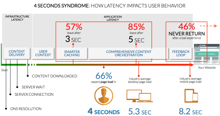
Meeting the 4-second load threshold is critical for meeting user expectations because if your page takes longer to load, your visitors will move on to another page that addresses their needs much quicker.
Faster mobile post-click landing pages (meant to be indexed, or included in search results) are also important for SEO purposes because they generally rank higher in search engines than slower pages. post-click landing pages are often “noindexed” so they do not compete with other website pages, as the content is usually similar (and shorter) compared to existing, indexable pages on a site. Visitors tend to click on higher-ranked pages more often, and thus, a faster mobile post-click landing page increases the chance for more visits and conversions.
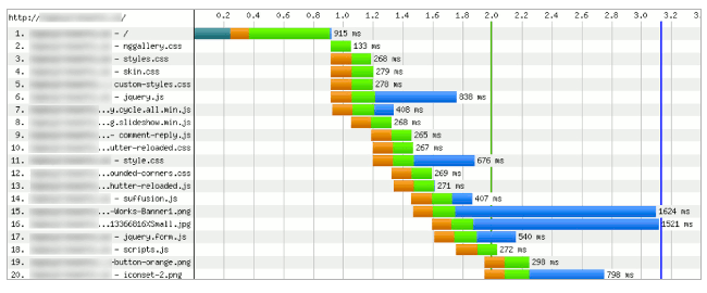
The WebPageTest tool uses the waterfall diagram to give a graphical representation of all the resources loaded by a web browser to show a page to users. By using this diagram, you can gain an insight into why your page loads slowly and how you can fix issues to make it faster. The diagram is a cascading chart that displays how a web browser loads and renders web pages. It uses a multi-colored bar to show where the browser spent time loading the page resource:
Google’s Pagespeed Insights gives you an in-depth UX summary of your website. It rates the website on a scale of 100 by checking off points such as font sizes, plugins, app interstitials, etc.
To demonstrate, let’s see how Google’s Pagespeed Insights rates Reddit’s post-click landing page:

Although the scoring data will likely change as Reddit makes changes to their page, the scoring criteria will remain the same (64 and 96 were shown here to demonstrate how Reddit scored when this test was performed).
Google’s Mobile-Friendly Test tests whether or not your page is mobile friendly. Just enter a URL and click “analyze,” like we did with Reddit’s mobile app post-click landing page:

Google’s Search Console tool shows a mobile version of your page and gives you a site-wide mobile usability report. Continuing with Reddit’s page, here is their result:

Like Google, Bing’s Mobile Friendliness Test Tool lets you analyze your page and tells you whether or not it’s mobile friendly by checking off a list of mobile page UX prerequisites (shown next to the green checkmarks).
Here are the results for the Reddit app page:

For your mobile post-click landing pages to load faster, you must take care of the following items:
Clearly, pagespeed is a vital ingredient to the conversion equation. Google’s introduction of Accelerated Mobile Pages (AMP) and Facebook’s Instant Articles are a clear indicator of this. The AMP framework uses a lighter form of coding languages to create pages that load quickly on mobile without any third party JavaScript and gives your page a big SEO boost.
This is what AMP looks like:

Both platforms claim to deliver mobile web experience ten times faster than the common website experience. The AMP project is an open source initiative and aims to help publishers create mobile-optimized content that loads instantly everywhere. Instant Articles are designed in the same manner and allow publishers to create fast loading interactive articles on Facebook:

Optimizing mobile post-click landing pages based on UX principles is the best way to ensure you’re providing value to mobile visitors. If you choose not to optimize your mobile pages, your conversion rates will undoubtedly suffer.
This chapter will showcase a variety of mobile post-click landing pages on different Android mobile devices, which will give you an idea of how different the pages look depending on screen size.
Operator is a mobile shopping app that connects you to experts to help you find what you want when you want it.
Here’s what their mobile app page looks like on Samsung Galaxy S7:

On the Samsung Note 4:

On Google’s Nexus 6P:

On Motorola X 2nd Gen:

They all look identical, right? Well, each one has subtle differences in how the page is displayed. For example, on the Nexus 6P you can see more of the man’s hands whereas the Motorola X 2nd Gen, his hands are almost entirely hidden by the bottom bar (until you scroll down of course).
The key thing to remember is that each mobile devices type will display pages a little differently because the page is responsive to each screen size.
Facebook Moments is an app that allows you to sync, group, and organize your Facebook photos. The first device we’ll look at is the Samsung Galaxy S7:
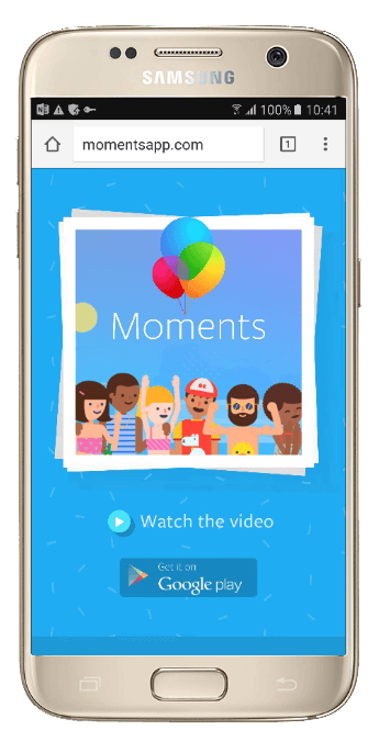
Next is the Samsung Note 4:

The Nexus 6P:

And the Motorola X 2nd Gen:

Both Operator and the Moments app are examples of good responsive mobile app pages because they are optimized regardless of which device you viewed them on.
Now, let’s see what optimized mobile app post-click landing pages look like on tablets.
JibJab is a fun app for texting, tweeting and posting. On a Samsung Galaxy tablet, this is how JibJab’s mobile app page displays in landscape mode:

This is how their page looks on Google’s Nexus 9, this time in portrait mode:

The bottom line is this: Visitors will only convert on your mobile app pages if the pages are responsive and optimized for every screen size.
In chapter 6 we showcased a few mobile app post-click landing pages on Android devices, now let’s look at a few displayed on Apple iOS devices:
Swifty teaches you how to code. This is how the same page looks on iPhone 6s:

On iPhone 6s Plus:

And, on iPhone 6 Plus:

Similar to the examples in the previous chapter, let’s see how optimized mobile app post-click landing pages display on Apple tablet devices.
On Apple’s iPad Air 2, this is how Swifty’s page displays in portrait mode:

What’s interesting to point out in this tablet example is that the navigation links are listed in the page header. This is not ideal for post-click landing pages because they serve as exit links, which can distract a visitor’s attention away from converting on the page.
This chapter will focus on Windows & BlackBerry mobile phones and what the post-click landing pages look like on these devices.
Let’s see what the Facebook Messenger app’s post-click landing page looks like on these devices. First is the Lumia 925:
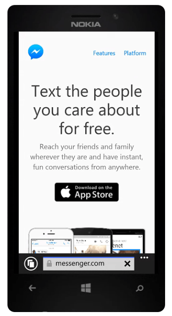
This is what the page looks like on the Nokia Lumia 930:

And the RIM BlackBerry 8900:

Based on these examples, the Messenger mobile app post-click landing page is optimized for Windows devices, but not for BlackBerry phones.
Creating mobile post-click landing pages are no different than creating desktop pages. You simply need a professional software to create and publish your page. Fortunately, if you are an Instapage user, you’re already halfway there! If you’re not an Instapage user yet, click here to sign up for a trial account.
To create a mobile app post-click landing page with Instapage, follow these steps:
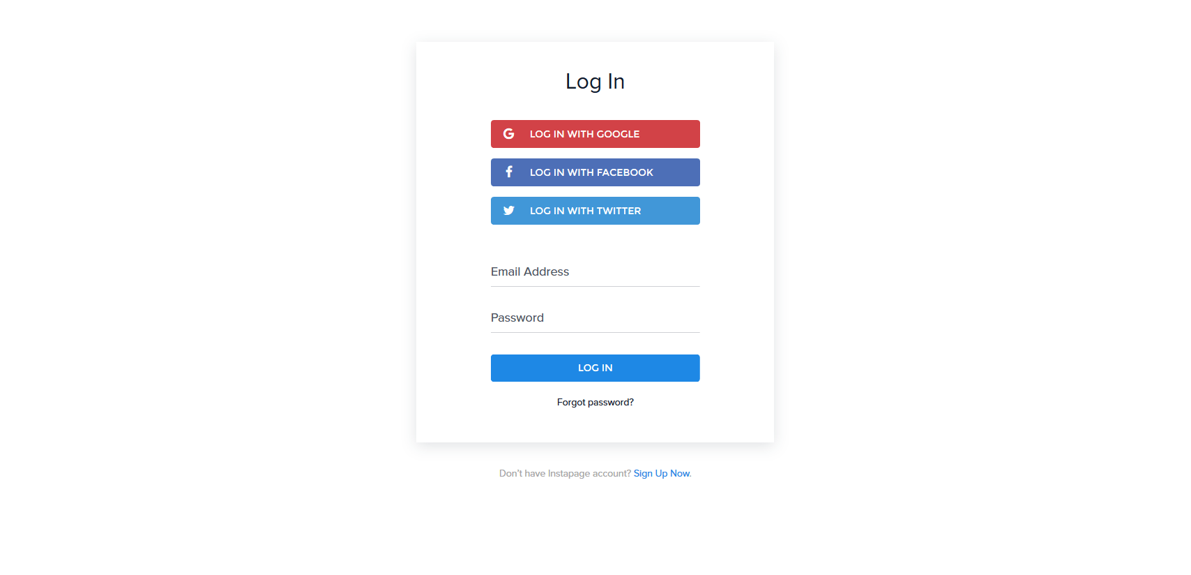
1. Login to your Instapage account:
2. Click the blue “Create New Page” button:

3. Click the “Pick a Template” option:

4. Select a template design from the “Mobile App” category:

5. Choose a name for your page:

6. “Mobile-enable” your page and customize it according to your offer:

7. Click “Preview” to check your customized post-click landing page and if you’re satisfied, click “Publish” in the top-right corner:

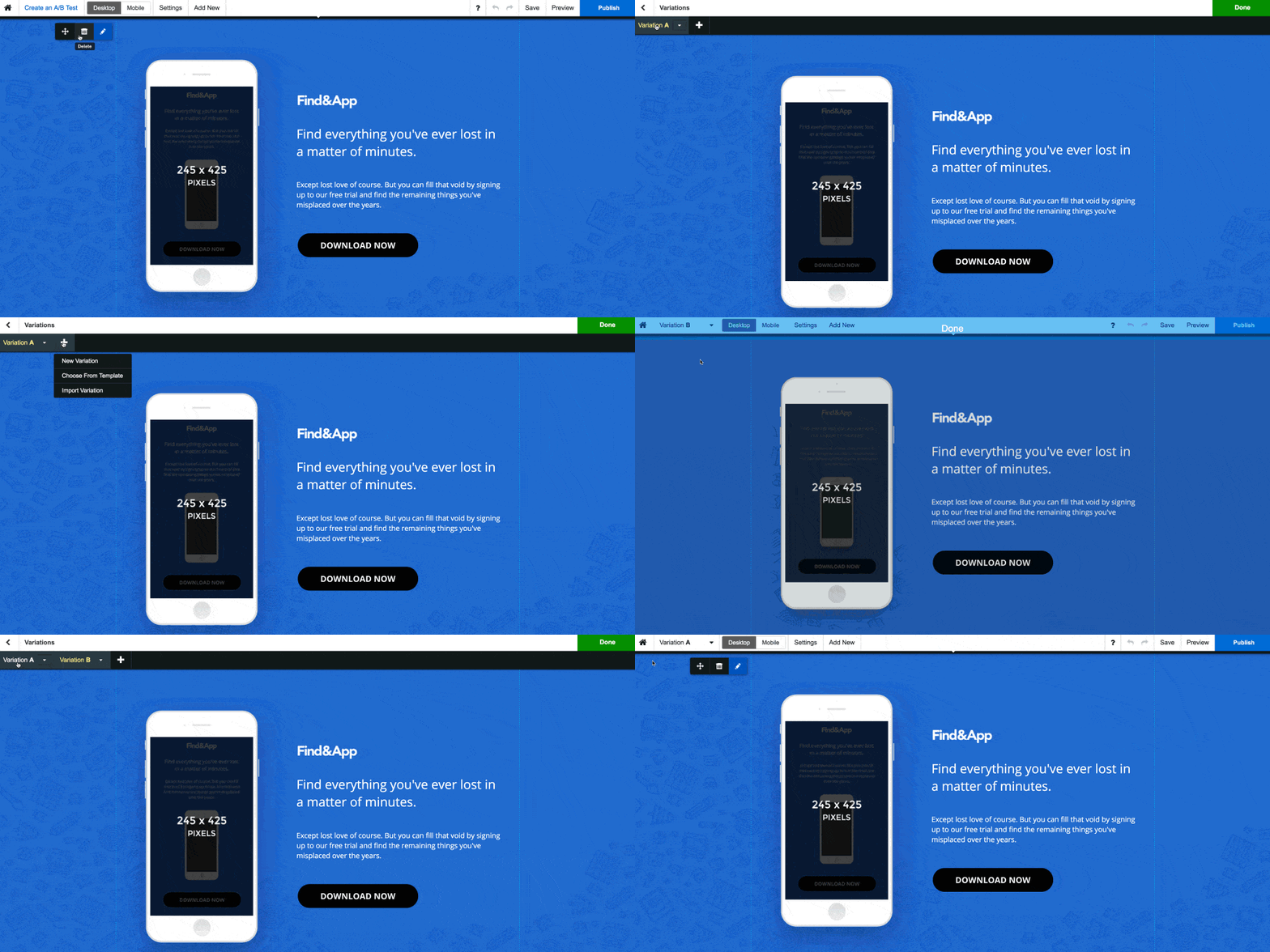
A/B testing mobile app post-click landing pages are just as easy with Instapage as well. Just click “Create an A/B Test” and make your desired change. Next, click “Publish again to make sure your new variation is live online:
Two examples of mobile post-click landing pages built with Instapage are TalentScout and Paynote, respectively:


Mobile app post-click landing pages are the future of digital marketing and companies that don’t utilize this technology will regret not doing so as competitors get the edge over you.
Don’t let that happen to you. Get started today by creating your professional mobile app post-click landing page with Instapage’s designer-friendly software.
Try the world's most advanced landing page platform today.