Landing Page Design Best Practices
by Fahad Muhammad

As a savvy marketer you know it’s important to create post-click landing pages to promote your offers. The dedicated standalone pages make it possible for your offer/campaign to achieve what it set out to accomplish:
Generate more conversions.
When designed properly, post-click landing pages can persuade your visitors to click your call-to-action button and enter your marketing funnel. The call-to-action click is where your visitors embark on their journey with your brand. It’s where you convert them into leads and then transform them into your loyal customers.
The question is, isn’t that too much for a single page to accomplish?
Absolutely not.
When correctly optimized, post-click landing pages have the power to acquire and retain customers. The key to post-click landing page success lies in the number of pages you create to promote specific offers and the way you design the pages. For example, it’s ideal to create a separate post-click landing page to promote your ebook and to create another dedicated page to ask visitors to attend a webinar where you talk about that ebook — every offer needs to have a dedicated page.
Our previous guides have shown you how to optimize individual post-click landing page elements and have showcased post-click landing page examples to provide you with the right page inspiration. It’s now time to show you the exact design principles that make all of this possible.
But, before we do this it’s important we discuss one critical aspect of post-click landing pages. This single principle is required for all of your pages regardless of your industry and the type of page you’re creating:
post-click landing pages must guide visitors towards a single action.
This represents the conversion goal on the page, and this goal can vary depending on the campaign you’re running — from signing up webinar registrants to getting free trial customers to upgrade.
However, all post-click landing pages should only have a single conversion goal.
Why post-click landing pages Should Have a Single Purpose
The primary factor that separates a post-click landing page from your homepage is singularity.
A traditional homepage is cluttered and promotes many offers, whereas a dedicated page is free of distractions and forces visitors to focus on just one action (the action you want them to take). This significant difference is what makes these standalone pages more suited to generate conversions as opposed to your homepage or any other website page.
If the design and copy of a post-click landing page don’t follow the singularity rule, the page won’t be any different than any other busy page on a website.
To demonstrate this point, you can’t expect to see a lot of conversions from this kind of busy homepage:

Conversely, this dedicated page is much more likely to generate conversions:

If you’re looking to demo the Kissmetrics software, which page do you think is best designed to increase signups?
Yes, the second one.
Design post-click landing pages in such a way that your offer gets the spotlight. That’s what this guide is going to help you with. Not only will we explore post-click landing page design best practices, but we’ll show you what role psychology plays in the overall design process.
Psychology plays an integral role in the success of your marketing materials, which includes your post-click landing pages. This is because your visitors are human beings who make irrational choices based on their cognitive biases and past experiences.
Using the right psychological principles to your advantage in your post-click landing page design convinces your visitors that you, in fact, are the right brand to solve their problem, and this guides their mouse toward the CTA button.
This is also known as conversion psychology.
Using psychology on your post-click landing pages to influence visitors’ decision-making abilities helps you convert them into customers.
The next section of the guide will discuss these psychological principles and explain how you can practically use these principles on your post-click landing pages.
How to Create Persuasive post-click landing pages
What’s the one fundamental thing that your post-click landing page needs to do?
Persuade your visitors enough to get them to convert on your form.
post-click landing page elements should complement each other so they can convince your visitors to fulfill your conversion goal.
Here’s a quick recap of the characteristics your post-click landing page elements must have to be persuasive:
There are certain psychological principles you can apply to create post-click landing pages that influence your visitors to convert. Two of the basic principles that will be discussed in this chapter are:
Cialdini’s 6 Principles of Influence
Cialdini’s theory of influence is comprised of the following six fundamental principles you can implement to convince your visitors to convert:
1. The Principle of Liking
Human beings have a tendency to be persuaded by people they like. One way to do this is to design your pages so that you and your team are represented on them. Include custom photography of your team at work, or add a video with a human voice that’s able to connect with your visitors.
Adding real photos alongside customer testimonials also triggers the liking principle and convinces visitors to convert.
To demonstrate, when Signal v. Noise tested a “human” page versus their original design, they saw a 102.5% increase in conversions:

See how the smiling woman on the post-click landing page draws you in better? Your visitors will likely feel the same emotion and stick around longer to find out more.
Furthermore, including an image of a happy person on your post-click landing page can help with conversion rates because it invokes an emotional response in your visitors.
2. The Principle of Reciprocity
Human beings like to do things for others who do things for them. So, if you’re expecting your visitors to sign-up for your service just because you told them how great it is, expect to be waiting a long time.
Want your visitors’ information? Offer them something in return – this is what a typical squeeze page is created to do.
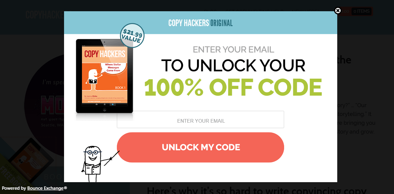
Copy Hackers’ page asks visitors to enter their email address in exchange for a 100% off coupon code for one of their original books:
Another approach is to offer your visitors a small chunk of information first, and then give them the rest in exchange for their contact details. This is what one variation of the Top 10 post-click landing page Styles does:

If you want to increase sign-ups for your service, try offering them a free trial first — that’s what Autopilot does on their post-click landing page:

3. The Principle of Social Proof
The principle of social proof dictates that human beings tend to do things that they see other people (like themselves) doing. This is where the herd mentality comes from. Your post-click landing page should include compelling customer testimonials from previous clients who can vouch for your product/service.
As an alternative, you can also include the number of satisfied customers your service has like Hootsuite does on its post-click landing page:

4. The Principle of Consistency
We tend to like people who honor a commitment they have made. In other words, human beings appreciate individuals who remain true to their word.
You can apply this principle to dedicated pages by establishing message match between the ad and the post-click landing page itself.
This is the Facebook ad for Vidyard’s guide on personalizing your marketing with video:

This is the post-click landing page connected to the ad:

The page and the ad have great message match because:
To increase your conversion rates, maintain a consistent journey for visitors by making sure there is message match between your ad and post-click landing page.
5. The Principle of Authority
The principle of authority dictates that people tend to obey authoritative figures. One way of establishing authority on your post-click landing page is to include customer badges from reputable companies. Doing this helps your visitors understand that highly credible companies have placed their trust in your product or service.
Crazy Egg follows this principle on its post-click landing page:

Authority on post-click landing pages can be showcased by including testimonials from influential people in your industry. Although the example below is from Backlinko’s homepage, which includes navigation bars and a full footer, it demonstrates that testimonials from influencers (such as Neil Patel) help establish credibility:

6. The Principle of Scarcity
People want more of something they can’t have, i.e. perceived scarcity influences your visitors’ decision-making abilities.
You can make your offer more enticing by putting a clock on it (a post-click landing page countdown timer will do the trick).
Here’s how Instapage uses a countdown timer to encourage webinar registrations:

You can also add urgency by offering visitors something for a limited time. Free trial offers often use this strategy.
This is what the Animoto post-click landing page does:

You can apply the principle of scarcity on standalone pages in the form of urgency. To do this, craft your copy in such a way that visitors understand they better act now if they want to get what you’re offering.
Merlin’s Pest Control does with their CTA button copy:

The CTA button copy adds a sense of urgency to the offer.
Here’s an infographic that sums up Cialdini’s principles of Influence.
Cognitive Biases
Cognitive biases are tendencies human beings have to think in particular ways that lead them to make irrational choices and decisions.
Your visitors are human beings, and they don’t always act rationally. It’s your job as a marketer to understand what these deviating tendencies are and use them to your advantage when designing post-click landing pages.
The Von Restorff Effect
According to the Von Restorff effect, we tend to remember things that stand out. Your visitors will remember your call to action button much more vividly if you design it in a contrasting color and make it stand out.
This is what the AWeber post-click landing page does:

The green color stands out against the gray background, making visitors remember the button before they leave the page.
The Deictic Gaze
When we see someone looking at an object, our brain acts reflexively, and we end up looking at that object as well. This is the Deictic Gaze in action. With regards to post-click landing pages, using directional cues that point to your call-to-action button, you draw more of your visitors’ focus on the button — persuading them to click it.
Postcard Mania uses a directional cue to point toward the CTA button, bringing more of their visitors’ attention to “get started:”

Picture Superiority Effect
According to the Picture Superiority Effect, people tend to understand concepts and recall them more easily when concepts are in the form of images as compared to copy.
Including relevant images on your post-click landing pages helps visitors understand your offer in a better manner. And when you add images alongside helpful copy, people are more likely to click your CTA button.
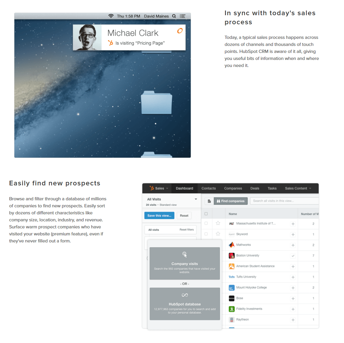
The HubSpot post-click landing page doesn’t just showcase benefits of the service with the help of copy, but they also use dashboard screenshots alongside the copy. This gives their visitors the optimal viewing experience:
Focusing Effect
The focusing effect is the tendency of people to place too much importance on one aspect of an event. You can use this cognitive bias to your advantage on post-click landing pages by having visitors focus on your unique value proposition.
Your product or service has an entire array of benefits and features for your target customers. However, when you highlight your UVP more than any other benefits, customers primarily anchor themselves to that statement — which convinces them to click your call to action button.
This is what Avast does with their post-click landing page by including their UVP in the headline:

Granted, there are other benefits mentioned on the page:

But, by focusing the attention on their UVP in the headline, they allow their visitors to anchor themselves and focus on that one particular benefit.
post-click landing page best practices are only one-half of the conversion equation. To maximize your post-click landing pages, apply conversion psychology to your post-click landing page design process.
The order in which the elements appear on your page also plays a vital role in getting conversions.
When designing the layout, it’s important to keep in mind the way your visitors are likely to view your page. There are essentially two common ways your visitors scan your pages as noted through eye-tracking studies: the F-pattern and the Z-pattern.
The F-Pattern
The F-pattern (aka the “fast” pattern) is named because of the direction a user’s eye travels when they scan a page, which looks something like this:

An eye-tracking study performed by the Nielson Norman Group of 232 users showed that the participants’ primary reading behavior remained fairly consistent across various websites. This reading method resembled the letter F and had the following components:
The eye-tracking study didn’t conclude that the user only looks at these three areas. Rather, it concluded that eye movement was quicker and spottier at other sections of the page.
What this means for your post-click landing page
Since you know how people will likely view your page, use that knowledge to place the most important elements exactly where your visitors are likely to take the most notice.
The F-pattern works for content-heavy pages, so the pattern works well on longer sales pages. However, you can also design your short-form pages keeping this pattern in mind.
This is how visitors will see the Fleetmatics page:

The Z-Pattern
The Z-pattern, similar to the F-pattern, is a name given to the way a user views a page. While the F-pattern may be more appropriate for content-heavy pages, the Z-pattern is mostly meant for post-click landing pages that contain minimal copy.
The Z-pattern reading method has the following order:

Let’s look at the Offerpop page as an example:

This is how the Z-pattern will look like on this page:
The Page Fold and What It Means for Your post-click landing page Design
The fold originally comes from the newspaper industry. Newspapers placed an intriguing headline and an enticing graphic “above the fold” because this was the visible part on newspaper stands.
In the internet age, the fold is the area of a web page that is visible to the visitors immediately upon landing on a page. The fold is not a definite line because it varies from the size of the screen you’re looking at to a particular web page you’re viewing.
To demonstrate, if your pixel screen resolution is of 1366 X 768 then the area highlighted in red below is where the page fold would lie:

According to most web designers, an average fold line placement is approximately at 1,000 pixels wide and 600 pixels tall — this is mostly true for common types of monitor/browser combinations of 1024 X 786 pixels. However, with the rise of mobile browsing the most common dimension for the page fold is either 320 X 568 or 360 X 640.
The debate about the fold came into conversion optimization because marketers wrongly assumed that visitors will not scroll. This wrong assumption influenced most marketers to stuff every important page element (relative to conversions) above the page fold.
The problem with this strategy is that you will often see a very busy post-click landing page like this:

Every element on this “post-click landing page” is stuffed above the fold out of fear that the visitor won’t scroll.
Well, the truth is that visitors do scroll.
They scroll down your page if you’ve convinced them to do so by how you’ve designed the page above the fold.
In fact, according to Google’s report, The Importance of Being Seen: above the fold is not always viewable, whereas below the fold usually is:

If you want your visitors to scroll below the fold, convince them above the fold that scrolling is worth their time.
This Campaign Monitor post-click landing page has placed convincing elements above the fold, making sure that visitors will scroll below the fold to get the remaining information:

How to Reduce Friction on post-click landing pages
Lead capture forms can be intimidating. Not everyone feels comfortable giving their personal information to a brand they don’t know. Visitors also don’t usually like forms because they give off a demanding vibe.
When you place the form too soon on a post-click landing page (i.e. before you have adequately described your offer), you negate the principle of reciprocity we mentioned in chapter 2. A prematurely placed form asks visitors to give something to you before you’ve given anything to them. This causes conversion friction on post-click landing pages.
This conversion friction makes your visitors hesitant to convert on your post-click landing page.
There are essentially two ways to remove friction from post-click landing pages:
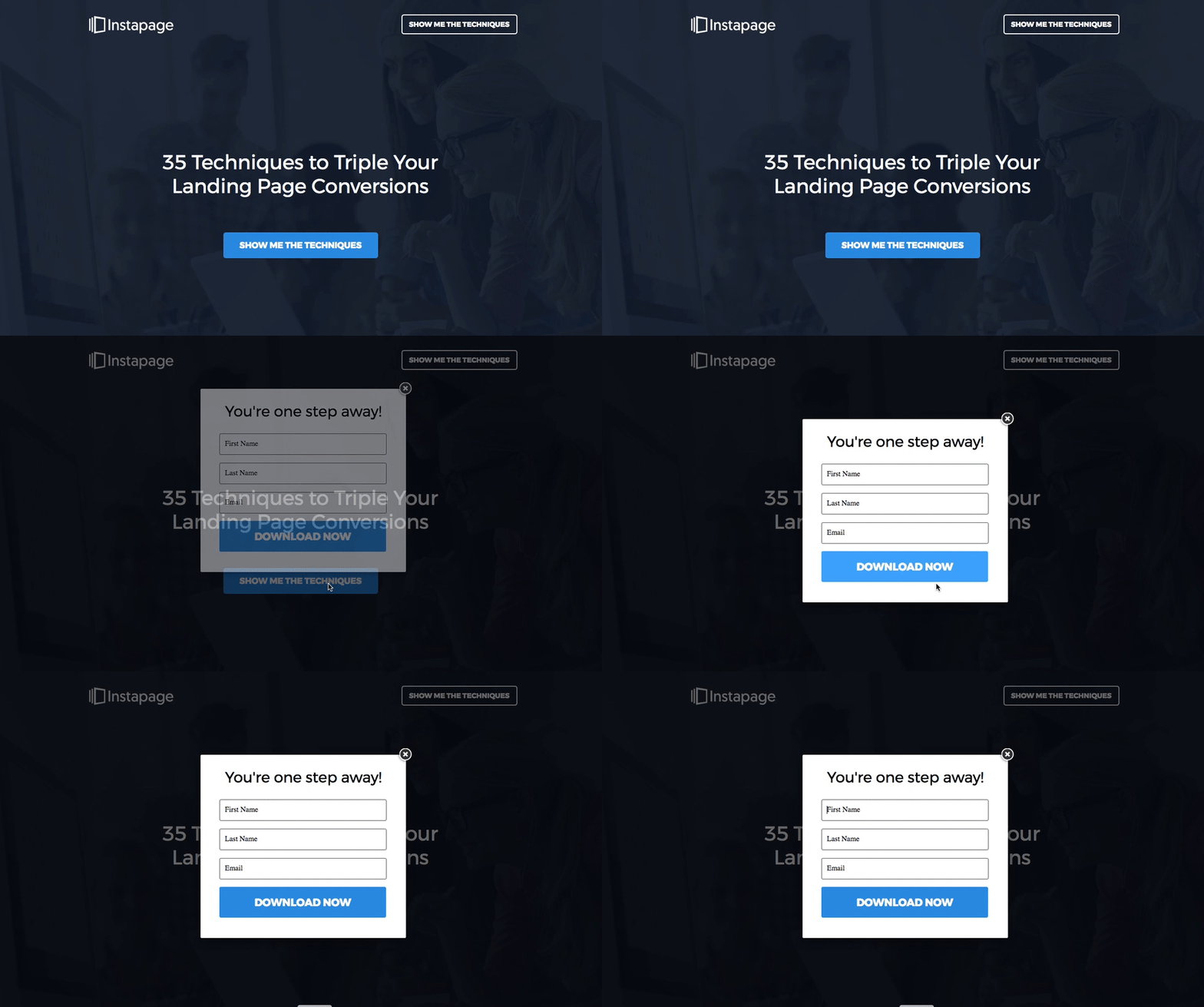
A two-step opt-in form allows you to “hide” your lead capture form from plain sight because the form only appears once your visitors click the call to action button. This type of form doesn’t cause conversion friction because visitors only get to see the form once they’re convinced about your offer.
When a two-step opt-in form is used, visitors feel in charge and more comfortable about making the click.
Here is what the initial screen looks like on one of Instapage’s post-click landing pages:

Once a user clicks on the blue CTA “Show Me The Techniques,” the two-step opt-in form appears:

Your post-click landing page Should Only Have One Exit Point
The purpose of your post-click landing page can vary, but the number of goals on the page doesn’t.
Since there is only one conversion goal, there should also be only one exit point — the point that takes your visitors to that conversion goal.
This exit link is your post-click landing page call to action button.
There should be no navigation links present that cause people to leave and land somewhere else. There is, however, one exception to this rule — a link to your privacy policy (as mentioned above) because it helps establish trust. If you choose to add a privacy policy, try having it open in a “light box” that keeps the person on your post-click landing page (and doesn’t take them to a new tab or open a new URL within the same tab). Doing this helps keep their attention on converting.
For it to be a true post-click landing page, no other links should be permitted because the only thing extra links do is distract your visitors from your page’s conversion goal.
Take the Act-On’s post-click landing page as an example:

The navigation bar at the top ruins this perfectly good page because these links act as exit points and distractions from Act-On’s product demo conversion goal.
Now let’s look at this Autopilot post-click landing page:

There are zero distractions on this page. The only exit link provided is connected to the conversion goal — the call to action button.
In the end, there is no room for navigation links on post-click landing pages, especially not entire headers and footers that can easily hurt your conversion rates.
Copy is a major part of your post-click landing page because this is predominantly the element you use to get the benefits and features of your offer across to your visitors. Unless the primary element of your page is a video, then the script takes over as the main element that relays product information.
The amount of copy your post-click landing page has can have a direct impact on your conversion rates. Too much copy and your visitors won’t bother to read all of it. Too little and they won’t have sufficient information to make an informed decision.
So how much copy should your post-click landing page have? That depends on your offer.
If you’re offering a free guide or an ebook, writing lots of copy probably doesn’t make sense because your visitors won’t need a lot of convincing to click the CTA button. In this case, a squeeze page like the one OptinMonster uses is a good option:

On the other hand, if your offer is an extensive consulting course, or a SaaS product — something that requires payment (immediately or at some point down the funnel), then you need to provide them with all the necessary details to make them click your call to action button.
This is what the SharpSpring post-click landing page does. The page doesn’t only ask visitors to schedule a demo like the OptinMonster squeeze page does, but it extensively explains the benefits of the service with the help of copy and a customer testimonial.

To help make your copy stand out it’s pertinent to format it using bullet points, lists, or short paragraphs — making it more readable. This is because it’s very likely that most visitors will only scan your post-click landing page copy, so formatting it appropriately will help ensure that your copy gets read.
Follow AdFicient’s example and how they display their body copy:

Make your copy customer-centric
Customer-centric copy doesn’t just talk about the customer; it talks to the customer. All post-click landing page copy should be customer-centric because this is the kind of copy that gets you conversions. After all, it’s easier to empathize with your visitors’ problems with copy that’s focused on them and not your brand.
Using the words “we” and “us” on post-click landing page headlines don’t help conversions. Stick to pronouns that relate to your customers. Adding the words “you” and “your” on a post-click landing page headline makes your visitors see the page from their point of view. This type of copy lets them know that you empathize with their problem and are providing a solution for it.
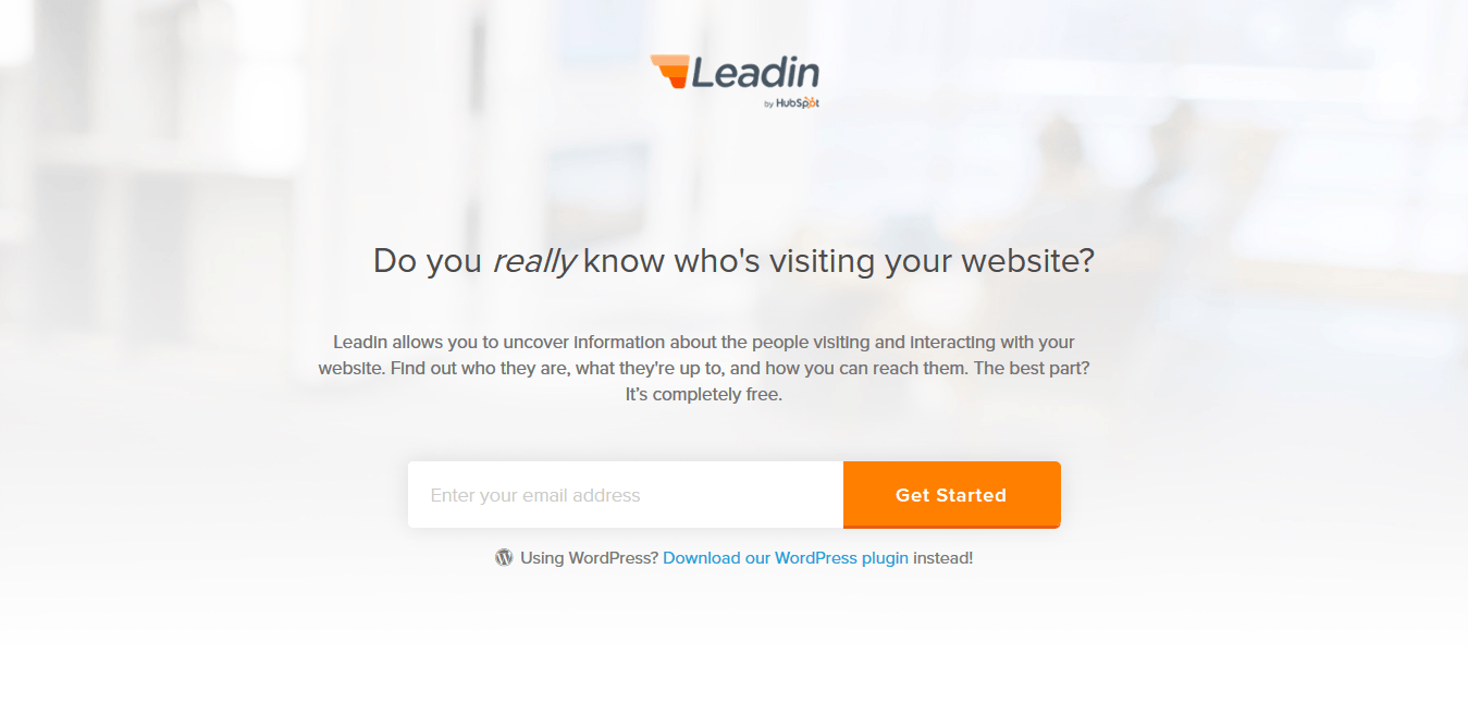
The post-click landing page headline for HubSpot’s Leadin service highlights the problem users face: “Do you really know who’s visiting your website?” Then, the secondary headline explains how Leadin has the solution to their problem:
Using customer-centric copy on the CTA button also helps encourage visitors to convert on the CTA button.
See, for example, the CTA button copy, “I’m Ready to Download” on this post-click landing page:

Font Style:
Choosing the right font isn’t just important for visual appeal, but the right font establishes brand consistency and also affects readability.
There are two main font types you can choose from:

Serif fonts are more decorative than sans serif fonts and are used for writing shorter sentences such as headlines and captions.
Sans serif fonts, on the other hand, are used for lengthy texts because they have been proven to be easier to read.
What type of font you choose also depends on the audience you’re creating your post-click landing page for. If your target audience is young children then using sans serif fonts are your best bet.
One issue with serif fonts is reproducing the serifs on darker-colored backgrounds. Keep that in mind if your brand’s colors are mainly dark shades, and you want to use a serif font.
Sans serif fonts work better on post-click landing pages and websites because serif fonts tend to be unreadable on the web.
A few examples of the two font types are:

The bottom line is this: Make sure the copy and font on your post-click landing pages are the most appropriate for your audience. To learn how much copy to write and which font type to use, try performing some A/B tests.
Your post-click landing page can use media in the following three formats:
And media helps you get conversions because it:
Not all media you place on your post-click landing pages, however, fulfill these three goals. To have the right effect on your visitors, your media needs to be relevant and assist in getting you a conversion.
Let’s discuss the three different formats of media separately:
Images
You can use images on your post-click landing pages for the following purposes:
Take your customers on guided product tours: Instead of writing paragraphs of copy on your post-click landing page to showcase features, use images and add some visual appeal to your page.
This is what one variation of Wrike’s post-click landing page does:

Other than using images for product tours, you can also use them to perform the following functions on a post-click landing page:
Introduce your team: Personalized post-click landing pages persuade visitors to click your CTA button because they start identifying with your offer and by extension your team. Where it’s relevant, add a picture of your employees and let your customers see the people behind the offer.
This is what Noah Kagan does on his post-click landing page:

Including a picture of the speaker and/or host is an essential element on webinar post-click landing pages. Kissmetrics does exactly that on their webinar post-click landing page:

The page includes the hero shots of both the speaker and the webinar host.
Another example is Kapost, by including a hero shot of the guest speaker:

Narrate a Story: You can also use a series of images or graphics on your post-click landing page to narrate a story. Narratives work well on longer post-click landing pages because they help engage the visitor throughout the longer page and encourages them to click the CTA button at the end.
The VWO post-click landing page does exactly this:

Video
Statistics show that 95% of viewers retain the messages in videos, so it’s highly recommend you consider adding a video to increase your post-click landing page conversion rates. In fact, according to EyeView Digital, videos have proven to increase conversions by as much as 80%.
Videos do the talking for you. They lend a human voice to your brand — making the page more enticing. They also help explain the value of your offer quickly, enabling prospects to make a choice in your favor and click the call to action button.
Web pages with video have more engagement compared to pages with text and images. On average, a user stays on a page with text and images for only 43 seconds, whereas a visit to a page with video lasts for about 5 minutes and 50 seconds.
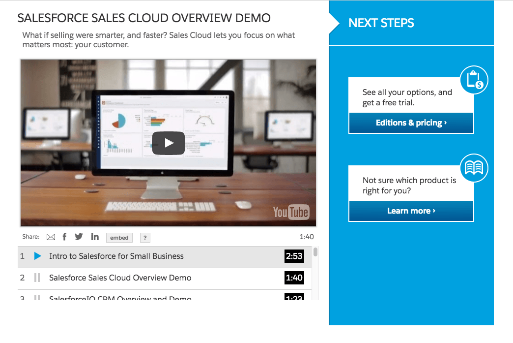
post-click landing page videos explain how the service/product works.
The Salesforce post-click landing page does exactly this:
Where you place videos on a page depends on the type of page you’re creating. For short-form pages and pages that contain less copy, the video should be showcased fairly quickly because it’s the primary source of information for visitors. For longer sales pages, the video can come after you’ve explained your offer with copy.
The placement of video is a judgment call. To find out if you’ve placed the video at the right location on your page, spend some time A/B testing different video placements.
However, not all post-click landing page videos are effective. To ensure your video adds value to the offer, make sure that the video:
If you don’t have the budget to create a proper post-click landing page video, you can add gifs to your pages instead.
Gifs
Gifs are animated images and a good substitute for videos on post-click landing pages. Contrary to static images, gifs add more depth to pages as they help explain offers in a better, more interactive way.
Instead of adding a screenshot of what your dashboard looks like, try adding a gif and show prospects how they can perform different actions in the dashboard, as shown in the example below:

Color has an impact on how we think, how we feel, and how we act. It has an impact on human psychology because colors define moods and has an influence on the choices we make.
Understanding the impact of color psychology on human behavior helps your conversion rates because you can predict how your prospects are going to react to your marketing messages when designed in specific colors.
How someone perceives a certain color depends on personal experience and cultural contexts. For example, the color white symbolizes brides and purity in the West whereas in India white is worn specifically at funerals.
Understanding color psychology is a big part of conversion rate optimization because it gives you an insight into how your customers think and are most likely to act. And understanding colors is required for marketers because no matter which colors you select, they are a big part of every marketing message you share with your audience.
Types of Colors:
There are three main types of colors:
Primary colors: Three primary colors make up all other colors: red, blue, and yellow.
Secondary colors: Purple, green and orange are secondary colors.
Tertiary colors: These are hybrids created by mixing a primary and secondary color. Tertiary colors have hyphenated names such as red-orange where red color is added more than the orange and yellow-green where yellow is added more than the green.
This color wheel represents the primary, secondary and tertiary colors:

To understand how colors work, it is important to recognize the visual nature of color.
For example, these are all considered the color blue:

They look very different because according to the Munsell System all colors contain three components:
1. Hue: This is the name of the color such as red, blue, orange, etc. Just limiting yourself to hue in your marketing materials is not a good idea because all three components (Hue, Value & Chroma) have their individual role to play:

2. Value: This is the level of brightness — how light or dark a certain color is. Colors with low value are darker (a.k.a. “shades”), colors with high value are brighter (a.k.a. “tints”):

3. Chroma: This is the level of saturation (i.e. how “vivid” a color is). In other words, colors with high chroma are vivid, while colors with low chroma look washed out:

Nick Kolenda describes how to choose the three color components in most graphic programs:

According to Kolenda people prefer different colors over others based on four theories:
1. Evolution: The research suggests that our preference for certain colors was formulated in early human history. Man associated blue color with nighttime, so it symbolized passivity, whereas sunlight was associated with bright yellow and it symbolized action. This is also why males prefer colors like blue and black, whereas females prefer yellow and pink, because — as gatherers — females had to pick different colored fruit from foliage.
2. Gender Schema Theory: According to this theory, when you come to identify with your gender as children, you seek out gender-related information and use that information to develop a concept of gender. As an example, many parents dress boys in blue and girls in pink, which helps children associate these colors with their gender as they grow up.
3. Ecological Valence Theory: EVT dictates that people develop preferences for different colors based on their emotional experiences with those colors.
4. Associative Network Theory: According to this theory, our brains have an interconnected web of knowledge known as an associative network. A unit of knowledge represents each circular node in this network. For example, different emotions would make up one node while various sensory experiences would make up another. All the nodes are connected to each other and make connections; some connections are strong while some are weak.
Your brain also contains nodes for different colors, the information in these nodes are modified as you gather more information about a certain color. All associations you make with colors have an influence on decisions you make.
Choosing Color Combinations
If you’ve been choosing color combinations at random, you’ve been doing a great disservice to your conversion rates. When choosing color combinations, you need to keep in mind three simple color relationships:
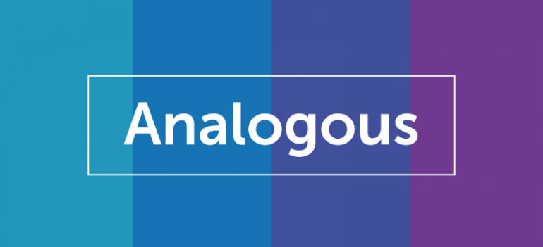
1. Analogous Colors:
Analogous colors are colors with matching hues (i.e. they sit next to each other on the color wheel). The colors tend to overpower each other with no one color standing out too much. The use of analogous colors can create a beautiful page, but it’s wise to use a complementary color if you want one element (like your CTA button) to stand out from the rest.
2. Monochromatic Colors:
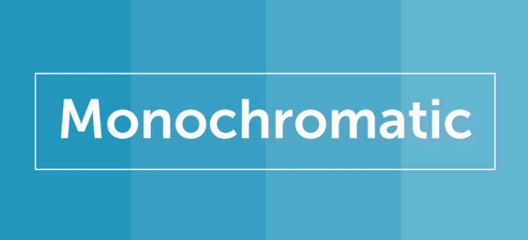
Monochromatic colors are a single color with different tints, shades, and tones. The differences between monochromatic colors are even more subtle than analogous colors. The colors work great when paired with the right complimentary color.
3. Triangle, Rectangle and Square Colors:
Once you’ve decided on analogous or monochromatic colors, you can use color combinations using a triangle, rectangle, and square on the color wheel:

A triangle (triad) is a color combination consisting of three colors evenly spaced on the color wheel. A rectangle (tetradic) is four colors — a color combination that consists of two complementary pairs. A square is similar to a tetradic; the difference is that the two sets of complementary pairs are evenly spaced on the color wheel.
Color and Word Associations
We tend to associate different colors with certain emotions. For example, red is often associated with danger while gold is associated with luxury.
CoSchedule’s graphic depicts colors with concepts that they symbolize:

Tools such as Adobe Color CC are a great help when you can’t decide which color combinations work well together. You can select the color combination, choose the shade, or simply play with the color handles until you find something you love:
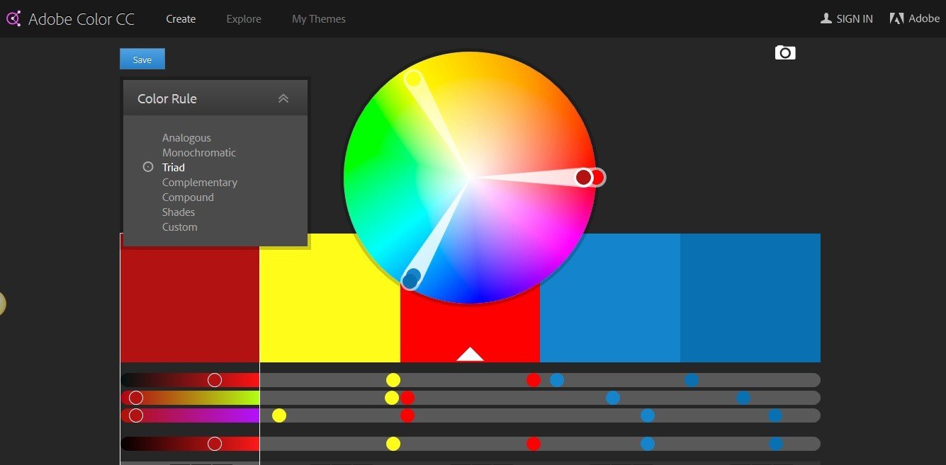
Then, all you need to do is to import the color palette codes into the program you’re using.
No matter what color combination you choose, remember that contrast matters. Contrast is what makes your page elements stand out.
You can add contrast to a page by using one color with another color. Two different colors may not have contrast because their tone is the same. To see if the contrast is right, turn your colors into grayscale and review their contrast:

High contrast is usually your best bet on a post-click landing page because the high contrast directs visitors’ attention to a particular element.
On a dedicated page color components are broken down into three parts:
According to Jared Christopherson of Yellowhammer, if you’re choosing three colors for your page, it’s best to follow the 60-30-10 rule. That means 60% of color should be the background, 30% for the base (a form or different page section) and 10% of the color should be for accents (CTA button).
Let’s see how this rule applies to Shopify’s post-click landing page:

The background color is dark gray, which comprises a majority of the page. The base color is black, (the section with the form and CTA button). Finally, the CTA button color (the accent) is green which presents a nice contrast against the navy and black.
Page design doesn’t have to be limited to just three colors. Choose colors you think work for your audience, go to the color wheel, and see if they complement each other well. Your post-click landing page will be better off for it.
Use this information on post-click landing pages
92.6% of buying decisions are influenced by visual factors — with up to 90% of that influence based solely on color.
By understanding how color works and influences our decisions, you can research the color preferences of your target audience and design your post-click landing pages and CTA buttons accordingly.
White space (aka negative space) is the empty area on a page that helps draw attention or highlight a specific element.
White space isn’t necessarily “white” space – it’s just negative space, so it can be any color as long as it performs the functions it’s supposed to.
On post-click landing pages, white space doesn’t just have an aesthetic purpose. Instead, it fulfills the following three functions:
1. Improves comprehension
White space helps reduce clutter from your page design. Using white space in left and right margins has been proven to increase comprehension by up to 20%. When you surround an element (e.g. your CTA) with white space, it allows it to “breathe” and increases readability.
2. Clarifying relationships
When two objects are near each other, they start to look similar and are grouped together. This is the law of proximity, and it applies to visual information. For example, how do you interpret this picture?

Instead of seeing 20 individual dots, we see two groups of dots — one with twelve dots and the other with eight. This is a shortcut our brain takes when it’s processing visual information. The only thing that is separating these groups of dots is white space between the two groups.
According to the Gestalt principle, people overlook elements if they are placed too far from each other. On your lead capture forms, this principle can be translated as having too much space between the text of the form field and the field where visitors are supposed to input data. Furthermore, it’s recommended you group similar form fields together to make the forms easier to fill out.
This graphic by Nielson Norman Group showcases the difference between two forms by grouping related fields together and adding sufficient white space:

This organizational structure is particularly beneficial when you’re designing long forms with a wide variety of fields.
3. Focus Attention
White space allows you to separate particular elements from each other, which makes them stand out more and attract attention. White space manipulates your eyes and makes you focus on elements that are surrounded by the space — such that you don’t seem to notice the space but only focus on the element.
As an example, the BirdEye post-click landing page uses ample white space between visual elements and copy to draw visitors’ focus to the most important thing — the CTA.

In contrast look at Trumpia’s post-click landing page where the use of white space isn’t ideal:

Let’s look at Intacct page, the negative space surrounding the page elements isn’t white, but it separates the elements from each other and reduces clutter:

White space is like the glue that holds a broken object together. You can’t see it, but it serves a very important function and helps increase your post-click landing page conversion rate.
Lead capture forms help you collect information from your visitors on post-click landing pages, which automatically makes them an essential page element. The form is the only place on standalone pages where you ask visitor to give you something. The rest of the page elements (such as the headline, copy, or testimonials) all represent things you are providing them.
Your form, however, is where you ask visitors to trust you with their information.
This is why lead capture forms can be a cause of conversion friction. To ensure that your forms don’t give visitors second thoughts or hesitate in providing their information, design your forms with the following aspects in mind:
Form Length
Form length depends on where your visitors are in your marketing funnel. If it’s the first time your brand and visitor are interacting; placing a long, intimidating form is only going to scare them away. For top of the funnel, design lead capture forms that don’t ask for too much and are easy to complete.
This is why many free trial post-click landing pages don’t have long forms. Look at WalkMe’s post-click landing page form as an example:

The HubSpot post-click landing page, on the other hand, has a longer form for visitors who aren’t new to their offers:

Form length also depends on your offer. The more high-stakes the offer, the longer the form can be.
The length of the form also depends on where your visitor is in your marketing funnel. You can’t risk putting too many fields for top of the funnel visitors, but you can increase the number of fields as the visitor descends.
It’s important to focus your visitor’s attention on lead capture forms, which is why it’s important not to have more than a single form on a post-click landing page. Even if your post-click landing page has a secondary CTA button, make sure the page doesn’t have a secondary form because you can’t expect visitors to fill out two forms to redeem a single offer. Plus, you don’t want to confuse them as to which form should be filled out to redeem the offer.
Another reason why there shouldn’t be additional forms on a post-click landing page is that integrating them with other tools can become increasingly difficult.
This brings us to multi-step forms.
Multi-step forms
Multi-step forms are broken down into parts so that the visitor isn’t overwhelmed by a single lengthy form.
Bills.com utilizes a multi-step form on their post-click landing page. The form progresses to the next step as you enter the necessary information. Here is the first step:

This is the second step:

Here’s the third step:

And this is the final step and form on the post-click landing page:

Two-step opt-in forms are one type of multi-step forms. Contrary to a standard lead capture form, a two-step opt-in form isn’t displayed on the page until after visitors click the CTA button.
This way, the form only appears for visitors who have the intention to fill it out. Another benefit of a two-step form is that it doesn’t cause conversion friction because only motivated visitors will see it.
The Instapage post-click landing page uses a two-step opt-in form:
You can also trigger forms to appear when visitors are about to exit the page. These exit intent forms can make visitors reconsider their decision of leaving without clicking the call to action button. You can also take this opportunity to offer them something else, so they do convert. If visitors aren’t ready to buy your product yet, you can offer them something free of charge, like an ebook, whitepaper or a simple “subscribe to blog.”
ThriveThemes does this by placing an exit intent form that offers visitors a chance to subscribe to their newsletter when they’re about to leave the page:

Exit intent forms can annoy visitors who just aren’t ready to click the call-to-action button, so it’s best to use them only as a last resort.
You can create exit intent forms for your post-click landing pages using tools such as OptinMonster, Sumo List Builder, Bounce Exchange, Optimonk, and even with Instapage using the custom code option.
Lead capture forms are the most important page element that can turn your visitors off so make sure this doesn’t happen when designing your forms.
A post-click landing page call-to-action button is where the conversion takes place.
In fact, it wouldn’t be wrong to say that the fate of every other post-click landing page element hinges on the call-to-action button. Design it properly and get a click; hide it amongst the rest of your post-click landing page and you risk abandonment.
To design your CTA properly, take the following factors into consideration:
Position
The CTA button’s position has an impact on your conversion rates. Where you place the button has nothing to do with the page fold and has everything to do with your offer.
The button should always come after you’ve introduced your offer to visitors and have presented your unique selling proposition. If you place the button too soon, you may turn your visitors off because they haven’t been convinced by your other page elements (such as headline and body copy).
As a general rule of thumb, the shorter the page the sooner you can place the CTA button. This placement rule also applies to the complexity and monetary value of your offer. If what you’re offering your visitors is a complex software that requires them to pay a fee, then the CTA button should only come after you’ve fully explained the offer to them. Sales pages often fall into this category.
If you have a free ebook available, then you can place the CTA button near the main headline, like UserVoice does with this post-click landing page:

The placement changes when the visitor is required to pay for the offer.
The “Buy Now” CTA button on Sujan Patel and Rob Wormley’s ebook post-click landing page draws attention to itself because it’s presented after the offer is described and is isolated from everything else on the page:
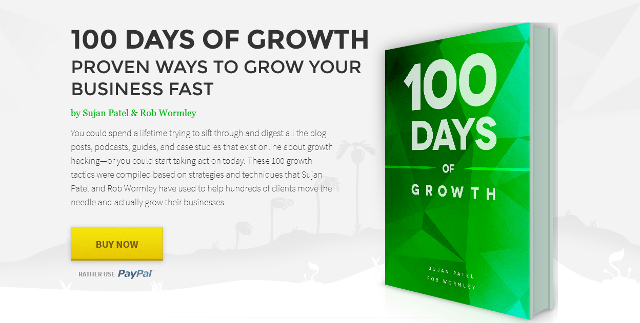
Both examples above demonstrate CTA buttons that are above the page fold. The difference lies with the amount of copy that precedes each button. For the free offer, UserVoice believes only a headline and sub-headline is enough to persuade visitors to consider clicking the CTA button, whereas 100 Days of Growth requires a full paragraph of copy explaining why buying the ebook is a good idea.
Size
Common sense dictates that the larger something is, the more noticeable it will be. So, it makes sense to design the call-to-action button to be relatively large.
Fitt’s law dictates that the “larger and closer a target, the faster and easier it is to select that target.” For CTAs, this essentially means the bigger the button is, the easier it is to point to it and click it.
Remember the size of the button is relative and not an absolute. You want your CTA to be easily noticed but not an eyesore. Don’t include an enormous button because this will mess up the aesthetics of the page and most likely discourage conversions.
The blue “See product demo” button on the Infusionsoft page is a little smaller than the surrounding elements and doesn’t draw attention to itself.

Make sure the button is bigger than its surrounding elements so that it stands out. Do what Racheal Cook does on her post-click landing page:

Now that’s a perfectly-sized CTA button for this particular post-click landing page.
The “perfect CTA button size” simply doesn’t exist because all button sizes should be determined keeping in mind the overall post-click landing page design.
Color
When deciding the color scheme of your post-click landing page make sure to design the CTA button in a contrasting color. This will help the button “pop” off the page and be found easily by visitors.
The Elite Marketing Pro post-click landing page has a good contrasting CTA button:

Multiple Buttons
Although not recommended, it’s not uncommon to have more than one call to action button on post-click landing pages. A secondary CTA button doesn’t refer to the number of CTA buttons. Rather, it provides visitors with an alternative conversion action to fulfill.
For longer sales pages it’s possible to have 5-6 buttons and not have a single secondary button.
Secondary buttons should be used as a last resort because they break the basic singularity rule of post-click landing pages. Don’t make the primary CTA button and conversion goal fight for your visitors’ attention by including a separate offer on your page.
Copy
Similar to the overall copy of a targeted page, the CTA button copy needs to be customer-centric. This is because CTA buttons are meant to inspire action and the copy that should be action-oriented.
For example, the “Start Your Free Trial” button copy on Desk.com’s post-click landing page inspires action:

Customer-centric button copy is relevant to the post-click landing page offer, which makes the click experience even more optimized for visitors.
The Instapage post-click landing page button copy keeps the visitor in mind and goes one step further having it personalized with “I:”

Including the words “you,”,’I” “your,” “me,” and “mine” make your visitors see your offer through their eyes — which helps persuades them to click the button.
This is what CoSchedule does with their free trial page:

CTA buttons can make or break post-click landing pages because if you’ve optimized everything else on the page — and the CTA isn’t designed to convert — then you’re missing out on valuable leads (and sales). Make sure you design your buttons with position, size, color, and copy if you want to maximize conversions.
What happens after visitors fill out your lead capture form and click the CTA button?
Do you abandon your visitors until you can target them with your next offer? Or do you do the smart thing and take advantage of the post-conversion time to strengthen your relationship with them?
Thank you pages help you maintain a good relationship with leads after they convert. With thank you pages you’re able to reinforce the notion that their decision to do business with you was the right decision.
Besides thanking the visitor for submitting the form, these pages typically inform the person of next steps, request they follow you on social media, or offer them something else they may find useful that pushes them further down the funnel.
The Upwork webinar post-click landing page does just that after you convert:

Upon submission, you are directed to their Thank you page:
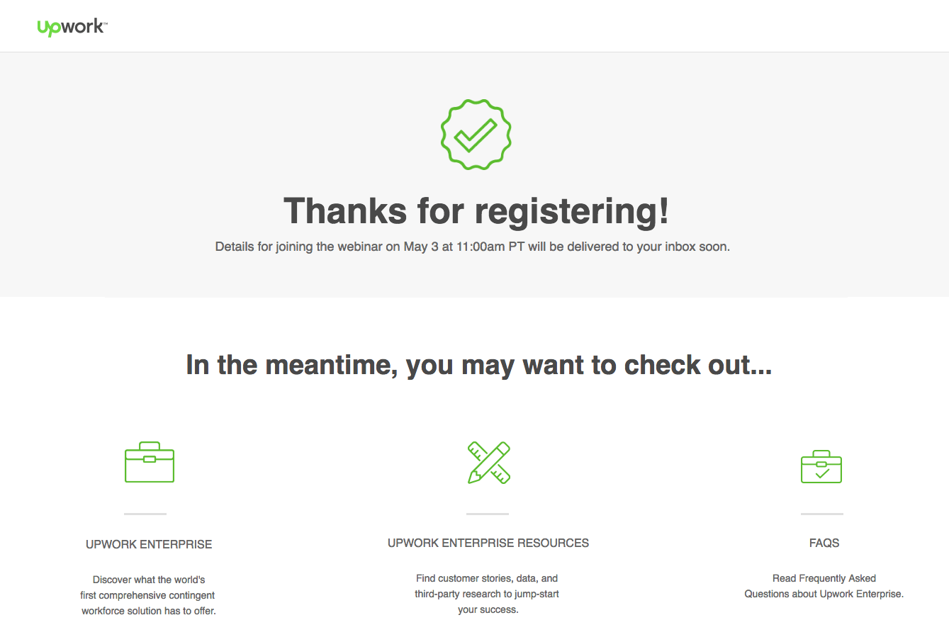
The page doesn’t just thank you for registering for the webinar. It also encourages you to check out other resources on their website. The page footer also contains links to their social media profiles to make it easy for visitors to engage with Upwork even further.
Beyond sending prospects to a thank you page, another good practice during the post-click conversion is to send a Thank you email. For example, in a webinar registration thank you email, you can also use this opportunity to confirm you’ve saved their spot and send them a reminder of how they can join the presentation along with any technical requirements needed to participate.
Upwork does both in its thank you email:

Make sure you don’t abandon your visitors post-click. Instead, strengthen your relationship with them on a Thank you page and continue the engagement process with a thank you email because every touch point matters.
post-click landing pages are invaluable tools that help you generate leads for your marketing campaigns. When designed properly, post-click landing pages have the power to fill your sales funnel with more leads than your home page or product page ever could.
To put these post-click landing page design best practices into action, build your own page by signing up for an Instapage account, today.
Try the world's most advanced landing page platform today.