Post-click landing pages, like web pages, should always follow some sort of organized visual hierarchy. Chances are, you know this already, but it bears reiterating. Anything you can do to influence your viewers to focus on what you want them to notice is pretty much the name of the game.
A good designer understands how users view and process information online. This knowledge informs their design decisions and leads them to place the most essential elements in a way that they will get noticed. If everything looks right, the design will entice visitors to take the desired action.
One of the primary ways designers influence users and draw attention to a page’s most important elements, is to design the page using the Z-Pattern.
What is the Z-Pattern?
A Z-Pattern design traces the route the human eye travels when they read — left to right, top to bottom:
- First, people scan from the top left to the top right, forming an imaginary horizontal line
- Next, down and to the left side of the visible page, creating an imaginary diagonal line
- Last, back across to the right again, forming a second horizontal line
When viewers’ eyes move in this pattern, it forms an imaginary “Z” shape:

It’s important to note that Z-Pattern designs are not required conform to a traditional Z-Shape and the number of Z-Angles along the pattern can vary.
How the Z-Pattern applies to post-click landing pages
Creating a web page with the Z-Layout helps to create a visual hierarchy that people are likely to follow, making it a perfect layout option for post-click landing page designs.
But why design a page with the Z-Pattern instead of the F-Pattern?
While the F-Layout tends to be more appropriate for pages dense with content, the Z-Layout is primarily meant for pages with minimal copy. Essentially, the Z-Pattern is better suited for pages where simplicity is a priority and the main takeaway is the CTA.
Designing with the Z-Layout in mind:
- The top horizontal line should include the main components you want viewers to focus on first
- The diagonal line should feature any bits of information that build up to your call-to-action
- The bottom horizontal line should highlight the CTA at some point along the pattern
Creating your post-click landing page according to a Z-Pattern layout can lead to more conversions because you get to control where the viewer’s eyes move.
Let’s learn a bit more about the Z-Pattern design by examining a few post-click landing page examples.
Keep in mind, for shorter post-click landing pages, we’ve shown the entire page. However, for longer pages, we only displayed above the fold. You may need to click through to each post-click landing page to see some of the points we discuss. Additionally, some examples listed may be A/B testing their page with an alternate version than the one displayed below.
A post-click landing page that ignores the Z-Pattern
The Traffic Light Media post-click landing page below doesn’t follow the Z-Pattern. It does, however, provide an intentional flow by being a clean, organized page that persuades viewers’ eyes to follow an intended path down the middle of the page to the CTA button:

They’re smart to A/B test the page with the variation below. This time, they are following the Z-Pattern layout:

Upon seeing this variation, the Z-Path is as follows:
- The white headline draws attention first against the darker background, even though the company logo is listed higher on the page.
- From there, the path scans across to the form headline, since this is right next to the page headline and it contrasts well with its white background. This is the first Z-Pattern angle.
- Next, the pattern design continues diagonally over to the left side of the page to the yellow “discover opportunity” copy.
- Following the path, attention is drawn back to the right side and focused on the orange CTA button.
Keep in mind, these eye movements are subjective, and not all users will scan pages the same way. The key thing to remember is to keep your viewers’ focused on the path that you want them to follow and persuading them to convert on your CTA.
Now, let’s examine some post-click landing pages that follow the Z-Pattern layout.
post-click landing pages that follow the Z-Pattern
LifeLock

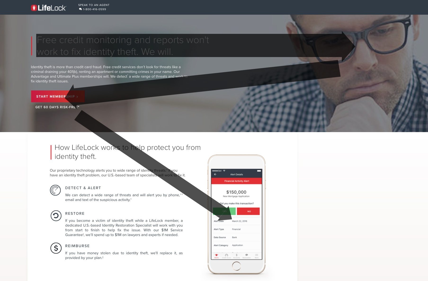
This LifeLock post-click page follows the Z-Pattern but doesn’t conclude with a CTA:
- The visitor will likely start at the headline, since it’s larger font than the rest of the copy and contrasts well with the dark background.
- Scanning over to the right, the viewer will then focus on the man’s face, which is the first Z-Angle.
- Next, eye gaze will travel diagonally to the bright red CTA button at the second turning point.
- Finally, focus will turn to the smart phone image.
Just like Z-Pattern designs must not form a traditional “Z”, it’s important to recognize that CTAs are not required at Z-Pattern angles. It’s just better if CTAs are located at the turns because this is where viewers’ eyes will end up.
CallFire

This CallFire post-click page is another example that doesn’t form a traditional Z, but the pattern is still evident:
- Viewers will start with the page headline since it’s larger than the rest of the copy.
- From here, visitors will scan down and to the right passing through the image, focusing on the form and CTA button — creating the first Z-Angle.
- Next, viewers travel to the left towards the video — creating the second Z-Angle.
- Finally, viewers’ eyes will continue across the page to the iconography and three steps.
Oracle

Oracle’s page is another example that doesn’t follow a traditional Z, but the path leads to the CTA at the end:
- Page visitors will likely start at the headline because it’s the largest font on the page and is easy-to-read with all of the surrounding white space.
- Next, they’ll move horizontally to the image on the right.
- From here, the human eye will naturally flow down to the left side at the graphic.
- Finally, viewers’ eyes will scan the bottom part of the page over to the CTA where the Z-Layout ends.
Fleetmatics

This Fleetmatics post-click landing page includes a CTA at multiple Z-Angles:
- Chances are, the headline and subheadline in the top left will capture viewers’ attention first.
- From there, visitors will scan over to the right to see the background video.
- Creating the first diagonal in the Z-Shape, visitors are likely to scan down to the left toward the first orange CTA button.
- Next, the user’s eye gaze will pass through the customer badges, switching back and forth through the bulleted copy to the second orange CTA button.
- Finally, the Z-Layout continues back to the left toward the image and back again to the third CTA button.
The pattern continues further down the page creating more Z-Angles. And, by including a CTA at many turns, viewers will have a hard time ignoring them and be persuaded to click and convert.
Design your next page with the Z-Pattern layout
Each of the brands discussed above does a great job of placing their post-click landing page elements along a Z-Pattern layout. Along the way, they effectively influence the viewer’s eye gaze and direct them to the CTA.
With these examples in mind, and to get your visitors more focused on conversion, design your next post-click landing page with Instapage. Sign up for an Instapage Enterprise demo today.

See the Instapage Enterprise Plan in Action.
Demo includes AdMap™, Personalization, AMP,
Global Blocks, heatmaps & more.
