Typefaces, font families, ball terminals, beaks — the world of typography is a fascinating one, the roots of which can be traced back to the fifteenth century when movable type was first invented.
Since then, we’ve come a long way.
Typography has only gotten more complex. The number of fonts available to us have grown immeasurably, as have the terms we use to describe them.
Today, we consume hundreds, even thousands of fonts every single day. We see them on food wrappers, on calendars, and on traffic signs. We notice them on book covers, labels, and restaurant menus.
But what we don’t realize is just how much the subtle differences in the way a letter is formed can affect our emotions, our ability to comprehend text, and whether or not we feel comfortable purchasing a product.
As you’ll learn later in this article, the right font can serve as a powerful ally in the battle for more business.
That’s why, if you market your company online in any way, shape, or form, you should know about one of the easiest, most popular ways to add custom fonts to your web pages today: Adobe Typekit.
What is Adobe Typekit?
Long before services like Adobe Typekit and Google Fonts, to make stylistic changes to text on your website, you needed to understand hypertext markup language (HTML).
The process entailed making your way through each web page, and, using a set of commands, individually altering its HTML code to reflect the appearance you wanted to present.
The whole thing was about as tedious as counting grains of sand and about as enjoyable as a visit to the dentist for a root canal.
Then, cascading style sheets (CSS) were introduced.
Coding in CSS was similar to doing so in HTML, only now you could make changes to multiple web pages at once, instead of having to do so individually.
Web design interns everywhere rejoiced.
However, for the majority of us without any coding skills whatsoever, this still meant we needed to hire someone to make even the smallest design changes to our web pages — like adding serifs to our font.
Luckily, because of services like Adobe Typekit and Google Fonts, today that’s no longer the case (at least when it comes to fonts).
While some claim that Google Fonts is a better service because it’s open source and free, many professional designers argue that Adobe Typekit contains far higher quality fonts — making it worth the extra money if you’re serious about typography.
How Adobe Typekit works
With Adobe Typekit, adding and changing fonts on your website is quick and easy. After signing up for one of their three plans, all it takes is a few easy steps.
First, browse or search fonts based on a number of filters from the right sidebar:
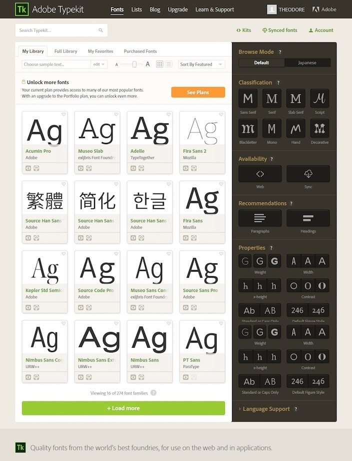
Adobe lets you sort by:
1. Classification
This filter allows you to browse fonts based on their traditional classification. Do you want a:
- Serif font: Fonts that have small lines at the end of their letters, known as serifs, like Times Roman and Century.

- Sans Serif font: Characterized by the lack of serifs at the end of each letter, popular ones include Arial and Calibri:
![]()
- Slab Serif font: This font has thicker, block-like serifs, as seen in Rockwell or Courier.

- Script font: Adobe appropriately describes these fonts as “flowing and calligraphic.” Popular ones include Vivaldi and French Script.

- Blackletter font: These fonts are what you would’ve seen in ye olde English textbook. Lucida Blackletter and Old English Text are two well-known families in this category.

- Monotype font: The letters of mono fonts all take up the same amount of horizontal space. Courier New and Lucida Console are two commonly used ones.
![]()
- Handwriting font: If you’re trying to make your font look like handwriting, fonts like these, which include Comic Sans and Chalkboard, are what you’re looking for.

- Decorative font: These are fonts like Abracadabra and Cooper Black, which are more decorative than functional, and better suited for titles and logos.
![]()
2. Availability
Adobe differentiates between two types of available fonts:
- For the web: These fonts are designed to integrate seamlessly with any of your web pages.
- Synced fonts: These fonts can be downloaded and aren’t limited to the web or the Adobe Creative Cloud. They can be used in your applications, or even to print on things business cards, posters, or t-shirts.
3. Recommendations
If you’re not sure of which font would look good on your web page, a cool feature of Adobe Typekit is that its staff will recommend a font based on how you want to use it:
- In a paragraph: If you’re looking for a font you can use in paragraphs, Adobe will recommend a style that will be legible across all operating systems at a small size.
- In heading: Adobe will pick out more decorative fonts that are big, bold, and legible at a larger size.
4. Properties
You can even filter by specific properties of font:
- Weight: This refers to the thickness of strokes used to create the font. The heavier the weight, the thicker the font.


- Width: This affects the actual width of the letterforms.


- X-height: This is the ratio of lowercase letter height to uppercase letter height in a font.
- Contrast: This refers to the ratio of thick to thin strokes in a font.


- Standard of Caps Only: This one is pretty self-explanatory. Caps-only fonts use only capital letters, and standard fonts use both capital and lowercase.
- Default figure style: Here you can choose between Oldstyle or Lining numeral display. Oldstyle numbers are a little more elegant, a little…well…older-looking in style. Lining numerals are a bit more modern.


Use any combination of filters to narrow down your choices, then preview your them by clicking any one of the fonts you’re interested in on the main browsing page.
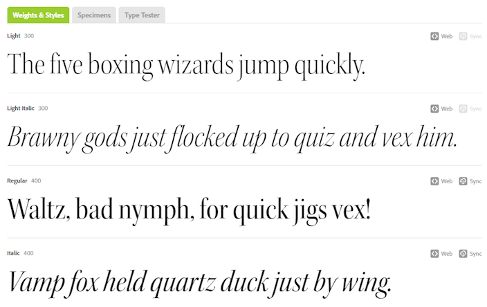
You can see the other weights and styles of the font you’ve selected:
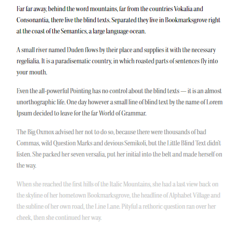
You can view your selected font like in different sizes, levels of brightness, and in paragraph form:

And if you’re looking for a more interactive testing experience, use the “type tester” feature:

Once you’ve finally settled on a font, click its icon on the main browsing page where it says “Use fonts.” Then, click the “Web” tab when the pop-up appears:
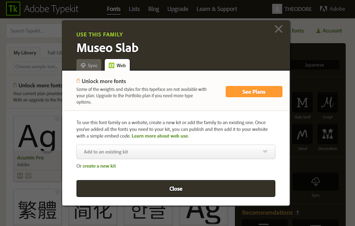
Before you can begin using any fonts on your website, you have to add them to a kit. Click “create a new kit” to get started.
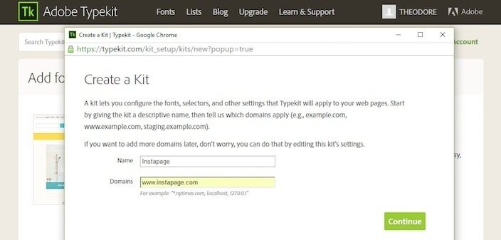
Enter your name, the domain you want to add your new fonts to, and click “Continue.”
Adobe will provide some JavaScript that you’ll need to inject into the code of the pages you want to display your new font and bam! After you select the preferred weight and style of your font, you’re done…
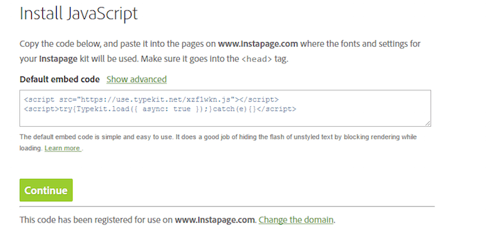
That is, of course, assuming you know how to edit the code in the back end of your website.
If you don’t, contact your website’s administrator to help you with this last step, or use Instapage to create a post-click landing page that already integrates with Adobe Typekit.
As a Premium member, you’ll even get all those cool fonts for free, without having to subscribe to Adobe’s Typekit service. Pretty sweet deal, huh?
“But… all this for some measly fonts? Sans-serif, serif, x-height, weight, who cares?”
You should, let us explain why.
Why your post-click landing pages should use custom fonts
1. To create great message match
If your brand uses the Arial font family in all of your advertisements, you’d better make sure that your post-click landing page is written in Arial, too.
The reason why has to do with something called “message match.” Let’s consider this hypothetical scenario:
You’re a social media manager in need of an analytics software that will help you better understand key performance indicators. While scheduling some Facebook posts one day, you notice a paid ad from a leading marketing SaaS company in your news feed. In a wide, bold, orange, sans-serif font, it advertises a suite of tools capable of analyzing metrics for Facebook, Twitter, Pinterest and Google+.
What luck! These are all the networks your company has a presence, so you click the ad to learn more about the product. But what happens when you do, totally confuses you.
Now you’re on a post-click landing page with a totally bizarre layout. And the font you saw in that Facebook ad? It’s nowhere to be found. Everything written on this page is in a serif font. There are no orange letters anywhere, nor visual cues like underlines you saw in the original ad.
So where the heck did you land? Is this the post-click landing page associated with that ad?
It can’t be. You must’ve been redirected to somewhere else.
Uncertain and uncomfortable, you exit your browser window and go back to scheduling your Facebook posts, satisfied with resuming your search later.
This is an example of what can happen as a result of poor message match. On your post-click landing page, everything from your images, to your font selection and word choice should completely match the advertisement it’s tied to. Otherwise, you risk losing prospects who have the potential to turn into customers.
No matter how jazzed they might be about your product or service, bad message match can leave them uncomfortable with converting on your post-click landing page.
2. Use Adobe fonts to maintain brand consistency
When it comes to what’s in a brand, nobody explained it better than the father of modern copywriting, David Ogilvy, who said:
A brand is “the intangible sum of a product’s attributes: its name, packaging, and price, its history, its reputation, and the way it’s advertised.”
Those intangible attributes have a major effect on how people view your product or service.
One of those attributes (font) has the potential to reinforce that brand image. For example:
If I tell you to picture the brand name “Coca-Cola” in its original font, what do you see?
Slightly italicized cursive letters, written in kind of a calligraphic fashion, right?
How about if I tell you to imagine the classic “Pepsi” logo text as it’s written on a soda can?
You see heavier weighted, wider, block letters, in what looks to be a title font, don’t you?
Our familiarity with these fonts and logos has been deliberately developed by marketers over time. The more we see them, the more we recognize them.
Sometimes we even get to the point, as with Pepsi and Coke, where we don’t even need to see them. We can picture them. It’s almost as if they’re branded into our minds.
The process of making that happen has to do with brand consistency. The more people see your font, or your logo, or your packaging, and the more it remains unchanged, the more familiar your brand becomes to them.
“Yeah, but so what,” you say. “If my product is good enough, my packaging and my font and my logo won’t matter. People will buy it regardless.”
Not so, according to this research.
It reports that 63% of people say that brand consistency plays a role in their spending. In fact, 34% of respondents claim they’re willing to spend more on a brand that is consistent in its messaging across channels, and 39% of people say they spend less on inconsistent ones.
So keep it consistent — that means font, logo, packaging, etc. Prospects take into account much more than just your product when deciding whether or not to buy it.
3. To make your content easy to read
To understand just how important readability is, you need to first realize how little people read on the web.
In a piece titled “You Won’t Finish This Article,” author Farhad Manjoo explains how he teamed up with a data scientist from Chartbeat named Josh Schwartz, to figure out how many people read all the way through (online) Slate Magazine articles.
Here’s what they found:
- 5% of people don’t read enough content to necessitate scrolling below the fold (on other sites, that number is closer to 10%).
- There’s little correlation between social sharing and reading depth (meaning people who shared the article didn’t necessarily make it all the way through; and that even though an article is widely shared, that doesn’t mean it’s widely read).
- The majority of these readers only made it 50% of the way through the article (on many other sites, that number is closer to 60%).
- Only 25% of readers made it four-fifths of the way through the article.
Compare these to findings from Jakob Nielson that show readers have time to read, at most, 20%-28% of the words on the average web page, and you’ll understand why Adobe Typekit and Google Fonts allow you to preview text before you throw it onto your website.
Because readability matters.
Some of the fonts you’ll notice are better suited for headlines. They’re big, bold, decorative, and they’re a pain to read in paragraph form.
Others are more appropriate for block text. They’re spaced well, often not attention-grabbing enough to use in headlines, and their letter are easily discernable from the other.
So, if the product or service you’re selling requires a long, text-heavy post-click landing page, you’d better make sure your prospects can read it.
Use Adobe’s “recommendations” feature to pick fonts that read well in headline and paragraph form, then preview them to make sure they look the way you want them to.
4. Use Adobe web fonts to create a visual hierarchy
We take for granted that we’re easily able to find the most important information on a web page — but the reason we can is because of font and layout.
We recognize headlines because they’re positioned at the top of the page, and they’re written in the biggest and boldest font. The smallest text is usually the body copy. In between, there are several different levels of headers, each of which often nests underneath it body copy, and sometimes even smaller sub-heads.
We’ve also come to understand that text written with more heavily weighted fonts is more important. The same goes for font that’s underlined or italicized.
To prove just how important these visual cues are, Dr. Kevin Larson of Microsoft teamed up with Dr. Rosalind Picard of MIT to conduct a study that separated ten men and ten women into two different groups.
They showed them two different versions of the New Yorker magazine — one with a traditional font and layout, and one with a less traditional design.
What the authors found was:
- The group who read the more traditional version underestimated how long it took them to read the piece. Time passed more quickly because they were captivated by the content (and layout, and font)
- The traditional group was found to have higher focus and better clarity while reading.
- The non-traditional layout group actually felt physically bad while reading, displaying at times a prominent frown, a facial expression controlled by the area of the brain that governs emotion – the amygdala.
- The group who read the non-traditional version overestimated the time it took them to finish the piece, indicating that reading felt longer.
When arranging your post-click landing page, make sure you use the visual cues we’ve come to rely on to find the most important information on it. Otherwise, you risk losing your prospects to poor reading experience.
5. Use Adobe Typekit fonts to become a marketing chameleon
If you’re part of a digital marketing agency, whether you specialize in web design, content marketing, or conversion optimization, you’re going to be responsible for creating marketing materials for a variety of clients.
That means things like eBooks, post-click landing pages, product descriptions, and much, much more.
So how do you think your client would feel if their brand exclusively uses the Adelle font family in all their marketing, but you went ahead and wrote their latest whitepaper in Source Code Pro because you don’t have Adelle, and…hey, that’s close enough. Good luck finding more business if you think “close enough” will satisfy your customers.
When that won’t do, Adobe Typekit will allow you to use 2,450+ fonts for the web depending on your plan, along with more than 5,660 downloadable ones you can use in offline marketing materials. With such a giant arsenal of fonts, there will be no client brand you can’t match.
Sign up for an Instapage Enterprise demo today.

See the Instapage Enterprise Plan in Action.
Demo includes AdMap™, Personalization, AMP,
Global Blocks, heatmaps & more.
