Yesterday a marketing campaign almost broke my mouse.
How?
By frustrating me to the point I nearly hurled it across the room.
After I finally calmed down, I realized there was a valuable marketing lesson to be learned from my anger. And here’s what it is…
Usability should be a top priority on your post-click landing page
This is what happened: I needed a last-minute hotel, so I typed “hotel tonight Boston” into Google’s search bar.
Eventually, after clicking through a paid search ad, I arrived at a location-specific post-click landing page from HotelTonight. It looked like this above the fold:

On it, my eyes were immediately drawn to the most attention-grabbing element in the visual hierarchy: the biggest text on the page, which read “Last-minute hotel deals in Boston.”
I glanced below that and saw some prices. Then, I scrolled down to look for more listings. Here’s what I saw:

There were hotels, but no indicators of pricing or availability. So, I assumed I had to select one to get more details. Not needing anything extravagant, I clicked the title of the “Midtown Hotel” listing to learn more.
…but nothing happened.
“Let’s try this again,” I thought, before clicking on the subtitle beneath it reading “No-frills Back Bay base.”
…still…nothing.
“What if I click on the ‘basic’ label?”
Nothing.
“Maybe this listing is broken. What if I click on the Wyndham Boston Beacon Hill?”
Again, nothing.
At that point I was frustrated, frantically clicking all over the page. My next thought, I blurted out loud: “CAN I JUST SEE A DAMN LISTING?!”
Why was this page so hard to use?
The importance of designing for user experience
Aesthetically, there was nothing glaringly wrong with this page. It looked credible enough to get me below the fold browsing listings.
But, there’s more to web design than making things look pretty. A page’s “usability” describes how effective it is in carrying out its function from a user standpoint. According to Steve Krug, author of Don’t Make Me Think:
It [usability] really just means making sure that something works well: that a person of average ability and experience can use the thing — whether it’s a website, a toaster, or a revolving door — for its intended purpose without getting hopelessly frustrated.
Unfortunately, many designs both online (that HotelTonight post-click landing page) and offline aren’t optimized for the user. If you’ve ever pulled a “push” door, you’ve experienced bad UX design.
Instead of thinking yourself an idiot, you should be wondering why the designer chose to install a “pull” handle on “push” door.
It’s not you; it’s the design.
Plenty of other examples of poor usability exist. Instead of getting into each of them, we can safely say that when a user interface isn’t created with its audience in mind, it can result in a poor user experience.
Online, that poor experience can have disastrous consequences for your website. From the father of web usability, Jakob Nielsen:
If a website is difficult to use, people leave. If the homepage fails to clearly state what a company offers and what users can do on the site, people leave. If users get lost on a website, they leave. If a website's information is hard to read or doesn't answer users' key questions, they leave. Note a pattern here? There's no such thing as a user reading a website manual or otherwise spending much time trying to figure out an interface. There are plenty of other websites available; leaving is the first line of defense when users encounter a difficulty.
During the design process, post-click landing page creators often forget their goal isn’t to showcase their skills. Instead, it’s to help another human accomplish an objective.
Broadly, that objective is to evaluate and possibly claim an offer on your post-click landing page. Specifically, you’ll have to ask yourself these questions before you begin designing:
- What is my objective for this post-click landing page (drive signups, downloads, purchases, etc.)?
- What is my audience’s specific objective once they land on it?
- What do they need to evaluate my offer as easily as possible?
- How do I enable them to claim my offer easily?
To answer them, you’ll need three things: comprehensive knowledge of your target audience, an idea of post-click landing page usability best practices, and insight into what makes a persuasive post-click landing page.
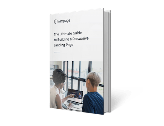
The first one, you can learn how to develop here; the second, you’ll find in this blog post; and the third, you can discover in the new Instapage resource: The Ultimate Guide to Building a Persuasive post-click landing page:
post-click landing page usability principles
Every business is unique and every offer is different, but the basics of delivering a good user experience remain the same. Keep these 5 C’s in mind when designing a post-click landing page for optimal user experience:
Consistency
While building your post-click landing page, it’ll be tempting to stray from design conventions with the goal of standing out among your competition. Here’s why you shouldn’t…
Don’t try to reinvent the web
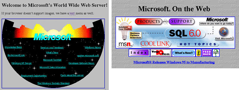
During the internet’s infancy, it wasn’t uncommon to see designers experiment with wacky layouts and elements. Take a look at these gems:

At the time, it wasn’t totally clear how the web would be used. So, sideways “FAQ” buttons and space backgrounds seemed like creative ideas.
Today, though, you won’t see web pages like this anymore. And that’s because they violate design conventions we’ve learned can degrade the user experience. Space backgrounds are distracting, and sideways text is unnecessarily hard to read.
That’s why you should focus on standing out with a clear USP, and not by trying to reinvent the look and feel of the web. Your buttons should look like buttons, not like stars or stop signs. Your logo should be located in the upper left corner of the page, not in the lower right.
Consistency is one of the biggest contributors to usability. To help visitors recognize and understand the elements on your page, you should use ones that are familiar to them — aka, the ones they see everywhere else on the web.
Let’s jump back to my frustrating experience on HotelTonight’s post-click landing page: I thought I could get more information on a particular listing by clicking it because that’s how nearly every hotel post-click landing page works. You click a listing to learn more about it.
But, this one didn’t work like that. It didn’t meet my expectation of how hotel post-click landing pages function, and the result was a frustrating user experience.
The lesson here?
Place elements where visitors expect to see them. Design them the way your prospects expect them to look. Don’t be cute. Be consistent.
Message match absolutely must be present
Another thing post-click landing page designers tend to forget is this: The post-click landing page is not your visitor’s’ first impression of your brand — the referrer is. That’s why your post-click landing page needs to deliver on the promise your ad, or email, or paid search result makes. Here’s what happens if it doesn’t, according to Smashing Magazine’s Co-Founder, Vitaly Friedman:
Most users search for something interesting (or useful) and clickable; as soon as some promising candidates are found, users click. If the new page doesn’t meet users’ expectations, the Back button is clicked and the search process is continued.
For perfect message match, words on a post-click landing page, logos, and even colors need to be consistent with the referrer. Disregarding this design best practice will get your page abandoned in an instant.
Clarity
Clarity and consistency are related. When people recognize a design element, they have an idea of how it functions. When that design element is clear as well, there’s no question of its purpose. Here’s how to make everything on your page easy for your visitors to understand and use:
Copy should be written for comprehension
Words are hard — for the people who write them, and for those who read them too. A copywriter is faced with the challenge of trying to explain an offer clearly when he already knows everything about it. And readers are put in an equally difficult position of trying to understand an offer when they currently know nothing about it. Some tips on writing comprehensive copy:
- Unless you’re writing for an audience with a high level of technical knowledge, remove all jargon and assume your prospects read at a 6th-grade level.
- Emphasize the benefits of your offer. Product features like “doodads” and “thingamawhats” hold no persuasive power. Instead, let people know what those features enable them to do.
- Replace ambiguous words. The word “quality” to some people means “high-quality.” To others, it means “satisfactory.” Use better descriptors to convey the value of your offer.
If they can’t understand why they should convert, there’s no chance your prospects will.
CTA buttons should let visitors know what clicking will do
If you’ve created a button that’s recognizable, you’ve already won half the battle. The other half is about letting visitors know what will happen once they click your button. For this, consider your offer.
If it doesn’t require payment from the visitor, pick a compelling CTA by asking yourself this: “What will claiming it allow visitors to do or become?”
For an ebook about post-click landing page design, consider using “Send my ebook” as your call-to-action, or even something more specific like “Make me a design pro.” Here’s an example from Amy Porterfield:

If it does require credit card number, on the other hand, it’s best to forego descriptive titles like the one above and instead use blatantly basic ones like “Buy” or “Donate.” The last thing you want is a throng of pitchfork-wielding customers who didn’t know their card would be charged when they hit the “Make me a design pro” button.
Form labels and feedback should be descriptive
To fill out your form, visitors will need to know exactly what you want from them. While these tips might seem like common sense, there are still plenty of forms that don’t follow them.
- Don’t use disappearing placeholder text as a label. It’s been shown to confuse prospects and challenge their memory. Instead, labels should be above the field they correspond to.
- Labels should be positioned closest to the form field they correspond to. Ambiguous white spacing, or equidistant spacing from another field, can make a prospect question what information they should be submitting.
- Should the entry be 8 letters with a special character? Can the form not process an asterisk? If a field requires a specific input, the label should let visitors know.
- Error messages should be attention-grabbing and descriptive. Don’t just use the color red, but a number of signals to indicate an input issue, like bold text and an outline around the incorrect field. Make sure they know what mistake they’ve made so they can correct it the second time around.
- Clearly distinguish between optional and required fields.
Your offer should be easy to understand
Why do people spend more with credit cards? Because spending cash feels more real.
When you swipe a card, money doesn’t exchange hands; the charge doesn’t show up on your bank statement until later; and if you don’t check your account balance, it’s almost as if the purchase never even happened.
Consider a research experiment conducted during a financial education session for ING employees. Two groups of participants were asked:
- if they would enroll in a 401k plan.
- how much they were willing to save regularly.
The first group was presented just these questions. The second group, though, was given an added directive: Imagine all the positive things in your life that would happen if you saved more.
The result was a boost in enrollment by 20% in group 2, and an increase in the amount that people would save by 4%.
What does this mean for your post-click landing page offer?
If you want people to understand its value, you have to present it in a way that clearly explains its benefits. And many times, that means using visual aids instead of text.
For some offers, infographics work best. For others, explainer videos or hero shots will do the job better.
Which you choose depends on your audience and offer. Show instead of tell, and test until you discover what sells your product or service best.
Concision
What may be the most important thing to remember when designing your page might also be the most commonly disregarded: You’re designing for people with little time and attention.
Nobody’s browsing your post-click landing page for fun. They’ve clicked an ad or a link in an email and they want to know, as quickly as possible, whether your offer is worth claiming. That means…
Text should be optimized for skimming
“Get rid of half of the words on each page, then get rid of half of what is left,” says Krug in his book. Once you’ve cut 50% of your post-click landing page copy, it’s important to make what’s remaining skimmable, because people don’t like to read.
Minimize verbosity by eliminating fluffy adverbs and stock phrases. Use bullet points and subheadings to break up blocks of intimidating text. Add effects like bold and italics to make important words noticeable.
Visual hierarchy should communicate importance
The way your page content is arranged and manipulated has a lot to do with what your visitors see and what they miss. On the HotelTonight post-click landing page, I missed the call-to-action but noticed the headline “Last-minute hotel deals in Boston.”
Why?
Because its size makes it the most attention-grabbing element above the fold. When users have little time (which is always), they use visual cues like placement, color, size, etc. to determine what’s important on the page. Some examples of how:
- Bigger = more important
- Higher placement = more important
- Greater contrast = more important
Learn more about using visual hierarchy to guide visitors to your CTA button here.
Your form should be as short as possible and easy to fill out
It’ll be tempting to capture all sorts of prospect information on your post-click landing page form — from name and email to role and budget. But, if you don’t absolutely need all that information, you shouldn’t ask for it.
The best lead generation is accomplished by marketing teams that know the bare minimum they need to qualify a prospect. For some, that will be three fields’ worth of information. For others, it will be ten.
Regardless of how long your form is, you should make it painless to fill out. Allow visitors to submit their information with one-click social autofill, and pre-populate fields that are commonly answered with the same input (for example, if you capture “country” and know most of your prospects are from the US, pre-populating “United States” is a good practice).
Additionally, present fields in a single-column layout to avoid disrupting the downward momentum of the visitor, unless they’re related fields (like city, state, and zip code). Then, placing them next to each other can help a visitor conceptually, as well as shorten the perceived length of your form.
Distractions should be eliminated
Part of presenting your offer concisely is eliminating all the other things around it that have the potential to detract from your conversion rate. That means getting rid of…
- your navigation menu
- the link to your homepage in your logo
- competing calls-to-action that advertise other offers
- outbound links in your footer
When we’re offered too many options to click on a webpage, a principle known as Hick’s Law comes into play. Miles Soegaard explains it plainly on the Interaction Design Foundation blog:
Hick’s Law is a simple idea that says that the more choices you present your users with, the longer it will take them to reach a decision.

But researcher Sheena Iyengar has discovered that choice overload can do more than increase the time it takes to make decisions.
In one experiment specifically, she and colleague Mark Lepper set up a display table at a grocery store, giving $1 off any jar of jam to those who sampled it. The first day, they offered shoppers 24 different varieties of the spread. On the second day, they offered only 6.
At the conclusion of the experiment, they found the big display drew more attention, but it generated 10x fewer sales.
Additionally, when people are offered more options, she found they’re more likely to:
- delay choosing even when it goes against their own self-interest
- make worse choices
- choose things that make them less satisfied, even when they perform objectively better
In a TED Talk, she says this specifically:
In fact, what we’re seeing more and more is if you are willing to cut — get rid of those extraneous, redundant options — well, there’s an increase in sales; there’s a lowering of costs; there’s an improvement of the choosing experience.
Watch the whole thing below for other eye-opening takeaways involving choice optimization:
Credibility
Credibility plays an even greater role on a post-click landing page than it does on the average web page. post-click landing pages are designed specifically to get visitors to part with personal information, and in some cases, money. That means you need to get them to trust you. Here’s how:
Your authority should be communicated through design
When evaluating someone’s authority, psychologist Robert Cialdini proposes that we look for three things specifically:
- Titles – Dr., Prof., Ph.D., President, Founder, CEO, Industry experts
- Clothes: Uniforms, suits, outfits (army fatigues, expensive suits, lab coats)
- Trappings: Accessories that come with certain roles (e.g. police badges, religious, rosaries, nice cars, etc.)
Online, though, without photos or knowledge of the people running a business, prospects can’t look for those things. Instead, they’ll evaluate your design.
If your page looks like it was built in 2002 by an intern who does web design on the side, you’re not going to come across as authoritative. For example, does this look like the website of Suzanne Collins, bestselling author of the Hunger Games?

It can’t be, right?
It can, and it really is.
Research shows that online, 94% of first impressions are primarily related to design, and only 4% are related to the actual content of a website. Make sure your web pages look and feel the way users expect them to.
Credibility badges should be displayed prominently
Authority is about looking the part, but credibility proves you’re capable. If possible, showcase as much of the following as you can:
- Any awards you’ve won
- Prominent publications or programs you’ve been featured in/on
- Experience you have
- Partnerships with trustworthy companies
- Reviews from happy customers
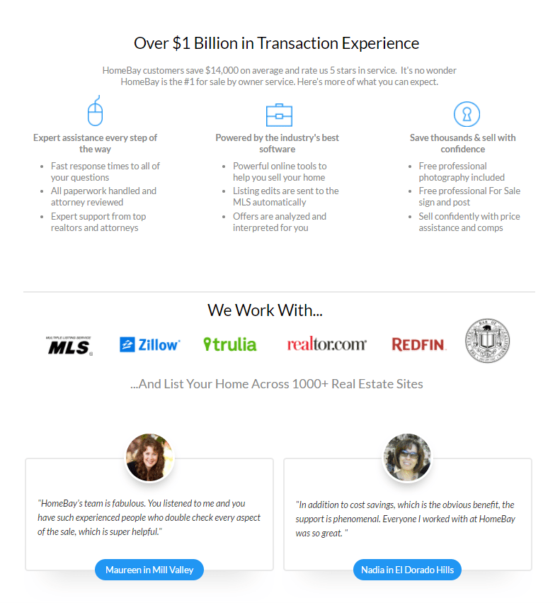
Here’s a great example from HomeBay:

Using credibility indicators is a simple way of proving you’re as qualified as you say you are; because telling people you’re the best without showing them won’t convince them of anything.
Convenience
In a world where users expect highly accessible pages, and the leading source of search traffic penalizes ones that aren’t, you have only one option: Adapt or fail.
If your page doesn’t follow these rules for convenience, its bounce rate will soar.
Your page should load quickly
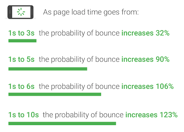
Data from Google indicates that 53% of people will abandon a page if it takes longer than three seconds to load. And from there, the probability of bounce gets even higher:

Considering the average mobile post-click landing page loads in 22 seconds, their data is problematic. Avoid losing the majority of your visitors by taking the following tips:
- Minimize page elements. According to Google, 70% of pages they tested were over 1MB, 36% were 2MB, and 12% were over 4MB. Via a fast 3G connection, 1.49MB takes around 7 seconds to load. The cause is too many page elements (images, headlines, buttons, etc.).
- Create performance budgets. Determine how quickly you want your page to load — aka “the budget.” From that budget, determine the elements you can include on your page to meet it.
- Cut down on images. Favicons, logos, and product images can easily contribute to ⅔ of a page’s size. High-converting pages contain 38% less images.
- Use less JavaScript. JS halts the parsing of HTML code, which slows down the speed at which a post-click landing page can be displayed to visitors. Programs like AMP and AMP for ads give developers a framework to build pages without JavaScript, making them load in the almost instantaneously.
For some more tips on how to speed up your post-click landing page, read this post.
Accessibility range should be a priority
It goes without saying, but I’ll remind you anyway: If people can’t access your page on their device of choice, they won’t use it at all. They won’t pinch to zoom, and they won’t fumble with your call-to-action button.
Your page should be designed responsively, meaning that it should adjust to the screen of any device. And all its elements should be easy to use.
Filling out a form with your thumbs is a pain if the fields are too small. Tapping a CTA button is difficult if its area isn’t as least as big as your fingerpad. Desktop is no longer the internet’s number one source of traffic, so if you have yet to optimize your pages for mobile, the time to do it is yesterday.
The user experience is different for every page
Countless post-click landing page design elements — from colors and shapes to words and layouts — affect the way people experience your post-click landing page.
The best way to determine their impact on your conversion rate is by testing to see how people behave on your page specifically. And remember: The way visitors use your page today may not be the way they use it tomorrow. So never stop testing.
To begin easily testing and optimizing post-click landing page user experience, Sign up for an Instapage Enterprise demo today.

See the Instapage Enterprise Plan in Action.
Demo includes AdMap™, Personalization, AMP,
Global Blocks, heatmaps & more.

