Geo-targeting, smart bidding, ad scheduling, and targeting audiences by browser and device types — these are just a few of the many options available to create personalized ads. And while personalized ads might get you clicks, they don’t guarantee conversions.
To translate ad clicks into conversions, you need to connect the ad with a matching personalized post-click landing page.
What is a personalized post-click landing page?
A personalized post-click landing page involves creating a dedicated experience for every user. Personalization aims to serve the most relevant post-click page to each traffic segment, instead of simply finding a random page to be shown after they’ve clicked an ad.
When you don’t send your audience, ad group, ad traffic to a highly segmented post-click landing page, you essentially tell your potential customers that you don’t understand or care about what they were looking to accomplish when they clicked the ad.
Let’s see how Square segments their post-click landing pages.
How Square segments post-click landing pages
Square uses segmented post-click landing pages for audiences looking for different services the payment platform offers. For example, when a search user researches “mobile POS system” they see this Square ad:

The ad headline talks about how the POS system is powerful and free. The copy lets the user know further details about the POS system, it’s easy to use, with quick set-up, it works online, etc.
Here’s the Square post-click page visitors come to after the ad:

- The ad and post-click page headline match, so the user is reassured that they’ve landed on the right place.
- The copy and visuals tell visitors a story of how the platform works and what hardware they need to get started. They answer the basic questions for users — how the software works, what is required, cost, and why consumers should use it.
- Zero distractions on the page, so no exit links can take the user away from the offer. The POS system is the only offer highlighted on the post-click page.
- The sticky bar with the CTA button allows the visitor to click the button at any point on the page without scrolling for it.
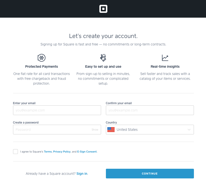
When the user clicks the CTA button they see this clutter-free, dedicated signup page that is quick and easy to complete:

Compare that personalized experience with someone searching for Square by name. In this search, the company does not run ads on themselves, so instead of clicking a paid search ad for the company, users click the organic link and see the homepage post-click:


- The homepage headline provides a general overview of the Square platform as a whole without focusing exclusively on the POS system.
- The copy and visuals explain to the user all the services the platform offers, there’s a section on POS also, but the page is not dedicated to this offer.
- The page header and footer are filled with navigation links that take visitors to different pages on the website. These links make sense for a homepage because it is meant to be a browsing experience (whereas the POS page above is dedicated to one solution).
The chances a visitor converts when they land on a homepage are pretty slim because someone searching for a POS system only wants information about that and nothing else.
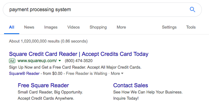
Here’s another Square ad that shows up when you search for a “payment processing system:”

The visitors are directed to this page post-click:

- The ad and post-click page headline both talk about payment processing and how Square allows merchants to accept payments from customers any way they want.
- The copy and visuals explain how the service works, what the interface looks like, the pricing, and testimonials from customers who have had success with the system.
- No navigation links means visitors can’t easily leave the page.
- The CTA button click takes the user to the same clutter-free sign up page shown earlier.
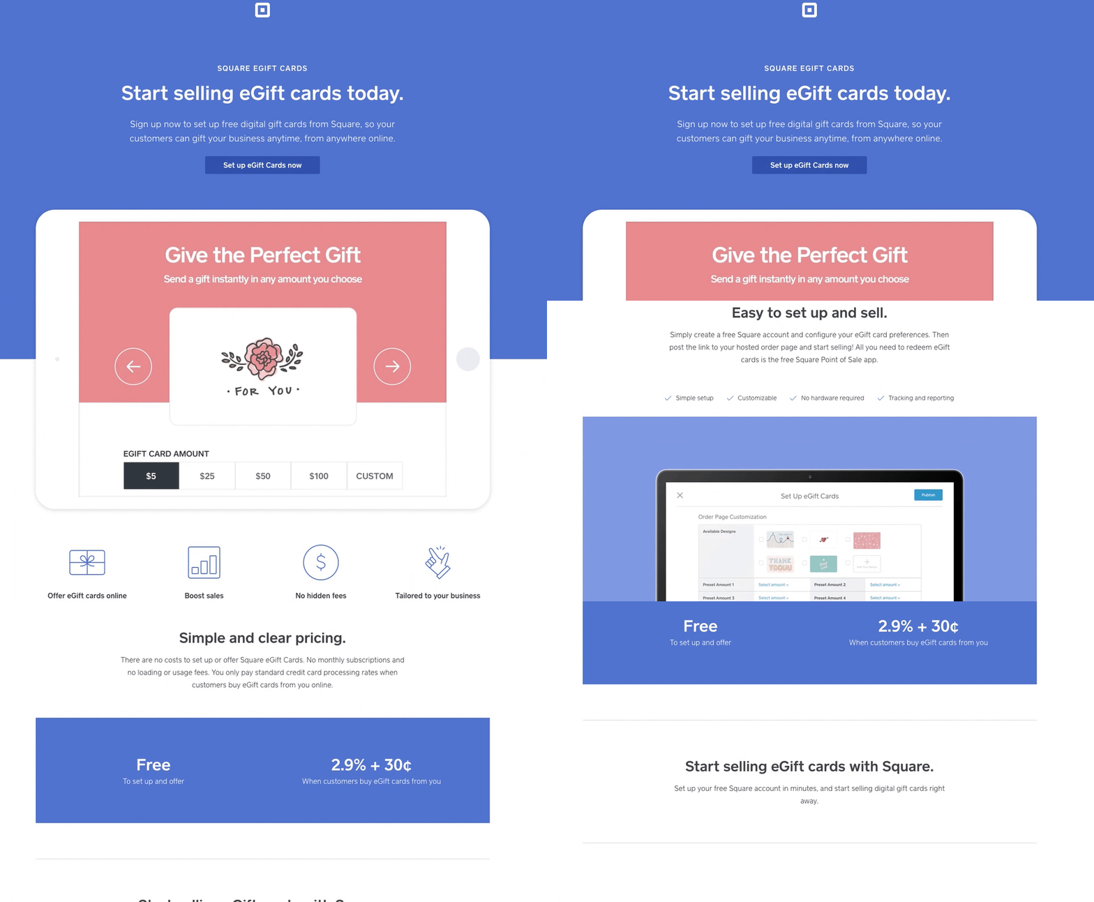
Now let’s look at Square’s eGift cards ad and post-click page:


- The ad and post-click landing page headline match, so the user knows they’ve landed on the right place.
- The copy and images show the service works and why users should click the CTA button to set up eGift cards.
- There are no distractions on the page.
- The CTA button click takes the user to the same clutter free sign-up page showcased in the first example.
Imagine what the user would feel if all the ads brought them to the Square homepage instead of segmented post-click landing pages?
They are likely to feel frustrated and abandoned because they wouldn’t get what they wanted when they clicked the ad.
Connect ads with segmented post-click landing pages
To generate advertising conversions and avoid wasting ad clicks, you can’t neglect the post-click landing page. You must devote as much time to the second stage as you do the pre-click stage. Square demonstrated that today because they realize segmenting post-click landing pages is the most strategic advertising step you can take.
Homepages are not personalized for specific audiences; they are created to give users a browsing experience and help them discover what they are looking for. Meanwhile, a personalized post-click landing page is a natural extension of the ad; each page element lets the user know they’ve come to the right place.
Get an Instapage personalization demo and see how the platform enables you to segment your post-click landing pages like never before.

Get a Personalization Demo
See how easy it is to create unique experiences for any audience you target.
