If you ask most digital marketers how their mobile CRO is progressing, you’re likely to hear a “huh?” Conversion optimization is not something we think of as being device specific. But, when the majority of internet users browse via mobile, it should be. post-click landing pages on mobile don’t work the same as ones on desktop. That means mobile conversions need to be addressed differently. To figure out how, we conducted the State of Mobile Conversion Report.
The Instapage State of Mobile Conversions Report
With data from 41 million anonymous visitors to 45,000 active post-click landing pages, the Instapage State of Mobile Conversions Report establishes the first benchmark for mobile post-click landing page performance. It contains insights into mobile conversion rates by industry, digital advertising budget, location, and more. It also provides an overview of the mobile post-click landing page conversion tech landscape. For any team assembling a data-driven mobile conversion strategy, this digestible report is a must-have:
Mobile conversion rates by industry
One of the most common questions from marketers is “How do I compare to others in my industry?” While the answer should always be taken with a grain of salt (there’s no business like your business), it’s a good way to get a general sense of what marketers are capable of.
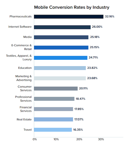
In the Instapage State of Mobile Conversions report, you’ll find average mobile conversion rates are much higher than you may expect:

When most post-click landing pages reportedly boast a conversion rate below 5%, it’s surprising to see numbers like 32% and 26%. It means marketers are beginning to prioritize and understand their mobile visitors, and mobile as an environment in general. If your conversion rates don’t look like the ones above, don’t panic. We’re going to cover a few ways to improve them.
Mobile conversion optimization methods
While seemingly established in our lives, mobile is still a new frontier. It’s evolving quickly. It’s confusing. There’s not as much reliable data to build campaigns from. Together, these details make integrating mobile difficult. Here are some takeaways for your mobile conversion strategy:
Design for a different context
When designing mobile experiences, marketers are usually okay with adjusting their desktop strategy. If their web pages are mobile responsive, they figure, that’s good enough. And sometimes that’s the case, but often it’s not.
“Mobile” doesn’t just mean a smaller screen. It means a completely different context in which content is consumed by the user, explains Chris Goward:
Mobile differs in many ways, primarily the context. By definition, mobile implies the user is “out and about,” which means they have greater distraction, less attention available, and different location-based needs.
Desktop users, on the other hand, are usually in lounge mode. They’re at work or at home, at a desk or with the computer in their lap. In environments like these, there are less distractions and there’s more privacy. And that means your content is more easily consumable.
In these different environments, conversion rate optimization looks very different. When you’re trying to boost mobile conversions, ensure your post-click landing page elements have been designed for usability in a high-distraction, low-commitment environment. For example:
1. Short form, big and easy fields: The lead capture form is a staple of the post-click landing page. On desktop, filling out a form is painful enough. On mobile, though, it’s incrementally worse. As any mobile device user knows, maneuvering with fingers on a small screen can be frustrating. Typing with your thumbs, you’re more likely to make errors. Also, progressing from one form field to the next can be tough even for the most dexterous index fingers.
To make filling out forms on your post-click landing page bearable, fields should be big enough to push with a finger. They should also use push-button progress. As in, your prospects should be able to hit a key like “ENTER” once they’re through with a field to move to the next, instead of having to click into every field with their fingers. To make things even easier, consider auto-filling information for returning visitors.
2. Maximize your button: Forms aren’t the only annoying element to navigate on mobile. CTA buttons can be frustrating to push too. Too small a target means your prospects will be slapping at their screen again and again to convert. And convincing them to do it once is hard enough. A safe bet is making your button size 10×10, as an MIT study shows the average touchpad is between 10 and 14mm:

3. Consider your media: There’s a variety of media you can use to compel your visitor to click on desktop. On mobile, though, users are on the move. It’s unlikely they’ll sit through a long introductory video of your founder. Instead, keep things short (which is usually a good idea on desktop, too). Limit your videos to 2 minutes if you use them. Also consider replacing them with something more easily consumable, like a hero shot or an infographic.
4. Keep your page as concise as possible: In the same way your user won’t watch a long video, they’re not likely to read a long page either. Writing skimmable copy is crucial even when your visitor has time to spare. When they’re browsing on the train or on their lunch break, it’s even more so. Keep text to a minimum, and use bullet points and subheaders to highlight your most important content.
5. Make your CTA buttons contextual: How your visitors convert varies from desktop to mobile. On desktop, they may want to download a resource to read or sign up for a mailing list. On mobile, they’re more likely to be searching for a more immediate and location specific solution to their problem. You may want to provide an instant solution to their problem with a click-to-call CTA.
Minify your page’s elements
Slow web pages cost businesses conversions. It’s been proven time and again, most famously by Google, which found that over 53% of people abandon a page if it takes longer than 3 seconds to load. And bounce rate gets worse as load time increases:

SOASTA, which partnered with Google to complete the study, found that load time was highly correlated to conversion rate. After looking at 900,000 ads’ post-click landing pages, they discovered that slower speed meant lower conversion rate. Culprits causing the slowdown were identified as page elements like images, buttons, and third-party trackers. When these elements increase from 400 to 6,000 on a page, the researchers found, the odds of converting a visitor drop by 95%.
So what can you do to keep your page loading quickly to boost mobile conversions?
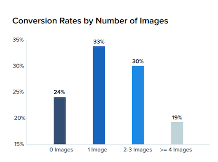
6. Keep page elements, specifically images, to a minimum. These are what researchers found slowed down pages more than any element. Pages that successfully converted visitors had, on average, 12 fewer images than ones which didn’t. Ridding your page of unnecessary stock images or images of text, for example, is an easy way to accomplish this without weakening the effectiveness of your page. Research from the State of Mobile Conversions report backs this up:

7. Minimize JavaScript. This is a little harder, considering there’s a lot that runs on JavaScript, including tags which allow you to retarget visitors who’ve abandoned your page. When pages become bogged down by JS, many turn to AMP.
With the AMP (Accelerated Mobile Pages) framework, you can create instant loading experiences with a lightweight version of coding languages you already use. While once limited, the framework has become capable of forming entire mobile websites. AMP pages are increasingly being used to create progressive web apps.
With an easy-to-use AMP feature from Instapage, you can easily include high-speed post-click landing pages into your website. Just click “AMP Page” in the “Create a page” drop-down, and open a component that will publish your page in the stripped-down coding language:

8. Leverage browser caching. Before your page fully loads, the browser and server may have to communicate several times, and each communication adds to your load time. Caching allows your browser to store or remember elements that have been recently loaded. The more elements it caches, the fewer times it has to communicate with the server to deliver the full page.
For more quick tips on boosting page speed, check out How To Interpret and Improve Your Google PageSpeed Insights Score.
Make retargeting a priority
The average mobile session is just 72 seconds. The odds your visitor clicks through your ad, reads your post-click landing page, and converts in that amount of time is slim. So, retargeting on mobile, when a visitor is likely to be pulled away from your page any moment, is even more important than it is on desktop.
Research has shown that website visitors who are retargeted with ads are 70% more likely to convert. If you’re not retargeting on your current post-click landing pages, you’re undoubtedly missing out on mobile conversions.
Make privacy a priority
One of the biggest differences between mobile and desktop is privacy. Desktops today aren’t as likely to hold sensitive information like mobile devices are.
On mobile, you’re likely to have passwords saved, app logins remembered, private communications stored. And mobile devices are also more likely to be lost or taken. This makes privacy a major concern for mobile users. Here are some ways to relieve their trust issues:
9. Use HTTPS. This should go without saying, but a surprising number of domains still don’t use HTTPS. Now, Chrome will warn visitors of an insecure website with a “Not Secure” label, which will kill trust in the mind of your prospects. Avoid this by switching to HTTPS yourself or building your post-click landing pages with Instapage, which comes with HTTPS built-in.

10. Make testimonials and badges a focal point. On post-click landing pages, testimonials prove that your solution has been valuable to others. We take our cues from other people a surprising amount, so these little blurbs can go a long way toward earning trust. Trust, in turn, increases the likelihood your offer gets claimed.
A similar, and just as powerful tactic is adding trust badges to your web page. These showcase accolades, high-profile customers and partners, or security proof (a lock, or a Norton Antivirus secure badge, for example).
Get what you need to boost your mobile conversion rate
The best mobile strategy is a well-informed one. Unfortunately, data on mobile conversions isn’t as available as marketers need it to be.
The Instapage State of Mobile Conversions is the first step toward building that strategy. To learn more about how to boost mobile conversions, and what to look for in a mobile post-click landing page solution, download the full report and get a customized demo of the AMP feature in Instapage.


