Post-click landing pages are where conversions happen. Yet, optimizing paid ads won’t have much of an impact on your advertising ROI if you don’t consider the post-click landing page.
Creating post-click landing pages for an optimized post-click landing page involves more than just inserting a headline and a CTA button on a page. To ensure your pages are set up for conversions you should consider the latest post-click landing page trends.
We reviewed hundreds of post-click landing pages from multiple industries to bring you 7 post-click landing page trends (showcased with examples) that you should consider this year.
post-click landing page trends to follow
The trends discussed below are user-friendly, innovative, and consistent with giving visitors a good user experience. This means all post-click landing pages should have:
-
1. Conversion ratio: The number of places to click compared to the number of conversion goals. Ideally, the ratio is 1:1, meaning there’s only one place to click on your post-click landing page. On most post-click landing pages, that link is a call-to-action button.
2. Message match: Matching the content of an ad to the post-click landing page so that the message is reinforced in the mind of the prospect and that they know it’s relevant.
3. Contrasting CTA button: The button does not blend in with the page; it uses a color that “pops”, and sometimes uses other design components like encapsulation and/or white space to prospects to notice and convert on the offer.
4. Appropriate white space: Having ample negative space maintains visual hierarchy and helps draw attention to specific page elements, like the form and CTA button.
post-click landing page trend #1: Custom illustrations
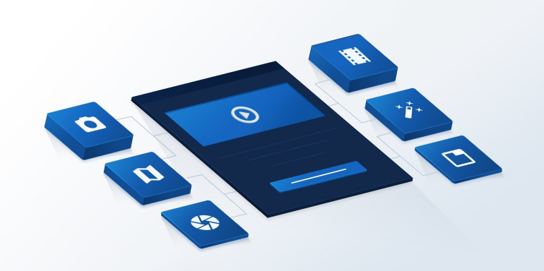
Custom illustrations add personality to your post-click landing page. The illustrations can also be used to tell a story and add a playful tone, which can make it more engaging for visitors.
You can add this design effect to make your page different from others in your industry. Qualaroo uses custom illustrations to demonstrate what users will learn from the guide:

Meanwhile, Lyft uses custom illustrations below to reinforce their branding and differentiate themselves from their primary competitor who showcases pictures of real people:

JOANY employs custom illustrations to showcase their brand ambassador, adding personality to the page:

BirdEye showcases illustrations to explain product features creatively, instead of simply adding screenshots:

LegalZoom features custom illustrations to add color and personality to a post-click landing page that could’ve easily been boring considering all the tax talk:

Custom illustrations help inject fun, energy, and personality in your post-click landing page; they can also be used to convey a more premium feel for your brand so add illustrations where it’s relevant to your offer.
post-click landing page trend #2: Minimalism/more blank space
Minimalism in web design stems from the ‘less is more’ philosophy. Showcase minimalism on post-click landing pages by stripping down the pages to only the essential elements and by using more blank space to let the showcased elements have enough room to breathe.
Blank space or white space is the empty area on a page that helps draw attention or highlight a specific element. White space isn’t necessarily “white” space. Rather, it’s negative space, so it can be any color as long as it performs the functions it’s supposed to.
Uberflip uses minimalism to create a de-cluttered page focused on their free ‘own the journey’ guide:

Woodpecker features blank space to keep visitors focused on the headline, and add a contrasting button to convince visitors to click:

The background custom photography on both etouches and the Zebra post-click landing pages add blank space to get visitors to focus on the headline.
First, etouches:

And the Zebra:

Minimalism helps you de-clutter your post-click landing page, and keep visitors focused on the elements that make an impact on conversions.
Minimalism helps you de-clutter your post-click landing page, and keep visitors focused on the elements that make an impact on conversions.
post-click landing page trend #3: Big, bold typography
Typography is a visual tool that helps add personality, evoke emotion, and set a tone on your post-click landing page while promoting your offer.
Combining large letters, contrasting serif and sans serif fonts in headlines and body copy effectively creates dynamic parallels on your post-click landing page which increases visitor engagement.
For Shopify, big, bold typography along with ample white space creates an engaging and visually appealing post-click landing page:

post-click landing page trend #4: Bright, vibrant color schemes
Instead of opting for web-safe colors, a lot of post-click landing pages now focus on supersaturation and vibrant shades of color that instantly gratify visitors. The bright colors instantly capture, and hold, visitor attention.
This is what ChartMogul does with their post-click landing page:

post-click landing page trend #5: Vertical split page design
A vertical split post-click landing page layout allows you to divide elements into two groups, increasing readability and organizing your page from unwanted clutter.
A vertical split layout provides you with more space to narrate a story for your visitors.
Slack demonstrates this by explaining benefits of the service via copy on the left and custom illustrations on the right:

This is the same approach Sleeknote takes with their post-click landing page:

Use vertical layouts to your advantage and convince visitors to click the CTA button in a more innovative, creative, and compelling way.
post-click landing page layout #6: Drop shadows and depth
Drop shadows add depth to page elements and create a 3D effect that gives an illusion of a world beyond the page. This shadow play helps create a versatile effect that increases the visual appeal of the page and helps user experience by providing emphasis to specific elements.
QuickBooks adds drop shadows and depth around its post-click landing page imagery to give a 3D effect:

Roadmunk does the same on their post-click landing page:
Enhance the visual appeal of your post-click landing page, add drop shadows and depth to create a 3D effect visitors can’t help but appreciate.
post-click landing page trend #7: Particle backgrounds
Want to include a video background on your post-click landing page, but concerned about page performance issues? Use particle backgrounds instead.
Particle backgrounds are lightweight JavaScript animations that create movement as a natural part of the background, so they don’t take time to load. This design component also attracts visitor attention because not only do they add the video effect on the page, but also make your page memorable.
Scout employs a particle background to showcase the benefits of the service:

Use particle background animations to share your narrative with visitors and persuade them to click the CTA button without any page speed problems.
Are your post-click landing pages on trend?
Whether you’re creating post-click landing pages to promote a free trial, an ebook or get attendees for your next webinar, make sure each page resonates with the audience so they stick around long enough to take the action you want.
Start creating professional, high-converting post-click landing pages by signing up for an Instapage Enterprise demo today. With 100% customizable templates, a designer-friendly builder, and Instablocks™; our platform empowers you to scale your post-click landing page production faster than ever.

See the Instapage Enterprise Plan in Action.
Demo includes AdMap™, Personalization, AMP,
Global Blocks, heatmaps & more.
