It’s pretty common for brands to direct prospects to their homepage when people search for their brand name, and not an offer in particular. This could be a reason why 96% of ad clicks don’t convert.
Advertisers like you deserve better than a 4% conversion rate. To do that, it’s best to connect your digital ads to relevant post-click landing pages. Intercom, a customer messaging platform takes their post-click landing pages very seriously. The company not only connects their segmented ads to relevant pages, but they also take prospects to a dedicated page when people search for them by name. (Go here for the Instapage A/B test using a post-click landing page from branded search traffic.)
How Intercom personalizes post-click landing pages
Why do prospects search for brand names? This mostly happens when they’ve heard about the brand and are aware it might help solve whatever pain point they’re facing. However, they don’t have the necessary information they need to make a decision, so they turn to Google.
Branded paid search ad
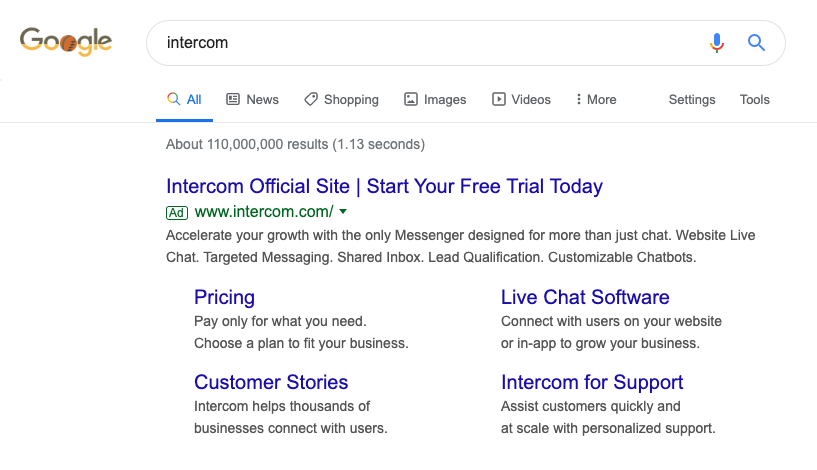
Intercom uses this opportunity to generate conversions by showing the following ad to prospects who search the company’s name:

The ad promotes Intercom’s free trial offer, which makes perfect sense because the search user was aiming to see how the company works, and what better way to do this than with a free trial. Furthermore, the ad copy lists ways Intercom helps customers accelerate growth and mentions their products, such as website live chat, targeted messaging, and customizable chatbots.
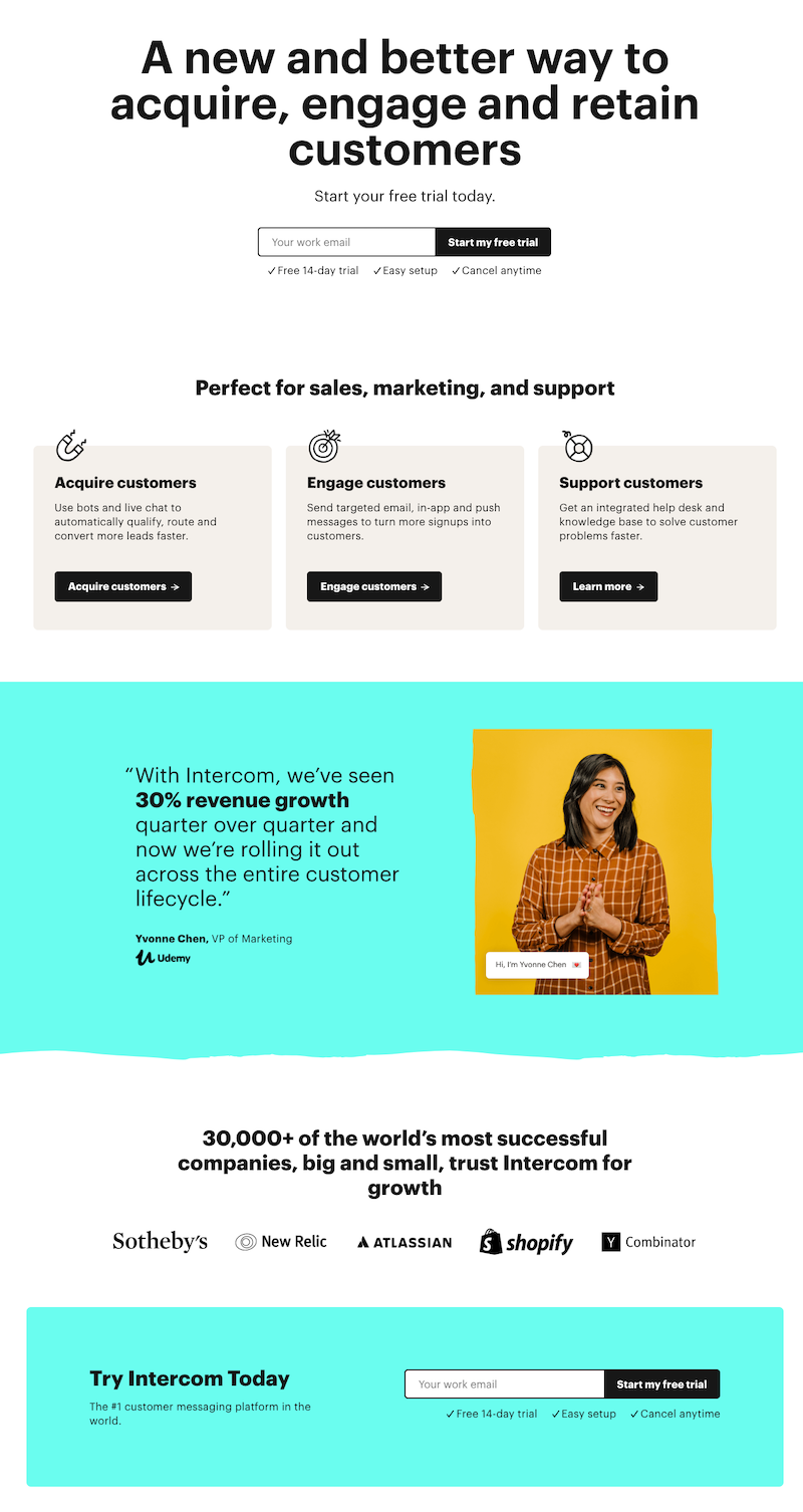
The ad’s headline calls out its official site. So, presumably, search users would land on Intercom’s homepage. Yet when they click, they go to this dedicated page instead:

- The page headline lets the prospect know what Intercom helps them achieve — a better way to acquire, engage, and retain customers. This matches with the “accelerate your growth” message promoted in the ad. The subheadline reinforces the free trial highlighted in the ad.
- The form is minimalistic since it only requests the user’s email address.
- The “perfect for sales and marketing” section describes how Intercom helps customers acquire, engage, and retain customers — the same message put forward in the ad. The section also details which Intercom products achieve each featured objective. For example, bots and live chat acquire customers, while targeted emails are utilized to engage customers.
- The customer testimonial highlights Udemy in that Intercom helped increase revenue growth by 30%. The picture of Yvonne Chen adds human appeal to the page.
- The customer tally and badges showcase Intercom’s success and lists the big-name brands which have seen growth with the platform.
- The form at the bottom of the page is strategically placed, so when a prospect comes to the end, they don’t have to scroll up to redeem the free trial.
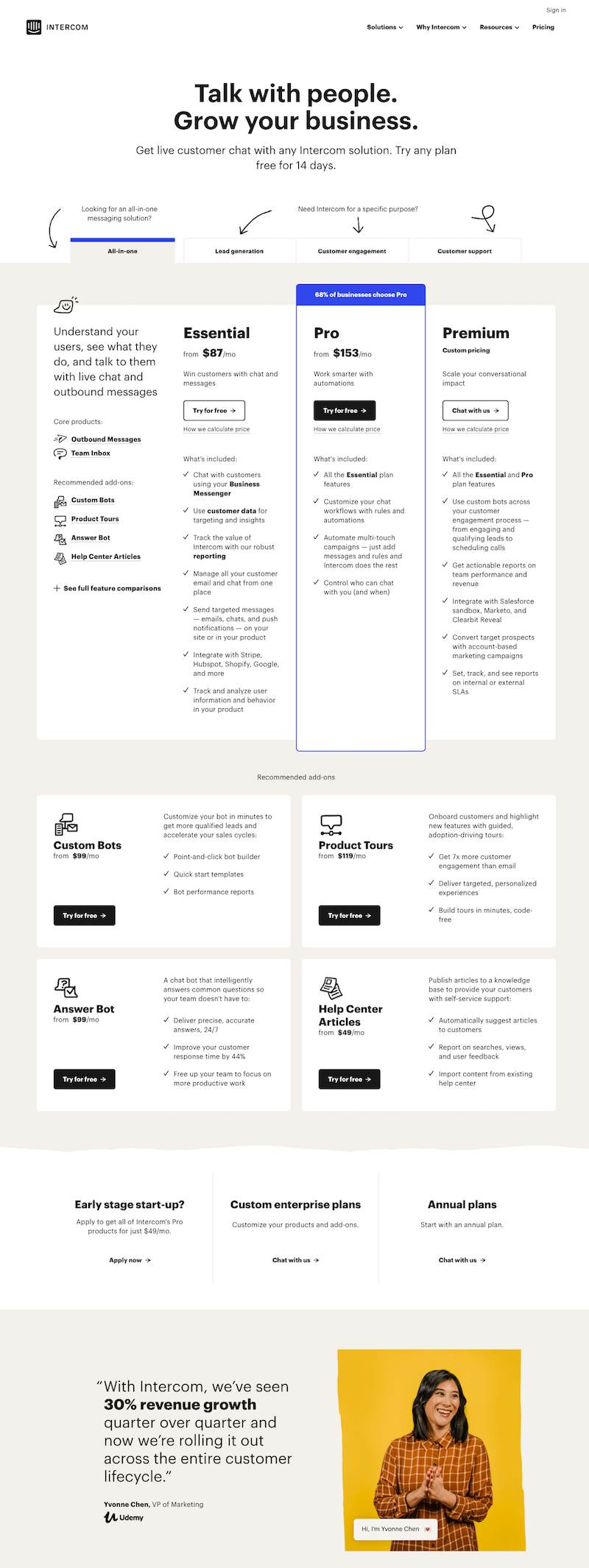
Clicking the CTA button takes users to the pricing page where they can select the plan that suits their needs:

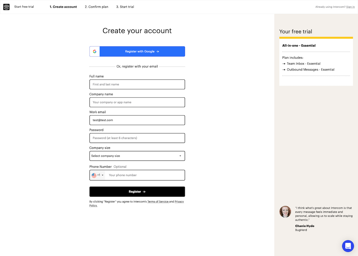
After the user selects the pricing plan, they see Intercom’s registration page, which consists of three steps. After completing them they can start the free trial:

Intercom takes a prospect who was just browsing for information to a personalized free-trial post-click landing page that is more likely to persuade them to convert immediately, contrary to what their homepage might have done.
The homepage comparison
Here’s what Intercom’s homepage has to offer users:

- The page header includes links to the solutions Intercom offers — their Resources section, pricing, and why prospects should choose Intercom. All the navigation links will send them to pages where they can get more information about the platform.
- The headline describes what Intercom does, focusing on their chatbot solution. The subheadline goes into more detail and explains how the platform is a “customizable messaging suite to drive growth at every stage of the lifecycle.”
- The form tells users that after entering their email address they can get started with the platform. It doesn’t talk about the free trial offer like the personalized landing page did.
- The customer tally section fulfills the same purpose it did on the dedicated page.
- The individual product feature section goes into detail about what the platform helps customers achieve. For example, tailored onboarding helps engage their customers, while chatbots and live chat help convert customers. Each feature section has a ‘’learn more’’ CTA which directs users to another page with additional information.
- The customer testimonial is the same one featured on the post-click page.
- The “New” section offers prospects information about what’s new on the platform.
- The form at the end of the page mentions the free trial, but also explains that eligible companies can get Intercom Pro features for $49/month, and they should click the “Learn More” link to find out if they make the cut.
- The page footer is full of navigation links and each one takes prospects to different pages on the website. The prospect can choose to go to the resources section to read the blog or click one of the features to find more details.
The homepage is perfect for a browsing experience because it is not focused on a single offer. Rather, it describes everything Intercom specializes in. Meanwhile, the personalized post-click page attracts users looking for information with a free trial. The page showcases everything Intercom offers but its focus remains the free trial highlighted in the ad — likely leading to more conversions.
Don’t miss out on branded search traffic
It’s tempting to connect every ad with your homepage since you already have it up and running, but this approach likely won’t generate conversions.
To ensure your ads convert, connect every ad to a meaningful, personalized experience by creating a dedicated post-click page for every offer instead of using your homepage or product pages as “landing pages.”
When a user lands on your post-click page after clicking an ad, the message should match so user expectations are fulfilled. Find out how to get personalized post-click landing pages right every time by signing up for an Instapage Enterprise demo.

See the Instapage Enterprise Plan in Action.
Demo includes AdMap™, Personalization, AMP,
Global Blocks, heatmaps & more.
