
There are few things in life you buy hoping to never use. Insurance is one of those things.
That’s why marketing and selling it can be so difficult. Nobody really wants insurance. What they want is for their home to remain safe from natural disasters. They want to avoid car accidents at all costs. They want to never lose their luggage on a vacation to Europe.
Unfortunately, these things happen. So, insurance marketers like you make people think “what if?” Then, you sell them peace of mind in the form of a policy.
But that comes after a long process that usually involves exams, estimates, and appraisals. So in the digital age, how do you get prospects to take that first step by requesting a quote from your agency?
Increasingly, some of the industry’s most well-known providers are leveraging the power of insurance post-click landing pages.
What is a post-click landing page?
A post-click landing page is a standalone web page with a singular goal: compel people to take action. It uses persuasive elements like social proof, benefit-oriented copy, and attention-grabbing media to to convince visitors to convert. In insurance terms, that could mean “get a quote,” “schedule a medical exam,” or any other action relevant to a business’s marketing goals.
Here’s how industry leaders are incorporating post-click landing pages into their digital marketing strategy.
Auto insurance post-click landing pages
The costs of owning a new car can quickly add up. There’s gas, monthly payments, regular maintenance, and on top of it all, insurance premiums. Prospects here are going to be on the hunt for the best bang for their buck. How much coverage can they get for an affordable monthly policy? Why should they choose you over other providers?
Let’s see if these post-click landing pages show them.
State Farm
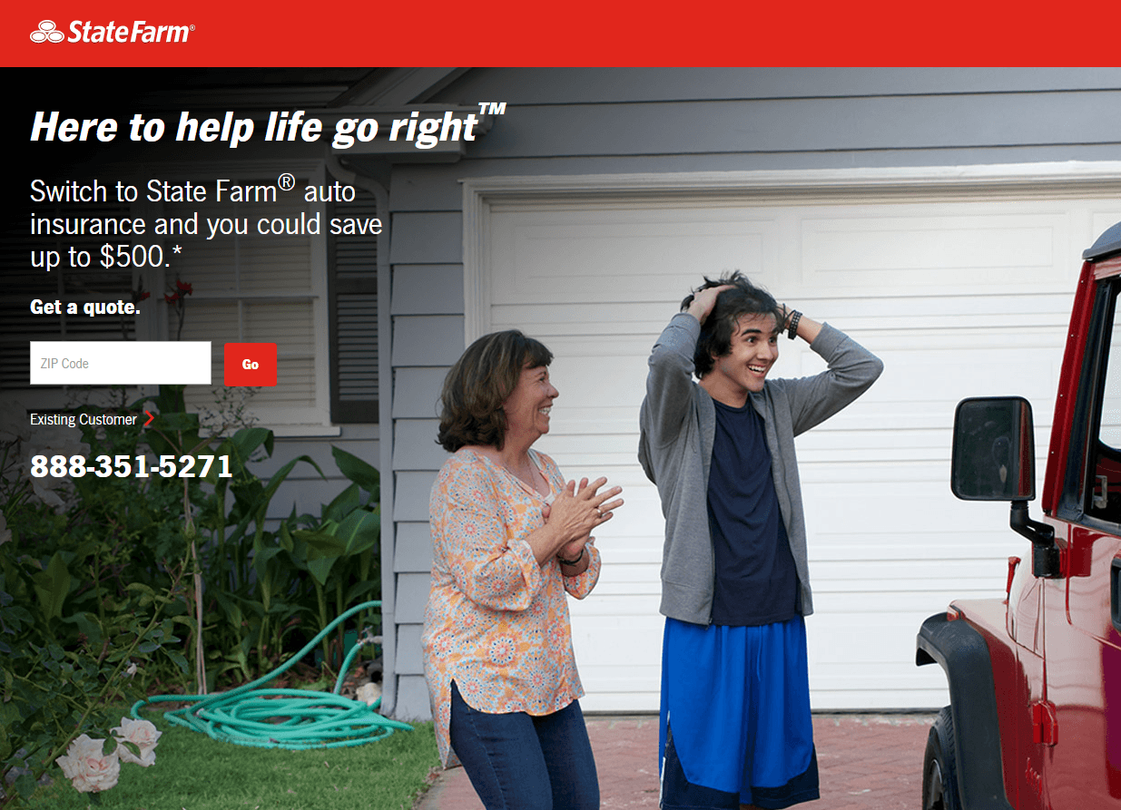
At first look, this page is off to a good start. No navigation means no visible way off the page. Though, it’d be off to an even better start if the State Farm logo wasn’t linked to the homepage.
Below it, the headline doesn’t provide much value at all. It might be a company tagline, but it really doesn’t communicate anything to the prospect. The subheadline, on the other hand, does a good job of conveying a benefit.
Judging by this background, State Farm’s target audience is parents, which is why they display an image that portrays a mom as the hero to her son by surprising him with a new car, presumably along with insurance so he can drive it.
But, how is he protected by that insurance? Visitors know they can save $500, but is that only if they sacrifice a large portion of their coverage? With such little information on this post-click landing page, we’ll never know.
A security badge in the lower right of the page will make prospects more comfortable with converting, though the busy footer just below it, along with the hyperlinked logo, will decrease the chances they stick around to do it.
Esurance
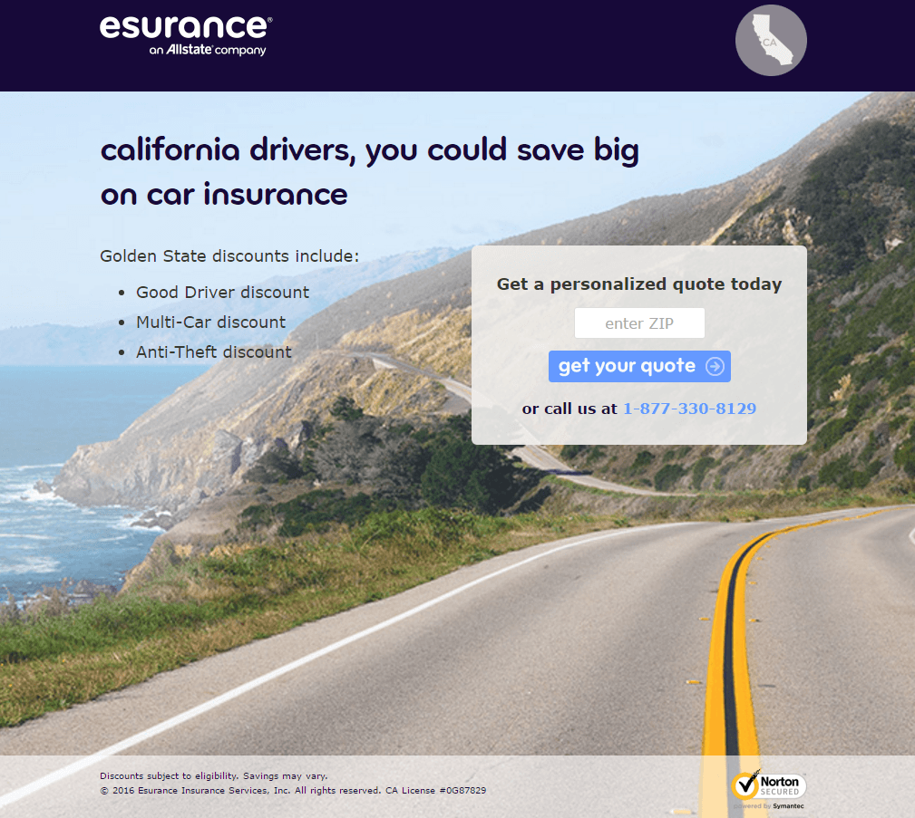
Not many distractions on this post-click landing page, are there? No navigation to be seen, no footer. Other than a hyperlinked company logo and the Norton security badge, there’s no way off this page other than through it.
A headline that uses the word “you” does a good job of addressing the reader directly. There’s no more powerful word in copywriting. On top of that, geo-targeting capabilities make this page even more personalized.
Below that, minimal text means prospects don’t have to think much to figure out the benefits of requesting a quote from esurance, but is it enough to convince them to convert?
We’re not sold. The headline says we could save “big.” But how big? Also, what kind of coverage do customers get for their money? And, what’s an “Anti-Theft discount”?
At the bottom of the page, a minimalistic footer keeps prospects focused on the form, which itself doesn’t ask for much. With just one field requesting zip code, a call-to-action tailored to the offer, and a security badge ensuring safety, this page makes converting both comfortable and simple for its visitors.
Life insurance post-click landing page
According to best-selling author Harry Beckwith, selling a service is “selling the invisible.” If that’s true, then selling life insurance is selling the non-existent. How do you get someone to buy a product that, in most cases, they won’t be around to benefit from?
Such is your struggle as a life insurance marketer.
Building a high-converting post-click landing page in this insurance niche requires tact. You need to be able to subtly remind your prospect that they’re mortal — even suggest their life has a monetary value — and at the same time, convince them that buying a policy is in their best interest. Let’s see if this provider is up to the challenge.
AARP
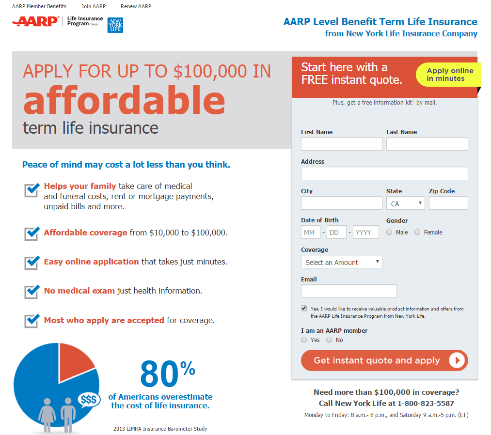
“WHY ARE YOU YELLING?” was the first thought we had after seeing at the headline on this post-click landing page. Going all-caps is never a good idea, even if you have something really important to say. At best it reads like you’re yelling — at worst, it looks tacky.
Above the headline, outbound links let prospects escape from this post-click landing page without converting. Below it, though, bulleted copy gives them a reason to stay by quickly explaining the benefits of the offer.
Even lower, the infographic reinforces the USP that the headline conveys, which is, “our life insurance is affordable.”
The form to the right does a good job of emphasizing that the offer is free at the top, but it’s a little long. On the other hand, the information it requests isn’t all that sensitive, so it’s not likely to cause much friction. It’s also all relevant to the offer, as in, AARP needs it to provide an accurate quote.
To get prospects to request that quote, the button below features a call-to-action that capitalizes on our desire for immediate solutions to our problems. But, it’s not perfect. A color other than red might make it pop on a page that’s already filled with the same hue. The more you can make your button stand out, the more attention-grabbing it’ll be.
Below the fold, trust badges from New York Life align AARP with a well-known insurance brand, making prospects more comfortable with converting. And with that minimal footer that features only terms of service and a privacy policy, it’s more likely they will. Busy footers containing links will only tempt prospects to poke around other web pages.
Health insurance post-click landing page
As much as we like to think we are, no one is invincible. And so, as a health insurance marketer, you help match prospects with a plan that offers them financial protection in the unfortunate event of an illness or medical emergency.
Potential customers will want to know where they’re covered, how much that coverage will cost, and whether they can trust you with their health. Will this post-click landing page show them?
ObamacarePlans.com
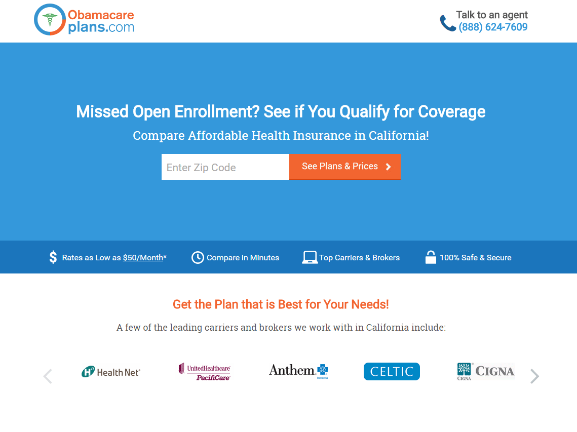
From the top, this post-click landing page gets a few things right. It’s without navigation and a hyperlinked logo, which means prospects can’t navigate away unless they convert or close their browser window. Its creators also make it easy to contact an agent by listing the company phone number in the upper right-hand corner.
The headline speaks to the reader with a question, and a relevant one at that. Since open enrollment is over, most visitors to this page are people who have missed the deadline. Below it, the subheadline takes relevance a step further by using geo-targeting to display the state the visitor is in.
The one-field form here makes converting simple for the prospect, and the icons underneath convey the benefits of doing so.
Lower, logos of carriers the company works with build trust with visitors by associating the business with well-known brands. But, several outbound links in the copy make it too likely the prospect will get distracted before they hit one of two cooperating CTA buttons.
Home insurance post-click landing pages
As a home insurance provider, you’re responsible for protecting people’s most valuable asset from fire, hail, lightning, and other natural disasters, along with man-made ones, like theft and vandalism.
Like on a car insurance post-click landing page, visitors here will want to feel secure by knowing how they’ll be protected. Will these post-click landing pages show them?
Farmers
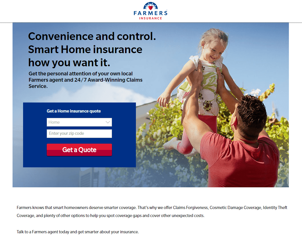
Our first question: What on earth is “Smart Home insurance”? This headline is confusing, and it doesn’t highlight the benefit of using Farmers as a provider. Luckily, the subheadline picks up a bit of the persuasive slack by promising “personalized attention” and “24/7 Award-Winning Claims Service.”
Below, the form copy could be better than “Get a home insurance quote.” Is claiming a quote free? Then say so. To readers, the word “free” is almost as compelling as “you.”
As for these form fields, there’s one too many. We’re already on a post-click landing page for home insurance because we clicked on a PPC ad for home insurance after searching for home insurance. Any idea what kind of home insurance we’re looking for?
Right, home insurance.
So why is there a second drop-down that requires visitors to select what kind of insurance they’re looking for?
That bright red CTA button may grab prospect attention, but a confusing headline, a repetitive form, and two hyperlinked logos, all decrease the likelihood it gets clicked.
Travelers

Well, we know this post-click landing page designer’s favorite color. The red chairs, red phone number, red bricks, red background, red lettering, and red bullet points all make that red CTA button less noticeable. The last thing you want is for your prospect to miss your call-to-action because it camouflages with the rest of your content.
Once you get past all the bright red, this page is actually fairly well-built. A subheadline gets specific, in dollars, about how much visitors can save by insuring. Below that, bulleted copy quickly explains the benefits of choosing Travelers, and clickable tabs allow prospects to learn more without leaving the page.
If Travelers scrapped the five outbound links off the page (social buttons and hyperlinked logo), and toned down the red a little bit, this page may see a bump in conversions.
Disability insurance post-click landing page
Not all work-related disabilities qualify for workers’ compensation benefits, which makes disability insurance a must-have for your prospects, even in jobs with low rates of injury. Since different insurers are known as being a better fit for one occupation than the other, it’s your post-click landing page’s job to let prospects know your bread & butter. Will this one?
Aflac
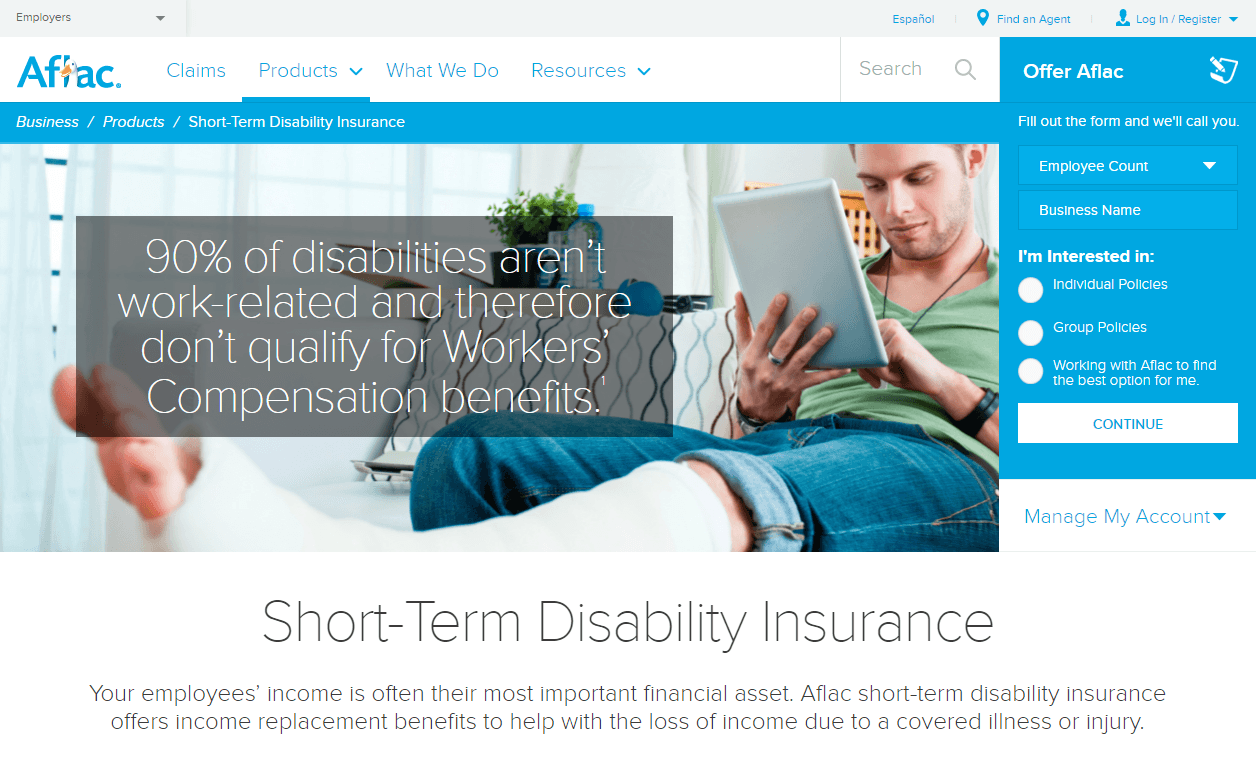
Looking at this post-click landing page makes us feel like a couple of kids wandering into an arcade for the first time. We’re overwhelmed and we’re not sure where to go first.
There are links, a search bar, and competing CTAs. It makes you wonder, “Is this even a post-click landing page?”
By many marketers’ standards, no. It’s not a true post-click landing page because it’s not a standalone web page designed strictly to convert.
On the other hand, we did land here after clicking a Google ad for disability insurance, which means that Aflac is using this page as a post-click landing page. And by doing so, they’re giving prospects way too many ways to escape without converting.
It’s been proven — navigation kills conversion rates. There should only be two ways off your post-click landing page: through converting, or by clicking the “x” in the browser window.
Remember, the more you keep your visitors focused on clicking your CTA button, the more likely they are to do it.
Travel insurance post-click landing page
Most consumers know travel insurance as the offer they opt out of after booking a trip. Numbers from a national travel survey show that only 7% of people purchase it regularly. As a provider, your post-click landing page needs to make the case for why this largely unused form of insurance is worth investing in. Let’s find out if this one can.
Allianz
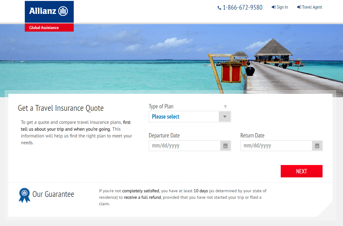
This post-click landing page shows promise in some places, but the overall execution could be better.
Let’s start with the logo. It’s hyperlinked, which will boost the likelihood prospects navigate to the homepage. In the upper right corner, an unnecessary link to a page for travel agents adds yet another escape route, as does the busy footer complete with a sitemap and social media links. Together with a click-to-call phone number that directs prospects to a 404 page, that makes over 20 points of exit.
Below the fold, bulleted copy does a good job of showing what Allianz travel insurance covers, and conveying the biggest reasons for buying travel insurance.
On the form, a guarantee might make prospects more comfortable with converting, but, how much? Is its promise really that great? Customers can get a full refund if they’re not completely satisfied, but they can’t request that refund after they’ve started their trip. How will they know whether or not they’re fully satisfied before they have to use the service?
Above the guarantee, a boring headline doesn’t do much to grab prospect attention, and while the bright red CTA button does, there are too many holes in the rest of this page to keep visitors focused on it.
Your turn
How do you get insurance prospects to convert? Do you have any tactics you’d like to share or have any post-click landing pages you want us to take a look at?
Create a professional insurance post-click landing page in minutes, sign up for an Instapage Enterprise demo today.

See the Instapage Enterprise Plan in Action.
Demo includes AdMap™, Personalization, AMP,
Global Blocks, heatmaps & more.
