Online image ads are like small, targeted billboards. They capture the attention of passive users the way billboards grab the attention of people driving or walking by. In both scenarios, the ads are shown to people not actively searching for what you’re selling.
Since online display ads are intended to reach passive users who might be researching something else, it’s imperative you use visual advertising techniques to make them stand out. On top of that, you have to work extra hard to ensure people click your ads when they do see them.
To make sure this happens, here are ten image ad best practices for creating high-performing display ads.
10 Image ad best practices
1. Simple sells
It can be tempting to squeeze as much as possible into your image ad to get it noticed and clicked. Like billboards, though, display ads are generally only viewed for a fraction of a second before the user moves on. Therefore, it’s important to keep the design and message compelling, concise, and clear so viewers can absorb it and are tempted to click.
When creating your display ad, only include what’s necessary:
- Your brand — Communicate who you are through your company’s logo or name, and implement visual branding through fonts, colors, and imagery style.
- A single, focused headline — Speak directly to your audience, and highlight exactly what you’re offering and why.
- A clear, compelling CTA — Indicate exactly what you want potential customers to do with an obvious CTA.
- A single, eye-catching visual — This is what grabs your audience’s attention first so make sure it’s relevant and high-quality.
Look at how simple, yet attractive this Terminus display ad is:

- The company logo is present
- A focused headline (with a value proposition) is right at the top of the ad
- The CTA is unmistakable with an arrow visual cue
- The calculator helps draw attention to the ad
2. Use the best ad formats
The Interactive Advertising Bureau stresses the importance of flexible ad sizing because people will be viewing your ad on different-sized screens. Fortunately, there are multiple different ad sizes and specifications to choose from, including:
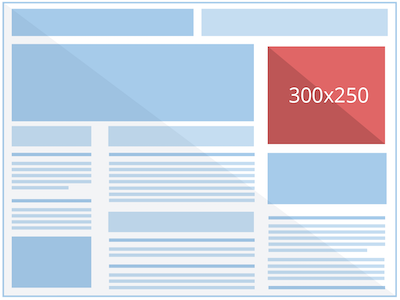
- 300×250 (medium rectangle ad) — Performs well when embedded within text content or at the end of articles:
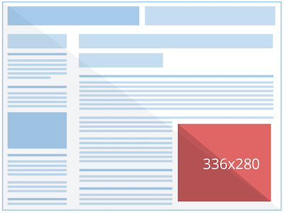
- 336×280 (large rectangle ad) — Slightly larger than its medium counterpart, and performs well when embedded within text content or at the end of articles:
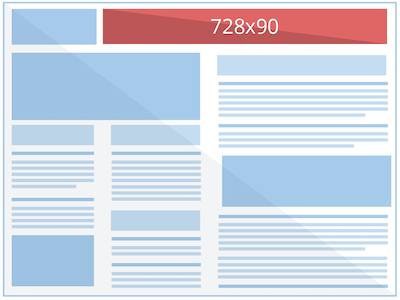
- 728×90 (leaderboard ad) — Performs well above the main content or on forum sites:
- 300×600 (half page ad) — Provides a larger space for advertisers to get their message across, which captures more attention (and faster) since the ad consumes more of the screen:
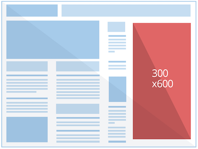
Note: Half page ads are a good alternative to the skyscraper format which is a similar shape, but doesn’t offer as much creative space.
- 320×100 (large mobile banner ad) — These ads are specific to mobile devices and are twice the height of standard mobile leaderboard ads:
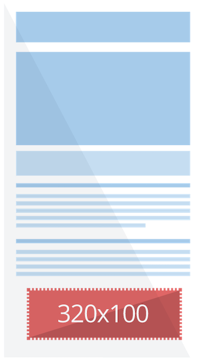
Google recommends including these most popular standard image sizes because they can be automatically resized to fit 95% of the available placements across 3M+ apps and websites.
You should also determine whether you’re optimizing for more efficiency or full control. For more efficiency, use responsive display ads. These use machine learning to create relevant ads to fit anywhere across the web. For full creative control, however, use standard image ads so you can customize your colors, fonts, and layouts.
3. Keep it on-brand
Every ad you create should match the look and feel of your website (colors, imagery, messaging, tone of voice, etc.) to establish a unified company image and increase brand recognition. Not only does this help with overall brand awareness, but people also trust and remain loyal to things that are consistent and reliable.
This is even more true for remarketing ad campaigns, because your ad needs to feel like a continuation of a previous site visit, or you risk hurting your CTRs.
Not only do you want your ad to match your website, but you also want it to set the tone and prime your user for the post-click landing page that follows. Ad-to-post-click message match can be implemented with consistent colors, messaging, visuals, fonts, etc. across your entire campaign.
See how Asana uses message match consistency from ad to post-click landing page below. It’s clear that the ad is connected to the page:

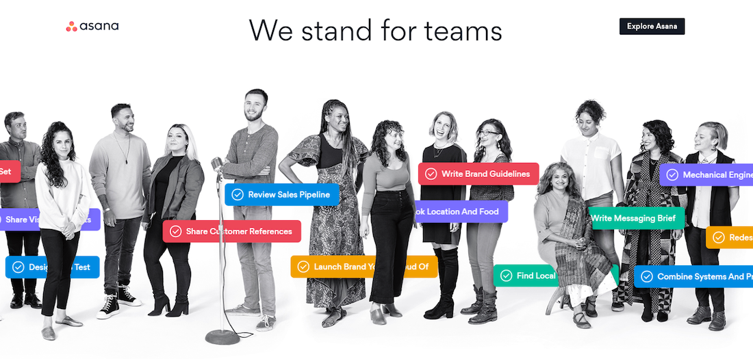
Conversely, inconsistency between your ad and post-click page can confuse and frustrate the visitor.
4. Give it structure
The foundation of a good display ad is structure, which requires the four fundamental elements of a display ad discussed in #1:
- Brand
- Headline (UVP)
- CTA
- Visual
Then, arranging those elements in a way that will create the highest-performing ad.
Since your unique value proposition and CTA are most important for boosting click-through rate (and ultimately, conversion rate), they should be the most visually distinct elements. After that, your logo can be placed along one of the edges, and your image in a location that doesn’t obscure any of the copy, like Heap does here:

For comparison, here’s an ad that lacks structure since the headline is at the very bottom and the CTA is hardly noticeable:

Note: The Heap example is only one structure you could use. A/B testing different images, copy, and ad structures is imperative to see what variations perform best for your target audience.
5. Incorporate visual cues
Visual or directional cues are a UX design tool used to point users in the direction of elements that are integral to your conversion goal, like your headline or CTA. Arrows, lines, pointing fingers, human line of sight, and the direction objects are facing are a few ways to incorporate visual cues.
In ActiveCampaign’s in-image ad below, they positioned their logo so that it acts as a visual cue with the arrow pointing directly at the CTA:

The ad’s structure could have easily been completely different, but this way encourages users to focus on the CTA.
In contrast, both Farmers Insurance and eVoice missed the opportunity to draw more attention to the most important ad elements by aiming human eye gaze straight ahead, instead of toward the headline or CTA:


6. Consider static vs. moving visuals
Both static and moving visuals have their own benefits, and one doesn’t necessarily guarantee better performance over the other.
For instance, although interactive or animated ads can be more eye-catching than static ads, not everyone has time to watch a 30-second video ad rotation. If they don’t have the time or patience to watch the whole thing, you risk them missing the most important elements like your UVP and CTA.
Whether you use static or moving visuals depends on the advertising channel, and the message delivered.
A short video might be better on Facebook, where people are more likely to be scrolling aimlessly rather than on the GDN, where they could be navigating the web for something specific.
A video might also be better if you want to show someone using your product, while a static image might be beneficial if you only need to show an ecommerce product by itself:

7. Refrain from too much ad copy
As essential as your headline and CTA are, it’s also critical you don’t use so much text overlay that it overrides and takes away from your image.
Look at the difference between these two Post University ads:


Because of the different ad formats, the text on the first one seems much more invasive than the second since it’s positioned across the entire image. Not only that, but it’s a lot easier to read on the horizontal version because it’s against a solid background rather than overlaying the image.
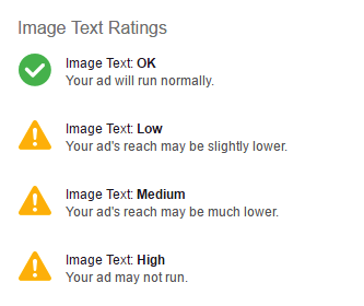
Not adding too much ad copy is especially important with Facebook advertising because of the platform’s 20% rule. While having too much text isn’t a reason your Facebook ad might be rejected, it could certainly have limited reach if it exceeds 20% text:
8. Decide between illustrations vs. stock photos
It’s no secret that stock photos like this one make an image ad look phony:

However, this isn’t always the case when you know how to use them correctly. When used appropriately (not unrealistically or unnaturally) stock photos can be a valuable tool for saving time and resources.
This one from TopDust isn’t so bad because it’s natural and realistic:

Another option is to use a custom illustration to add more personality, tell a story, and convey a playful tone — all of which can make your ad more engaging and stand apart from other image ads.
Bonus: Facebook image ad best practices
9. Use color contrast
Whether you’re creating an image ad for the Google Display Network, social media, or otherwise, one of the most common ways to make it stand out is with color contrast. How you make that happen, though, depends on where you’re advertising.
An image ad on the GDN could be seen on any number of sites where the color scheme is completely different from another one. So it might be more challenging to ensure color contrast between the ad and host site (although color contrast within the ad is still possible).
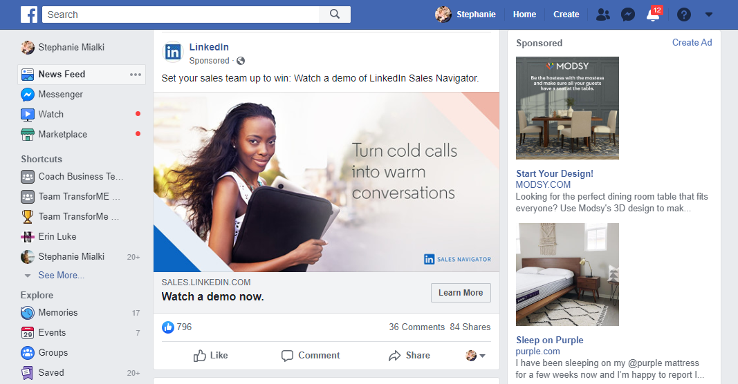
Yet, Facebook’s color scheme is blue, grey, and white, so it’s much easier to make your Facebook image ad stand out in the news feed. Avoid those three colors, and choose contrasting ones instead.
In this screenshot, there are three Facebook image ads from LinkedIn, Modsy, and Purple — yet none of them stand out vividly because they all contain a lot of blue, grey, and/or white:
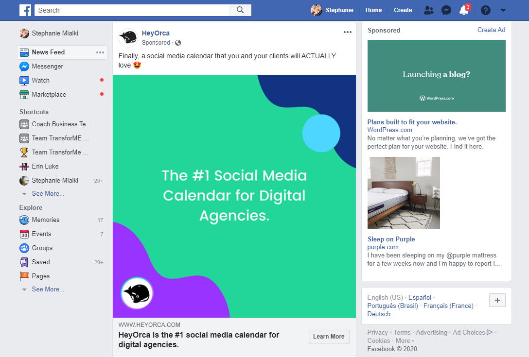
In this one, the HeyOrca and WordPress ads stand out more because they include additional contrasting colors:
10. Multiple Facebook ad images with the carousel format
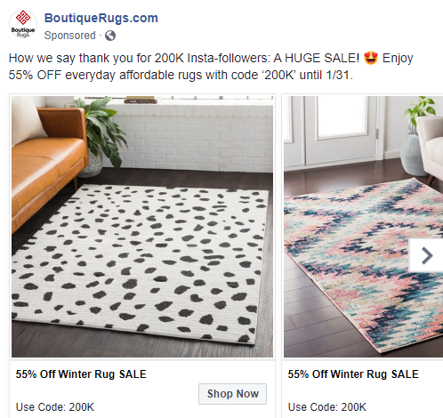
Facebook’s Carousel ad format allows you to showcase 2-10 images (or videos) within a single ad — each with its own external link:
These are great for any business looking for more creative ad space to:
- Highlight multiple products, services, or apps
- Showcase more information about a single product, service, or app
- Promote an event or series of events
- Explain processes and benefits of how your business works
- Tell your brand’s story through successive image or video cards
Boost your CTR with these image ad best practices
Image display ads are intended to reach a custom audience, but one that isn’t actively searching for you. No matter where you’re advertising, these 10 best practices will help you grab the attention of those passive users.
Once you’ve optimized your image ad enough to earn a click, be sure to maximize that click by connecting it to a dedicated post-click landing page. Request an Instapage Enterprise Demo today to see how you can create personalized post-click pages at scale.

See the Instapage Enterprise Plan in Action.
Demo includes AdMap™, Personalization, AMP,
Global Blocks, heatmaps & more.
