When you navigate to a website, (through an organic listing, a PPC ad, or even from a shared link on social media) if you don’t see what you’re looking for on the first page, you’re likely just to click out and abandon the page.
“If our customer doesn’t see the perfect dress for her on the first page she visits, she’s likely to move on. It’s absolutely necessary to show her what she wants as soon as she comes to us — even if she doesn’t yet know what that item is,” said Grace Hong, VP of Product and Design at Revolve
Optimizely is an experience optimization platform that provides website and mobile A/B testing and personalization solutions.
More than 330,000 websites are currently using Optimizely, including some of the world’s leading brands such as The Walt Disney Company, HotWire, LiveStrong, Rocket Lawyer and The New York Times. All of these well-known brands use Optimizely to deliver connected experiences to their audiences. The software company has thousands of customers worldwide and has supported them in delivering more than 700 billion optimized visitor experiences to date.
But to get where they are today, we noticed they use post-click landing pages as a way to generate brand awareness, grow their email lists, and establish thought leadership. Today, we’re going to look at how Optimizely post-click landing pages convert visitors into leads and leads into sales.
But first, let’s start at the top with a quick reminder.
What is a post-click landing page?
A post-click landing page is a standalone page that is used to offer your visitors something valuable in return for their contact information through a strong call-to-action. That CTA could include signing up for a webinar, to download an ebook, to start a free trial, to purchase something, etc.
Let’s look at a few ways Optimizely uses post-click landing pages.
6 Ways Optimizely uses post-click landing pages
Optimizely recognizes that post-click landing pages are perfect for establishing a great first impression and are an essential component of their overall marketing strategy. The company uses post-click landing pages to target product, marketing, and brand managers — offering an array of assets for their audience’s information.
1. White papers
Why the post-click landing page was built:
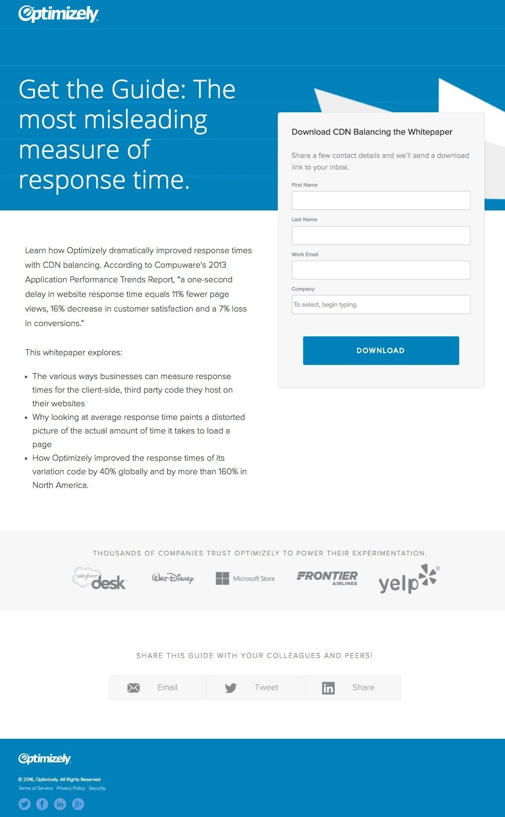
To generate white paper downloads and make people aware of how Optimizely improves response times with CDN balancing.
What the page does well:
- The statistics in the copy help reinforce the problem of slow response time and is the basis for Optimizely to produce the white paper. It also helps engage prospects by previewing what they’ll learn by downloading the asset.
- Bulleted copy makes it quick and easy for prospects to see what they can expect by redeeming the offer.
- The short form, once again, makes it quick and easy for visitors to convert and get the white paper.
- Well-known brand names act as trust signals helping provide credibility to Optimizely. If companies like Walt Disney and Yelp “trust Optimizely,” then you can, too.
What it could improve and A/B test:
- Adding a related image — perhaps a sneak peak of the white paper — will give the page more visual appeal. It could also balance the page out a bit more by filling in the white space below the form.
- Both Optimizely logos link back to Optimizely’s homepage, which give the visitors an escape without converting.
- The CTA color has already been used on the page. When designing your CTA, you want it to be as noticeable as possible. In this case, Optimizely should change the button color like green or red
- The share buttons and social icons are unnecessary because they draw attention away from the main goal of the page.
2. Online shopping trends report
Why the post-click landing page was built:
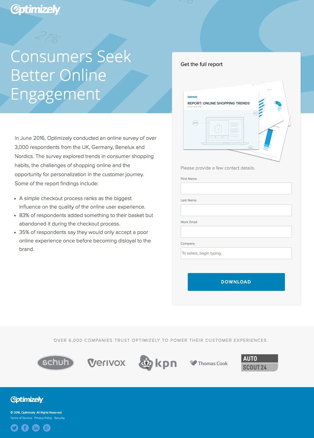
To generate report downloads based on Optimizely’s 2016 survey of consumer shopping habits.
What the page does well:
- The title of the form, “Get the full report,” is direct and action-oriented. When people read this, they know exactly what they are getting by filling out the form and clicking the CTA button.
- The 4-field form is appealing to visitors because they don’t have to divulge much information to download the report.
- Concise copy is not a chore to read. It gets right to the point and provides more context as to why the report is valuable and worth downloading.
- The bulleted list makes it easy for visitors to scan the page and find out exactly what the report includes.
- Company badges located directly below the form provide credibility for Optimizely. Also, adding the fact that Optimizely has over 6,000 satisfied customers increases the trustworthiness of the company as well.
- ”Over 6,000 companies” above the company badges acts as social proof and can help persuade prospects to convert.
What it could improve and A/B test:
- The CTA button color does not contrast at all with the page. If Optimizely wants to maximize report downloads and generate leads, why hide the button using a similar color that’s already been used?
- The headline, “Consumers Seek Better Online Engagement,” isn’t very specific as to what the page is offering, or what the report shows.
- Share buttons at the bottom of the page act as exit points, allowing visitors to leave the post-click landing page without first downloading the report.
- Both Optimizely logos at the header and footer of the page link back to Optimizely’s homepage. By linking away from the post-click landing page, conversions may be dramatically reduced.
3. Toolkits
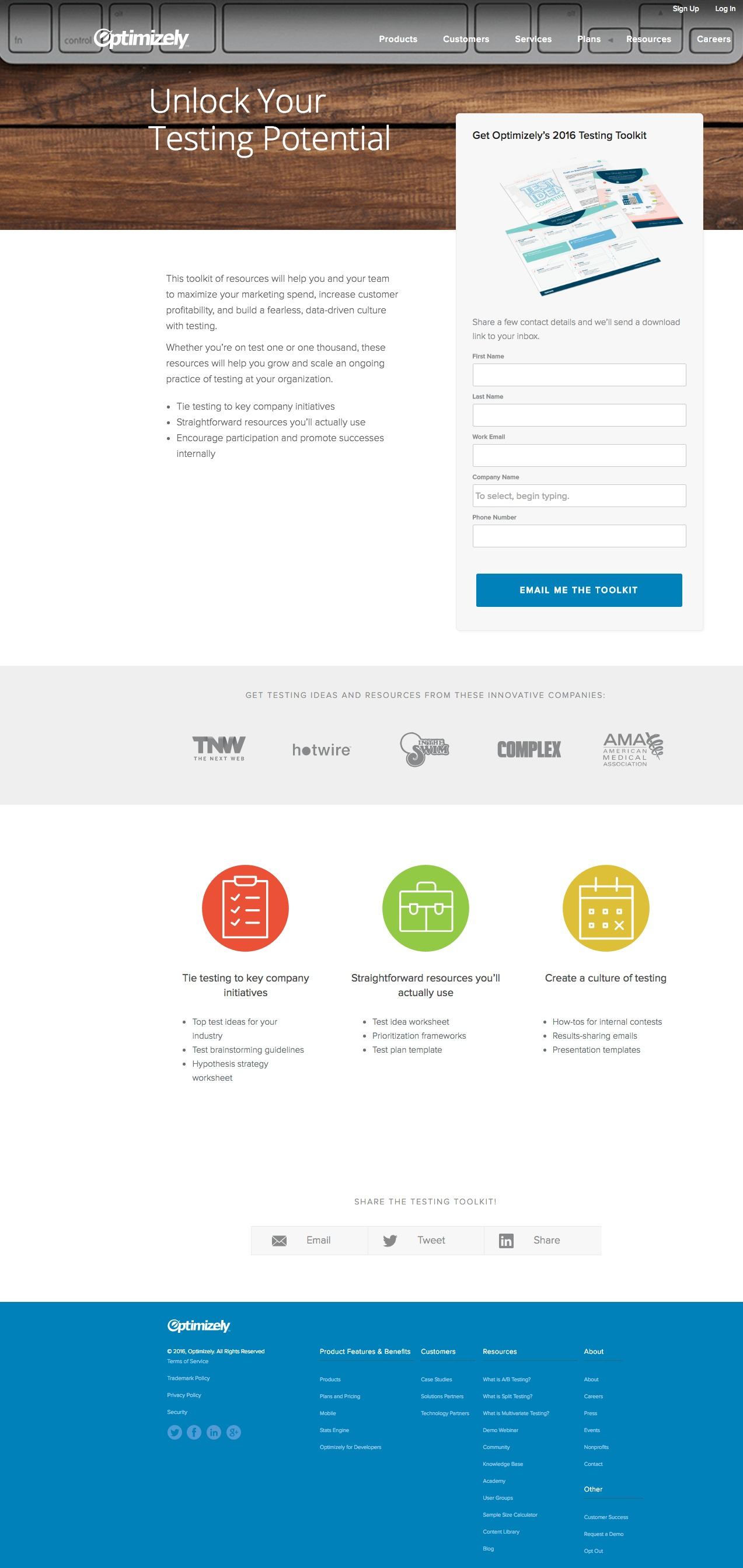
Notice this Optimizely post-click landing page form includes the same fields as the two examples above, except this time they also ask for a phone number. They may believe that someone interested in this toolkit is a more qualified lead and they want to have more than one way of following up.
Why the post-click landing page was built:
To generate top of the funnel leads by offering a testing toolkit of resources.
What the page does well:
- The form’s title (“Get Optimizely’s 2016 Testing Toolkit”) acts as a CTA of sorts because it helps guide visitors to the form and CTA button below.
- The form is above the fold so there is no chance visitors can miss it once they land on the page.
- The CTA color contrasts very well with the rest of the page.
- The CTA copy is written in first person and is more relevant to the offer (as opposed to simply saying “Download” on the button).
- Company badges demonstrate credibility for the testing toolkit because if Optimizely is including testing tips and resources from brands like The Next Web, Hotwire, and the American Medical Association, chances are your brand can benefit from the content.
- Bulleted copy below the fold expands on the bulleted copy above the fold…
What it could improve and A/B test:
- The navigation bar at the top is a big no-no, especially because it’s one of the first things you see when you land on the page. Removing the navigation could significantly improve the conversion rate of this post-click landing page.
- The background image doesn’t match with the goal of this post-click landing page’s goal.
- The overwhelming footer is another element to avoid on post-click landing pages. If the goal of this page is to generate toolkit downloads, why give visitors so many other clickable options like Plans and Pricing, Academy, and the About Us section?
- Share buttons at the bottom of the page act as distractions/exit points, as they link away from the post-click landing page and take away from the post-click landing page goal.
4. Optimization guides

Why the post-click landing page was built:
To generate new leads from app developers looking to optimize their app.
What it does well:
- Bulleted copy lets visitors know what they’ll learn by downloading the guide.
- The short form helps encourage maximum conversions because “guides” are typically top of the funnel, awareness stage offers — and these types of offers don’t ordinarily require lengthy forms.
- The CTA color contrasts with the page, drawing as much attention as possible.
- Popular app images add value to this post-click landing page. The report includes tactics used by many best-in-class apps, so Optimizely used brand familiarity to increase the value of the report.
- Privacy policy and terms of service are included so if any visitor is concerned about how their information will be shared by Optimizely, they can read more details on those links.
What it could improve and A/B test:
- The headline is a bold statement, but not very convincing, “Create Amazing Mobile Experiences.” Okay, but how is Optimizely going to help me do that?
- Every form field is required. We understand that “email” should be required (and probably first name, too) but having last name and company as optional could increase conversions.
- The “Download” CTA is way too vague. The CTA should read something more along the lines of “Download My Free Mobile Optimization Guide” or “Help Me Optimize My Mobile App.”
- The mini footer includes links to Optimizely’s blog, their help center, developers, and even their jobs page. This page should focus all of its attention on the mobile optimization guide and nothing else.
5. On-demand webinars
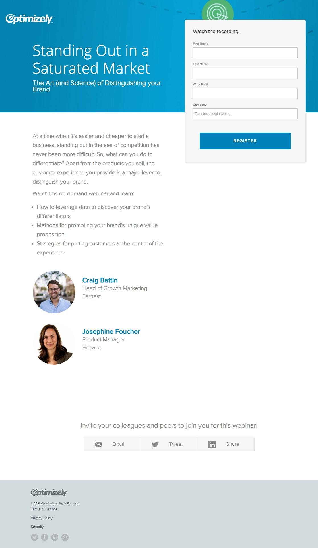
Why the post-click landing page was built:
To increase leads and generate brand awareness for Optimizely by emphasizing the importance of data in making business decisions — and letting the audience know Optimizely is a leader in A/B testing.
What the page does well:
- The short form makes it easy for visitors to convert and watch the on-demand webinar.
- Concise copy is not a chore to read. It gets right to the point in that you’ll learn how to differentiate your brand, promote your unique value proposition, and how to put the customer front and center.
- Presenter headshots, title, and company names are provided. These are all helpful because prospects like to know who they are learning from. Plus, these elements all help establish the credibility of the presenters and if visitors are curious to search the companies and what they do, they can.
- The form’s title: “Watch the recording” is direct and action-oriented — sort of like a call-to-action before the form that tells the prospect what to do.
What it could improve and A/B test:
- Both “Optimizely” logos are clickable and send visitors off this page to the homepage. While it’s important to include your logo for branding purposes, linking it to the main website acts as an exit route and is not recommended for post-click landing pages.
- The headline doesn’t convey Optimizely’s UVP or tease the visitor about the webinar’s content. A revised headline such as, “3 Ways to Stand Out in a Saturated Market” may encourage visitors more, get them to read the rest of the page, and convert.
- The CTA is unremarkable and making a quick change could greatly increase conversions. An improved CTA copy could be, “Send Me the Recording” because it’s written in first person and includes the type of the offer (recording).
- The page seems out of balance with a lot of white space on the right side. Creating more of a visual hierarchy could also help increase conversions.
- Adding a video to the post-click landing page to give the users a valuable sneak peek into what the webinar will offer. Since this is an on-demand webinar, including a short clip from the presentation could be the persuasive factor that convinces visitors to complete the form.
- Speaker information is absent. Including a very brief bio of what the presenter does and what makes them qualified to speak on the webinar adds credibility to them and the webinar’s content.
6. Free trial
We searched “A/B testing software” and found the Google Ads post-click landing page below after clicking on this ad in Google:


Why the post-click landing page was built:
This PPC post-click landing page was created to increase free trial sign ups.
What it does well:
- The free trial is front and center because there is nothing else on the page that will distract a visitor from the end goal of signing up.
- The short form makes signing up quick and easy.
- Privacy policy and terms of service information is included so users can learn more about how their information will be used.
- Company badges from globally-recognized brands give the users the confidence that if other big names are using their tools, they should be too.
What it could improve and A/B test:
- Removing the hyperlink on Optimizely’s logos so that the user can’t click out of the post-click landing page without signing up for the free trial.
- Removing the footer and social sharing buttons again, so that the user doesn’t have a way of clicking out of the page without signing up.
- The CTA color is a similar shade of blue as the banner on the top. Granted, this signup post-click landing page does not include many elements to distract from the button. However, using a contrasting color such as green or orange could only help increase conversions.
- The CTA copy could be improved and more enticing to click with a subtle change, such as “Start My Free Trial.”
- Including a short demo video about Optimizely (or even a short case study video) could help increase free trial sign ups.
- Adding testimonials from well-known companies could further demonstrate that Optimizely is a trusted software for A/B testing.
What do you think of Optimizely’s use of post-click landing pages?
Optimizely understands that post-click landing pages are a critical component to their digital marketing strategy because they continue to use them to fill their sales funnel and generate brand awareness. And, since they’re an optimization platform, we guarantee they’re A/B testing their post-click landing pages to see what converts best with their audience.
That said, you don’t need a separate tool to A/B test your post-click landing pages. Learn how to provide 1:1 ad personalization for every audience you have, sign up for an Instapage Personalization Demo today.

See the Instapage Enterprise Plan in Action.
Demo includes AdMap™, Personalization, AMP,
Global Blocks, heatmaps & more.
