Creating a segmented post-click landing page involves serving the most relevant page to every traffic segment that clicks an ad. This means instead of linking every ad with a generic landing page; you must create, personalized post-click landing pages.
Connecting every ad with a matching personalized experience after the click helps turn ad clicks into advertising conversions.
We recently did a rundown demonstrating how Square segments and personalizes post-click landing pages, today we focus on Citibank.
How Citibank segments post-click landing pages
As a global brand offering many financial services, Citibank uses segmented post-click landing pages for audiences looking for a variety of solutions the bank offers. To demonstrate, today we’ll look at home loan financing, checking accounts, and a display ad for homeownership.
Example 1: Home loan financing
When a search user enters “home loan financing” they see this Citibank ad #2:

The ad talks about finding the right home loan, viewing the rates online, and giving users personal attention — all backed by 35+ years experience:
Here’s the Citibank post-click page visitors come to after the ad:

- The ad and post-click page headline match, both talk about financing your home with Citibank. This reassures the user that they’ve landed on the right place. The subheadline, emphasizes the personal attention point the ad copy highlighted.
- The background image shows an image of a family, which is consistent with the home loan offer.
- The mortgage rates table allows users to go through the information easily. The user who clicked the ad expected to be helped out with mortgage rates and this table helps the user do exactly that. Plus, the mortgage rates are automatically updated so the user always gets the most recent rates and knows the page is personalized for them.
- The lead capture form lets visitors self-identify whether they want to purchase or refinance a home.
- The Citibank home loan process is showcased in iconography which makes them more readable.
Example 2: Checking accounts for people in California
Meanwhile, this Citibank ad shows up when you search for “California checking account:”
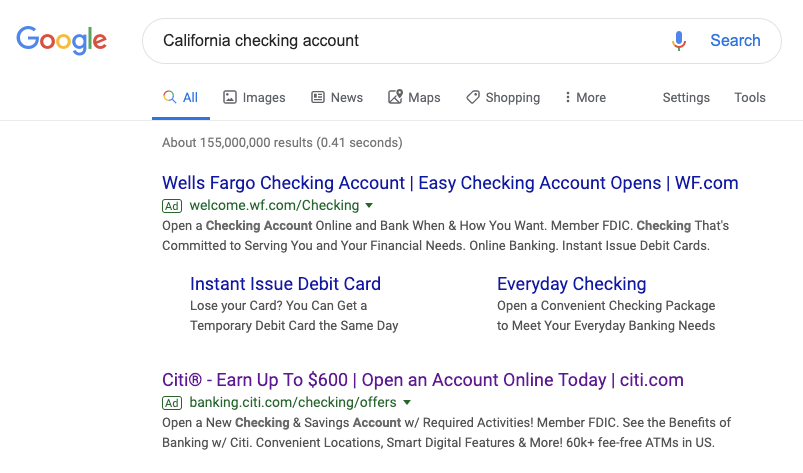
The ad headline highlights how visitors can earn up to $600 by opening an account online today, while the ad copy gives details of other perks a Citibank checking account holder receives.
Search users see this page, post-click:
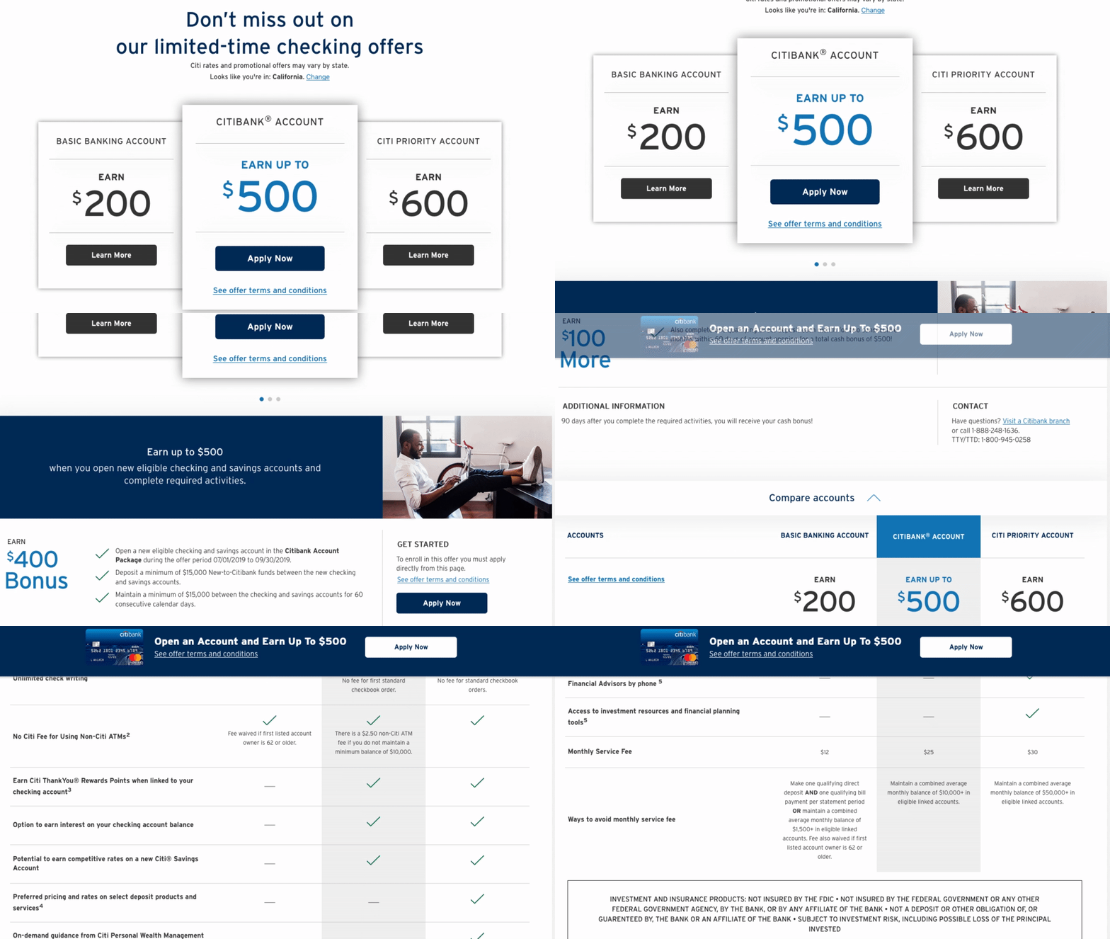
- The ad and post-click page headline both talk about checking accounts and how visitors shouldn’t miss out on the ‘limited time checking offers’.
- There is only one offer on this page. The only difference is the signup bonus amount.
- The location tag personalizes the page based on the user’s search term.
- The copy and visuals explain how the service works, the pricing, and the features of different accounts.
- The “Open an Account” banner and CTA button are sticky so it follows the visitors as they scroll through the page. Doing this makes it an easier UX experience because once the prospect has evaluated the offer, they don’t have to search where to convert.
Example 3: Mortgage rates
Now let’s look at one of Citibank’s display ads and its corresponding post-click page:

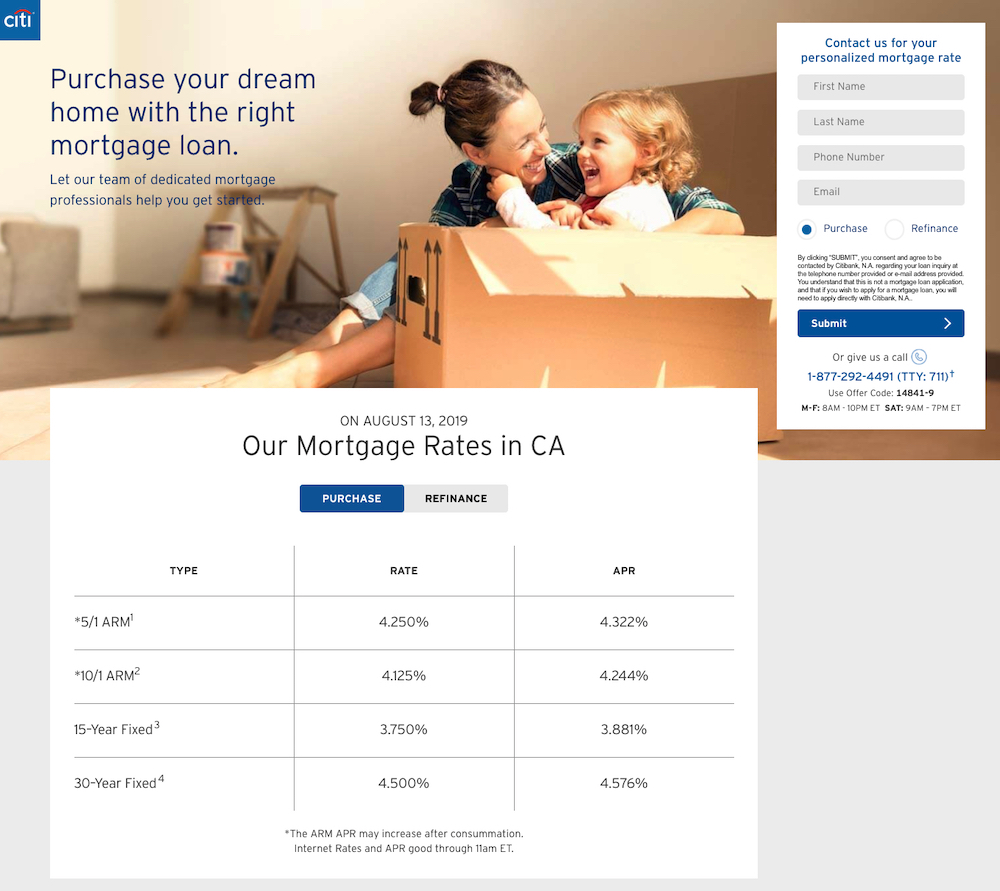
- The ad and post-click landing page headline both have the “owning a home” narrative.
- The images in the ad and post-click page are identical, which establishes message match.
- There are no distractions on the page, so the prospect is entirely focused on mortgage rates in California.
- The lead capture form lets visitors toggle between the “purchase” and “refinance” option.
- The mortgage rates are automatically updated so the user always gets the most recent rates.
Compared to Citibank’s homepage
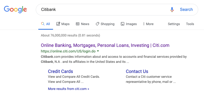
Compare all the personalized experiences above with someone searching for Citibank by name. In this particular search, Citibank does not run ads on themselves, so instead of clicking a paid search ad for the bank, users click the organic link and go to the homepage:
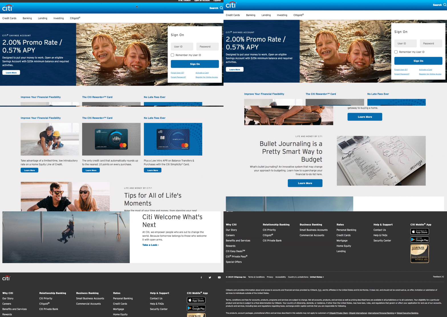
- The homepage headline provides a general overview of Citibank’s saving account.
- The copy and visuals explain what opening an account with Citibank entails and the perks the users get.
- Many navigation links in the header and footer take visitors to different pages on the website (credit cards, banking, lending, investing, etc.). These links make sense for a homepage because it is meant to be a browsing experience. These links are related to every service the bank offers and not anything in particular (like the post-click pages before did).
- The homepage is not dedicated to a single offer like the post-click landing pages above.
- There is a form where users sign into their account. This makes sense because if you’re a Citibank user already, you would have login details. For the post-click landing pages earlier, they don’t request username or password.
- The search bar option in the top-right lets people input what they’re looking for in hopes of getting relevant content.
- The Spanish-English language toggle in the top-right lets people customize the page based on their preferred settings.
- The ATM / Branch link lets people find the closes Citibank to their location.
- The “bullet journaling” article featured halfway down the page gives expert advice to consumers on the topic, and is further proof the homepage is meant for browsing and not converting on a single offer.
- The “Feedback” tab that sticks to the right margin provides quick access for people to send comments to Citi.
Citibank understands that converting a specific offer on the homepage is very unlikely, so it doesn’t focus on a dedicated offer. Instead, the homepage gives a comprehensive overview of their services and provides multiple ways for people to browse for the content they wish to consume.
Get better results by connecting ads with segmented post-click landing pages
To avoid wasting ad spend (and clicks) depends on the post-click landing page you provide audiences. The Citibank examples showcased above explain how segmenting post-click landing pages helps them create relevance between the ad and each post-click page.
Homepages are not personalized for specific audiences; they are created for users looking to discover the brand. Meanwhile, a personalized post-click landing page is a natural extension of the ad, and each page element lets the visitor know they’ve come to the right place.
Get an Instapage Personalization demo and see how Instapage empowers you to segment your post-click landing pages like never before.

See the Instapage Enterprise Plan in Action.
Demo includes AdMap™, Personalization, AMP,
Global Blocks, heatmaps & more.
