On a landing page, the call to action is supposed to be the final persuasive nudge toward conversion. After a magnetic headline draws the reader in, skimmable copy presents the benefits of converting, and engaging media makes the offer more tangible, all that’s left to do is encourage the visitor to take action.
But instead of using a CTA that makes the page more persuasive, most designers miss the opportunity, leaning on uninspiring copy like “submit,” “sign up,” and “subscribe.”
Today, we showcase landing page call-to-action examples that raise the bar, using persuasive principles that can boost conversion rates.
Unique call-to-action examples that can boost conversions
The most compelling argument for using traditional CTAs is that people are used to seeing buttons with “submit,” “subscribe,” and “sign up” written on them. Since they’re so familiar, visitors have no trouble figuring out where they need to click to convert. Trying too hard to make your CTA copy unique can make it challenging to recognize as a CTA. And in advertising, it’s always better to be clear than to be clever.
But there’s a middle ground. CTAs can be compelling without confusing people. From eight different brands, here are 13 call-to-action examples that prove it.
Square
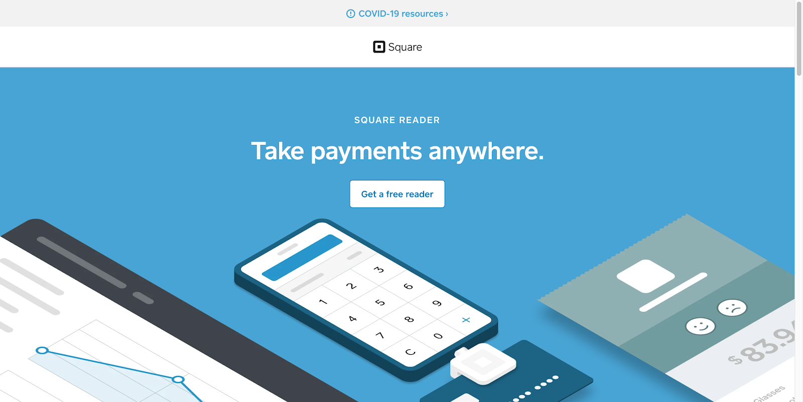
This landing page from Square seems pretty straightforward. But in reality, the CTA is quite unique. On a page like this, most people would write “Sign up” or “Start taking payments.” Instead, Square opts for something completely different with “Get a free reader.”
Of course, getting a free reader is a benefit of signing up, but it’s not the main benefit of signing up. The primary advantage is the ability to accept payments anywhere.
So, why would Square focus on this aspect of the offer? Because if you wanted to accept payments anywhere, you could sign up on a page like this one from Shopify, or get a product like this one from Lightspeed. The CTA “Get a free reader” separates Square from competitors.
This copy almost reads like a giveaway page: “Simply input a name, email, and password, and we’ll send you a free reader. Oh, and did we mention you’ll be able to accept payments from anywhere?” This landing page uniquely separates Square from other mobile POS systems, and makes converting as easy as claiming a free gift.
Freshworks CRM
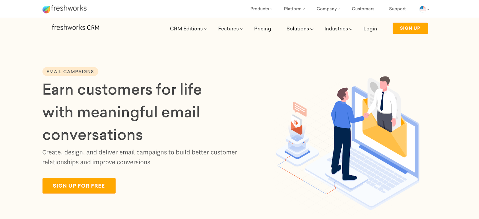
This post-click landing page from Freshworks advertises its CRM solution with the promise of boosting conversions through meaningful email marketing. The offer is for a free trial of the solution, and the CTA copy reads: “Sign up for Free.”
“Free” is one of the most powerful words in copywriting. It capitalizes on our innate greed: We all want as much as possible for as little in return. And there’s nothing cheaper than free.
“Sign up” is a traditional call to action, but when combined with “Free,” it communicates a persuasive proposition that’s hard to ignore. This CTA strikes the balance between traditional and persuasive well.
ActiveCampaign
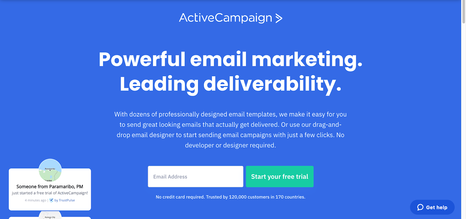
This landing page from ActiveCampaign advertises its email marketing solution. You’ll reach it after clicking through a paid search ad.
With a CTA that reads “Start your free trial,” ActiveCampaign attempts to elicit the conversion similar to the way Freshworks does. But one crucial difference between the two makes this more persuasive.
This landing page uses the word “Free” with the words “Start your trial,” which communicates to visitors that they’ll get to use the software for free. By comparison, Freshworks offers visitors the opportunity to sign up for free.
But signing up is free most everywhere. Using software is not. To understand that Freshbooks offers a free trial, visitors will have to click through the top CTA or scroll to the bottom of the page. And neither action is a given. This ActiveCampaign CTA clarifies what the company is offering, while still capitalizing on inherent consumer greed.
FabFitFun
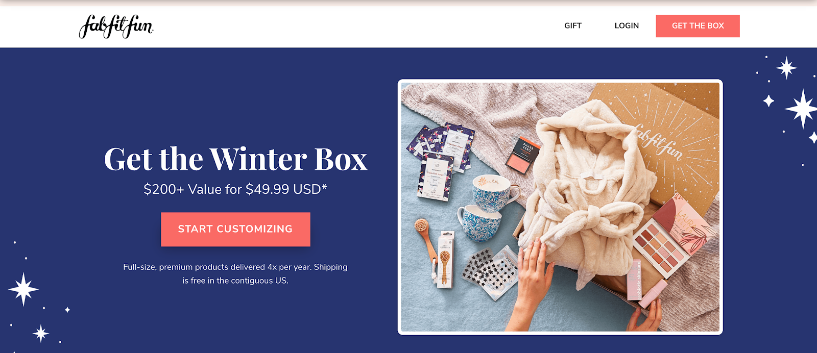
FabFitFun is a seasonal subscription box company. This landing page its Winter Box, which visitors can customize to their preferences. The design features several great examples of unique and compelling CTAs.
First, above the fold is the “Start Customizing” CTA. It communicates a few things, but most enticing is the fact that you can tailor the box to your specific needs. This feature enhances product satisfaction. It also capitalizes on our our desire for exclusivity. With various brands, categories, and products to choose from, it’s unlikely the box you create will be like anyone else’s.
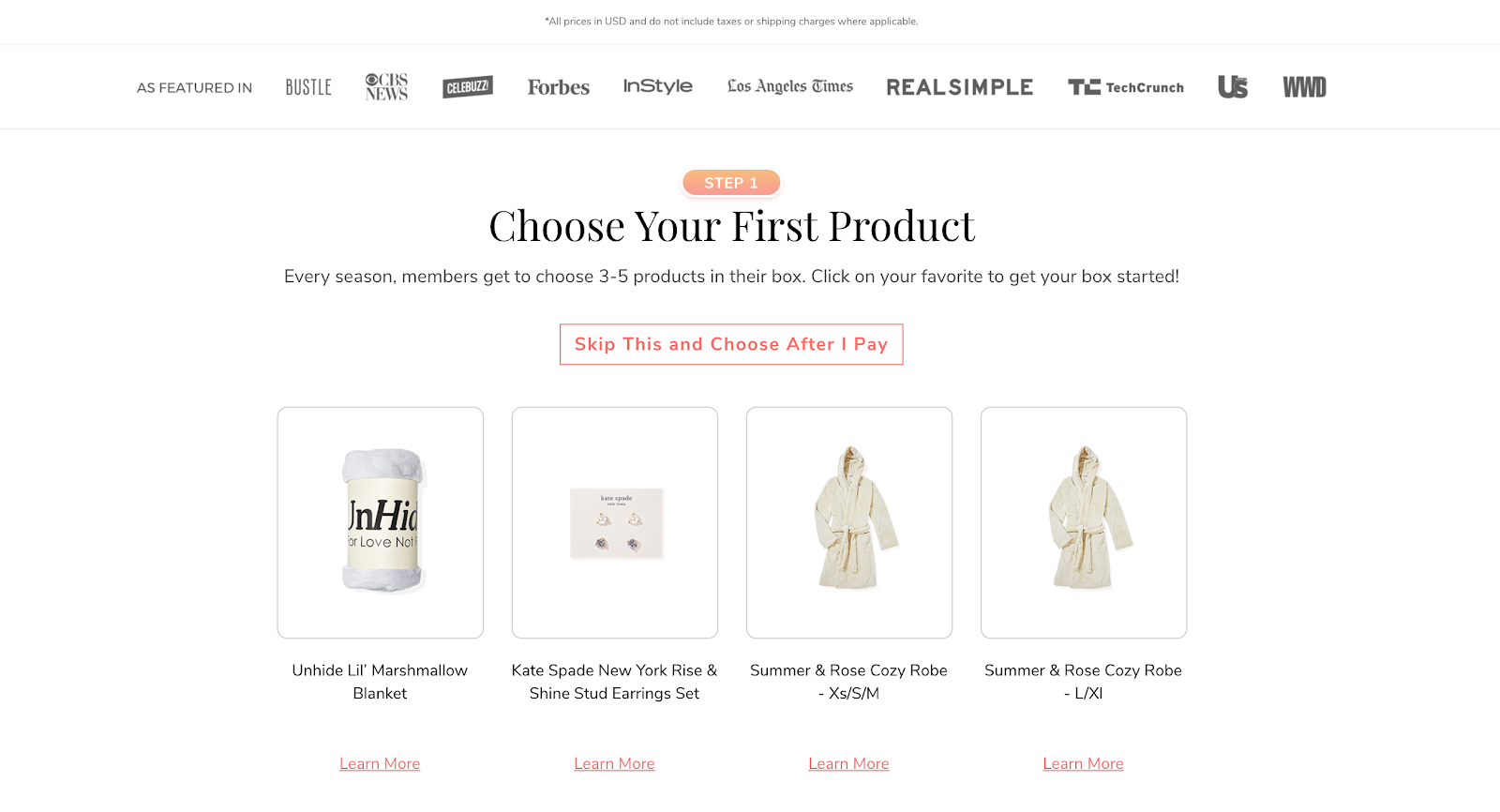
This second CTA, “Skip This and Choose After I Pay,” offers visitors flexibility. Anyone feeling overwhelmed by the amount of products to choose from can take advantage of this option to purchase first and customize later.
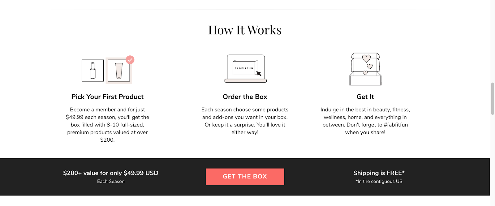
Further down the page, you’ll see an example of a CTA that emphasizes the benefit of clicking the button, instead of calling the visitor to action with words like “download” or “sign up.” Where most designers might use the copy “buy now” or “subscribe,” FabFitFun uses “Get the Box.” Focusing on the benefit of clicking the button, as opposed to what you need to do to claim the product, is an excellent way to inject some persuasiveness into your CTA.
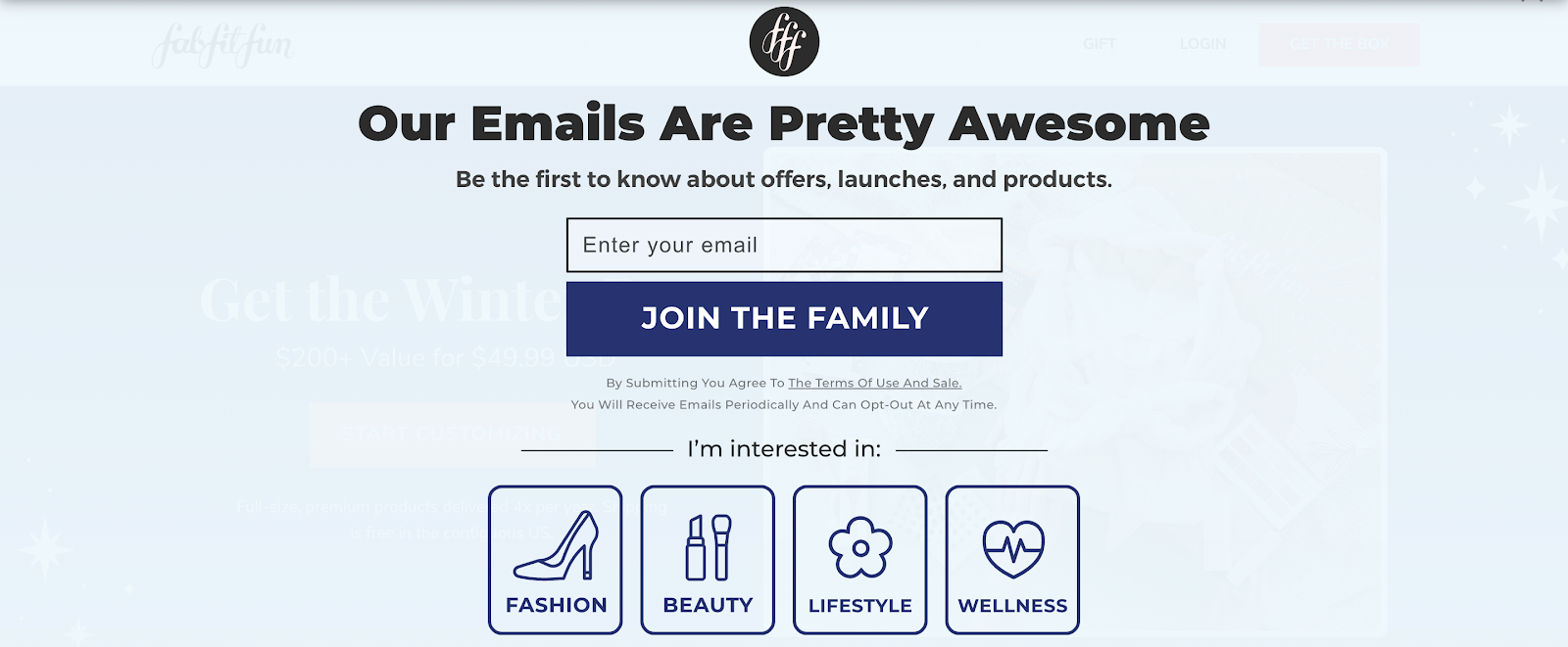
Lastly, this FabFitFun CTA does more than ask visitors to subscribe to emails. Though it’s a little on the cheesy side, it takes advantage of our desire to belong. Instead of “Join the list,” this button welcomes visitors to the FabFitFun family.
SAS
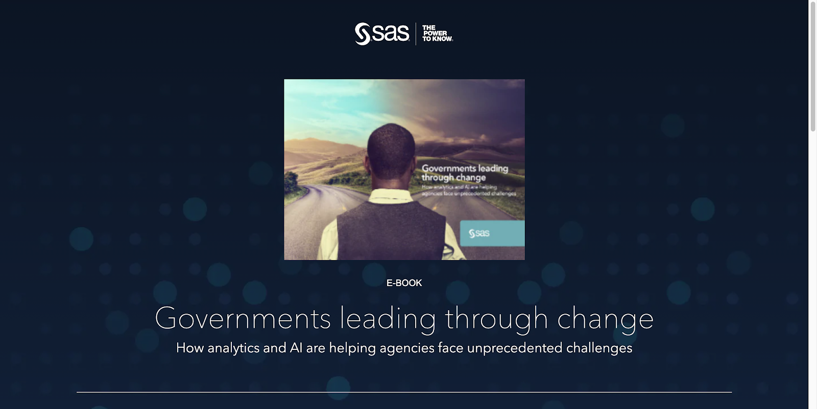
This SAS landing page offers an ebook on how analytics and AI help government agencies overcome challenges. Visitors can find it after clicking through a paid search ad. When they scroll down, they’ll see this form:
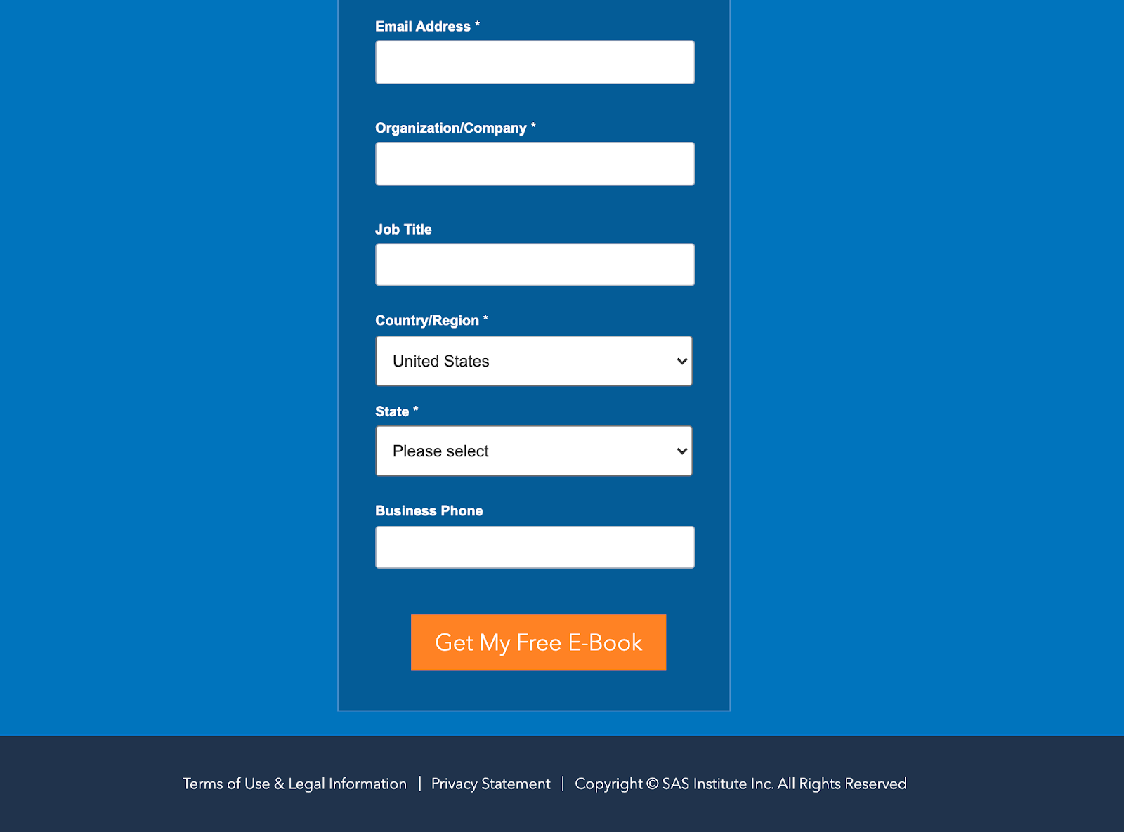
At the bottom, an orange CTA button contrasts against the blue background well. On it are the words “Get My Free Ebook.”
This CTA combines elements of several examples we’ve already seen. First, it uses the word “Free,” which is among the most powerful words in copywriting. Second, it’s written in first-person language, which is proven to boost conversions. Though “Get Your Free Ebook” would still work here, “Get My Free Ebook” could work better.
Lastly, the button’s copy emphasizes what the visitor will get in return for clicking. “Get my ebook” or “Send my ebook” is better than “Download” or “Submit.”
TransUnion
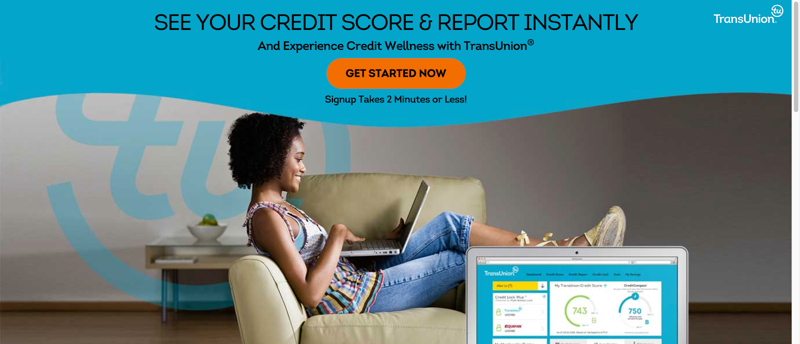
This landing page from TransUnion offers visitors “Credit Wellness,” which, according to the copy, comes with several benefits. Above the fold, the first CTA button uses the text “Get Started Now.”
While it might look uninspiring, this CTA uses the word “now.” And in the context of accessing credit and protecting your identity, there is a level of urgency involved. You want to be protected as soon as possible. This page lets visitors know they can begin the process immediately.
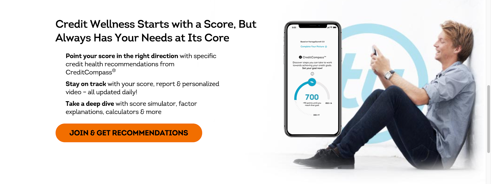
The second CTA, “Join & Get Recommendations,” attempts to use personalization the way FabFitFun does. A bullet above the CTA reads “Point your score in the right direction with specific credit health recommendations from CreditCompass.” It also mentions “personalized video.” Though “Get personalized recommendations” might be more powerful, this CTA is better than “Join” or “Sign up,” especially because it emphasizes the benefit of clicking.
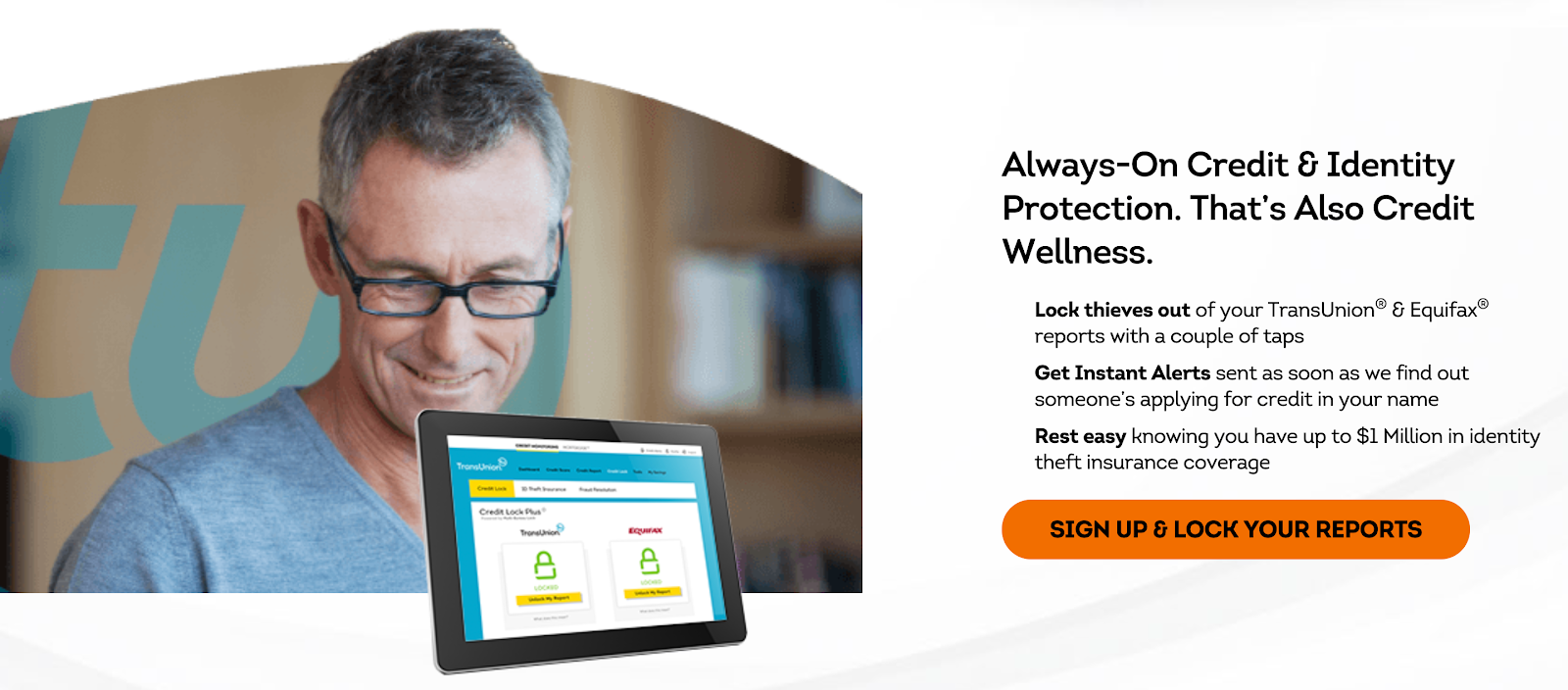
This final CTA from TransUnion combines a traditional CTA with a reason to click. Along with bulleted body copy, “Sign Up & Lock Your Reports” tells visitors they can protect their identity by locking thieves out, getting instant alerts, and signing up for $1 million in identity theft insurance coverage.
CheckMyScore.com
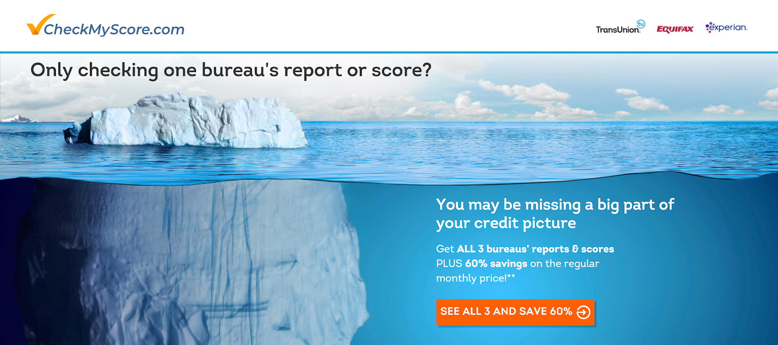
This landing page from CheckMyScore.com offers visitors the opportunity to check credit scores from all three major credit bureaus at once, and at a discounted monthly rate. This CTA does an excellent job of highlighting the two major benefits of converting: First, it uses the word “all,” which emphasizes the comprehensiveness of the information visitors will receive. Second, it explains that they’ll get it at a 60% discounted rate. This page proves that benefits aren’t only for bulleted copy and headlines. CTAs can contain unique selling propositions, too.
John Hancock Aspire
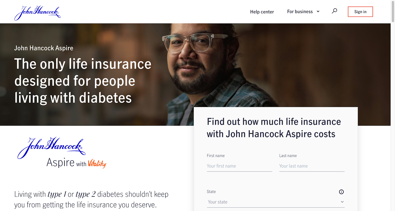
This landing page from John Hancock Aspire offers customers the only life insurance product designed for people with diabetes. Scroll down and you’ll see their CTA:
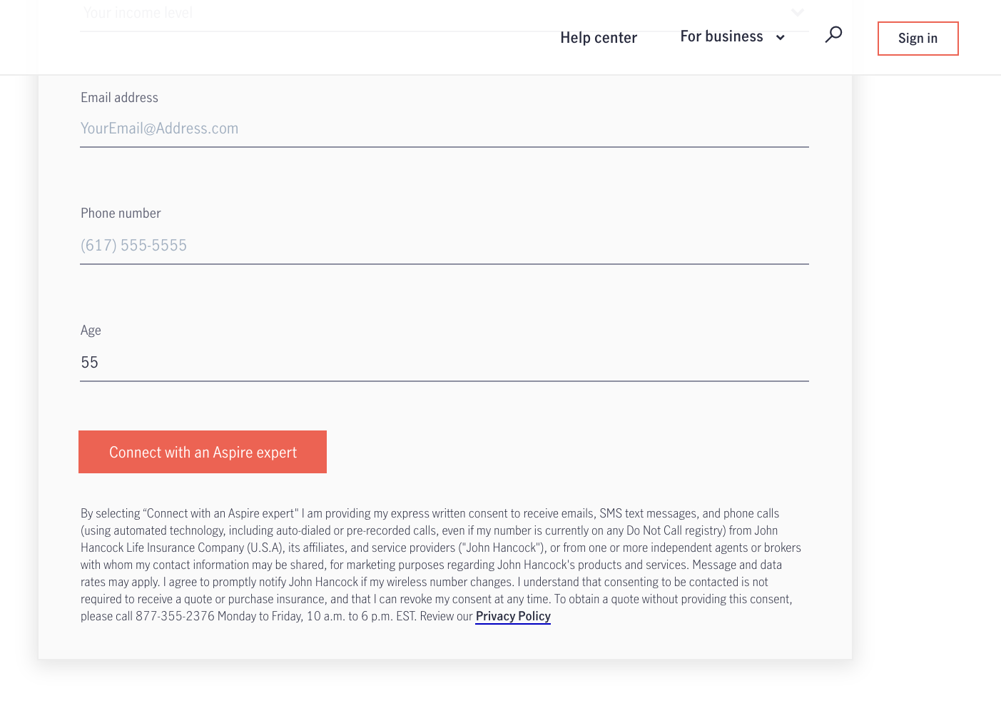
The text “Connect with an Aspire expert” works with this landing page because John Hancock is advertising the product as the only solution for people with diabetes. If they’re the only brand offering the product, they’re the closest thing to an expert in the space. “Connect with an Aspire expert” tells visitors that, by clicking, they’ll receive information from someone with experience in solving their problem. And people always perceive information from experts to be more valuable because it’s specialized. Obviously, this button also emphasizes the benefit of clicking over the work needed to claim the offer.
Use unique CTAs in your post-click experiences
Every element on a landing page has a responsibility to fulfill, and each job contributes to the overall goal: to get the visitor to claim your offer. However, for some reason, most advertisers don’t treat the CTA as an element that can contribute to that overall goal.
Instead of using “sign up” or “subscribe,” try to personalize your CTA the way you would other copy on your page. What would most influence your audience? Consider the benefits of claiming your offer, and don’t make your visitors claim it. Present them the benefits of clicking, like “Get a free reader,” “Get the box,” “Lock your reports,” or “Connect with an expert.” These are much more likely to boost conversion.
