Best Landing Page Examples
by Fahad Muhammad

A post-click landing page is a standalone web page that helps marketers promote their offers to targeted audiences. When you advertise your offers through focused post-click landing pages instead of cluttered homepages, you effectively increase your chances of scoring higher conversion rates.
Every post-click landing page should be created for only one offer, whether you’re promoting a free trial of your SaaS service or a chance to buy your ebook. Post-click landing pages can be used no matter which industry you operate in because they have proven to deliver higher conversion rates in comparison to any other website page.
Post-click landing pages are gaining popularity with each passing year because they help you target specific audiences and enable you to collect valuable user information (such as email address and phone number). Higher conversion rates and targeting are precisely the reasons why most marketers create post-click landing pages in today’s business world.
Creating an optimized post-click landing page can be quite a challenge if you’re new to the process. There are many page elements you need to add in with the perfect balance so you can convert visitors into leads, and leads into loyal customers.
To that end, eight core elements make up an optimized post-click landing page, and each element must compliment the others to have the right persuasive effect on your visitors:
There are certain criteria and post-click landing page best practices that determine the efficiency of each post-click landing page core element. For example, your primary headline must have the clarity to convince your visitors to stay on your page and your call-to-action button must call-out to your visitors so they convert.
The upcoming chapters of this guide will focus on the core post-click landing page elements. Each chapter will explain the criteria by which each element is judged while showcasing post-click landing page examples that have mastered that particular element criterion.
First, let’s take a look at a few post-click landing pages that have the right mix of optimized page elements.
GoToWebinar
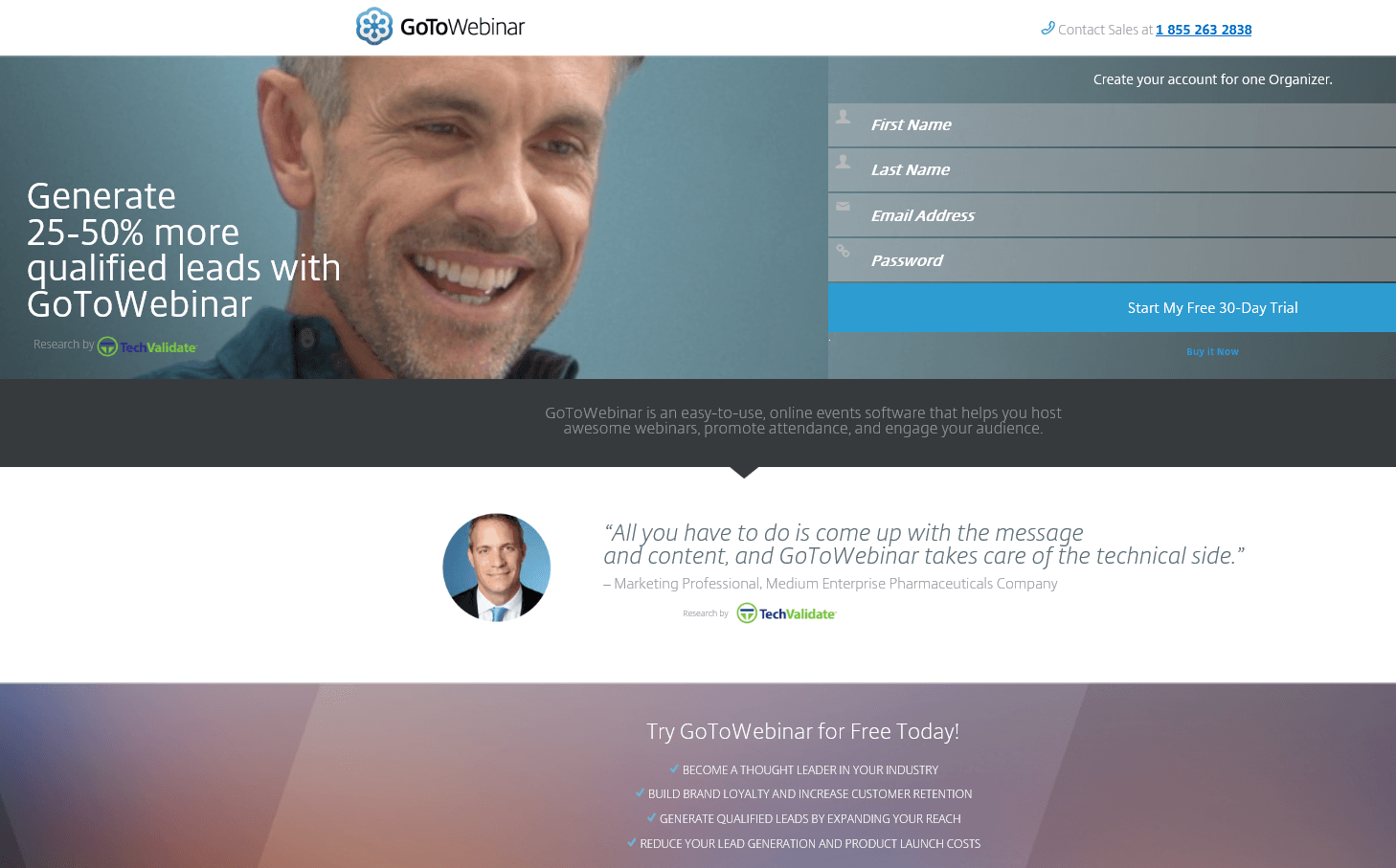
The GoToWebinar post-click landing page has:
Google Docs

The Google Docs post-click landing page has:
The main post-click landing page headline is the first thing your visitors see, so it is important to craft a headline that clearly describes your product or service.
Think of your page headline as a “hook” where you have the opportunity to reel in your visitors. If your headline fails to impress, your visitors will likely abandon your page.
The primary headline must:
There are four main approaches you can take with your headline:
To demonstrate, here are a few post-click landing pages with stellar primary headlines:
Zoho CRM

Zoho CRM post-click landing page’s primary headline is clear in that it helps its customers “Close More Deals in Less Time.” From the get-go, it provides visitors with the solution to their lead conversion problems, making it easy for them to click on the red CTA button urging them to “Get Started Now.”
ProductPlan

The ProductPlan post-click landing page headline clearly describes the value that visitors are going to get when they click the call-to-action button.
The purpose of a secondary headline is to support the claim of the primary headline. That being said, not every post-click landing page requires a secondary headline. When the main headline is too long to look appealing to visitors, a secondary headline makes an appearance.
If you choose to include a secondary headline, make sure it:
Let’s look at two secondary headlines to demonstrate:
GetResponse:
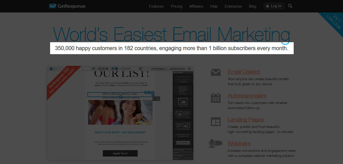
GetResponse uses a secondary headline stating how many customers, countries, and subscribers that currently use the “world’s easiest email marketing” software.
Outbrain:
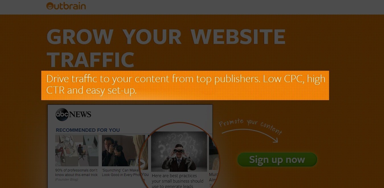
Outbrain uses a secondary headline to expand on their primary headline so that it doesn’t look too long or minimize its impact.
An effective UVP answers the question, “why should I buy from you?” Your UVP is more than just a statement; it needs to communicate the results customers will achieve by using your product or service.
Your value statement should be read relatively quickly, and should set you apart from your competition.
Where is the best place for you to mention your service’s UVP? In your post-click landing page copy, this includes your post-click landing page headline as well. Your copy should describe why your service is superior and solves your visitor’s problem better than the competition.
Your copy should:
Here’s what an effective UVP (inclusive copy) can look like:
Flok:

Flok’s post-click landing page copy is broken down into easily readable points, each one highlighting the service’s benefits and what Flok can do for prospects.
Sprout Social:

Sprout Social also lists their UVP in bullet points. Each bullet point expands on the primary headline, providing more value to the visitor.
Your visitors need to trust your service before they decide to sign-up or enter their email address to watch your webinar. Trust indicators help you make your post-click landing page credible.
There are five common ways to include trust indicators on post-click landing pages:
1. Statistical Evidence: Just saying you can do something doesn’t persuade your visitors to sign-up. Providing statistical proof of how you can deliver results is what gets your visitors to convert. The key to providing credible statistics is to include the source that generated them, i.e. you need to support any claims you make with actual evidence.
Contently uses this strategy on their post-click landing page. Instead of self-proclaiming they are the best content marketing platform, they’ve mentioned it was Digiday Signal Awards that gave them this commendation:
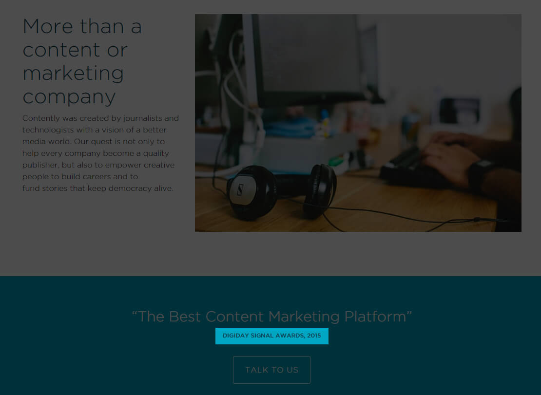
2. Customer Badges: Showing badges of companies you’ve already helped tells your customers they can achieve success with your product. A visitor may not know who you are — but recognizes one of your customer badges — is more likely to click on the CTA.
Crazy Egg does this with their post-click landing page. Not only do they include badges from renowned companies, but they also share the fact that 200,000 businesses convert better with Crazy Egg heat mapping technology:

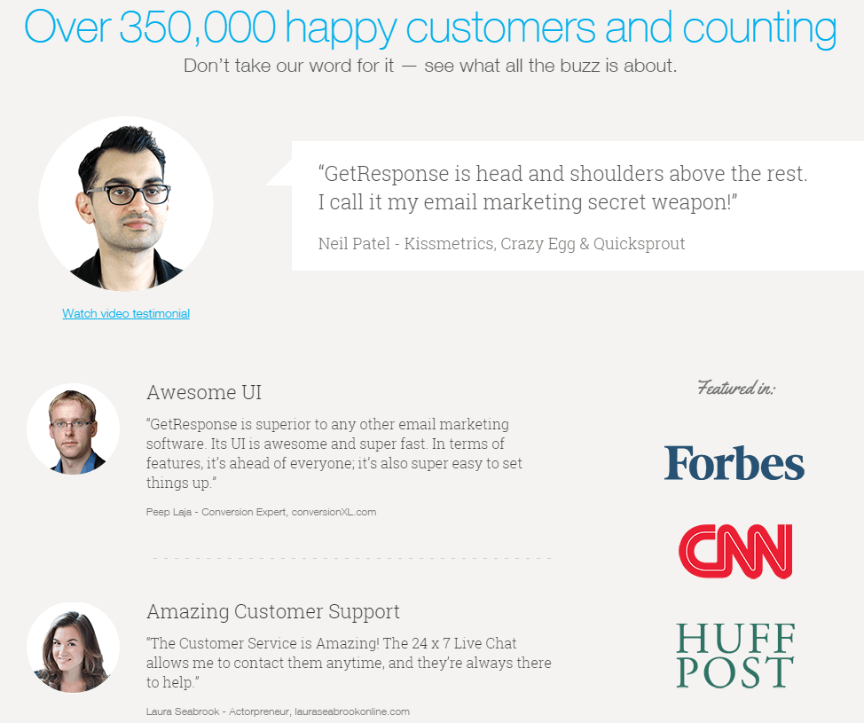
3. Honest Customer Testimonials: It’s always nice to know that your past customers have something nice to say about you. This becomes even more satisfying when you can show your potential clients just how satisfied your customers are with your service. Honest customer testimonials can help you do just that.
Honest customer testimonials are a given, but when the reviewer says something unique about your service, and they’re well known within your industry — those testimonials have even greater impact.
This is what GetResponse does on their page:
4. Privacy Policy: Providing a privacy policy link below your lead capture form (or in the footer) notifies visitors how their information will be shared, if at all.
This is what Kapost does on their post-click landing page:

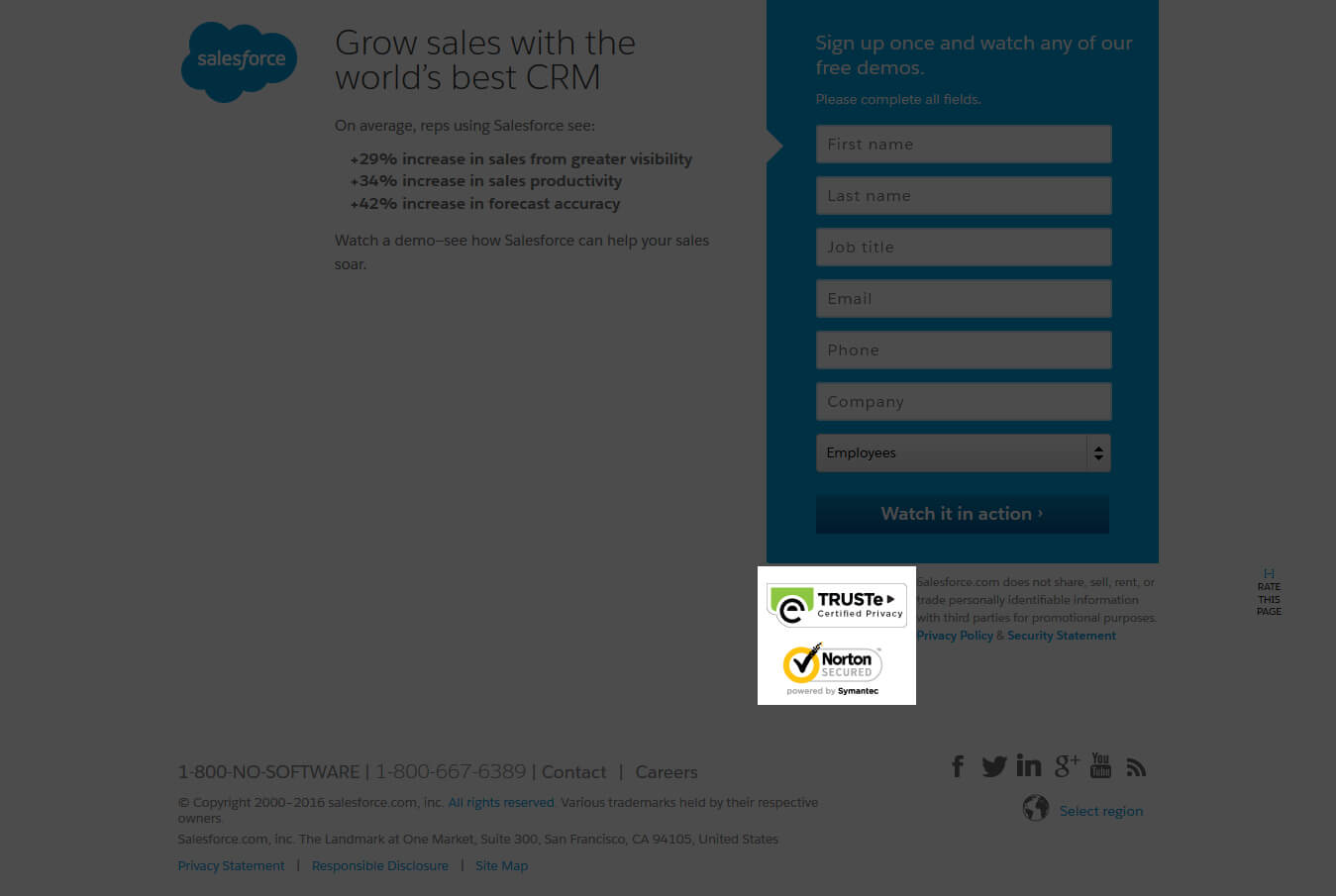
5. Third Party Seals: Third-party seals advise your visitors that doing business with you is completely safe, which persuades them to click your CTA button:
Salesforce uses two trust seals on their post-click landing pages, TRUSTe and Norton:
Creating the most enticing CTA button is crucial for a successful post-click landing page.
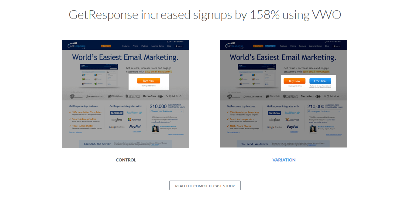
A primary call-to-action button gets the visitor to perform the main action. For example, the primary action on a webinar post-click landing page is for visitors to sign up for the webinar. The page could also have a secondary goal, possibly a button taking visitors to the pricing page for a free trial sign up. Secondary goals (CTAs) usually appear below the fold and at the bottom of a post-click landing page.
VWO uses both primary and secondary CTA buttons. The primary CTA button urges visitors to start their free trial:

The secondary CTA tells the visitors to view a case study (secondary action):
To be clicked, your call to action button must nail the following four criteria:
Color: You need to make your button pop on your post-click landing page, which is why you need to design it in a contrasting color as compared to the rest of the page.
Vidyard does this with their button. The service places an orange CTA button on a green background, making the button more noticeable:

Size: Your button should be an appropriate size to attract your visitors’ attention. Sprout Social has two CTA buttons, but they’re both an appropriate size relative to its immediate area:

Placement: When placing your primary CTA button, make sure you don’t put it too prematurely on the page — otherwise, you risk losing conversions. Explain your offer first, and then display your CTA and how they can obtain your offer.
Copy: CTA copy is crucial. Eliminate words that cause friction such as “Submit,” “Buy,” and “Download.” If you’re looking to increase visitor sign-ups, use personalized copy and add something unique about your service.
Kissmetrics uses personalized copy and puts themselves in the visitor’s shoes:

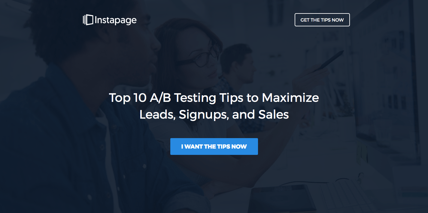
Pronouns like “I,” “me,” and “my,” directly address your visitors, which is why they work well for CTA copy. Instapage does this with their button copy, and even add urgency with “Now:”
The images that you choose to put on your post-click landing page shouldn’t just be eye-candy, they need to help persuade visitors into clicking your call to action button.
When used the right way images help you:
AWeber uses an image of real people, which adds human appeal to their service:

On the other hand, Qapital offers visitors a sneak peek into their app dashboard:

Choosing the right image can go a long way to maximizing your conversions. This is because when used properly, post-click landing page images can be very effective in helping increase your conversion rates because they help tell your offer’s story.
According to Forrester Research’s Dr. James McQuivey, one minute of video is worth 1.8 million words. post-click landing page videos explain your product or service in a much more interactive way than words ever can.
Voiceover in videos helps you talk to your visitors better than copy because videos don’t need any exclamation points or italics to get your message across. Videos can also play at your heartstrings, capture, and keep your visitors’ attention exactly where you want it.
You can explain all of your benefits and features quickly with video, which means your post-click landing page doesn’t have to be that long, either.
To produce effective post-click landing page videos, make sure the video:
Optimizely uses a video on their post-click landing page to explain how their A/B testing and personalization platform works:

Mixpanel uses a video as a product demo for their visitors. The video plays once you click on their primary CTA button:

One of the principal purposes of a post-click landing page is to collect user data — a lead capture form helps you accomplish this. When your form is designed properly, you make it easy for visitors to submit their information and get you more conversions.
Your lead capture form must:
UserReplay has an optimized form with the fields labeled properly, making it easier for visitors convert:

When visitors don’t see a form on the page, they go through the post-click landing page with ease because they aren’t thinking about entering their personal information.
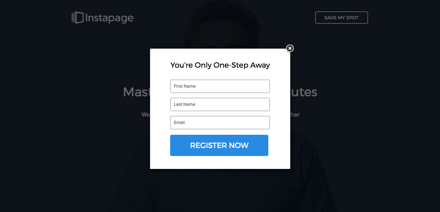
Two-step opt-in forms are a great tool to eliminate anxiety from your forms. With this technique, visitors that click the CTA button are then presented with the form — reducing the intimidation factor and post-click landing page friction. This way, only the most interested visitors see the form and submit their information.
Instapage is known for using two-step opt-ins on many of its post-click landing pages:
Now that you know which page elements should be included on an optimized post-click landing page, how can you build a high-converting post-click landing page of your own?
You essentially have two options:
If both of these options seem unfeasible to you, fortunately, there’s a third option — use Instapage post-click landing page software.
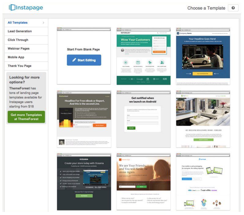
Instapage enables you to create professional post-click landing pages in a matter of minutes with the help of its fully-customizable builder. The software requires no design or coding experience because the service provides you with pre-optimized post-click landing page templates that you can customize to your brand and offer:
post-click landing pages help you solve the conversion equation by providing an opportunity to promote your offers to a targeted audience. Armed with the information in this guide, you can now create high-converting post-click landing pages.
Point-and-click your way to your perfect post-click landing page, starting today, with Instapage. Your conversion rates will thank you!
Try the world's most advanced landing page platform today.