Winc is a wine club that doesn’t just deliver wine to your doorstep. It also helps you “discover the wine of your dreams.”
But the company is not alone in its mission. A quick search for “wine club” reveals many competitors. To set itself apart, Winc uses digital ads with post-click landing page experiences for different customer segments. Today, we explore how.
How Winc uses post-click landing pages
Below you’ll find ads from different networks that Winc uses to draw visitors to post-click landing pages. See what they did well and how you might bring new perspectives to your campaigns.
Facebook news feed ad for wine drinkers

Above is an ad Facebook users may see in their news feed. It shows the product, and most importantly, a variety of what might come inside the box once it reaches the customer. The banner in the upper left corner uses urgency to pressure the user into deciding before the offer expires, and block text highlights the benefit of claiming it: Get four bottles for less than 10 per bottle, and pay no shipping. Clicking it will take you to this landing page:

It starts well with no navigation menu. This keeps visitors focused on converting. How about the rest of the page? Let’s review.
-
- Who is this page for? Facebook users with an interest in wine or subscription boxes or related products.
-
- What is the offer? The offer is for a personalized box of wine delivered regularly to your door. On Facebook, the ad claims you get 4 bottles for $39, but that’s not mentioned on the page. The page does say you’ll get 35% off your first order at checkout, but it’s unclear if that is the same as the offer that was advertised on Facebook.
- Why should visitors choose Winc? The offer is affordable, convenient, and it’s personalized too. The words “a world of wine” put images of faraway vineyards and exotic vintages in the mind of the visitor. The call-to-action button is attention-grabbing, and the hero shot is a great look at a variety of wines the user may get in their box. Plus, icons and brief copy highlight the benefits of the offer below.

- Is there a clear next step? Yes, the user can get started creating their wine profile by clicking the “Get Started” link.
Search ad for query “personalized wine”

Above is a Winc search ad that users may see when they search “personalized wine.” It uses social proof — a 4.7 rating from 523 reviewers — to convince users that their wine is popular and well-liked. The copy offers a free wine profile and recommendations customized to your taste. The headline offers a significant discount: 35% off your order. Clicking it will trigger this

Your first instinct may be to scroll up, as it appears you’ve been directed to the footer of a page. A closer look, however, reveals that this is a product category page for different types of wine. They’re also looking for signals they found in the ad to be reflected on the post-click landing page, like the “35% off” text in the banner above.
-
- Who is the page for? People searching for “personalized wine.”
-
- What is the offer? In the ad, the offer is 35% off your first order of a customized subscription box of wine. On the post-click landing page, however, the discounted offer is not evident. The yellow bar in the header is easy to miss, and scrolling down, you’ll find many types of wine.
-
- Why should visitors choose Winc? Winc offers a seemingly endless variety of wines from all over the world, hand-pick them, and deliver them affordably to your door. On top of that, you’ll get 35% off your first order.
- Is there a clear next step? The 35% offer in the ad is reiterated on the page with the black CTA button (“Unlock Offer”). Still, the button is not immediately evident because the “Get Started” option is more prominent. Plus, numerous other links could distract prospects from redeeming the 35% offer.
Facebook news feed ad for investors

The above is a Facebook ad that will appear in the news feed of prospects that Winc has determined may be likely to invest. It uses hues that contrast the Facebook color scheme to command attention. When it earns that attention, the copy uses social proof to compel the click: “you know us for cult favorites like…” and “Named one of Fast Company’s 50 most innovative companies…”
If you click, you’ll find yourself on this post-click landing page:

The first thing you’ll notice is the headline and the image closely match the ad. You see the Summer Water bottles in the background, and in the foreground, “Own Part of a Modern Winery” is very similar to the text on the Facebook ad. The message matches, relevance is maintained, and visitors know they’re in the right place.
-
- Who is this page for? This page is for Facebook users who Winc has identified as potential investors.
-
- What is the offer? This page offers visitors the opportunity to own a part of Winc, which comes with additional benefits like early access to events, discounts, and more.
-
- Why should visitors choose Winc? This page is much longer than Winc’s other post-click landing pages, and that’s because it aims for a much higher value conversion. Investors are spending significantly more than $40 for 4 bottles of wine, and as a result, will need much more convincing than the average Winc customer. This page does a great job of that, with logos of other major investors to use as social proof, a video of the company’s background, a case study, statistics that prove its success, investment tiers, more. This page is quite comprehensive, offering much of what a potential investor would need to know before supporting the company.
- Is there a clear next step? Yes. The “Invest now” button is bright red, and you’ll find it in several places throughout the page:

Search ad for query “wine club”

Searching “wine club” in Google may reveal this search ad, which uses the keyword phrase, and touts the service as the internet’s number one wine club, along with offering 35% off your first order. Below the headline, a 4.7 rating based on 527 reviews uses social proof to convey popularity and quality and provides personalized recommendations based on a free wine profile.
Clicking the search ad will take you to this post-click landing page

How does this page continue the same narrative from the ad? Let’s find out.
-
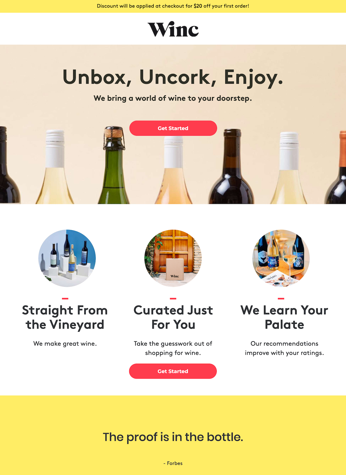
- Who is this page for? This page has been created specifically for searchers of the ads above relating to wine subscription, wine club, and wine delivery.
-
- What is the offer? The offer is for 35% off your first personalized wine box. For clarity, and to better highlight the offer, it would be best to use text similar to the ad in the headline.
-
- Why should visitors choose Winc? This featured image shows variety by using a photo of different wine bottlenecks. They also point to the CTA button, which guides the visitor’s eye. The headline conveys ease, convenience with three words. Unbox, Uncork, Enjoy means there are only two easy steps to take before you can enjoy the product. Below, icons tout the product’s customization and ease of use, while the same testimonial from Forbes boosts perceived authority.
- Is there a clear next step? The “Get Started” button appears twice on the page, and it begins the process of wine personalization.
Create personalized post-click landing page like Winc
Some of Winc’s searchers want personalized wine, some want a subscription box, others want to invest in the company. Post-click landing pages should cater to these various desires. That’s why, to maintain relevance throughout the campaign, every audience needs a dedicated post-click landing page. Learn how to create post-click landing pages for every audience with a free demo from Instapage.

See the Instapage Enterprise Plan in Action.
Demo includes AdMap™, Personalization, AMP,
Global Blocks, heatmaps & more.
