When you think effective written marketing content, what comes to mind? Blog posts? Articles? E-newsletters?
According to the B2B respondents of Content Marketing Institute’s 2016 State Of Content Marketing Report, there’s a type of written content that’s more effective than all those.
White papers.
What is a white paper?
The answer to that question isn’t as clear-cut as you might think. Ask someone off the street, and they might tell you it’s a government document. Consult Investopedia, and you’ll find a definition centered on company promotion:
“A white paper is an informational document issued by a company to promote or highlight the features of a solution, product or service.”
Today, though, white papers have grown to include more than government legislature and promotional content.
As valuable offers in the awareness and consideration stages of the buyer’s journey, they’re usually filled with content (like research, case studies, action plans) about a product, a service, or a particular methodology, that help readers make more informed business decisions.
Let’s take a look at how 20 brands convince their visitors claim them with post-click landing pages.
20 white paper post-click landing page examples
1. Oracle
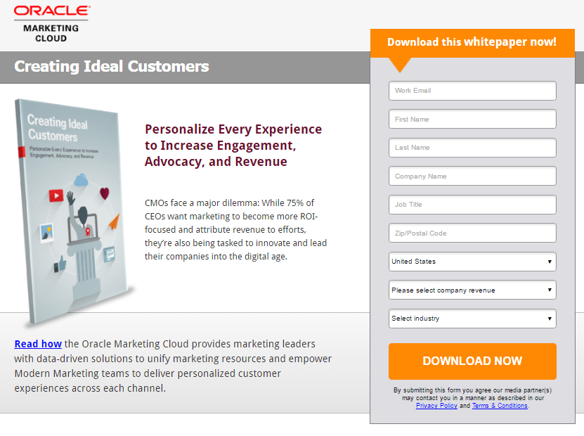
What this post-click landing page does well:
- The white paper’s image shows visitors what they’ll claim by completing the form.
- A bright CTA button stands out on this gray form, grabbing visitor attention.
- The form title, “Download this whitepaper now” acts as the next step for visitors after they’ve read the copy
- The orange arrow beneath the form title is a visual cue for visitors to complete the form.
A/B tests to run:
- The headline doesn’t convey a benefit. “Creating Ideal Customers”? What does that mean?
- This form looks intimidating with 9 fields.
- The form begins with “email” instead of “first name.” While it doesn’t seem like a big deal, an unconventional move like this could potentially confuse visitors. But, it also might not. This could certainly be something to test.
- Numerous outbound links give people too many exit routes.
- The text “Read how” is hyperlinked but it doesn’t take the visitor anywhere. What’s the purpose of linking it?
2. Tableau
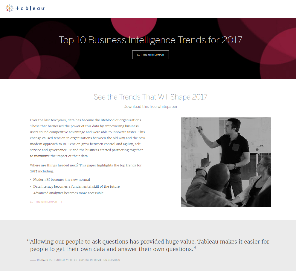
What this post-click landing page does well:
- Bulleted copy quickly lets visitors know what they’ll learn when they read the white paper.
- The CTA acts as a two-step opt-in because once it’s clicked, the form slides in from the right margin.
- Customer badges from Forbes, Fortune, and the Wall Street Journal align Tableau with respected brands. Therefore, the 2017 business intelligence trends in the white paper must be good.
A/B tests to run:
- Tableau’s logo is linked to the homepage, which gives visitors an obvious exit route off this page before downloading the white paper.
- A 10-field form has the potential to intimidate visitors into leaving the page.
- This headline and subheadline combo doesn’t convey a benefit.
- Links to “Resources” and other white papers are distracting from the white paper offered on this page.
- The footer includes too many links, which can distract visitors from converting on the form.
3. Motorola

What this post-click landing page does well:
- An image of the white paper shows visitors what they’ll claim.
- Instructions above the form tell visitors what to do in order to get the white paper.
- An unchecked opt-in box ensures the visitors who opt in actually want to receive updates from the company.
A/B tests to run:
- This block text is intimidating. Where are the subheads for easy reading? Where are the bullet points?
- The formatting of the copy isn’t set up for optimal reading. If you’re going to insert an image inline, do it on the right. When you position it on the left, you make it harder for people to read.
- A logo linked to the homepage gives an easy out to the prospects.
- This headline communicates no benefit.
- The busyness of the page makes it overwhelming. A little more white space would make it less cluttered and easier to digest.
- The CTA button color has already been used on the page, so it doesn’t stand out as much as it could.
4. NetSuite
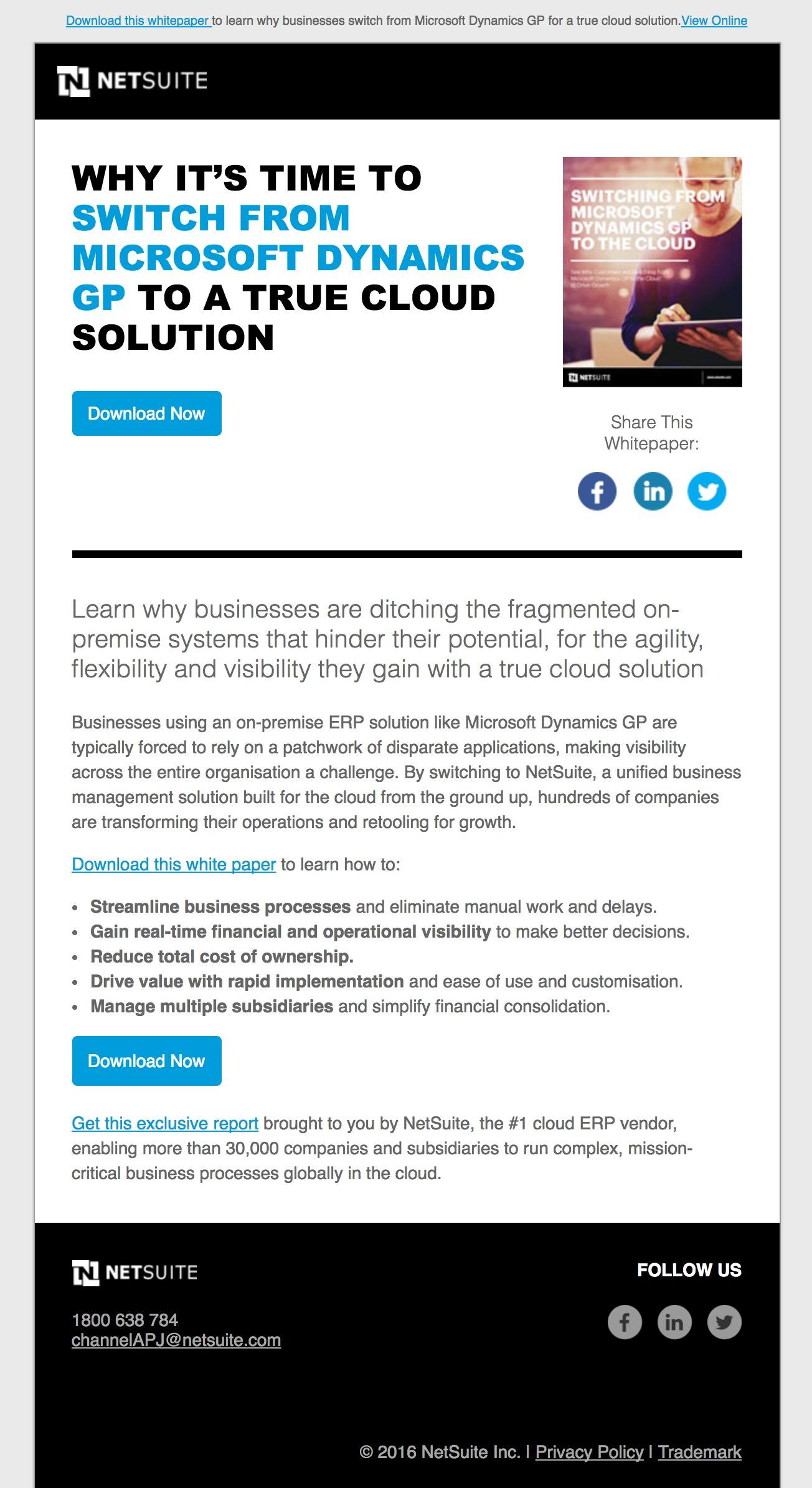
What this post-click landing page does well:
- Multiple cooperative CTA buttons work together to convert the prospect.
- The image shows visitors what they’ll get by clicking “download now.”
- Bulleted text here quickly gives visitors the idea of what they’ll learn in the white paper.
- This click-through post-click landing page content warms up the visitor to the form on the next page.
A/B tests to run:
- The headline here doesn’t communicate a benefit.
- This text-heavy page is hard to get through.
- The logo is linked to the homepage, making it an easy escape route.
- A two-step opt-in form may work better than a click-through page here. Once a visitor clicks any of the CTA buttons, the form pops up for them to download the white paper.
- Social media links allow visitors to escape the page without first downloading the white paper.
5. Netronic
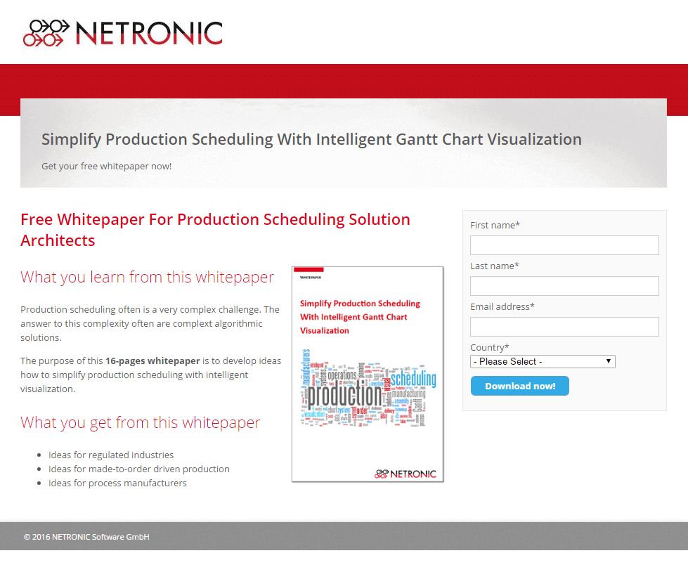
What this post-click landing page does well:
- Bulleted text quickly lets visitors know what they’ll get by reading the white paper.
- An image of the white paper shows visitors what they’ll get by converting.
- The word “free” is used many times to entice visitors.
- The word “now” in the call-to-action takes advantage of
- The text “16-pages whitepaper” lets visitors know exactly what they’re getting themselves into.
- A short form makes converting on this page easy.
- A minimalistic footer keeps visitors focused on converting.
- The subheadings and copy are both left-aligned, making it easier for visitors to read and evaluate the offer.
A/B tests to run:
- A logo linked to the home page gives visitors an obvious route off this post-click landing page.
- A small CTA button doesn’t attract as much attention as it could if it were larger.
- The call-to-action could be stronger. Remember to focus on what the prospect is getting out of claiming your offer instead of what they have to do to claim it. Instead of “Download Now,” why not “Simplify My Production Scheduling” or “Give Me The Free White Paper”?
6. Leeyo
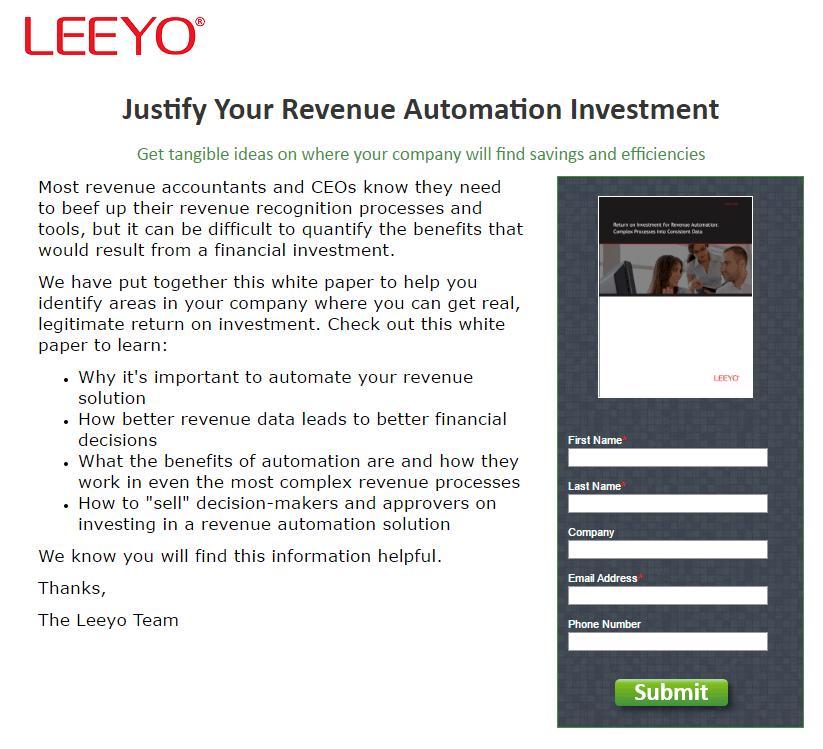
What this post-click landing page does well:
- The white paper’s image shows visitors what they’ll claim, although it’s too small for it to be recognizable.
- Bulleted text concisely describes what the visitor will learn by reading the white paper.
A/B tests to run:
- A logo linked to the homepage gives visitors an easy out on this page.
- The copy here is too wordy and each bullet point could use some extra space between it for easier reading.
- The CTA “Submit” is as lazy as they come.
- This headline doesn’t convey a straightforward benefit.
- The closing is written like a letter – “We know you will find this information useful. Thanks, The Leeyo Team.” Why should we believe the Leeyo team when they say we’ll find it useful? A testimonial from one of the company’s customers would be more powerful proof.
7. Aeris
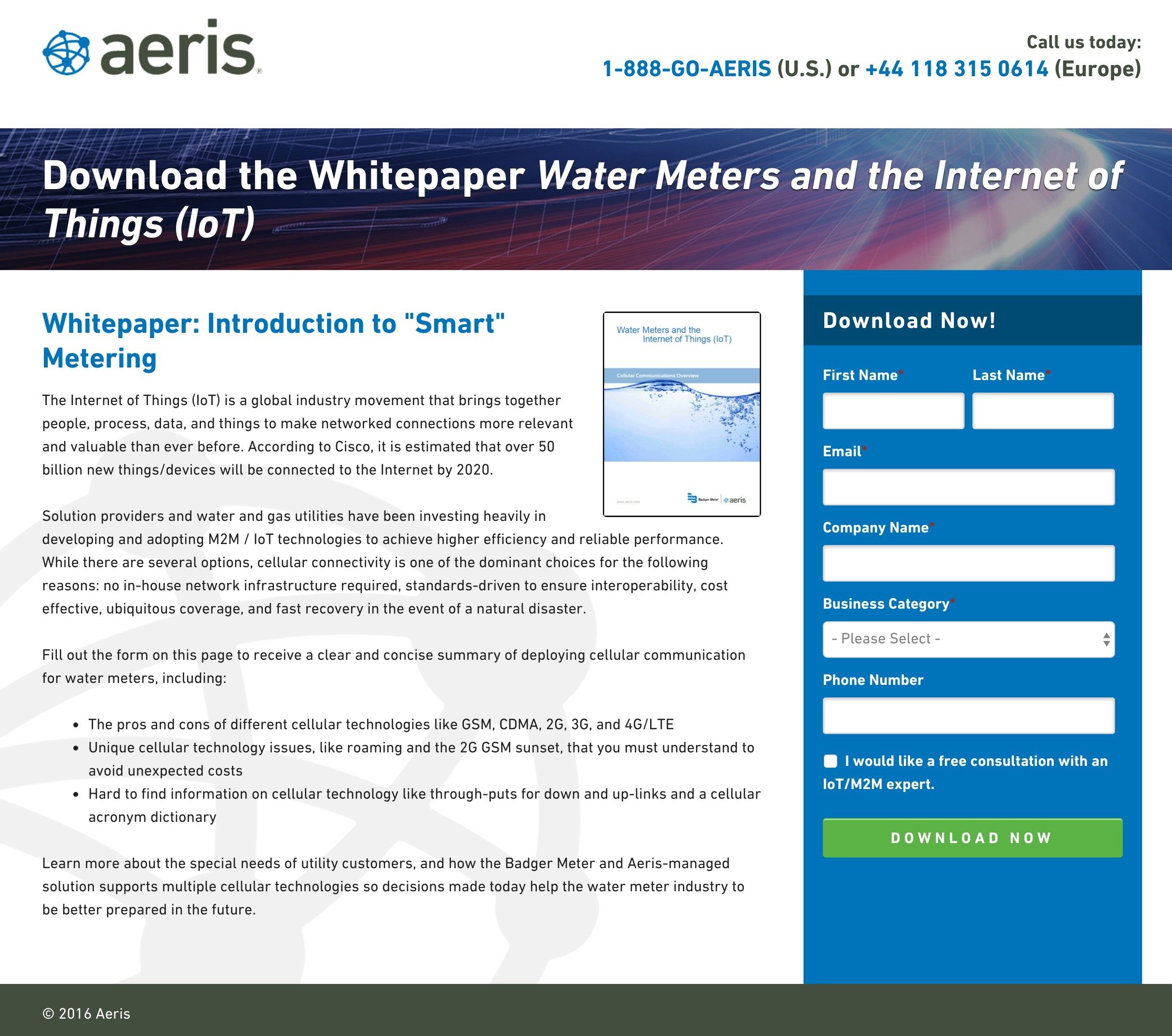
What this post-click landing page does well:
- Two phone numbers, one for visitors in Europe and one the US, give people an easy way to contact the company if they need to — and both are click-to-call.
- Bulleted copy quickly lets visitors know what they’ll learn by reading the whitepaper.
- The image shows prospects what they’ll get by converting.
- This green CTA button stands out on a blue form.
- The word “now” in the call-to-action takes advantage of people’s inherent need for immediate results.
- An unchecked opt-in box ensures that the visitor will actually want a free consultation when they check it.
- A minimalistic footer keeps prospects focused on converting and not on links to other web pages.
A/B tests to run:
- The Aeris logo is linked to their homepage.
- This headline doesn’t convey a benefit to the reader at all.
- The phone number form field isn’t required. If it’s not needed to qualify the lead, then why ask for it?
- The form headline and the CTA copy are the same. Having different copy could help increase conversions. For example, changing the CTA copy to read, “Send Me the White Paper” could generate more conversions.
8. IDG Enterprise
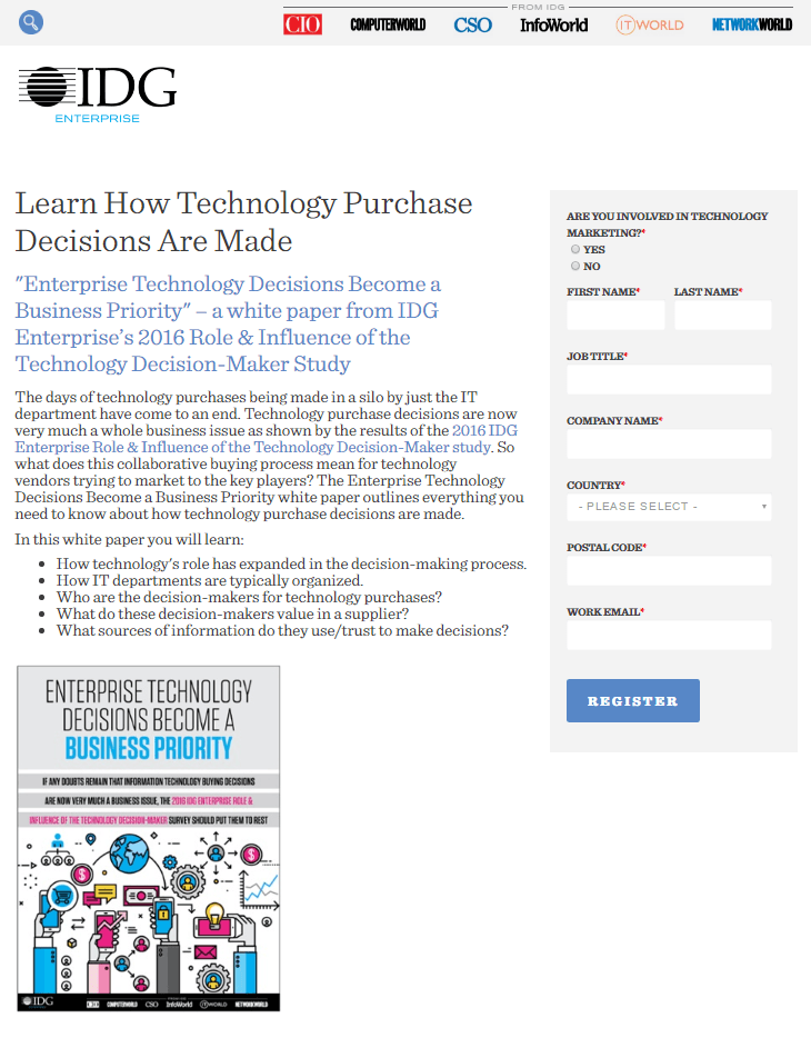
What this post-click landing page does well:
- Badges in the header showcase the other well-known businesses IDG has created.
- The image on this post-click landing page shows visitors what the white paper looks like.
- Bulleted copy lets visitors know what they’ll learn in the paper.
A/B tests to run:
- The logo is linked to the homepage, providing visitors with an easy exit route.
- There’s no need for a search bar on this page. All it will do is encourage users to abandon it prior to converting.
- A headline without a strong benefit doesn’t encourage readers to convert. Why is it important to learn how technology purchase decisions are made? What’s the benefit to the visitor of knowing?
- A link to the homepage in the text gives visitors another
- The “Register” call-to-action isn’t relevant to the offer at all.
- This block of text is likely to scare readers away immediately.
- A busy footer features way too many outbound links.
9. Meta

What this post-click landing page does well:
- A logo that’s not linked to the homepage gives visitors no obvious way off this post-click landing page.
- This page uses the word “free” many times to entice visitors into claiming the offer.
- Unchecked opt-in boxes ensure the company’s leads remain high quality.
- The image shows visitors what they’ll get when they convert.
- A nonexistent footer means visitors won’t have any way to escape through it.
A/B tests to run:
- This headline and subheadline combo contains way too much jargon.
- The lack of persuasive elements on this page, like testimonials and benefit-oriented copy, means the odds people claim this offer are lower than they could be.
- The CTA button color could be more contrasting. With the majority of the page designed in black, this teal CTA button doesn’t pop off the page as much as it could. Something like red or orange would be better.
10. Tata Communications

What this post-click landing page does well:
- A logo that’s not hyperlinked to the homepage keeps visitors from quickly escaping this page.
- Directions on the top of the form let visitors know how to claim the white paper.
- The unchecked opt-in box will keep TATA’s email list filled with leads that want to receive their offers.
A/B tests to run:
- The term “SD-WAN Journey” is too jargony. Your visitors don’t want to start a journey. They want the benefits of what comes with starting that journey.
- This CTA button could be much bigger.
- The call-to-action “submit” is unremarkable.
- This page’s background is very distracting to the eye. Nothing should take your prospects’ focus away from your CTA button. This does.
11. HYLA
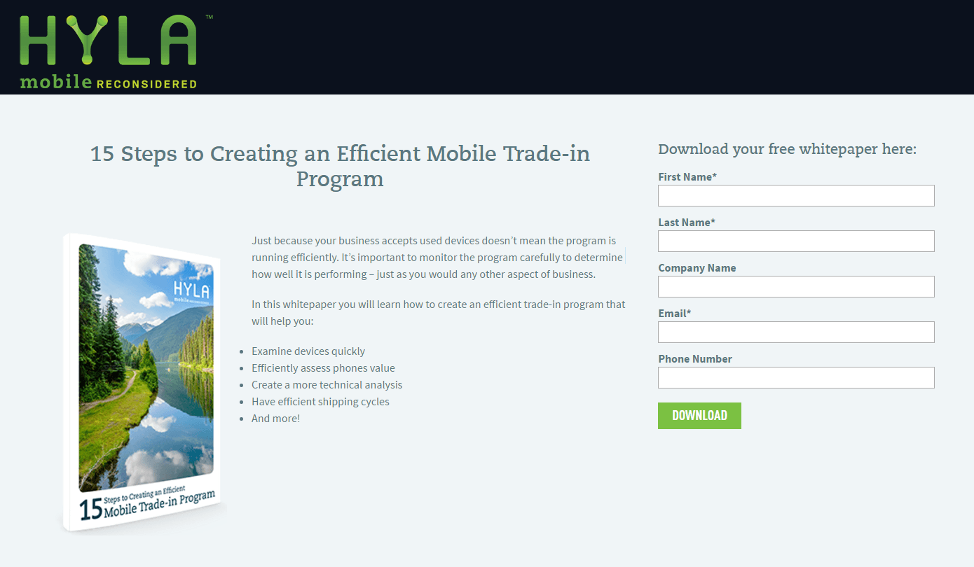
What this post-click landing page does well:
- The headline gives visitors a reason to download: a step-by-step guide to creating an efficient mobile trade-in program.
- A minimal amount of copy on this page makes it easy to read.
- The image shows visitors what they’ll get by downloading.
- Bulleted text tells visitors what they’ll learn by downloading the whitepaper.
A/B tests to run:
- The word “efficient” in the headline could be replaced with something less ambiguous. What does an efficient mobile trade-in program accomplish? That’s your benefit.
- The green CTA button draws attention, but it could draw more with a color that hasn’t already been used on this page. Both the logo and a majority of the image are green.
12. AtScale
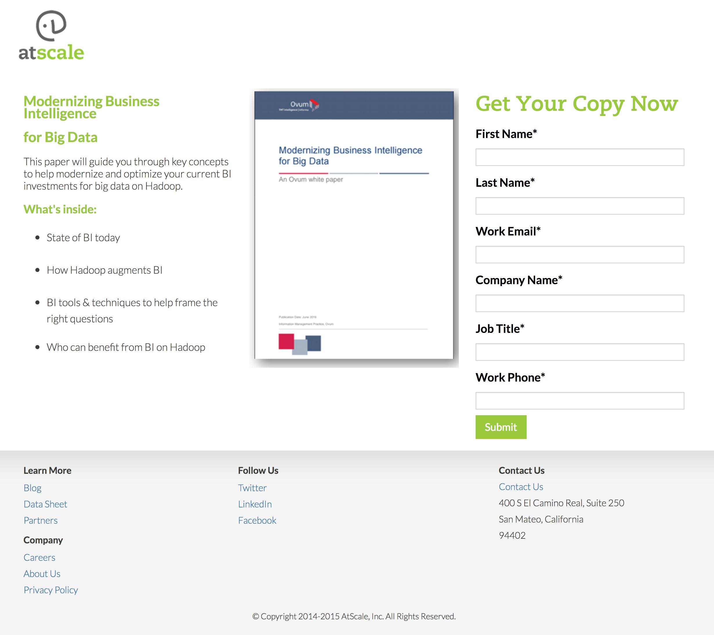
What this post-click landing page does well:
- Minimal text makes reading this post-click landing page easy.
- Bulleted copy lets visitors know what they’ll find inside the guide.
- The word “your” on the form speaks to visitors directly.
- The word “now” takes advantage of our inherent desire for immediate gratification. When you click “submit,” you get the white paper immediately.
- This image shows visitors what they’ll get by converting.
A/B tests to run:
- The headline “modernizing business intelligence for big data” doesn’t convey a clear benefit.
- A busy footer gives visitors way too many outs on this page.
- “Submit” is one of the worst words/phrases you can include on a CTA button.
- The copyright info is outdated – which may make visitors wonder, “How accurate is the information in the white paper?”
13. Develop
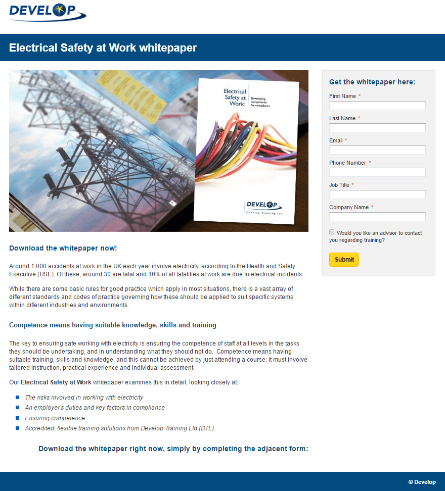
What this post-click landing page does well:
- This image gives visitors an idea of what they’ll get after entering their information in the form and hitting “Submit.”
- Bolded words and subheadings create a visual hierarchy that makes this page easy to navigate.
- The copy is broken into small, digestible chunks that aren’t to intimidating to read.
- An unchecked opt-in box ensures the leads generated from this page are high-quality.
- Bulleted text quickly communicates what will be covered in the ebook.
- The bright CTA button pops off the page drawing attention on this post-click landing page.
- A minimalistic footer doesn’t distract post-click landing page visitors.
A/B tests to run:
- This logo is linked to the homepage, making it easy for visitors to leave the post-click landing page before converting.
- A headline without a benefit doesn’t give visitors a reason to stay on this post-click landing page long.
- The CTA button could be much larger to draw more attention.
- Changing the “Submit” CTA copy would likely inspire more visitors to download the white paper.
14. Exact Macola

What this post-click landing page does well:
- The headline uses the word “your” to address the reader directly.
- The image of the white paper shows visitors what they’ll get by converting.
- The copy uses the word “your” throughout to involve the reader in a conversation.
- A CTA button colored differently than every other element on the page draws attention.
A/B tests to run:
- The entire header image is linked to the homepage, giving visitors an easy way to escape the page before they convert.
- The copy is awkwardly spaced — justified center — making it difficult to read.
- Multiple links in the footer have the potential to distract visitors from converting.
- The CTA button could be larger to draw more attention.
15. Zeta
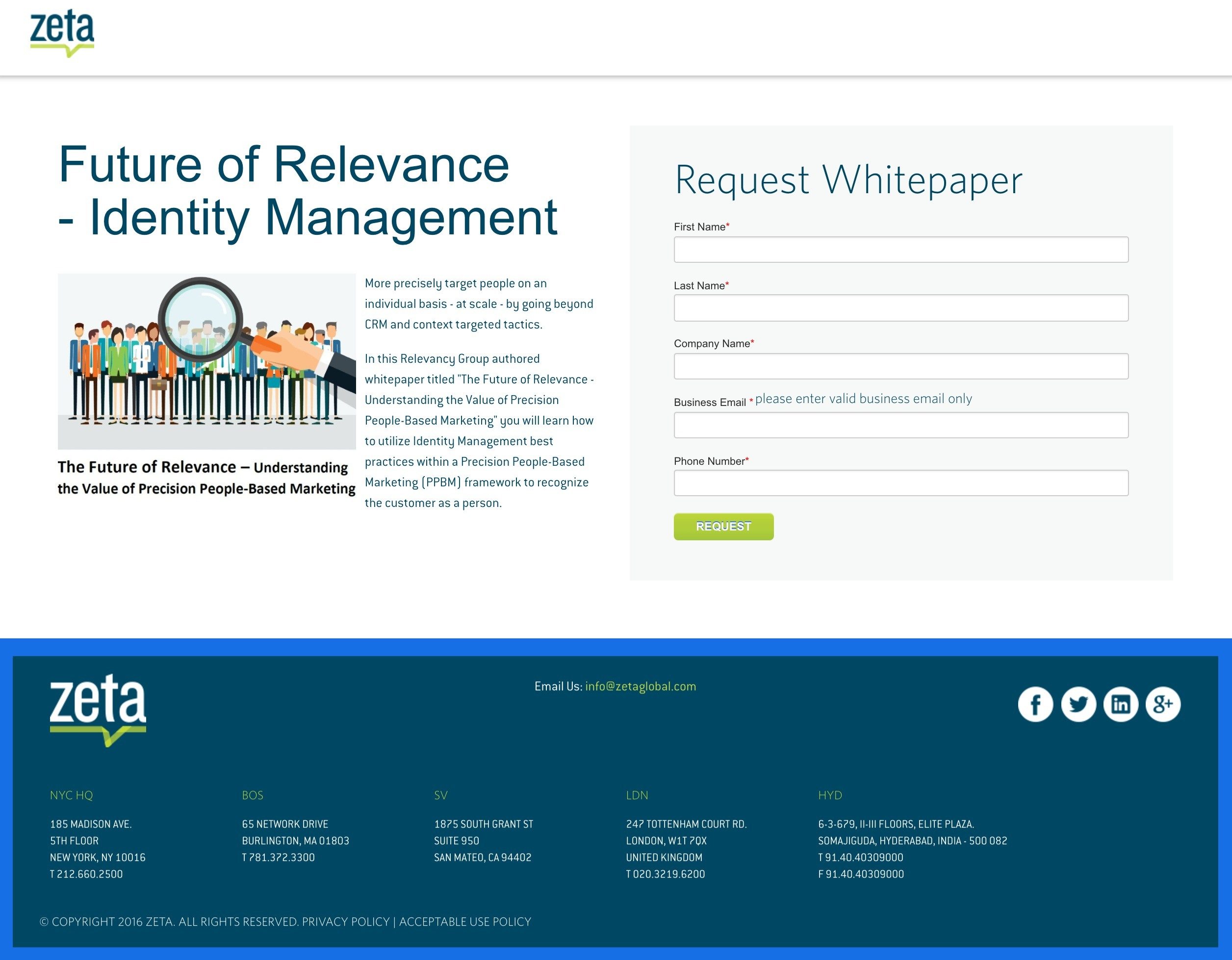
What this post-click landing page does well:
- The copy on this page explains to the visitors what they’ll learn from the ebook.
- This CTA button color pops on the page’s white background, drawing visitor attention.
A/B tests to run:
- A logo linked to the homepage has the potential to drive visitors out.
- The headline conveys no benefit whatsoever.
- The stock photo doesn’t add anything to the page.
- The words “Request Whitepaper” imply that the visitors won’t get their resource immediately upon converting.
- A justification for requesting visitors’ email address would likely make them more willing to hand it over. Why does Zeta need it? Is that where they’re going to send the white paper? Let visitors know why they should give up their information.
- Links to social media pages in the footer allow visitors to leave the page before converting.
- The CTA copy “Request” is not inspiring. An alternate version such as “I Want the Whitepaper” would likely generate more downloads.
16. Yext
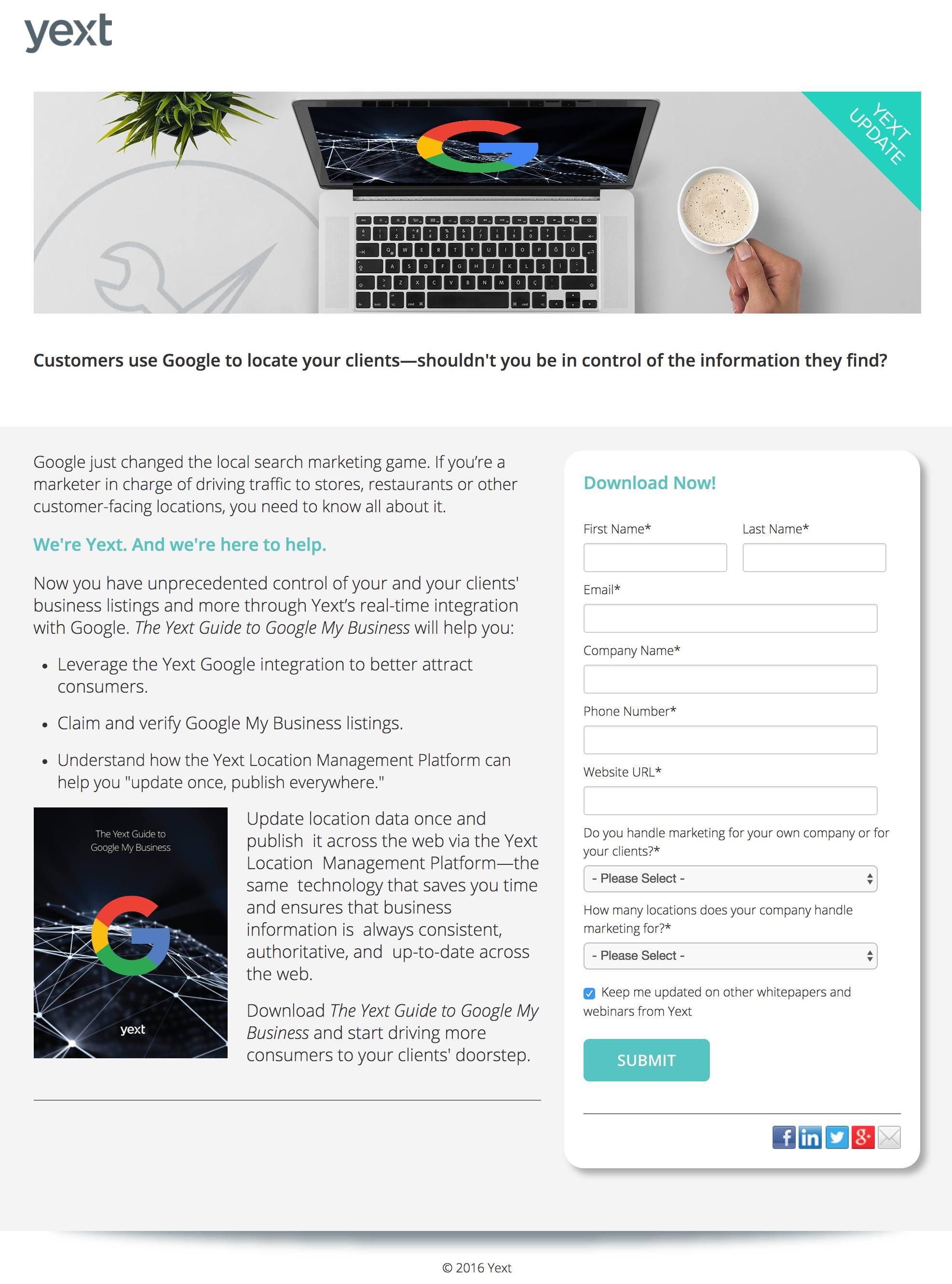
What this post-click landing page does well:
- The copy is written in plain, easy-to-understand language, without jargon.
- Bulleted text quickly communicates the benefit of downloading.
- The white paper’s image gives visitors an idea of what they’ll claim.
- The Google logo aligns Yext with an authoritative and trustworthy brand.
A/B tests to run:
- The headline on this page is missing in action. It’s necessary to get visitors to read the rest of your copy. Without one, they may not even stick around.
- The image breaks the left margin, making the copy more difficult to read. Remember that studies have shown when content is formatted in a way we’re not used to, we have a hard time digesting it.
- Social media links on the bottom of the form give visitors a way to leave the page.
- The CTA button could be larger and designed in a more contrasting color.
- The call-to-action “Submit” likely isn’t generating as many white paper downloads as say, “Send Me the White Paper.”
17. RAIN Group
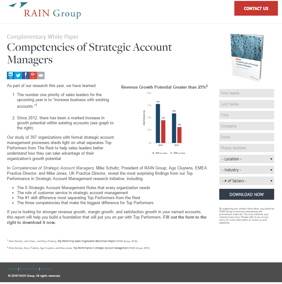
What this post-click landing page does well:
- The copy previews what visitors will find in the white paper.
- An image of the white paper shows visitors what they’ll claim.
- An infographic helps to convey information to visitors more efficiently, but it’s also small and difficult to read.
- Numbered and bulleted lists convey important information about the white paper concisely.
A/B tests to run:
- The “Contact us” button in the header is more attention-grabbing than the call-to-action button on the form.
- The headline is missing a benefit.
- A 9-field form has the potential to scare visitors off this page.
- Outbound links in the footer allow prospects to abandon the page before converting.
18. Aiim

What this post-click landing page does well:
- The white paper’s image shows visitors what they’ll claim by completing the form.
- Bulleted copy quickly lets visitors know what they’ll learn when they read the ebook.
- The bright CTA button draws prospect attention on the blue form.
A/B tests to run:
- The Aiim logo is linked to the homepage giving visitors an obvious exit route off this page.
- This headline and subheadline combo doesn’t convey a benefit.
- This copy is a bit too complex. “Pressure is mounting on organizations to support information capture and access, and process interaction beyond the corporate walls”? What does that mean?
- A 10-field form has the potential to intimidate visitors into leaving the page.
- The CTA button doesn’t draw as much attention as it could. Making the button larger would likely attract more eyeballs, and even clicks.
19. Averna
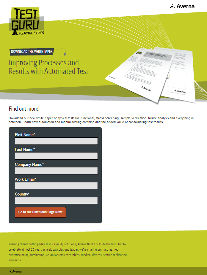
What this post-click landing page does well:
- An image of the white paper shows visitors what they’ll claim.
- A minimalistic footer keeps visitors focused on converting.
- The arrow serves as a visual cue, and it’s animated as well.
A/B tests to run:
- The lack of content on this page makes it unconvincing.
- “Go to the Download Page Now” is confusing CTA copy. If a visitor completes the form and clicks the button, why wouldn’t they receive the whitepaper on the thank you page or in their inbox? They have to visit the “download” page? This just adds friction.
- Too much white space next to the form makes the page look unbalanced.
20. eScan

What this post-click landing page does well:
- A short form makes converting easy on this page.
- The CTA button color pops off the page.
- The badge reading “#1 Choice of Digital World” adds social proof to the page. If it’s the number one choice for a major business, it’s probably good enough for yours, too.
A/B tests to run:
- No white paper image makes it confusing for visitors to see what they’re downloading.
- The dramatic, inauthentic stock photo doesn’t add value to the page. Plus, combining a stock photo with a graphic makes it seem even more inauthentic.
- The call-to-action “Send” is confusing. Send what? My information to E-scan? Send me the white paper? What does it mean?
How do you do white paper marketing?
At the awareness and consideration stages of the buyer’s journey, white papers can pass along valuable information that your prospects can use to make more informed business decisions. And they can position your company as an authority to revisit when they have a similar problem or question.
To turn ad clicks into conversions, create dedicated, fast-loading post-click pages for every offer. See how to provide all of your audiences with unique post-click landing pages by signing up for an Instapage Enterprise Demo today.

See the Instapage Enterprise Plan in Action.
Demo includes AdMap™, Personalization, AMP,
Global Blocks, heatmaps & more.
