93% of today’s marketers say they use videos for sales, communication, and some form of digital marketing, including using video post-click pages.
According to research, just including the word “video” in your email subject line can boost open rates by 19%, click-through rates by 65%, and reduce unsubscribes by 26%.
With 65% of people admitting they watch more than three-quarters of the videos they start, it’s no wonder that in an age when our attention spans are perpetually shrinking, marketers are turning to more interactive media to keep us highly engaged with their brands with video post-click pages.
So with that said, we only have one question for you:
Why aren’t you leveraging video on your post-click pages like the following businesses when 95% of viewers retain the message in videos?
Doing so has been proven to boost conversions by as much as 80%. In an attempt to help you capitalize on the video craze, we sorted through countless video post-click pages to show you some examples of the great, and not-so-great, video post-click pages being used today.
(Keep in mind, for smaller pages, we’ve shown the entire page. However, for longer pages, we only displayed above the fold. You may have to click through to the page to see some of the points we discuss and some examples may be A/B testing their page without a video.)
20 video post-click pages critiqued
1. Outbrain’s video post-click page

What they did well:
- The headline “Drive Quality Traffic To Your Site” conveys a clear benefit. The reader knows exactly what they’re going to get when they use Outbrain.
- Authority badges, which showcase some of Outbrain’s most well-known associates, prove that the company has been relied on by some powerful businesses.
- The photos on the page provide value, giving viewers an inside look at how the service works.
What to improve:
- The Outbrain logo is clickable, allowing prospects a way to escape from this post-click landing page.
- The orange CTA button is the same color as much of the other content on the site. When you’re choosing a button color, try to pick one that hasn’t been represented at all on the page.
- This video explains the service well, but other than the fact that we get to watch someone draw cartoon figures in real-time (which I found distracted me from absorbing the information in the video), it’s not all that engaging.
2. Sprout Social’s video post-click page
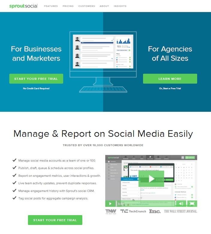
What they did well:
- The headline is benefit-centric. After landing here, you know the benefit of using Sprout Social right off the bat.
- Authority badges from TechCrunch, Inc., and The Wall-Street Journal prove Sprout Social is used by some heavy hitters.
- Bullet-pointed copy makes this page easy to skim for the important content.
- This video, as far as product demonstrations go, is one of the most comprehensive on the list. It uses screenshots and brief clips of the software itself to show visitors exactly what they’d be getting by requesting a free trial.
What to improve:
- Links are plentiful on this page, and, as a result, points of exit for the prospect.
- The page is connected to a main navigation menu, which means clicking out of it is far too easy for visitors.
- There’s no video CTA at the conclusion of this short product demonstration.
3. PageCloud’s video post-click page
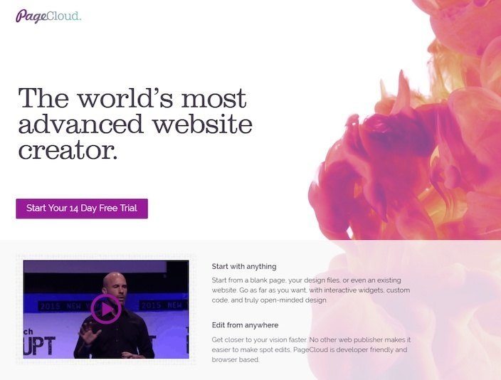
What they did well:
- The strong headline positions PageCloud as the most advanced website creator in the world — which is a great thing to highlight, as long as it’s true.
- The call-to-action button color contrasts the white background well.
- The copy is brief, but informative. At no point is the visitor required to read more than three sentences in a row.
What to improve:
- The text at the bottom of the page is confusing. Why do some sentences start with “yes” as if they’re answering a question? Our guess is that there was a mix-up between a project manager, a copywriter and a web designer here.
- The CTA copy “Sign up” on the bottom button isn’t exactly compelling me to click. How about you?
- A clickable logo let’s prospects off the hook before they convert and start their free trial.
- Make the post-click landing page video shorter. This video is informational, but it’s too long. Most people are looking for a brief introduction to your product, and yet this is a presentation video nearly ten minutes long from the TechCrunch Disrupt event.
4. AdLift’s video post-click page
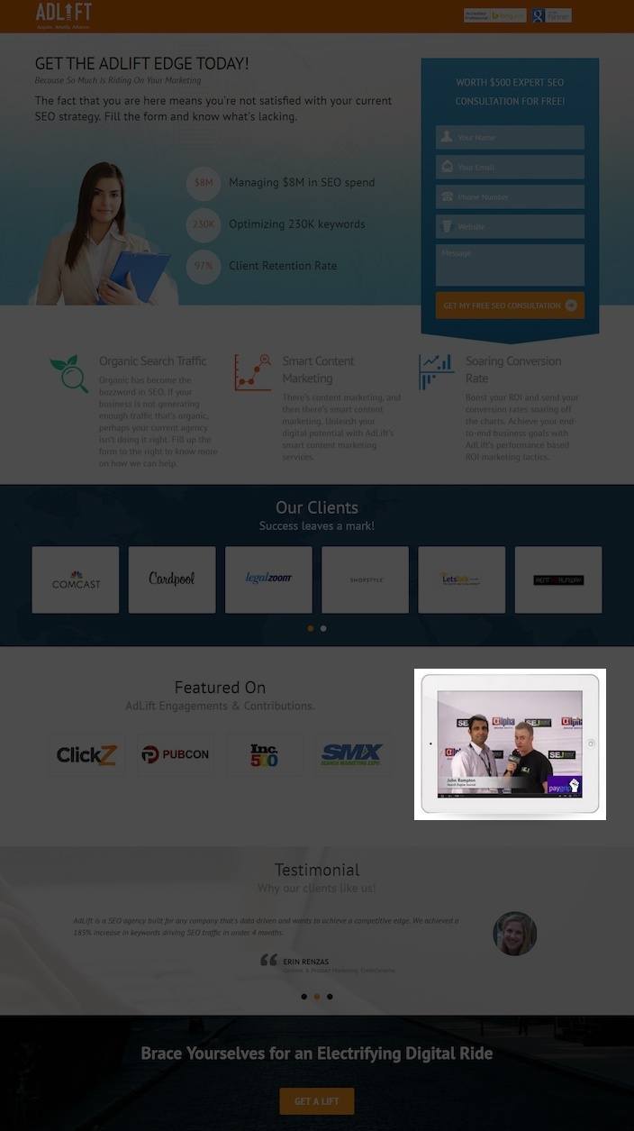
What they did well:
- The AdLift logo isn’t clickable.
- The orange CTA button pops on a dull background
- The form’s CTA button copy is written in first person, helping the reader envision what she needs to do to convert on the page.
- AdLift uses facts on its video post-click page to persuade its prospects because many times, numbers speak louder than words – “Managing $8 Million In SEO Spend,” “Optimizing 230,000 Keywords,” “97% Client Retention Rate” are tangible results that are more powerful than the alternative “Managing Millions In Spend,” “Optimizing Thousands Of Keywords,” “High Client Retention Rate.”
- Authority badges count brands like Overstock, eBay, Comcast, and Walmart among AdLift’s customers.
- These testimonials have full names and pictures, and they’re from people in the advertising and marketing industries.
What to improve:
- The text above the form that reads “Worth $500 Expert SEO Consultation Free” sounds really awkward and should be rewritten.
- “Brace yourselves for an electrifying digital ride” is a creative headline, but it doesn’t convey a benefit. Don’t abandon benefit-oriented writing for flowery language just because it sounds more creative. Your readers want to know what you can do for them. The more you reinforce your value proposition, the better.
- There’s no play button on this video, so it’s unclear at first whether or not it’s actually a video. What good is adding a video to your video post-click page if it simply looks like a photo?
- This video isn’t even AdLift branded. It’s a video from a Search Engine Journal interview with an AdLift employee about Google keywords. Maybe we should’ve realized that, since it’s under the “Featured On” section of the video post-click page, however we were hoping to find out more about AdLift’s service in this video, not Google..
5. Salesforce’s video post-click page

What they did well:
- The headline on this page is missing in action. You mean to tell me that “Salesforce Sales Cloud Overview Demo” is the headline? I sincerely hope not. What benefit does that convey? Why not use copy like “Discover the power of Salesforce Sales Cloud,” or “Sell Smarter, Sell Faster With Salesforce Sales Cloud.”
- Multiple educational videos give prospects the option to learn much as they want about Salesforce’s solution. They’re each only about 2 minutes long, and they give the prospect an insider’s look into what using the software.
What to improve:
- The blue CTA buttons, while a different shade of blue than the rest of the background, still don’t contrast the rest of the page enough to jump out at the prospect.
- Social share buttons should be on the “thank you” page, not your video post-click page. Prospects feel more comfortable sharing what you have to offer after they’ve been convinced to convert — and they know your offer is worth spreading throughout their networks.
- The phone number on this page isn’t click-to-call. That shouldn’t be the case. It’s such an easy thing to implement, and with most internet users browsing on mobile now, it’s not something you can afford to skip.
- The logo on this page is clickable. It shouldn’t be. That’s one more way for your prospects to get away without converting.
- A site map link has no place on a video post-click page. If your prospect wants to view a map of your site, let him do so from your homepage.
6. Scorpion Internet Marketing’s video post-click page

What they did well:
- The headline’s use of “aggressive” is perfect word choice for the audience of this post-click landing page — lawyers.
- The phone number is click-to-call, making it easy for mobile users to reach the business with a tap of their finger.
- The words “Award-Winning” before your company name can sometimes give you the boost of authority that you need to win over a prospect, and they’re well-used here.
- Bulleted copy makes this post-click landing page easy on the eyes, and simple to digest.
- The testimonials on this page are great. They include all three things that make a great one: real pictures, real names, and real quotes from real people.
- Authority badges on the bottom of the page associate Scorpion with powerful brands like Inc., Bing, and Google.
- “Free” is mentioned in the copy on the bottom of the page regarding the consultation prospects get after submitting their information.
- This video post-click page with video capitalizes on one of the best ways to sell your services — by letting someone else do it for you. The video is a short testimonial of sorts, narrated by a client. It’s concise, and it’s filled with a lot of praise, along with valuable information about how the company operates.
What to improve:
- Links to other pages of the site like “Home” and “Blog” shouldn’t be here. They’re potential points of exit from your post-click landing page.
- The Scorpion logo is clickable — creating yet another way for prospects to slip away before converting.
- The CTA button color is blue, even though one of the primary colors on this page is blue — making it easy for your eyes to skip over it.
- Excessive form fields make this post-click landing page a pain to complete. Why do they need to know so much prospect information for just a consultation?
7. Autopilot’s video post-click page
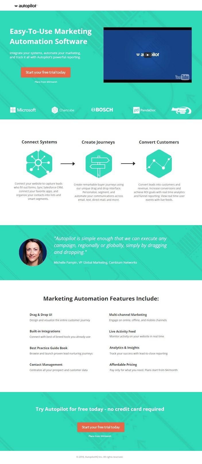
What they did well:
- This headline/sub-headline combo immediately conveys the benefit of using Autopilot’s marketing automation software.Authority badges align Autopilot with Microsoft, Bosch, Chartcube and more.
- Authority badges align Autopilot with Microsoft, Bosch, Chartcube and more.
- Easily digestible copy makes this page a breeze to get through.
- An absolutely perfect testimonial adds to the persuasive power of this video post-click page. Take notes, folks. This is what a testimonial should look like.
- “Free” is emphasized above the CTA button, and ON the CTA button.
- The text “no credit card required” ensures that this is actually a free trial, and not some ploy to get you to hand over your credit card details so Autopilot can snag some easy money the moment your trial is over.
- The CTA button color contrasts the rest of the page very well.
- This video is quite comprehensive for one that’s just three minutes long.
What to improve:
- The CTA button copy should be tested against a version that reads “Start my free trial today” to see if first-person writing produces higher conversions, as it has been proved to in the past.
- There’s no video CTA at the end of Autopilot’s product demo. Not only that, but in order to maximize it, or see how long it’s going to run, you need to click off the page to YouTube.
8. Salesgenie’s video post-click page
What they did well:
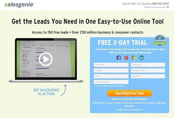
- The headline and sub-headline of this page are pretty compelling. By converting you get: an easy-to-use tool with which to generate leads, access to 150 free leads, and over 250 million consumer contacts.
- “Free” is emphasized in the copy above the form.
- The CTA button color is bright, and contrasts the page very well. It’s pretty obvious where you need to click to convert.
- One-click logins for several social networks make converting effortless for your prospects.
- The CTA button copy “Start Risk Free Trial” coupled with the text below that button that reads “Risk-Free – No Credit Card Required” comforts prospects by letting them know this truly is a free trial, instead of the kind where you get charged the moment your trial is over.
- The words “used by thousands” invoke feelings of trust by leveraging social proof.
- Multiple CTA’s working together give prospects a number of opportunities to convert.
- Trust badges on the bottom of the page indicate that it’s secure.
- Limited copy makes it easy to quickly figure out the benefits of using salesgenie.
- This video was professionally produced, it’s under two minutes long, it explains all the capabilities of the software, and (unlike many of the videos on this page), it actually has a CTA at the end.
What to improve:
- The testimonials could be much better. On a page where much of the content is optimized, it’s surprising to see that these testimonials are simply pulled from review sites and don’t include any photos.
- The product shots in the video are stock photos, and don’t give the prospect a real idea of what the software interface actually looks like. For a great example of how to combine an animated video with real product demos, take a look at the video post-click page from Act! on this list
9. Act! video post-click page
What they did well:
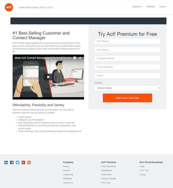
- The headline boasts that Act! is the no. 1 best-selling customer and contact manager. It’s a great headline if the claim is true. Just remember: if you’re going to write it, you’d better be ready to back it up, otherwise your company comes away looking as bad as the corner coffee shop advertising the world’s best cup o’ joe.
- The CTA button color stands out against the gray background.
- This video does a great job of combining an animated story with real product demos. Take a look for yourself to see what we mean.
What to improve:
- The phone number listed in the upper left-hand corner isn’t click-to-call, despite looking like it is. Not only will this confuse mobile internet users, but it will also make your company harder to reach.
- Social media share icons are more likely to work better on your “thank you” page. That’s usually because prospects like to if what you’re offering is worth passing along to their networks.
- More than a dozen outbound links on this page make it a post-click landing page full of holes.
- The CTA button copy’s use of “your” should be changed to “my.” Studies have shown that writing in first person (at least on button copy) can boost conversions.
- The CTA at the end of this video post-click pageisn’t clickable. That’s an easy fix in YouTube, so why include a link to your website if we can’t click to get there. The chances a prospect is going to type the whole thing into their address bar are slim.
10. TouchBistro’s video post-click page

What they did well:
- The case-study-inspired headline is a great way to pull prospects in. It essentially says, “Here’s a real-life case about how we boosted sales for Jim by $2,000/day, and we can do it for you too.”
- The green arrow pointing at the form works as a great visual cue, guiding the prospect’s eyes toward where they need to go to convert.
- The CTA button copy is written in first person.
- Bullet-pointed copy makes reading all the benefits of using TouchBistro quick and painless.
- Authority badges from businesses like the Ritz-Carlton put TouchBistro in the company of some well-known brands.
- This post-click landing page video uses real people in a real restaurant setting — not some animated character experiencing a hypothetical problem. It’s also the first one we found on this list with a clickable CTA at the end, which drives you to a scheduling page where you can pencil in a time for a product demonstration.
What to improve:
- Social media buttons and post-click landing pages don’t mix well. They work better on “thank you” pages. Here they simply serve as a distraction.
- The copyright information says 2014, which could very well give the impression that other things on this page are, too.
- The “Contact Us” link at the top of the page is another way out for the prospect.
- The length of the video on this post-click landing page is an issue. If I was a prospect, I likely would’ve clicked out before Jim, the restaurant owner, even started talking about TouchBistro. The first minute, filled with information about the establishment and the kind of food they serve, could certainly be cut out.
11. HubSpot’s video post-click page
What they did well:
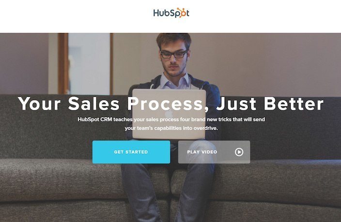
- The blue CTA button color pops against the gray background.
- Persuasive words and phrases like “Transform your business,” “Relentlessly powerful,” and “3 Simple Steps” help convince the reader to convert.
- These photos actually add value, showing the prospect what the guts of the CRM actually look like.
- This video is expertly done, it includes interviews from real people who used HubSpot’s CRM, and it cites actual results (a 400% increase in business for the documented company).
What to improve:
- Words like “better” convey a benefit, but they’re vague and not very powerful. Why not take from the wording in the sub-head below to say “Your Sales Process, On Overdrive” instead of “Your Sales Process, Just Better.”
- The video has no CTA at its conclusion, which surprised us, because HubSpot’s marketing materials are almost always totally optimized.
12. Zen Foods’ video post-click page
What they did well:
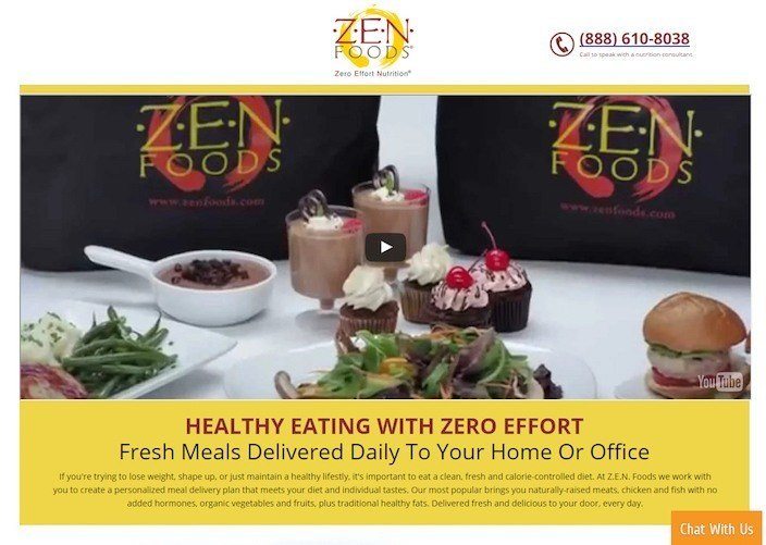
- The headline conveys an immediate benefit: Get fresh, healthy meals delivered to your home or office daily, without any effort on your part.
- The coupon code for $50 off your first 7-day meal delivery plan gives users a bonus incentive to try the service.
- The phone number is click-to-call, allowing anyone who visits this page on a mobile phone to call by tapping the digits.
- The CTA button copy “Contact Me” is in first person.
- The photos on this page look professional and make the food look appealing to the eye.
- There are no ways off this page other than through one of the CTA buttons or the red “X” in the corner of your browser window.
- The video follows a man named Eugene who used Zen Food’s service to get in the best shape of his life. It’s a great true story that adds to the persuasiveness of the post-click landing page the way a testimonial would.
What to improve:
- The CTA button doesn’t really stand out to us. Does it stand out to you? Green is already used on this page in a picture of lettuce, as well as in the coupon code box. Why not try something like bright blue?
- The video CTA pushes users to visit the Zen Foods website, but, like several other video CTA’s on this list, it’s not linked to the website itself.
13. The Recovery Village’s video post-click page

What they did well:
- The phone number in the upper right-hand corner is click-to-call.
- Bullet-pointed copy helps the reader absorb all the most important information about the program in a short amount of time.
- The language on the page is very audience-specific. It’s clear the copywriter knows who he’s talking to.
- Badges at the bottom of the page quickly give the reader an idea of what insurance providers are accepted at this particular rehabilitation center.
- Several testimonials give prospects a chance to read the experiences of others who have been through the program.
- This video was the first one on this list to address the viewer directly. Many follow a pretend character, or a satisfied client, but this one spoke directly to the viewer, addressing the pain points of someone searching for a rehab solution.
What to improve:
- The call-to action. Where in the world is it? We see one button on the bottom of the page with a phone number written inside it, but that can’t possibly be the only button on the page, can it? Is there no form? No lead capture? No call-to-action at all? This post-click landing page is majorly flawed without such elements.
- The video CTA isn’t linked to the company’s website.
14. Camtasia’s video post-click page
What they did well:
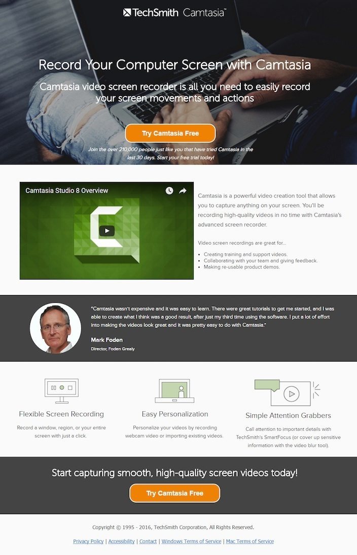
- The TechSmith logo at the top of the screen isn’t clickable, nor are there any outbound links on this page (aside from terms of service and privacy policy information), leaving your prospect no choice but to convert or leave.
- The text “Join the over 210,000 people…” leverages social proof by highlighting the vast number of people that have signed up for a trial of the software.
- A perfect testimonial boosts the likelihood of conversion on this video post-click page.
- Minimal copy makes this page easy to read through to the end.
- Two bright CTA buttons work together to get the prospect to convert.
- This video is one of the best on our list. It shows a number of ways in which businesses use the Camtasia software to connect with their customers, and it’s one of the few that actually has a CTA at the end.
What to improve:
- The CTA button copy could be better, if we were being nitpicky. But really, this is a very well-designed video post-click page overall.
- The computer screen background image is black. Why not have the screen show someone recording their actions on screen or using the software?
15. MakerSquare’s video post-click page
What they did well:
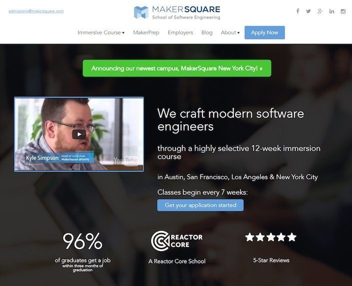
- The blue CTA button jumps out at you on this dark page.
- These testimonials have first and last names, along with pictures, making it very likely that they are real.
- Authority badges associate MakerSquare with Amazon, PayPal, Zipcar, and IBM.
- This video gives a brief overview of the program and combines that with real, impactful stories from students and graduates.
What to improve:
- There are too many outbound links on this page — too many possible “outs” for prospects.
- The page is connected to a main navigation which is always a big no-no for post-click landing pages. They shouldn’t be connected to any other page on your site.
- There’s no “pause” button or scrub bar to stop, fast forward, or rewind the video at all.
- The video has no CTA, and it doesn’t allow the user to maximize it at all, making some of the text in it impossible to read. Sure, you can argue that the YouTube icon in the lower left-hand corner of the video will allow you to fullscreen it by taking you to YouTube itself. But at that point, you’re not on the post-click landing page anymore. Combined with the fact that there’s no CTA at the end of this video, it’s totally possible the user watches this on YouTube, then gets distracted by the next video of a dog riding a roomba.
16. SharpSpring’s video post-click page

What they did well:
- The statistic “63% of companies that are outgrowing their competitors use marketing automation” is a great example of how to use numbers to persuade prospects.The bullets “Generate Leads,” “Drive Sales” and “Optimize Spend” are all action-oriented benefits that the prospect will gain when they convert.
- The bullets “Generate Leads,” “Drive Sales” and “Optimize Spend” are all action-oriented benefits that the prospect will gain when they convert.
- Authority badges from Salesforce, LinkedIn, and Formstack showcase the powerful brands that SharpSpring has worked with.
- Bite-size copy makes the rest of this video post-click page easy to get through.
- Testimonials that feature real names of real people add to the persuasiveness of this video post-click page.
- This video does a good job of providing a very brief overview of the service without boring the viewer.
What to improve:
- The visual hierarchy here is confusing at best. Remember: layout and typography matter greatly on your post-click landing pages. The way we make our way through web pages is left to right, top to bottom, so why is the first element I see on this page a video? Why is the headline (if that’s actually the headline) awkwardly shoved into the upper right-hand corner of the page? Why is all the font nearly identical? This page could be organized much better.
- Three unexciting CTAs really bring this page down. One reads “Get Started,” while the other two say “Get Started Now.” Something more benefit or results-oriented would work better.
- There’s no video CTA at the end of SharpSpring’s short product demo, and the vocals in the background music drown out the narrator at times. When your video is less than two minutes long, every second you have your prospect’s attention counts. Make sure they can both see and hear every second of the video before you publish it.
17. WordStream’s video post-click page

What they did well:
- “Free” appear several times on this page.
- Powerful testimonials from happy customers make it more likely your visitor converts to join them.
- Authority badges from USA Today, The New York Times, The Huffington Post, Entrepreneur, CNN, and FORTUNE associate WordStream with some of the most powerful businesses in the world. Notice that there’s no text that reads “Featured in” or “Some of our clients.” We don’t really know what WordStream’s association is with these companies, but the mere fact that the logos are there add to the persuasiveness of the page.
- Bullet-pointed copy makes it easy to see the benefits of WordStream’s tool without having to read extensively.
- The brightly orange-colored button really draws your attention on a page with a mostly blue and white color scheme.
What to improve:
- The copyright information at the bottom of the page reads “2014.”
- The long form makes this video post-click page a pain to complete.
- Two phone numbers can be found on this page. One at the top and one at the bottom. Neither one are click-to-call.
- The headline “Try WordStream Free” contains the word “Free” which is great, but it could be improved by stressing the results of trying WordStream free. The funny thing is, the tiny body copy below the headline actually does it, but it’s barely visible. Drawing from that text, a more powerful headline would be “Maximize The Performance of Your PPC Campaigns Easier Than Ever Before.”
- This video follows yet another cartoon character determined to optimize his PPC campaigns. It’s filled with some valuable information about the service, but all the product shots are replaced with stock photos. It would be great to see what the interface actually looks like. On top of that, there’s no CTA at the end of this video.
18. ilos’ video post-click page

What they did well:
- The headline conveys a clear benefit: record your screen simply.
- The ilos logo is not link to any other web page.
- “Free” mention on both CTA buttons.The CTA button color pops off the page well against the white background.
- Authority badges showcase some of ilos’s biggest customers: Codility, Freshdesk, and the University of St. Thomas Minnesota.
- Testimonials draw attention to a number of satisfied ilos customers.
- Minimal, benefit-centric copy adds to the readability of this page.
- This post-click landing page video, like Act!’s, combines actual product demos with an animated story. At just a minute long, it’s brief, and does a great job of selling all of ilos’s best features.
What to improve:
- Six mandatory form fields make converting on this post-click landing page a bit of a pain. Do you absolutely need to know all of this information about me?
- The video is embedded in pretty awkward place. To the left of it there’s nothing but blank space.
- The headline could do without the phrase “in the cloud.” As is, it sounds a little drawn-out.
19. Swagbucks’ video post-click page

What they did well:
- “Free” highlights multiple times, as it always should be. Remember: next to “you,” “free” is the most powerful word in copywriting.
- Authority badges from the New York Times, Billboard, NBC, MSN, and Woman’s Day align Swagbucks with some powerful and well-known brands.
- The Facebook Connect button underneath the post-click landing page form allows prospects to easily fill out the form with a click. It also gives the Swagbucks team access to the mountain of information that Facebook has collected on the prospect.
- The $5 bonus gives the reader a little added incentive to convert.
- The text “how it works in one minute” conveys to the visitor that they won’t have to dedicate a lot of time to watching the video.
- The Swagbucks logo on this page is not clickable, which means it doesn’t serve as an escape route for prospects.
- This post-click landing page video is great. It contains a number of recognizable brands like PayPal, Amazon, and Wal-Mart, and it leverages social proof by mentioning the millions of members Swagbucks already has.
What to improve:
- There are too many outbound links in the footer of this page. Remember, your prospect’s options should be to either convert or get out.
- The testimonials at the bottom of the page look fake. The pictures look like stock photos, have no names, and… is it just us, or do these quotes sound made-up?
- The CTA button color could be something bolder and brighter. The background of this page is light blue, so why make the button light blue? Why not bright orange or bright red to stand out more?
20. Cyberlink’s video post-click page
What they did well:
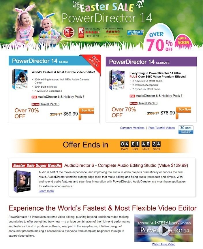
- The word “Sale” at the top of the page indicates that I’ll find deals here.
- The “Offer Ends in…” countdown timer creates scarcity and encourages the visitor to convert before time runs out.
- Badges create trust and authority in numerous places on the page.
- A money back guarantee makes prospects a little more comfortable with converting.
- This intro video, while embedded on our least favorite post-click landing page, was the most entertaining to watch. It did a great job of explaining the software, touching on product reviews, and comparing other industry competitors without making our eyes glaze over.
What to improve:
- Talk about sensory overload. With so many colors and badges and photos we don’t even know where to look! To be honest, if I wasn’t critiquing this page, I would’ve left already.
- This page is way too text-heavy. It’s not likely your prospects have time to make it through 1,000 words of text, so don’t make them do it because they won’t.
- Too many colors vying for attention means that I’m skipping over CTA buttons many times.
- There are too many outbound links on this page.
- The video effects were unnecessary at times, and there was no call-to-action at the end of the video — which is a bit surprising, considering there are too many to count on the page itself.
Start creating optimized video post-click pages to boost conversions and increase audience engagement, sign up for an Instapage Enterprise demo today to find out how you can make the best of your post-click landing pages.

See the Instapage Enterprise Plan in Action.
Demo includes AdMap™, Personalization, AMP,
Global Blocks, heatmaps & more.
