Tonal, the world’s most intelligent fitness system, is revolutionizing the fitness industry. Its state-of-the-art equipment and expert guidance into full-body, at-home, on-demand workouts can’t be found anywhere else. What’s more, the Tonal smart home fitness system gets to know its users’ health and fitness goals to deliver highly personalized programs and yield results.
That’s not the only way Tonal leverages personalization, though. The company also uses proven personalized advertising tactics to promote their brand and product. Specifically, extreme ad targeting and ecommerce post-click landing pages.
Today’s article presents one great Tonal ecommerce post-click landing page example the brand uses to increase awareness and ultimately generate sales. But first…
Why are ecommerce post-click landing pages necessary?
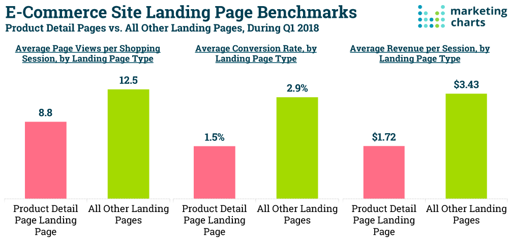
An ecommerce post-click landing page is the ticket to more purchase conversions. That’s because although nearly 1 in 4 online shoppers begins their customer journey on a product page, about 96% of them aren’t ready to buy when arriving there. In turn, they’re much more likely to bounce than actual post-click landing page visitors.
Product pages also underperform post-click landing pages for ecommerce:

- Product page visitors view 42% fewer pages (8.8 per shopping session) than post-click landing page visitors (12.5 per shopping session)
- Product pages convert nearly half as many visitors as post-click landing pages (1.5% conversion rate vs. 2.9%, respectively)
- Revenue per session on product pages is about half that of post-click landing pages ($1.72 and $3.43, respectively)
So what’s the difference between a post-click landing page and a product page? Mainly, their purposes.
The purpose of a product page is to appeal to the masses and attract browsers. It’s designed to introduce and educate visitors on your brand, product, or service. It often includes links to other locations of your website so visitors can navigate the whole thing.
A post-click landing page, on the other hand, is a standalone web page with only one goal in mind, designed specifically to convince visitors to fulfill that goal (sign up, buy, download, etc.).
As businesses become more data-driven, post-click landing pages are becoming increasingly favored due to their ability to generate more leads, boost conversions, and ultimately, deliver high ROI. This is because every customer is unique and requires personalized attention and engagement to be persuaded to purchase — and the best ecommerce post-click landing pages allow you to do this.
Ecommerce post-click landing pages are also referred to as “pre-cart” post-click landing pages because they come before the shopping cart to assist in the purchase process. While ecommerce ads and product pages are still important to include in your strategy, post-click landing pages serve as specialized digital storefronts, allowing you to tailor your business to individual customers to boosts sales.
That said, let’s detail the Tonal fitness ad-to-checkout process and how they targeted Instapage Founder & CEO, Tyson Quick.
Tonal fitness ecommerce post-click landing page example
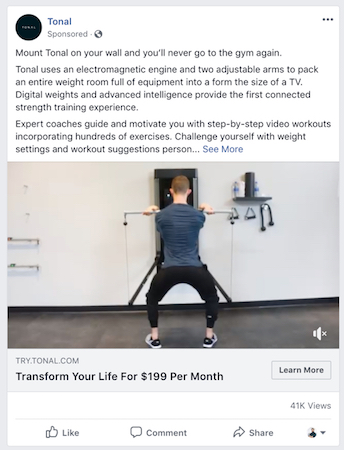
The campaign starts with a Facebook ad:

Tonal likely targeted this user based on several different marketing segmentation factors:
At its most basic targeting level, this ad likely used geo-location to appear in front of the user. He lives in San Francisco, CA, and Tonal currently delivers to San Francisco, Los Angeles, Orange County, and San Diego.
The ad also probably targeted this user based on demographic and psychographic segmentation. As the founder and CEO of a SaaS company, it can be assumed that he enjoys using hot, new technology (psychographic), and likely has the buying power to purchase a Tonal fitness machine (demographic).
Furthermore, as a young CEO running a company, he spends a lot of time working and doesn’t have much time to get to the gym. Therefore, there’s a good chance he prefers at-home workouts to meet his lifestyle needs. This is another example of psychographic marketing.
Lastly, having a lot of gym equipment isn’t an option because he likely lives in a small apartment (it is San Francisco after all!). That makes Tonal’s all-in-one equipment (adjustable arms and 200 lbs of digital weight compacted into a flat strength training machine right onto a wall) the perfect solution for him. It will save a ton of space in his home.
Once he clicked the ad, he was brought to this Tonal ecommerce post-click landing page:

The post-click landing page is optimized with many best practices, including
- A click-through design for reduced friction
- An intriguing and specific headline
- Minimal, personalized copy
- Images to narrate a story and highlight product features and benefits
- Analogous colors, creating an aesthetically pleasing page
- Multiple CTA buttons for more opportunities to convert
However, Tonal may want to A/B test just a few elements:
- Changing the CTA button color to a more contrasting one would make it stand out more
- Removing the links to the other website pages would presumably increase the conversion rate on this page
- Adding social proof, like a customer testimonial, would create more brand and product credibility (Note: There are several testimonials included on the product page below, but adding them to the post-click landing page would ensure more visibility since it comes first in the sequence.)
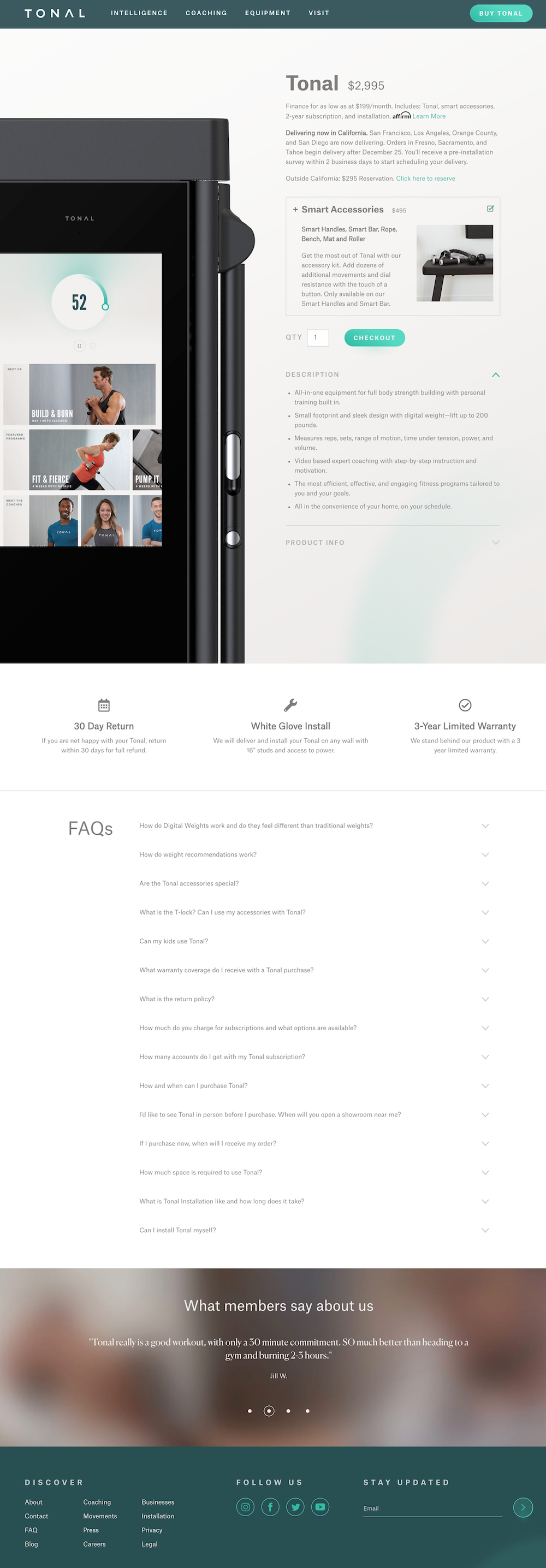
After learning all about the Tonal fitness system, he can click either “Get My Tonal” CTA buttons to see this product page:

The product page presents him with pricing information and the option to add the Smart Accessories kit to the order. It also offers finance and reservation options, as well as information on returns, installation, and warranty:
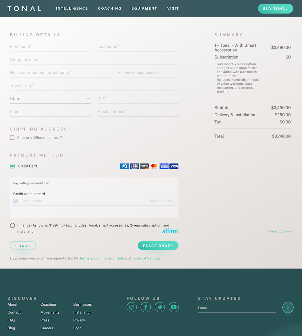
Finally, he can click through to the checkout page to view the order summary and complete the transaction:

Note: This Tonal ecommerce post-click landing page example highlights a Facebook ad campaign, but the company likely sends traffic to their post-click landing page via other channels as well.
Follow Tonal’s lead for more sales
Tonal is revolutionizing the fitness industry and making sure the world knows it. The company is building brand awareness, informing people of their product, and generating sales with their post-click landing page strategy.
Learn from Tonal’s example and create your own personalized ecommerce post-click landing pages with Instapage. Sign up for an Instapage Enterprise demo today.

See the Instapage Enterprise Plan in Action.
Demo includes AdMap™, Personalization, AMP,
Global Blocks, heatmaps & more.
