The American Marketing Association reports that the average American sees 10,000 brand messages each day. A lot of information for consumers to process, no doubt, but conversely, marketers have to implement creative ways to stand out for attention.
But how do you do that and still generate conversions?
Our recent Taboola webinar answered that question, explaining why brands should make native advertising a key part of their acquisition strategies:

The webinar highlighted new psychology-backed native advertising tips for attracting and converting people to your brand, some of which we’ll discuss here.
3 key takeaways from the Taboola webinar
1) Target the right personas with your ads.
Advertisers don’t want just any clicks — they want high-intent clicks for a better chance at higher conversion rates.
Brands can qualify prospects for more intent-based clicks with the appropriate ad imagery and copy using these native ad tips:
Imagery
To grab attention, three types of imagery perform best:
People — This pertains to the survival perspective. People survive and thrive from social ties, in the real world and online. For example, the first thing many people do when they walk into the office is look around to see who else is there. The same thing happens online. You scroll down a web page and look for people:

Color contrast — Studies have found that color contrast makes an image stand out. Taboola found that black and white images were trending on their network, which surprised them at first until they learned that everybody else was using color:

Video — Anything that’s animated or moving will grab attention because humans have a natural instinct to look towards movement. In fact, online studies have shown that videos are almost impossible for users to ignore:

Copy
After grabbing the initial attention through imagery, now you have to convince those highest-intent prospects to click with compelling copy. Although there are many best practices for this, here are three that focus on using psychology in the headline:
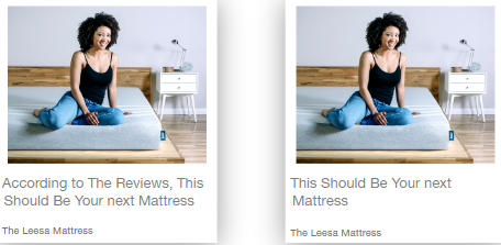
Social proof — Adding a trust indicator such as “According to the reviews” or “According to the experts” increases the sense of confidence and security, and the chance of someone highly-interested clicking and converting:
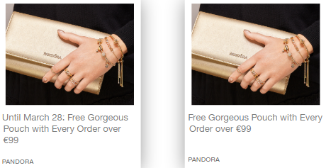
Urgency — If you increase urgency with a time-sensitive sale or limited number of offers, you’re likely to get more clicks and conversions. Faster, too, because people often feel afraid of missing out:
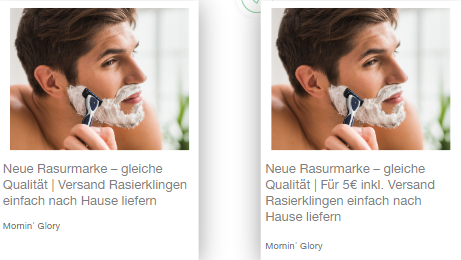
Pricing — Even if you don’t read German, you can tell in the shaving example below that one ad includes a price, and the other doesn’t. The ad on the left would probably get more clicks simply because it doesn’t include a price point. However, those clicks wouldn’t all be qualified. The ad on the right would likely get fewer clicks, but more engagement because the brand basically says, “Don’t click here unless you’re willing to spend money:”
2) Use experimentation to find what resonates with people, but continue to analyze results to prevent creative fatigue.
The native advertising tips above provide excellent results in many countries. But, not all countries respond the same way, primarily due to cultural influences. Consumers in some countries will always click on colorful images instead of black and white simply because of cultural differences.
Naturally, there are also consumer differences depending on the product or service you’re offering. If you’re an email marketing company, for instance, your audience may not be the same as competitors. You may specialize in ecommerce, while another company focuses on SaaS.
Every audience is unique, and that’s why you should always A/B test to know how your audience reacts and test new creatives to prevent creative fatigue.
3) Create a consistent experience from ad to post-click page and personalize the experience.
Once you’ve captured attention and convinced them to click, you need a dedicated place for them to go — a matching, personalized post-click landing page. It should be highly-tailored to your ad campaign and feel like a continued experience, that matches the ad experience.
Uber offers their example here:
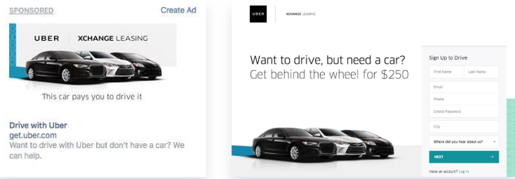
The same image in both locations, along with similar copy and font, lets visitors know they’re in the right place on the next step of their journey. Naturally, this plays a huge role in decreasing bounce rates and increasing conversions.
Personalization between both the ad and post-click landing page also helps increase conversion rates. You want to personalize for segmented audiences, so it makes sense that you’ll need to create separate ads and landing pages for each unique segment.
Consider Airbnb who uses a lot of geography-specific ads. Rather than sending all of their prospects to the same destination page, the company ensures that prospects in different locations receive an experience personalized to them (San Francisco, New York City, Chicago):
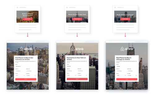
By message matching your ads and landing pages, along with personalization, you can be sure to see a positive effect with your conversion rates.
2 great questions & answers
Q: How can I design a post-click landing page for higher conversion rates?
Start with the hero section to show visitors the benefits and value of your product or service and immediately answer the question of “why?” when a visitor lands on your post-click page.
There are three main keys to a successful post-click landing page, all of which show visitors why they should choose your business:
Value proposition
- Why is your business right for the prospect?
- What differentiates you from your competitors?
- What are the benefits of using your product?
Social proof
- Why can prospects trust in your value?
- Do you have product or service ratings?
- What is your background or history?
Incentive
- Is there a reason visitors should act now and not later?
- Will they miss out on something by not acting now?
These three components should always be included on your post-click landing pages to convince visitors to convert.
Other important best practices relate to how visitors engage with your content. Studies have shown that people don’t have the desire or patience to read through loads of text, so it’s essential to make it:
- Minimal — including just copy enough to get your point across without it being overwhelming.
- Skimmable — subheaders, bullet points, numbered lists, bold copy, etc.
Finally, your CTA button color, size, copy, and position must be optimized for maximum conversions. Taboola found that adding a button to the right margin or the very bottom of the page doesn’t convert as well as positioning it immediately below the main content, when prospects are still thinking about what you said.
Q: What is creative fatigue and how can I avoid it?
Creative fatigue is when a copy or imagery trend begins to lose its effectiveness. Continue analyzing heatmaps and ad metrics to discover potential fatigue and experiment with new ideas to continue driving conversions.
Your creative might generate great results for a while and then eventually stop performing well. When viewers have seen the same copy style or type of image used repeatedly in ads, the mind begins to ignore it, and it’s not getting them to click anymore.
We discussed A/B testing above, but it’s also critical to use heat maps to understand how your visitors engage. How are you supposed to know what to test until you know how people are interacting with your page? You have to know what they’re looking at, what elements they click, scroll depth, mouse movement, etc. before you know what to experiment with changing.
Maybe you’re putting elements in the wrong places based on how users interact with your page — in an F-pattern layout:
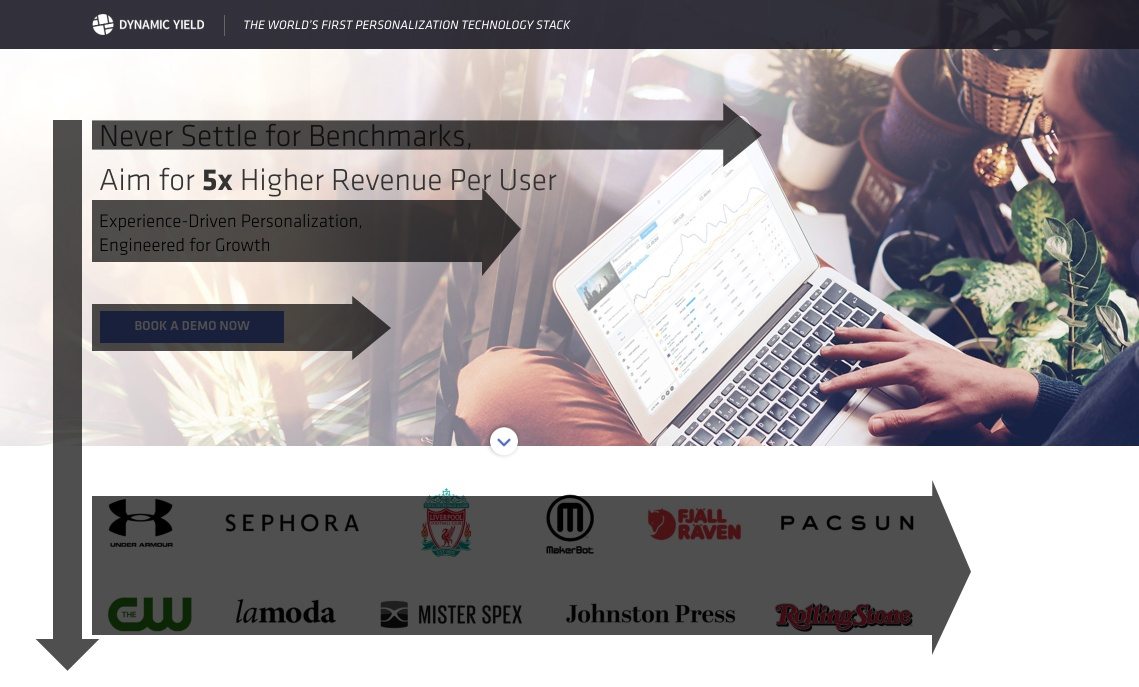
Or Z-pattern layout:
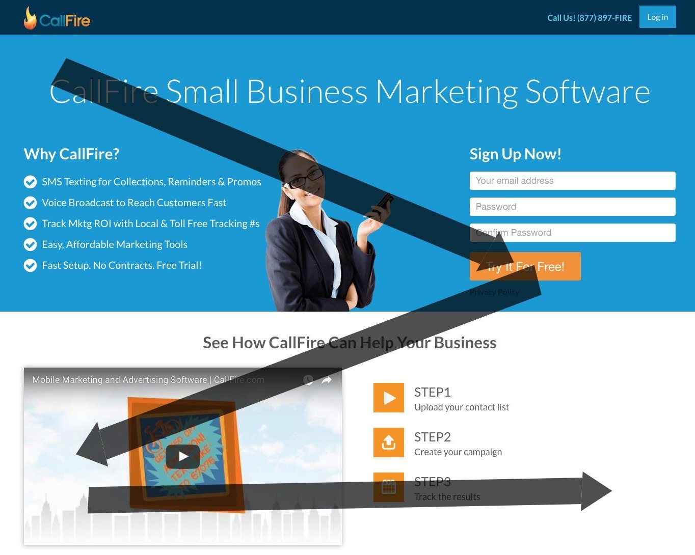
Placing the most important elements along these paths gets them noticed and boosts conversions.
1 compelling quote
Rachel Zalta, Head of Research and Insights, Taboola:
The average American is exposed to 10,000 brand messages in one day. That amounts to about 10 messages every minute. Marketers have to work really hard to get their message across and earn conversions.
Now go watch the full Taboola Webinar
Watch the full webinar with Taboola to inject native advertising tips and modern psychology principles into your advertising funnel and deliver more conversions today.
