Far too many advertisers don’t prioritize the post-click landing page. They don’t realize this stage of the customer journey is just as crucial as the pre-click stage because when ads and post-click landing pages fail to tell the same story narrative, conversion rates suffer. This is evident from an average conversion rate of just over 4%).
To generate maximum conversions, you must maintain relevance from ad to post-click landing page. This is especially true in the higher education industry, where prospective students are extra cautious about where to invest a large chunk of their money for many years.
We previously examined how other universities use dedicated post-click landing pages to acquire new students:
Now let’s see how Southern New Hampshire University does the same.
How SNHU segments their post-click landing pages
Example 1: Google search for “online degrees”
Someone near the top of the funnel considering an online education might do a quick Google search for “online degrees” and see this ad:

Several components indicate the ad is segmented for a specific audience:
- The first half of the headline “Online Accredited Degrees” is almost identical to the search query, letting prospects know the ad is relevant to them.
- The description continues providing information about SNHU’s 200+ degrees and degree programs.
- The second ad extension repeats “Online Degrees”, assuring users this ad will be valuable to them since that’s what they searched for.
The “Frozen Tuition” extension leads to this post-click landing page to continue that particular narrative:
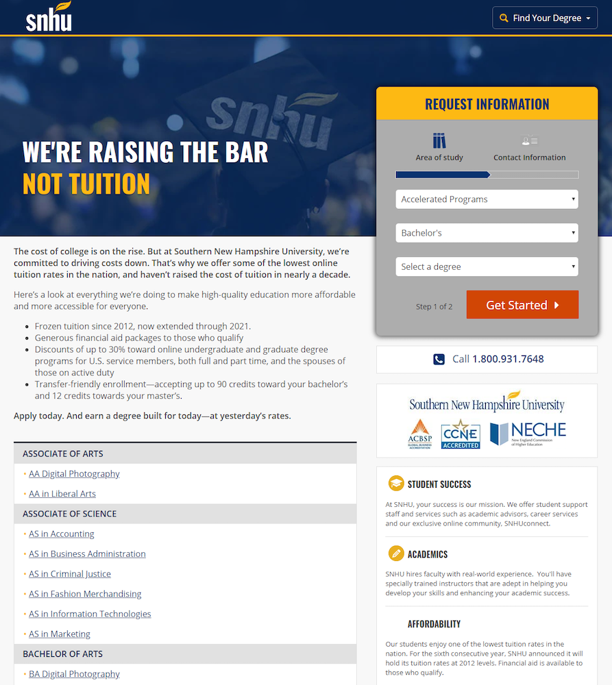
- What is the offer for? — Anyone who clicks the “Frozen Tuition” extension is likely attracted to the idea that SNHU’s tuition isn’t rising year after year. So it makes sense that the page headline would continue to highlight this benefit.
This type of message match also ensures visitors know what the offer is as soon as they arrive and don’t doubt that they’re in the right place for what they’re looking for.
- Why is SNHU the best choice? — The Frozen Tuition promise is the main reason for choosing SNHU, which is conveyed throughout the page — from the headline, to the bold copy underneath the headline, to the bullet points.
Additional benefits to choosing SNHU — surrounding student success, academics, and affordability — can be found under the lead capture form.
- Who supports SNHU? — Showing the logos beneath the form serves as social proof, letting visitors know that they can trust the school because it’s been accredited by well-known associations:

- How can visitors take action? — Prospects can request more information by completing the multi-step form and clicking the orange “Get Started” CTA button.
Visitors can also click the “Request Info” anchor link at the bottom of the page to be directed back up to the form.
Example 2: SNHU branded search
Searching by Southern New Hampshire’s acronym shows this PPC ad with more sitelink extensions to segment users into different audiences:

Clicking the second extension takes users to another dedicated post-click page:
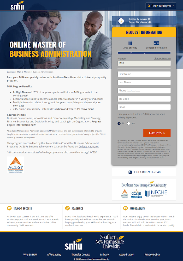
- What is the offer for? — The Master of Business Administration narrative is continued from the ad to the post-click page. Even though the page doesn’t mention a degree in 15 months, it does contain the other details from the ad extension (accreditation, affordability, online programs).
- Why an MBA from SNHU? — This part of the story is highlighted with bold copy and bullet points, listing the main benefits of obtaining an MBA degree through SNHU:

- Who supports the school? — In addition to the three company badges from Example 1 indicating who the school as a whole is accredited by, this page also includes accreditation information about specific MBA program:

- How can visitors request more info? — By completing the lead capture form and clicking the orange “Get Info” CTA button.
The blue box above the form creates urgency and encourages prospects to request more information sooner, rather than later:

Example 3: LinkedIn retargeting ad
Following the previous interaction with SNHU, the university retargets with LinkedIn ads like this one:

Clicking the ad leads to this post-click landing page, which isn’t quite as personalized as the other two:
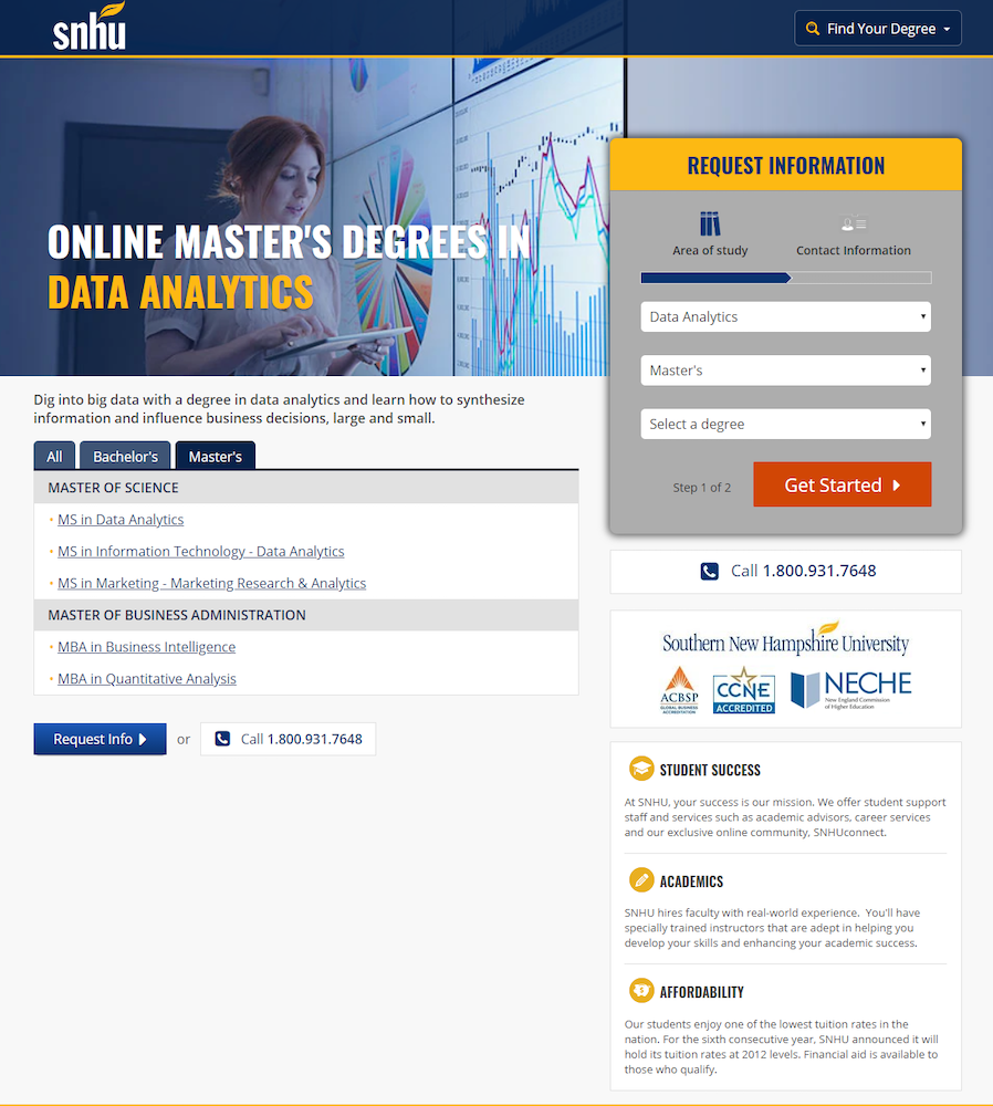
- What is the page offering? — The ad narrative continues onto the post-click landing page, promoting SNHU’s offer for an online Master’s Degree in Data Analytics on both the ad and post-click page.
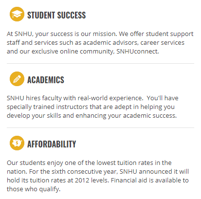
- Why choose SNHU? — Similar to Example 1, the top reasons for choosing a Data Analytics Master’s Degree at SNHU are listed in the bottom-right:
- Who is the school accredited by? — Also like Example 1, the company logos from SNHU’s accreditors are pictured directly beneath the form, so visitors feel more comfortable and confident submitting their information.
- How can visitors request more info? — By either completing the multi-step form or clicking the anchor tag at the bottom of the page (which takes them back to the form).
Compare these experiences to the SNHU homepage
Your ad traffic shouldn’t be sent to a homepage because it likely doesn’t deliver a unique, personalized post-click landing page to a segmented audience. Typically, homepages are designed as browsing experiences, providing an overview of everything a company offers.
Look at the SNHU homepage, for example:
- Four competing CTA buttons above the fold divide visitors’ attention between multiple offers:

- An extensive header navigation, complete with a student login link and dropdown menus, enable visitors to visit other website pages:

- Additional competing CTA buttons in the “Student Experience” section provide visitors with more escape routes to other web pages, continuing to demonstrate a browsing experience:

- The success stories CTA button and social media links further encourage visitors to leave this page and browse the rest of the website:

- The Newsroom section contains multiple external links for people to leave and read university news articles, and the accreditation panel offers a link for visitors to leave and “View All Accreditations:”

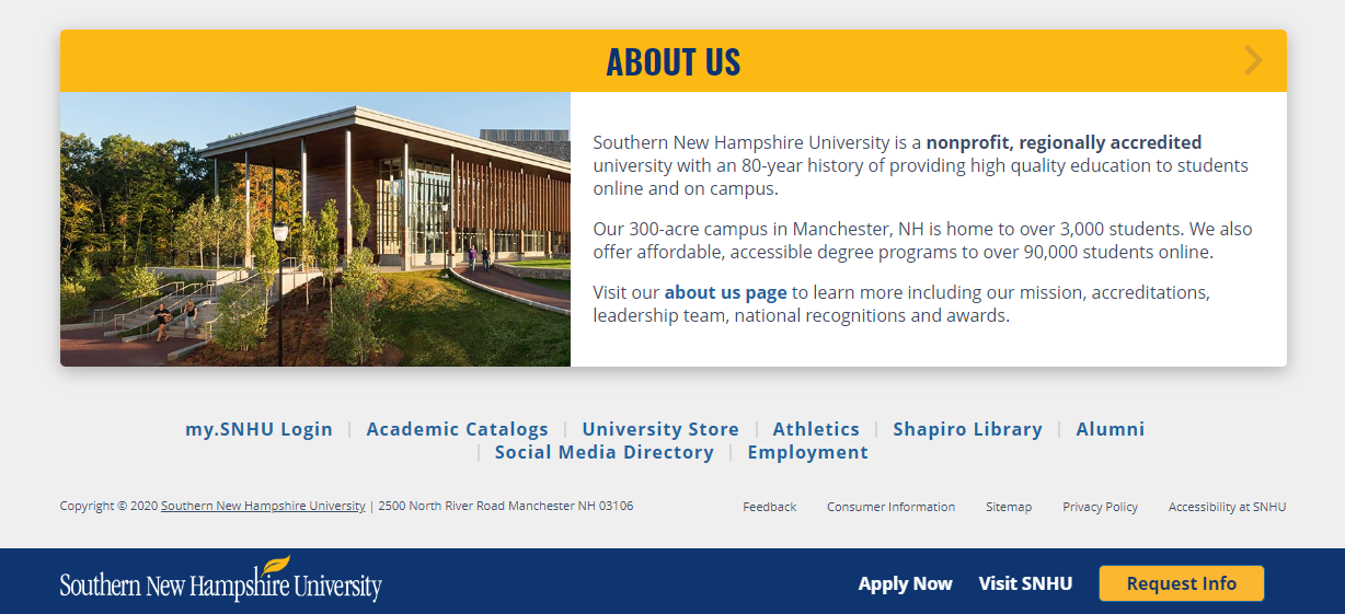
- A full-sized footer provides a whole new section of external links, allowing visitors to bounce from the page without any conversion:
It’s clear the SNHU homepage is designed to be a comprehensive browsing experience for all visitors, unlike the post-click landing pages above that all enjoy a 1:1 conversion ratio for segmented audiences.
Create a cohesive ad-to-post-click landing page
If you’re personalizing ads, you must also personalize the pages they direct traffic to. By focusing all your attention on ads and ignoring the post-click landing page, you’re likely wasting ad clicks and budget.
Be inspired by the SNHU examples above to tell the same story narrative across the pre- and post-click landing page. Then schedule an Instapage Enterprise Demo to start creating personalized post-click pages at scale.

See the Instapage Enterprise Plan in Action.
Demo includes AdMap™, Personalization, AMP,
Global Blocks, heatmaps & more.
