SoFi — the personal finance company that provides personal loans, mortgages, and student loan refinancing — prides itself on its unique approach to lending, offering lower interest rates and bigger customer savings than other financial companies. To best promote these offers, they employ post-click landing pages to advertise many of their products, services, and special offers.
Previously, we showed how LendingClub uses post-click landing pages to increase their customer base. Now let’s examine how SoFi uses their own to drive specific action and reach various business goals.
What is a post-click landing page?
A post-click landing page is a standalone web page that uses persuasive elements (such as compelling headlines, engaging media, valuable social proof, attention-grabbing CTA buttons, etc.) to convince visitors to take action on a specific offer. That action could be to download a guide, register for a webinar, sign up for an account, schedule a demo, and more.
6 ways SoFi uses post-click landing pages
(For shorter post-click landing pages, we’ve displayed the entire page. For longer pages, we’ve only shown above the fold, so you’ll need to click through to the page to see some of the points we discuss. Also, some pages may be undergoing A/B testing with an alternate version than is displayed below.)
1. To offer personal loan interest rate calculations
A Google search for “SoFi personal loan” showed this paid search ad:

When search users click the “Pay Off Your Credit Cards” sitelink extension, they’re brought to this click-through post-click landing page where they can see personal loan interest rates SoFi has to offer:

What the page does well:
- The click-through design allows visitors to warm up to the offer without feeling pressured to convert with a lead capture form in front of them.
- The headline is benefit-oriented and large enough for visitors to notice immediately.
- The CTA button copy uses first-person and tells prospects exactly what they’ll get by clicking. (Note: The “Find my rate” call-to-action is used on many of SoFi’s web pages, because their primary goal is to increase new signups.)
- Assuring prospects that checking their rate won’t affect their credit score is smart, since this is likely a common concern.
- The “Why SoFi?” section tells visitors the main benefits of borrowing from SoFi. Providing statistics and specific examples in each category serves as social proof and helps further persuade prospects to take action.
- The Personal Loan Comparison chart (and the “How much can you save?” section) demonstrate how SoFi personal loans compare to other popular types of loans, answering many of the questions prospects might have.
- Multiple cooperative CTA buttons provide visitors with several opportunities to convert at different sections of the page.
- Security badges in the footer let prospects know that their private information will remain safe and secure.
What could be changed and A/B tested:
- The SoFi logo and footer links are distracting and could remove visitors from the page before converting.
- The image seems unrelated to the post-click landing page offer. Although it could be an image of people celebrating their freedom from debt, there’s not enough evidence to know that for sure.
- Changing the CTA button color to red would help it stand out more, because there’s already a lot of blue on the page and the lights in the header section prevent yellow or orange being a good option.
- A click-to-call phone number would provide a better user experience, especially for people on mobile devices.
- Many links in the footer, including social media, app download buttons, and more could intimidate visitors, deterring them from converting.
2. To encourage residency contest entries
This Facebook ad promotes a SoFi contest, in which one medical resident will win $30K toward their living expenses, plus the tools and resources to support them through their medical career:

When Facebook users click the URL in the description, they’re directed to this post-click landing page:

What the page does well:
- The headline and subheadline complement each other well — the headline is short and simple, and the subheadline provides more details about the offer, explaining how SoFi supports residents.
- Only one form field makes it so visitors are more likely to enter the contest.
- The “We help doctors get ahead” section acts as social proof, letting prospects know exactly how SoFi has helped others, and how it could help them too.
- “What you get when you join the series” provides visitors with details about what SoFi will provide them with if they decide to join.
- The second form and CTA button give prospects a second opportunity to convert after they’ve learned more about the offer.
- Rajesh Sekar’s testimonial serves as social proof, likely encouraging others to get help from SoFi as well. Adding a headshot would make it even more persuasive.
- The countdown timer instills a sense of urgency in visitors, letting them know exactly how much time is left until residency begins.
What could be changed and A/B tested:
- The SoFi logo and footer links could easily remove visitors from the page before converting.
- Redirecting the doctor’s eye gaze to the headline or form would draw more attention to those elements, likely encouraging more contest entries.
- The CTA buttons are barely noticeable when first landing on the page, and even after the form is completed, they still blend in with the blue background.
- The CTA button copy, “Join the series”, isn’t very persuasive. Something more enticing, like “Enter for a chance to WIN!” might encourage more prospects to click.
- Fine print in the footer could intimidate visitors and prevent them from converting.
The following SoFi post-click landing pages aren’t true post-click landing pages because they don’t feature a standalone offer like a post-click landing page should. They also contain a header navigation, a large footer, and detailed fine print, which could all easily distract visitors from the page. However, they do use many key post-click landing page elements — so let’s look at what they do well, and what could be A/B tested for higher conversion rates.
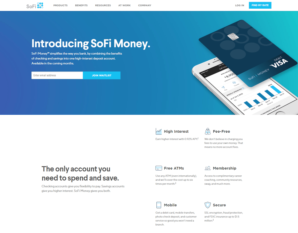
3. To persuade people to join the SoFi Money waitlist

What the page does well:
- A simplified page, divided into sections each with a section header, provides visitors with easy navigation.
- The headline and subheadline provide an overview of what this page offers (and more specifically, what SoFi Money offers).
- A single-field form makes it quick and easy for visitors to join the waitlist.
- The image shows prospects what the SoFi Money mobile app looks like.
- Iconography and bold copy helps highlight the primary benefits of SoFi Money.
- The interest graph demonstrates how much more interest can be earned with SoFi than with other average checking accounts.
- The “Common questions” section could help increase prospect’s chances of converting.
- A second form at the bottom of the page provides prospects with another opportunity to join the waitlist after learning more about SoFi Money.
What could be changed and A/B tested:
- Multiple offers (join waitlist and find my rate) could confuse visitors and deter them from converting.
- Adding a live chat to answer any additional questions prospects might have could help increase conversion rates.
- Social share buttons act as exit links, potentially taking visitors away from the page before converting.
4. To offer a partnership with SoFi

What the page does well:
- Multiple CTA buttons act as anchor tags, taking visitors directly to the bottom of the page where the form is located.
- The student loan contribution calculator helps personalize the visitor’s post-click landing page experience.
- The “Why SoFi” and “Testimonials” sections provide ample social proof that helps encourage others to partner with SoFi.
- The Autofill with LinkedIn option provides prospects with a better user experience, making it quick and easy for them to complete the form.
What could be changed and A/B tested:
- The headline, “Make SoFi work for your company”, sounds like the prospect must be responsible for something before they can benefit.
- Many different offers — rate calculator, contact SoFi about a partnership, subscribe to email list, see the white paper data, etc. — could overwhelm visitors and prevent them from converting.
- Adding white space would make the page less cluttered, more navigable, and easier to comprehend.
5. To generate Student Loan Benefits white paper downloads

What the page does well:
- The 2-step opt-in design allows visitors to learn all about the white paper before being faced with a form.
- The headline and subheadline provide visitors with an overview of the white paper and why they should download it.
- The white paper image shows prospects what the resource looks like before downloading it.
- Iconography and bold copy makes it easy for visitors to find what’s contained in the white paper.
What could be changed and A/B tested:
- A stock photo as the background image isn’t great for sparking any sense of emotion in visitors. Also, it doesn’t do a great job of relating to the offer.
- The blue CTA buttons would stand out more in a color that’s not used elsewhere on the page, like orange.
- The CTA button copy, “Download Now”, is vague and uninspiring. Changing it to something more personalized and exciting like, “Show Me the White Paper!” would likely produce better results.
- Social share buttons provide escape routes for visitors, potentially lowering conversion rates.
- Multiple offers (rate calculator, white paper download, SoFi at work, view blog, etc.) could confuse visitors, preventing them from converting.
6. To increase Home Buyer’s Guide downloads

What the page does well:
- The 2-step opt-in form reduces friction by allowing visitors to first learn about the offer, and then complete the form on the next step.
- The image of the home is relevant to the offer (although a more realistic image might be more effective than a stock image).
- The guide cover page gives prospects a preview of what their resource will look like before downloading it.
- Iconography and bulleted copy highlight what’s inside the guide, making it easy and convenient for prospects to scan the page and find the most important information.
What could be changed and A/B tested:
- The guide isn’t gated. When prospects click the “Download Guide” CTA button, they’re shown a pop-up window with the option to enter their email address to subscribe to the blog, or download the guide without providing any information at all.
- Changing the CTA button color to one that’s more contrasting (like orange) would help them draw more attention.
- “Download Guide” on the CTA button could be more personalized and persuasive, such as “Send My Home Buyer Guide!”
- Social share buttons serve as escape routes, through which visitors can leave the page without downloading the guide.
- Additional calls-to-action (“find my rate”, “view mortgage licenses”, “view our blog”, etc.) could distract visitors from the page’s primary offer.
What can you take from these SoFi post-click landing pages?
It’s clear from the first two examples above that SoFi recognizes the importance of using post-click landing pages to generate awareness and leads for their marketing and advertising campaigns. Take notes from SoFi’s pages, but be sure to create customized, dedicated post-click landing pages for all of your offers. That way your campaigns can reach their full potential.
Create a better visitor experience and generate more leads by building 100% customizable post-click landing pages with Instapage today. Sign up for an Enterprise demo today.

See the Instapage Enterprise Plan in Action.
Demo includes AdMap™, Personalization, AMP,
Global Blocks, heatmaps & more.
