Pre-click advertising strategies — micro-targeting ads, personalizing the ads, even creating ads at scale — has been made progressively easier over time. Unfortunately, the same isn’t always true for post-click landing pages, which is why average conversion rates remain just over 4%.
To guarantee more conversions, advertisers must segment and personalize the entire user experience from ad click to conversion.
Instead of linking every ad to your homepage or even a generic landing page, creating relevant, personalized post-click landing pages for every audience segment that clicks your ad is the most proven way to increase conversions. The ad and post-click page must tell the same consistent story.
Let’s see how experience management company, Qualtrics, uses 1:1 ad-to-page personalization to offer their solutions by reviewing a few examples.
How Qualtrics segments post-click landing pages
Example 1: Google paid search
Someone looking for “customer experience management” options might see this keyword-relevant paid search ad:

Pieces of the search phrase are included in both the ad headline (‘customer experience’) and the third sitelink extension (‘Experience Management’), letting the user know this ad is relevant to their query. The in-depth description also informs them that clicking through will provide more useful information.
Once clicked, they land on this post-click page which continues the relevancy to the next stage:

Upon arrival, it’s clear the page is closely connected to the ad, telling visitors a story about market research and why it’s integral for customer experience management:
- What the offer is for — The headline indicates that the offer is for Qualtrics’ Market Research Tool. It highlights that visitors can try the tool risk-free if they qualify for the trial.
The copy below the headline then provides a brief overview on why prospects should want to pair up with Qualtrics (freedom to make real-time changes, control of reports, easily shareable insights, etc.) before the benefits are explained further down the page.
- Who else uses Qualtrics — Customer testimonials from HP, Microsoft, and Sony show three global brands who also use the company to improve their customer’s experience. This serves as strong social proof, especially since they’re all direct quotes from employees.
- Why Qualtrics’ market research is essential — Next in the page’s story are the 3 main reasons to run in-house research with Qualtrics. You can do the research better than if you were to delegate, faster than if you had to wait for budget revisions, and for less money than hiring an agency.
This part of the story continues into the next section of the page where Qualtrics lists some benefits their customers receive: bulletproof survey templates, flexible self-service or fully managed service, instant access to high-quality survey respondents, award-winning customer support, etc.
- How prospects can apply — Once visitors get to the bottom of the page, they can click the blue “Apply Now” CTA button. This is an anchor tag that automatically takes them back to the top of the page where they can complete the lead capture form.
Example 2: Bing paid search
A similar, but slightly varied Bing search for “digital customer experience” shows this Qualtrics paid ad:
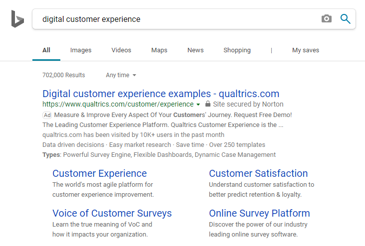
Again, the ad is extremely relevant to the search phrase. The exact term is included in the main headline, and pieces of it are included in both the description and sitelink extensions. They’re included in the display URL as well, which shows searchers they’ll be sent to a highly-relevant post-click page that matches their search query.
Clicking either the main headline or the “Customer Experience” sitelink extension leads to this matching page:

Immediately, it’s clear the page continues the customer experience story, as it tells visitors:
- What the page is offering — The headline lets prospects know right away that Qualtrics offers “the leading customer experience platform.”
Next, the subheadline supplements that by explaining how the platform makes it easy for companies to monitor, respond, and improve every touchpoint along the customer journey. This is further supported by the image showing all the different devices on which Qualtrics delivers great customer experiences.
- Who else uses Qualtrics — There are plenty of social proof elements, assuring visitors that they’d be making a great decision by choosing Qualtrics as their customer experience management platform.
First, the G2 Crowd badge for 2019 winter leader at the top of the page. Then company logos directly below the fold that use Qualtrics, including Disney, Coca-Cola, and Microsoft. Lastly, several star ratings from G2 Crowd, TrustRadius, and Capterra highlight that Qualtrics is rated well by its customers.
- Why choose Qualtrics — In addition to showing testimonials of Qualtrics benefits, the company itself explains the benefits throughout the page. This part of the story starts next to the lead capture form and continues in the remaining three sections of the page.
- How prospects can take action — Once visitors scroll to the bottom, they can move onto the next part of the story by clicking the blue “Request Demo” CTA button, which also directs them back to the top of the page to complete the form.
The “Customer Satisfaction” extension takes people to a very similar page as the previous example:

This page tells the same story, but adds context about Qualtrics customer satisfaction:
- The headline and subheadline explain that customer satisfaction surveys are a powerful way to optimize customer experience.
- A focus on customer satisfaction positioned directly next to the form.
- Details as to how customer experience drives satisfaction underneath the form.
To conclude the Bing example, clicking the “Online Survey Platform” sitelink extension leads to this page:

Similar to the page design as the others before it, this time it focuses specifically on how the platform can be used for online surveys, telling prospects:
- What the offer is for — Offering a demo of Qualtrics’ online survey platform, rather than focusing exclusively on customer experience or satisfaction.
- Who uses the survey platform? — Company logos below the fold show some of the brands and business schools that rely on Qualtrics.
At the bottom of the page are two more sections of social proof to highlight who else uses Qualtrics: analyst awards and customer testimonials.
- Why use the Qualtrics online survey platform? — The story continues throughout the rest of the page, providing many of the platform’s benefits: drag and drop ease, flexibility, analysis and reporting, many distribution channels, etc.
- How to get the demo — Visitors have multiple opportunities to redeem the demo: the lead capture form in the middle of the page, or either of the two CTA buttons top and bottom of the page) that both lead back to the form.
Example 3: LinkedIn retargeting ad
After the Google and Bing searches — and visiting each post-click landing page — I was then retargeted by this Sponsored Ad on LinkedIn which continues the customer experience story:
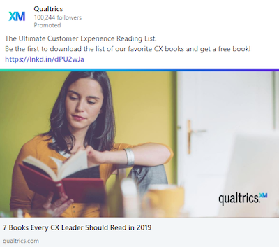
Clicking the ad takes people to this page where they can dive deeper into the story before downloading the CX reading list:
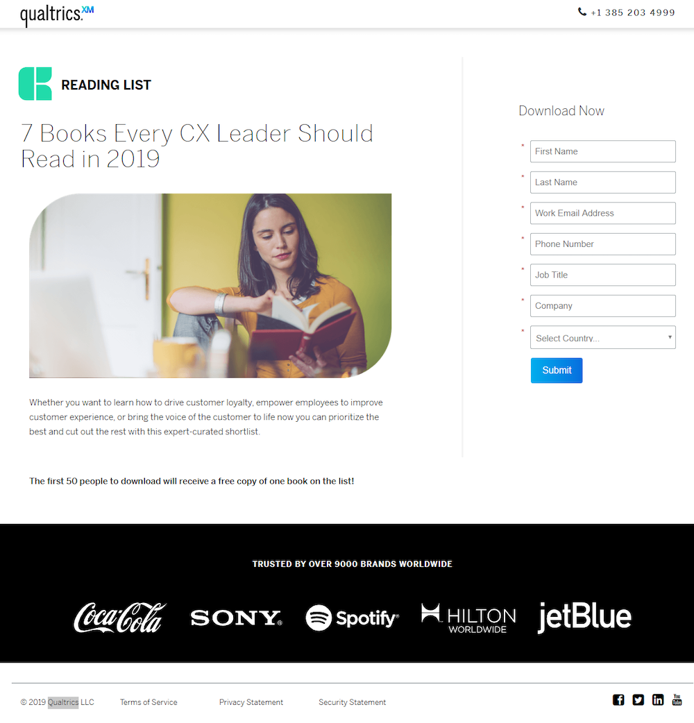
The page displays incredible message match to the ad and tells a specific story:
- What the offer is — Both the ad and post-click page offer a book list download. The headlines are identical — explaining further that the list includes 7 books all CX leaders should read.
- Why people should care — Minimal copy explains the reasons for downloading the list and reading CX books: driving customer loyalty, empowering employees to improve customer experience, etc.
There’s even an incentive for downloading the list (the first 50 people receive a free copy of one book on the list) which adds urgency to redeeming this offer.
- Who else trusts Qualtrics — Sony, Spotify, and JetBlue are among 9,000 brands worldwide that trust Qualtrics.
- How to take action — With a much shorter page compared to previous examples, there is only one CTA button underneath the form. This is also the only way visitors can download the list.
Example 4: Retargeting display ad
I was also retargeted by these two display ads on Forbes.com:
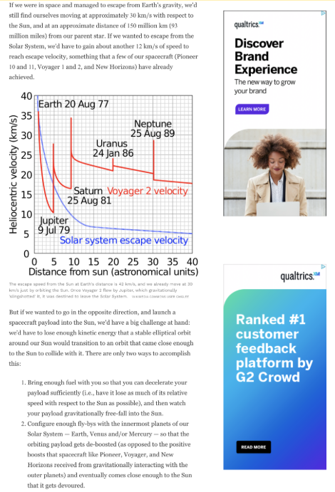
Clicking the bottom ad goes to this page:
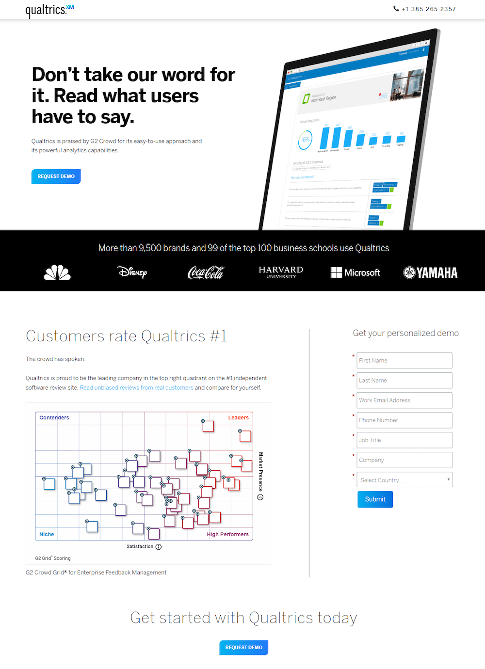
It tells a slightly different story this time:
- What’s being offered — This serves as a last effort in the decision stage of the advertising funnel to convince people to choose Qualtrics over the competition.
- Who uses Qualtrics — This page includes the same company logos as before and emphasizes again that over 9,500 brands and top business schools use Qualtrics.
- Why choose Qualtrics? — The answer to this is the main story of the page: Qualtrics is the leading company on G2 Crowd, the #1 independent software review site.
- How prospects can request a demo — There are three opportunities to request the demo: the lead capture form and the two CTA buttons that both lead back to the form.
Compared to non-segmented ads and the homepage
Compare all of the personalized experiences above with what a search user sees if they search for Qualtrics by name. They may still see a paid ad:
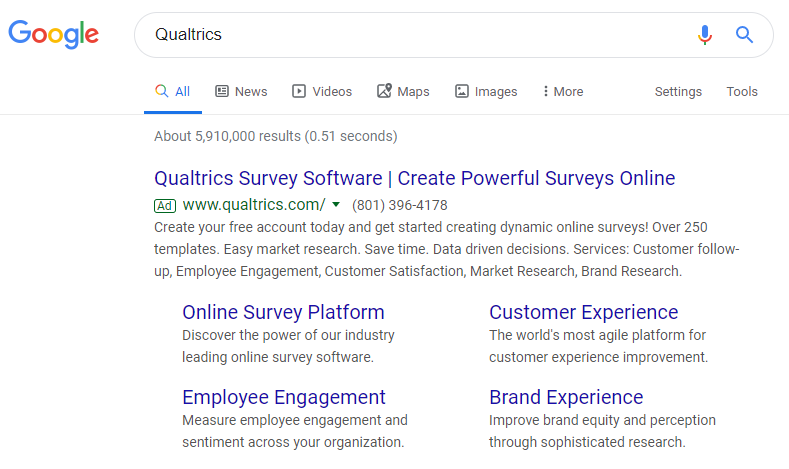
However, clicking the ad takes people to the Qualtrics homepage instead of delivering a specific, personalized post-click landing page:

The homepage provides an overview of what Qualtrics offers so that users can explore a solution to any problem themselves.
- A full header navigation with dropdown menus allows visitors to visit other pages instead of increasing the chances of converting on this page.
- The login link allows users to access their account.
- The headline highlights all of Qualtrics’ services rather than focusing on any particular one.
- The “Four core experiences” section summarizes everything Qualtrics can do, rather than separating each core area among different pages like the post-click examples demonstrate.
- Multiple links and CTA buttons to other website pages throughout the content demonstrate a browsing experience.
- The full-sized footer (below the fold) provides individual links for popular use cases.
Since this page is generalized to anyone interested in Qualtrics for various reasons, all visitors see the same page. Like many homepages, it’s designed to be a browsing experience and doesn’t persuade visitors to convert on any specific offer.
Increase conversions by connecting ads with segmented post-click landing pages
To avoid wasting ad clicks and advertising budget, you must pay as much attention to post-click landing pages as you do your ads. A homepage is not personalized for specific audiences, while a dedicated post-click landing page is a natural extension of the ad.
Use the Qualtrics examples above for inspiration and get an Instapage Personalization Demo to see how you can provide dedicated post-click pages for each target audience.

See the Instapage Enterprise Plan in Action.
Demo includes AdMap™, Personalization, AMP,
Global Blocks, heatmaps & more.
