- What is a product landing page?
- Product pages vs product landing pages
- Why are both page types necessary?
- The product page
- The product landing page
- Product landing pages deliver conversions
- Different visitors require different experiences
- How to create an optimized product landing page
- Build trust
- Translate product features
- Media
- Reviews
- Conclusion
Post-click landing pages are versatile. They can be used across industries, teams, and services to convert people on a particular offer.
But their usefulness doesn’t end there. While it’s rarely considered, products need their own landing pages too.
Known as product landing pages, these are the choice of companies that rely on paid advertising. And if you have a product, and you’re advertising without a post-click landing page, you’re leaving revenue on the table.
What is a product landing page?
A product landing page is a post-click page created specifically to convince a visitor to convert on a product-related offer. Design-wise, it’s similar a traditional landing page. It features conversion-centric elements, like a magnetic headline, benefit-oriented copy, hero images, social proof and more, to compel visitors to click the CTA button. The only thing that makes it different from other landing pages is that it is used specifically by companies that sell products.
How are product pages different from product landing pages?
Like product landing pages, product detail pages feature images and details about a product, complete with a call-to-action button. However, they are not designed specifically for conversion.
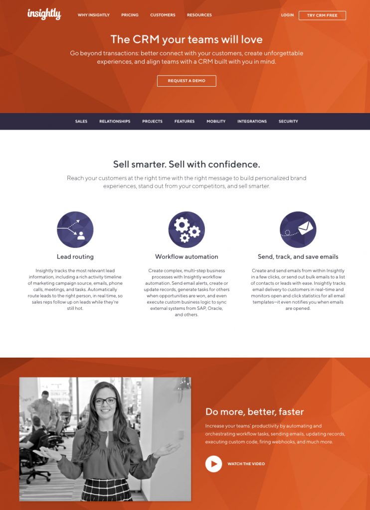
Example: Insightly CRM product page

It’s clear the goal of this page is to compel visitors to click the call-to-action button “request demo.” It features benefit-oriented copy, a hero shot, an explainer video, etc.
Unlike a true product landing page, though, this page contains a mass of distractions. There are many links the visitor can click to abandon the page: a full navigation menu, links to other products, a footer, social media icons, etc. Each of these links is a potential page exit that competes with the primary call-to-action.
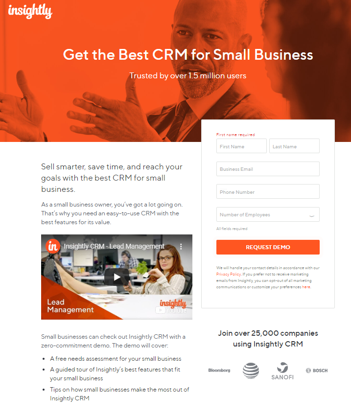
Example: Insightly CRM product landing page

Notice how it has no navigation in the header or links in the content. The only way off the page is through the call-to-action button. The only goal is to convert the visitor on this one product.
Without numerous distractions, this page keeps its visitors focused on evaluating the CRM product. They can’t leave the page to another product page, or the homepage, or about page, or any other page unless it’s through the call-to-action button.
One link off the page, one conversion goal. This is known as maintaining a conversion ratio of 1:1, which is ideal for converting visitors. When it’s out of balance — meaning there are numerous places to click, or several different goals — you get a page like a product page, which isn’t ideal for conversion.
Why both product pages and product landing pages are necessary
Just because they’re designed differently doesn’t mean one of these pages is better than the other. Comparing the two is a little like comparing a blog post to a pricing page. They’re meant for two different purposes, and both are crucial in different areas of your marketing.
The product page
Even if they specialize in one particular product, many companies sell more than one: add-ons, upgrades, alternatives, etc. And the way those products are accessed depends on the customer.
Let’s consider the user experience of a first-time visitor to the Synthesio website:

Synthesio provides brands and agencies with social media intelligence products. Through a recommendation from a contact, imagine this prospect has navigated here to evaluate those products.
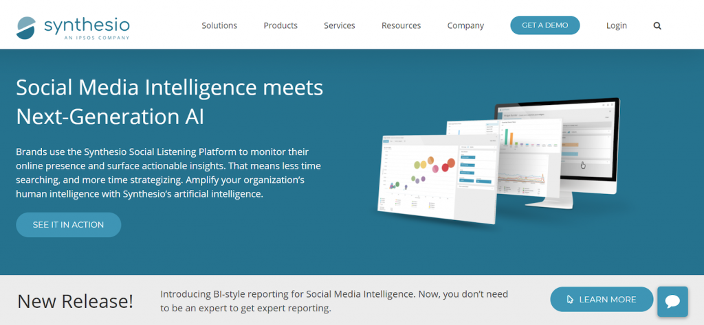
After skimming the homepage, they hover over “Products” in the navigation and select “Social Listening for Real-Time Conversations,” which lands them on this page:

They scroll down to assess the features of the product and its benefits, then make a decision about scheduling a demo.
Since this visitor isn’t sure of what they need, it’s less likely they schedule a demo, and more likely, they abandon the page to view other products, eventually leaving the website without taking action.
There was no conversion, which isn’t ideal. Still, it’s better than what would happen if you used a product landing page in place of a product page here: Not only would you likely lose out on the conversion, but you’d frustrate the user to the point of leaving your website, and likely ruin your chances of drawing them back.
This user is browsing. If they click through from a product category page to a product landing page, they’ll have no navigation menu through which to return to the category page, they’ll have limited information, no “related products” that might help them in their search, etc.
Overall, it would be a poor design that impairs the browsing experience of the user. That’s why, in this scenario, the product page is more appropriate.
The product landing page
On the other hand, let’s imagine this user hasn’t arrived at the website via a recommendation. Instead, they’ve typed “social media listening tool” into Google. They click through when they see this ad:

Instead of being directed to the products page, or specifically the social media listening product page, they’re directed to this dedicated post-click landing page:

Right away, you’ll notice a few key differences between this page and the original product page:
- There’s no navigation or footer. This keeps the visitor focused on evaluating the offer in front of them.
- The headline matches the message of the ad, and also communicates a benefit: Make smarter business decisions.
- Copy is minimal. There’s much more of an emphasis on brevity. Here, the creators of the page want to highlight the benefits of the product, knowing that long-winded copy could be enough to repel the visitor. Easily skimmable bullets communicate the capabilities of the software.
- A single call-to-action ensures that the visitor must make a decision about the offer to leave the page. Either abandon this product landing page or click through.
- A lead capture form solicits key information for sales to follow up with leads.
- Recognizable logos at the bottom of the page serve as authority boosters. If big brands like Mastercard, Toyota, Intuit, and Subway trust Synthesio, then you should feel confident trusting them, too.
Instead of browsing, the prospect in this scenario is expressing higher intent. They know what they’re looking for: specifically, a social media listening tool.
Word for word, they’ve typed “social media listening tool” into the search bar, and with an ad that reads: “Social Media Listening Tool | Synthesio Official Website,” Synthesio has attempted to provide the solution to their search.
Why a product landing page is best for conversions
In this case, a product landing page is more appropriate than a product page because:
- The visitor is searching intently for a specific product.
- It keeps the visitor focused on the offer with a 1:1 conversion ratio.
- It matches the message of the referring advertisement. Every ad needs a dedicated post-click page to fulfill the promise of the ad, and to let visitors know they’re in the right place.
- It maintains personalization through the second half of the campaign. The first half of the campaign is called the pre-click experience. Whatever targeting you use on the ad in the pre-click experience, you must use on your product landing page in the post-click landing page. If you don’t, you’re delivering an inconsistent user experience. Post-click automation allows advertisers to create product landing pages as efficiently as they create ads.
- It highlights the benefits of the software, quickly.
- It boosts trust with authority signals, like the logos of popular users.
Different visitors require different experiences
In the end, deciding when to use a product landing page is fairly simple. Ask yourself these questions:
- Is my referrer paid or organic? Post-click landing pages are assets specifically for maximizing ad revenue. When you’re running a targeted, personalized ad campaign, only a targeted, personalized landing page can provide the experience needed to convert the visitor.
- Is the purpose of my page strictly conversion? Overall, product pages inform browsing users while providing a call-to-action on the off-chance they want to convert. Post-click landing pages, on the other hand, make conversion the primary goal.
- Where is my visitor in the buyer’s journey? Top or lower? In the example we used before, the first-time visitor to Synthesio’s website is likely at the top of the funnel. They’re not yet ready to evaluate specific products. On the other hand, the visitor that comes through a search ad is evaluating products already. In this case, they’re likely ready to schedule demos for social media tools because they have an urgent need for a solution.
As with any marketing medium or tool, what you use will depend on the situation. For visitors browsing your website, a product page is more appropriate. For high-intent visitors referred by an advertisement, a post-click landing page is the most effective solution.
4 Tips for creating an effective product landing page
All post-click landing pages should be built with certain fundamental elements known to convert visitors. On top of those, product landing pages need something extra. Here are some tips for yours:
1. Build trust and anticipation
The headline on a product landing page isn’t like the headline on other pages. Since you only arrive on a product landing page by clicking through an advertisement, this headline has to first match the message of its referring advertisement.
Notice that, in the Synthesio example above, the words “Social Media Listening” are in the headline. Since these match the exact words of the ad headline, which match the user’s query, this lets visitors know they’ve been directed to the right place.
However, it’s also important to note this headline conveys the benefit of the offer. On your product landing page, you want to remind people of the ad they came from, but also why they came. In Synthesio’s case, prospects have come to evaluate a social media listening tool.
But why should they read the copy or register for a demo?

Because they’ll be able to make smarter business decisions with the help of the product. Adding “Powered by Ipsos” to the headline adds authority by affiliating Synthesio with a recognizable, trusted brand.
2. Translate your product features
When it comes to advertising products, it’s tempting to tout all its new and powerful features. In most cases, this would be a mistake.
Since you’re likely advertising to a non-technical crowd, the features of your product aren’t going to mean much to decision-makers. For example, SugarCRM is a customer relationship management platform. Instead of talking about a specific kind of automation it runs on, it uses phrases like: “Boost sales productivity with automation.”

This helps visitors by putting particular features in context. It’s not just automation; it’s a tool to “boost sales productivity.” Without translations like these, the purpose of technical features are lost, and with them, the reason for claiming the product.
3. Shows visitors all they need to see
On your product landing page, the right media can make all the difference. Some products will benefit from a hero shot. Other, more complicated products, might be better presented with an explainer video.
How do you figure it out? Use A/B and multivariate testing to try different approaches. And don’t count out the collection of qualitative data. In this case study, video creators started by talking to their customers, whose biggest concern was: “How will this clothing look on me in a fitness class?”
From that question they created a new video that showed a woman actually working out in the clothing:

The results speak for themselves: Among search traffic, their revenue per visit increased between 25 and 100% depending on the segment.
4. Reviews that prove your product will meet expectations set by your marketing
When prospective customers reach a product landing page, they expect to be overpromised. They expect you to tell them your product is the best. It’s the most affordable, fastest, most convenient, etc. That’s why social proof is so powerful.
Social proof indicators, like reviews or testimonials, give a different perspective. They take self-interest out of the equation. The people who vouch for your product have no stake in your success. So, when someone can be quoted on your product landing page describing your product as “priceless,” it’s a much more powerful effect than if you do it yourself.

Quick Base not only does that, but they also attribute the quote to a full name, along with the company they’re from. The full name adds credibility to the review, since “Rob Donahue” is someone we can all look up to make sure he’s real. Putting his place of employment, TomTom Inc., adds authority to the quote because it’s a recognizable company.
Start building personalized product landing pages for every segment
No matter the product, if you’re going to advertise it, it needs its own personalized product landing page to match. Without one, you deliver an inconsistent user experience. And if you only personalize half your campaign, it’s unlikely your visitors convert, which means you leave revenue unclaimed.
Post-click automation (PCA) is the only way to create a product landing page for every advertisement. Map your ads, scale your post-click pages, personalize and improve them with PCA from Instapage. Find out how by scheduling a demo.

See the Instapage Enterprise Plan in Action.
Demo includes AdMap™, Personalization, AMP,
Global Blocks, heatmaps & more.
