With Presidential campaigns in full swing, candidates are doing everything they can to make a great impression with voters, gain trust, and earn votes. Not only are they doing this through the TV commercials we see daily, but with online ads, too.
For those ads to be successful, they must be segmented to specific audiences and connected to personalized post-click landing pages. When the same narrative is delivered from ad to page, user expectations are met and candidates establish credibility with voters. Enter Democratic candidate Pete Buttigieg.
How Pete Buttigieg uses segmented ads & post-click landing pages
Example 1: Branded Google search ad
It’s evident the Pete Buttigieg campaign bids on his name because this ad appears with a Google search:
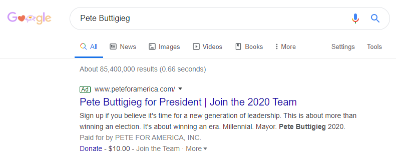
We can tell the ad is relevant to the search because:
- The headline includes the exact search phrase
- “Pete Buttigieg” is bold in the description copy
- “Pete” is included in the display URL
Clicking the main headline goes to this signup page where the narrative continues:
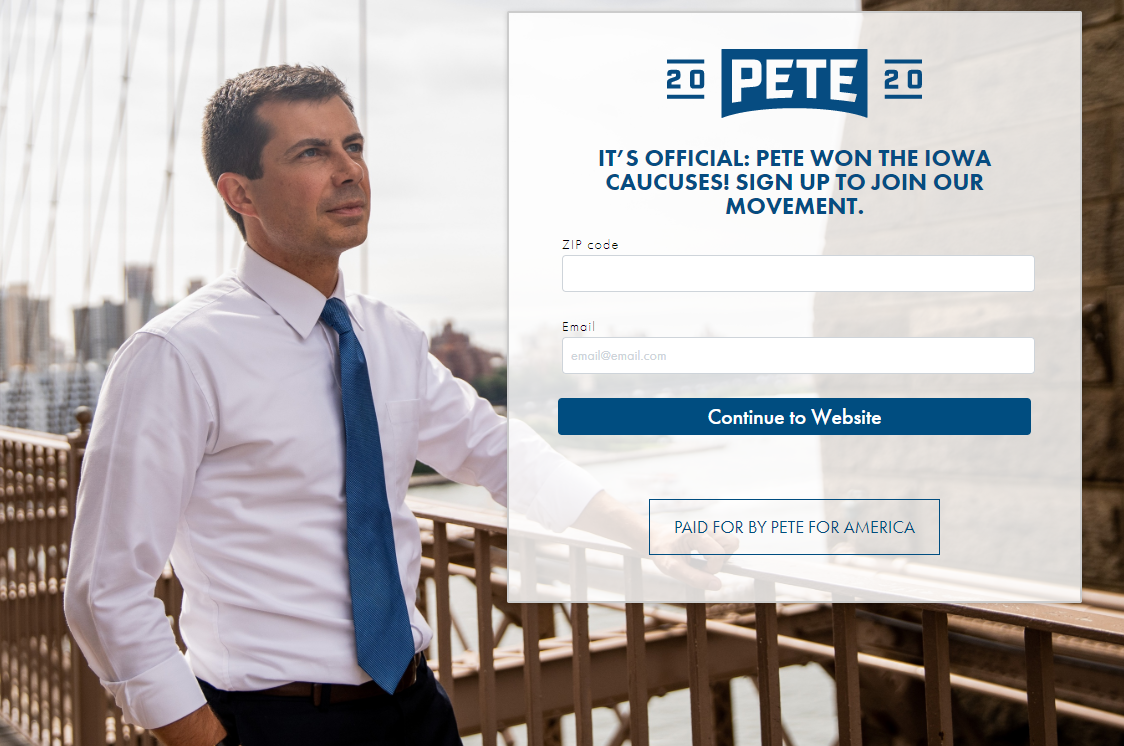
- What is the offer? The page continues the ad’s message, encouraging prospects to sign up to join Buttigieg’s 2020 team. Many words and phrases are repeated including, “Pete,” “2020,” “Sign up,” “Join,” and “Paid for by Pete for America.”
- Why take action? Through part of the headline: “Pete won the Iowa caucuses.” Buttigieg’s eye gaze helps draw attention to the form and joining his email list.
- Who supports this offer? As indicated by the encapsulated copy toward the bottom of the page, the ad is supported and paid for by Pete for America.
- How visitors can take action: Visitors can sign up by completing the 2-field form and clicking the blue “Continue to Website” button.
Example 2: “Donate” extension
When prospects click the “Donate” link in the ad from Example 1, they’re directed to this post-click landing page:
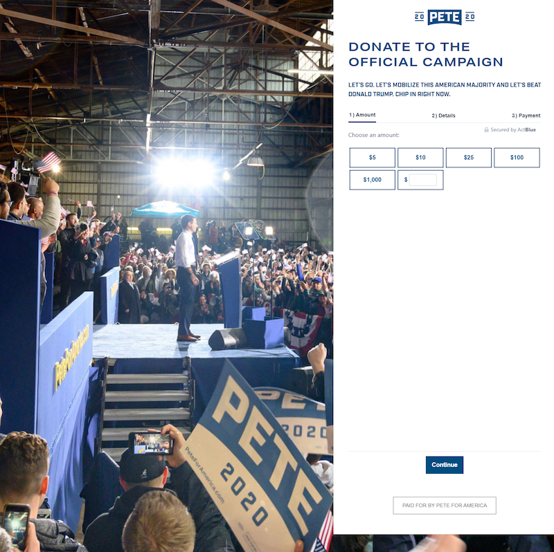
- What is the offer? The donation narrative continues from ad to post-click page, which visitors can tell from the page headline.
- Why take action? Beneath the headline, copy encourages visitors to donate because it’s the only way to mobilize the American majority and defeat Trump.
- Who supports this offer? The Secured by ActBlue stamp lets prospects know they can submit their personal information and donate to the Buttigieg campaign, without their privacy or information being compromised.
- How visitors can take action: Visitors can complete the multi-step form to submit their donation.
Example 3: Facebook retargeting ad
In addition to paid search ads, Buttigieg targets Facebook ads to relevant users:

Clicking this ad takes prospects to another relevant post-click page:
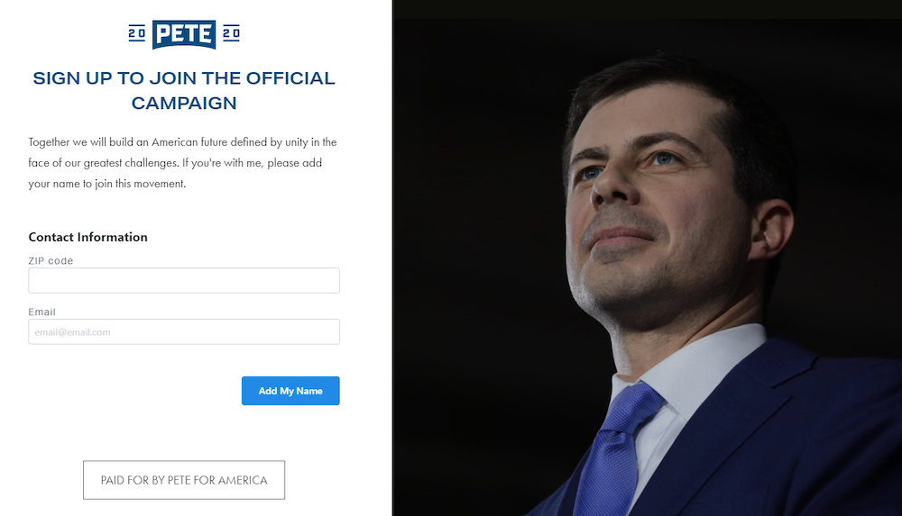
- What is the offer? — The headline reiterates the ad’s message to “add your name” to his campaign.
- Why take action? To “build an American future defined by unity in the face of our greatest challenges”) is highlighted under the headline.
- Who supports this offer? “Paid for by Pete for America” box lets visitors know this page and offer is legitimate.
- How visitors can take action: By inviting visitors to join the official campaign, by entering their zip code and email, and clicking the blue “Add my name” CTA button.
Example 4: Instagram ad
Instagram ads like the one below are also part of Buttigiegs’s advertising campaign:
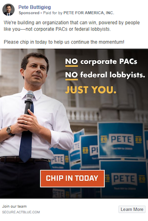
The ad begins a narrative about building an organization powered by regular people (not corporate PACs or federal lobbyists). Once clicked, prospects see this donation page where the story continues:
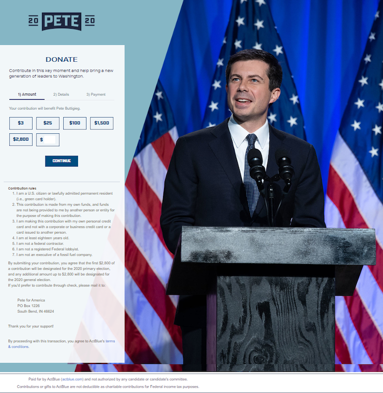
- What is the offer? The page offers prospects a chance to donate any amount they choose to the Buttigieg campaign.
- Why take action? The small copy at the top of the box tells visitors why they should donate: to contribute in a key moment and help bring a new generation of leadership to Washington.
- Who can donate? The list of seven contribution rules indicates who can make a donation (U.S. citizens/permanent residents, adults 18+ years, non-federal lobbyists, etc.).
- How visitors can take action: Visitors can make a donation by completing the three-step form.
Compared to the Pete Buttigieg homepage experience
In contrast to the personalized post-click landing pages above — each with a 1:1 conversion ratio — Pete Buttigieg’s homepage isn’t nearly as focused. It offers a full browsing experience and comprehensive overview of everything he stands for:
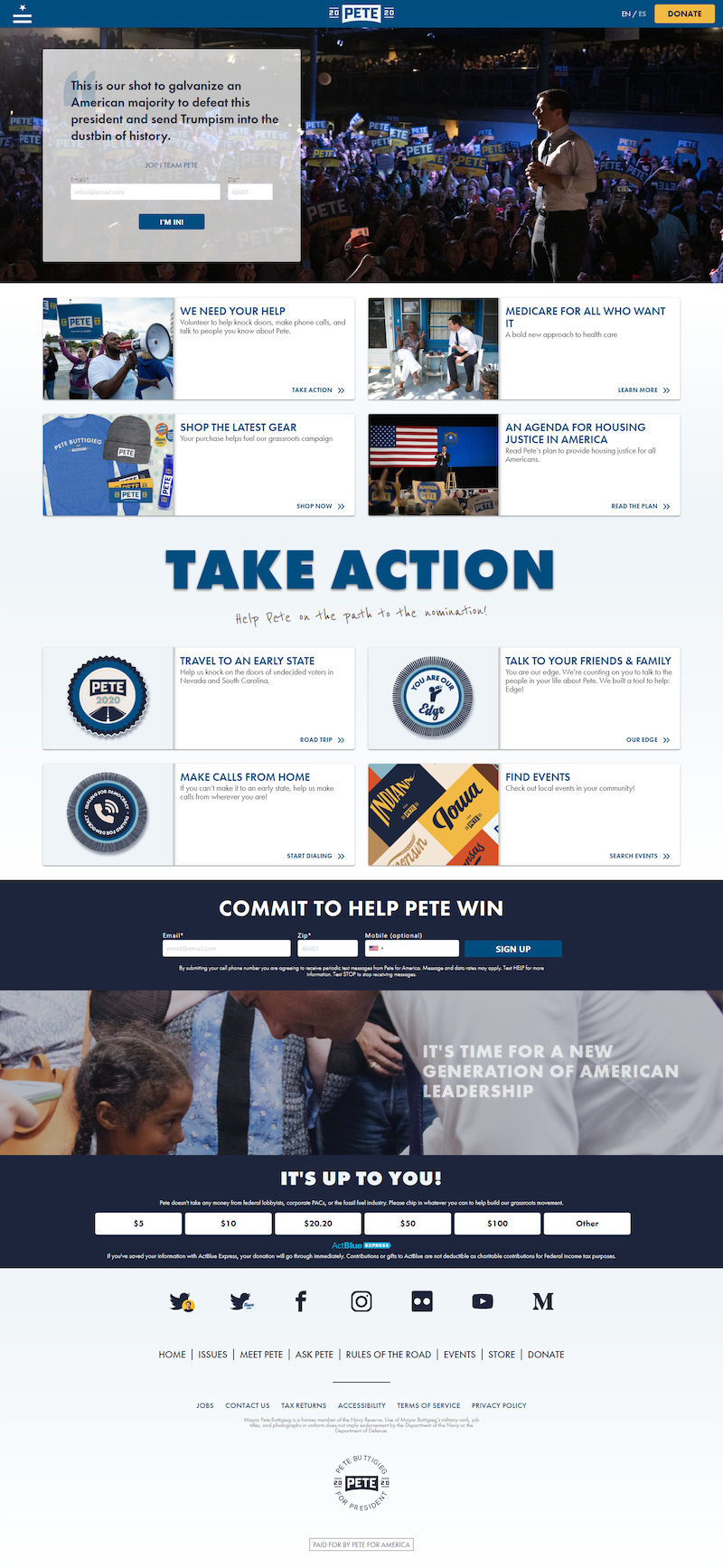
- A menu button in the top-left reveals a detailed menu allowing visitors to navigate to other pages instead of converting on this page.
- No headline above the fold might mean visitors feel lost on the page before scrolling mid-page and seeing “Take Action.”
- Competing CTA buttons above the fold (“Donate” and “I’m in!”) could confuse visitors and deter them from clicking either one.
- Additional links throughout the page are likely to overwhelm visitors and decrease conversions on this page.
- Social media links enable visitors to bounce from the page without any conversion.
- A large footer menu provides one more chance for prospects to leave without converting.
Continue the narrative from ad to post-click landing page
By focusing all your attention on ads and ignoring the post-click landing page, you’re wasting ad clicks and budget. This is especially true in politics where you’re vying for people’s trust, loyalty, and votes.
Use Pete Buttigieg’s examples above as inspiration to ensure you don’t miss your opportunity to influence people and encourage action. Start telling the same story narrative across your pre- and post-click landing pages, and then request an Instapage Enterprise Demo to see how you can create dedicated post-click landing pages at scale for each audience.

See the Instapage Enterprise Plan in Action.
Demo includes AdMap™, Personalization, AMP,
Global Blocks, heatmaps & more.
