Could you imagine using IBM’s predictive analysis to fill out your NCAA tournament bracket ten years ago? The IBM Watson platform has been developed into a tool that users can apply in their daily lives. IBM is one of the largest corporations in the world, but they are still innovating and finding new ways to impact the people and companies who use their products.
IBM’s investment in developing new technology has played a huge role in their success. However, technological advances alone can’t explain the corporation’s growth. IBM employs a savvy digital marketing team that leverages post-click landing pages as a major part of their strategy to generate leads.
post-click landing pages are standalone pages that are designed for one purpose: conversion. post-click landing pages use persuasive elements such as compelling headlines, visual cues, and social proof to convince a prospect to take action. IBM’s post-click landing pages ask prospects to take action on offers such as e-books, free trials, newsletters, and white papers.
Here are a few ways the IBM marketing team optimizes post-click landing pages for conversion and maximizes lead generation.
9 IBM post-click landing page examples
1. To promote their cyber security paper
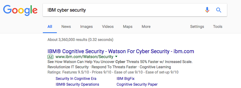
A quick Google search for “IBM cyber security” will display IBM ads with links to the company’s Watson technology and post-click landing page offers. The “Security In Cognitive Era” link takes visitors to the post-click landing page below:

What the page does well:
- Message match between the IBM ad and the post-click landing page. Both use “security in the cognitive era” in their title.
- Minimal copy allows visitors to quickly assess whether or not the paper is worth their time.
- The privacy statement link directly above the CTA can give peace of mind to prospects concerned about their data.
What the page could change or A/B test:
- The header logo is linked, giving visitors an easy opportunity to leave the page without considering the offer.
- The hamburger menu and the search function in the header are distractions from the post-click landing page offer. The header links should be removed to limit exit points and keep attention on the paper.
- The “No thanks” link directly below the copy gives visitors a way off the page just as they are learning more about the offer.
- The lack of social proof means that this offer won’t emotionally connect with prospects. Adding a testimonial on the cybersecurity paper could improve conversions.
- The lack of images means that prospects aren’t sure of what the paper they are being asked to download looks like. Adding a preview would allow prospects to get a glimpse of what the paper looks like, should they choose to download it.
- White space directly below the copy makes the page feel unbalanced. This space could be filled with a testimonial or an image of the paper’s cover.
- Lack of copy doesn’t allow readers to know what exactly they’re downloading. Adding bullet points or a short descriptive paragraph could lead to more conversions.
- The CTA color is repeated on the page, which makes it more difficult to stand out. Changing to a color such as red or green could increase conversions.
- The footer links are another opportunity for prospects to leave the page without converting.
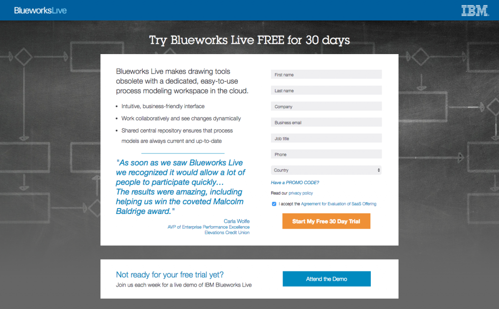
2. To encourage viewers to sign up for a Blueworks Live trial
What the page does well:
- No header navigation helps to keep prospects on the post-click landing page and focused on the offer.
- The word “FREE” in the headline catches the eye of prospects and lets them know that they won’t have to pay anything for the offer.
- The bulleted copy allows visitors to quickly determine whether the offer is worth their time.
- The testimonial quote below the bulleted copy is strong, but it could be even more effective with a headshot.
- The privacy policy link above the CTA gives peace of mind to prospects worried about their data.
- The CTA color is distinct and isn’t repeated anywhere else on the page. This helps to make it stand out and catch the eye of visitors.
What the page could change or A/B test:
- The Blueworks Live logo is linked, which gives visitors a chance to leave the page without converting on the offer.
- There is no image on this post-click landing page. An image of Blueworks Live being used on a computer or a headshot for the testimonial on this page could both help optimize the post-click landing page.
- Trust seals could inspire more confidence in this page and the security of Blueworks Live, but none are used here.
- The “Not ready for your free trial yet” section below the fold links to another offer. This takes the focus off of the free trial and likely reduces conversions. Removing this second CTA could help to optimize conversions on this post-click landing page.
3. To increase sign ups for their newsletter
What the page does well:
- The headline lets visitors know exactly what this post-click landing page was designed for as soon as they arrive.
- The bulleted copy lets prospects quickly learn what the key takeaways are in the newsletter.
- The image of the newsletter shows prospects what they can expect to see should they convert.
- The 5-field form is short enough that it won’t scare off prospects who are weary of submitting lots of personal information.
- The privacy policy in the page footer gives prospects confidence that IBM won’t misuse their data.
What the page could change or A/B test:
- The linked logos in the header give visitors a chance to leave the page without reading the offer.
- A misuse of white space leaves the page above the fold looking a bit off. Because the copy above the fold is centered, the white space on either side feels like wasted space. IBM could move the copy to the left side while adding another element, such as a testimonial, to the right.
- The CTA button color is repeated on the page, so it doesn’t stand out. Changing it to a color like orange could have a positive effect on conversions. A quick look at the color wheel can help choose an appropriate contrasting color.
- The “Submit” CTA copy is very uninspiring. “Receive your IBM newsletter today,” could produce better results.
- Social media links in the footer give visitors an opportunity to leave the page without converting on the offer.
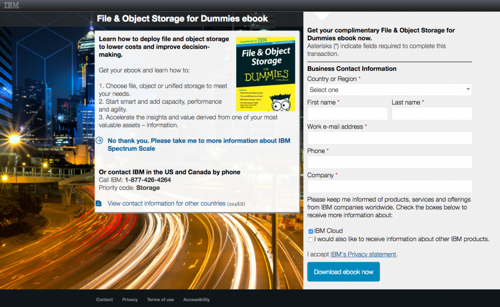
4. To offer their file & object storage ebook
What the page does well:
- The headline and subheading give visitors a clear idea of what they can expect in the ebook.
- The ebook cover image gives prospects a visual, so they know exactly what they’ll be downloading if they convert.
- The 6-field form is short enough not to create friction that prevents conversions.
- The privacy statement above the CTA allows visitors to access the full statement so they can learn how their information will be shared, if at all.
What the page could change or A/B test:
- Hovering over the header logo brings up the full navigation menu. This navigation menu should be removed to keep visitors focused on this post-click landing page’s offer.
- The “No thank you,” link below the copy gives visitors another chance to leave the page without fully considering the offer.
- The background image is busy, doesn’t add anything to the page, and distracts from the offer.
- This post-click landing page lacks social proof, a testimonial or a video from someone who has found the ebook insightful could help increase conversions.
- The CTA color can be changed because there are a number of different hues of blue already on the page.
- The links in the footer give visitors another opportunity to leave this page without converting on the offer.
5. To increase sign ups for their webcast

What the page does well:
- No menu navigation keeps visitors on the page and focused on the offer.
- The copy in the abstract is descriptive and gives visitors a clear picture of what the 60-minute webcast is about.
- The webcast presenters are accompanied by headshots, titles, and company names. This helps to establish them as authority figures on the subject of storage infrastructure.
- The encapsulated form naturally draws in the prospect’s gaze.
What the page could change or A/B test:
- The 12-field form is overwhelming and likely increases friction, ultimately reducing the number of conversions.
- The social media links give visitors a chance to leave without converting on the offer. The page should be completely focused on the webcast, not promoting their social channels.
- The privacy statement text is not linked, which means that prospects interested in how IBM uses their data will not be able to get any information before making their conversion decision.
- The CTA color is repeated several times and doesn’t “pop” off the page. It could be changed to red or yellow to stand out more.
- The “Submit” CTA copy is boring and doesn’t inspire action. Changing it to something more personable such as “Register Me for the Webcast” would likely inspire more action.
- Links in the footer allow visitors to leave the page without converting.
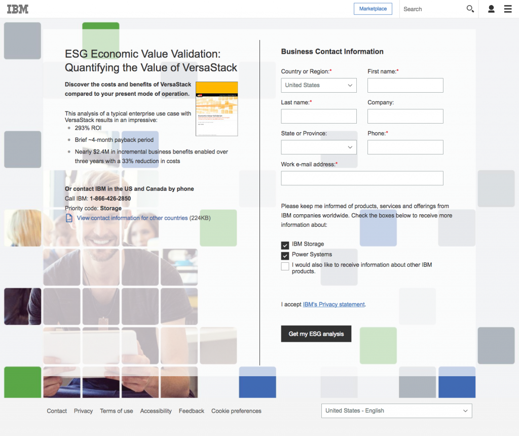
6. To generate interest in their ESG analysis book
What the page does well:
- The headline and the sub headline describe the post-click landing page offer.
- The image of the ebook cover lets visitors know precisely what they’ll be receiving if they convert on this offer.
- The privacy statement link gives peace of mind to prospects worried about how their personal data will be used.
- The CTA copy is personable. “Get my ESG analysis” is much more persuasive than “Submit.”
What the page could change or A/B test:
- The IBM logo in the header is linked, and the hamburger menu also opens up navigation links. The links should be removed from the header to keep visitors focused on the offer.
- The image of the ebook cover could be larger and centered to stand out more on the page.
- This page lacks social proof The copy talks about VersaStack’s ROI, and a testimonial verifying how the ebook impacted a company financially could be highly effective here.
- The image of the man in the background could have him look towards the CTA, as a visual cue. Additionally, it’s a very busy image which could be distracting.
- The links in the footer should be removed, as they give visitors another opportunity to leave the post-click landing page without converting.
7. To promote their SAP HANA migration webcast
What the page does well:
- No menu navigation in the header means that visitors are more likely to remain on the page and consider the offer.
- The copy describes what prospects can expect from the webcast, without forcing them to read through blocks of text.
- The encapsulated form draws in the eyes of the prospect, increasing the likelihood of conversions.
- The speakers have their name, title, and a headshot listed, which gives them better credibility with prospects.
What the page could change or A/B test:
- The privacy statement is not linked, which means visitors worried about their data won’t get a chance to read about IBM’s policy before deciding on conversion.
- The social media links give visitors an opportunity to leave the page without converting.
- The CTA color doesn’t stand out because it is repeated several times on the page. Designing the button in yellow would help draw more eyes to the CTA.
- The CTA copy isn’t compelling. “Submit,” could be replaced with “Become a migration expert today” or something more inspiring.
8. To encourage downloads of their content management ebook
What the page does well:
- The image of the whitepaper gives visitors an idea of what to expect if they convert and download the paper. However, the paper could be a bit larger.
- The bulleted copy lets visitors quickly determine whether or not the content management white paper is worth their time.
- The visual cue arrow at the top of the page helps to draws attention to the form they want prospects to input their information into.
- The privacy statement gives visitors the confidence to complete the form and provide personal information to IBM.
- The CTA copy is personable “Get my whitepaper” is much more compelling than “submit.”
What the page could change or A/B test:
- Hovering the mouse above the IBM logo in the header brings up a navigation menu. These header links should be removed to keep visitors on the page and focused on the offer.
- The “Not interested” link below the copy takes visitors away from the page before they can convert. Removing this link will likely increase conversions.
- Adding an image onto the tablet would fill out the background image further and incorporate branding.
- The CTA color is a similar shade of blue as other elements on the post-click landing page. Changing this color to red or green would help it stand out more.
- The footer links also give visitors an opportunity to leave the page and should be removed to maximize conversions.
9. To get visitors to register for an IBM Cloud webcast
What the page does well:
- No navigation menu in the header keeps visitors focused on the offer.
- The copy in the abstract quickly lets visitors know what they can expect by converting and watching the webcast.
- The speakers have their name, title, and a headshot all displayed. This helps to establish them as an authority figure on the IBM Cloud.
- The privacy statement link gives peace of mind to visitors worried about how their data will be used.
What the page could change or A/B test:
- Social media links give visitors a chance to leave the page without considering the offer.
- Adding an encapsulated form could help draw in the eyes of the prospect, increasing the likelihood of conversions.
- The CTA copy is bland. “Submit,” could be changed to “View your IBM cloud webcast,” or something similar.
- The Black CTA color is too common on this page. It is seen all over and doesn’t draw in the eyes of visitors. An orange or red CTA could be more effective at increasing conversions.
- The footer links allow visitors to leave the page without converting.
Design post-click landing pages to catch your prospects eyes
IBM uses persuasive elements to convince prospects to convert on their newsletter, whitepaper, free trial, and ebook offers. The IBM marketing team has proven to be skilled at optimizing post-click landing pages with the right elements to maximize conversions.
You can build post-click landing pages as persuasive (or even more so) with Instapage. Our designer-friendly platform is completely customizable so that you can choose the look that is right for your next campaign. Sign up for an Instapage Enterprise demo today.

See the Instapage Enterprise Plan in Action.
Demo includes AdMap™, Personalization, AMP,
Global Blocks, heatmaps & more.
