You likely know the stat well — nearly 96% of ad clicks don’t convert. A big reason this failure rate remains high is that advertisers don’t connect their ads to relevant post-click landing pages that continue the message and story from the ad. By continuing the same story in the pre- and post-click stages, you get what matters most: more conversions from those ad clicks.
Homebase — best known for their employee scheduling and time tracking software — is one company that understands this connection. They recognize the need for segmented ads and personalized, unique post-click landing pages to convert prospects into customers.
How Homebase uses segmented ads & relevant post-click landing pages
Example 1: Online employee timesheets
Someone at the top of the funnel looking for digital options for “employee timesheets” might see this Google PPC ad:
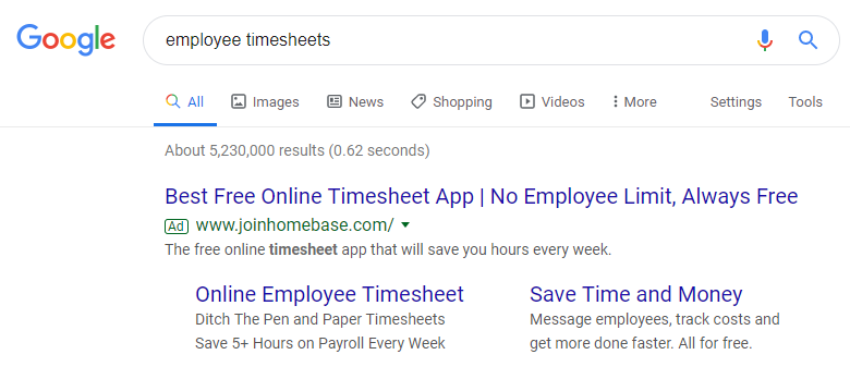
The ad is closely related to the search query, as the headline includes both ‘employee’ and ‘timesheet’, the description repeats ‘timesheet’, and the first ad extension contains the exact search phrase.
The headline, description copy, and ad extensions also do a great job of letting prospects know that the app is free and that it can benefit them by helping to save time.
Clicking the ad headline takes users to the next stage of the customer journey — the post-click landing page — which continues the relevancy:
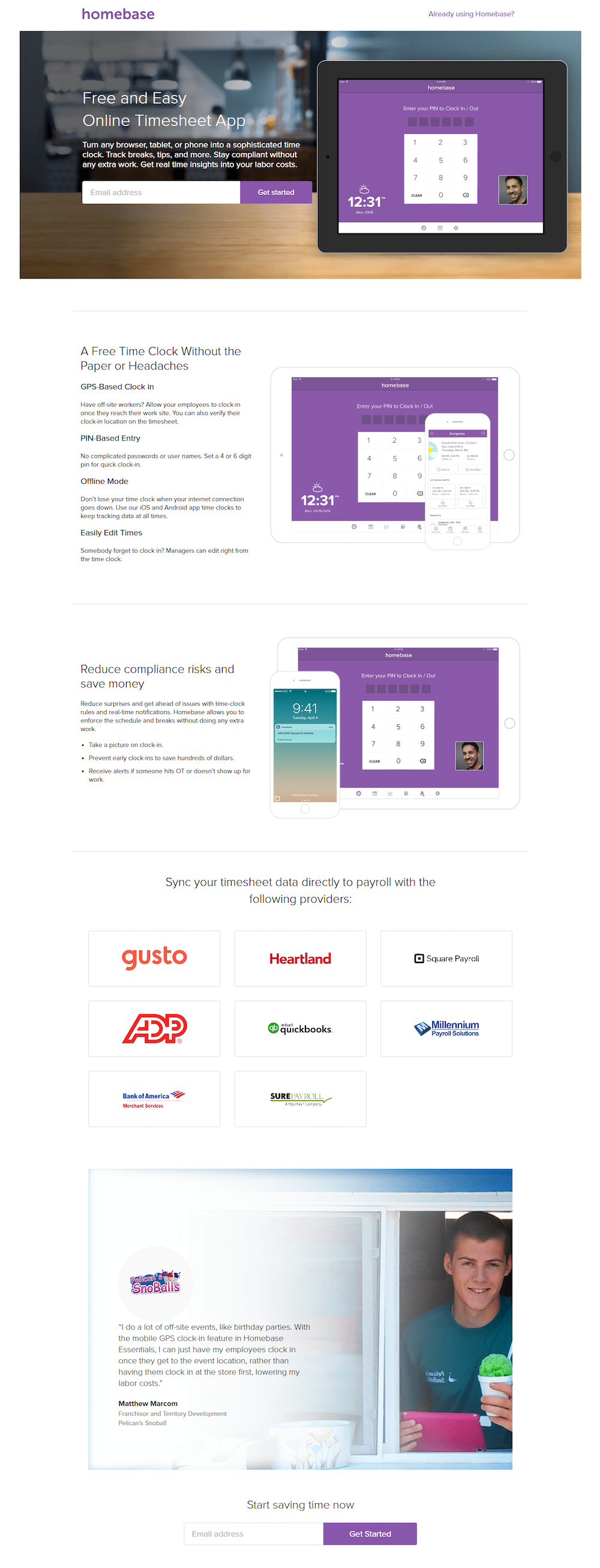
Immediately after landing here, it’s clear that it’s connected to the ad and tells the brand’s story as it relates to employee timesheets:
- What the offer is for — The headline reiterates the offer is for timesheets — exactly what the user was searching for, based on their search query and ad click. It also lets visitors know that the app is free and easy to use, which are two major benefits.
The subheadline further describes the offer by briefly telling people how the app works (“turn any browser, tablet, or phone into a sophisticated time clock”, “track breaks, tips, and more”) and how it can benefit them (“stay compliant without any extra work”, “get real-time insights into your labor costs”).
A product image also helps deliver the message by showing visitors a preview of what the timesheet app looks like on their tablet.
- Why Homebase is a great option — This part of the story is told by section headers and subheaders, minimal copy, and more product images to make the offer more engaging and easy to comprehend.
- Who else uses Homebase — The next section shows which providers sync with Homebase timesheet data for payroll purposes, like Square, QuickBooks, and Gusto. It also includes a customer testimonial from a Pelican’s Snoball Franchisor as social proof.
- How visitors can take action — Finally, prospects can start using the app by entering their email address and clicking either purple “Get started” CTA buttons.
Example 2: Employee scheduling
Once someone conducts a search, clicks the search ad, and visits the post-click page, Homebase begins retargeting prospects on different websites with banner ads like these two:
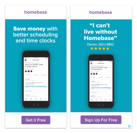
Both retargeting ads continue the story from the beginning of the journey, reminding people how Homebase can benefit them, and that other people can testify to that.
Clicking either ad (or the ‘Save Time and Money’ ad extension from the first example) directs prospects to this post-click landing page where they can learn more of Homebase’s features:
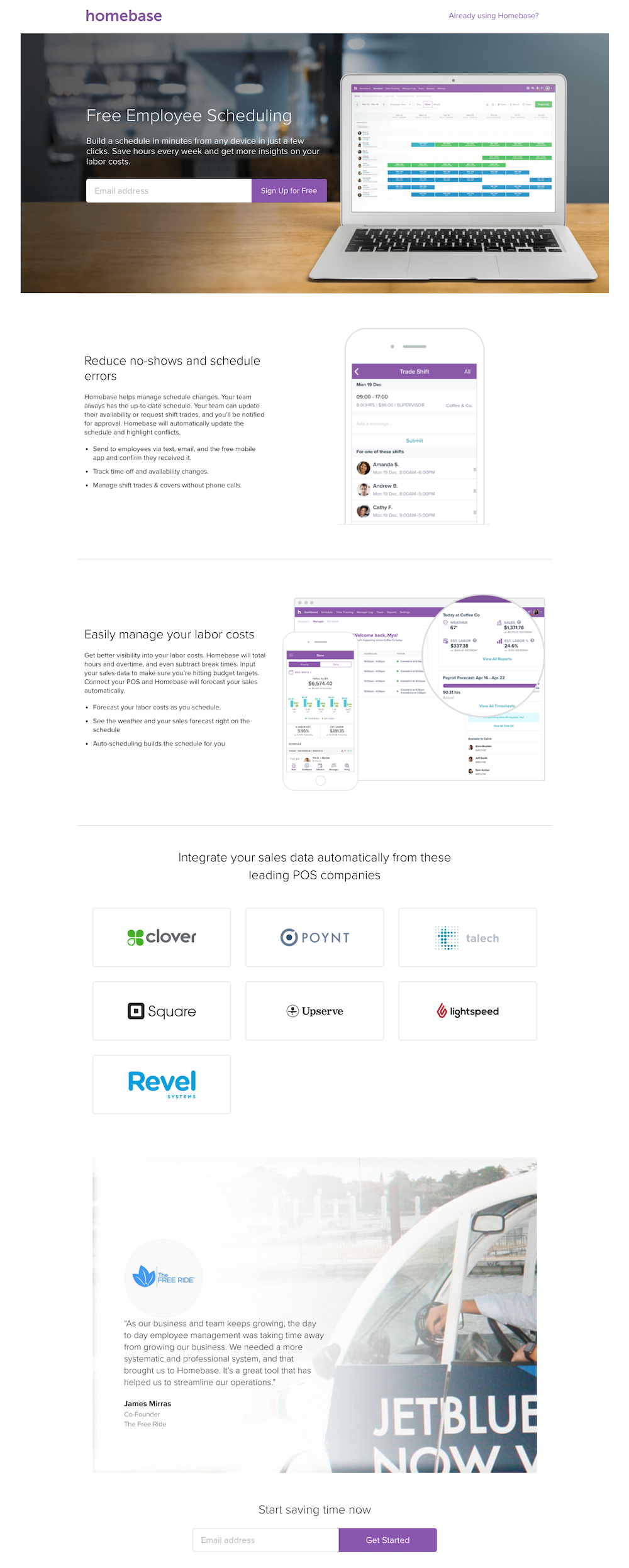
Similar to the previous post-click page, this one tells a detailed story to a specific buyer persona rather than explaining everything Homebase offers all at once:
- What the new offer is — The headline lets visitors know this offer is for free employee scheduling because it’s likely that the same people who were searching for employee timesheets are also interested in employee scheduling tools and features.
The subheadline here is similar to the previous one — again, telling prospects that they can use any device to manage employees’ schedules, save time, and get more insights into labor costs.
Another product image reinforces the message even more by demonstrating what the scheduling software looks like.
- Why companies should use Homebase scheduling — Section headers, bullet points, minimal copy, and software images are used to tell this part of the story in an engaging and comprehensible way.
- Who else uses Homebase — The story continues by showing which leading POS solutions users can automatically integrate their sales data with. It also includes a customer testimonial from the Co-Founder of The Free Ride to ensure prospects that other businesses have had success with Homebase scheduling.
- How visitors can get the scheduling software — Concluding the story is a one-field form and CTA button where prospects can submit their email address and sign up for Homebase free.
Example 3: Welcome back retargeting
Additional retargeting banner ads, like the one below, may appear after all of the previous engagement with the brand:
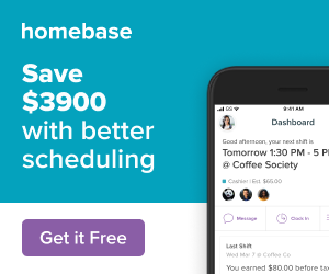
This ad still highlights the scheduling component like the previous example, but now points out that prospects could save $3,900.
Clicking this ad takes prospects to a “Welcome back” page because they’ve already engaged with the company multiple times:
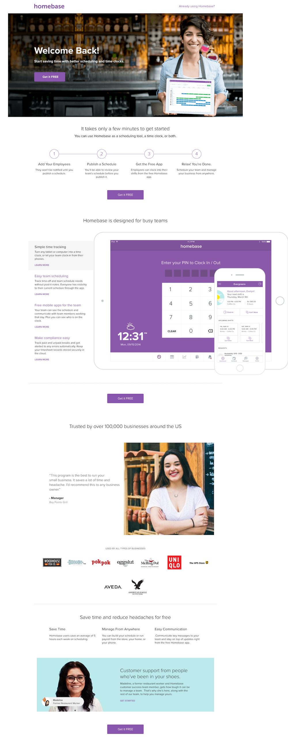
The story continues onto this page:
- What prospects are doing on the page — They’re back after engaging with Homebase previously, just like the headline says. The image of the woman holding the computer exaggerates the “Welcome back” message because it’s like she’s reminding prospects what they left behind — the opportunity to start saving time with better scheduling and time clocks (like the subheadline says).
- Why prospects should convert — This page is a combination of the first two examples, promoting both the scheduling tool and time clock. Unique to the other pages, this one shows a progression of how the software works directly under the first image.
- Who Homebase is for — The next part of the story conveys that Homebase is designed for any busy team looking to simplify their employee scheduling and time tracking. It also lets prospects know that over 100,000 other US businesses (some of which have logos on the page) have found success with Homebase. This, as well as the customer testimonial, serve as social proof.
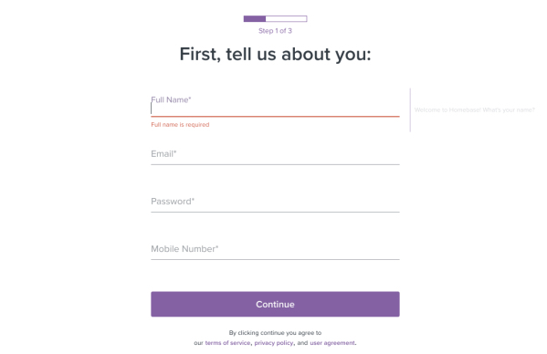
- How visitors can get started — Finally, the story completes with multiple opportunities for visitors to convert. By clicking any of the purple “Get it FREE CTA buttons, they’re taken to this signup page:
Now, how what story does the homepage tell?
Compared to the Homebase homepage…
When people search for the company name instead, their experience is much different.
They’re still shown a paid ad:
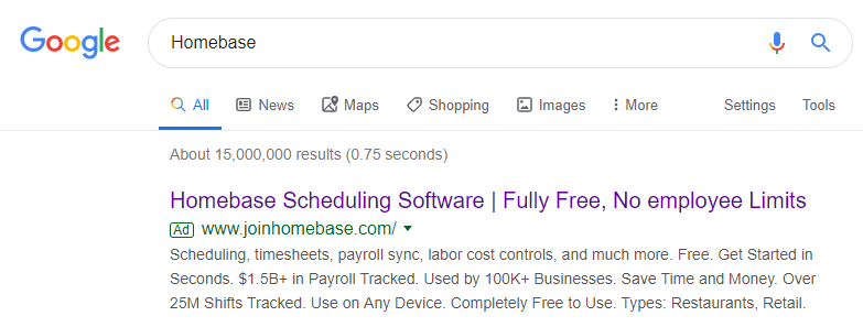
However, rather than targeting a segmented audience and taking them through a personalized 1:1 post-click landing page, clicking this ad takes users to the Homebase website:
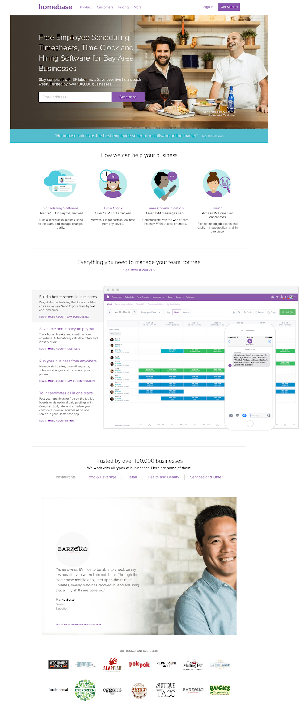
Since this page is generalized to anyone who might be interested in Homebase for various reasons, all visitors see the same page. Like many website homepages, it is designed for a browsing experience, and not focused on a single product offering because it includes:
- Header navigation
- Customer sign in option
- Multiple links to other website pages throughout the content
- App download links
- Full-sized footer that lists out separate pages for industries
This isn’t the case with the PPC ad and post-click pages above because they are specifically targeted for a specific keyword query and previous engagement with Homebase.
Provide unique experiences for each ad like Homebase
Digital advertisers are responsible for segmenting their audiences to deliver the most relevant, personalized ads at all times. Beyond that, they must also provide matching, unique post-click landing pages to those audiences to avoid any gaps in the customer journey.
Use inspiration from Homebase and get an Instapage Personalization Demo to segment your ads and provide dedicated post-click pages for each target audience.

See the Instapage Enterprise Plan in Action.
Demo includes AdMap™, Personalization, AMP,
Global Blocks, heatmaps & more.
