Many advertisers don’t realize that their post-click landing pages deserve the same attention and focus as their ads, and it causes their conversion rates to suffer.
When ads and post-click pages convey the same narrative, not only are user expectations successfully met, but credibility is established — and consumer trust and credibility play a crucial role in winning conversions. This is especially true in the higher education industry, where students are extra cautious about where to invest a large chunk of their money.
We previously examined how Ashford University and Capella University use dedicated post-click landing pages to acquire new students — now let’s see how Full Sail does the same.
How Full Sail University segments their ads & post-click landing pages
Example 1: Sportscasting degree Google search
Someone interested in a sportscasting degree might conduct this search and see the following Google ad for Dan Patrick’s school of sportscasting:

It’s clear the ad is segmented for a specific audience because it relates closely to the search query:
- The second half of the headline “Dan Patrick Sportscasting” includes most of the search phrase so searchers know the ad is meant for them.
- The display URL repeats “Sportscasting” to assure prospects they’ll be taken to a Full Sail post-click destination about sportscasting.
- The description highlights “Dan Patrick School of Sportscasting” in bold, and briefly explains what the schooling and degree entails.
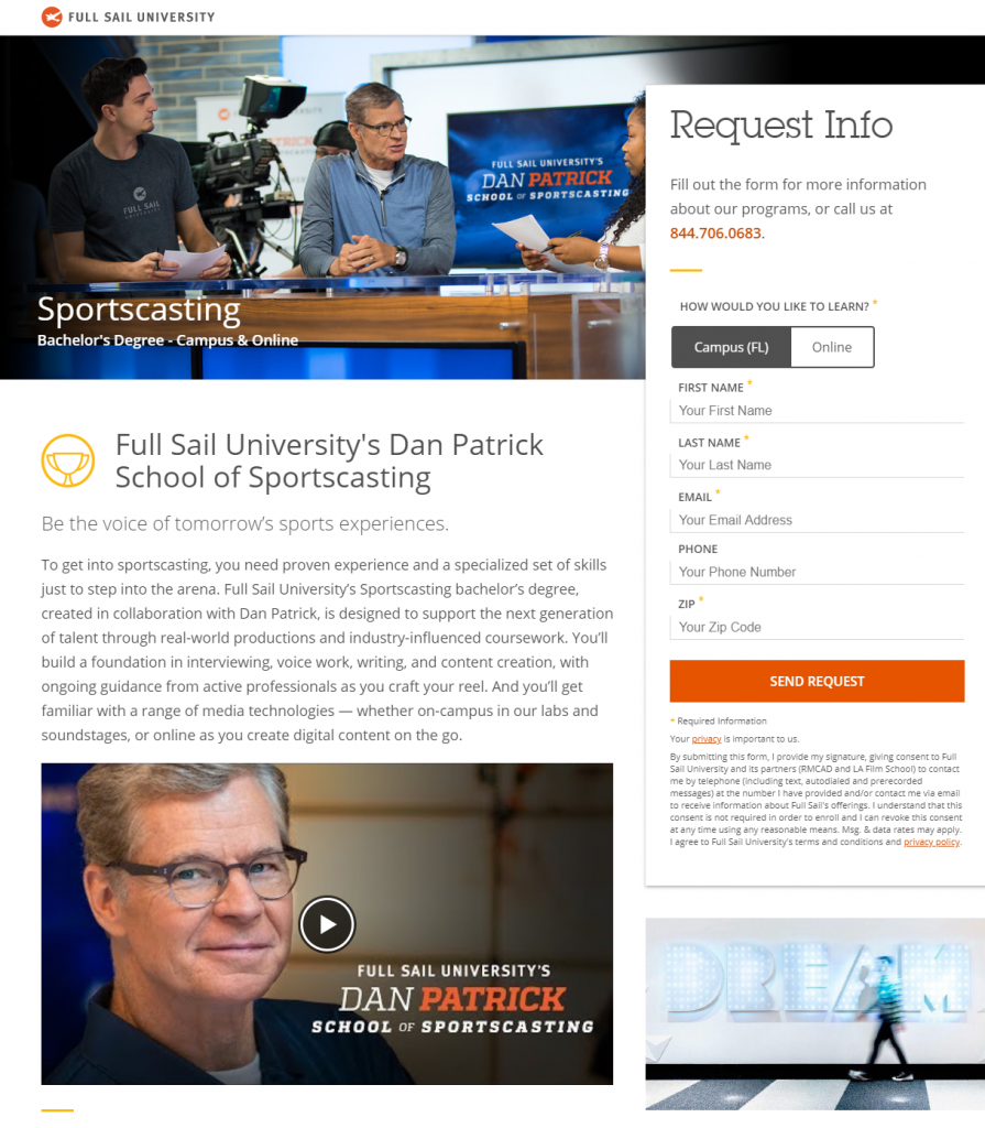
Clicking the ad’s main headline takes prospects to this post-click page that continues the same story narrative:

- What is the offer for? — It’s clear that this page tells the same story as the ad because the main headline, “Full Sail University’s Dan Patrick School of Sportscasting,” addresses exactly what the user is searching for:

The subheadline makes the offer more appealing by telling prospects they can be the voice of tomorrow’s sports experiences, which is likely why they were interested in sportscasting to begin with.
- Why choose Full Sail? — This part of the story is told throughout the entire page, starting with the paragraph underneath the headline and subheadline explaining what Full Sail’s Sportscasting bachelor’s degree is designed to do for students.
Reasons to choose Full Sail continue further down the page — highlighting the focus areas in sportscasting, the opportunity for students to earn their bachelor’s degree in only 20-29 months, and a chance to work in major sports entertainment facilities:

- Who supports Full Sail? — Support from Dan Patrick is the whole idea of the page. His affiliation and collaboration with Full Sail let’s potential students know that this school is one that can be trusted.
- How can visitors take action? — Prospects can request more information by completing the lead capture form and clicking the orange “Send Request” CTA button. Dan Patrick’s eye gaze at the form serves as a directional cue to persuade visitors to complete the form and request more information:

They can also click the “Request Info” anchor link at the bottom of the page, which takes them back up to the form to complete it.
Example 2: Digital marketing degree Google search
A new Google search — this time for “digital marketing degree” — shows this PPC ad at the top of the results page:

Like the previous example, we can tell the ad is relevant to the user’s interest because it’s very similar to the search query:
- The main headline includes all of the words from the search phrase — “digital marketing” in the first section and “degree” in the second section.
- The description contains multiple variations of the search phrase in bold, including the exact phrase (“digital marketing degree”) and several individual words from the query.
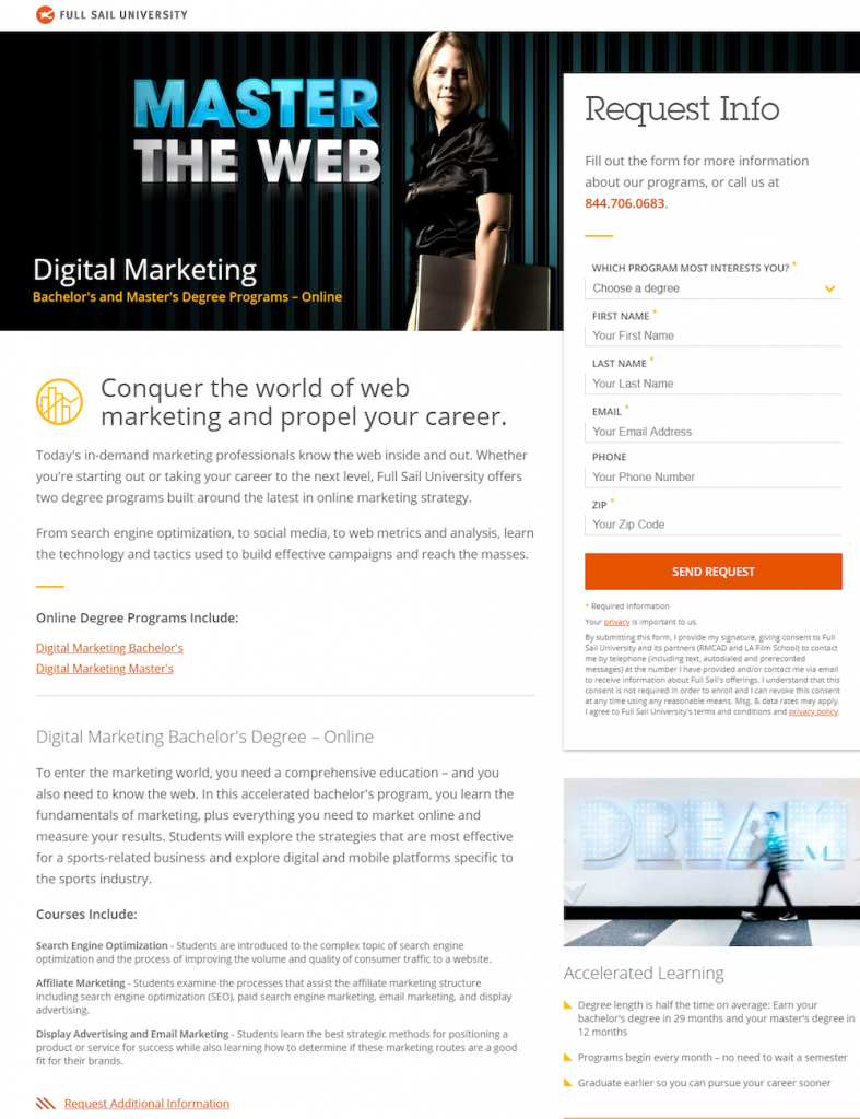
In this example, clicking the main headline goes here:

- What is the page offering? — The landing page offer here is the same as the ad since the top of the page reads, “Digital Marketing: Bachelor’s and Master’s Degree Programs – Online.” This is an alternative way of repeating the ad headline to match the user’s search query.
- Why Full Sail University? — Reasons to choose Full Sail are conveyed throughout the page, starting with the paragraph under the header image explaining that Full Sail University offers two degree programs built around the latest in online marketing strategy.
The Accelerated Learning section on the right side of the page points out that students can earn their bachelor’s degree in 29 months and master’s degree in 12 months, so they can pursue a career sooner:

- Who is the offer for? — Anyone looking to pursue their bachelor’s or master’s degree in digital marketing. The two degree programs are described in great detail so visitors can determine which degree is right for them.
- How to redeem the offer? — Like the previous example, completing the form on the right side of the page and clicking the orange “Send Request” CTA button.
Again, visitors can also click the “Request Info” CTA button at the bottom of the page to be directed back up to the form:

Example 3: LinkedIn retargeting ad
Following the previous interaction with Full Sail, the university retargets with LinkedIn ads:

Clicking the ad leads to a post-click landing page that serves as a follow up to Example 2:

- What is the offer? — The story on this page is similar to the previous example, except this one is only about a master’s degree.
“Digital Marketing: Master’s Degree – Online” at the top of the page begins the story letting visitors know exactly what the page is about. The main headline adds appeal to the offer by telling prospects they can advance their digital marketing skills in a variety of areas — likely why they were visiting this page in the first place.
- Why Full Sail? — This part of the story starts with the paragraph Beneath the fold, the university explains what their master’s degree can do for students: teach them how to use the Internet, search engines, email, social networks, etc. to unleash new advertising opportunities.
The program is further explained throughout the rest of the page, highlighting the three areas of focus with section headers, lists, and bold copy:

- Who should redeem the offer? — Since the preceding ad was a retargeting ad based on engagement with Example 2, it’s evident the page offer is directed at someone highly interested in obtaining a digital marketing master’s degree.
- How can visitors take action? — Visitors can complete the form to request more information about a digital marketing master’s degree.
They can also click the “Request Info” button at the bottom of the page — or any of the “Request Additional Information” links throughout the page — all of which take them back up to the form.
In comparison to Full Sail University’s homepage
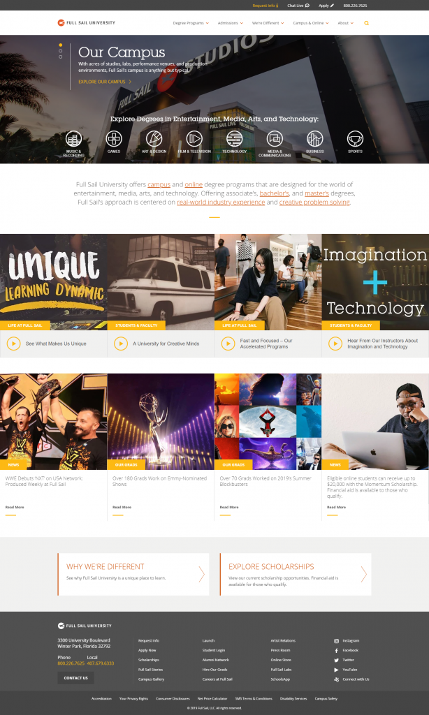
In contrast to the examples above that deliver unique, personalized post-click landing pages to segmented audiences, the Full Sail homepage introduces the school by providing a comprehensive overview:

- Extensive header navigation with dropdown menus allows visitors to easily visit other pages instead of converting directly through this page.
- Three different headlines (and subheadlines) divide visitors’ attention and make it so there’s less attention on one particular offer.
- Multiple links and CTA buttons to other web pages throughout the content demonstrate a full browsing experience.
- A full-sized footer provides additional external links, including many social media links, allowing visitors to bounce from the page without any conversion.
The homepage is generalized to anyone who might be interested in Full Sail University, so all visitors see the same page with general information. And since visitors may be on the page for a variety of reasons, it’s designed to be a comprehensive browsing experience rather than having a 1:1 conversion ratio like an optimized post-click page.
Continue the story from ad to post-click landing page for best results
By focusing all your attention on your ads — and ignoring the post-click landing page — there’s a good chance you’re wasting ad clicks and budget. Generate maximum conversions by paying equal attention to your pre- and post-click landing pages, and telling the same story narrative across both.
Use inspiration from the Full Sail examples above to connect your pre- and post-click landing pages. Then request an Instapage Personalization Demo today to see how you can start creating dedicated post-click landing pages at scale for each of your segmented audiences.

See the Instapage Enterprise Plan in Action.
Demo includes AdMap™, Personalization, AMP,
Global Blocks, heatmaps & more.
