When car shoppers visit a dealership, they aren’t necessarily looking to buy right away. A car salesperson must nurture the relationship, answer their questions, offer a test drive, and relieve their doubts before a purchase is made. Marketers take their online prospects through a similar journey as they move from the awareness stage to the decision stage.
In the decision stage of the buyer’s journey, prospects already know they have a problem, have evaluated their options, and are testing out who they should purchase from. Marketers know this well, as an estimated 93% of web-based companies and startups offer a free trial at the bottom of their marketing funnel. That percentage is overwhelming because a free trial offer is the best way for prospects to experience the product and sell themselves on using it.
Now let’s examine how businesses are using free trial post-click landing pages to convert prospects.
10 free trial post-click landing page examples
(For shorter pages, we’ve shown the entire page. However, for longer pages, we only displayed above the fold. You may need to click through to the page to see some of the points we discuss and some pages may be undergoing A/B testing with an alternate version than is displayed below.)
1. LinkedIn
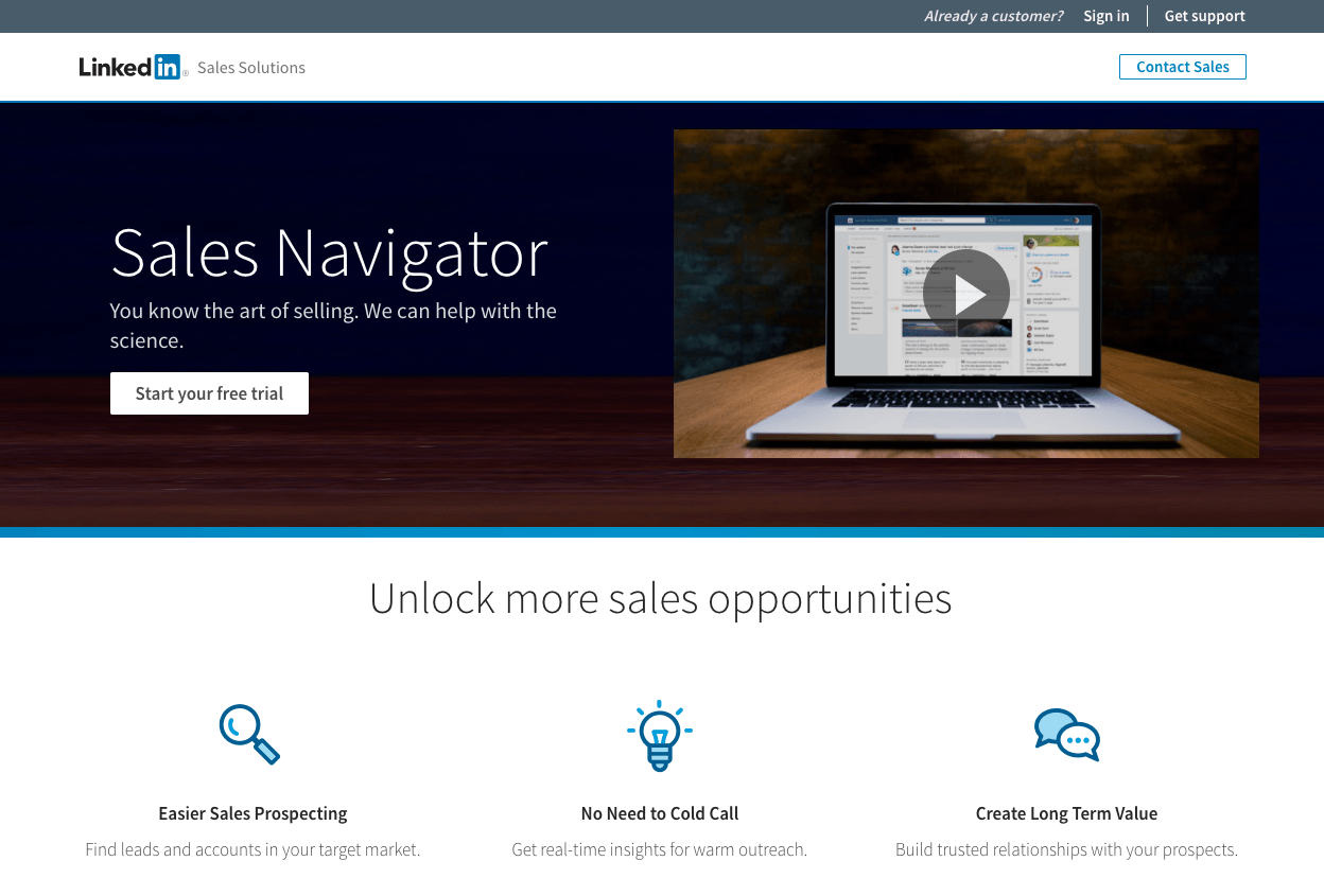
What the page does well:
- The video above the fold provides visitors with the information they need about LinkedIn Sales Navigator to make a decision on the free trial.
- Minimal copy combined with iconography allows visitors to learn about Sales Navigator features quickly.
- The customer logos act as trust symbols to showcase high-level brands already using LinkedIn Sales Navigator.
- The FAQ section provides more information about the free trial, billing, and the Sales Navigator program.
- The slider at the bottom explains additional features of the Sales Navigator program.
What the page could change or A/B test:
- Links in the header (Sign In and Get Support) take focus off of the free trial offer. Eliminating these links reduce the temptation to click away from this post-click landing page.
- The “See More” link opens another full menu of links that tempt visitors to leave this free trial post-click landing page.
- Conflicting CTA goals work against the free trial offer. “Contact Sales” sends visitors to a different post-click landing page, whereas the “Start Your Free Trial” CTA offers different free trial plans. To maximize conversions and focus attention, a post-click landing page should only have one conversion goal.
- Both free trial CTA buttons (white above the fold, blue below the fold) don’t contrast with the page. Designing them in a more contrasting color like green or orange would draw more attention, as would making the buttons larger.
- Adding testimonials would provide more credibility to the LinkedIn Sales Navigator program. The customer logos are great, adding testimonials would be even better.
- The sitemap and social media links in the footer act as distractions and exit links away from the offer.
2. Salesforce

What the page does well:
- No navigation menu helps keep visitors focused on the page and not distracted by other links near the headline.
- Good use of white space draws attention to the form on the left, and the copy and image on the right.
- Minimal copy makes it easy for visitors to skim and find information relevant to their decision.
- The image shows that Salesforce is versatile and can be used on both desktop and mobile.
What the page could change or A/B test:
- The Salesforce logo is linked, which gives visitors an opportunity to leave the page without evaluating the offer.
- The blue CTA button is the same color as other elements, which makes it more difficult to stand out and draw attention.
- Social media links in footer allow visitors to leave the page without starting a free trial. If this page is focused on generating free trial users, why are they showing social media icons?
- “Contact” and “Careers” are unnecessary links for this page. If Salesforce wanted to acquire maximum free trial users, why would they want to provide a link to view open Salesforce job opportunities?
- Adding social proof or testimonials would demonstrate how Salesforce software has helped other brands.
3. Norton

What the page does well:
- The headline conveys the benefit immediately. Visitors to this post-click landing page quickly see what Norton Security is offering.
- Minimal copy provides visitors with the information they need to make a decision without bombarding them with large amounts of text.
- The gray and white buttons allow visitors to learn some key features and benefits and compare three Norton products.
- Award badges highlight industry accolades Norton has recently won.
- Two collapsible tabs at the bottom provide detailed technical information and free trial details. These tabs help keep the page simple and not overwhelming with copy.
What the page could change or A/B test:
- The Norton logo in the header links back to the main website. This gives visitors an opportunity to leave the post-click landing page without redeeming the free trial offer.
- The “Buy Now” CTA takes focus away from the free trial offer. Removing the “Buy Now” offer out can help increase conversions for the free trial.
- The “Try Now” CTA blends in with the other yellow elements and doesn’t draw as much attention as it could.
- Including images of humans using Norton Security could help make an emotional connection with visitors.
- Adding social proof in the form of testimonials or counter of how many free trials have been redeemed would help convince visitors to convert.
4. Xero
Xero, a cloud based accounting software, understands that paid search ads should be connected with dedicated post-click landing pages. Searching on Bing for “Xero free trial” displays this ad, which then sends visitors to the corresponding post-click landing page:

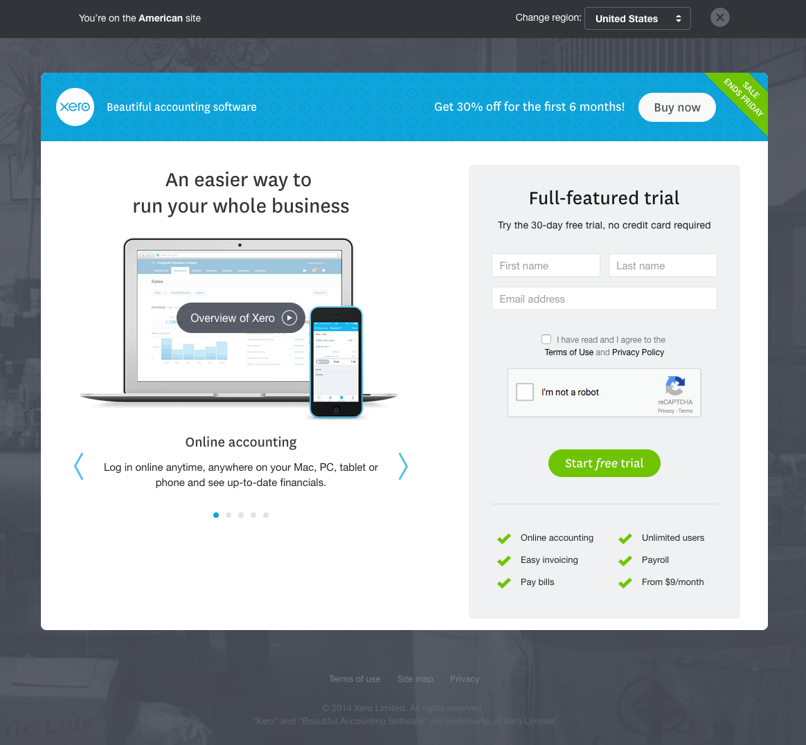
What the page does well:
- The headline is intriguing and encourages visitors to continue evaluating the offer.
- The short form reduces friction and increases the odds a visitor will convert.
- The arrow visual cues show visitors there is more information available once they click either arrow.
- The image shows Xero’s versatility on both mobile and desktop.
- The checkmark bullet points make reading the features and benefits of Xero easy.
- The green banner reading, “Sale Ends Friday,” provides urgency but it is directed towards the “Buy now” CTA instead of the “Start free trial” CTA.
- The “Overview of Xero” link opens up a video in a lightbox that describes Xero’s features.
- The video that opens up is short (1:15) so it doesn’t run the risk of losing prospects’ interest.
What the page could change or A/B test:
- Conflicting CTA goals (“Buy Now” and “Start free trial”) don’t keep the focus on generating free trials. Removing the option to buy Xero can improve free trial conversions.
- Changing the free trial button color to something more contrasting (like orange) would draw more attention because orange hasn’t been used on the page.
- The live chat option opens in a new tab, away from this post-click landing page. Offering live chat is okay as long as the visitors stays on the same page.
- The outdated copyright (2014) can make prospects believe the offer is outdated.
- The site map link in the footer gives visitors an opportunity to leave the page before converting.
5. GoToMeeting
Searching on Google for “web conferencing free trial” displays these top paid ads. Clicking GoToMeeting’s ad sends visitors to the following page:


What the page does well:
- The headline and secondary headline clearly state the offer, which helps prospects quickly decide whether to read on.
- The woman’s eye gaze is a visual cue toward the form and CTA button. This moves a prospect’s gaze towards the CTA.
- The short form reduces friction and increases the odds that the form will be completed.
- “No credit card required” allows prospects to try out GoToMeeting without having to worry about their credit card being auto-renewed once the free trial period ends.
- The privacy policy directly under the CTA makes it easy for prospects to learn more about how their personal data will be kept safe.
What the page could change or A/B test:
- The GoToMeeting logo in the header acts as an exit link because it links to the homepage, away from the offer.
- The CTA is the same color as other elements on the page. This prevents the CTA from standing out as much as possible. A blue CTA button could draw more eyes to the offer.
- The “Join A Meeting” link takes visitors to another page. Why would prospects need to join a meeting if they’re searching for a free trial?
- Adding more white space below the fold would help visitors scan the page and evaluate the features and benefits of GoToMeeting.
- Adding social proof such as testimonials would add a level of trust and credibility to GoToMeeting’s software.
- Customer badges would show that high-profile companies use GoToMeeting for their video conferencing needs.
6. Hootsuite

What the page does well:
- The navigation menu uses anchor tags to direct visitors to specific sections within the page.
- Good use of customer logos to indicate which high-profile brands use Hootsuite.
- Software screenshots show visitors what it’s like to use Hootsuite.
- The green CTA buttons stand out on the page and draw the visitor’s gaze.
- The header scrolls with you, and the CTA in the header is a constant reminder to visitors to begin their free trial.
- Emphasizing popular social networks such as Instagram, Facebook, and Twitter lets visitors know that Hootsuite works with the most popular platforms (along with 100s of apps).
What the page could change or A/B test:
- The “Request a Demo” CTA puts emphasis on a different offer separate from the free trial that this page is meant to focus on.
- The 2016 copyright can make visitors think that the offer is outdated.
- Adding any award badges could showcase the prestige that sets Hootsuite apart from its competitors.
- Including social proof (such as a counter) could add more credibility to Hootsuite (especially since they’re a social media marketing platform).
- More images of people using Hootsuite could humanize the offer and make it more relatable.
7. WebEx

What the page does well:
- No navigation menu or linked logo in the header keeps visitors from leaving the page immediately without evaluating the offer more.
- The bright green CTA button stands out from its surrounding elements. This helps to draw visitors’ gaze towards the CTA.
- The privacy policy under the CTA helps visitors easily access the privacy policy.
- The short form increases the likelihood that visitors will complete it and request a free trial.
What the page could change or A/B test:
- “TOMORROW starts here” is too vague. What does that mean and how does WebEx fit in?
- Emphasizing “no credit card required” in larger font would likely entice more visitors to start a free trial without having to worry about their credit card being auto-charged once the trial period ends.
- “Chat with Sales” and “Request a Demo” links both take visitors to another page and takes the focus away from this free trial offer.
- The testimonial would be even stronger if Martin Reed’s headshot was included.
- The image above the fold seems irrelevant because his face is cut off and the image doesn’t convey what he has to do with WebEx. Another thing to make the image stronger is to have him looking at the form, subtly persuading visitors to complete it.
- Adding customer logos would show prospects which brands are currently using WebEx for their online meetings.
- White space around the form and the three screenshots below the main image would help draw more attention to each section, respectively.
8. FreshBooks

What the page does well:
- The 2-field form reduces friction and increases the odds that prospects will complete the form.
- “Free” is emphasized multiple times throughout the page so visitors understand there is no cost to the offer.
- The video offers social proof in the form of testimonials and answers several questions about FreshBooks.
- The green CTA button contrasts with everything on the page, so it draws maximum attention.
- The “no credit card required” tab above the form can increase conversions. Although, making this more prominent would make the point even more persuasive.
- Quotes from big brands like Forbes and PC Mag add an element of trust because if those brands recommend FreshBooks, then they must offer a quality service.
- Award badges showcase industry awards and highlight what sets FreshBooks apart.
What the page could change or A/B test:
- The phone number appears to be click-to-call but it’s not. Instead, you go to a contact page with a form, away from this free trial offer.
- The image doesn’t convey any relevance to FreshBooks. Are these three individuals using FreshBooks? If they were to look down at the form, that would be a visual cue for visitors to complete the short form.
- Making the video hyperlink bigger would make this point even more noticeable and convince more visitors to start a free trial.
- Links in the header act as exit routes off this page.
9. SendGrid
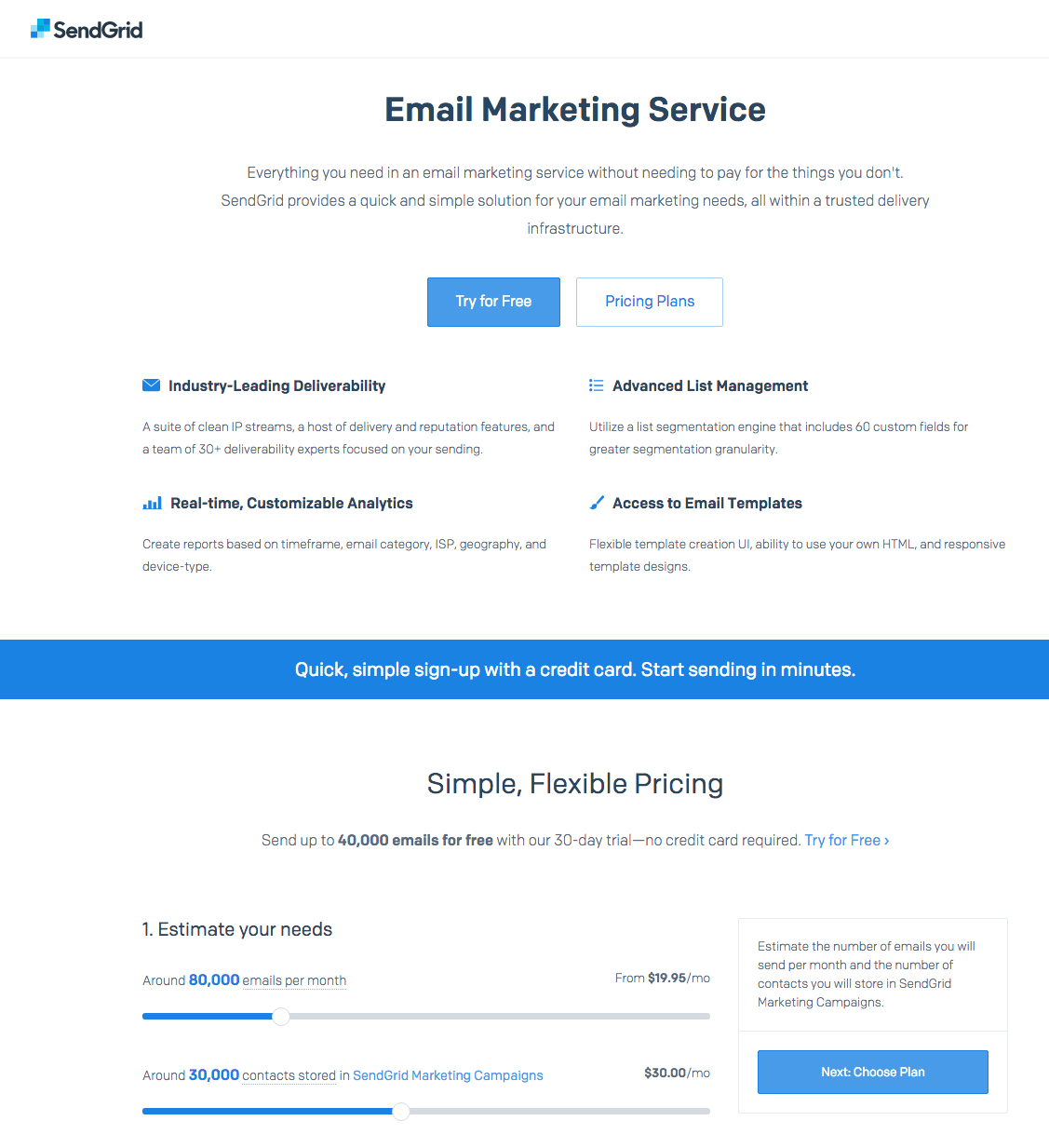
What the page does well:
- No navigation menu doesn’t provide options for visitors to leave the page.
- Customer logos such as Uber, Spotify, and Airbnb showcase which brands are using SendGrid.
- The sliding scale tool helps visitors determine what plan they would need in the future.
- Minimal copy allows visitors to quickly scan the page and get the information they need to make a purchase decision.
- The “SendGrid Difference” section highlights a few key points why prospects can trust the company to provide a valuable and trustworthy service.
What the page could change or A/B test:
- The headline “Email Marketing Service” is too vague of a headline. A more specific, benefit focused headline could increase conversions.
- Adding an image on this post-click landing page could humanize the offer and create an emotional connection with visitors.
- The blue CTA doesn’t contrast with the page, which makes it more difficult for visitors to find the button and redeem the free trial offer. Changing the button color to green or orange, for example, would make the button “pop” off the page.
- The “Download the Guide” section promotes three separate offers and should not be on the page. Is the main goal of the page to promote free trials or these guides?
- The “Contact Us” button takes visitors to a different page. This takes attention away from the free trial offer.
10. BigCommerce

What the page does well:
- No header navigation keeps visitors focused on the page and the free trial offer.
- Minimal copy emphasizes the benefits of BigCommerce without overwhelming visitors with blocks of texts.
- The testimonials include a photo, title, and company name. This social proof is valuable, versus testimonials that don’t include photos or a name of the company. The additional information helps prospects make an emotional connection.
- The CTA copy is relevant. “Start Your Free Trial” speaks directly to the prospect.
- The page is clutter-free and each section lets visitors scan the content without confusion.
What the page could change or A/B test:
- The SendGrid logo links to their homepage.
- The laptop screenshot is too small to really offer value because you can’t see what’s on the screen. Sure, it’s a graph, but what is the graph demonstrating?
- The blue CTA button is the same color as other elements on the page, which takes focus off of the CTA.
- The social media links in the footer give prospects an exit route off the page.
- Security trust seals could help inspire consumer confidence in this ecommerce platform.
How does your free trial post-click landing page compare?
Is your business using free trials at the bottom of the marketing funnel to help prospects make a purchasing decision? What tips will you take from the critiques above and incorporate on your free trial post-click landing page?
Get started creating your free trial post-click landing page with Instapage as our 100% customizable templates, sign up for an Instapage Enterprise demo today.

See the Instapage Enterprise Plan in Action.
Demo includes AdMap™, Personalization, AMP,
Global Blocks, heatmaps & more.