Designing a high-performing Facebook ad can be challenging because not only must you stop people from scrolling, the ad must go another step further and make users click. Ads require a compelling image, persuasive copy, and an action-oriented CTA. And yet, the Facebook news feed image size is the essential starting point in the design process because without the correct pixel size; you don’t know how much space you have to design.
Today’s article will cover how to create Facebook news feed image ads, their ad specs, best practices, and show a few examples on both desktop and mobile devices. But first…
Why Facebook image ads?
It’s no longer enough to post about your brand, products, or services on your profile, or even your business page. Now, the best Facebook Ads, targeted at the right audience, have proven to produce higher engagement and ROI.
When selecting the best ad format, consider this: Not only is visual content favored by Facebook’s algorithm, but it’s also more engaging with a higher chance to be shared and remembered than copy-heavy ads. Ad placement is essential, too and several options exist for image ads — news feed, right column, and mobile:
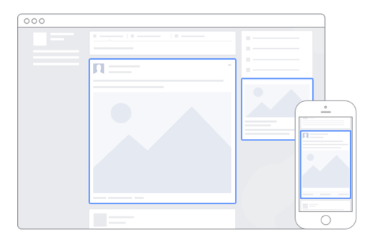
Although right column Sponsored Ads were Facebook’s first ad placement, news feed image ads offer additional benefits in comparison. Specifically, they:
- Attract more attention than other Facebook ad types because they are bigger and located in the user’s feed
- Likely get higher engagement than right column ads, due to their native advertising features
- Raise awareness for your brand, product, or service, because they can show specific details
- Typically offer less expensive clicks and conversions
- Are quick and easy to create
How to create a Facebook news feed ad image
If you’re already using the dynamic ads tool, it doesn’t get much easier to set up a Facebook feed image ad. However, when creating ads from scratch, it’s still extremely simple:
- From the Power Editor or Ads Manager, choose the Conversions or Traffic objective
- Then, at the ad level, select the “Single Image” option

Facebook allows you to create both vertical and horizontal single image ads. Vertical image ads naturally take up more space on mobile because they have tall screens. With horizontal images, the Facebook news feed image size is automatically formatted by Facebook. This means your image could be distorted, so it’s important to consider what device your audience is likely using.
Facebook news feed image ad specs
Along with supported objectives and call-to-action options, Facebook news feed image ads have certain design specs and technical requirements:
- File type: jpg or png
- Image ratio: 9:16 to 16:9
- Image size: No max resolution when it comes to Facebook news feed image size pixels (upload the highest resolution image available)
- Text: 125 characters
With link:
- Images: cropped to 1.91:1
- Recommended resolution: at least 1,200 x 628px
- Headline: 25 characters
- Link description: 30 characters
Technical requirements:
- Minimum image width: 600 pixels
- Minimum image height: 600 pixels
- Aspect ratio tolerance: 3%
Note: The new Instapage digital advertising specs guide contains everything you need to know about advertising on every major advertising — dimensions, file formats, examples, and more — all in one place.
5 best practices for Facebook news feed image ads
To stop scrolling users in their tracks and have a chance of them clicking through your ad, consider the following in your creative process.
1. Ensure relevancy between your ads and target audience
If you fail to show a relevant ad to the user, you’ve already lost because they won’t click through, convert, and/or purchase what you have available. You wouldn’t show an engagement ring ad to women who recently got married, would you?
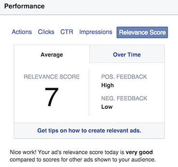
In February 2015, Facebook launched their relevance score feature that rates ads and appoints scores based on the relevance of your ad image, copy, and destination page. The higher your score, the more favorably Facebook treats your ads:
2. Show people using your product
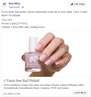
People respond better when they see others using a product as opposed to seeing the product by itself. This Ella+Mila Facebook ad shows their nail polish on a woman’s fingernails, rather than the bottle:
3. Keep text to a minimum
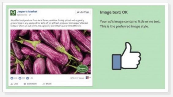
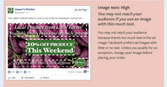
Too much text is overwhelming and people aren’t likely to read it all anyway, which is why ads with higher amounts of image text are shown to fewer people. Facebook may even limit your ad impressions, or reject it altogether, if it contains more than 20% text. Facebook image ads with minimal text (in the description, not on the ad’s image) receive more ad impressions.
For reference, compare the two ads below and how Facebook would likely treat each. The first ad has less than 20% text and the second consists of more than 20% text:
4. Focus on your UVP
This is important for two main reasons. The first is, with too much text, the ad will be cluttered and viewers may scroll passed it. Instead, crop your image tightly around the most important content — your UVP.
The second is, your UVP can attract more attention, especially if you incorporate enticing language, like “free,” “win,” or “sale.”
HubSpot highlighted its UVP (“100% free, forever”) front and center to ensure it wouldn’t be missed. Italicizing “forever” adds a dramatic effect too to emphasize the offer:

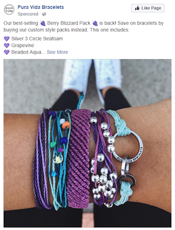
5. Bright, vibrant colors catch the eye better
Pura Vida Bracelets demonstrates this one well. The combination of vibrant purples and blues with the shiny silver make it hard to miss this ad in the feed:
Placing your ad image against a contrasting background can also make users stop scrolling. Although this ad from DailyOM doesn’t use any background, the woman catches your attention:

With Facebook’s blue and white color scheme, using these colors can make your entire ad blend in and be missed. To combat this, if your product image or logo is blue or white, be sure to design it with a bright, contrasting background to help it stand out.
Facebook news feed ad examples
Facebook news feed image ads are available for desktop and mobile. Below we analyze what each example does well and what could be improved.
The image in this Smallwoods desktop news feed ad is sharp and provides a great first impression:

Although it doesn’t show any faces, it still provides a relatable, personalized message to its targeted audience, which is likely something similar to minimalist farmhouse mothers. The sign is an excellent representation of the company’s promotion mentioned in the ad description. Also, the cursive script is likely to be unique from everything else in the user’s news feed.
An A/B test the company could run is a separate ad with the family sitting on the couch with the sign hanging behind them. Smallwoods may also want to increase the image brightness to see if that generates more views and ad clicks.
Conversely, this is what a mobile news feed image ad (from Birchbox) looks like:

Notice how crisp the image is and not blurry or pixelated at all. Plus with minimal text, Facebook won’t limit the ad’s reach. The image isn’t cluttered because it matches the ad description above with five samples for skin, hair, and style.
To optimize the image even further, the sampler box could be larger and an A/B test Birchbox could run is a happy customer applying one of the products in the image.
Get better engagement with Facebook news feed image ads
With fierce competition on Facebook, you need to ensure every part of your ad stops people, engages, and persuades them to click. Of course, the image plays a big role but the overall Facebook news feed image size will be your most important starting point in the design process.
For the most up to date ad specs and targeting options, refer to the digital advertising reference guide. Then be sure to complete your ad campaign with an optimal post-click landing page from ad to post-click landing page with Instapage — the most robust post-click optimization platform.
