
Effective direct-to-consumer advertising caters to the customer’s journey. The experience should support a continuous narrative from ad to page. Central elements of the landing page, such as headline, hero image, and CTAs, must resonate with that specific audience segment. Furthermore, designing the landing page with conversions in mind provides a seamless advertising experience. The entire process should engage the visitor, build a relationship, and convert them into a customer.
Here are 8 examples of effective direct-to-consumer advertising journeys.
1. The Farmer’s Dog


This search ad highlights the fresh quality of dog food from The Farmer’s Dog. It calls out how U.S. regulations don’t require pet food producers to uphold high safety and quality standards. And it includes a 50% off offer.
The ad directs visitors to this post-click experience, where the headline “Dog Food Should Be Food” reflects the concerns highlighted in the search ad. The CTA button is prominent on the page and in the color orange, which makes the button stand out. The button’s copy reflects the offer from the ad, so visitors don’t have to go searching for the discount or remember a special code. Together, the page elements communicate to the visitor that they have arrived at a place relevant to the ad they clicked.
In order to establish trust, The Farmer’s Dog has includes customer testimonials at the bottom of the page. Finally, the page is using a 1:1 conversion ratio—since there is only one conversion goal, there is only one link included on the page. This approach ensures visitors who click on the CTA accomplish the conversion goal.
This ad is an effective example because the entire journey emphasizes the narrative of switching to fresh pet food while highlighting a discount that inspires visitors to convert. The page design itself enables the visitor to convert easily once they decide to move forward with the purchase.
2. Rory
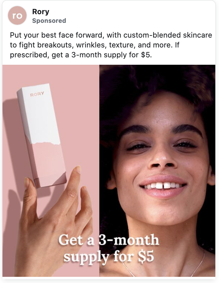

Rory’s Facebook ad promotes a 3-month supply of custom-blended skincare for $5. The post-click landing page then highlights the offer above the fold. There is a sticky banner so that as the visitor scrolls down, the deal is easy to access. The CTA button also revolves around claiming the discount.
The page makes use of visual hierarchy to guide the visitor in a way that will educate them about the product and persuade them to act. Both the ad and landing page include images of the product to support a shared experience. The “How It Works” section uses a highly contrasting green color to draw the visitor’s attention so they can easily understand how simple the process is. As they scroll further, there is a breakdown of the dermatologist-selected ingredients included in their treatments. Near the bottom, FAQs educate consumers on prescription skincare, and customer testimonials help establish credibility.
This post-click landing page educates and persuades the visitor, while centering the offer from the ad to present a relevant experience.
3. Eargo


Eargo’s Facebook ad narrative focuses on how federal employee health benefits cover the cost of hearing aids and they tailored the post-click landing page experience toward federal employees for consistency. The headline reinforces that there is no cost to the hearing aid recipient, while the subheading calls out federal employee health benefits.
A visitor clicking on this ad is likely interested in learning more about how federal health benefits can cover the cost of hearing aids. Their journey from ad to page should support a continuous narrative so that they will be more likely to engage and convert.
Also catering to this narrative is the page’s visual hierarchy. As you scroll down, the page provides information about what plans are available. Below the fold is a step-by-step breakdown of how it works. By introducing more relevant information first, the page engages the visitor and holds their attention. Then, they provide additional details once a visitor is engaged and wants to learn more.
Finally, Eargo uses a frictionless form to increase the likelihood of a conversion. They keep the form short by capturing only the most essential information, and include a drop-down for insurance types to limit keyboard usage, thereby speeding up the completion process.
4. Cozy Earth


Cozy Earth’s Facebook ad highlights Oprah’s endorsement of their bamboo sheets and includes a discount offer.
The ad sends visitors to this post-click experience. The headline reinforces Oprah’s endorsement, reassuring shoppers that this experience is relevant to the ad they just clicked. The 20 to 35% discount offer displays on a sticky banner, and is easy to find no matter how far people scroll down.
Below the fold, the page includes an “Oprah’s Favorite Things” badge, as well as a quote with Oprah’s signature. As the visitor scrolls further down, they can see the benefits of Cozy Earth’s sheets. Lastly, to further establish trust, the customer testimonials and an FAQ section are at the bottom.
This ad-to-page experience is effective because it offers a frictionless journey to learn more about these Oprah-endorsed sheets. The design elements and copy on the landing page continuously communicate that this is a relevant experience and support the message established in the ad.
5. Caraway


Caraway’s Facebook ad highlights how their pans are “non-toxic for healthy eating” and the post-click experience presents copy that supports this narrative. Both the headline and the quote emphasize the lack of chemicals, so the visitor knows immediately they are on a relevant page.
Below the fold, Caraway provides a bulleted list of reasons the visitor should choose their product. Presenting “non-toxic” as the first reason helps to tailor the narrative to the ad and drive home one of the key selling points.
Images and dimensions of the pans and storage accessories are in the breakdown of what comes with the cookware set. Each product shot is accompanied by a brief description, with examples of the kinds of meals home chefs can prepare with that pan. Providing specific examples is particularly helpful here, since it enables the visitor to imagine the benefits they could enjoy with this set.
There is also a section describing the non-toxic coating and eco-friendly materials used to make this high-quality cookware, followed by a comparison chart showing the benefits of the brand over other types of pans. This level of detail makes it easier for the visitor to decide to buy, since they are provided with answers to many of the common questions that may stop them from purchasing.
This ad-to-page journey is highly effective because it maintains a consistent narrative that is well-tailored to a visitor who cares about non-toxic cookware.
6. Nectar


Nectar runs competitive search ads bidding on their competitors’ keywords. In this example, the ad states “Don’t Buy That Other Mattress.”
The post-click landing page is written for a very specific target audience and the entire page focuses on comparing the Nectar and Purple brands. The brand knows visitors to this post-click landing page were searching for a competitor so they make it easy to see how Nectar differs. Below the fold, Nectar highlights their more affordable options with a side-by-side comparison to show that their mattresses are less expensive and that they include free accessories like pillows as a bonus.
Below the CTA, there are links allowing visitors to skip to information that they’re most interested in and waste less time. Since visitors are already shopping for a specific brand of mattress, they likely already know what some of the most important features are in their decision making process. Nectar makes it easy for them to see the benefits and convert (away from the brand they initially thought they wanted).
This strategy is effective because a person who searches for Purple and lands on a Nectar page may not know of Nectar and their affordable options. This page aims to convince them why they should pick Nectar based on their specific needs and offers lots of value adds to encourage them to convert.
7. Ritual


Ritual’s Facebook video ad prompts potential customers with a question: “Do you know what nutrients you need from a prenatal vitamin?”
The corresponding post-click experience caters to visitors looking to learn more about prenatal vitamin nutrients. The headline matches the ad copy, so the experience is immediately relevant. The page structure is straight-forward and easy to read, with formatting similar to an educational blog post. This lends credibility as it feels more educational than promotional.
Reading through the list of nutrients, visitors see: “You can find all 12 of these nutrients in our Essential Prenatal vitamin. Start your Ritual today.” Providing educational content about the nutrients and their different benefits, Ritual presents their vitamin as a simple one-stop solution.
This ad-to-page journey is highly effective because it offers helpful, easy to understand content to the visitor. Since the information is so engaging, visitors are more likely to click the CTA and read more about Ritual’s prenatal vitamin.
8. Warby Parker


Warby Parker’s Facebook ad promotes their free home try-on and the corresponding post-click landing page speaks directly to an audience interested in this offer. The hero image reflects the try-on process by including a box and glasses and the headline reinforces that you can try frames on at home. Since the ad targets someone who wants to learn more about the try-on process, the page supports that narrative.
Beneath the fold, the page describes the benefits of their glasses and service. Since the page is primarily about having multiple options to try on at home on, this section is helpful for reminding the visitor of the benefits of using Warby Parker. Customer testimonial quotes instill trust in the visitor and emphasize how easy the home try-on process is.
Effective advertising caters to the customer
Highly relevant and engaging ad experiences are most effective because they capture the visitor’s attention and inspire them to act. To be effective, the landing page should reinforce specific callouts from the ad. A more relevant experience will engage your visitor. A more engaged visitor is more likely to convert into a customer. It’s critical to design your post-click experiences with a conversion-centered focus. After all, your goal is to motivate visitors to purchase. As you increase your advertising’s effectiveness, you’ll see conversion rates.
Create fully optimized landing pages
We know how challenging it can be to identify gaps in your ad-to-page narrative. We’re ready to help. Instapage offers three different plans to help take the stress out of building, optimizing, and converting. Schedule an Instapage demo here.
