As the health and fitness industry becomes more saturated, companies within it must amplify their marketing and advertising efforts to stand apart from the majority. Most importantly, they need to recognize that every ad represents a conversion opportunity — but a disconnected ad and post-click landing page could cost them that conversion.
Equinox is one company that understands: when there’s no message relevance between the pre- and post-click landing pages, prospects get confused and frustrated, and don’t convert.
Let’s take a look at three examples showing how the brand connects their segmented ads to relevant, unique post-click landing pages to drive conversions.
How Equinox uses segmented ads with unique post-click landing pages
Example 1: Branded search
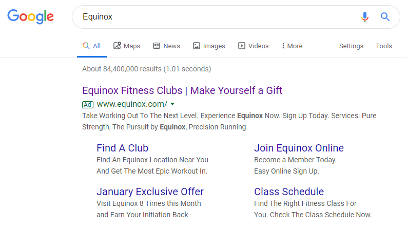
Someone in the middle of the funnel, already considering Equinox as an option, might do a basic search for Equinox. Since the company bids on their own name, the user is likely to see this PPC ad:

We can tell immediately that the ad is relevant to the search query because “Equinox” is repeated throughout the entire ad:
- Headline
- Display URL
- Description
- Sitelink extension headlines
- Extension descriptions
Both the main headline and “January Exclusive Offer” extension take prospects to this post-click landing page:

While the page isn’t completely in line with the main ad headline, it does continue the relevance to the “January Exclusive Offer” extension:
- What’s the offer? — The extension headline and the post-click page headline tell the same story, promoting the brand’s “January Exclusive Offer”. The same words (in a different order) are repeated again in the top-right of the page:


The offer details — the opportunity to earn the initiation payment back after eight visits — are explained in both the ad extension description and the post-click landing page, directly underneath “Exclusive January Offer.”
- Why choose Equinox? — The next part of the story (and the majority of the landing page copy) conveys the benefits of signing up for an Equinox membership:

The new membership privileges are even highlighted in list form to attract more attention and for easier readability.
- Who is the offer for? — Equinox clubs are only found in select locations, so not everyone may want to join. The “Preferred Location” and “Select a Club” dropdown menus at the bottom of the form let visitors know where the clubs exist, so they can decide if the offer is right for them.
- How can someone take action? — Prospects can schedule a visit to a club location by completing the rest of the form and clicking the black “Submit” CTA button.
Example 2: “Join Equinox Online” extension
If searchers have enough information about Equinox, they can sign up for a membership immediately through the “Join Equinox Online” sitelink extension:

From here, visitors are taken through a 4-step process where they can select their location and membership, and then complete their billing information to purchase:


Notice how all the steps in the signup process work together to tell one cohesive story:
- What is the offer? — Matching the sitelink extension headline, this offer is to “Join Equinox Online” and that’s exactly what the post-click story is about.
It’s evident immediately upon landing on the initial page that it’s the beginning of the signup process — hence the headline and subheadline in all caps: “Commit to high-performance living” and “Start your membership experience today” respectively:

- Who should sign up? — This part of the story is told through the “Find a Club” dropdown menu at the top of the main landing page, letting prospects know if there’s a location near them to sign up for a membership based on their area:

Once they choose one of these regions, they’re taken to Step 1 of 4 of the process which continues this “Who” part of the story. With address and hour details listed, prospects can decide if the club is a good fit:

If yes, they can click the “Membership Options” button to proceed to Step 2 of 4, where the narrative continues.
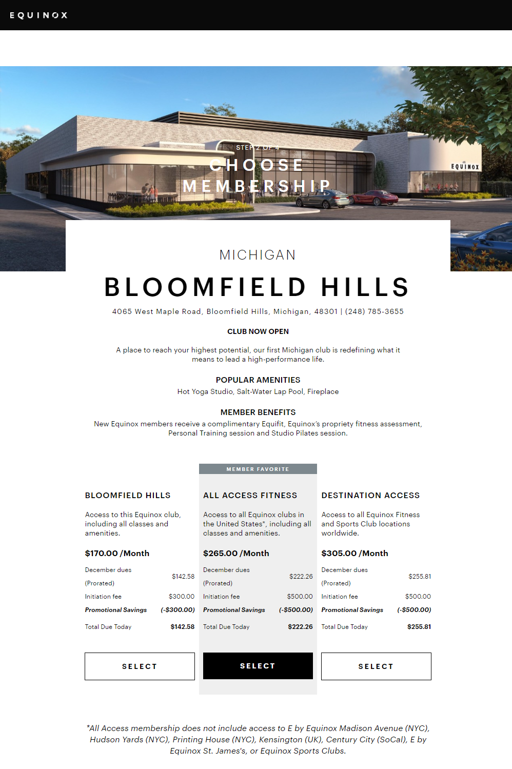
- Why choose Equinox? — The main reasons to sign up for an Equinox membership are delivered in Step 2, starting with the “Popular Amenities” and “Member Benefits” sections toward the top of the page:

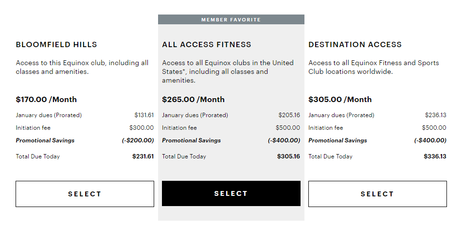
The reasons for choosing specific packages are conveyed in the membership options since each option contains different benefits, savings, etc.:

Notice how Equinox uses the decoy effect in their post-click landing page to subconsciously convince people to choose the All Access Fitness option by highlighting it in the middle.
- How to redeem the offer — Visitors can redeem the offer in steps 3 and 4 by first completing their personal and billing information and then submitting their order.
Example 3: LinkedIn retargeting ad
After continuously engaging with the company’s post-click pages, homepage, social media, etc., this Equinox retargeting ad appeared in the main LinkedIn feed and connects to the same post-click page from Example 1:

Compare these experiences to the Equinox homepage
Homepages are not the same as post-click landing pages and shouldn’t be used as such. Take a look at this above-the-fold image of the Equinox homepage to see why:

- A full header navigation menu allows visitors to leave and visit other website pages, instead of converting on this page. That’s fine on a homepage because it enables a browsing experience. But on a dedicated post-click landing page, it’s a group of distracting exit links immediately upon landing on the page.
- The login link in the top-right allows members to sign into their accounts. But this isn’t necessary on a post-click page where the goal would primarily be to persuade visitors to begin a membership.
- “Schedule a Visit” and “Watch the Video” CTA buttons also allow visitors to exit this page. Remember, that’s acceptable on the homepage because it’s designed to appeal to a wider audience at different stages of the buying process — but not on a post-click page where there should be a dedicated offer.
The Equinox homepage continues to provide an overview of everything the brand offers, even below the fold:
- Additional links and CTA buttons (“Explore Classes,” “Explore Benefits” and “Find a Club Now”) demonstrate a browsing experience rather than a conversion opportunity.
- A footer containing additional Equinox webpages, other brand links, and social media account pages — all allowing visitors to bounce from the page.
Rather than delivering a unique, personalized post-click landing page to segmented audiences with a 1:1 conversion ratio — the homepage is a comprehensive browsing experience generalized to anyone who might be interested in Equinox.
Get more from your ad budget with personalized post-click landing pages
Now that you’ve seen how Equinox uses dedicated post-click landing pages for their paid ads, hopefully you feel inspired to do the same. After personalizing an ad, continue the story with a personalized page. Otherwise, you could be wasting ad clicks and struggling to convert ad clicks.
See how to scale your brand’s post-click landing pages by requesting an Instapage Enterprise Demo today.

See the Instapage Enterprise Plan in Action.
Demo includes AdMap™, Personalization, AMP,
Global Blocks, heatmaps & more.
