As as an email marketer, you’re a part of what many businesses consider their most profitable channel. You’re valuable, which means your work is highly scrutinized…
High open rates alone won’t cut it. Your messages have to boost your business’s bottom line. And when it comes to generating leads and sales with email, advice about subject lines isn’t much help.
How to generate email leads and sales
As teams are increasingly called upon to own their channel’s entire customer journey, it’s crucial to understand principles that get subscribers to do more than open emails. Here are some tips to convert more of them.
1. Learn the art of directing attention
Your subject line will get them to open your email, but what they do next is largely dependant on the design of your content.
If that design is based on psychological theories of perception, you have a better shot at guiding your visitors to your desired call-to-action. If you’re not totally sure about what those are, here’s a quick crash course in visual hierarchy:
- The whole is other than the sum of its parts — meaning, people do not visually perceive their surroundings equally. For example, when crossing the street, we look at the cars but do not notice graffiti on a bus stop or a pothole in the road. This is like opening an email on a different scale. The brain prioritizes information in order of importance.
- So what’s important to our brains? Motion, size, color, position, among other differentiators, yell to the brain “LOOK HERE.”
- Manipulating these elements in emails can get people to look where you want, when you want. Here’s how our brain prioritizes:
- An element higher in the email is more important than one lower.
- An element that contrasts its surroundings is more important than one which blends with its surroundings.
- An element that is bigger is more important than one that is smaller.
- Bolded, italicized font is more important than regular font.
- An area heavily weighted with elements is more important than an area with empty space (but that doesn’t mean you should pack a bunch of elements into one area. Use of white space is important.)
Take a look at this Monster email on mobile:

The first thing you notice is likely the Monster logo, which is big, high on the page, and in font that contrasts the purple background. Then, your eyes likely move downward toward job postings.
What’s unlikely is that you’ll look back up to that teeny tiny ad that ironically reads “Don’t be invisible. Stand out with our free resume assistant tool.”
That’s a link which drives visitors to a click-through post-click landing page where Monster can generate leads and sales:

But at its current size, it’s nearly unreadable on mobile. Users aren’t going to squint to read your value proposition. They’re going to go where their attention takes them. And in this email, that’s to the logo and then downward.
2. Always make conversions and leads the primary goal
Building off the last point, it’s important to match your business priorities with the brain’s priorities. Ask yourself, “In the best-case scenario, what will readers of this email do?”
If the best-case scenario is they click your resume assistant tool ad and sign up, make the CTA for your resume assistant tool more noticeable than the CTA for your job postings, even if the purpose of the email isn’t to drive sign-ups for your resume assistant tool.
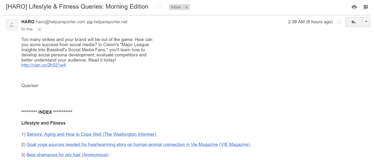
In other words, make conversions the primary goal of all your emails — even non-promotional ones like newsletters or digests. Here’s an example from HARO, a service which matches subject matter experts and journalists:

The opening paragraph has nothing to do with matching the reader to lifestyle and fitness queries (which is the purpose of the email), but instead generating leads and sales with a report on social media fans of Major League Baseball.
Here’s another example from NextDraft, a digest of interesting news compiled by Dave Pell:

Notice before Dave gets into the day’s most interesting news, he calls readers to action with an ad for Mozilla. The message still fulfills its promise of information, yet it makes lead generation its primary goal with an attention-grabbing banner at the top of the email.
3. Double, triple, quadruple check everything
This wasn’t an original inclusion to our list until we clicked through a link for a lead magnet in an email and were directed to this:

Always, always, always check your campaign links before they’re live, and continually monitor them to ensure you don’t lose out on a heap of leads because of an error like this one.
4. Leverage scarcity and urgency
Research has shown that there’s a scientific foundation for the phrase: We want what we can’t have. It’s true, when something is rare, exclusive, limited-time only, we want it more than we do things that are common (just ask diamond manufacturers).
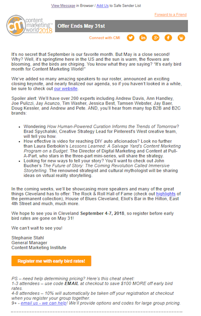
So if your offer isn’t available year-round (like a weekend sale), or if there’s a limited number of them — like products or seats in a webinar — make sure you highlight it, as Alaska Airlines does in this email for a 3-day fare sale:

5. Settle your prospects’ fears
You’ve probably experienced this before: You’re on the fence about hitting the “buy” button. The offer is expensive and possibly overhyped. What if it’s not as good as the company claims it is?
Settle these familiar fears by highlighting any guarantee or friendly refund policy. Alaska Airlines does it well in the example above. A 3-day fare sale is something worth taking advantage of, but what if something comes up and I have to cancel? What if the person I want to go with can’t come? What if I change my mind when I see the weather forecast?
The text “If you change your mind, you can reschedule or cancel within 24 hours for free” gives readers the confidence they need to pull the trigger now and cancel later if they need to.
6. Get to the point
For today’s employees, time is scarce. So a good lead-gen email is written like a good post-click landing page: In a concise way that prospects can evaluate and move on from. That means:
- Use bullets to highlight the benefits of an offer. These separate the important takeaways from the rest of your text.
- Bold important words and phrases to ensure they’re seen.
- Be visual but don’t distract from the goal. Any image you use should help the visitor evaluate the offer by providing information. In most cases, it’s best to stay away from stock.
- A clear call-to-action that lets readers know where they need to click to learn more.
Your goal is to give enough information to get people interested in clicking through to the post-click landing page. This is too much information and not enough subheaders, bullets, etc. to break up the text:

Here’s an example closer to what you want:

7. Try Gmail Ads
Gmail ads offer advertisers something most businesses have had to work tirelessly for with valuable content: immediate access to the inboxes of countless people using their email service.
The ads appear unobtrusively enough at the top of your Gmail folders:

And when clicked, they open to look like an organic email, which the reader can choose to interact with, save to their inbox, or forward.

Per Google, here are all the targeting options you’ll have available:
- Affinity audiences: Select from these audiences to reach potential customers and make them aware of your business. For example, a sports apparel advertiser could select relevant topics like “Fitness” and “Sporting Goods” or reach people in the “Health & Fitness Buffs” or “Running Enthusiasts” affinity audiences.
- Audience keywords: Choose words or phrases relevant to your product or service so yours ads appear to customers who are interested in those terms.
- Automated targeting: Automatic targeting helps optimize your targeting across Gmail, letting you reach people your targeting wouldn’t otherwise reach, at around the same cost per person — automatically.
- Customer match: Lets you show ads to customers based on data about those customers that you share with Google.
- Demographics: Lets you reach people on the Display Network who are associated with certain demographic categories, like gender, age range, or household income.
- In-market audiences: Select from these audiences to find customers who are in the market, which means that they’re researching products and are actively considering buying a service or product like yours.
- Life Events: Reach customers in key life moments like moving, marriage, or college graduation.
- Remarketing: You can also reach people who’ve already engaged with your company’s products and services, including past visitors to a website, mobile app, videos or your own lists. Remarketing lists targeting Gmail ads must have a minimum of 100 active visitors or users within the last 30 days for your ads to show.
If your lead database is low and your email marketing lead generation efforts need a quick boost, Gmail Ads are definitely worth the try.
8. Remember the “I” in FUGI
Anyone with experience in sales will recognize the FUGI acronym, a model for guiding behavior during selling opportunities. Here’s what it stands for:
- Fear of loss: Our brains are wired to avoid losses, so when framing a sales statement, it’s more powerful to emphasize potential losses without the product than potential gains with it. Saying “Our average customer earns an extra $200 per month” isn’t as persuasive as the “Don’t pass up the extra $200 per month earned by our average customer.” Translated, the first option says “You might earn an extra $200 per month with us,” whereas the second says “By claiming this offer, you’ll have an extra $200 per month. Don’t throw out $200 per month by passing this up.”
- Urgency: We value things more highly when they’re only available for a limited time.
- Greed: People want a lot for a little.
- Indifference: If they don’t want your offer, act indifferent about it.
The “I” is something that email marketers unknowingly violate all the time, and it kills their credibility. Here’s why:
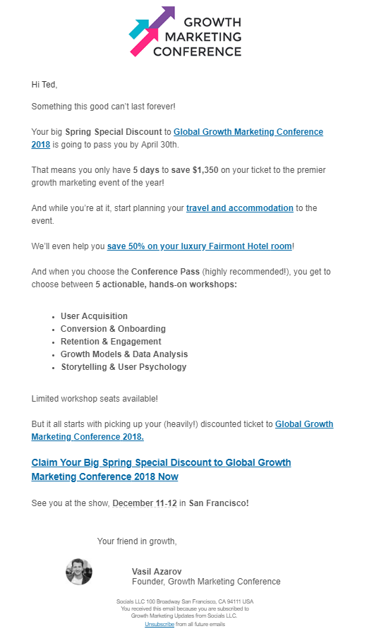
If you have something valuable, you don’t need to beg someone to buy it. They will buy it because it is valuable. So, when you see a flood of emails like these within a several-day span, you start to think to yourself, “Looks like they’re really desperate. A lot of people must be passing on their product.”

Scarcity and urgency have no power if you use them all the time. It’s “urgent” today, but I’ll have another “last chance” tomorrow.
Greed also loses its power when our skepticism kicks in. If it sounds too good to be true, it probably is. So either the offer isn’t valuable because it’s only being sold for $1, or I’m going to put in my credit card information for a trial and get automatically enrolled in the service if I don’t opt out at the end.
Nothing worth sending this many emails about is $1 outside. Don’t pretend like it is. Send some follow-up reminders, but don’t kill your credibility by overdoing it.
9. Direct subscribers to a targeted post-click landing page
Getting your prospects to trust you enough to share their personal information or to buy your product is no easy task. And when you use the wrong tools, it becomes even harder.
If you’re losing out on leads, it could be because you’re directing your prospects to a page that isn’t designed for conversion — like your homepage or any other page on your website, for example.
These are not post-click landing pages, even though subscribers “land” on them after clicking through your email. A post-click landing page is a standalone page (disconnected from your website’s navigation) designed specifically to compel a visitor to act: sign up, download, buy, etc.
These pages employ the of use principles like message match, a 1:1 conversion ratio, psychological principles of persuasion, and much more to nudge visitors toward conversion.
Get more out of your email lead generation efforts
Getting prospects to open email marketing messages has gotten progressively easier with software to segment lists and A/B testing tools to compare subject lines. What still remains a big pain point is persuading them to click through and convert once they’ve opened your email. The post-click stage.
Start optimizing your emails for what comes after the click, and stop losing leads and sales without post-click landing pages. Try Instapage, the most robust post-click automation platform today. With AMP, Instablocks™, heat maps, and pixel-precision design features, no other solution compares. Sign up for an Instapage Enterprise demo today.

See the Instapage Enterprise Plan in Action.
Demo includes AdMap™, Personalization, AMP,
Global Blocks, heatmaps & more.
