Countless healthy food subscriptions exist in which a customer can provide their information, make a payment, and a box of food shows up on their doorstep a few days later. It’s easy and convenient, which is why it has become in-demand.
With a saturated market, how each brand presents its product online is integral to its success. Daily Harvest understands this and distinguishes itself by advertising unique offers and dedicated post-click landing pages for its customers. Here are four examples.
4 Ways Daily Harvest uses segmented ads and post-click landing pages
Example 1: Search ad to promote smoothies
Someone interested in learning more about or ordering nutrition shakes might search Google and see this Daily Harvest ad:
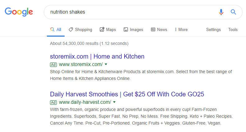
We can tell the ad is segmented to a specific audience because:
- The first part of the headline includes “smoothies”
- The second part of the headline offers $25 off of those smoothies
- The description provides details and benefits of their smoothies
Clicking the ad headline takes prospects to this post-click landing page where the narrative continues:
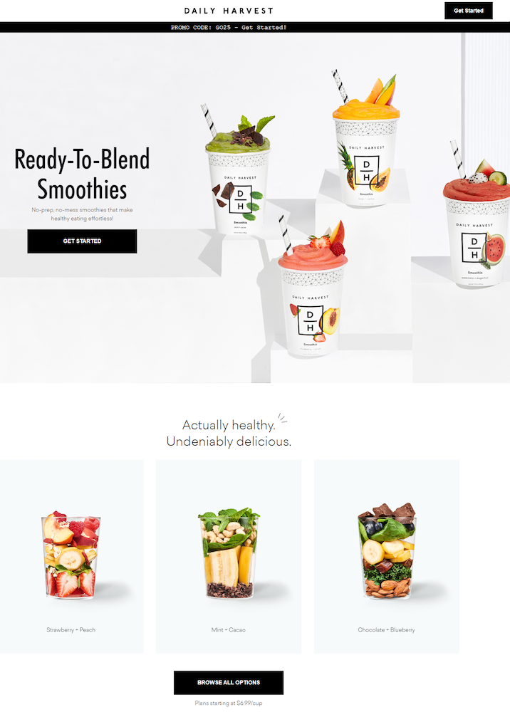
- What is the offer? — The headline and image above the fold immediately assure visitors they’re on the right page to learn more about Daily Harvest smoothies. The promo code at the top reminds them they get a discount on their first order.
- Why try these smoothies? — The subheadline provides several main benefits of Daily Harvest smoothies (no-prep, no-mess, effortless healthy eating), and the section below the fold continues the narrative letting prospects know the smoothies are “actually healthy” and “undeniably delicious”.
- How can visitors take action? — Since this is a click-through landing page, prospects can start their Daily Harvest subscription by clicking any of the three black CTA buttons and completing the multi-step form on this page:
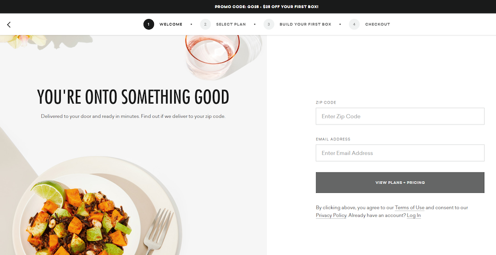
- Who is Daily Harvest for? — Prospects can find out if they are able to order from Daily Harvest by submitting their zip code and email address on the form above.
Example 2: Branded search ad to maximize brand exposure
Searching for “Daily Harvest” shows that the company bids on their own brand name:
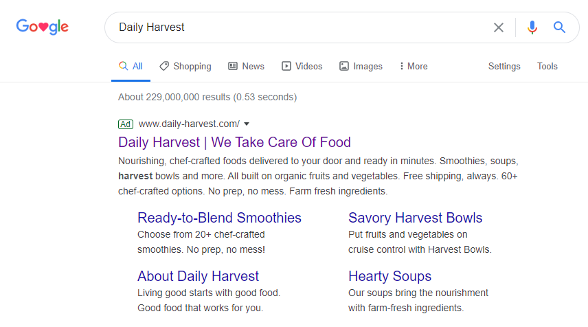
When searchers click the main headline, they see this Daily Harvest landing page:
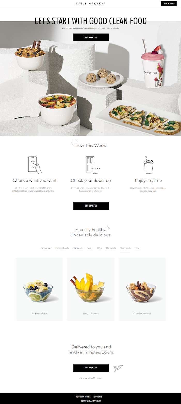
- What is the offer for? — Rather than focusing on smoothies like the previous example, this page tells a story about the entire brand. The headline and subheadline introduce the story by highlighting that the company specializes in good clean food built on fruits and vegetables, delivered to your door, and ready in minutes:

- Why sign up with Daily Harvest? — The main benefit here is how fast and simple it is to order from and use Daily Harvest. Not only is this highlighted with the subheadline shown above, but also in the middle of the page:

And the bottom of the page above the CTA button:
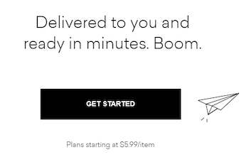
- How can visitors take action? — Visitors can sign up for Daily Harvest by clicking any of the four “Get Started” CTA buttons and completing the multi-step form on the following page.
- Who does Daily Harvest deliver to? — Prospects can learn if Daily Harvest delivers to them by submitting their zip code and email address.
Example 3: Facebook ad to promote a new product
Following previous interaction with Daily Harvest, prospects will likely to be targeted with social media ads like this on Facebook:
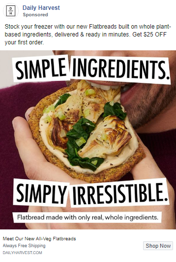
The ad begins a story narrative about Daily Harvest’s new flatbreads, and directs traffic to this page where the story continues:
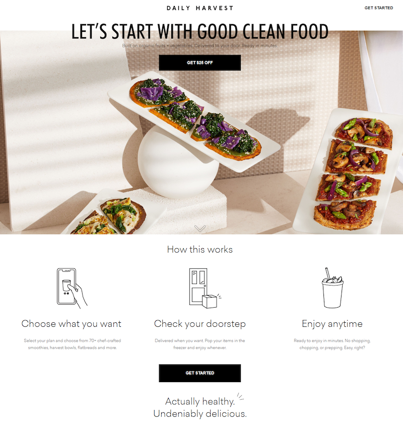
- What is the offer for? — The background image above the fold indicates this story narrative is specifically about flatbreads. The “Get $25 off” CTA button also reminds visitors they get a discount on their first order like the ad promised.
- Why Daily Harvest? — Similar to Example 2, the subheadline provides several of Daily Harvest’s main benefits: organic fruits and vegetables, delivered to your door, ready in minutes.
- How can visitors take action? — There are five cooperating CTA buttons on this page that all direct prospects to the multi-step form from Examples 1 and 2.
- Who can order from Daily Harvest? — Prospects must submit their zip code and email address through the lead capture form.
Example 4: Instagram Stories retargeting ad
Daily Harvest retargets prospects with Instagram Stories ads to ensure they stay top of mind after previous interaction on their website:
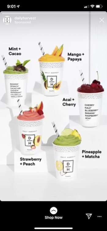
This ad sends traffic to the same post-click page from Example 2.
Compared to the Daily Harvest homepage…
Most homepages are designed as browsing experiences, providing an overview of multiple services. Unlike the examples above that each delivers a unique, personalized post-click landing page to a segmented audience.
Compare the Daily Harvest homepage to the previous landing page examples:
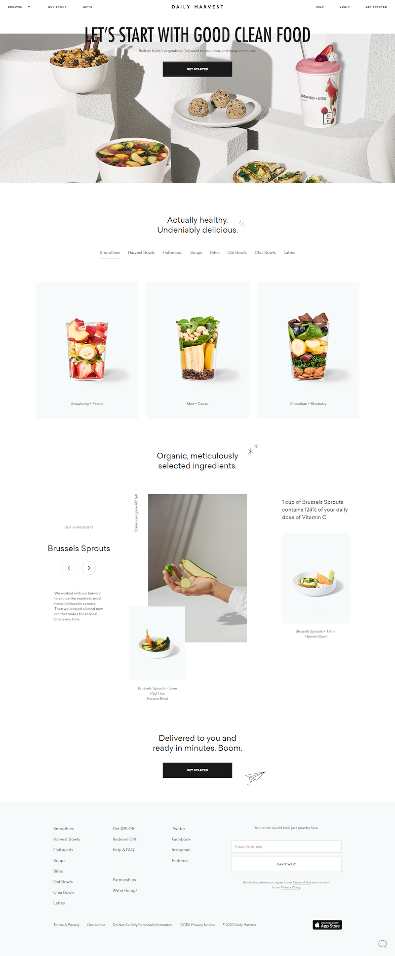
- A full header navigation (with a dropdown menu) provides visitors access to all of Daily Harvest’s other web pages.
- The Login button enables customers to leave this page to access their existing account instead of converting on a specific offer.
- A full-sized footer with many external links allows visitors to bounce from the page without any conversion.
Each of these components indicate the Daily Harvest homepage is designed to be a comprehensive browsing experience for all visitors, instead of having a 1:1 conversion ratio.
Connect every ad to a relevant post-click landing page
Personalizing the post-click landing page is just as important as hyper-targeting your ads. Not only that, but failing to create one cohesive experience from ad to post-click landing page will likely waste your ad clicks and budget.
Take inspiration from the Daily Harvest examples above to start creating your own completely personalized campaigns. To see how Instapage can help you create unique post-click landing pages at scale, request an Instapage Enterprise Demo today.

See the Instapage Enterprise Plan in Action.
Demo includes AdMap™, Personalization, AMP,
Global Blocks, heatmaps & more.
