Founded in 1995, Constant Contact began as “a valuable marketing tool that would help small businesses level the playing field in the battle against big business.” By 2005, the company surpassed 50,000 customers, and just two years later, they had doubled that number, reaching over 100,000 customers.
The company understands that one of the best ways to grow their email lists, nurture leads, and eventually turn those leads into customers is through post-click landing pages. We’ve covered many types of email marketing post-click landing pages before, so now let’s see how Constant Contact uses post-click landing pages in their campaigns.
But first, the basics.
What is a post-click landing page?
A post-click landing page is a standalone web page used to convince visitors to take a specific action (download an ebook, sign up for a trial, register for a webinar, schedule a demo, etc.). To inspire action, post-click landing pages use persuasive elements such as benefit-oriented headlines, hero shots, visual cues, and social proof.
Now let’s examine a variety of Constant Contact post-click landing pages and how they persuade prospects to take action.
(Keep in mind, for shorter pages, we’ve displayed the entire page. However, for longer pages, we only show above the fold, so you may need to click through to the page to see some of the points we discuss. Also keep in mind that some pages may be undergoing A/B testing with an alternate version than we’ve displayed below.)
7 Ways Constant Contact uses post-click landing pages:
1. To encourage people to request an event speaker

What the page does well:
- The headline and subheadline complement each other well and use personalized copy to speak directly to the visitor.
- The copy is informative (experienced speakers to deliver keynotes, moderate panels, corporate training sessions) and personalized (using “you” and “your”), making it more persuasive and compelling to visitors.
- Bullet points highlight the various topics covered by Constant Contact’s speakers, so prospects know if their desired topic is is covered.
- “Experts in your area” and “located near you” implies that no matter where a prospect is located, a Constant Contact expert can be available to speak at their event.
- The form’s border helps encapsulate and draw attention to it.
- The page is aesthetically pleasing — organized, well-balanced, and follows a good visual hierarchy.
What could be changed and A/B tested:
- The company logo is hyperlinked to the homepage, making it easy for visitors to leave the page before having a chance to evaluate the offer completely.
- The “Submit” CTA copy is vague and uninspiring, so it doesn’t inspire action as much as “Find Me a Speaker” could.
- Adding social proof like customer testimonials from others who have hired a Constant Contact speaker would likely inspire others to do the same.
- Adding white space between the subheadline, image, and content would help each element draw more attention.
- Social media links in the footer act as exit points and may distract prospects from the goal of the page before pursuing the offer.
2. To offer professional training
What the page does well:
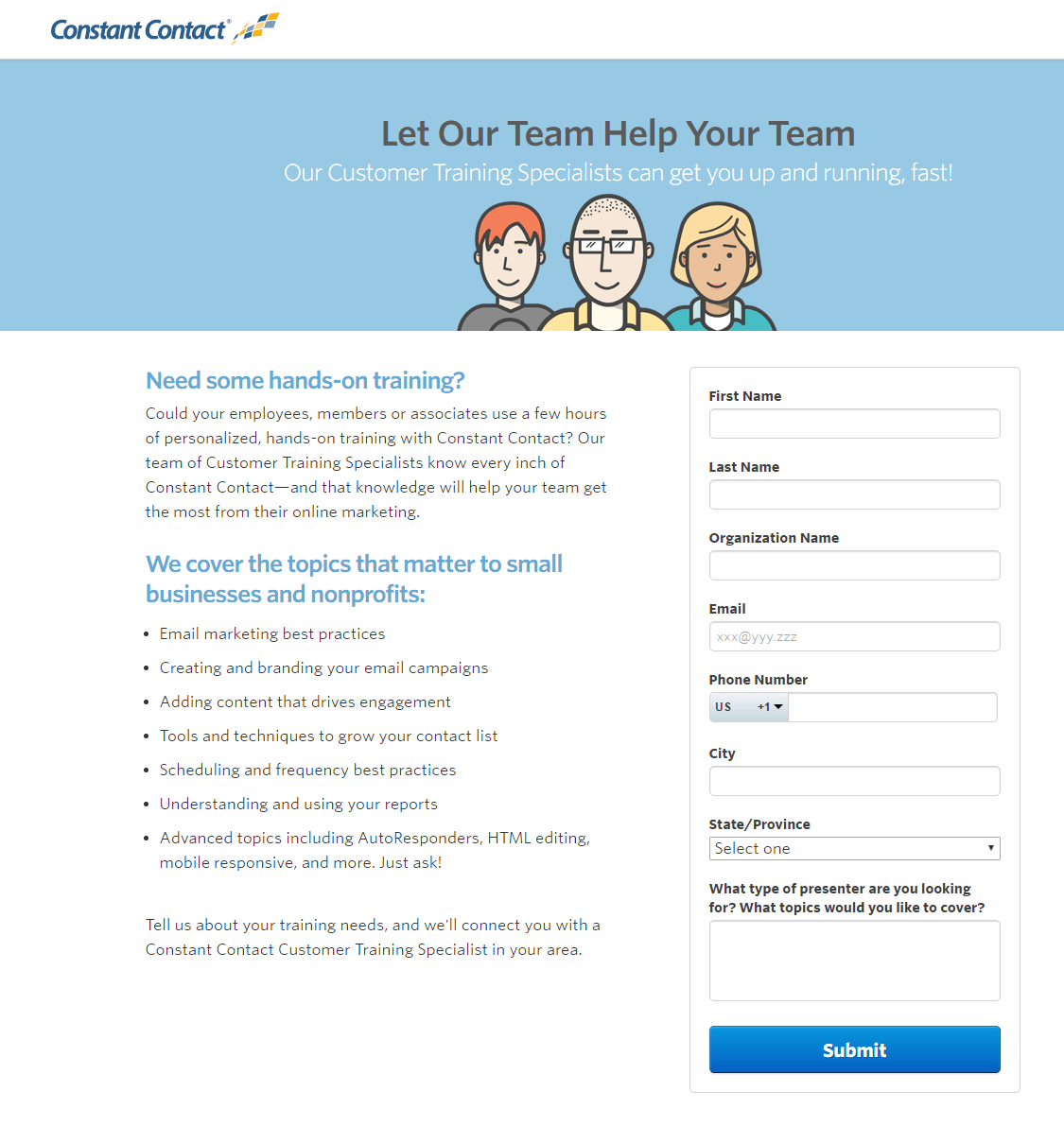
- The headline is benefit-oriented and supported by the subheadline.
- Personalized copy (words like “you,” “your,” and even “personalized”) makes the offer more relatable for visitors, likely persuading more of them to convert. It even states, “Tell us about your training needs,” to assure prospects that the content training content will be personalized to their specific needs.
- Bullet points with minimal copy inform prospects of the topics covered by trainers, without overwhelming the page with too much copy.
- The frame around the form helps highlight it, likely compelling more prospects to complete the form.
- The page is visually appealing because it is nicely organized and well-balanced.
What could be changed and A/B tested:
- The hyperlinked company logo serves as an exit link, providing visitors with an easy and immediate way off the page.
- The blue CTA button could be tested in a color other than blue (like red or orange) since blue is used throughout the rest of the page.
- The CTA button copy is boring. Something more enticing and benefit-oriented like, “Find My Personalized Trainer” may produce more leads.
- Providing social proof would make prospects feel more comfortable about working with a Constant Contact trainer. For example, adding a number counter of those who have requested personalized help could inspire visitors to convert.
- Links to social media accounts distract prospects from the goal of the page and give them multiple opportunities to leave the page before converting.
3. To persuade prospects to sign up for a free trial
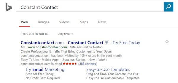
A Bing search for “Constant Contact” displays this paid search ad:
When prospects click the “Try Email Marketing” ad extension, they’re directed to this post-click landing page:
What the page does well:
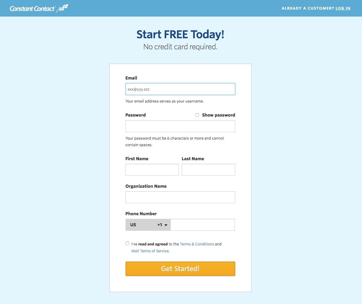
- “Free” is used in the headline, which grabs attention immediately.
- The ad and post-click landing page match with “Start Free Today, No credit card required.” This is a perfect example of providing a good ad-to-post-click landing page experience because prospects see a consistent message at each step.
- The form is encapsulated and plenty of white space surround it so visitors can’t help but pay attention to it.
- The orange CTA button jumps off the page making it very difficult to miss.
What could be changed and A/B tested:
- Multiple exit links act as distractions and could potentially take prospects away from the page, resulting in lost customers.
- Adding social proof like company badges or customer testimonials would add credibility to Constant Contact and make prospects feel more comfortable with signing up.
- Adding engaging media such as a Constant Contact software image or video might inspire prospects to sign up.
- The CTA button copy is a little bland and could be improved. Changing it to, “Sign Me Up” may produce better results.
4. To convince prospects to sign up for a paid account
Another Bing search, this time for “Constant Contact email marketing,” produced this paid search ad:

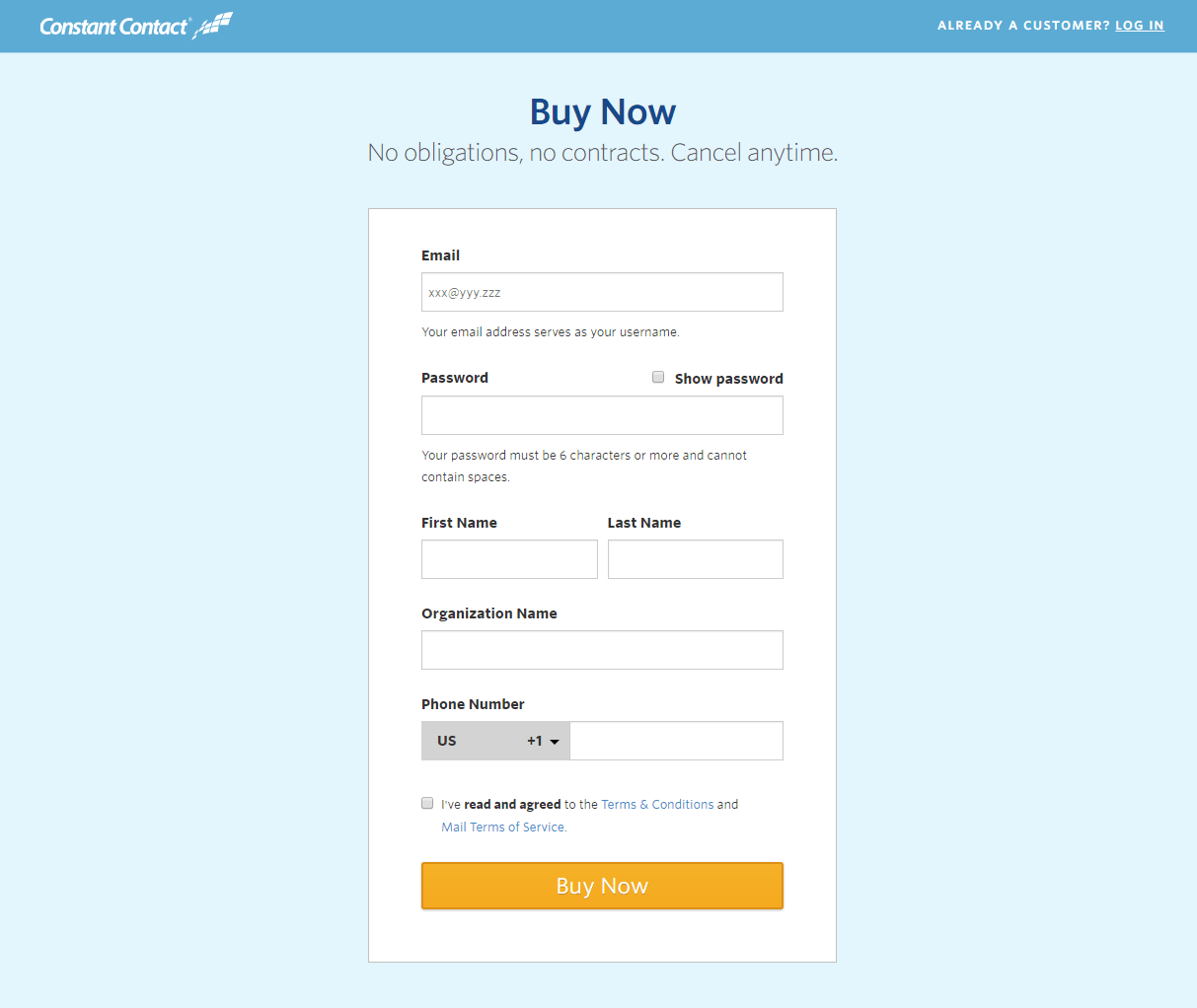
When the “Ready to Buy?” link is clicked, visitors are brought to this Constant Contact post-click landing page where they can sign up for a paid account:
What the page does well:
- The headline completes the thought of the ad extension. “Ready to Buy?” (Yes, “Buy Now”).
- The subheadline copy reassures anyone who may have doubts or reservations about being locked into an account with Constant Contact.
- The form stands out on the page because it’s encapsulated in a different color than the background.
- “Show password” is a nice addition because visitors can make sure they’re typing in their desired password when creating an account.
- The orange CTA button is attention-grabbing because it contrasts well with the blue page.
What could be changed and A/B tested:
- Exit links in the header and footer are distracting and could cause visitors to leave the page before creating an account.
- Adding informative, persuasive copy would lead to better results. When convincing prospects to buy, it’s best to provide information on what they’re paying for and why they should pay for it.
- Lack of social proof decreases credibility. Adding elements like company badges or customer testimonials would likely make visitors feel more comfortable with signing up.
- Adding a video testimonial could help seal the deal in converting visitors to customers.
- The CTA button copy, “Buy Now,” is vague and sounds somewhat demanding. Testing engaging, personalized, benefit-oriented copy would likely convince more prospects to sign up.
5. To target real estate professionals
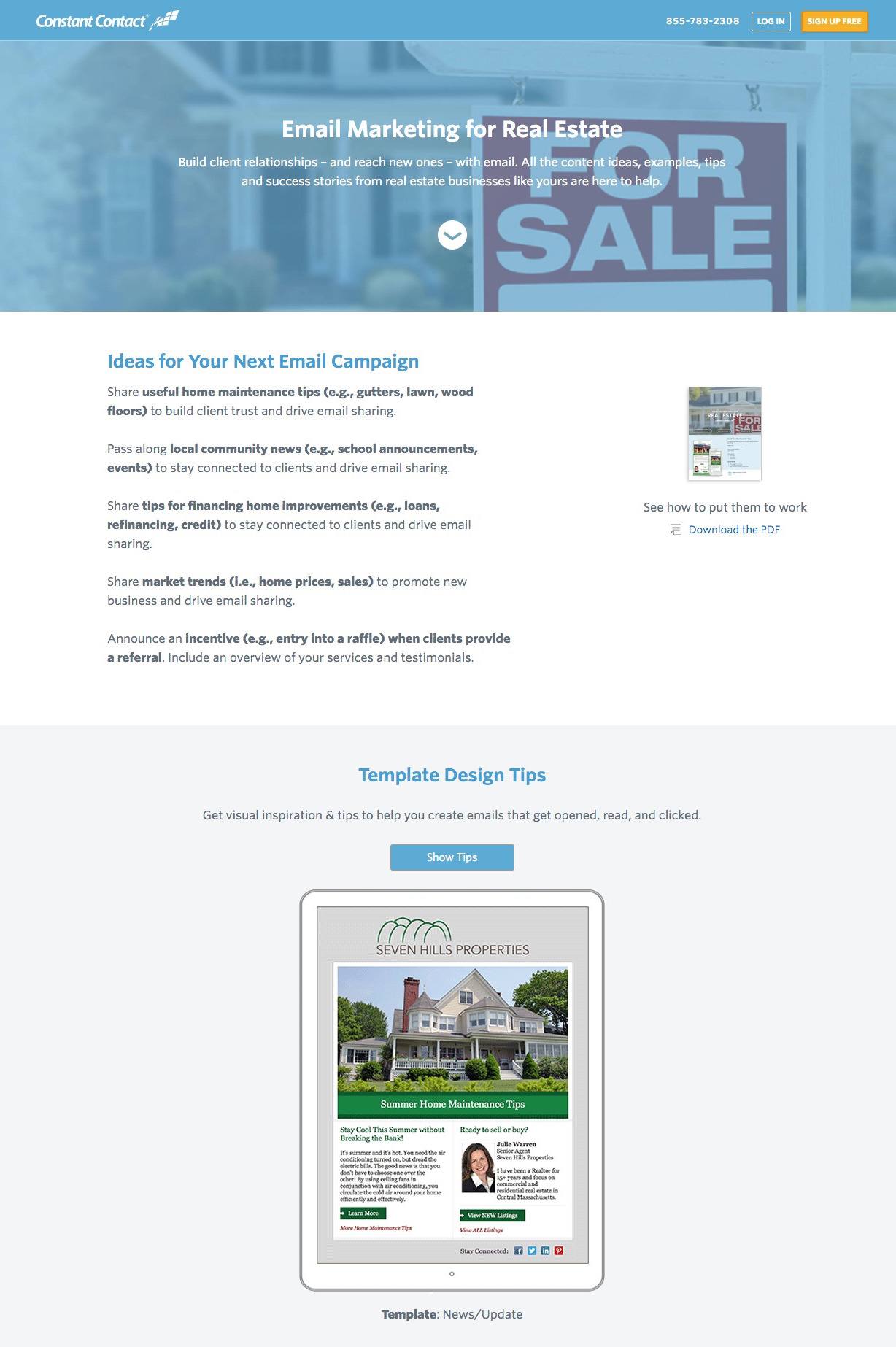
This example is a click-through post-click landing page that targets professionals in the real estate industry. Once a visitor clicks either orange CTA button, they are taken to this signup page. Nonetheless, the content on this page is specific to real estate professionals and how Constant Contact’s software can help them generate new clients:
What the page does well:
- The click-to-call phone number is a nice inclusion, because it makes it easy and convenient for prospects to contact Constant Contact customer service.
- The downward-pointing arrow is a directional cue using an anchor tag to encourage visitors to scroll down the page and learn more.
- Bold print in the “Ideas” section draws attention to the most important details so visitors don’t feel like they have to read all of the copy if they are looking for something specific.
- The “Show Tips” button expands the section to provide more information instead of cramming it all onto the page or taking prospects away from the page.
- The horizontal-pointing arrows in the tips section let visitors know that they can scroll left and right to see more tips.
- The customer testimonial adds social proof to the page, showing that other people have found success with the company. The only thing missing from the testimonial is Brandon Stewart’s headshot. Putting a face to the name adds even more credibility.
- The orange CTA buttons contrast well with the white and blue page.
What could be changed and A/B tested:
- Numerous exit links in the header, footer, “Download PDF,” and the Log In button give visitors too many options before they convert on the offer.
- The headline could be improved. Although it’s targeted for real estate professionals, a benefit-oriented headline would be more compelling.
- Adding social proof such as how many real estate customers use Constant Contact would convince prospects that their email software is a proven marketing tool for those in the real estate industry.
- Enlarging the CTA button would make it more attention-grabbing and likely make more prospects click.
6. To offer their email and social media marketing guide
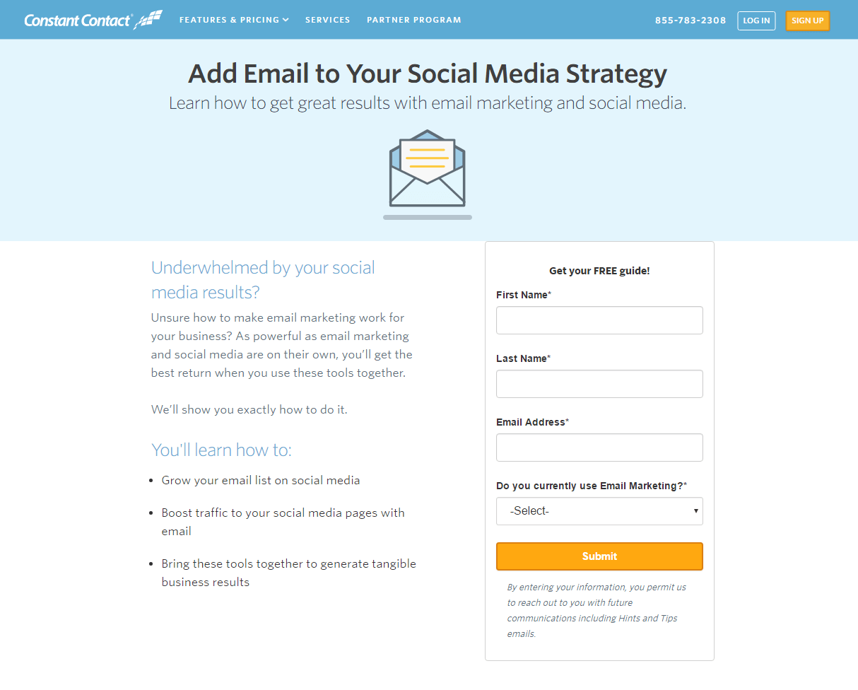
An exit-induced banner appears when visitors attempt to leave a Constant Contact web page. When prospects click this CTA button, they are directed to the subsequent post-click landing page:

What the page does well:
- The click-to-call phone number makes it easy and convenient for prospects to reach Constant Contact’s customer service team.
- Personalized copy acknowledges a common problem that prospects face (underwhelming social media results) and presents them with a solution to that problem (using email marketing and social media together).
- Bulleted copy highlights the key takeaways from the guide so visitors can scan the page quickly and understand what’s included.
- The word “free” in the form headline is very persuasive at convincing prospects to redeem the offer.
- The length of the form is appropriate for the consideration stage of the marketing funnel, because prospects are past the awareness stage (fewer form fields), but are still getting to know the company before reaching the decision stage (more form fields).
- The CTA button “pops” off the page because it’s bright and contrasts with the entire page.
What could be changed and A/B tested:
- Exit links in the header makes it easy for visitors to leave the page immediately.
- Adding social proof, like testimonials or email and social media marketing stats, would help persuade prospects to download the guide and start working with Constant Contact.
- No trust signals — not even a privacy policy — may prevent visitors from downloading the guide.
- The CTA button copy is vague. “Submit” doesn’t say anything positive about the offer, so it’s not likely to persuade prospects to convert. “Download the Guide” and “Send Me the Free Guide” are both much better than “Submit.”
7. To generate downloads of their digital marketing agency guide
What the page does well:
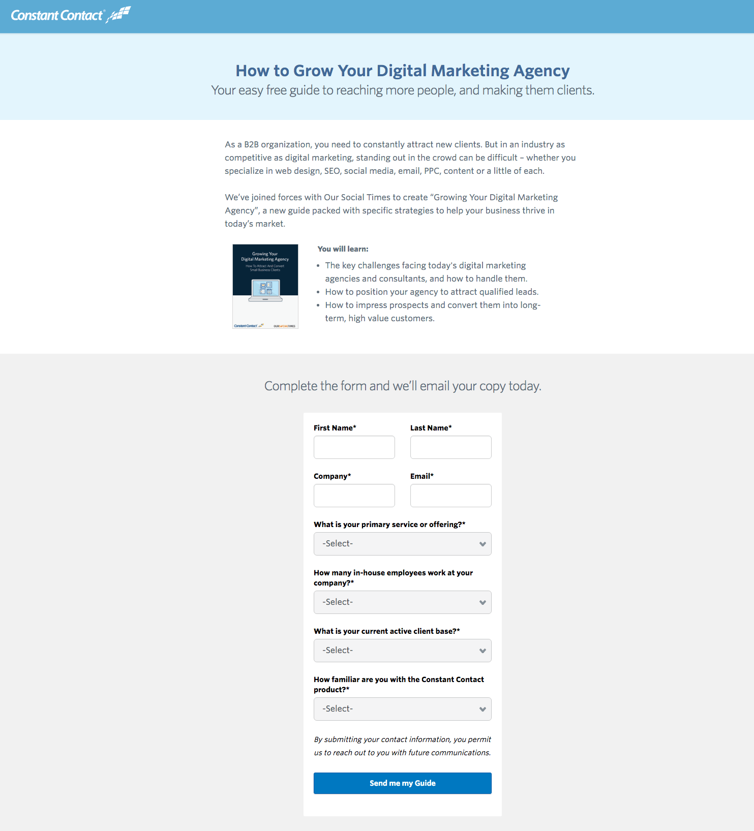
- The headline and subheadline are benefit-oriented and use the word “your” which speaks directly to visitors.
- Bullet points separate the important takeaways of the guide from the rest of the copy, making them easy to spot when skimming the page.
- The form headline let’s prospects know they’ll receive the guide immediately upon completing the form.
- The form stands out because it’s encapsulated in a different color than the background it’s against.
- The CTA button copy is written in first-person, making it more personalized and relatable for prospects.
- The page is aesthetically pleasing — organized and well-balanced — providing visitors with an enjoyable experience.
What could be changed and A/B tested:
- The logo and footer links are too tempting to click, and take prospects away from the page before completing the form.
- Making the guide image larger would draw more attention and give prospects a better idea of what they’re downloading.
- The CTA button color should be a different color than blue because light blue and dark blue have already been used on the page. Green or orange would contrast well with the page and draw maximum attention.
- Adding social proof, like the number of guide downloads or testimonials from others who have used the guide, would make the offer more irresistible.
Which Constant Contact post-click landing page inspired you?
There’s no doubt that Constant Contact understands the persuasive power of post-click landing pages in their digital marketing strategy. Each example above highlights a different offer based on the marketing funnel and how they optimize each page for conversions.
What did you learn from their post-click landing pages? What inspired you, and what will you do differently?
Take what you learned and start filling your funnel and growing your own brand awareness, sign up for an Instapage Enterprise demo today.

See the Instapage Enterprise Plan in Action.
Demo includes AdMap™, Personalization, AMP,
Global Blocks, heatmaps & more.
