With nearly 5,000 FDIC-insured commercial banks in the United States alone, it’s essential for any bank to know exactly how to present themselves online to win awareness and market share.
To help establish its online presence, Chime advertises its services with targeted PPC and display ads, all connected to personalized Chime landing pages that continue the ad narrative. Let’s look at a few examples.
How Chime uses targeted ads with post-click landing pages
Example 1: “No fee debit card” Google search
Someone at the top of the marketing funnel, researching their options for a debit card without additional fees might search Google for “no fees debit card” and see this ad at the top of the results:

There are many indicators the ad is segmented for a specific audience:
- The first section of the headline lets prospects know the offer is for a debit card — the same as the search query.
- The second section of the headline assures them there’s no card fees — a stipulation specified in the search query.
- The description continues providing benefits of a Chime account (including a list of all the fees not associated with this account/card, but commonly associated with others).
- The second ad extension (headline and description) reiterates there are never any fees associated with this debit account/card.
Clicking the main headline leads to this post-click landing page where the no-fee narrative continues:

- What is the offer for? — The mobile app GIF and card image at the top of the page immediately shows visitors what the page is about. The narrative continues by saying, “Chime is a mobile banking app and debit card made awesome:”

- Why choose Chime? — The no-fee promise is the main reason for choosing Chime, which is conveyed throughout the entire page (GIF, checkmark list, sections of benefits in the middle of the page, “Security and control on the go” section, etc.).
- Who supports Chime? — The logos next to the visuals at the top of the page serve as social proof, letting visitors know that they can trust Chime because Apple and NerdWallet both do. The three reviews from App Store Review also help convince people to sign up with Chime because they highlight other customers’ success with the company:

- How can visitors take action? — Prospects can sign up for a Chime account by entering their email address and clicking the “Apply Now” CTA button at the top of the page. From the bottom of the page, they can also click the “Get Started” button, which takes them to this application form:

Note: The “Get Started Today” extension in the ad above takes prospects immediately to the signup page/form.
Example 2: Branded search
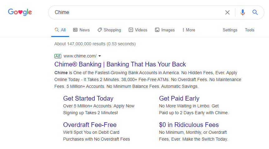
A simple branded search for “Chime” shows this PPC ad with even more sitelink extensions to segment users into different audiences:

Clicking the main headline in this ad takes prospects to a page nearly identical to Example 1, aside from the very top of the page, which has a new variation of the copy (to message match the ad exactly) and visual:

Underneath that, the remainder of the page looks the same and delivers the same narrative from Example 1.
Example 3: “Get Paid Early” extension
Someone intrigued by the idea of getting paid earlier than usual would click the “Get Paid Early” extension from the ad in Example 2 and land on this post-click page:

- What is the offer for? — The page immediately continues the ad narrative with a headline and subheadline letting visitors know they can get their paycheck up to two days early with Chime’s early direct deposit option. The image to the right supports this idea too.
- Why choose Chime? — Since this example is targeted to people interested in getting paid early, that’s the primary reason for choosing Chime in this story narrative. It is conveyed through the headline and image at the top of the page, the descriptive copy throughout, and even though the reviews in the middle of the page.
- Who supports Chime? — The Trustpilot ratings and reviews show visitors who else supports Chime and highlights their success with the company:

- How can visitors take action? — Prospects can sign up for a Chime account in three different locations throughout the page: the green “Get Started” CTA button at the top of the page, or either of the two email fields.
Example 4: “Overdraft Fee-Free” extension
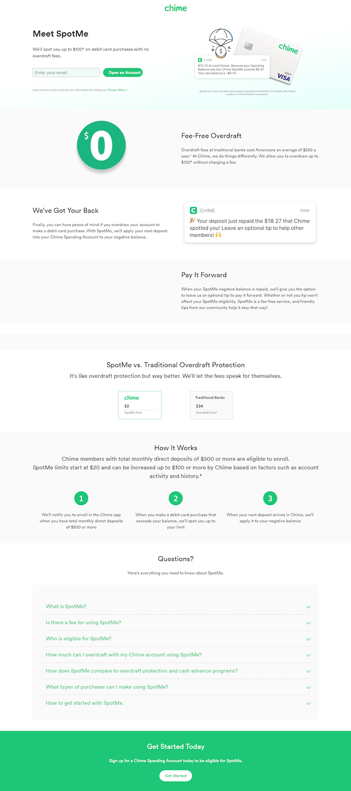
Clicking the “Overdraft Fee-Free” extension in the same ad directs prospects to this page to learn more about how Chime protects members from overdraft fees:

- What is the offer for? — The headline and subheadline introduce visitors to SpotMe, Chime’s overdraft protection feature. The story continues to describe SpotMe throughout the page.
- Why choose Chime? — Again, this example is segmented to people most interested in overdraft protection. Therefore, that’s the main benefit of Chime in this story narrative. The comparison between SpotMe vs. traditional overdraft protection helps demonstrate why visitors should choose Chime:

- Who supports Chime? — Under “Who is eligible for SpotMe?” in the questions section, it’s explained that Chime members who have received at least $500 in direct deposits over the last 31 days are eligible for SpotMe.
- How can visitors take action? — Visitors have two options for signing up in this example: enter their email address and click the “Open an Account” CTA button at the top of the page, or click the “Get Started” button at the bottom of the page.
Example 5: Facebook retargeting ad
Following the previous interaction with Chime, and after visiting their homepage, the company retargets prospects with Facebook ads like this one:

Clicking the ad takes people to a post-click page identical to Example 1, aside from the copy at the very top of the page.
Compare these examples to the Chime homepage
While all of the examples above deliver a unique, personalized post-click landing page to a targeted audience, homepages are typically designed as browsing experiences, not focused on advertising conversion.
Look at the Chime homepage, for example:

- A full header navigation, complete with dropdown menus, provides visitors access to all of Chime’s other web pages.
- The Log In button enables customers to leave this page to access their existing account, rather than signing up for a new account.
- Links to other Chime web pages with every scroll provide visitors with many escape routes, continuing to demonstrate a browsing experience.
- A full-sized footer with many more external links (including social media buttons) allows visitors to bounce from the page without any conversion.
These elements indicate the Chime homepage is designed to be a comprehensive browsing experience for all visitors, unlike the post-click landing pages above that both provide a 1:1 conversion ratio for segmented audiences.
Create every campaign with a seamless ad-to-post-click landing page
Segmenting and personalizing ads is necessary, as is personalizing the pages they direct traffic to.
Use inspiration from the examples above to create your own campaigns that tell the same story narrative across the pre- and post-click landing page. To see how Instapage can help you create these experiences at scale, request an Instapage Enterprise Demo today.

See the Instapage Enterprise Plan in Action.
Demo includes AdMap™, Personalization, AMP,
Global Blocks, heatmaps & more.