With every Presidential candidate vying to make an impression and win votes, it’s no surprise that political advertisements abound across the web.
The most successful ads, though, are ones segmented to specific audiences and connected to personalized post-click landing pages that continue the same ad narrative. This ensures user expectations are met, and helps candidates establish credibility with voters. Let’s see how the Bernie Sanders campaign executes its strategy.
How Bernie Sanders uses segmented ads & post-click landing pages
Example 1: Google paid search to generate donations
Since Sanders pays to advertise on his own brand name to show up at the top of SERPs, searching for “Bernie Sanders” shows this paid search ad:

The ad is segmented to online users searching for Bernie Sanders, since:
- The headline includes his name
- “Paid for by Bernie 2020” is highlighted beneath the description
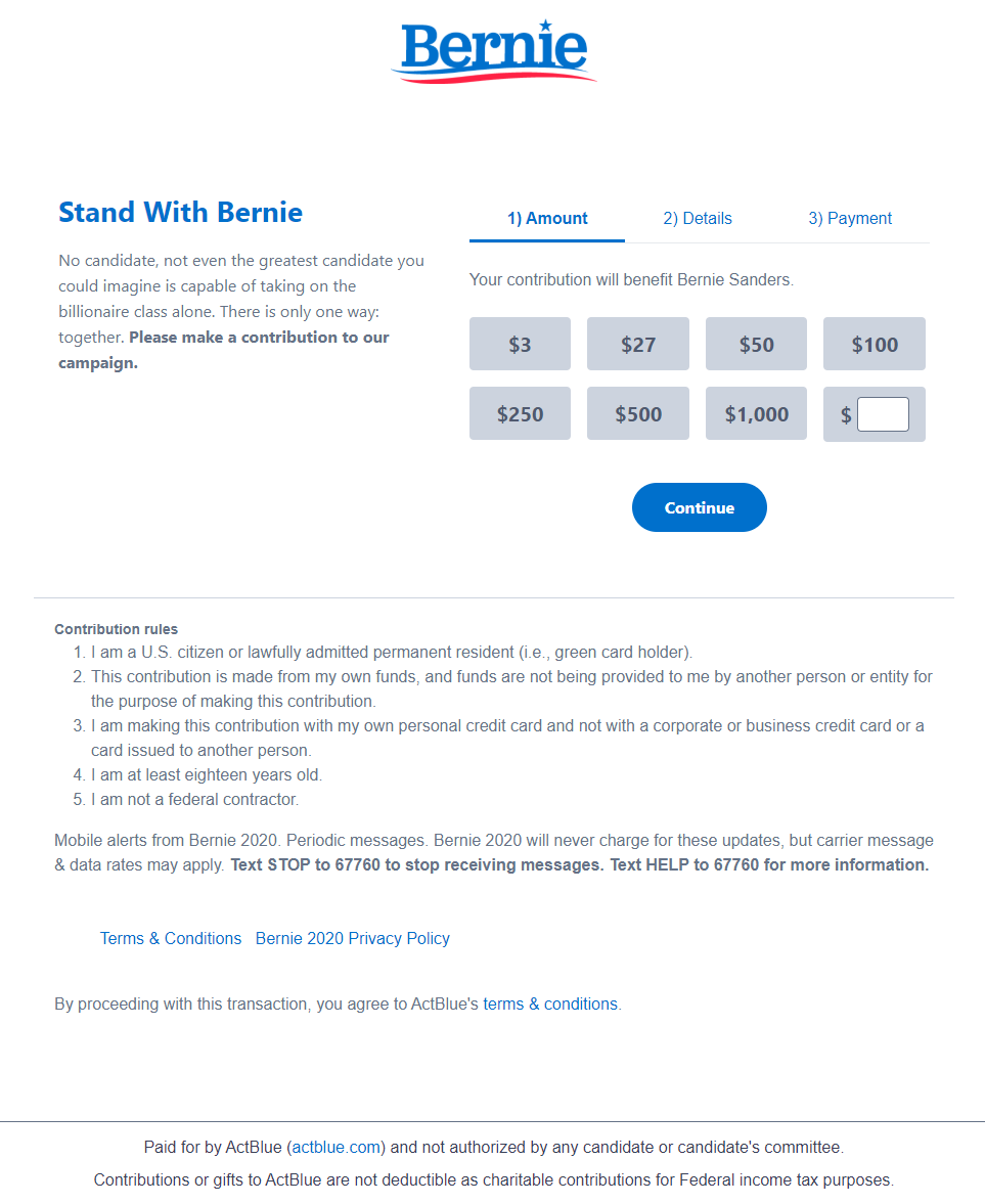
The ad’s message continues onto the post-click page:

- What is the offer? — As the headline reads, to “Stand with Bernie” and support him by donating to his campaign.
- Why contribute? — This part of the story is told directly beneath the headline: the only way to take on the billionaire class is together.
- Who can donate? — The list of five contribution rules indicates who can make a contribution (U.S. citizens/permanent residents, adults 18+ years, non-federal contractors, etc.).
- How can people take action? — Visitors can complete the multi-step form to pay their donation.
Example 2: Facebook image ad to accrue vote pledges
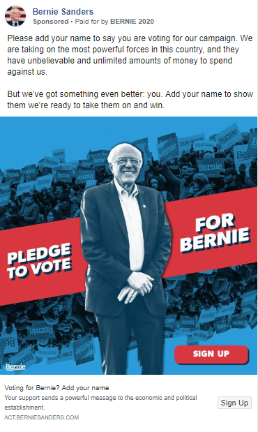
The Sanders campaign also targets users with Facebook ads and personalized post-click landing pages:

The ad begins a story narrative about pledging to vote for Bernie to take on and win against the most powerful forces in the country. The narrative continues onto this signup page:

- What is the offer? — For Facebook visitors to sign up tol support Sanders in their state’s primary or caucus.
- Why take action? — The page explains that the only way for Sanders to win the election is if his supporters continue to stand together.
- Who supports the offer? — The encapsulated copy at the bottom indicates that the ad is supported and paid for by Bernie 2020.
- How to sign up — Supporters can complete the lead capture form and click the green “Submit” CTA button to pledge their vote for Sanders.
Example 3: Sponsored Instagram ads to encourage event signups
Sponsored Instagram ads like this one are also part of Sander’s campaign:

Introducing a story about a Dallas rally, the ad directs traffic to this event signup post-click page:

- What is the offer? — To learn more about, and RSVP to, the Dallas, TX rally event. The same image on the ad and post-click page lets prospects know the same message is being delivered in both places.
- Why take action? — The page encouraged visitors to take action quickly because it was a time-sensitive event. All of the details about when the event took place — and “Sign up now” above the form — helped create urgency and a reason for visitors to sign up quickly.
- Who supports the offer? — The “Paid for by Bernie 2020” box and the Mobilize America logo lets visitors know that the offer and page are legitimate.
- How to RSVP — By completing the 5-field form and clicking the blue “Sign up” CTA button.
Compare these examples to Bernie Sanders’ homepage
Each personalized post-click landing page above has a 1:1 conversion ratio, but the Bernie Sanders homepage does not. That’s okay, because instead of focusing on one conversion goal for a segmented audience, it offers a comprehensive browsing experience for anyone visiting his site:

- A full header navigation allows visitors to explore other pages, decreasing their chance of converting directly through the homepage.
- Competing CTA buttons above the fold (“Donate” and “Add your name!”) could confuse visitors about what is preferred action and deter them from clicking either one.
- A vague headline might leave people wondering, “What is the main purpose of the page?”
- Additional links and CTA buttons throughout the page (“Meet Bernie,” “View all Issues,” “Get the BERN app,” “Sign up to Volunteer,” “Shop,” etc.) could overwhelm visitors and decrease conversions on this page.
- A large footer menu provides another chance for prospects to continue browsing instead of taking immediate action (donating, joining email list, etc.).
Tell the same story across ad and post-click landing page
Bernie Sanders’s digital advertising team focuses their attention on both ads and post-click landing pages to ensure ad clicks and budget aren’t wasted. Use his examples as inspiration to tell the same story narrative across your pre- and post-click landing pages to ensure you don’t miss your opportunity either.
Request an Instapage Enterprise Demo today to see how you can start creating dedicated, personalized post-click landing pages at scale for each of your segmented audiences.

See the Instapage Enterprise Plan in Action.
Demo includes AdMap™, Personalization, AMP,
Global Blocks, heatmaps & more.
