The majority of advertisers aren’t focused enough on the post-click landing page, and it shows since more than 95% of Google ad clicks don’t convert.
They put in the effort to segment their ads to a target audience, but then fail to continue the same story narrative from ad to post-ad-click page. The expectations set with the ad aren’t met on the next step, and this lack of relevancy prevents visitors from converting.
To generate maximum conversions, you must continue the same story narrative from the ad. Today we’ll take a close look at how Ashford University does it. (To see how Capella University tells their story from ad to page, go here.)
How Ashford University segments their ads with post-click landing pages
Example 1: “Education degrees” Google search
Someone thinking of studying education might search Google for “education degrees” and see this ad:
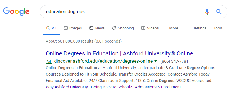
We can tell the ad is segmented for a specific audience since it relates to the search query:
- The first half of the headline “Online Degrees in Education” lets prospects know the ad is specifically for people interested in the education field.
- The display URL repeats “education” and “degrees online” to assure prospects they’ll be taken to a relevant post-click destination.
- The description starts with “online degrees in education” before providing more information specific to Ashford University.
Clicking the ad’s main headline takes users to this post-click page where the education degree narrative continues:
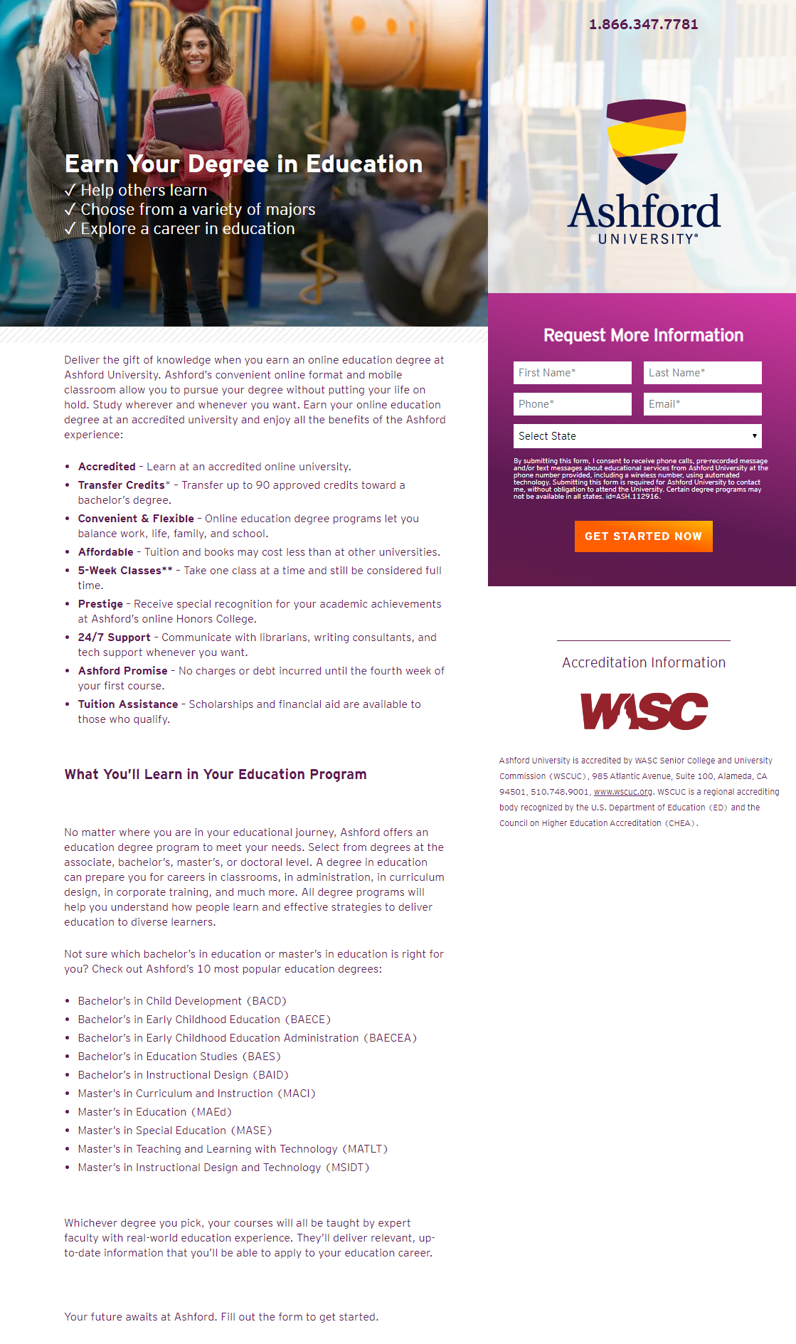
- What is the offer for? — The headline, “Earn Your Degree in Education,” begins the story by reassuring visitors they’re in the right place for more information on their search query.
The subheadline makes the offer more appealing by telling prospects they can explore a career in education and select from a variety of majors.
- Why Ashford? — The next part of the page continues the story by listing the benefits of the Ashford experience, complete with bullet points and bold copy highlighting why prospects should choose Ashford for their education degree.
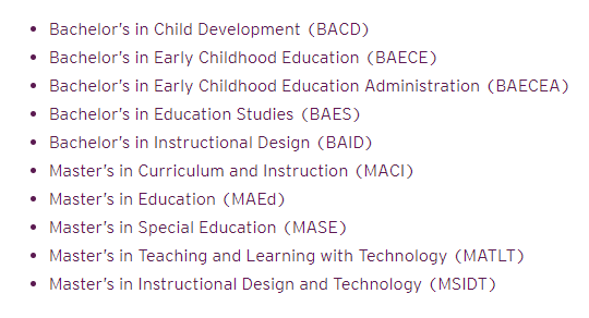
The list of Ashford’s 10 most popular education degrees also helps tell this part of the story, showing visitors all the various options they have:
- Who supports Ashford? — Directly below the form is accreditation information stating that Ashford is backed by WASC Senior College and University Commission, complete with the WASC logo.
- How can visitors take action? — Potential students can request more information about earning a degree in education by completing the purple encapsulated form and clicking the orange/yellow “Get Started Now” CTA button.
They can also click the anchor link at the bottom of the page, which takes them right back up to the form to complete it.
Example 2: “Why Ashford University” extension
Clicking the ”Why Ashford University” extension in the ad above takes prospects to this unique post-click page:
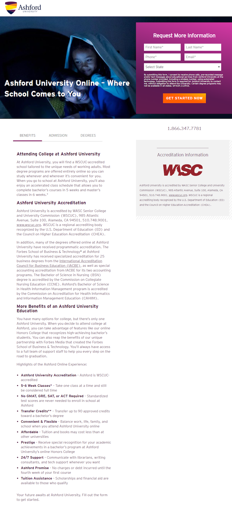
- What is the offer for? — The story on this page is focused on the benefits of attending Ashford University, rather than obtaining the education degree from the previous example. The headline highlights that Ashford is an online school that people can attend from home.
- Why choose Ashford? — Since conveying the benefits of Ashford is the primary goal of this page, it has its own subsection visitors can click on:

Under this section, visitors can learn all about the main benefits of an Ashford University education from the bulleted list:
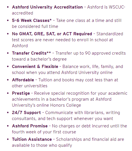
- Who accredits Ashford? — Similar to the previous example, there is accreditation information and a WASC logo underneath the form. There’s additional information under the Ashford University Accreditation section.
- How can visitors redeem the offer? — Prospects can request more information about Ashford University Online by completing the form and clicking the “Get Started Now” CTA button, or clicking the anchor tag at the bottom of the page to complete the form.
Example 3: “Online MBA degree” Google search
Someone interested in obtaining their MBA degree online might conduct this search and see the second ad below:
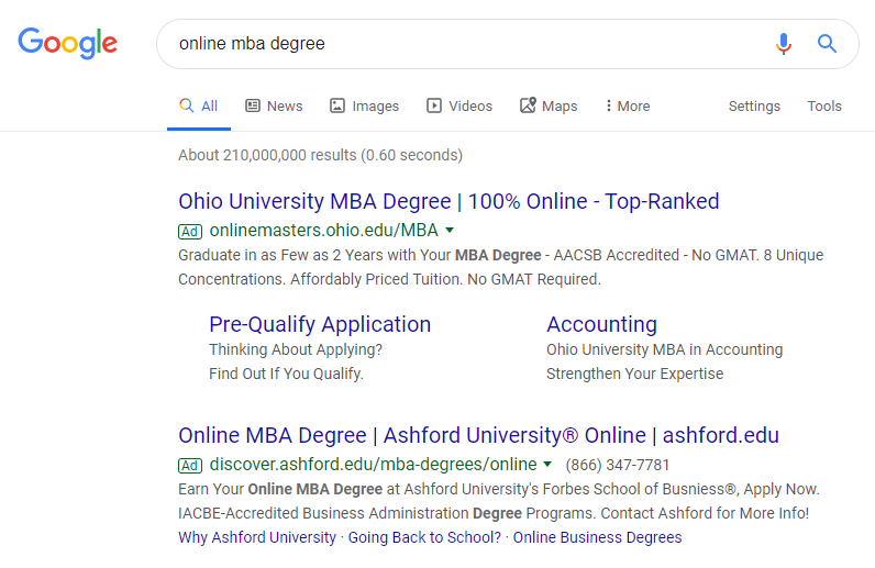
Again, it’s clear the ad is segmented for a specific audience since it matches the search query:
- The first half of the headline “Online MBA Degree” is exactly the same as the search phrase.
- The display URL uses both “mba degrees” and “online” as path fields to provide more specific information on where prospects will land after clicking.
- The description highlights “Online MBA Degree” again in bold copy.
Clicking the headline takes prospects to this page:
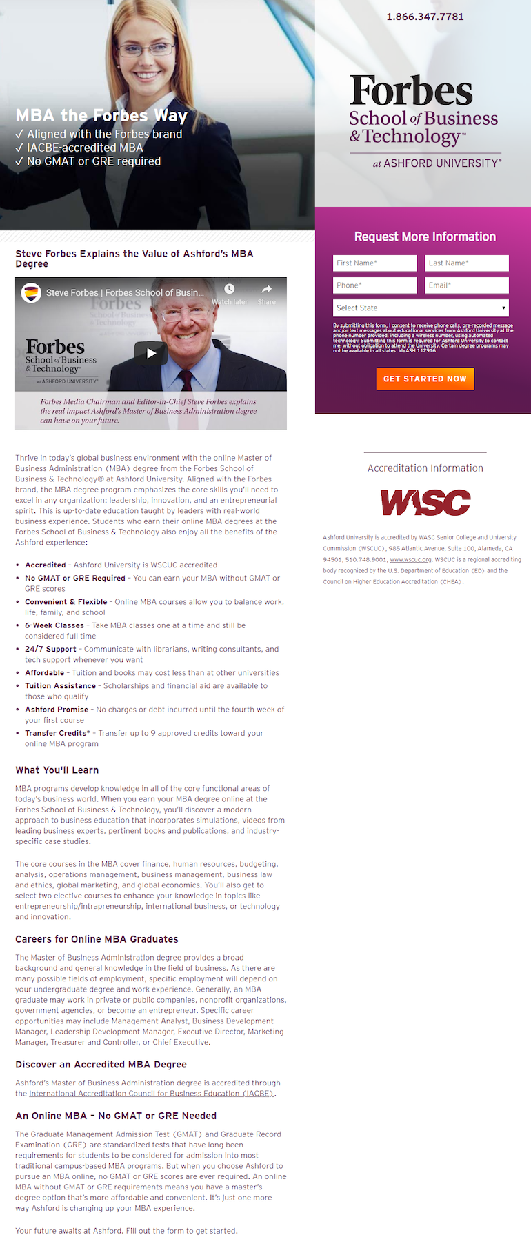
- What is the offer for? — The offer on this page is for prospective students interested in a Master of Business Administration degree. This is made clear throughout the entire page, with multiple mentions of “MBA degree,” “MBA programs,” etc.
- Why choose Ashford for an MBA? — This part of the story is told with the same list of benefits from the previous examples, highlighted with bullet points and bold copy.
Several sections underneath that list also help tell this part of the story, explaining what students will learn in their MBA programs, possible career options for online MBA graduates, and that no GMAT or GRE is needed to pursue this degree.
- Who can testify on Ashford’s behalf? — Social proof is a huge part of this page, with numerous mentions of Forbes throughout the content:
- In the headline and subheadline
- Above the form
- Within the copy
- The video testimonial

- How can visitors request more information? — More info. can be requested the same way as the previous examples — with the lead capture form or the CTA button at the bottom of the page.
Example 4: LinkedIn retargeting ad
After visiting each page above, this retargeting ad appeared in the LinkedIn feed:

Clicking the Promoted LinkedIn ad takes users to this page to learn more about a human resource master’s degree:
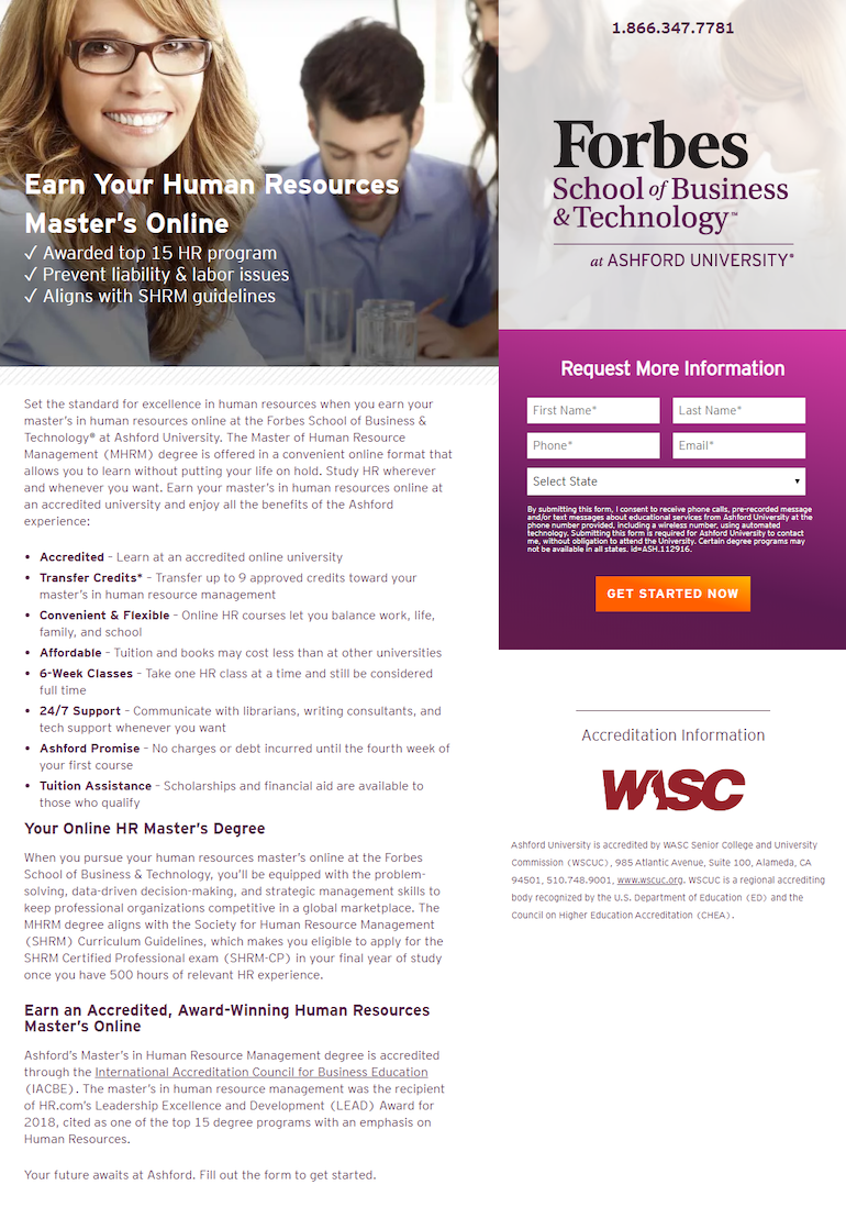
- What is the offer for? — The headline, “Earn Your Human Resources Master’s Online,” begins the story by reassuring visitors this page is closely connected to the ad they just clicked.
- Why choose Ashford? — Again, the list of Ashford benefits conveys the main reasons prospects should choose Ashford for their Human Resources Master’s degree.
The copy beneath the list (“Your Online HR Master’s Degree”) helps tell this part of the story as well.
- Who accredits Ashford? — Just like all other examples, this page explains underneath the form that Ashford University is accredited by WASC Senior College and University Commission (WSCUC):

The last paragraph on the left tells prospects how Ashford’s Master’s in Human Resource Management degree, specifically, is accredited through the International Accreditation Council for Business Education (IACBE). It continues to boast that the program was the recipient of HR.com’s Leadership Excellence and Development (LEAD) Award for 2018.
How to learn more? — Potential students can request more information by completing the purple lead capture form.
Compare these experiences to the homepage
Ashford’s homepage provides an overview of everything the school offers — with many navigation and browsing options — instead of delivering a unique, personalized post-click landing page to segmented audiences:
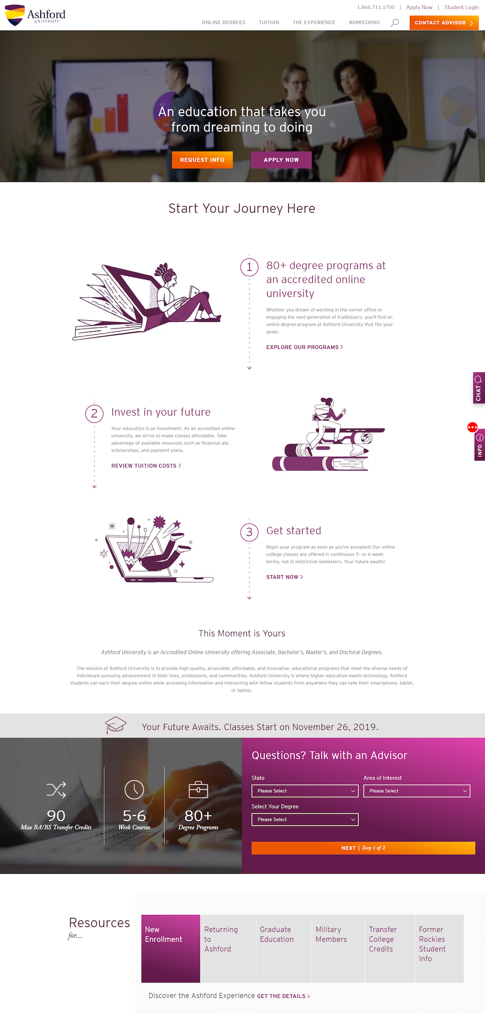
- A full header navigation with multiple dropdown menus allows visitors to leave and visit other pages instead of converting on this page.
- The student login link in the top-right could distract users since they can leave this page to access their account.
- The headline is vague and doesn’t highlight any particular degree or offer like the previous examples.
- Multiple links and CTA buttons to other website pages throughout the content demonstrate a browsing experience.
- The full-sized footer (below the fold) provides additional external links, including many social media links, allowing visitors to bounce easily from the page.
Since the homepage is generalized to anyone who might be interested in Ashford University, all visitors see the same page. Rather than having a 1:1 conversion ratio and persuading visitors to convert on specific offer, it’s designed to be a comprehensive browsing experience.
Complete your campaigns with the segmented post-click landing pages they deserve
Avoid wasting ad clicks and generate more conversions by paying equal attention to your pre- and post-click landing pages. Translation: tell the same story narrative across the entire user experience.
Use the Ashford University examples above for inspiration, and request an Instapage Personalization Demo today to see how you can create dedicated post-click landing pages at scale for each target audience.

See the Instapage Enterprise Plan in Action.
Demo includes AdMap™, Personalization, AMP,
Global Blocks, heatmaps & more.
