Years after Google aimed to speed the mobile web, the little blue lightning bolt has become a recognizable symbol in search engine results.
With tens of millions of domains now “AMP”ed, the open-source framework has expanded its reach. Now, marketers aren’t just speeding post-click landing pages, blog posts, and full websites with AMP; they’re improving email with it too.
What is AMP for email?
AMP for email is another way for marketers to leverage the speed of the accelerated mobile pages framework. In the official release on the AMP blog, Product Manager of Gmail and Chat, Aakash Sahney, calls it a powerful way for developers to create more engaging, interactive, and actionable email experiences.
What can you do with AMP for email?
One of the most frequently asked questions about AMP for email is: Can you do all the things with AMP for email that you can with AMP?
The answer is “no.”
However, AMP email is far less constrained than traditional email. And while you can’t use ALL of AMP’s commands in Gmail, you can still create a highly rich user experience. According to AMP, here’s what you can use in your AMP emails:
Dynamic content
Thus far, email content has been primarily static. The user cannot engage with it other than to read, watch, or click through. With AMP for email, dynamic content allows for more versatile engagement, like form submission, for example. Here are some of the dynamic content elements you’ll be able to use with AMP for email:
- amp-form: This is AMP’s form element. It allows designers to create forms directly in email that can be completed by users.
- amp-selector: This is multi-select widget for use within a form.
- amp-bind and amp-state: Simple scripting language in AMP that allows the manipulation of a state machine for interactions between elements. Can also be used to add behavior on certain events. amp-state is used to remotely fetch the initial state machine values.
- amp-list: Remotely fetches JSON data that will be rendered by an .
- template type=”amp-mustache”: A Mustache template markup to render the results of an amp-list call.
Layout
The layout of traditional email is fairly rigid. AMP for email opens it up with elements like a carousel for media, lightboxes for images and text, and accordions for showing and hiding different sections. Here are the elements you can use to display your email in novel ways:
- amp-accordion: A UI element that facilitates showing/hiding different sections.
- amp-carousel: A carousel UI component.
- amp-sidebar: A sidebar for navigational purposes.
- amp-image-lightbox: A lightbox for containing images.
- amp-lightbox: A lightbox for containing content.
- amp-fit-text: A helper component for fitting text within a certain area.
- amp-timeago: Provides a convenient way of rendering timestamps.
Media
In the battle against bounce rate, media is your greatest enemy, contributing more to load times than any other element. With the two elements below, you’ll ensure efficiency and speed without compromising design.
- amp-img: An AMP component that replaces “image”.
- amp-anim: Embeds GIF files.
3 Examples of AMP for email
AMP hasn’t been fully rolled out to all users yet. That doesn’t mean we don’t have examples of its usage though. In 2018, a few businesses partnered with Google to highlight what marketers can do with AMP for email. At the 2018 AMP Conference, they showcased the results.
1. Doodle
Doodle is a tool that makes scheduling meetings easier. With the help of polls on locations and times, managers can figure out optimal gathering times for all participants.
Normally, these polls require visitors to complete more dynamic actions on a web page. But, with AMP for email, things look a little different.
Below, you’ll see an image of a poll that’s being set up in Doodle. The title reads “Save The World With Dynamic Mail:”
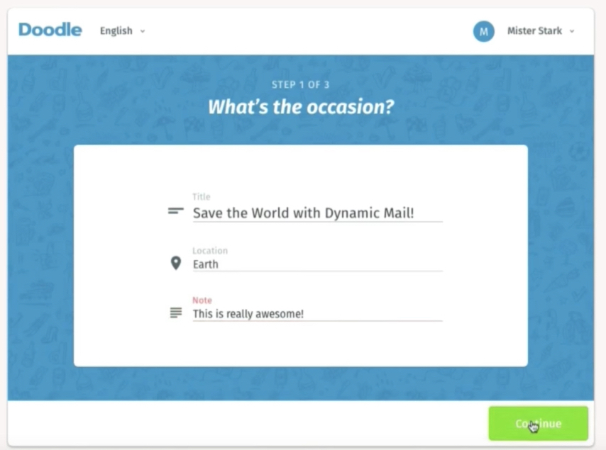
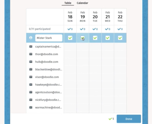
When the user clicks “Continue,” they’re able to choose the most convenient times for them, then, email it out to the group:
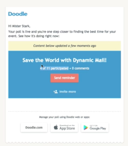
Here’s what the email looks like in Gmail. You’ll notice that underneath the title of the event “Save the World with Dynamic Email,” the notification “4 of 11 participants, – 0 comments.” This is where AMP for email shines:
Dynamic content
What you’re seeing is dynamic content. As in, this content will update as more users participate in the poll. When a fifth user completes the poll, you’ll see 5 out of 11 participated. When someone comments, you’ll see an updated comment count.
This is opposed to the normally static content that we get in emails. With a static email, if we wanted to be updated on the number of people who had participated in the poll, we’d need to receive a second email. What you see above, no matter when it’s opened will have the most up-to-date information about the poll.
Another great example of AMP for email at its best is seen below, in the “Send Reminder” function of the email:
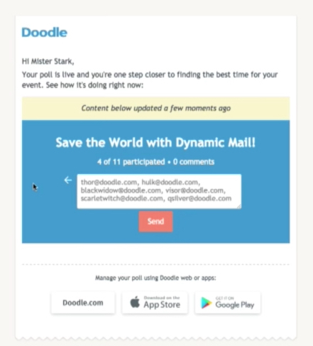
Here, you’ll notice the user can input email addresses of participants, then click “Send” to remind them to complete the poll. This is yet another shining example of AMP for email at work.
What you’re seeing is the completion of a form as it would look on a website or in an app. Yet, it’s in an email, which makes completing it a heck of a lot easier.
Next, we see what it looks like when the majority of participants have completed the poll, and the user can choose a final date and time. You’ll see that the dynamic content indicates that 10 people can make Monday, Feb 19, when only 9 can make that Tuesday, and 8 can make that Wednesday:
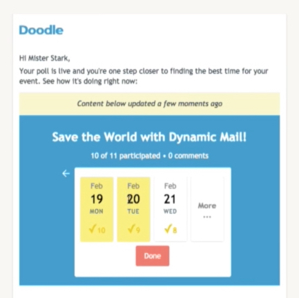
By clicking the date, then the “Done” button, the user can finalize the time of the meeting, at which point participants will be notified.
2. Booking.com
Like Doodle, Booking.com takes advantage of AMP’s dynamic content to deliver users a better experience in email. In this case, it relates to their search for lodging.
As you see in this first email, Booking.com offers its users a room recommendation with an image. But, one thumbnail? That’s hardly all you need to see to decide on a room:
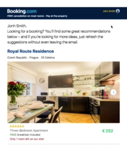
But unlike static email, which would force you to click through to the listing page to see the photos of this apartment, AMP for email allows the user to click the arrow on the edge of the image to slide to the next photo, seen below:
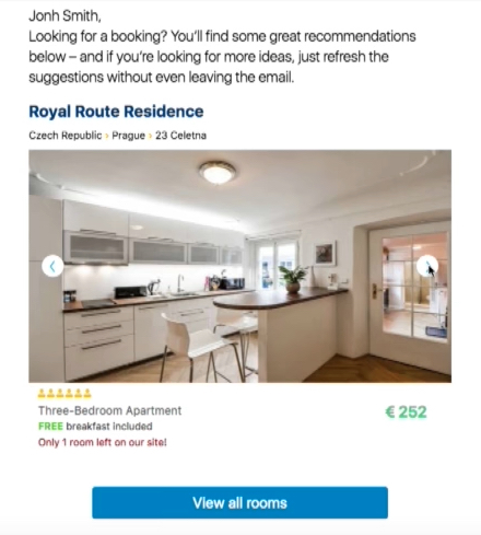
The user gets a more informed view of the listing without ever having to leave the email. While an email slider like this can be created with CSS, it’s been called a far smoother experience with AMP for email.
But, what if the user rules out that listing altogether? With AMP for email, not an issue.
When the user scrolls down, they’ll find several other listings. Here, you see one in Moscow, Paris, Amsterdam, and more.
And if those aren’t enough, the user can click “See new deal” in their desired location, and another listing in that place will pop up:
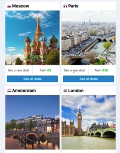
And if users decide they’re receiving too many of Booking.com’s promotional emails, they can simply scroll to the bottom of the message and click “Manage your Subscription,” which will reveal a form below:
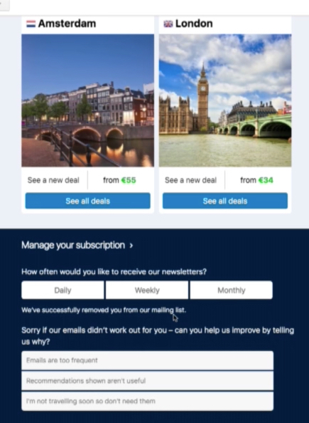
Here, both the user and the marketer greatly benefit. The user can determine how often they want to receive these emails, or unsubscribe altogether, while the marketer gets to gather more data about how users respond to their campaigns.
3. Pinterest
Pinterest has always been a highly visual social network, which helps its team create attention-grabbing emails. Unfortunately, before AMP for email, attention-grabbing is all they could be.
Take this email below:

Normally, if this email were in your inbox, you’d have to click through to see details of the recipe, what it contains, comments on it, variations, etc.
But, with AMP for email, you can click on that “Korean Fried Chicken Tacos” recipe in the upper-right of the board, and it will expand, in the email, to a bigger and more detailed pin:
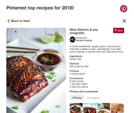
For Pinterest, AMP for email makes sense across the board, but especially during the onboarding process, which is hard to get users to complete. Here’s how much easier it could be with AMP for email…
Normally, when a user signs up, they get an email like the one below, that instructs them to follow 5 or more topics so Pinterest can build them a custom homefeed:
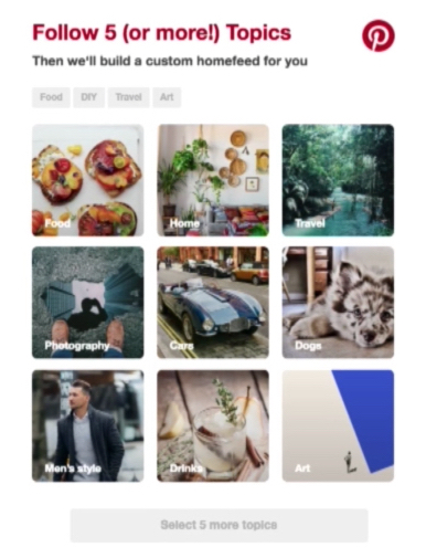
In a static email, users would have to click through this to the Pinterest website to pick five topics to follow.
Dynamic Headline
But, as you see in the example below, once the user starts clicking topics, the headline of the email dynamically changes to “Follow 3 (or more!) Topics:”
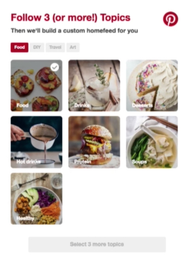
Not only can they choose from the topics displayed, but the ones hidden by filters under the subheadline as well. They read “Food,” “DIY,” and “Art.” When the user clicks them, they reveal a new group of topical photos which the user can click to subscribe to.
When topic selection is finished, the CTA above, which is grayed out, turns red and becomes clickable and reads “Done.” In addition, the headline reads “All set!” above the subheadline “Ready to build a custom homefeed for you.” You can see what that looks like here:
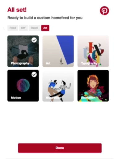
When the user clicks “Done,” a homefeed is built, and the loading bar, below, will progress as it would in an app, with the headline/subheadline reading “Building Homefeed/Finding your ideas from…”
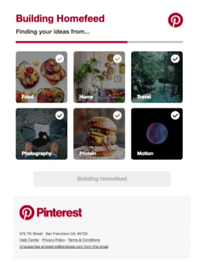
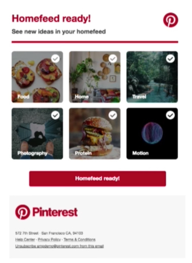
At its completion, the user is fully ready to begin engaging with the app, and the email lets them know it with a button that reads “Homefeed ready!” which they can click through to the website.
Possible negatives to AMP for email
While AMP for email brings revolutionary potential to a powerful medium, not everyone’s convinced it’ll be for the better. In a blog post for Litmus, Jain Mistry outlines a few problems the technology may face:
- There’s little support from ESPs: Emails using AMP aren’t like traditional emails, so, they can’t be built the traditional way. If your email service provider can’t support the technology needed to create them, you may find yourself unable to.
- AMP for email only works in Gmail: Currently AMP for email is exclusive to Gmail. If your email list is primarily Gmail users, this may not be an issue. If it isn’t, you may have to create a non-AMP version of your email for non-Gmail users.
- Tracking may be limited: Tracking is crucial to optimization. Currently, marketers can track opens, clicks, etc. to improve campaigns. When you add to the list of actions users can take, you also add to what marketers must to track. Will there be ways to track them?
- It may confuse users: The problem with completely changing the way we use email is that it could potentially be too much too soon.
For example: Dynamic content, while giving marketers the opportunity to keep their emails up-to-date after sending, could confuse users expecting static content. Mistry writes: “Imagine opening the same email once, twice, and then a third time expecting to find the same content and not? It’s a tactic that may lead to losing trust among your subscribers — a valuable commodity in email marketing.”
Will you use AMP for email?
According to a survey from Litmus, of the 55.6% who are familiar with AMP for email, 55.4% say they are somewhat likely or very likely to use it:
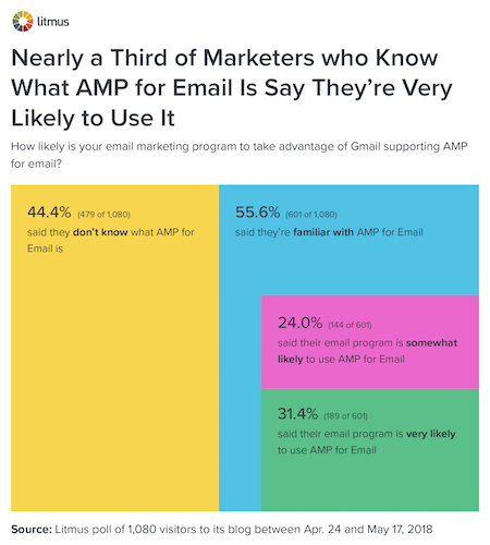
In the examples above, the benefits are clear. AMP for email allows users an easier, friction-free way to interact with brands via email. For brands, the benefits of making interaction easier are always seen in ROI.
If they can fill out a poll in email, it’s more likely they do; if they can browse hotel listings in their email, it’s more likely they will. And the same can be said in Pinterest’s case, for onboarding through social media.
If you’re ready to use AMP to improve your post-click landing pages, sign up for an Instapage demo to see what it can do for your campaigns.

Get an Instapage AMP Demo
See how quick and easy it is to create AMP
post-click pages in Instapage.
