Today’s accounting companies must convince prospects that their firm has the expertise required and that using their service is the best solution to manage financial records and remain compliant with all state and federal laws. With an abundance of accounting sites just a quick Google search away, how will yours differentiate from the competition and win more business? How will your accounting firm earn people’s trust and convert them into paying customers?
To do this, the best accounting websites promote their services with post-click landing pages because post-click landing pages are designed for conversion and used at various stages of the buyer’s journey.
What is a post-click landing page?
A post-click landing page is a standalone page that uses persuasive elements such as benefit-oriented copy, trust badges, testimonials, and color contrasting CTAs to get visitors to take a specific action. That action could be starting a free trial, receiving a quote, registering for a webinar, and more.
Similar to financial services companies using post-click landing pages, the accounting industry also uses these dedicated pages to create a great first impression, generate leads, and sales. Let’s see how well leaders in the accounting industry use them to move prospects through the marketing funnel to sale.
Accounting post-click landing pages
(Keep in mind, for shorter pages, we’ve shown the entire page. However, for longer pages, we only displayed above the fold. You may need to click through to the page to see some of the points we discuss and some pages may be undergoing A/B testing with an alternate version than is displayed below.)
FreshBooks
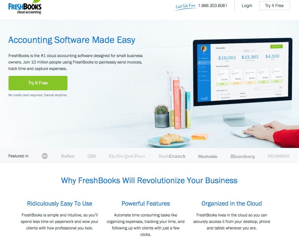
This FreshBooks post-click landing page is actually a click-through post-click landing page. That’s because once any of the CTA buttons is clicked, prospects are sent to this signup form.
Nevertheless, this accounting post-click landing page makes a strong first impression because the header states the value being provided by the service and the image shows someone using FreshBooks’ software. Plus, visitors can quickly see that FreshBooks is a credible accounting software company if Forbes, CNN, and The New York Times have all featured them on their respective sites.
Once you scroll below the fold, detailed testimonials (complete with title and affiliation) also help sell the value of FreshBooks accounting software. The collapsible FAQ section is a nice touch because it answers some common questions without forcing prospects to leave the page. To round out the positives, the word “free” is used in every CTA button and social proof (10 million people using FreshBooks” both help persuade visitors to click through and start a free trial.
However, the page is not without its faults. First, the hyperlinked logo in the header makes it too tempting for visitors to abandon this page without converting. More white space could be added throughout the page to allow each element to get noticed even more. The help center email address and social media are unnecessary and only act as exit links away from this free trial offer. Just removing those links would help keep the attention on the page and clicking any one of the CTA buttons instead.
Tax preparation
Tax preparation services simplify the lives of employees and business owners. By preparing tax returns for a fee, tax preparation services allow those parties to focus on their work instead of the complexities of tax law. Let’s evaluate how tax preparation services are using post-click landing pages to persuade prospects to become customers.
H&R Block
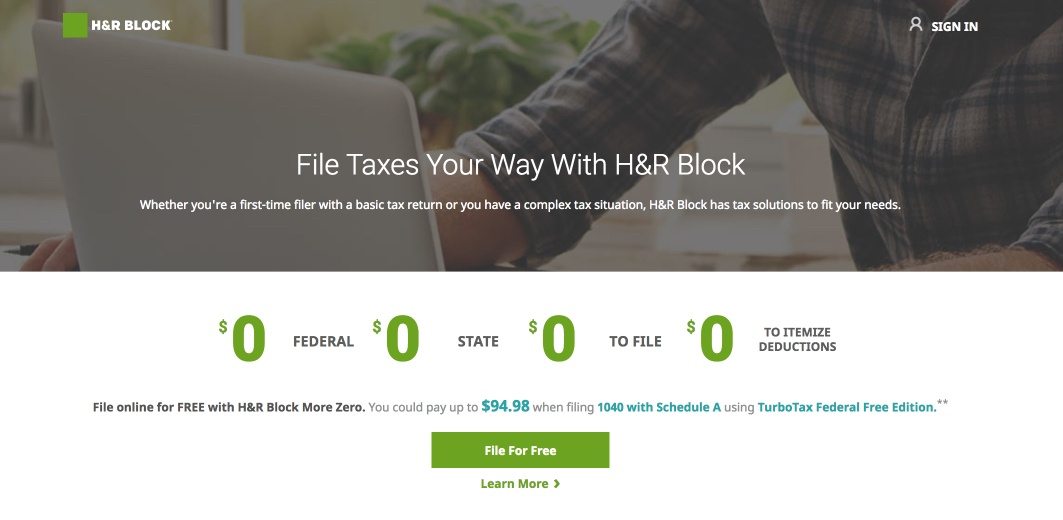
Eliminating the header and footer navigation was a great first step H&R Block did when designing this post-click landing page.
H&R Block also uses a click-through page for prospects to file their taxes online. When visitors get to the page, they immediately know that H&R Block’s offer is free with the row of zeros. The only thing that would make it more obvious is if the headline used the word “free.” The testimonial slider adds a nice persuasive element to the page, and the 2017 copyright lets visitors know the page is updated with the current tax year.
H&R Block could do quite a bit to optimize this page, however. First, removing the hyperlink from their logo in the top left wouldn’t changing the “File for Free” CTA button to a more contrasting color would help it draw more attention and generate more clicks. Also, crafting better copy such as “File My Taxes for Free” may get more people to click the button and start the process.
What’s missing from this page are trust badges and more explicit social proof. What was the average tax refund H&R Block for past clients? Has H&R Block won any industry awards? Adding both of these elements could entice more people to click the CTA button and file their taxes online.
Jackson Hewitt

The maximum refund guarantee is the most persuasive element on this post-click landing page, so it’s good that it’s the first thing a visitor will see upon arrival. Removing the header and footer navigation is smart because it keeps distractions to a minimum and focuses the page on providing the best savings options. The eye gaze visual cue influences people to read the FAQ section, but a better use of visual cue would be for him to look at the “Find a Local Office” CTA button.
Unfortunately, that’s where the positives stop. What is the primary goal of this page? Is it to find a local Jackson Hewitt office, or is it to learn more about savings options? The majority of the page is blue, so it doesn’t make sense to have the CTA buttons blue as well. Changing the CTA button to green or orange would make it more noticeable and generate more clicks.
The post-click landing page includes multiple links that allow visitors to leave the page without converting. Most notably, Jackson Hewitt’s logo links to the homepage and the “Learn More” CTA button links to their page on NerdWallet’s site.
To help reduce the page clutter, Jackson Hewitt could duplicate FreshBooks’ collapsible FAQ design so that answers are only revealed once a question is clicked. The alternative design choice would be adding white space throughout the page with some arrow directional cues. This would encourage visitors to scroll down and evaluate the rest of the offer.
TurboTax

Upon arrival, visitors instantly know that TurboTax offers customers the ability to start for free. This page is short and concise but still uses white space well to highlight the zero-cost nature and benefits of using TurboTax. The image of the woman using TurboTax to receive her refund provides value because it shows visitors someone who has taken advantage of the offer to a positive effect.
There isn’t much copy, but that isn’t necessarily a bad thing because the main goal is to emphasize the zero-cost filing program. Highlighting that people can capture their W-2 with their phone and that the platform is multi-device compatible gives people the freedom to file their taxes however they want.
The security trust badges in the footer let visitors know that TurboTax is a secure program that they can trust with their sensitive information. TurboTax could place these trust badges closer to the CTA to heighten their effect on conversions.
The logo in the header links back to TurboTax’s main website, which gives visitors an opportunity to leave the page. Including a few testimonials and social proof from customers could help increase conversions because prospects want to be assured TurboTax is a reputable service they can trust.
Tax Act
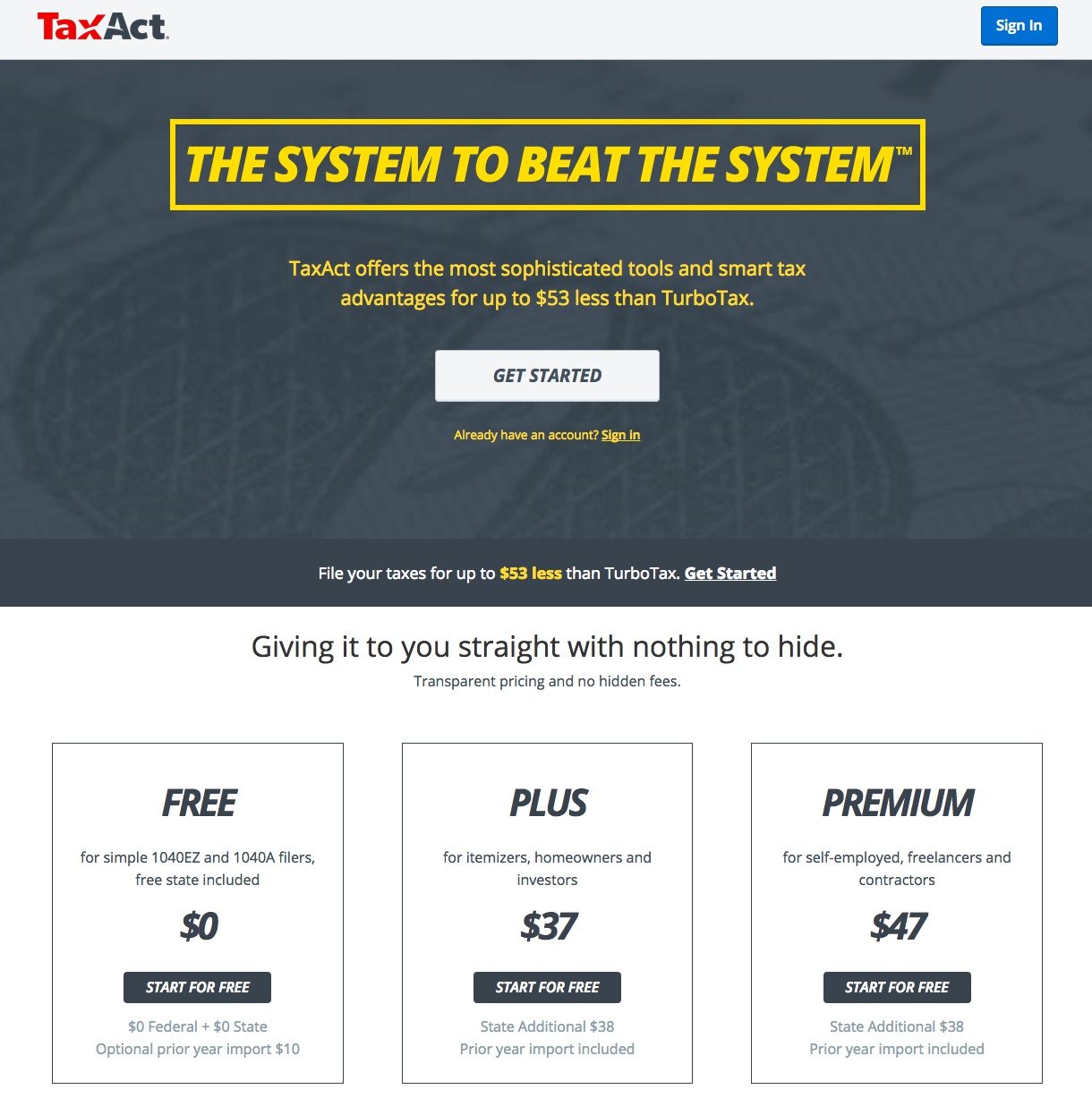
This Tax Act post-click landing page makes a great first impression. First, the absence of a header navigation and a compelling headline make visitors want to learn more about the offer. Next, the copy continues to highlight that Tax Act costs $53 less than TurboTax, which is a distinguishing variable for prospects that are comparison shopping.
Scrolling down, the sticky banner reinforces the cost savings versus TurboTax and for visitors to “Get Started.” There is ample white space that allows each element to get attention, like the comparison chart. The chart is great because it points out the customer support and low-cost of using Tax Act. Even further down the page is an animated demonstration how Tax Act will handle your taxes. Finally, security badges like those from Norton and TRUSTe instill confidence and trust for visitors because they know their information will be kept safe.
However, the biggest mistake on this page are the CTA buttons because they blend in with the background and surrounding elements. The short videos are okay, but if they featured customer testimonials, that would be more persuasive at generating button clicks. Multiple exit links attached to the Tax Act logo and social media provide easy ways for visitors to become distracted and not focused on converting. Simply removing these links would keep visitors engaged on the page and that much closer to converting.
Bookkeeping
Running a business is a time-consuming venture, and the executives and managers making day to day decisions need someone handling the books. Companies of all sizes need bookkeepers to record their financial transactions. Let’s see how these bookkeepers use post-click landing pages to convert prospects.
Zenefits
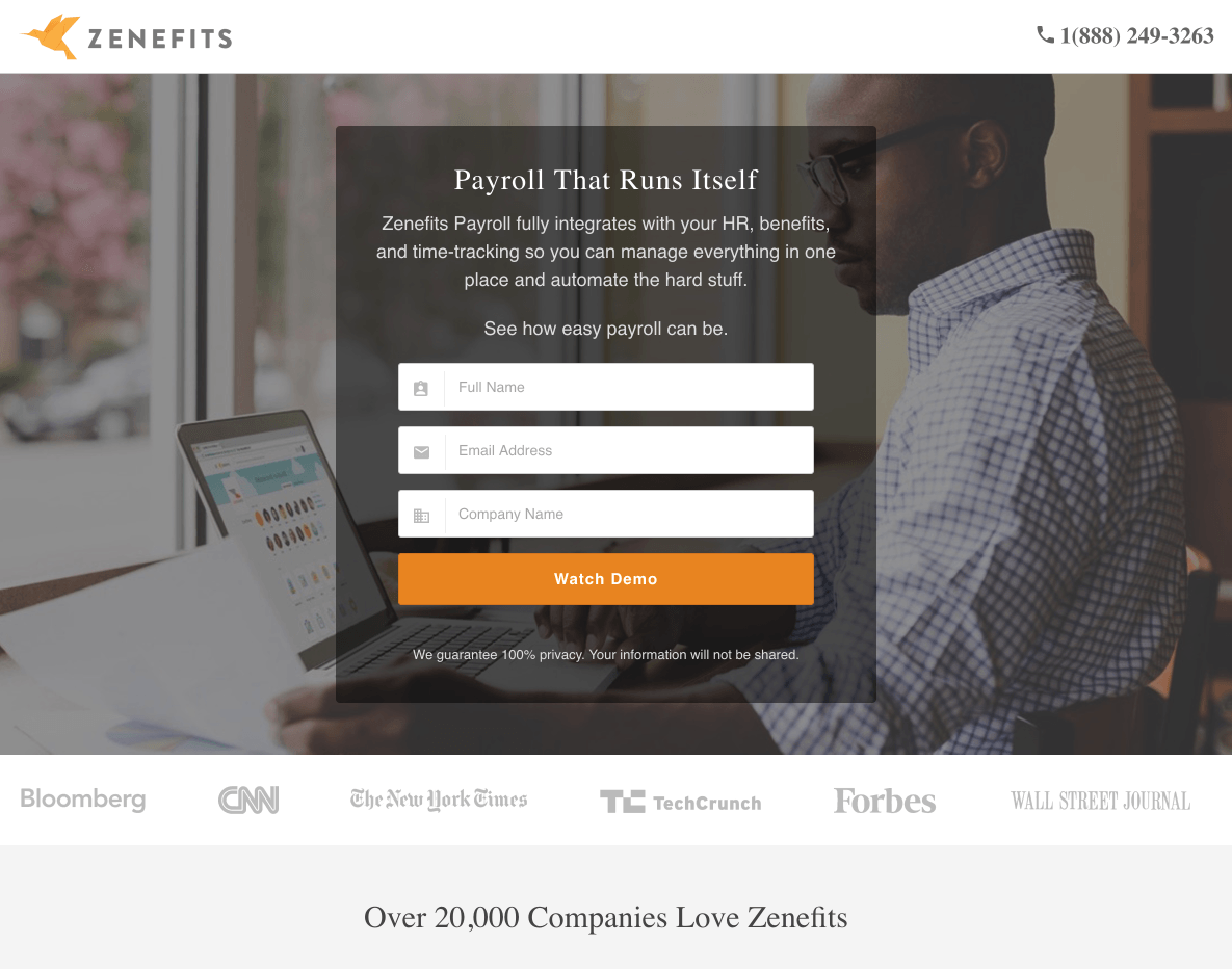
For starters, no header navigation and a contrasting CTA button keep visitors focused on the page and the demo. Plus, the man’s eye gaze is directed at the form and CTA button serving as a visual cue to complete the form. The short form reduces friction and allows visitors to redeem the offer without having to divulge too much personal information. The privacy guarantee below the CTA is nice, but linking it to the privacy policy would be even better to alleviate any concerns.
The image is relevant to the offer because the man is using the Zenefits platform to do his payroll. “Over 20,000 companies love Zenefits” is great social proof and customer badges from big brands such as CNN, Forbes, and Bloomberg inspires confidence and makes visitors feel comfortable about converting.
On the other hand, the Zenefits logo links to the homepage, giving visitors an opportunity to leave without converting. The “Watch Demo” CTA copy isn’t as inspiring as it could be and doesn’t really move prospects to take action. A better phrase might be, “Show Me the Demo.” The testimonials below the fold are great additions, but without a headshot, they seem a little empty. The logo in the header also links back to the main site, giving visitors an opportunity to leave without converting.
Paychex
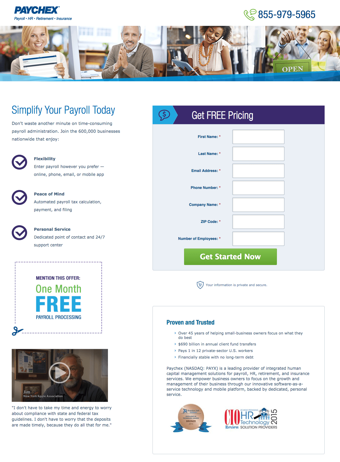
Paychex’s post-click landing page has a lot going for it. For starters, the click-to-call phone number makes it easy for interested prospects to contact the company. Plus, their logo is not linked, so it’s not a distraction. Minimal copy makes the page quick and easy to scan and the page is well balanced. Social proof (600,000 businesses), impressive statistics, and the video testimonial all add trust and credibility to the company for this free pricing offer. Finally, the big green CTA button contrasts with the blue scheme so it’s not easy to miss.
The 7-field form would normally increase friction. But in this case, the pricing request means the prospect is further down the funnel and in the decision stage. So it makes sense that Paychex would request all of these fields.
To optimize the page even more, Paychex could replace the stock photos with an accounting manager doing payroll with the software. Writing better CTA copy that is more relevant to the offer could also help improve the post-click landing page. “Get Started Now” doesn’t inspire action as much as “Show Me Your Prices.” Also, what is the enclosed “Mention this offer” about? Do visitors have to cut it out like the scissors indicate? Perhaps a coupon code prospects can submit upon paying for the service would work better.
Insperity
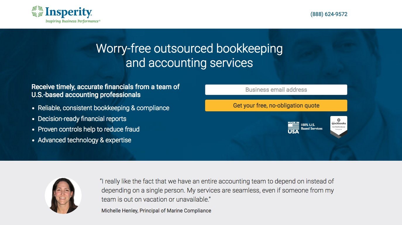
This accounting post-click landing page is doing a lot of things well. The logo in the header doesn’t link back to the main site, and no navigation menu means there is no easy exit off the page. The phone number in the header is click-to-call — providing visitors another way to connect with Insperity quickly and easily.
Bite-sized copy with bullet points makes it easy for visitors to scan the page and understand the offer. The yellow CTA button color stands out against its surrounding elements to and draws maximum attention and clicks. The CTA copy’s use of free is a good way to push prospects to convert.
Below the fold, multiple testimonials (complete with headshot, name, and organization) speak to the value of Insperity and help persuade visitors to request a free quote. To that point, “free” is used on all four cooperative CTAs, so it’s very clear there is no cost to this offer. When you scroll down, you get a testimonial that provides value. Testimonials like these let visitors know that other people have already had success using Insperity’s service. Scroll down even further, and you get a short video testimonial along with two other traditional testimonials.
Furthermore, each CTA button is a two-step opt-in that displays the lead capture form so only very interested prospects see the form. Finally, the QuickBooks badge underneath the first CTA helps instill a sense of trust in that Insperity is partnered with an industry leader.
ADP
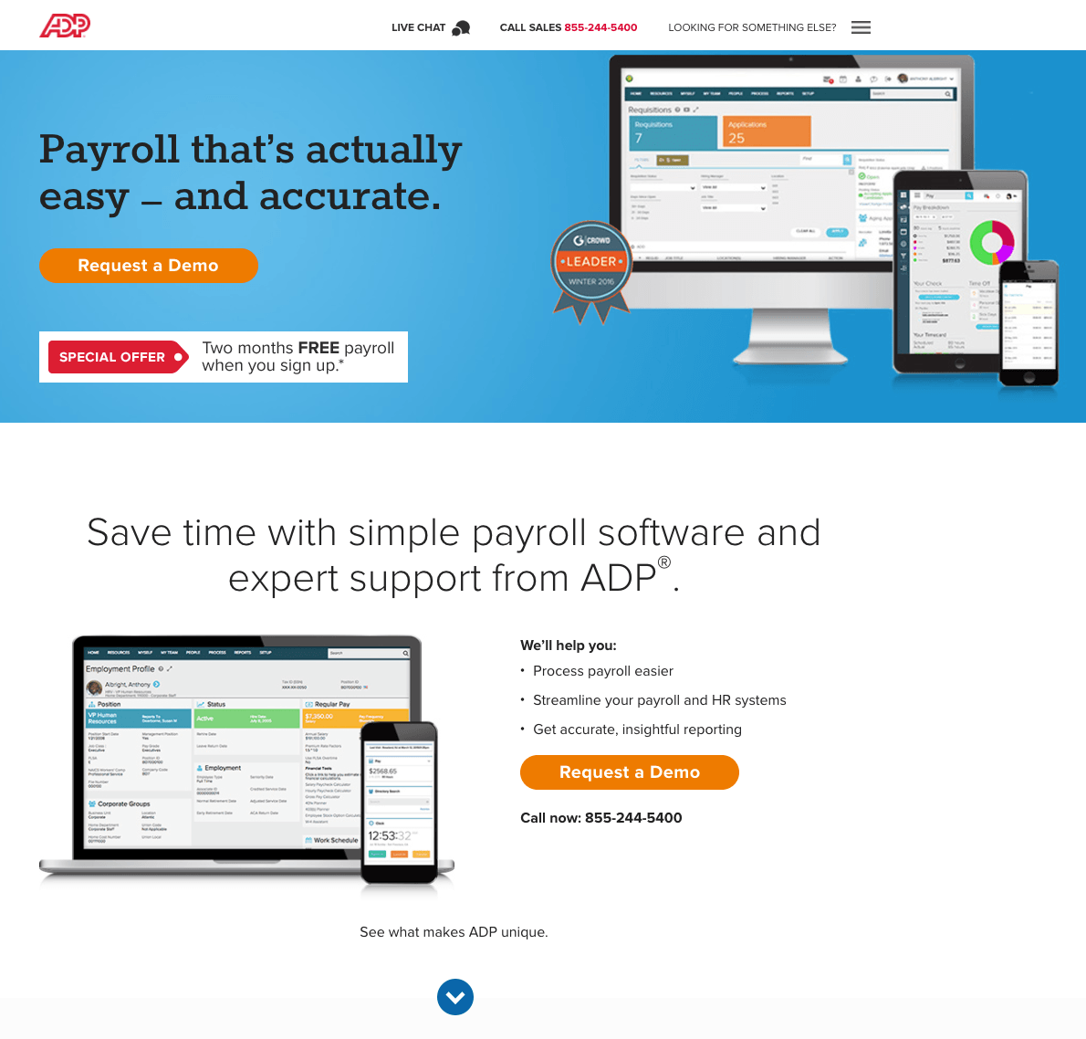
One of the best things about this ADP post-click landing page is that it has multiple, cooperative CTA buttons — all offering a demo — that contrast with the page. Also, the click-to-call phone number in the header makes it easy for visitors to contact ADP with any questions with the click of a button.
Below the fold, the page gets even better. The secondary headlines explain the offer, and the screenshots of ADP software operating on desktop and mobile shows that the platform is versatile. Arrow visual cues prompt the visitor to keep scrolling down the page, white space helps draw attention to the iconography, and detailed testimonials speak to the benefits of using ADP. If that’s not enough, industry awards add credibility to the company.
The biggest areas of improvement are the hamburger menu, CTA copy, and live chat feature. The hamburger menu in the top right provides easy exit routes from this post-click landing page to employee pages and HR Administrative links, which are counterproductive to generating demo registrations. The CTA copy could be optimized and more personalized to the visitor. “Request a Demo” is okay but changing it to “Show Me a Demo” or “Schedule My Demo” is a little more relevant and inspiring to take action. Finally, live chat is a nice touch as well, but if the dialog box opened on the post-click landing page instead of a new page, it would keep visitors focused on this demo offer.
Which accounting post-click landing page would inspire you to act?
What persuasive elements do you use with your accounting post-click landing pages? Are your pages doing all they can to convince visitors to convert and do business with you?
Always connect all your ads to personalized post-click landing pages to lower your cost per customer acquisition. Start creating your dedicated post-click pages by signing up for an Instapage Enterprise demo today.

See the Instapage Enterprise Plan in Action.
Demo includes AdMap™, Personalization, AMP,
Global Blocks, heatmaps & more.
