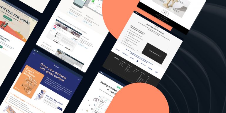
You only get one chance to make a first impression—if you fail to make a good one, it sets a bad tone for the entire relationship. In marketing, this first impression comes down to your landing page design.
The first thing a visitor looks at post-ad-click is your landing page—and before their eyes zero in on the copy, they see the page design. From the colors to the typography to the hero image, everything needs to be visually appealing, provide a seamless user experience, and make visitors want to scroll—and eventually click the CTA button.
Here is where design trends come in.
Each year’s trends help you see what’s working and what’s not, so you can design a page that looks good, feels relevant, and engages visitors.
Landing page design trends in 2023
For years, web design trends have pushed further and further into the sci-fi universe. However, the 2023 design trends are the complete opposite. This year’s web design trends share one common theme: realism.
The current trends combine digital and real-life aspects to showcase how standard websites have become in everyday life. We’ve curated four landing page design trends that will add visual appeal to your page, make a connection with visitors, and help with conversions.
Design trend #1: Parallax animation
Parallax animations create an optical illusion, so objects in the foreground appear to move faster than things farther away. The effect is similar to looking at passing scenery while driving. When used on landing pages, the animation’s impact comes across as simultaneously real and surreal.
With parallax animation, designers create depth by using foreground, background, and immersion, transforming the computer screen into something resembling a theater stage. As a visitor navigates the page, the seemingly fluid animations draw them in.
Here’s what the design looks like in action:
How to use parallax animation on your landing page
Instead of using generic icons to explain why your product or service is the perfect fit for visitors, create parallax animations to showcase product features and user benefits on your landing pages. The magic of the animations is more likely to engage visitors and get them to pay attention.
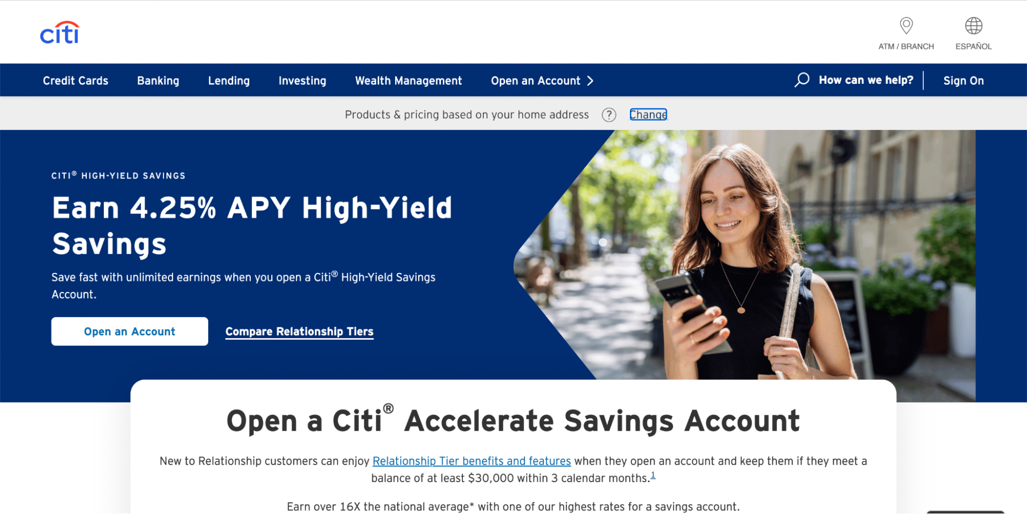
Design trend #2: Big, Bold Text
One effective way to communicate a unique value proposition (UVP) is by using big, bold text. With shorter attention spans and information overload, users tend to scan content rather than reading lengthy paragraphs. By making your copy big, bold, and direct, you can grab attention and effectively convey your message. Online bank Citi’s high-yield savings account page is a great example of using large, bold text to showcase an impressive rate and highlight account benefits.
Trend #3: Fluid Shapes & Gradients
Move away from classic geometric shapes and embrace organic, fluid shapes. These shapes evoke approachability and add personality to your landing pages. Meal kit company Home Chef uses organic shapes to enhance their UVPs and direct the viewer’s eye. Additionally, gradients have gained popularity, mimicking the blending of colors and light sources found in the natural world. Magic Spoon, a cereal brand, creatively combines organic shapes and gradients to create a whimsical and engaging landing page.


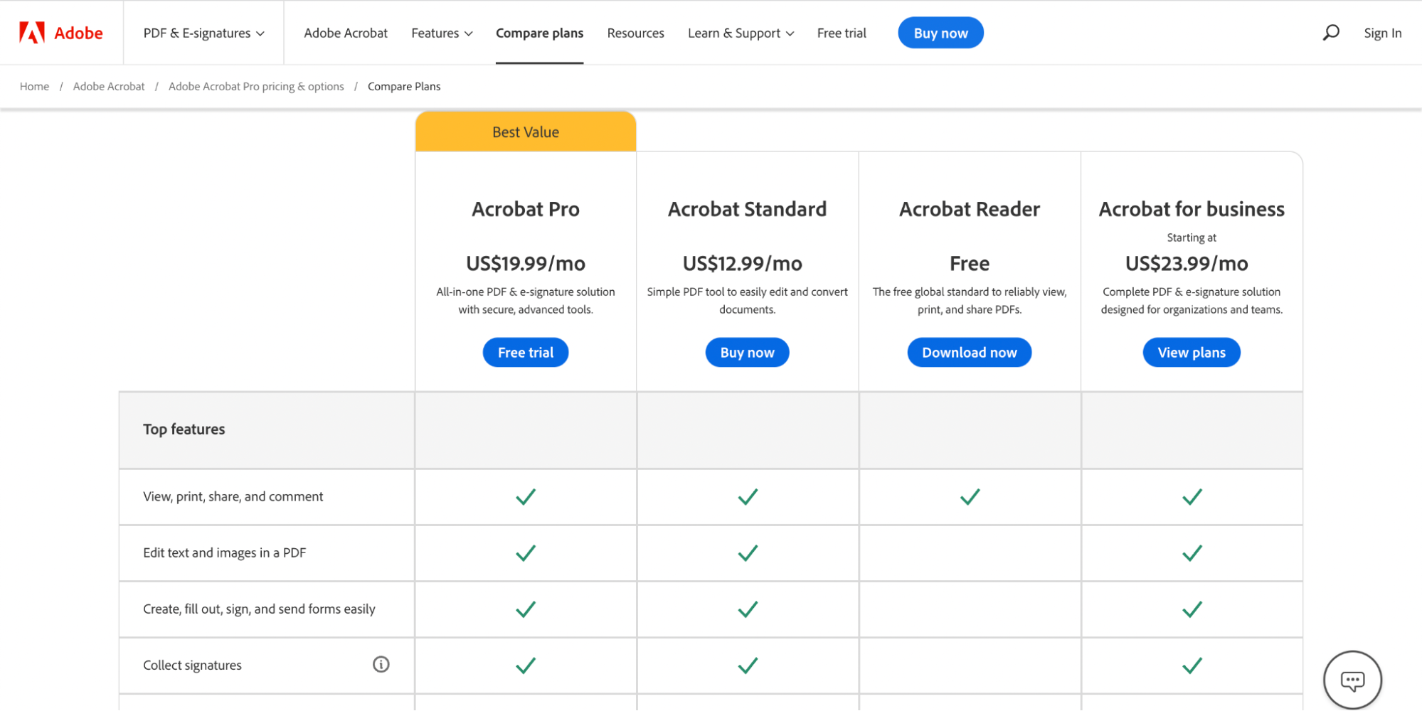
Trend #4: Comparison Charts
Make information easily digestible with scannable comparison charts. Whether you have multiple products or close competitors, comparison charts simplify decision-making for your prospects. Adobe effectively uses a product comparison chart to highlight key differences between their offerings. Tech warranty company Upsie transparently displays how their pricing compares with big-name competitors, helping visitors make informed choices without leaving the landing page.

Trend #5: Dark Mode
Dark mode, already popular in various applications, is becoming a growing trend in landing page design. Offering dark mode as an option on your landing page provides familiarity, reduces eye strain, and allows for a fresh and distinct visual experience. Empire Today, a carpet and flooring company, offers both traditional and dark-themed landing pages to cater to different viewer preferences.

Trend #6: Soothing colors
With the increasing use of digital technology in our lives, most users spend most of their time staring at screens. Because of this, eye strain is a prevalent concern. This year’s page design trends revolve around color schemes that put less stress on the eyes.
Soothing colors are a step away from the two extremes of dark and light. Soft color palettes, like subdued greens, pastel blues, warm browns, and light pinks, are all the rage this year. These muted, inviting colors don’t only make websites and landing pages less jarring than black or white, but they also naturally induce calmness and relaxation.
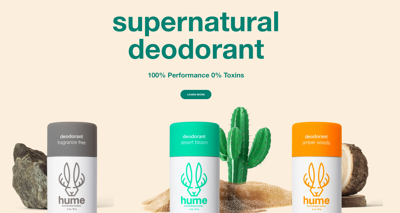
The Hume deodorant homepage is the perfect example of soothing colors:
How to use soothing colors on your landing page
Designing your landing page in a calm, soothing color scheme makes it more comfortable for visitors to view your page and click the call-to-action button. To choose the right color for your page, review this comprehensive guide on how to pick the perfect color.
Remember, everyone experiences colors differently, so there isn’t a single way to incorporate the principles of color psychology for everyone in the world. The feelings evoked by specific hues tie to meanings deeply rooted in each culture—and you know your audience better than anyone.
Trend #7: Doodles
You probably already know what a doodle is—many of us filled the margins of school notebooks with doodles whether we grew up to be designers or not. Google frequently features doodles to commemorate meaningful events and personalities on their homepage.
While doodles often remain hidden away in a designer’s sketchbook, sometimes never coming to life in the finished design, this hand-drawn element can often inject the perfect amount of creativity into page interfaces and layouts.
This design style also adds personality to the page and gives it a feeling of originality you can’t get from digital animations and effects alone. And while doodles aren’t a new trend per se, they’re making an emphatic comeback this year.
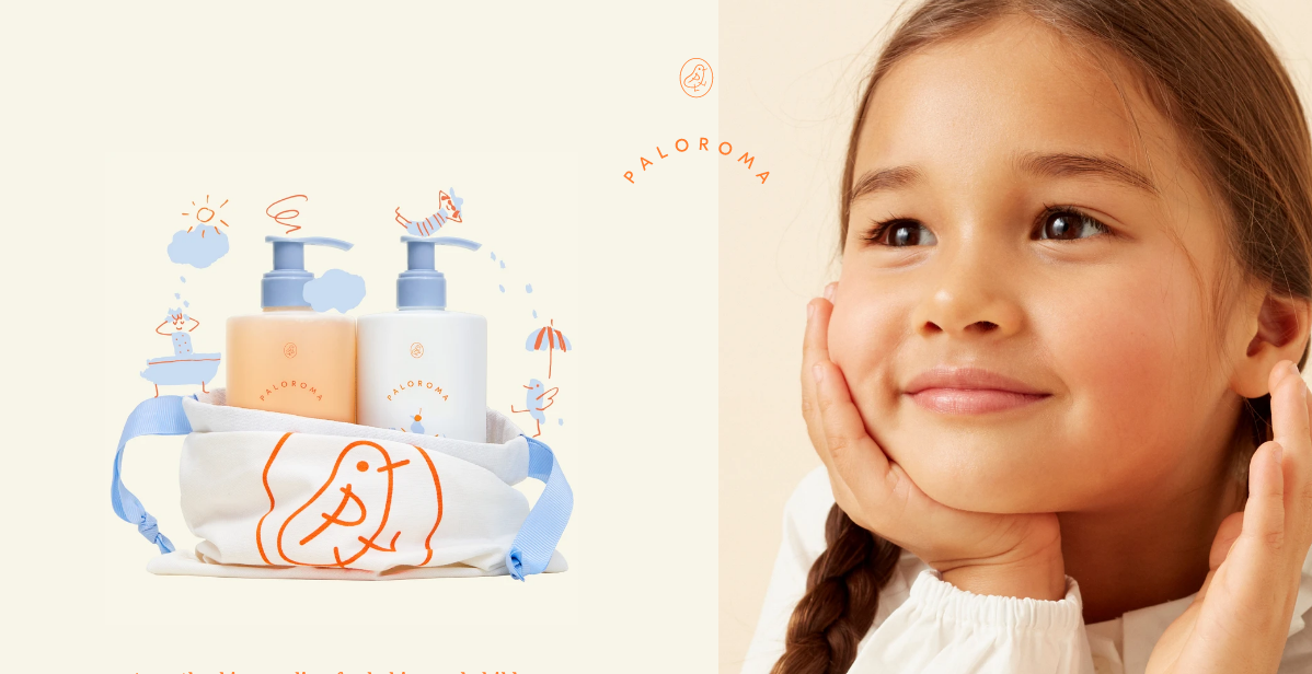
Skincare company Paloroma combines doodles with photography to draw users in. The drawings bring visitors’ focus to the product images. The brand also uses animated doodles further down the page to make the product range come to life.
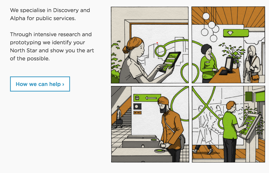
Mace & Menter, a research and design studio, uses a hand-drawn comic strip to explain how their service works:
How to use doodles on your landing page
Doodles make your page design more human-centric and approachable, so adding a few elements on your page that look hand-drawn helps visitors relate to your brand and brings your product or service to life.
While doodles add a simplistic whimsy to your landing page’s overall look, which may not work for all brands, that’s not all they can do. When used as visual cues, simple doodles can get visitors to pay attention to specific page elements such as the lead capture form or the call-to-action button.
Trend #8: Neumorphism
Neumorphism has been slowly gaining traction since last year. In 2023, it promises to usher your pages into the paradoxical age of minimalist realism.
The style is a successor to skeuomorphism—a design approach that incorporates renderings of familiar, outdated materials into current designs. Even though the style relates to skeuomorphism, neumorphism focuses on the color palette rather than the contrast or similarity between the real and digital worlds.
This design trend uses the color of the entire screen, layering elements from background to UI and buttons to deliver a unique user experience. Hallmarks of neumorphism include minimal design, solid colors, low contrast, shadows, and pops of color.
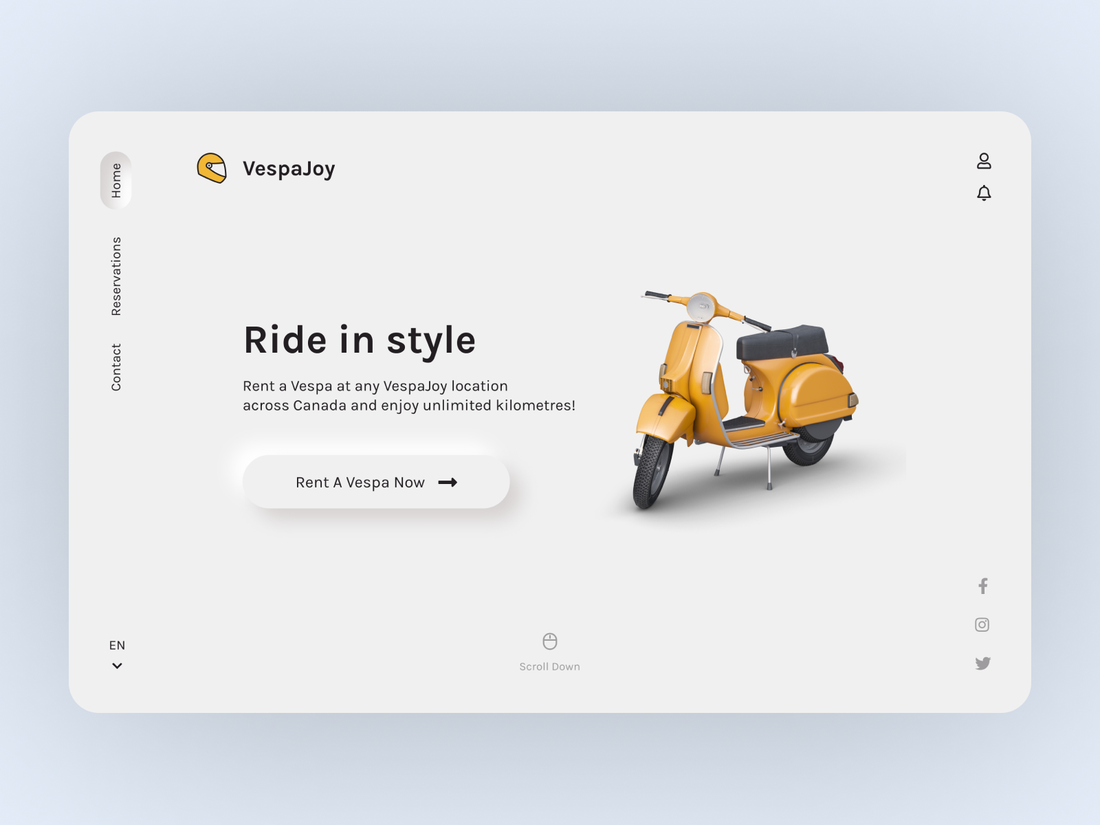
The VespaJoy web concept from designer Sara Salehi is a beautiful example of what neumorphism looks like in action:
Ongoing Trends: Custom Illustrations and Singular Conversion Goal
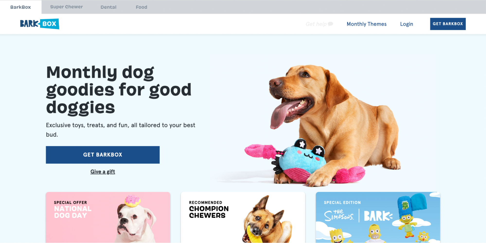
Custom illustrations continue to be a popular choice in 2023, providing flexibility and creativity in visual communication while bypassing logistical challenges and costs associated with high-quality photographs. Additionally, maintaining a singular conversion goal and eliminating distractions from the landing page, such as multiple CTAs and excessive navigation, remain crucial in streamlining the decision-making process. FabFitFun and BarkBox effectively demonstrate these practices on their landing pages.

Ready to Create Stunning, Conversion-Focused Pages?
Now that you’re aware of the top landing page design trends for 2023, it’s time to put them into action! With Instapage, you can easily create high-quality, customizable landing pages at scale. Our user-friendly interface and conversion-optimized templates empower anyone on your team to build landing pages without the need for a developer. Plus, by integrating with over 120 top marketing tools, Instapage will seamlessly fit into your existing tech stack.
If you’re looking for more support beyond a landing page builder, our conversion experts are here to ensure your landing page content and design are optimized for success. Book a demo today and receive a personalized walkthrough of our platform and services.
Incorporate these trends, create stunning landing pages with Instapage, and drive conversions like never before. Your audience will appreciate the engaging and user-friendly experience you provide, leading to higher conversion rates and business success. Don’t miss out on the opportunity to leverage these design trends and optimize your landing pages for maximum impact. Stay ahead of the competition by embracing big, bold text, fluid shapes and gradients, comparison charts, dark mode, custom illustrations, and a singular conversion goal.
Remember, landing page design is a vital component of your marketing strategy. It’s where potential customers land and make crucial decisions about engaging with your brand. By implementing these trends and utilizing Instapage’s powerful platform, you can create compelling landing pages that captivate your audience, guide them towards conversion, and ultimately drive business growth.
Better landing pages = higher ROAS
So, why wait? Take the first step towards creating stunning, conversion-focused landing pages. Start your free 14-day trial and unlock the potential of your digital marketing efforts. Our team of experts is ready to assist you in achieving your goals and maximizing your online presence. Start building high-performing landing pages that leave a lasting impression and turn visitors into loyal customers. If you’re looking for inspiration, check out our eBook of 2023 Landing Page Design Trends for even more insight!
